— Los Angeles Rams (@RamsNFL) March 7, 2020
Good morning! In yesterday’s Ticker, Phil linked to the tweet shown above, in which the L.A. Rams teased the fact that they’ll soon be changing their logo (which everyone already knew, of course). That tweet, which was posted on Saturday, set off an interesting chain of events that has given us the clearest sense yet of what the Rams may be up to in their forthcoming redesign.
Here’s the deal: Unsurprisingly, there were several hundred responses to the Rams’ tweet. So it was easy for people to miss this one, from a guy named Kenneth Castillo:
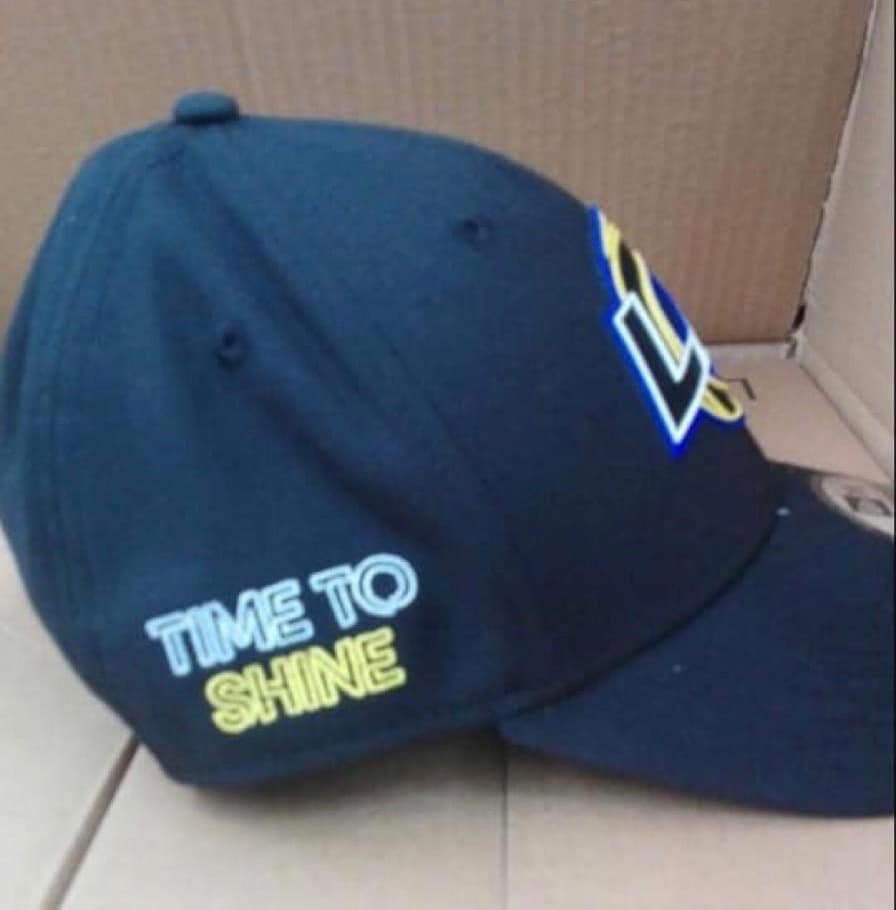
Then they put this up pic.twitter.com/wk6y7Noqf3
— Kenneth Castillo (@TicoKenitrin) March 7, 2020
A few people picked up on Castillo’s tweet and responded to it, but it didn’t go viral like some leaks tend to do. I might not have known about it myself — at least not right away — if not for Twitter-er @wutamclan7, who brought it to my attention on Saturday afternoon (and who also pointed out, “The colors might not be right. That style of hat is known as the Draft Night hat and done in ‘Las Vegas neon lights’ style”).
I wanted to know more, so I got in touch with Castillo, who told me, “I know a guy who texted me the picture. He works at a Dick’s Sporting goods in L.A. County and said they won’t be on sale until early April.”
I was busy for the rest of Saturday. But on Sunday I contacted a Rams representative and asked if they had any comment on the photo. While I was waiting for a response, another photo of the cap began circulating. This one was brought to my attention by reader Brad Belstock, who said he saw it on Reddit (click to enlarge):
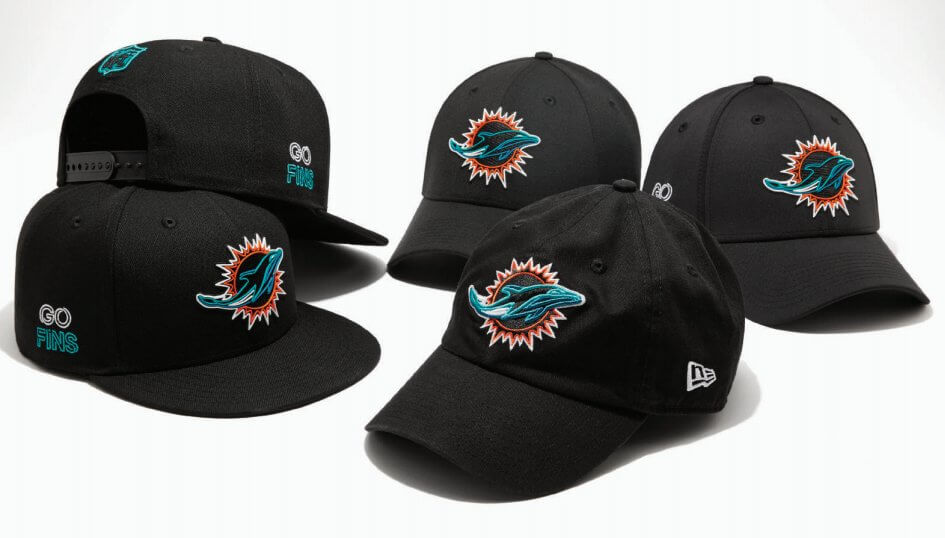
Castillo, the guy who tweeted the first photo, tells me he also posted the second photo (to a Rams-centric Facebook group, not to Twitter). The cardboard background matched the setting of the first photo, and the neon-style “Time to Shine” side lettering matched up with photos of similarly styled Dolphins caps that had leaked a few weeks ago (click to enlarge):
And here’s the kicker: Castillo pointed out to me that the phrase “Time to Shine” has been trademarked by — sure enough — the Rams.
All of this seemed to argue in favor of the cap’s legitimacy, but I still wanted to hear back from the Rams. Before that could happen, however, Yahoo Sports columnist Charles Robinson went ahead and confirmed the whole thing:
So this #Rams new logo hat that leaked on Reddit is legitimate. That’s the new logo. Thoughts? pic.twitter.com/mTZMeseS2f
— Charles Robinson (@CharlesRobinson) March 8, 2020
Okay, so what are we to make of this? Some thoughts:
• As everyone and a half has already pointed out, this seems like it could just as easily be a Chargers logo as a Rams logo (although not a particularly good logo in either case). It’s almost like someone said, “Hey, we’re sharing a stadium, let’s share a logo too!”
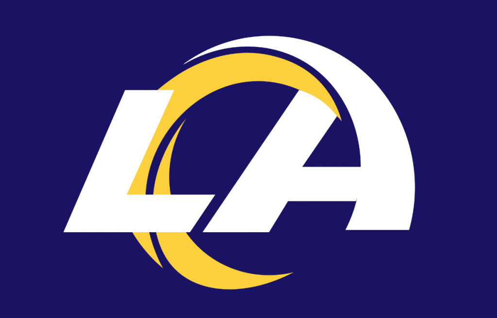
• Remember, the colors used on the cap are probably not the actual logo colors (just like the colors on the Dolphins cap don’t reflect that logo’s actual colors). Over on the SportsLogos.net message boards, there was lots of speculation regarding what the real color treatment might be. One of the people there, @FFWally, came up with a plausible-seeming rendition of how the real logo might look:
This concept has also been floating around, although I’m not sure where it originated:
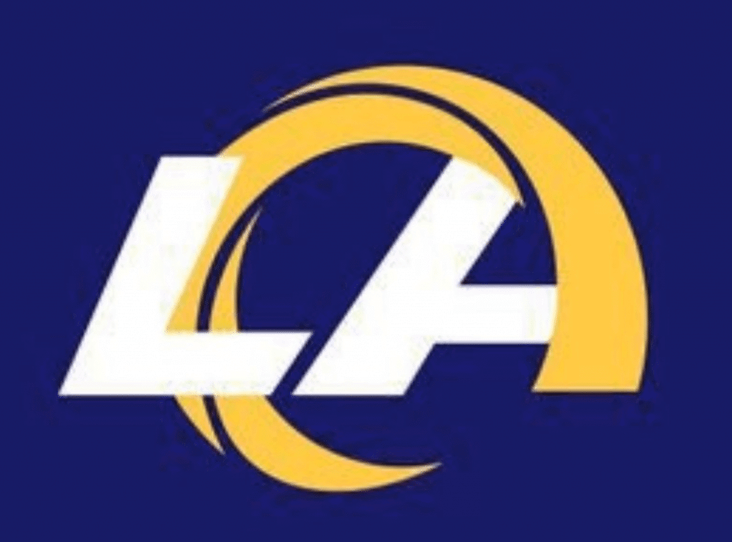
Update: That second concept appears to have be the work of SportsLogos.net user @Jeffrey.
The first one has a better treatment of the “LA” (but is arguably even more Chargers-esque); the second one has a better horn but has already been repeatedly mocked for looking like Donald Trump’s hair.
In short: Not great. I get that the Rams want to emphasize Los Angeles in their new branding, but this does not bode well. It reminds me (and, I’m sure, many of you) of when the Chargers floated their own abortive “LA” logo, which they quickly scrapped after the response was so negative:
Who did it better — er, worse? pic.twitter.com/WXaYoM8MJd
— Paul Lukas (@UniWatch) March 8, 2020
• Why did they design the stadium to be shaped like the old logo if they’re introducing a new logo? Maybe they’re retaining the old logo in a diminished capacity.
• On the positive side, a primary logo matters less to the Rams than to most other NFL teams, because we know they’re going to stick with rams’ horns on their helmets. Compare that to, say, the Falcons — their new logo will presumably be on the sides of their helmet, so it will carry more weight. The Rams’ new mark, by comparison, isn’t that big a deal, at least yet. We’ll have to wait and see how, if at all, it plays into the new uniform set.
• Of all the reactions I’ve seen so far, the funniest was from Twitter-er and Uni Watch reader David Bloomquist, who wins the award for creative Photoshoppery:
My @UniWatch inspired reaction to the #leaked #RamsLogo pic.twitter.com/q5OM6o7XE7
— HongKongHawk☝✌ (@dbloomy) March 9, 2020
Meanwhile: I did eventually hear back from the Rams yesterday. They said they have no comment at this time.
(Big thanks to @wutamclan7, Kenneth Castillo, Brad Belstock, @LesPantin, and reader/commenter James S. for their assistance with this post.)

Click to enlarge
Too good for the Ticker: Reader Ignacio Salazar, who specializes in Houston-related Ticker contributions, recently scored a sensational piece of Astros memorabilia: an original printing plate for the letterhead used by team chairman and Astrodome creator Judge Roy Hoffheinz.
Printing plate graphics are, by necessity, mirror-imaged. But we can flop the photo to create a more pleasing view:
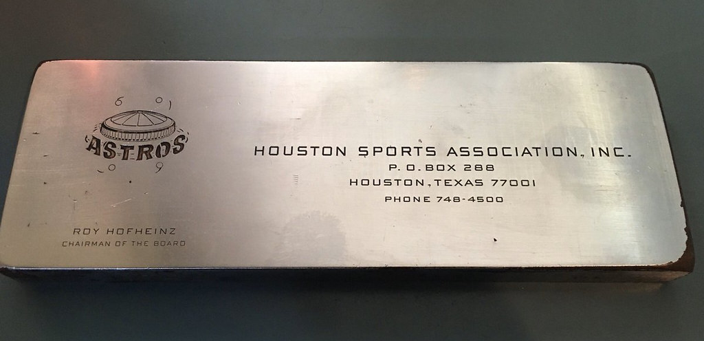
How awesome is that? Ignacio found it on Craigslist. “The seller was asking for $125, but I offered $65 and he accepted,” he says. “He told me got it from the original company that used it after they went out of business. It weighs two pounds and measures 6.5 x 2.25 inches.”
So cool! And please, let’s not have any jokes about Asterisks or cheating — let Ignacio enjoy this unique piece of history. Thanks.
Uni Watch Hit Parade: New York Giants chain crew honcho Tom Quinn, who I profiled for ESPN a while back, has musical tastes that mirror my own, and he recently tipped me off to an absolutely monster track called “Daily Routine,” from a young Wisconsin band called Disq. It’s the lead song on their new debut album, Collector. Nothing else on that album even approaches the level of “Daily Routine,” but it doesn’t matter — “Daily Routine” is so good that it justifies the band’s existence all by itself. Most bands will never even have one song this good.
Like so many great songs, “Daily Routine” has an addictively hummable melody that seems intuitive and obvious. Like, how is it possible that nobody used this melody before? How is it possible that any other melodies even exist? Throw in some crunching guitars, a bit of well-deployed dissonance, a bit of piano plink-plunk on the third verse, some deadpan Pavement-style vocals, and you have an instant classic.
As a bonus, this is the rare song whose title is a self-fulfilling prophecy, because “Daily Routine” is definitely destined to become part of my daily routine. Tom, if you’re reading this, thanks for the tip!
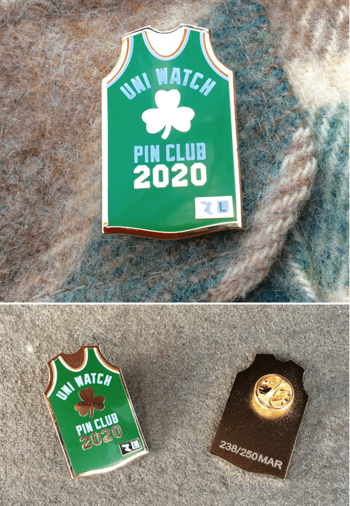
Pin Club reminder: In case you missed it last week, the March design for the Uni Watch Pin Club is now available. It features a basketball jersey (for March Madness) with a shamrock and orange/white trim (for St. Patrick’s Day), along with a winged stirrup jock tag (for Uni Watch!). This one is a numbered edition of 250, and we’ve already sold more than half of them, so move fast!
If you need to get caught up, the January and February pins are still available until they sell out, and we also have our basic winged stirrup logo pin. And remember, card-carrying Uni Watch members get a 15% discount on these pins (and on everything else in the Uni Watch Shop).
My thanks, as always, for considering our products.
The Ticker
By Jamie Rathjen

Baseball News: The Royals’ team dietician, Erika Sharp, wears a T-shirt that reads, “Plate Discipline” — get it? … Yesterday was International Women’s Day, so the Giants posted some photos of MLB’s first female coach, Alyssa Nakken, in uniform (thanks, Brinke). … Baldwin High in Hawaii wears gorgeous triple-striped stirrups.

Football News: The XFL’s Houston Roughnecks wore a new red/navy combo (from Wade Heidt). … Speaking of the XFL, in case you missed it over the weekend, they’re considering the use of advertising patches.

Hockey News: Some junior hockey items from Wade Heidt: the WHL’s Medicine Hat Tigers participated in the WHL Suits Up promotion by wearing orange jerseys with the vintage Hockey Night in Canada logo as a crest. … The WHL’s Portland Winterhawks wore a new alternate uniform. … The OHL’s Niagara IceDogs wore alternates designed by the winner of a student contest. … The WHL’s Red Deer Rebels and Swift Current Broncos played a color-vs.-color game. … Harvard and RPI’s series later this week in the ECAC tournament is to be played behind closed doors because of two coronavirus cases in New York’s Capital District.

Basketball News: The Clippers usually cover up the Lakers’ retired numbers and banners during their home games, but Kobe Bryant’s retired numbers are uncovered (from Jakob Fox). … Hampton’s men’s team has been wearing blue uniforms with hard-to-read Old English-style chest lettering and NOBs at the Big South tournament (from multiple readers). … Hampton and their opponents, Winthrop, also wore two different versions of the conference logo patch (from Josh Hinton). … Another from Josh: Lafayette and Colgate played a color-vs.-color Patriot League semifinal. … Liberty’s men’s team wore throwbacks for yesterday’s Atlantic Sun final (from @UncleFraz). … Players at Division III Yeshiva University, which is affiliated with Orthodox Judaism, wear yarmulkes during games, as you can see in an image used for this WaPo story. The story itself isn’t uni-related, but is an interesting account of how Yeshiva successfully finished their first-round Division III tournament game before sundown Friday, as it was held behind closed doors at Johns Hopkins because of the coronavirus and delayed while their opponents waited for permission to play from school administrators (from Ethan Zanger). … A character on an episode of the Netflix show Narcos that takes place in the early ’80s was shown wearing a hat with the Jumpman logo, which didn’t exist until 1988 (from @EvilEmpireFan).

Soccer News: German team Bayern Munich wore their 120th-anniversary throwbacks yesterday (from @_bbbene). … In France, Marseille striker Dario Benedetto suffered a head wound Friday and instead of the usual gigantic bandage received a swimmer’s cap. … Some recently-revealed national team kits debuted during women’s invitational tournaments held this month, including both of the U.S.’s kits, Scotland, and Northern Ireland. Both U.S. shirts have odd broken accents down the sides. … U.S. fullback Crystal Dunn received a commemorative shirt for reaching 100 caps. … Italy’s women’s team seem to have promoted their mono-green third kit to first choice recently; it was only worn once by the men’s team in October, but the women’s team has worn it at least three times and the federation’s Twitter feeds show that a number of Italy’s youth and futsal teams of both genders appear to prefer green as well. … Some leagues, including the Premier League, English Football League, and France’s Ligue 1 and Ligue 2, have banned prematch handshakes because of the coronavirus after Scotland did so for all leagues in the country last week. … In MLS, the Portland Timbers wore their white second kit at home, forcing Nashville SC to change as well. Announcer Jon Champion apparently said that Portland had to wear white a certain number of times this season. … Nashville midfielder Dax McCarty had the small and big Cs in his NOB switched (from multiple readers).. … In the USL Championship, Loudoun United goalie Collin Miller switched to No. 0 this season (from my brother Nate Rathjen). … USL Championship teams Sporting Kansas City II and Charlotte Independence played a light blue vs. royal blue matchup (from Ryan Cruz). … Here’s the latest in the Chicago Fire’s series of 12 patches for the 2020 season (from David Ziemba). … The website Museum of Jerseys is inviting readers to help pick the best Premier League kit of the 2019-20 season.

Grab Bag: Fans attending rugby sevens tournaments often dress up in costumes, so here’s a selection that did at this weekend’s Canada Sevens in Vancouver (from Wade Heidt). … Before the cricket Women’s Twenty20 World Cup final, the names and numbers of two Australia players injured before and during the tournament, Ellyse Perry and Tayla Vlaeminck, were added to the sleeves of their team’s training shirts. … The final, at the Melbourne Cricket Ground yesterday, also attempted to break the record for the largest crowd at a women’s sporting event, which was set in soccer with 90,185 at the 1999 Women’s World Cup final, and fell short but still set attendance records for women’s cricket and Australian women’s sports. … Australia’s men’s and women’s field hockey teams both wore their indigenous-designed kits revealed last week. … For International Women’s Day, The Telegraph republished a piece from January on equipment-related challenges faced by women in various sports. … Formula One’s Bahrain Grand Prix, which is in two weeks, is to be held behind closed doors because of the coronavirus. … Southwest Airlines is the latest carrier whose employees have complained about rashes and other reactions from their uniforms (from Timmy Donahue).
Wow. For all of the time spent on this redesign, and years of hype behind it, this is decidedly underwhelming at best. What a terrible, pathetic logo. So bad and so bland.
I live in Wisconsin so was curious to hear about Disq. Fun music video for Daily Routine found on their website. Love the piñata hit to the tap of the snare.
link
What’s the worst way to focus group a logo – a regular focus group? The Rams found it, for sure. That thing ain’t got no alibi. It’s ugly and deserves all the mockery.
Anyone else still having issues with the formatting on mobile devices? I get the old/desktop version when I go to leave comments but I can’t navigate back beyond the current post. Is that the way it is?
Ongoing issue. Entire site will be revamped in a few weeks. Thanks for your patience.
Anyone else feel like the ram horns, aside from looking like a “C” for Chargers, also kinda looks like it could be a stylized basketball (or any other circular ball)? I can’t not see that now.
Funny that’s exactly what my wife saw when I showed her how bad the logo was.
Wow. Not only is that logo utter shyte, it makes no sense; what’s with the “layered” ram horn? Does anyone think the helmet decal is going to look like that?
Could this be a hybrid Rams/Chargers logo that’s going to adorn the concourses of the new stadium? Or a “primary” logo that appears nowhere on the uniform, like what the Jets have now?
You’d think, as badly as the NFL wanted to be back in L.A., and with all the marketing and design talent in that town, that they could do better than this. Jeebus fleebing cripes.
I thought about it being a hybrid Rams/Chargers secondary logo. Honestly … I think I’d be okay with that? I think?
It is shocking they came up with such a bad logo. Like I really scratch my head and wonder who in their organization saw this and thought it was not only an upgrade to what they had, but even looked good to begin with. At best it is a mediocre secondary / lettermark logo.
That they weren’t just going to recolor the existing logo (either to blue and yellow or navy and yellow depending on what colors they go with) was symptomatic enough of teams not abiding by “if it aint don’t fix it” rule with their logos/uniforms, but they full on replaced a good logo that didn’t need to be replaced with an trainwreck.
As a St. Louisan and ex-Rams fan still bitter about the team’s departure for LA, the news of that ridiculous logo made my entire weekend.
Rams should have just kept their current logo in a royal blue and yellow colour scheme. Done and done.
Nothing wrong with the Ram’s new logo. Nothing.
Simple & Clean.
Of course, there was nothing really wrong with the hated Chargers LA logo either.
I’d say the “layered” ram horn is something that’s “wrong” with that logo, unless the helmet decal is going to look like that, which seems highly unlikely.
Notwithstanding, whether there’s anything “wrong with” it is not the point; it simply looks terrible. As did the “hated Chargers LA logo” referenced herein. It looks terrible because it’s a clumsy, lazy and poorly-executed attempt to combine letters of the alphabet with graphic shapes/images. Which link be done link, or link well, if one puts one’s mind to it.
Also because it is a clear downgrade to what is already there. New for the sake of new is foolish. I think it was the Rams themselves that defended not just going with their blue and yellow throwbacks (and presumably a blue and yellow version of the current logo) because “well the Packers, Raiders, Chiefs, etc have never changed” as if to say those are iconic ONLY because they have never been changed, and they can’t go back to what worked because they already changed once, so the throwbacks are somehow less iconic.
Did the Rams hire Sonic the Hedgehog to design their logo?
I don’t think there’s anything wrong with the new Rams logo off the bat. I think the logo makes sense. It’s not overly sloppy, the white and yellow horns I can actually see harking to both the white and yellow rams colors the team wore in LA.
I think the biggest issue everyone has is that its a new logo and not a throwback.
The logo is awful and there’s no reason to change it. Keep the logo (with color changes) and make the throwbacks the full time uniforms. That’s what the fans want and the throwbacks are gorgeous.
Let the 5 year clock begin on the new Rams uniforms. 2025 here we come!
It is amazing to me after numerous of these new Nike designs that are immediately panned and slug along for the mandatory 5 years that the NFL and its teams still refuse to actually pay attention to the fans ahead of time and just go with the obvious and popular sentiment.
Agreed. What I don’t understand is how all these teams have gorgeous and literally perfect throwback uniforms that fans love and want to go back to.
Browns, Rams, Vikings, Dolphins, Falcons, Jaguars, Bucs, and Lions all have beautiful uniforms they wore in the past that should be their permanent uniforms today.
I thought a corner was being turned when the Chargers did a 180 after posting that awful logo on Twitter. But it looks like the powers that be still refuse to use the excellent and free sources of reddit and Twitter to take fans temperature.
Hey Paul, it looks like CCLC user @Jeffery posted the second image, with the all yellow horn. The @ffwally image came second.
link
Thanks, James. I’ll add that to the text.
Thanks for the shout out and raising the profile of my snarky Twitter page, Paul
This Rams logo has a Tulane vibe. Maybe it’s just the draft cap color rendering. But the horn kinda looks like a wave too. Anyone else think so?
I just can’t unsee Donald Trumps hair in that logo.
I think the Rams logo is great. Never fails to amaze how people seem to reflexively hate anything even slightly new when it comes to sports logos (and many other elements of design too, for that matter).
What if the Rams change the horns on the helmet to match this logo? Has anybody mocked that up yet?
The Rams logo doesn’t look quite as bad if you imagine the yellow circular thingamawhatsit as anything other than a ram horn. Like, I don’t know, a circular aperture of some kind. Or the letters entering (or emerging from) a vortex. Or surfing a wave.
What bugs me the most about the Rams logo leak is that it was even leaked in the first place. What gives that employee the right to do so? For 5 minutes of fame? The amount of time, money, & resources to research & create a new brand only for a ‘nobody’ to sneak a picture & share it on social media. I’m a nobody myself and seen tons of new logos & uniforms months in advance but never dared to leak any of that out of respect for those involved. Forgive me if I’m misinformed about some details.
I’m not saying the employee was right to take and share an unauthorized photo. But how exactly would a carefully orchestrated corporate rollout on the scheduled date make this logo any better? The logo is what it is, regardless of how it came to light.
Also, the employee did not get any “fame.” He has not been publicly identified, and we have literally no idea who he is.
The poor brands! Won’t someone think of the brands!
I find the actions of the employee outside the view of my moral compass as well. Think what you will of big brands engaging in merchandising agreements with other big brands that license another big brand’s property- an employee getting paid by a company has an obligation to abide by the rules of said company.
These companies also know that this is a risk of business. The more people you tell a secret, the greater the chances that secret will slip. Hats have to be designed, manufactured and shipped to many locations of several retailers in, basically, silence.
One employee, at least, made a poor decision. You can argue whether the poorer choice was taking the photos to begin with or trusting them with a friend. Let’s assume he shared them with a friend.
But all this bickering about decision making assumes the employee even views his actions as detrimental at all. If the employee took the photos knowing full well they would find their way online without regard to future employment status, all these decisions may have been excellent. It may not have brought the employee “fame,” but perhaps a smug sense of satisfaction.
Would the logo be any better if it weren’t leaked? Objectively, no. Subjectively, I dunno- maybe? We have an amateur image- that still doesn’t display the design’s primary color layout- displayed on a themed cap in front of a cardboard box. Maybe a carefully orchestrated corporate rollout might shift my perception.
I guess it all depends on the view.
It’s gotten to the point that whenever I see a bad XFL, MLS, NBA, etc. logo, I tell myself “woof that thing looks like a new NFL logo”. Gone are the days of referring to bad work as “high school logo”. The league has struck out bad for the last two decades on redesigns and reveals.
Again, the Tarrant Theory comes into play.
Every time an established team brings out a new logo, most people hate it at first (unless it is a return to a “classic” logo)…after a few years, either people get used to it and it becomes a classic itself, or it does the five-year run and the team reverts back to the old logo, which is a “classic” only because it had been around a long time.
I am & have been a Tarrant Theory truther.
Usually a theory gets named after an originator…not by one.
link
synnexcorp wants their logo back
link
That font for Hampton Univ is the WORST I have ever seen…it’s unreadable.
I like some things about the new Rams logo; the faceted horn is a terrific modification, and in fact curly ram’s horns often look like that.
But in a world where there is also another NFL team in the same town with a yellow curved lightning bolt as a helmet logo, changing the horn to look more like a curved lightning bolt is not a good design choice.
I think Daniel Tarrant has the right idea here…
So often when a new logo/uniform is rolled out, a lot of people hate it, which results in the following back-and-forth:
Person 1: “This logo is awful!”
Person 2: “The logo is fine. You just hate it because it’s new.”
Person 1: “Age has nothing to do with it. It’s objectively awful.”
I think the truth is that age/longevity does play a big role – perhaps a bigger role than people even consciously realize – in formulating opinions on this topic. We all have different opinions on what “good design” is, since, after all, this whole exercise is subjective anyway. But the one thing that does seem to be consistently true is that uniforms that exist for a long time are usually loved, or at least liked. The biggest single factor that seems to make people like a uniform is simply the length of time that uniform has been worn.
For example, take the Dallas Cowboys’ white set. If there was ever an objectively terrible uniform design, this would be it, with the mismatched grays and the mismatched blues. But the Cowboys have been wearing it for so long that now most people think of it positively as a “classic”.
Another good example is the logo of the Montreal Canadiens. It’s a “C” for “Canadian” (or the French equivalent thereof) and an “H” for “hockey”. Can you imagine if a new expansion baseball team in the US rolled out a primary logo that was an “A” (for “American”) with a “B” (for “baseball”) inside? They would be laughed out of the league, and rightfully so. But the Habs have been wearing that logo for decades, so now it’s a “classic”.
Personally, I’m hoping the Arizona Diamondbacks continue to wear their current trash for at least 20 years because I bet the same thing would happen for them eventually ;-)
So you are saying if the 49rs had kept their one day logo it would now be seen as good because it would be a classic? Are the cardinals and falcons uniforms going to be viewed as good someday because they will be classics? Using this theory to say that all design is good design because if it is used long enough it will be classic has some flaws. I get that some designs were not loved when presented initially but are viewed now as good design. The same goes for movies, music, and so many other things. There are also many times that logos, movies, music, etc., are viewed as bad initially and time proves that initial response correct.
“So you are saying if the 49rs had kept their one day logo it would now be seen as good because it would be a classic?”
Yes, that’s exactly what I’m saying. And your only rebuttal appears to be hypotheticals: “Are the cardinals and falcons uniforms going to be viewed as good someday because they will be classics?” Yes, I think they will.
Obviously only time can give us the final answer, but can you give me one concrete example of a uniform/logo that was worn for at least 20 consecutive seasons and is now widely considered to be bad?
I should clarify… the Falcons and Cardinals unis will be viewed as good IF they are worn for a long time. That’s my argument.
As a lifelong Rams fan and graphic designer who has designed hundreds of logos… dang I wish they’d hired me to help! Very rarely does an attempt to be “modern” go well.
I’d be happy if they just dropped the Navy + Gold and replaced it with the blue + yellow hues they used through the 70s, 80s, 90s. Either that or go back to their late 70s logo
And if they ever EVER mess with the helmet horns… there will be a revolution, and the ghost of Fred Gehrke will be leading the cavalry:
link
…and for anyone unfamiliar with Fred’s place in sports uniform history, read this:
link
Anyone else unable to play the embedded tweet on Chrome?
Both the L.A. Wildcats and now the L.A. Rams have logos devoid of dynamic animal imagines. A wild wildcat? A robust ram? Not shown. Instead, some lame logs using the “LA” letters. Yawn.
There’s a lot wrong with this logo. However now that my initial ire has died down, and Demoff suggests that it’s legitimate, I can better articulate it (echoing a few comments here):
— The current aggressive ram with triangular collar logo (like the new stadium) is by no means a classic, and was filed for trademark in St. Louis in 1999 (registered 2001). So it has nothing to do with L.A., and in fact they were likely trying to distance themselves from the L.A. years at this point after introducing the navy and metallic gold.
— The latest iteration of the Ram skull (like Sean McVay and coaching staff often wears) is reminiscent of an old design, but still only filed in 2006 (registered in 2009).
— The fact is that the Rams never had a regular standard logo, instead using only either the helmet or a wordmark (either just “Los Angeles Rams,” “St. Louis Rams,” or the LA built into the RA (link) The R logo with the wraparound horn was also St. Louis-era.
Phew. So with new stadium and uniforms it probably felt like high time for a new, real, fresh, modern, original L.A. Rams logo.
The problem (like everyone has mentioned) really lies at the crux of the design’s essentially generic quality (which it would be in any context), but more particularly its similarity to Chargers’ logo’s essence and color scheme:
— It does look like something Hollywood cooked up for a generic football movie to represent the L.A. team
— There are already too many damn “LA” logos for all our teams. The ?original? and best will always be the Dodgers’. There was an Angels one, which was pretty derivative of the Dodgers’, just in the Angels’ font. We had a bland LA Express one, among others through the years, and now the L.A. Football Club and L.A. Wildcats have hit us with new “LA” logos in short order. How about integrating the letters into the design if you have to include them, instead of making them the centerpiece of the design (especially when you have something as iconic as the horn to work with)?
— Despite the color-scheme similarity, just about no one confused or conflated the Chargers’ bolt and Rams’ horn until right now. Like, never. One represents electricity/energy (after largely dropping horse imagery until reviving ancient LA Chargers logo), and one represents a male sheep. Now they’re sharing a city, a stadium, and a basic color scheme, and somehow the horn is stylized to resemble a yellow, bolt-ish C. Without the hook in the horn. Stylized could have been cool, but this one doesn’t look anything like the helmet horn design, which makes no sense. Stylize it with the layers, but make it look like the helmet if you’re going to have any prayer for recognition and differentiation vs. Chargers!
— It feels like the two teams have been playing a sort of color war in their design and advertising strategies. Chargers edge closer to powder blue with alternate design combo with white helmet. Then powder becomes primary, but they introduce royal alternate. Rams go back to navy/white, but give fans the chance to vote on pants. Kay. Then we get white-horned helmets with mismatched uniforms (almost always white), until they decide they’re going to use home retro alternates every chance they get (including the Super Bowl!!!). So they tease us with navy, the fans infer that some kind of yellow/gold will return, and then scam everyone by just kind of darkening the royal and using the exact same gold. Like they’ve claimed every shade of blue and gold for themselves, yet have still committed to none of them (see UCLA Bruins as well for this violation).
— It feels like the colors are going to be dark-royal/light-navy and yellow-gold. The uniforms will probably look mostly the same, with the helmet and uniforms finally united in the same blue. Fine. The logo will probably be a throwaway/secondary/whenever they need to cram something consistent on a hat like this draft event. But it will never catch on or have any real association with the uniforms (much like the “R”).
— They’ll probably roll out a new wordmark that’s consistent with the logo. Fine. A clean and modern wordmark is enough..better to be consistent than have five different fonts all over the field and merchandise like they do now.
— But as a self-contained representative primary logo, this sucks, and they could have done much better. I say back to the drawing board, and if you have to tie “LA” in somehow do it more creatively, and without a C-shaped horn that is more reminiscent of the helmet.
The Dodgers LA logo actually originally belonged to a priors Angels minor league team (which has nothing to do either current MLB Angels franchise). So I would say the Dodgers’ LA logo is pretty derivative of that prior Angels logo, just saying.
Agree with you on everything else though, we’ll stated.
Thanks, I’d never really looked at the minor league Angels’ logo history, but it sounds like O’Malley inherited the logo (which doesn’t really match the Dodgers’ wordmark like the Brooklyn B did, but it obviously works) along with the farm team that he ended up shipping off to Spokane. But that must’ve been why the Dodgers chose it in white — it’s just the best possible LA logo, and probably always will be.
It’s not a bad logo in a vacuum, but considering LAR already has a classic logo, uni’s, and word mark, this new look just pales in comparison.