
For all images, click to enlarge
After a few weeks’ worth of drip-drip-drip retail leaks, MLB and New Era finally made it official yesterday by releasing the full slate of spring training/batting practice caps. (You can get a closer look at each design here.)
As the leaks had suggested, they are very, very bad. Like, remarkably bad, mind-bendingly bad.
Normally I wouldn’t care. Everyone knows BP/ST caps are just a lifestyle merch program cynically masquerading as an on-field program, and the on-field component is for games that don’t even count. Hell, every now and then, sort of like a blind squirrel, they even find a nut! Overall, though, it’s just a merch dump, so who gives a shit?
But even by those low standards, these are the cream of the crap. It’s not that the logo-within-a-logo format is inherently stupid — it’s actually a fun idea. It’s easy to imagine a Photoshopper playing around with this approach and posting the results on Twitter or Reddit or the SportsLogos.net forums, at which point everyone would say, “That’s a fun idea, but it doesn’t really work,” and then everyone would get on with their lives.
Instead, MLB and New Era instead decided to go ahead with these. I’m sure someone will try to defend them, but get real — there’s nobody who can seriously call this good design. Are there a few that don’t suck? Sure — Blue Jays, maybe ’Stros and Tigers (those two work in spite of themselves, because they present simply as striped logos, not as logos within logos). Maybe you don’t like those but you like a couple of different ones. Whatever — overall, the full set is an embarrassment. Most of them don’t look good up close, and they’ll just be a confusing blur or smudge on the field.
There’s no point in going through every single one of these, but a few deserve special mention, beginning with the Orioles’ design:
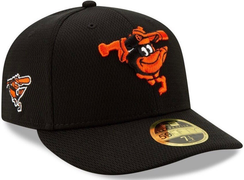
I mean, come on. If you didn’t know that was intentional, you’d assume it was a mistake. (Actually, it was a mistake, but not by the factory.) Also, it was brilliant of them to put the real swinging bird logo on the side of the cap, just so everyone can see how good that logo can be — and how bad the hybrid logo on the crown is.
Next: I didn’t think it was possible to ruin the Swinging Friar, but it turns out I was wrong:
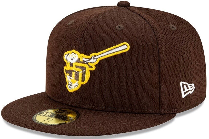
Bulldozing all of the Friar’s charm is bad enough. But as many observers quickly pointed out yesterday, the partial “SD” also has the unfortunate effect of looking a lot like a swastika. Good luck un-seeing that one, Padres fans.
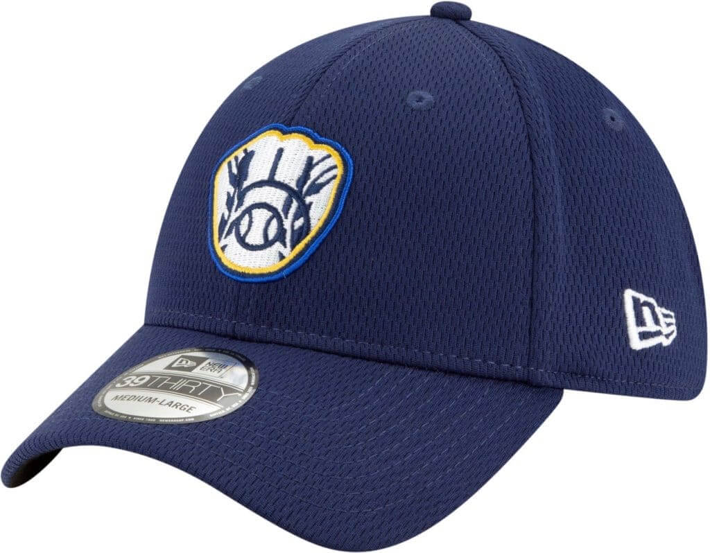
I didn’t think it was possible to ruin the Brewers’ ball-in-glove either. And yet:
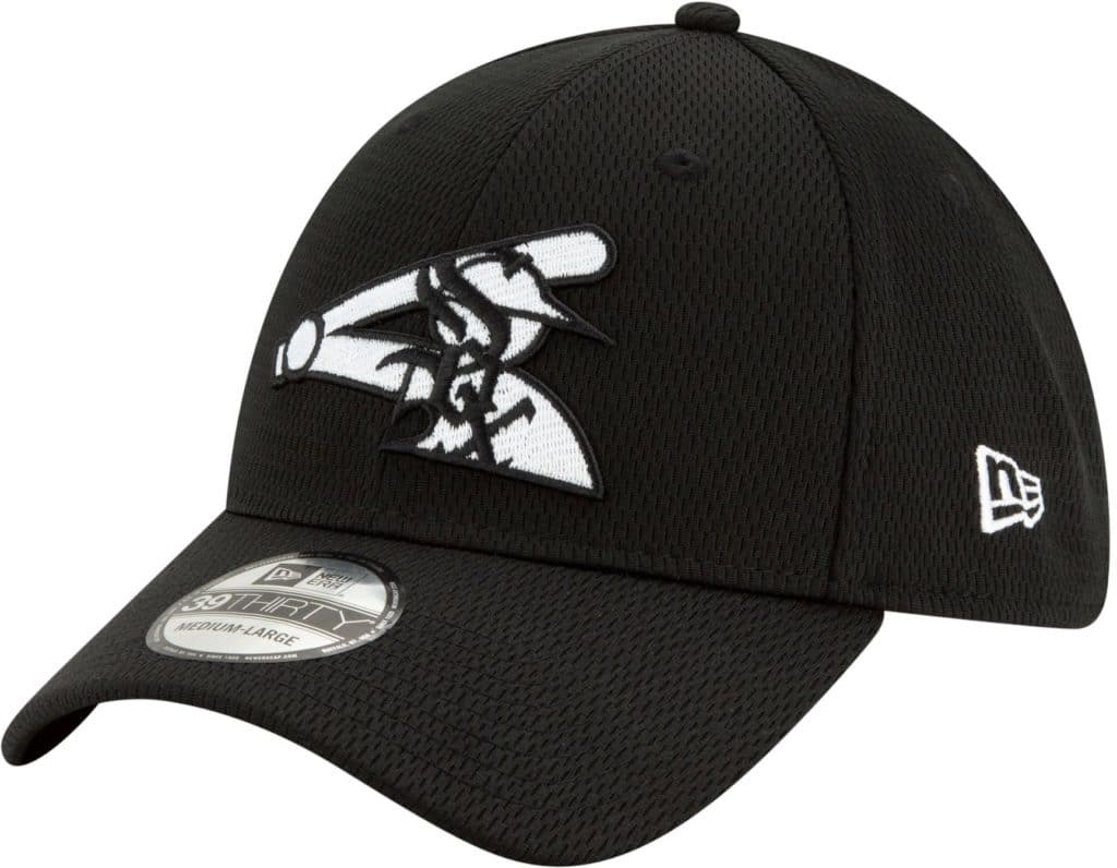
Hey look, a street artist tagged the White Sox’s batter logo with some graffiti:
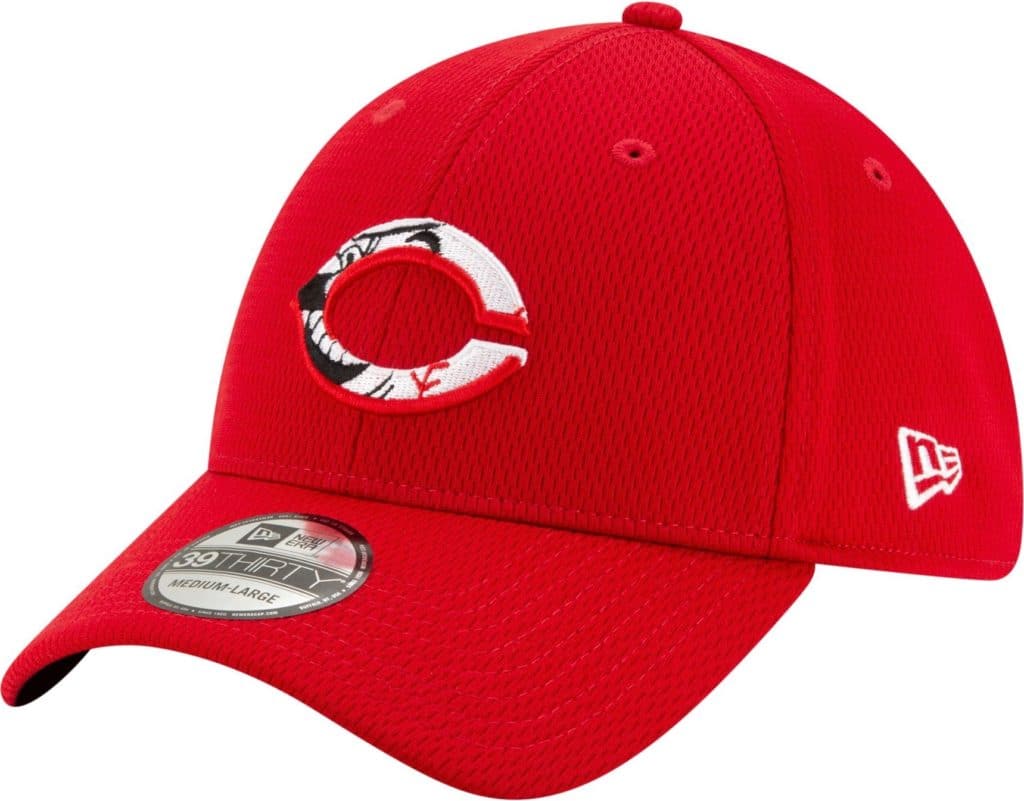
Leaving aside how bad most of the designs are, why is it necessary to shoehorn every team into this multi-logo format? For some teams, like the Yankees, it doesn’t fit their visual identity; for others, like the Reds, it just doesn’t work from an execution standpoint:
And so on. Honestly, I can’t believe I’ve devoted this much space to this slop. I’m just having a hard time wrapping my brain around the fact that players are actually going to wear these during Grapefruit and Cactus League action.
I’ll say this much for these caps, though: For once I approve of the New Era logo appearing on the side. They should definitely have to own this!
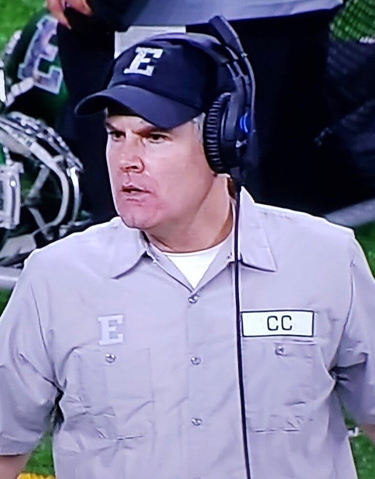
Working Class Wannabes™ update: Had a great time being a guest speaker via Skype yesterday for North Dakota State Professor Justin Walden’s seminar class on labor communications, where I talked about my recent New Republic article regarding the sports world’s fetishizing of the working class (including Eastern Michigan football coach Chris Creighton’s unfortunate decision to dress up like a janitor for the team’s bowl game in December).
The students were a mix of communications, marketing, and journalism majors. My session was supposed to last about 30 minutes — roughly half for my presentation and the other half for Q&A — but we ended up going for twice that long, because the students were so engaged (or maybe just because I was so long-winded), which was great. I was really happy with how this article turned out, so it was a genuine thrill to discuss it with a bunch of students and mold their impressionable young minds and have some good back-and-forth with them. A really good experience! Big thanks to Justin for inviting me.
My only gripe: NDSU’s school colors are green and gold — my favorite combo — so I was hoping a lot of the students would be wearing green/gold sweatshirts, or caps, or whatever. Turned out there was just one guy in a green/gold hoodie. Dang.

Pin Club reminder: In case you missed it on Tuesday, we’ve launched the February design for the Uni Watch Pin Club. As you can see, we’re going with a Presidents Day-themed design. Note Honest Abe’s stovepipe squatchee!
Just like in January, we’re doing a numbered edition of 350, with the number and month laser-etched on the back of each pin.
This pin is available here. And if you need to get caught up, here’s the January pin (we’ll keep selling that one until it sells out) and our basic winged stirrup pin.
My thanks, as always, for your support of Uni Watch — much appreciated.

Click to enlarge
Hockey jersey reminder: You now have less than a week remaining to get in on the first-ever Uni Watch hockey jerseys. You can place your order here through next Monday, and there’s more info here.
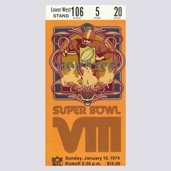

Raffle reminder: Today’s the last day to enter the latest raffle from our longtime advertiser Vintage Brand. The winner will get to choose anything from the VB site (including the Super Bowl VIII poster shown above).
To enter, send an email to the raffle address by 8pm Eastern tonight. One entry per person. I’ll announce the winner tomorrow. Good luck!
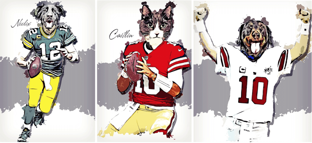
New advertiser shout-out: Remember my recent post about how you can turn your pet into an NFL player (as I did with Uni Watch girl mascot President Caitli, shown in the center above)? I’m happy to announce that the company behind that, Agora Idea, is now a Uni Watch advertiser, as you can see in our right-hand ad sidebar.
My thanks to Agora Idea’s Daniel Lim for his support, and my continued thanks to you folks for considering our advertisers.
The Ticker
By Paul

Baseball News: The Phillies will retire Roy Halladay’s No. 34 on the 10th anniversary of his perfect game (from Mike Chamernik). … The Blue Jays will wear their new powder blue alternates for their home opener (from Ted Arnold). … Lots of fun promotions this season, including several throwback games, for the Astros (from Ignacio Salazar). … Gorgeous new throwbacks for Oklahoma Baptist (from Brian Dude). … New Latino Heritage unis this year for the Cedar Rapids Kernels (from @MiLBPromos). … New 10th-season logo for the Futures League (from John Cerone). … Arizona appears to have a throwback in the works (from Rocky De La Rosa). … With Red Sox OF Mookie Betts reportedly being traded to the Dodgers yesterday, lots of media outlets Photoshopped Betts into a Dodgers uni, usually with a Nike maker’s mark (even though no Dodger has ever worn that on the field yet). ESPN went with a Majestic jersey. And Sports Illustrated really botched things by adding the Nike mark but leaving the Majestic sleeve mark. They also failed to capture the Dodgers’ 3D batting helmet logo (from @heyzeusL).

NFL News: Here’s a pretty cool NFL helmet digital wallpaper project (thanks, Brinke). … Jets QB Joe Namath once appeared in uniform on The Brady Bunch, as seen here with Bobby Brady. Note that Bobby’s wearing Northwestern-striped stirrups, but without the white crew sock over them that most football players wore at the time (from Nash Nunnery).
College Football News: If you were wondering which D2 stadiums were the most scenic, today’s your lucky day (from Kary Klismet).

Hockey News: Virtue rewarded: The great Wafflebored DIY’d himself a blue/green version of the Canucks’ flying-V jersey, and a local website wrote an article about it. Congrats, buddy — well deserved!

NBA News: Here’s why LeBron James decided that his team in the upcoming NBA All-Star Game will wear No. 2. … Mavs owner Mark Cuban supports changing the NBA logo to a depiction of Kobe Bryant. The Mavs also retired No. 24 within a day of Bryant’s death. … In a related item, the Lakers’ memorial patch for Bryant has been added to the NBA 2K video game (from @DesusBloodyShoe).

College Hoops News: New floor design for Frostburg State. Here’s the old one for comparison (from Kary Klismet). … Western Kentucky will go BFBS on Thursday. … Purdue women will wear pink unis this Sunday (from BoilerUniforms). … An Ohio State player — not sure who — suffered a serious jersey tear last night (from Josh Hinton).

Soccer News: MLS teams are slated to unveil their new uniforms this evening. Our own Jamie Rathjen will have coverage tomorrow. … New sleeve advertiser for Atlanta United FC (from Ed Zelaski). … Former Manchester United winger Angel Di Maria — now playing for Paris Saint-Germain — says United gave him No. 7 despite his preference for No. 11 (from our own Anthony Emerson). … Here’s our first look at Inter Miami’s refurbished stadium. “That’s a lot of pink!” says Kary Klismet. … The USWNT will apparently be unveiling something new today (from many readers). … “Monaco are wearing a tight-fitting shirt to celebrate the 20th anniversary of Kappa’s tight-fitting Kombat template, first worn by Italy,” says Ed Zelaski. … Italian side Fiorentina is changing kit outfitters, switching from Le Coq Sportif to Kappa. … Fans of Bundesliga club SV Werder Bremen came up with a clever way of protesting the sale of stadium naming rights (from @koTenSixtySix and Ed Zelaski).

Grab Bag: A new UK law could save parents money by banning branded school uniforms. … New logo for Marvel Studios. … The city of Chicago has sued an Illinois coffee brand for allegedly poaching the Chicago Fire Department’s logo. … The Norfolk, Va., police department has a new mascot and is inviting the public to help choose its name (from Kary Klismet). … Not uni- or design-related, but here’s a faaaascinating piece about the guy who invented the five-digit ZIP code (from Jesse Agler). … New logo for Sonic Drive-In (from Mike Chamernik). … Jefferson County Community College in upstate New York is seeking input for a new mascot (from Timmy Donahue). … Also from Timmy: New uniforms for Iberia Airlines. … And yet another from Timmy: The Bermuda Olympic Association has chosen five finalists for this summer’s Team Bermuda logo.
Any word on if the Spring Training/BP jerseys will have the same logos as the caps? Or when they will be released?
No idea – sorry.
Paul
These hats are absolutely disgusting. They look like something you would see in the $10 clearance section at Lids.
Not sure if you have seen them but the Clubhouse collection hats New Era released about a week or two ago look way better then these bp caps. A ton of classic logos & they look clean. Not sure why they did not go with them. Between these & those god awful Players Weekend duds I cannot fathom what we have in store once they release the dreaded Holiday caps this year
Totally agree on BP/ST caps. Is there no one at New Era that could brakes on this project? I do like Houston, Detroit & Toronto.
As an O’s fan I am very disappointed in their design.
I agree. Houston, Detroit, Toronto and I’d add Seattle. The rest just look awful.
I’m an O’s fan as well and I agree. Don’t mess with the Swinging Bird! If they used the Maryland state outline with the Smiling Bird inside and keep the Swinging Bird on the side that would be a major improvement!
Small typo in the Ticker: it should be Frostburg, not Frostberg. (Frostburg, Maryland is a great little town, by the way. Definitely check out the Princess Diner if you’re ever there!)
Thanks! Fixed.
Hi Paul, “Find a nut” link opens to NYM pinstripes.
And the Angels hat makes me dizzy!
Fixed!
Small typo in Soccer ticker: le Coq Sportif.
Got it.
Does anyone know why Mark Cuban is so vocal about Kobe after his death? First, unofficially retiring the number #24 for a guy who never played for the team reeks of the Heat retiring Jordan’s #23. Now the push for remaking the NBA logo? It just comes off as desperate – I would understand if Kobe ever played for him but it seems too much for no obvious reason.
Kobe’s death hit everyone pretty hard, more so in the NBA. Some people handle grief differently than others. I don’t want to say he’s overreacting, but he’s just reacting the way his mind is telling him to during his time of grief.
Speaking as someone who dealt with him a couple of times as a reporter, and did not enjoy the experience, I just think Cuban has such a never-ending need for attention that he had to inject himself into the Kobe discussion in some way.
Well, the NBA made Cuban pay $10M to women’s and domestic violence organizations to avoid a fine for sexual harassment and other improper conduct in the Mavs’ front office. Bryant bought his wife a $4M diamond ring after being accused of rape. Maybe that’s it?
The most profiled Maverick to wear 24 is Mark Aguirre who played for Dallas for 8 1/2 seasons, is third in the most points scored for the Mavericks trailing Rolando Blackman and Dirk Nowitzki. Well his number is being retired for someone else.
link
Mark Cuban, much like LeBron James, wants to make everything about him. In my view, this is a giant, “Hey look at me” moment.
As someone who feels strongly that media outlets should not use corporate names of stadia/arenas in their reporting (on the grounds that it’s free advertising in their news reporting that they would otherwise not provide in a non-sports story) the addition of the swoosh on the Photoshopped Mookie jersey offends me even more. (I didn’t think that was possible.) They had to go out of their way to add advertising to the image (which, again, Nike isn’t paying them for) and, because everyone knows it’s a photo illustration, you don’t have to add the swoosh on supposed grounds of “accuracy.” Ye gods.
I 100% agree with this. Media outlets are not obligated to create the uni ads for Nike. The Majestic/Nike mashup just shows how they were just falling all over themselves to, I guess, please Nike. It’s pretty disheartening to see.
I’ll add that I really don’t like seeing how add are creeping into video games now as well. Developers using the lame excuse that it’s how the games are broadcast is just pathetic. But, we keep consuming it.
The Red Sox spring hat just looks like the normal logo with some lines on it. I can’t decide if that makes it the worst one or the best one.
Hey Wafflebored, congrats on being featured in the article!
I like all those Flying V jerseys, but that blue and green one is pretty spectacular. Like the nameplate being done in white with blue lettering.
You gotta strut around town wearing that one. It is just too damn sweet.
Actually, I would wear a stick-in-rink sweater done up in the yellow, orange, and black color scheme. But I’m not going to make up more work for Wafflebored.
Ditto on the kudos to Wafflebored. A fun read, and fun hockey sweater designs! I always love it when he shares his latest projects!
That’s a darn good headline today. Accurate, too. What I want to know is—-who’s the NE exec who…approved these? Is he/she in witness protection at this point?
I don’t blame NE. They have a million designs for every team that are as bad as this or worse.
I blame whoever at MLB to approve this thing going on professional players heads and on the field.
I have to put the blame on us as consumers as a whole. If people weren’t buying this junk, NE wouldn’t produce it. At some point these have to jump the shark, right?
As a Padres fan, I can assure you that anyone who buys that abomination will be subject to persistent and universal shame any time they wear it in public. It’s that bad.
Proofreading: *Frostburg (not “Frostberg”)
Already fixed!
Whelp, those hats look like something they would find in a serial killer’s notebook.
Another little typo: Cedar Rapids Kernels, not Kernals.
And yes, those hats are so bad and they make my eyes hurt.
I believe ESPN went a Majestic jersey, not a New Era jersey in regards to the Mookie Betts photoshop.
D’oh! Yes, that’s what I meant. Fixed.
What gets me about the spring training caps and jerseys is the need to come up with something different each year in order to sell more merch. When this is combined with the fact that baseball is a fairly traditional sport uniform-wise, the outcome is designs that just play around the edges like the 2020 caps. I’d rather have them take an approach like European football teams that change their kits every year. If we are going to adopt the attitude that it’s just spring training, then change the colors, come up with a radical different design. It’s only practice. They might actually come up with a better design that could be used for a regular season uniform. Make it experimental.
PS – The White Sox cap looks like shit and I am not buying it.
When you think of it, most teams change the uniform designs each year. I’m thinking of soccer, college basketball, college football (except Penn State and Alabama), and the NBA. The cause is usually some “exciting, new” template by the manufacturer or some ginned-up myth-making that afflicts even legacy programs such as Notre Dame football or Duke basketball.
Death, taxes and Uni Watch complaining about BP Caps.
I quote, from 2018: “I find it hard to get too worked up about them one way or the other.”
You should follow your own advice and not let the 2020 caps bother you.
Victor, I disagree.
These caps are a collective WOOF.
Uni Watch: “I find it hard to get too worked up about them one way or the other.”
New Era: “Hold my beer.”
A: Blue Jays
B/B-minus: Rays, Twins
C: Phillies
D-minus, but could have been an A with a white letter H: Astros
F: Every other team.
Among the three teams I root for, I actually kind of like the Twins cap. But only as a fashion cap offering for fans. What a dreadful thing to have players wear on the field. The Nats cap is almost not-bad; the logo-in-logo treatment is so poorly executed that it almost disappears from view, and the same cap with just a plain red W would be terrific. The Brewers cap kind of pisses me off. The team recently unveiled a suite of sweet new alternate logos, so the smart merchandising cash grab would be to slap one of the new alt logos, unaltered, on a navy cap, maybe with a yellow brim. New logo inside other new logo? Who’s that for?
The Marlins and Diamondbacks caps are reasonably well-executed.
As for the rest…dreadful is the perfect descriptor, especially the Angels’ A-inside-the-A-with-a-side-order-of A!
Maybe its the shape of the crown or he angle of the picture, but doesn’t the Blue Jays beak appear to be slightly of balance, like its pointing up?
I think the Rockies’ cap, with the state flag design inside the “CR” logo, looks halfway decent. I’m not a huge fan of them deviating so far from their color scheme to shoehorn a popular state emblem onto their hats. They’ve done it before:
link
…and I wasn’t partial to it then, either. But separating out the color scheme and looking at it simply as a hat, it works about as well as other, similar state flag-themed designs that are ubiquitous in Colorado:
link
It’s okay, I just wouldn’t wear it to a Rockies game myself.
“Cream of the crap” is a tremendous descriptor.
Agreed! I laughed out loud when I read that!
I like SOME of those caps. I think they work better with the teams with a graphic treatment rather than letters because there is a lot more real estate to work with. The Blue Jays, Phillies, Athletics, Orioles, Twins — those are neat-looking caps! The Reds, not so much.
Included in the Astros promotions this year should be a giveaway of mini trash cans. :)
Opposing teams should have
Trash Can Day when the Astros come to town!
This is some rather strong criticism coming from a guy and website that now puts a “Uniwatch” logo on everything and tries to sell it. I’m not a fan of most of the cap designs either but is there anything that comes out that pleases you anymore Paul? You sell cuff links, thread – stitch removers, hats, jerseys… anything. You Do do the same thing pro sports leagues and their suppliers do- and then you criticize them for doing it.
Actually, Joe, I do not criticize anyone simply for selling things, because I am not opposed people to selling things. Rather, I am opposed to selling things (a) when they have shitty designs and (b) when the retail/merch tail wags the on-field dog. Both of those conditions apply to these caps; neither applies to Uni Watch products.
Now that we’ve dispensed with your failed attempt to call me a hypocrite, would you like to defend these BP caps? That’s the issue at hand. Do you think they’re good? If so, why?
As always: Think about message, not the messenger.
Kyle Young was the Ohio State player with the torn jersey. He went to the bench, put on a NNOB spare jersey with #50 on it, and sank two free throws awarded for the flagrant foul that tore the jersey.
To this day I am still in hysterics that Sonic is headquartered in OKC. I know a few people made mocked up jerseys with Sonic as the jersey ad sponsor for the Thunder.
The should have put the front of those caps on the back……
Worst spring training hats since the ones with piping on the brim and the ones that had piping around the ears with that shiny fabric separate from the rest of the mesh fabric of the hat. Whatever happened to just coming up with alternate logo on the front of the hat? Why have the same logo on the side when you put inside the logo on the front of the hat? Just bizarre.
As my dad use to say, “Somebody had an idea.” He was an architect and he would make that comment when he would see a building with a particularly bad design.
I meant to say this yesterday – I LOVE the February pin design, and already placed my order! This is fun, Paul – great idea!
Toronto looks good.
Arizona and Houston look okay.
The rest need to be burned upon arriving at Lids and in the ST Clubhouses.
Yikes MLB/New Era.
With a fine point Sharpie, you can make a special Billy Ripken version of that Orioles hat. Then it’ll be cool.
I actually LOVE the Toronto cap. It is very cool and I hope to see it again and maybe see it move into regular cap logo territory for maybe the Canada Day cap or other alternate. The Blue Jay head fits so well in the Leaf and the colors look great!
The only other one that sparked my interest was the Rockies cap. It struck me how well the Rockies would look with the state flag logo and colors in their visual identity, instead of the purple and silver.
All the rest are terrible.
I’m waiting to see who goes Chris Sale this spring….
I recall a few years back when the hats were all low-profile, 3930 models with the weird seams on the brims (the Red Sox and other teams had contrasting color panels, I believe), a lot of teams just didn’t wear them.
When the Pirates released their new jerseys a couple weeks ago, it puzzled me that the Bucco sleeve patch had a yellow bandana on the black jersey, but kept the bandana red on the gray jersey. They’re keeping the big P black jersey, and his bandana’s always been red there so I wondered why make this new jersey special and not just keep the bandana red (or make the bandana yellow for all jerseys!)
Now it’s clear why at least one of them needed to be yellow…if they had to use the red bandana for this new ST cap, there wouldn’t be any yellow on the hat at all!
Apparently New Era still thinks they’re the Anaheim Angels.
I was just about to mention that — the one good thing about this horrible agglomeration!
Geez, at first glance, I thought the Oriole had a bazooka on its shoulder
Or a telescope!
I don’t think the BP caps are terrible, I can see them selling a lot but to me they look cheap or fake or unofficial and I will not be buying one but I somehow see the market for them (snowbirds).
Also, I cannot see the swastika in the Padres hat.
See it now?
link
They forgot that the Angels are Los Angeles and not Anaheim when putting their BP hat first on display. Should have been right before the Los Angeles Dodgers.
A pop-up ad that appears here moves constantly so you have to chase it with the mouse when you try to delete it. It’s trying to trick you into clicking on the ad, which redirects you to their web page, if you miss the X. I understand the site’s need for ads, but this tactic is highly hypocritical from one that’s always railing against logos and other forms of advertising.
Dave, the site should not have pop-ups. Can you please take a screen shot of what you’re seeing and email it to me at link? Thanks.
Dave, you likely have a “bot.”
For me there’s 3 ad panels which show when I come on. Two on the side panel and one on the bottom. You can click on the side panels and they’ll go away without moving.
If you try to hover over the ad panel at the bottom of the screen, the ad “pops up” from its position at the lower part of the page and it can be a challenge to hit the X.
In support of Paul, I don’t use ad blockers, but to be honest, none of the ads which show on the page are ever about anything I’d likely buy.
The Reds’ hat reminds me of the “Here’s Johnny!” scene from ‘The Shining’.
I had to do a couple of double-takes. The Rockies’ cap almost looks like a hint at a full coloring change to state flag colors. And at first I thought the Indians’ had subtly resurrected Chief Wahoo.
The Houston Cheaters hat doesn’t look too bad.