Paul here, taking a rare August turn in the lede spot, because my annual Uni Watch College Football Season Preview is finally running today. As usual, it’s enormous, and it was a blast to work on. You can check it out here.

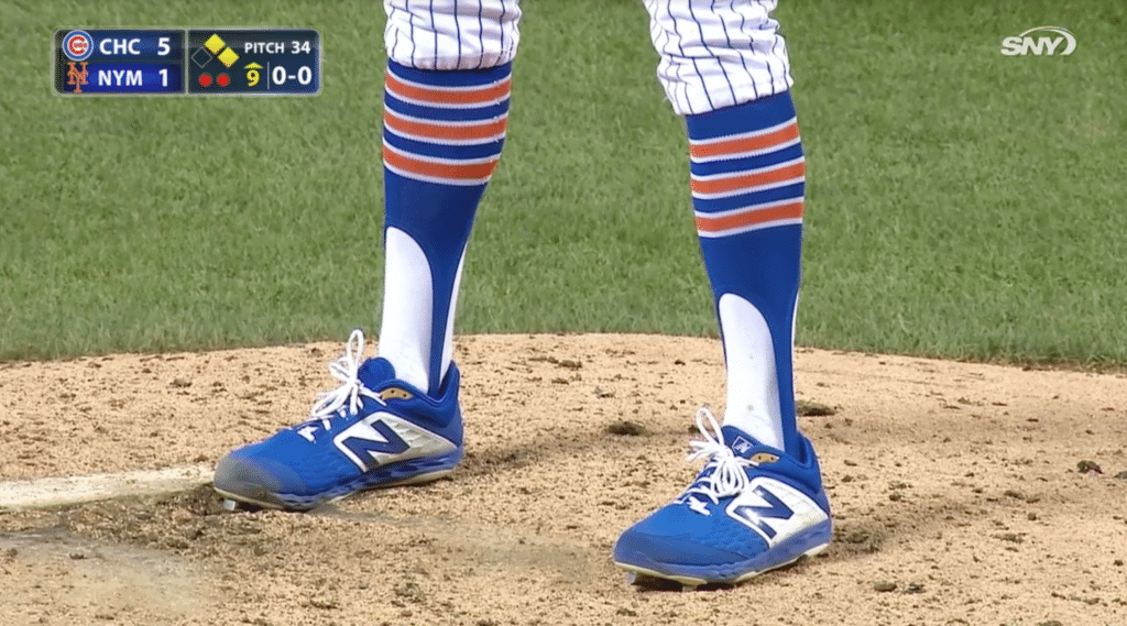
Major stirrup discussion on the air: Paul still here. Yesterday’s Ticker included a mention of how the Mets’ broadcasters said during Tuesday night’s game that pitcher Chris Mazza bought his own striped stirrups on Amazon. Here’s a full transcript of that discussion, which is worth reading in its entirety. The chatter took place in the top of the ninth, and the three participants were play-by-play man Gary Cohen, analyst Keith Hernandez, and roving reporter Steve Gelbs:
Gary Cohen: Old-fashioned stirrups for Chris Mazza. I don’t recall any other Met wearing socks with stripes like that.
Keith Hernandez: The Mets have never had stripes, right? Always solid? I just don’t think they work with the vertical pinstripes. [Cohen chuckles.] You’ve got the horizontal stripes on the socks. I mean, it just — you know…
Cohen: May I say something, Keith?
Hernandez [trying to say something fashion-related]: Beau Brummell!
Cohen: Regardless of the socks and the positioning of the stripes, I’m just happy to see the Mets back in their regular uniforms [after Players’ Weekend].
Hernandez: Oh, I am too, and I love the stirrups.
Cohen: And we check in with Steve Gelbs. Steve?
Steve Gelbs: Well, Keith, you said you loved the stirrups. The way Chris Mazza describes it is “a principle thing.” He feels like if your pants are up, you have to have stirrups. Now, I asked him, because they’re so rare nowadays in baseball, if he gets them specially ordered from the equipment manager. He said, “No. I get ’em on Amazon. Every time I’m with a new team, I check their colors, I order them on Amazon.” So they’re his.
Cohen [sounding astonished]: Really?
Gelbs: Really.
Hernandez [semi-sarcastically]: That’s very good investigative work there, Steve.
Gelbs [ditto]: This is what I’m here for, Keith.
Cohen [ditto]: We are so fortunate to have you, Stevie. Nobody else is bringing forth that kind of information.
[The ballgame proceeds for several minutes. Then an Amazon page appears on the screen.]
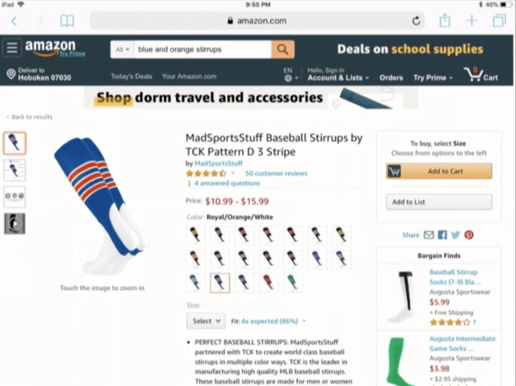
Cohen: Oh, there you go! If you want them for yourself, the very ones that Chris Mazza is wearing, that he orders from Amazon himself, there it is. Baseball stirrups, orange and blue. I mean, the price is reasonable.
Hernandez: I never heard of a major league player having to buy his own equipment!
Cohen: But it’s not a standard item. You made the point — those are not the socks that any Met has ever worn, as far as the stirrup is concerned. You have stripes on the skyline socks, like the ones Pete Alonso wears, but those aren’t stirrups and they also have the [skyline] design on them. But those are straight out of Amazon.
———
A few thoughts on this:
• It’s true that the Mets have never had socks or stirrups with just basic stripes – but they were supposed to! The famous 1962 photo (or at least it’s famous here on Uni Watch) of inaugural Mets manager Casey Stengel holding an illustration of the Mets’ first uniform clearly showed the uni with striped stirrups. That detail was later scrapped (as was the tail under the script, obviously).
• The Mazza/Amazon situation is a particularly vivid example of how baseball hosiery has been transformed from a team-issued uniform element into an accessory that’s mostly up to the player’s whim, much like wristbands or batting gloves. I’d say we can trace the origins of that transformation back to 1980s and early ’90s, when several factors – the start of low-cuffery, the introduction of two-in-ones, etc. –- combined to marginalize socks and stirrups. A pity.
• It’s great that the Mets’ broadcast team covered this topic. But it’s a drag that they had to sabotage it with lots of cutesy comments, almost like they’re embarrassed or apologetic to be discussing uniform issues. Fuck that — when it comes to uni-related banter, guys, talk loud and talk proud!
Meanwhile, if you want to order yourself a pair of the same stirrups that Mazza wears, they’re available here.
ITEM! Uni Watch pennant now available: A few weeks ago I mentioned that I was working with Oxford Pennant to create the first-ever Uni Watch pennant (such an obvious idea, I can’t believe I never thought of doing it until now) and presented you folks with two design options to vote on. I’m happy to report that the finished pennant, based on the design that you people chose in a landslide, is now ready (click to enlarge — it’s worth it):

Is that sweet or what? Looks soooo good! And like all Oxford Pennant product, it’s made of really soft-to-the-touch felt — none of that stiff stuff. I’m super-grateful to the folks at OP, who’ve been great to work with throughout this project.
Want to have this pennant on your wall? You can order it here.
Also, if you missed out on ordering the Uni Watch Cycling Jersey, completely with your choice of number and NOB, the deadline has been extended to 6pm Eastern tonight. Contrary to what I said a few days ago, it turns out that this item will not be offered as a stock item after the pre-order window closes. So if you want it, order it today.
Okay, that’s it from me today. Now over to Phil with the rest of today’s content.
Thanks, Paul! Glad you’re (almost) back to the full-time weekday gig. Two more days for me, and there was a LOT of uni news on the NBA front yesterday, so let’s get to that straight away…
By Phil Hecken
Follow @PhilHecken
Cavs Introduce New Throwback and a couple new courts

The leaks and rumors were (unfortunately) true: yesterday the Cleveland Cavaliers released a throwback to their 1994-95/1995-96 season that were, at least at the time, widely panned — and many today (including myself) still hate. However, time seems to heal all wounds, and now the black/powder blue sash/slash unis, with their Toronto Blue Jays-esque fonts, have returned. The return coincides with the 25th anniversary of the introduction of these unis for the 94-95 season.


The Cavs have announced they’ll wear this uniform for the first time during the season home opener on Saturday, October 26 vs. Indiana Pacers. They’ll wear this uni eight total times; in addition to the home opener, they’ll be worn during these home games:
Saturday, November 23 vs. Portland Trailblazers 8:00 p.m.
Monday, November 25 vs. Brooklyn Nets 7:00 p.m.
Wednesday, December 11 vs. Houston Rockets 7:00 p.m.
Friday, December 20 vs. Memphis Grizzlies 7:00 p.m.
Tuesday, January 28 vs. New Orleans Pelicans 7:30 p.m.
Saturday, February 29 vs. Indiana Pacers 8:00 p.m.
Saturday, April 11 vs. Milwaukee Bucks 7:30 p.m.
This will be one of five unis the team will wear this season (because it’s deemed “Classic” one of those Nike names, it will only be worn this season), joining three unis the team already has plus one as-yet un-unveiled uni.
Not as much corporate speak in the description of the unis (of course, I edited out the references to swooshie and the advertiser):
The front of the black shell features CLEVELAND in an orange and black inline typeface that is slanted upwards across the chest. The neckline is a traditional scoop neck that reflects the style of uniform worn during the 1994-95 season. … The back of the uniform features the player name in orange and black and the player number centered beneath the name in white and black. The NBA logo is centered above the lettering of the player’s last name. The black shorts feature the Cavs logo from 1994-2003 and a blue splash that stretches from the bottom of the right leg to the top of the left leg.
Some more looks:


The Cavs also introduced two new courts — the first to be used whenever the Cavs wear the 94-95 throwback:

Another “50th Season” court will also be used this year:

And of course, what unveil wouldn’t be complete without the hype video?
Boo Ya!#Cavs50 → https://t.co/gZSf5OikXz pic.twitter.com/DRidlXby0D
— Cleveland Cavaliers (@cavs) August 28, 2019
You can see more of the new (old) uniforms here.
And The Utah Jazz (Sorta) Unveil New Throwback (and court)

There was a second “unveiling” yesterday — sort of. The Utah Jazz revealed they’re going to be throwing back to the “Purple Mountains (Majesty)” unis of yore — the road kits from 1996-2004, a period that included back-to-back trips to the NBA Finals in 1997 and 1998. Only, in sort of a bizarre twist, they didn’t actually unveil the uniforms at all. They released videos and graphics of the new (old) uni, but no actual photos. What we got was stuff like this:


They did a nice job showing what they will be throwing back to…
📓| More than The Shot: Here are our 5️⃣ favorite moments in the purple mountain jerseys ⤵️
— Utah Jazz (@utahjazz) August 28, 2019
They gave a nice history of the purple mountains…
…and a really well done hype video:
1997 🔁 2019#MountainTime
» https://t.co/CyruuyacDM pic.twitter.com/8n3jto5saz— Utah Jazz (@utahjazz) August 28, 2019
But no photos of the unis.
The release describes the new throwback thusly:
Based on the road uniform worn during Utah’s back-to-back trips to the NBA Finals, the purple jersey features the prominent white-to-purple gradient mountain range and is trimmed in purple, teal, white and copper. The ’90s Jazz wordmark is featured on the front chest, while white numerals trimmed in copper and teal sit underneath. The shorts feature the white mountain range on the left leg, the “UJ” secondary mark on the right leg, and the tertiary snowflake basketball logo on the waistband.
We did get a graphic of the new uni…

It’s not hard to imagine a real live uniform, but this is really weird. There were some closeups of part of the uni…


…such as these and the top photo showing the logo on the waistband. But no shots of the full uniform.
There will also be a new court to be used when the team wears the throwbacks (which total 11 times, but as far as I can tell, no dates for such were given)

You can read more (and see some of the graphics/closeups) here and here.
I was never honestly a fan of these unis when they were worn, and I’m not sure if time heals all wounds with these. I suppose it will be fun to see them again…but that doesn’t mean I’ll suddenly become a fan.

Griffins Jersey Contest Vote Results
Group D

The results of the fourth and final round of voting for the Griffins Jersey Design Contest are now in.
Group D featured one clear winner, but, according to pollster Larry Torrez, “This group was very interesting because save for the runaway winner Dan Gustafson the next four positions were engaged in some wild vote stuffing.” There were some other machinations, but after the clean vote was tabulated, the top three have emerged. As it turns out, because of vote stuffers, the top three would ALL have been different had their multiple votes been tabluated. Cheaters never prosper.
I want to thank the great Larry Torrez for all his help with the polling. He has been a godsend in making these contests run smoothly and to ensure (to every extent possible) a fair vote.
OK, let’s take a look at the results for the penultimate group.
GROUP D

Here are the final three finalists (you can view their submissions by clicking on their names):
Dan Gustafson – 231 votes (42.6%)
Micheal Bustin – 154 votes (28.4%)
Brian Oesch – 153 votes (28.2%)
And there you have it — congratulations to the Group D Finalists.
Below, you can have a look at the designs of the 12 Finalists, from which the Griffins will choose a winner. I’ll announce the winner in my final weekday post, tomorrow morning, so be sure to check back then!
GRIFFINS DESIGN CONTEST: Your 12 Finalists!

And now that the voting is complete, we’re down to our 12 finalists for the Grand Rapids Griffins Jersey Design Contest. Congratulations to the final twelve — tomorrow I’ll reveal the winner as chosen by the Griffins. You can see all the finalists jerseys (in alphabetical order) in this album.
To recap, the top three vote getters in each group were as follows:
GROUP A:
Matt Harvey
Casey Sprogis
Iris Dos Santos
GROUP B:
Brandon Lamarche
Lucas Daitchman
Kurt Gorecki
GROUP C:
Tim Fesmire
Jordan Roberts
Steven Karnes
GROUP D:
Dan Gustafson
Michael Bustin
Brian Oesch

Guess The Game…
from the scoreboard
The game has returned! At least for a trial basis, but I got a lot of positive response to its return, so we’ll see how long we keep this one going.
Today’s scoreboard comes from reader Tom Hagerty.
The premise of the game (GTGFTS) is simple: I’ll post a scoreboard and you guys simply identify the game depicted. In the past, I don’t know if I’ve ever completely stumped you (some are easier than others).
This one is cool in that the photo pictured below was actually taken by … Tom Hagerty!
Here’s the Scoreboard. In the comments below, try to identify the game (date & location, as well as final score). If anything noteworthy occurred during the game, please add that in (and if you were AT the game, well bonus points for you!):

If you guys like this, please continue sending these in! You’re welcome to send me any scoreboard photos (with answers please), and I’ll keep running them.
The Ticker
By Alex Hider

Baseball News: Indians P Shane Bieber wore “NOT JUSTIN” as his Players’ Weekend NOB. But he apparently sent the pop star a jersey with the NOB “NOT SHANE BIEBER” — which Justin was spotted wearing recently (from Mike Chamernik). … According to Jamie, Diamondbacks OFs Adam Jones and Jarrod Dyson wearing shiny red belts on Tuesday. The rest of the team was wearing darker, muted belts. … Yesterday’s pitching matchup between the Braves’ Mike Foltynewicz and Blue Jays Jacob Waguespack featured 17 unique letters — one shy of the all-time record (from @jamesesiddall and @RamoneCat). … The Phillies have more or less used the same home and road unis since 1992. According to Timothy O’Malley, the Phils wore their old maroon batting jerseys and helmets through spring training and unexpectedly unveiled their new threads on Opening Day. Fans in attendance received this poster. … Twitter user @bparras spotted this backward MLB logo at a casino.

Football News: The Broncos have released their 2019 uniform schedule (from Jacob Bischoff and Jason Lefkowitz). … The University of Buffalo is going to wear GFGS jerseys for some games this season (from Scott). … Kentucky LB Kash Daniel will likely wear camo military appreciation cleats at some point this season (from Josh Hinton). … Illinois will wear a No. 97 decal in honor of Bobby Roundtree, a player who suffered a spinal injury during a swimming accident earlier this year (from Craig Choate). … Auburn is adding a memorial decal for announcer Rod Bramblett (from Mark Palczewski). … Throwback and farewell to Sam Boyd decals on tap for UNLV this season (from @MaxMetalFriar). … Syracuse will wear orange-white-orange this weekend (from Phil). … Arizona State will wear a traditional yellow-maroon-yellow combo for week 1 (also from Phil). … Adidas is now making the uniforms for the Polynesian Bowl, a high school All Star game in Hawaii (from Phil). … Fairfield High School in Ohio will wear camo uniforms on Friday (from Negan Gains).

Hockey News: The Kings’ new ice design includes the Staples Center’s 20th-anniversary logo (from Jakob Fox). … The Oilers will unveil their new third jersey on Sept. 14 (from Phil). … North Pole High School in Alaska is logo poaching both the Blue Jackets and the New England Patriots (from Denny Majeske). … New uniforms for the Sarnia Sting of the OHL (from Wade Heidt). … The Mongalian Australian Football League is still poaching the Arizona Coyotes’ logo and is using it on league uniforms (from Brian Barrish).

Soccer News: University of Illinois at Chicago has new uniforms based on the Chicago city flag (from Jake Epstein). … Lincoln City MF Neal Eardley had a number peeling in yesterday’s match (from Josh Hinton).

Grab Bag: This Forbes story has the backstory behind the corporate name of the Golden State Warriors’ new arena. … New kits for English rugby club Bath Rugby (from Eric Bangeman). … We all know that Paul can’t stand purple. This YouTube video might explain the science why (from R. Scott Rogers). … The Wells Fargo Center in Philadelphia is in the process of installing a new scoreboard (from @PhillyPartTwo).
Not sure who submitted the item about the Diamondbacks players’ belts, but it definitely wasn’t me (which is what “Jamie” unqualified means).
Not to be too pedantic, but from the Football News section technically it’s the University AT Buffalo
link
Baltimore Orioles at Detroit Tigers, October 1, 1978
Funny thing is, I didn’t search for any game information at all, and I knew it was 1978ish just from the hair and glasses of that guy who is front and center in the photo.
Well, and I figured #41 pitching for Cincinnati was Seaver.
Scoreboard: Tiger Stadium Oct. 1, 1978, Orioles beat Tigers in end-of-season one-game playoff.
Was not a one-game playoff. Simply a makeup game. They finished 4th and 5th in the AL East that year so nothing to playoff for. I think that may be the last game for that scoreboard at Tiger Stadium.
Nowadays that game doesn’t happen. A 4th and 5th place team playing a makeup game wouldn’t get the MLPBA seal of approval.
There was a one game playoff that year but it was the next day between the Yankees and Red Sox
The Elias Bros sign on the scoreboard was a dead giveaway.
preview is up
link
Just read it. More great work from Mr. Lukas, his thoroughness and attention to detail continue to impress.
As a throwback, I don’t hate those mid-90s Cavs unis. They’re fun when used sparingly.
A rare example of real actual so-bad-it’s-good. (Usually, people mean so-bad-it’s-fun, which is different.) Just about every choice that went into that uniform, they made the wrong choice, but somehow the whole is way better than the sum of the parts.
Whereas that Jazz uniform is just plain excellent, about as good as a uniform designed to the trends of the time can be.
Those Jazz unis have a nostalgic appeal to me as a Bulls fan.
I don’t even like the NBA, or really the sport of basketball, and pretty much my strongest fan-like opinion about the league is “to hell with the Jazz!” and those unis have nostalgic appeal to me!
I had somehow forgotten the orange on the Jazz unis. That gives them four colors (teal, orange, purple, bright blue) plus black and white, which was the style at the time.
At least the Cavs throwbacks got the proper font for the names, unlike the Rockets and Hornets with the generic serifed block font which were not used in the originals.
Actually happy to see the Utah Jazz throwbacks. Those uni represent something above us Utah, not an out of plac Nola Vince he in Salt Lake City….
Never thought of that. I see it’s more representative of Utah than anything else they’ve worn.
I was around 12 when the Cavaliers switched to those unis and the ball-going-in-hoop logo and I hated it at the time.
As time’s passed, and the fact they’re only being used a few times, I don’t mind them as much anymore.
Also, the pics don’t show a gold championship tab on the back, wonder if those will get added.
I read yesterday that they don’t put the tabs on throwbacks – someone showed examples of that from last season.
Nice to see Matt Harvey have some success this summer
On another note, I am surprised at the number of teams that spend money on alternate courts for a limited number of games, seeing how they look to gouge fans right and left. Strange that they would make that investment. I find it surprising enough that they do it for the All Star Game, but there it is the whole league eating the cost.
Lamarche or Roberts! i look forward to seeing the winner tomorrow.
The video on color, skip to the 15:00 mark for the bit on purple. Short version, which blew my mind, is that because of the way our eyes sense color, purple and magenta are “non-spectral” colors. As far as our eyes are concerned, there is no color purple on the visible spectrum. Rather, the brain receives signals from the three types of cone receptors in the retina. Most of the time, when a color stimulates our blue receptors to a certain extent and our red receptors to a certain extent, our green receptors are also stimulated to a slightly greater extent and we sense the color as green. When the green wavelengths are missing, we sense the blue and red alone and perceive that as purple or magenta. So as far as our brains are concerned, purple is not a color unto itself but rather the absence of the color green.
Basically, purple is a bonus shade of green. Fascinating stuff.
Now we need a Paul caricature pennant like the ones in the 90s
I guess I’m in the minority. Those Cavs and Jazz uniforms are their worst looks. I don’t know why you would purposely dress like a clown. Those are clown suits. Silly fonts and wrong colors.
Re: the Phillies wearing their old uniforms thru spring training. Most teams wore their old uniforms before braking out new duds the day the new season began. It makes sense since the new design has to be ordered but the team doesn’t know exactly who will be playing until the end of spring training. They’ve got multiple seasons worth of the old uniforms to outfit all the guys showing up in March to try to the team.
Getty Images has a series of link taken to illustrate John’s pitching motions. They were shot in Florida during the 1971 spring training. John’s wearing the 1970 road uniform but instead of the white striped stirrups, he’s wearing blue ones. The White Sox would introduce the red uniforms on opening day, 1971. (Very Phillies-like, btw!) But it looks like they still had the blue ones (without the cool white stirrups) when these photos of Tommy John were taken.
Would the new designs get broken out near the end of spring training so the guys making the roster can see how they fit? It must have happened, but it would take the surprise out of opening day.
I was at the Phillies home opener in 1992, a loss to the Cubs. Lenny Dykstra, in his first game back after missing 3 months of the 1991 season, was HBP from Greg Maddux and broke his hand. The new uniforms were NOT unexpected, my recollection is that we knew they were coming. But it being 1992 you just had to wait until they took the field to see them. I was disappointed, they were essentially just a rehash of the 1950-69 unis but with a hideous number font (which they compounded by wearing on the left sleeve, never a good idea). I had to wait until 2008 to get the uniform I preferred, the Cream Alts which really are the 1946-49 unis reimagined. Now just change those numbers!
Gold face masks for UCLA, matching the helmet. No gray tonight
Not like it matters (and it’s late), but until this current era of the silly socks (skyline and otherwise), the Mets have NEVER worn striped socks.
Just sayin’.
Coastal Carolina is also a “150 patch” left side team.
No uniform preview for Duke football on the SI site?