[Editor’s Note: Paul is on his annual August break from site. Deputy editor Phil Hecken is in charge from now through the end of the month, although Paul may be popping up here occasionally.]
Hey guys — Phil here. Today we have another installment of “Gone Too Soon,” a series by our own Alex Hider. It’s been a while since we ran one of these, but you can check out earlier articles in the “GTS” series on the 1980s Cleveland Cavaliers, the 1968-71 Cincy Reds, the 2003 Blue Jays, and the late 90s Reds sleeveless t-shirts. Alex today takes a look at the 1940-41 Pittsburgh Pirates.
Enjoy!
Gone Too Soon: The 1940-41 Pittsburgh Pirates
By Alex Hider
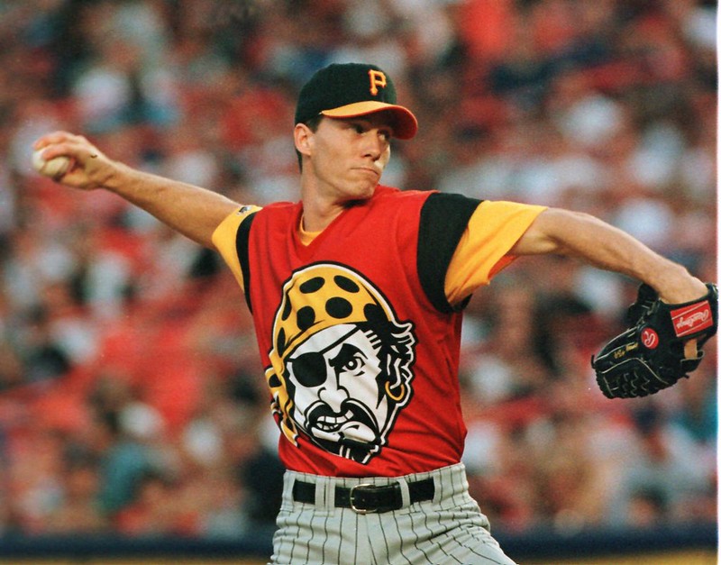
July 27, 1999. The Pittsburgh Pirates faced off against the “Mercury” Mets at Shea Stadium, wearing bright red jerseys with black and gold sleeves. As Pirate rookie Kris Benson took the mound for his first major league start, his face wasn’t the only one staring toward the plate.
The other? The Pittsburgh Pirate himself.
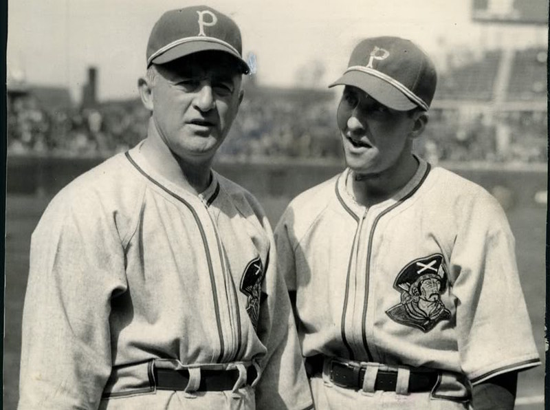
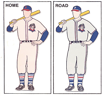
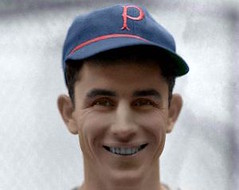
While “Turn Ahead the Clock” was supposed to offer a glimpse into the future of Pirates uniforms, the jerseys also served as a flux capacitor-equipped DeLorean — providing a Back To The Future-esque trip through time to 1940 and 1941, the only other time a Pirate appeared on the front of Pittsburgh’s jerseys (click to enlarge):
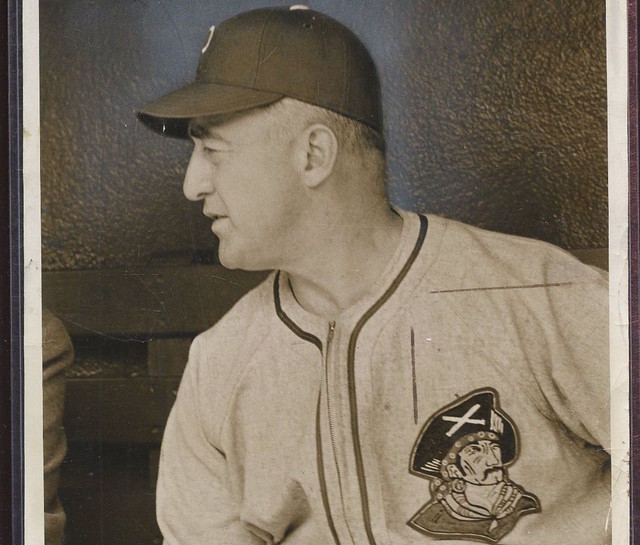
While I do love the “modern” Pirate logo (dipping habit and all), it just doesn’t compare to the Pirate of the ’40s. Just look at the detailing — the crossed bats on the hat, the handlebar mustache, the giant hoop earring, the spotted bandana, the textured ascot. Of all the iterations of the Pittsburgh Pirate mascot through the years, this one is easily my favorite. I’ve yet to find a close-up of this embroidery, but the stitch work must have been incredible.
Artwork like this deserves front-and-center treatment on both the home and road jerseys, even for a team with such a rich typography history as Pittsburgh.
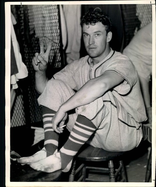
In addition to the chest logo, the 1940 and ’41 sets had plenty of other endearing quirks: a zipper front, overly striped stirrups, separate caps at home and on the road.
The 1940s Pirate would return to Pittsburgh’s uniform in 1987 as part of a sleeve patch but would be retired following the ’96 season in favor of the modern Pirate mascot.
I’d love to see the Bucs break these out for a throwback game or two — even if they decided to render them in black-and-gold, the city-specific color scheme the Pirates adopted a few years later in 1948.
Oddly enough, while researching these unis, I came across this Pittsburgh Press clip from December 1939 on Todd Random’s blog that describes the Pirates’ new chest logo as “life-sized.” That’s obviously not the case — unless they were referring to Pittsburgh’s 1999 “Turn Ahead the Clock” uniforms.
Great Scott!
Great Alex! Thanks for this nice look back at another “gone too soon” uniform.

Boise State Goes BFBS…Again

Yesterday, the Boise State University Broncos (re)introduced an alternate BFBS uniform — they’d previously worn black unis, but not with the current uni set. That all changed.
Like their mono-blue, mono-white and mono-orange sets, they’ve now added a fourth mono-set, this one complete with black helmet, pants and jersey. Of course, they don’t always go mono…they’ve mixed and matched the individual elements in the past, and I’d expect they’ll do the same with the new black set.
The new black set isn’t all that different from their previous one, which looked like this:

That set was on the previous Nike “chassis” and featured a black hat with a black facemask, and slightly different number fonts which featured a sublimated shading pattern going from blue to white, outlined in orange. The new helmet is still matte black, but features a metallic blue facemask…

… while the jersey contains full white numbers outlined in blue, a blue collar and what I guess are anthracite stripes on the shoulders. The “BOISE STATE” wordmark remains, but rather than being in blue like the prior set, it’s a very dark gray — almost black (I’m Calling It Anthracite).

Nameplates on the back, like the wordmark on the front, are almost black, and so will be impossible to read at any distance (but hey, at least the numbers will be legible, and that’s kinda what’s most important here):


According to the Broncos/Nike,
The updated black uniforms include the current Broncos’ uniform of two stripes on the shoulder, which represent speed and power. The stripes on the uniforms are reflective gray to serve as an accent to the black. … The uniforms also have a blue-collar, with Blue Collar printed inside the back of the collar, continuing the theme from the Broncos’ last uniform update.
Also, the new helmets will include a chrome blue Bronco logo on the side, which is now a permanent part of the helmet and not a sticker decal. The helmets will be asymmetrical, with the bronco on one side, and the player number on the other.
Still, it’s all meant to be a very dark (and intimidating?) uni, especially if worn for night games — depending on the lighting (and the hype video stills really seem to show it), the uni will look almost solid black, except for the numbers:

Oh yeah, the hype video probably gives the best overall looks at the uni:
ʙʟᴀᴄᴋ ᴏᴜᴛ ᴛʜᴇ ʙʟᴜᴇ#BleedBlue pic.twitter.com/p3NCFrlIAx
— Boise State Football (@BroncoSportsFB) August 5, 2019
And of course, the players love the uniforms. Here’s Redshirt junior Curtis Weaver saying that wearing the Boise State football team’s new all-black uniforms will feel like a funeral — for the other team:
I’ve never been a fan of pairing royal blue and black, since the colors are both too dark (IMO) to work well together — it didn’t work well on the Mets or the Royals (and the handful of other teams who’ve tried this scheme), and of course it’s BFBS — but it’s probably one of the better royal/black unis, if one can damn with faint praise.
The team hasn’t yet said when they’ll wear the new all black combo, but if I were to guess…
Time to plan out your Gameday outfits, Bronco fans, because the 2019 Color Schemes for our six home games have been announced!
📰 https://t.co/IDrgMej5C9#BleedBlue pic.twitter.com/0aPJhHI3Wu
— Boise State Football (@BroncoSportsFB) June 4, 2019
…September 20 seems like a safe bet.
Collector’s Corner
By Brinke Guthrie
Follow @brinkeguthrie

We’ve seen a lot of the Braves 1970s “feather” throwbacks recently, and they show up once again on this package of “Hank Aaron Pops!” (In Six Scoring Flavors: Double Orange, Wild Pitch Lime, Wildberry Steal, Triple Strawberry, Home Run Peach, and Grand Slam Grape.) These are “Fast Freeze and Eat Ice Bars,” and they’re still sealed in their original packaging. This must date back to at least 1976: the packaging shows “755” which he hit July 20, 1976, when he was a….Brewer. But who’s quibbling? Now for the rest of the week:
———–
• Without a doubt a Collector’s Corner first: an actual 16mm camera from NFL Films. Somewhere out there, John Facenda lurks in the shadows.
• Here’s Joe Cool hanging outside the Dolphins training camp facility, waiting for a chance to score an autograph or two from his favorite players. This Peanuts T-shirt is a size LG and the auction ends tonight, BTW.
• One more for the Fins; this time we’ve got a….foam Dolphin head hat. And the dolphin’s wearing a helmet. Can’t say I’ve seen one of these before. The packaging doesn’t include the current NFL shield, so I’m not sure when this is from.
• This 1970s MLB standings board looks to be in great shape. This one’s pre-1977, the year the Jays and M’s came into the AL.
• Check out these early 1970s Cowboys stickers. These are bright blue foil with silver- the very same one that graced the back window of our Ford station wagon in the fall of 1971.
• Staying with the Cowboys, here’s a 16 page 1978 instruction manual from Sears (“Headquarters for Officially Licensed NFL Merchandise”) called “The NFL Way To Play Touch Football With Roger Staubach.”
• Steelers fans, grab this plastic yellow team bucket while you can- perfect for Halloween in just 86 days.
• Ah, the classic Bills logo, shown on this 1960s Bills coffee mug sponsored by your friends at Chase & Sanborn coffee.
• Dorsett, Bradshaw and an unidentified Patriots player are featuered on this 1970s NFL sleeping bag. (They’re not referred to by name, but you can tell who they are.)
• Here’s a full set of the 1971 Chiquita NFL helmet stickers, all 26 teams. Note that you could order an extra set for a quarter! And they want almsot $150 for this set! Around that time, I was eating a lot of Chiquita bananas and pounding down the Gatorade for those helmet caps! (Like this one for the Bengals.)
Got an item to include on Collector’s Corner? Send any submissions to uniwatchcollectorscorner@gmail.com!
Mocking MSU … Again

The good thing about Social Media is that users seem to have very short memories.
Of course, the bad thing about Social Media is also that users seem to have very short memories.
Such was the case yesterday when Michigan State football writer Colton Pouncy announced that Sparty’s new alternate uniform (pictured above) had arrived.
The new (and god awful) uniforms were first unveiled all the way back in April (and I covered them then — scroll down). So, there’s not much new news here, but if you read the comments on Pouncy’s tweet, I guess no one realized these had already been unveiled.
Lots of folks also took to using the retweet with comment feature, providing their own commentary while sharing Pouncy’s work.
I get it — they’re awful (and some of these comments are pretty funny), but it ain’t like we hadn’t seen this unveiled already. But that’s were twitter rage works best, I guess. I’m sure we’ll see similar comments once the unis are on the field, but that’s worlds different than a non-“new” unveiling.
Gotta love Twitter.

Click to enlarge
The family that displays together…: Paul here, checking in again from Ireland, where I’m still on vacation. Got a note yesterday from longtime reader/pal Ben Traxel, who sent me this photo of himself and his sons all outfitted in Uni Watch Tequila Sunrise Deluxe hoodies! That’s proud papa Ben (second from left) with (from left) Hank, Sam, and Beau.Nitpickers may notice that striping on the hoods is wrong — it’s supposed to be on the inside of the hoods, not the outside — but Ben says he and his family don’t mind. Think of them as a collector’s items, guys!
Okay, back to the final days of my vacation. I fly back home on Wednesday evening, and I’ll make have my debut column as a Sports Illustrated staff writer next Monday. Link to follow, of course. Big thanks to Phil for running the site throughout August!
Griffins Jersey Design Contest Reminder
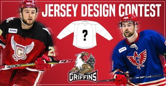
In case you missed it, Uni Watch is again partnering with the Grand Rapids Griffins to allow readers to design an alternate jersey to be worn this upcoming season.
As before, the winner will receive a personalized jersey, tickets to the game when the jerseys will be worn (February 22, 2020), and public recognition at the game.
The jersey is going to be worn on the Griffins’ 90’s Night (with either red or black pants and red gloves/helmets), so for this contest, the team is looking for a “90’s inspired jersey.”
The deadline for submissions for this contest is Friday, August 16th, 2019.
All the details are spelled out in detail here, so be sure to read that.
Good luck to all who submit!
The Ticker
By Anthony Emerson

Baseball News: @29_sunset discovered that ump Mike Estabrook wore a glossy helmet behind home plate at the beginning of last season, but over the course of the year switched to a matte helmet. … @esear7 found a logoless Yasiel Puig Reds jersey at a Cincinnati-area Dick’s. … Also posted in the soccer section: the Cubs honored all NWSL Red Stars players who were at the Women’s World Cup before yesterday’s game with jerseys (thanks, Jamie). … The Somerset Patriots of the Atlantic League are wearing Star Wars unis a week from today (from John Cerone).

Football News: The Raiders’ Las Vegas stadium has received its corporate name (from multiple readers). … The CJFL’s Regina Thunder has released its 20th anniversary logo (from Wade Heidt). … Before each season, LSU awards the no. 18 jersey to a team leader. For the first time, that honor has gone to a lineman, Lloyd Cushenberry III. Because of number restrictions, Cushenberry will wear no. 18 as a patch on his no. 79 jersey (from Benji King).

Hockey News: In 1973, Carole King’s backing band performed with St. Louis Blues jerseys because, according to King herself, bandleader Lou Adler “liked the musical note logo and thought the jerseys would be better than black suits” (from multiple readers).
.

NBA News: NBA uni numbers update from Etienne Catalan: Raptors SG Matt Thomas will wear no. 21 and SG Alec Burks will wear no. 8 with the Warriors.
.

Soccer News: The Guardian published an article yesterday decrying the marketing-speak kit manufacturers use when releasing new kits (from Chris Cruz and Ben Armstrong). … Also from Chris, Crystal Palace has unveiled its third kit. … New Liverpool GK Adrián appears to have the Premier League patch on his shoulder in this shot, rather than the sleeve. Bizarre (from Tommy McLaughlin). … Cross-posted from the baseball section: the Cubs honored all NWSL Red Stars players who were at the Women’s World Cup before yesterday’s game with jerseys (thanks, Jamie). … Wellington Phoenix have unveiled their new kits (from @MadMaclegend). … New kits for Cape Town City, which has to be one of the most confusing names for a soccer team I’ve ever seen (from Ed Żelaski). … Mexican side Tigres are selling a special André-Pierre Gignac jersey after he became the all-time top scorer in Liga MX history. Gignac is French, hence the colors of the “105” jersey (from Cory Mizer).

Grab Bag: Erick Kriewaldt is in St. Petersburg, Russia, and found Matryoshka dolls of various athletes of the Big 4 North American sports, European soccer and the Olympics.
.
Hey I recognize those stickers on the Hank Aaron ice bars!
For the Raider’s corporate sponsor the name at least isn’t completely awful (Guaranteed Rate, Fiserv, etc). So that’s some reprieve…I guess.
Those Hank Aaron ice pops are from the later part of the 1980s, not 1970s. If you look on the back there’s an offer for an autographed photo with an expiration date of Decemeber 31, 1990, and it mentions his 1982 HOF induction.
Odd facemask on Dorsett on that sleeping bag. ???
No rhyme or reason to how the order of the Chaquita stickers.
Not alpha, not by div./conf.,…
Randomness for randomness’ sake?
That pirate illustration is pretty racist, tbh.
Please explain, I’m not sure if you’re being funny, but if you’re not please explain. I don’t know much about pirates at all, so I’m very curious.
I cannot wait for your recap of Northern Ireland and the Republic! Brings up great memories for me.
Say hi to my friends in Derry City!
The stripes on Boise State’s jerseys represent speed and power? Good grief.
Here’s a brief spring training clip featuring those Pirates uniforms…:
link
…and here’s the clearest pic I could locate of the logo:
link
GREAT STUFF!!!
Bearcats
My hoodie has exterior striping.
Thank you, Lou Adler.
I just posted below you about outside stripes. Do you think this is a Teespring error? Because it wouldn’t the first error from them for me. Although, most of the stuff I get is good.
I don’t think the Blues wore those jerseys in’73. I am pretty sure they had yellow trim and were more of a sky blue color than what the band was wearing with Carol King
Excuse my ignorance, but what is the significance of the green, yellow, red, and black dashed lines between breaks?
Some decoration, Phil didn’t go to the Coco Chanel school of accessorizing ; )
My hoodie has the stripes on the outside of the hood too. Anyone else? Maybe Paul’s is the collector’s item!
Todd *Radom*
Is it me, or does the Mountain West logo on the Boise unis look like the modern White Castle logo?
What number restrictions are preventing the LSU player from wearing #18? LSU specific-restrictions? SEC-specific restrictions? Because I don’t think CFB as a whole has any restrictions, other than having 2 of the same number on the field at once.
I don’t have specifics, but on offense, the OL must wear numbers that specify their ineligibility in regards to being a receiver. Ie, they must wear numbers between 50-79.
I’m sure there are others that can be more decisive with the explanation?
Lee
Per Wiki:
According to NCAA rule book, Rule 1 Section 4 Article 1 “strongly recommends” numbering as follows for offensive players:[2]
Backs 1–49
Center 50–59
Guard 60–69
Tackle 70–79
End 80–99
For LSU, #18 is a bit of an honor and trophy, bestowed upon a senior by the teammates.
Awesome, there is an alternate UniWatch hoodie jersey. Please have Chris Creamer add it to his database.
*proofreading*
I can’t believe no one else noticed, but in the hyperlink to the Cincy sleeveless t shirts, you refer to them as the Reds. They’re the Bearcats.
Still looking forward to a breakdown of the new NFL sideline hats!
I love, love, love those Pirates unis, and I was thrilled to be able to work them into a comic strip on Arky Vaughan’s impressive All-Star Game performance in 1941:
link
Great GTS entry today!
Here’s a candidate for a future GTS:
those gorgeous 1969-1970 road White Sox unis with the white lettering!
-Jet
What are those large circle patches on the Blues jerseys those Carole King band members are wearing?? I don’t ever recall seeing a patch in that era, especially one that large, and nhluniforms.com doesn’t show anything either…
-Jet
My Chiquita banner stickers are still stuck to a drawer on a chest of drawers in my parents’ old house which my brother now owns.
They are aligned in an offense vs. defense formation over a line of scrimmage.
If I ever get by there, I’ll take a pic…
-Jet
I must confess this, after, oh, what 48 years? 1971? I would peel some of those stickers off the bananas in the supermarket when no one was looking. I couldn’t eat THAT many bananas. To the Winn Dixie mgr in Louisville, I apologize.
Of course, from 1971 I also have a copy of “Brian’s Song” from the Dallas public library. Fine must be a bit steep at this point.
Boise State nameplates influenced by 1977-78 Toronto Maple Leafs jerseys.
link
I don’t care if most people hate them. I think the neon MSU unis are bold and awesome.
your blog is really informative we really like that and the manufacturer and supplier of sports goods.
Hey Guys! About André-Pierre Gignac, he became the top scorer in UANL Tigres history with 105 goals. He is still far away from being the top scorer in Liga MX history (Cabinho with 312 goals). Greetings from a long time Mexican reader (and UANL Tigres fan) in Germany!