There was an amusing incident on the fourth pitch of last night’s Mets/Dodgers game, as Dodgers rookie first baseman Matt Beaty fell into the stands while attempting to catch a foul pop and apparently had a run-in with fan’s Dodger dog (or maybe some nachos), because he emerged with uniform pants covered in mustard and ketchup (or maybe cheez).
“Oh no,” said Dodgers play-by-play broadcaster Joe Davis, “those pearly-white Dodgers home unis, covered in ketchup and mustard.” Gotta love the uni-centric reporting, right? The game was briefly delayed while Beaty used a towel to wipe off some of the offending condiments.
I’ve been watching baseball for a long time, and I can honestly say that I can’t remember ever having seen this before. No word on whether there were any capers involved.
Over in the Mets’ broadcast booth, analyst Todd Zeile speculated that Beaty would probably change to a fresh pair of pants after the inning, but Beaty — who was playing in just his seventh big league game — stuck with the stained knickers. As it turned out, his dirty-uni adventures were just beginning, because in the bottom of the second he slid head-first into second base while legging out a double. By the time he stood up, the condiment stains were the least of his worries:
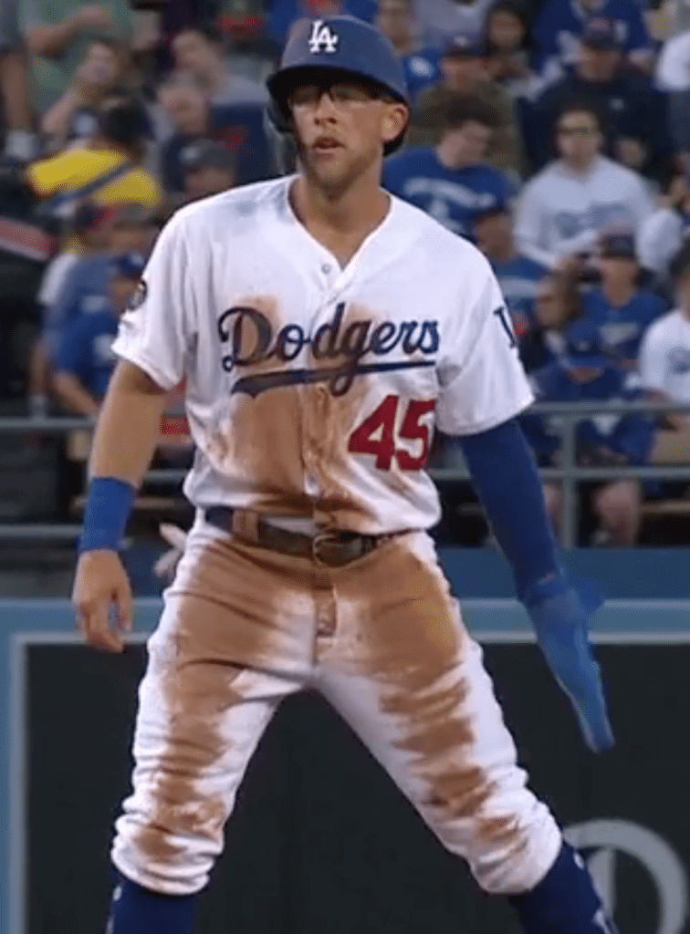
Okay, we’ve all seen dirty uniforms, but that is a seriously dirty uniform. I like how you can still see the mustard (or maybe cheez) under the dirt on his left thigh. The Dodgers laundry staff definitely had their work cut out for them after this game.
This was the second time in a month that a fan’s food or beverage ended up on a Mets opponent’s uniform. Back on April 28, Brewers left fielder Ryan Braun attempted to make a catch at the outfield wall and ended up taking a fan’s beer on his cap:
Hot dogs (or maybe nachos), beer — we’re hitting most of the major food groups here. Now we just need a player to dive into the stands and end up wearing a fan’s ice cream — and, ideally, wear the souvenir helmet cup on his head.
Click to enlarge
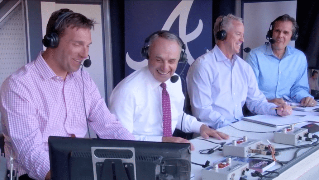
Manfred touts logo creep as key to game’s growth: MLB officially awarded the 2021 All-Star Game to Atlanta yesterday. Since commish Rob Manfred (second from left in the screen shot shown above) was in town for the announcement, he stopped by the Braves’ TV booth during last night’s game. At one point the broadcasters asked him about his efforts to grow the sport, and he responded like so:
There’s a couple of things that we’re working on. Number one, you need third-party partners to support the marketing of the game. You know, next year we’re going to have the Nike swoosh on the front part of the jersey — obviously, there’s direct economic benefit to baseball from that. But more important, when you have a Nike, a brand like that, marketing your players, supporting that players, that’s important.
Of course, Nike could presumably market the players just as effectively if its logo appeared on the sleeve, like the Majestic logo currently does, instead of moving to the chest. (Indeed, Nike appears to have no problem marketing NFL players, despite its logo appearing on NFL jersey sleeves, not chests.) The only difference is that Nike is paying MLB a lot more for the front-facing logo.
In short: Contrary to Manfred’s assertion, it’s not about marketing. It’s just about money.
(My thanks to longtime reader Benji Boyter for bringing this one to my attention.)
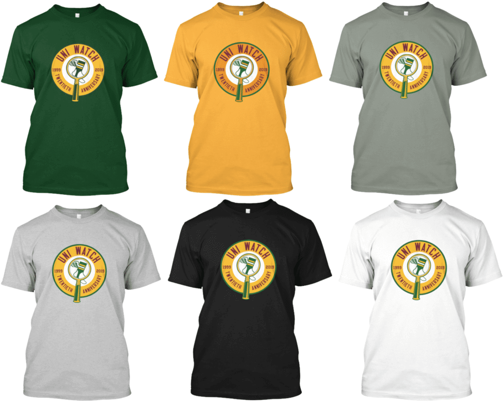
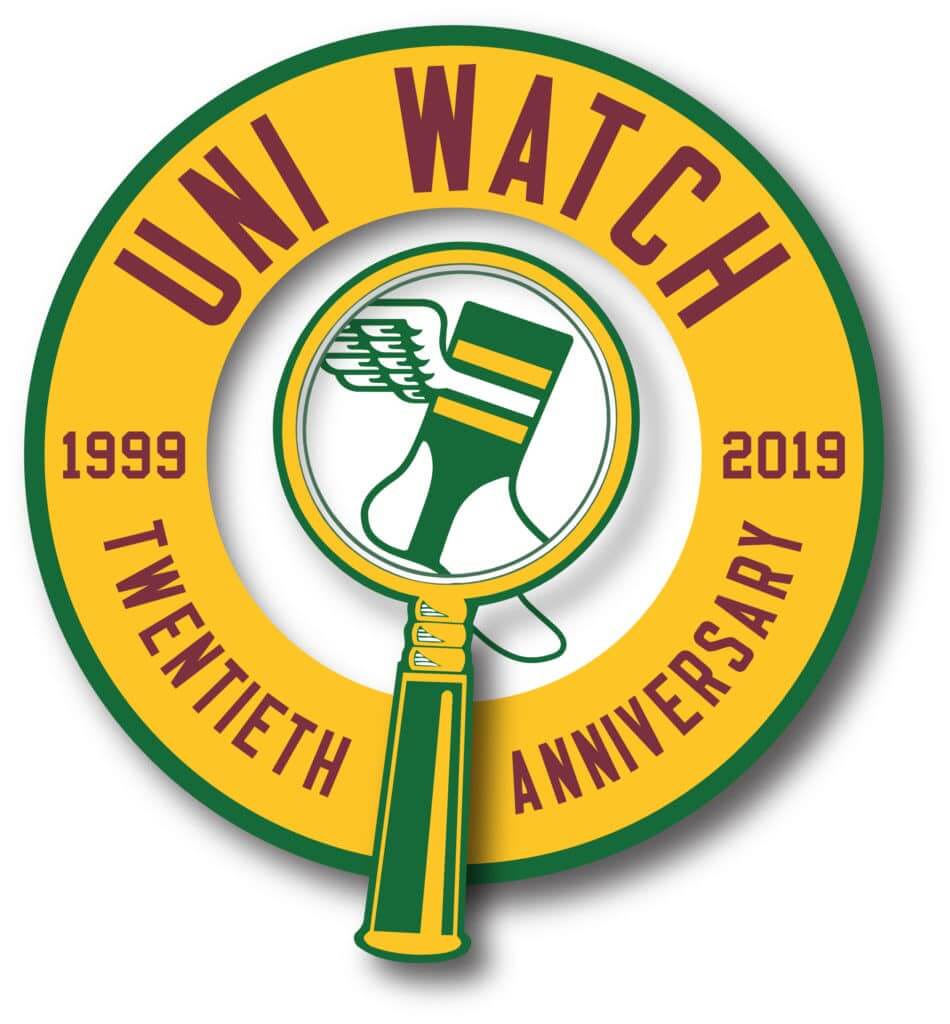
Anniversary update: As you can see above, T-shirts featuring the Uni Watch 20th-anniversary logo are now available and ready for ordering. Long-sleeve tees and hoodies are also available. Here are the links for ordering the green version, the gold version, and various shades of grey, charcoal, black, white, and so on.
In addition, in case you missed it yesterday, the logo is also available as a high-quality die-cut sticker, and you can browse our full range of merch in the Uni Watch shop.
Meanwhile, I’m still looking for a volunteer who’d be willing to keep tabs on the various Uni Watch satellite parties that will take place on June 29. As I mentioned earlier this week, this person would keep a spreadsheet showing all of the party cities, venues, organizers, etc. The spreadsheet could be shared on Google Drive, or something similar, so everyone could see what’s going on in their city. People who wanted to organize or host a party could get in touch with this party coordinator, who’d then update the spreadsheet and so on.
If you’re willing to be this person, please email me so we can discuss. Thanks.
Party coordinator now hired! More details tomorrow.
The Ticker
By Paul

’Skins Watch: Six Tampa-area schools will no longer use Native American mascots, although two others are keeping them for now (from John Jennings). … Students at an Idaho high school are sharply divided (WaPo link) over whether “Redskins” should continue to be the name of the school’s teams (thanks, Phil). … Now that Maine has banned public schools from using Native mascots, here’s a look at similar efforts in other states (NYT link) and throughout the sports world. … A Rhode Island fire department has sparked controversy by using a stereotypical Native American caricature as a mascot (from Timothy Finnegan).

Baseball News: Mets 1B Dom Smith has worn No. 22 throughout his short big league career but had a 3 on the back of his cleats Tuesday night (good spot by @chiefstevfe_). … The annual Rickwood Classic was held yesterday in Alabama, with the Birmingham Barons and Montgomery Biscuits both wearing throwbacks (from @NikolaiPopusk19). … How do you dress for a 5k? When it’s the Baseball Hall of Fame BASERace 5k in Cooperstown, you wear stirrups, of course! That’s 10-year-old McKinley Brei, daughter of longtime reader/contributor Doug Brei. … Yesterday’s Ticker noted that Twins P Devin Smeltzer wore beautiful logo-emblazoned stirrups while making his MLB debut on Tuesday night. Closer inspection reveals that the logo on his ’rups appeared to have a “TM” symbol, plus he was breathing Ethier (from Craig Van Someren). … Here’s a glimpse of the Women’s College World Series sleeve patch on Alabama’s softball uniforms (from Griffin Smith). … Meanwhile, for the men’s CWS, here’s the uni breakdown by manufacturer. … The Springfield Cardinals are going G.I. Joke this Saturday (from Tony Hansel).

Football News: The Pats have been giving out some position-inappropriate uni numbers. … Naming rights for the new Rams/Chargers stadium apparently won’t be as lucrative as originally forecast (from @ThatRodneyGuy). … Here’s a time-lapse video showing the installation of new turf, including a new midfield logo, for Southern Illinois (from @MrMichael21).

Hockey News: Instead of soda cases to look like a team logo, how about rolls of colored athletic tape to look like the Bruins’ and Blues’ socks? (From Marc-Louis Paprzyca.)
.

NBA News: Here’s the game-by-game uni schedule, according to LockerVision, for the NBA Finals. Note that Games Four and Six are slated to be color vs. color. … NBA headbands are a thing again (from Pete Svendsen). … Ad creep continues, as the Cavs have now sold the naming rights to two of the entrances at their arena (from Jim Vilk). … The Clippers have reportedly looked into buying the rights to Raptors F Kawhi Leonard’s “Klaw” logo from Nike as a way of luring the free agent-to-be to L.A.

Soccer News: The daily download from Josh Hinton: New leaks for Juventus, Celtic, Tottenham Hotspur, Chelsea, Club America, Porto, Lille OSC, and Hansa Rostock, and legit unveilings for KFC Uerdingen, Brighton & Hove Albion, Rotherham United, Preston North End. … A Spanish team is combating racism by using racist slurs that the players have been called as NOBs, including “Monkey,” “Nigger,” and “Slave.” … A Brazilian team has developed a retail jersey with technology that allows fans to hide the jersey’s emblem as they leave the stadium, thereby avoiding violent run-ins with rival fans. Perhaps it would be a simpler solution to simply dress like a normal person instead of wearing a jersey. … Atlanta United wore white instead of their “five stripes” kit at home vs. Minnesota United (from Brian Henke). … New uniforms for West Ham United. “You can buy them without the ad on the front, but even the ‘unsponsored’ version still has the sleeve ad, so they couldn’t even do that right,” notes our own Jamie Rathjen.

Grab Bag: New uniforms for the Burnaby Lakers and the Victoria Shamrocks of the Western Lacrosse Association (from Wade Heidt). … The construction equipment maker Caterpillar has sent a cease-and-desist order to a California coffee shop over the shop’s name, which includes the word “Cat” (from Max Weintraub). … The growth of e-sports has led to larger and larger arenas (NYT link), although many remain skeptical about the industry’s future (second link from Trevor Alexander). … In a related item, Walmart is now selling e-sports jerseys. … Delta Airlines employees say the airline’s new uniforms are making them sick. … Here’s a list of seven corporate logos that caused controversies due to their similarities to other companies’ logos. … Warner Bros. Records is now simply Warner Records. The new name comes with a new logo. Additional info here. … The athletics program at Columbia College Chicago is getting a new logo. … A Texas sheriff’s deputy has been accused of making a drug deal while in uniform. … A WWII veteran’s uniform has been returned to his family in Kansas. … Roger Federer’s French Open shoes celebrate his 2009 French title with an apostrophe catastrophe (from Chris Perrenot). … According to The Seattle Times, capers “bring zippy flavor and nutrients to any meal,” yet somehow there’s no mention of putting them on hot dogs! (Big thanks to Matt Busch.) … New logo for the NLL’s Rochester Knighthawks. This is an expansion franchise, as the previous incarnation of the team moved to Halifax (from @AuzzyEli and Jack Goods).
Our latest raffle winner is frequent Ticker contributor Ignacio Salazar, who’s won himself a Uni Watch membership card (and who, if his Ticker submissions are any guide, will almost certainly choose a Houston-based design motif for his card). Congrats to him, and big thanks to Marc Cavalli for sponsoring this raffle.
Dodgers pbp – Joe Davis, color – Orel Hershiser
Thanks! Will add his name to the text.
Dodgers’ broadcasters are Joe Davis (who said the pearly-white line) and Orel Hershiser (who made the relish joke).
Related to this in LA sportscasting – the late Chick Hearn used to say “The mustard really came off the hot dog that time” when a player’s showboating went bad.
One thing the article about the headband in the NBA didn’t mention is that most of the players named either only wore one for a game or two, or had been wearing them before this season. It also didn’t mention that Nike moved their logo from the back to the front (alongside the NBA logo) this year.
I know buying overpriced polyester shirts isn’t for everyone, but after years of wanting a Phillies home jersey, the main reason I finally pulled the trigger is because I viewed this season as my last chance to get one without an ugly maker’s mark on the front. Thanks to Nike and MLB for the final push I needed!
Really not looking forward to seeing that, especially on the Cardinals and Yankees jerseys.
The Yankees have never had a manufacturer logo on their game jerseys (retail authentics and replicas do have them). Allegedly they have a contract with Adidas that doesn’t allow anyone else’s marks on the uniform.
We’ll see if Nike has managed to do something about that.
No longer has anything to do with Adidas. Majestic just omits the logo “for tradition’s sake.” But they will indeed have the Nike logo.
Good. F “Yankees Exceptionalism”
If you don’t want them to be exceptional, make everyone like them.
Maker mark free.
I’m genuinely dreading this. It’s going to completely ruin the look of the jerseys. It’ll be worse than any other sport because of how much use most teams make of that area of the jersey with sprawling logos and names. Even in the NBA, the region in which the swoosh is placed was kind of outside of the area in which graphics or logos usually appeared. This is going to be directly interfering with the balancing of the team names and logos and it’s going to look awful, especially on the many uniforms that have gone unchanged for years and years and years.
Truly a terrible development and to tout it like it’s something that we should all be very excited for is pretty insulting.
In re: the Patriots arbitrary numbering of rookies, good for them. A lot of the rules regarding numbers in the NFL are silly, anyway. If it works in college or the CFL, no reason it wouldn’t work in the NFL.
This is just me wanting the return of zero and double zero. Loved me some Ken Burrough.
Agreed. I’d love to see #60 throwing a pass to #76 again…which became #14 throwing to #36.
link
Forgive me if this has already been addressed, but I’m curious as to why the Uni Watch anniversary logo color changed from gold to yellow for this iteration. Any particular reason?
Basically, the color has been migrating for a while, in part because we’ve had multiple designers for various logos and in part because I’ve been bad about quality control. When Bryan Molloy created the winged stirrup, he used a lighter yellow than the one we’d been using, and I didn’t notice, so now that is sort of our official yellow, and Scott Turner matched it when doing the anniversary logo.
I know this is going to sound weird, but the inconsistency doesn’t bother me that much. I care more about the various items looking good on their own. If there’s a bit of inconsistency along the way, eh, whatever. Not a big deal to me. I realize that probably seems antithetical to the whole notion of uniforms. So be it.
I honestly thought it was a nod to how a team may tweak their color scheme slightly :)
I’m Calling It Gold
I’m STILL calling it Gold
I think what Paul meant to say is that the inconsistency pays homage to all the historical logos that had color and other small detail changes over time due to changing suppliers, poor record keeping, and the general laissez faire attitude that was prevalent before the idea of “brand”. Haha.
Well put!
If a spectator loses food to a play like that, does the club replace free of charge?
That’s exactly what I was wondering.
Between the hot dog and drink it was probably $200!
Hi Paul, on the Burnaby Lakers Ticker item. The photo in the Ticker is actually the old uniform I had sent as well for comparison.
This is the new Burnaby Lakers white jersey. Main crest now roundel-style with just the lake monster’s head. No more red trim in the numbers and new design:
link
Fixed.
Shame on several of the Montgomery Biscuits for wearing pajama pants for the Rickwood Classic, instead of high-cuffed like the rest of their team, as well as the Barons. While the jerseys were classic, the pajama pants just are anathema in Rickwood Field.
Absolutely surprised that the Rochester Knighthawks, version 2.0, are making a major change to their logo and colour scheme. Also disappointed. If they made arrangements to keep the name, should have kept their longstanding logo if they could and not change the colour scheme. They had a signature look in the NLL and this new look is far from it.
Weren’t the Celtics/Lakers NBA Finals match ups color vs color as well?
You could say ALL of the Lakers finals were color vs color if you consider the Lakers yellow, which I do not. But no way they wore purple while the Celtics wore green in any of their many finals.
I wish I could find this story now, but years ago (I’m talking pre-internet), I remember reading about some baseball player who decided to sneak a couple hot dogs, because he figured he wasn’t going to be playing. Just as he added condiments, he got called to pinch hit. In his infinite wisdom, rather than set the hot dogs down somewhere (I think he feared the consequences should the hot dogs be found near his spot on the bench), he stuffed them up under his shirt. Sure enough, he gets on base, and eventually ends up having to slide (head first, of course), which results in the condiments bleeding through his shirt when the hot dogs got smashed. So much for hiding them! Does anyone else recall such an incident (or, better yet, have a link to the story)?
Gates Brown? I think it was in one of the “Baseball Hall Of Shame” books.
That’s quote possible, as I remember having some of those books as a kid. Thanks!!!
Gold Star for you, Nestor Chylak, it was indeed Gates Brown! The incident is even chronicled on Mr. Brown’s Wikipedia page:
link
That’s a great story! It’s also a great story I am not going to believe without video evidence!!
Lee!!!
Has happened with hockey players also:
link
link
Cavs Warriors last year went black vs blue in games 3 and 4 as Cleveland was wearing their black for all home games.
No I’m absolutely wrong never mind. Warriors wore white those games.
Was Twins rookie pitcher Devin Smeltzer actually breathing (Andre) Ethier? I’m guessing it was ether.
Unfamiliar with the term, “breathing Eithier”?
It’s a Uni-Watch thing.
It’s a reference to the cut off Nike logo on his undershirt ;)
In that case, I hope he breathes very deeply for the rest of his career. Thanks very much for the clarification, gentlemen!
Paul, not sure if you mentioned this and I missed it, but are there any plans for a 20th anniversary embroidered patch?
Yes! They’re in production as we speak. I hope to have them available in early June.
Why no blue vs red for the finals?? No gold and white Raps alternates? Its like the NBA/Nike allow all these uniforms but then wash and repeat all series.
West Ham unveils new kits inspired by the uniforms they wore during 1980 FA Cup championship season.
link
Off this item in the ticker. The only West Ham kits you can buy without the sponsor on the front are kids/juniors because you can’t sell a gambling sponsored shirt to a kid by law.
See below; they changed “unsponsored” to “under 18” after the shirts were released. So, yes, I know removing betting ads is a thing they and other teams do. However, the use of “unsponsored,” while actually inaccurate, attracted a decent amount of attention this morning.
I imagine Vin Scully would have come up with quite the bon mots for young Mr. Beaty. Never cared for the Dodgers, but listening to Scully was a real treat
Knickers! I’m watching too much British comedy.
Jamie, I think that the west ham kits are only ad free for those who wish to purchase the U18 team, as they are not allowed to feature a gambling kit ad. I personally will be purchasing the ad-free home kit!
I see they have changed “unsponsored” to “under 18.” Should have gotten a screenshot.
Something not being mentioned concerning the Braves hosting the All-Star Game is whether there was a deal struck with MLB to “inch” away from their Native imagery. As a Braves fan (who is ready to move away from the Native imagery), I’ve assumed that the Braves would not host in their new stadium until some move was made. A move such as eliminating the tomahawk from their jersey or a move to stop doing the chop. This seemed to be the case with Cleveland anyway. I know that Manfred has mentioned that he would rather the Braves stop doing the chop, so I’ll be curious to see if some of the Native imagery is scaled back between now and 2021.
As a Cleveland fan I wondered the same thing until the Braves tweeted they landed the ASG and included #chopshop.
The Ryan Braun beer shower brings up a pet peeve of mine: no ballpark should be designed in a way where a fan can reach over into the field of play. Especially over the home run fence.
Before they added more seats to Three Rivers, when you sat along the outfield railing you looked down behind the fence. Even as a kid I remember thinking it was good to have a buffer zone like that.
To those who say, “But then you can’t see a catch made at the wall,” unless you’re in the very front row, you still can’t.
By the way, Paul, great work this week. Just got caught up on the last couple of days. RIP, Bill and Marc.
Thanks, Jim!
The Metrodome use to have hockey glass in the outfield for fans to pound on. Kirby Puckett use to jump “into the boards” to catch warning track fly balls.
Speaking of logo creep. New University of Michigan Head Basketball Coach Juwan Howard wearing a Jumpman Lapel pin on his suit at his introductory presser today.
That’s just gross. Did Nike make the suit? What exactly does Nike have to do with the hiring/introduction of a coach? Corporatism run amok.
I’m still surprised every time I’ve seen a Jumpman logo on a major league catcher’s chest protector this year. It’s just a weird crossover to me.
To me, it feels particularly out of place when making an appearance on a certain NASCAR Cup driver’s firesuit:
link
To others, it may be especially off-putting when rendered in purple.
Am I the only one surprised to see the slurs spelled out in the Soccer section of ticker? I understand making the point but why use the slurs right there in the ticker?
1) The words were fully spelled out on the soccer jerseys. Why not quote them accurately?
2) I don’t believe in using asterisks or euphemisms (“n****r” or “N-word” or whatever). Words have power — often terrible, disturbing power. I would never call someone a nigger. But if I have reason to use that word, whether because I’m quoting someone or because I’m making a historical reference or whatever, I’m going to use it literally, not euphemistically.
Yes, it’s a terrible word. Yes, it’s disturbing to hear it or even see it. That’s the point (both mine and, I suspect, the soccer team’s).
West Ham United: Sponsor aside, I like the adding of more light blue to the jersey.