As you probably know by now, MLB released its holiday uniforms on Friday. Phil had a full rundown on Saturday. If you haven’t already read that, start there so you’re up to speed on who’s wearing what.
Personally, I’ve never seen the need for any of this stuff and I’d be happier if teams just wore their regular uniforms on the various holidays. This program has always been more of a merch dump than an on-field design program (the latter following from the former, which is the opposite of how it should work), and it’s hard to think of a single instance of a team whose look has ever been improved by one of these holiday uniforms. I know some of you like to buy some of the caps, and that’s fine, but it’s neither here nor there from a Uni Watch perspective. As far as this website is concerned, the only thing that matters is how it looks on the field.
That said, some of this year’s holiday sets are better than others. Here are my thoughts. (One aside: SportsLogos.net’s Chris Creamer’s article about the unveiling had the web’s best graphics, showing all 30 teams’ designs for the five cap collections. He has graciously allowed me to reproduce those graphics here; for all of them, you can click to enlarge.)
Ma’s Day (May 12)
Thank god they’ve abandoned the pink-trimmed jerseys and are only doing chest ribbons this year. The caps, meanwhile, are an embarrassing mess. They really need to stop this promotion already. Grade: F
.
Armed Forces Day Long Weekend (May 17-19)
The never-ending quest to celebrate the military and create camouflage merch continues, this time with a three-day celebration for a one-day “holiday” that most people weren’t even aware of. Thankfully, there are no camouflage jerseys, although the little chest patch is both too much (any excuse to use stars/stripes, sigh) and too little (having type on the top of the circle but not the bottom makes the patch seem oddly unfinished). As for the camo caps, they’re brutal, as usual. Three fucking days of this nonsense? Ugh. Grade: F
.
Memorial Day (May 27)

I never thought I’d live to see the day when an American sports league adopted the remembrance poppy as its symbol of mourning. (For the record, the Cowboys and Jags wore poppies for an NFL game in London in 2014, but no Big Four league has ever gone poppy-clad on a league-wide basis.) It’s actually an appropriate symbol for the holiday! And they’re only wearing it for one day instead of for the entire weekend, imagine that! And in the biggest surprise of all, they’re not selling the poppy-clad jerseys and caps, perhaps because they finally realized how inappropriate it is to merchandize people’s deaths.
I would’ve preferred just the poppy by itself, without the “Lest We Forget” inscription, and the cap patch is pointless, but this is still a huge step in the right direction. Bravo. Grade: A-
.
Pa’s Day (June 16)

They can call the cap fabric pattern “tie-dye” all they want, but that ain’t tie-dye. A cynical merch dump. Looks better than pink, but that’s about the best thing you can say about it. Grade: D
.
Independence Day Festival (July 4-7)

Did you know that Independence Day is four days long? Neither did I, but that’s how long we’re going to have to look at these caps. It’s not clear why MLB was willing to scale back the holiday creep on the other holidays but not for this one.
Anyway: Most of these designs leaked two weeks ago (the Brewers’, Tigers’, Mariners’, and Angels’ leaks turned out to be wrong). As I wrote at the time, “It’s always nice to see throwback logos, of course. It would be even nicer to see them without the stars/stripes nonsense.” On the plus side, no pandering jerseys this year! And some of the caps are actually pretty nice (the finished versions look more polished than the video game leaks). But many of them look awful. Did I mention they’ll be worn for four days? Grade: C
.
All-Star Workout (July 8)
Sorry, but I cannot bring myself to assess workout gear for an exhibition game. Let’s move on to…
.
All-Star Game (July 9)
Not bad! While I’d prefer to see the players just wear their regular caps, these are pretty tasteful, if not quite tasty. No ridiculous star-shaped metal grommets this year, either. Grade: B+
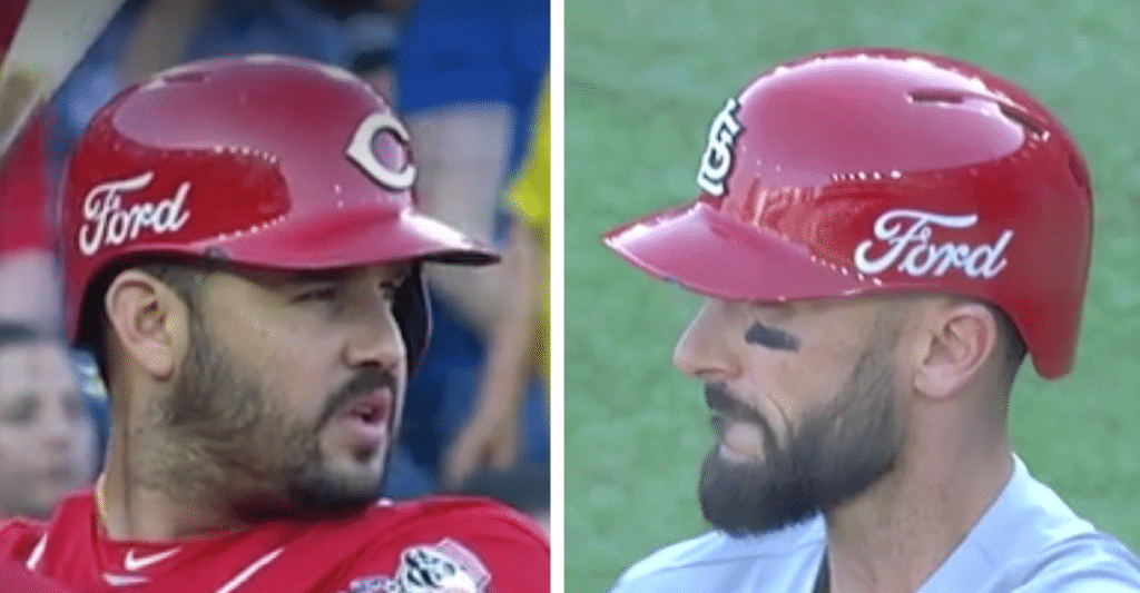
Gross: In case you missed it, the Reds and Cardinals wore advertisements on their batting helmets for their two-game weekend series in Mexico. The ads, which were not announced ahead of time, were bigger than the team logos. Naturally, they were placed on the camera-facing side of the helmet, depending on whether the batter was left-handed or right-handed. The result looked a lot like a replica giveaway helmet for the first 5,000 kids (or 50 ballplayers) in attendance.
According to a source, “It’s just for the Mexico Series. It’s an MLB initiative — the teams had nothing to do with it and had no option to decline or opt out.”
To my knowledge, this is the first time MLB teams have had uniform advertising for a regular season game anywhere other than Japan. (Previous games in Mexico have been ad-free.) It raises the question of whether the Red Sox and Yankees will have uni ads for their games in London in late June. And if you think the Yankees would never do that, think again — they already did it for their season-opening games in Japan in 2004.
Click to enlarge
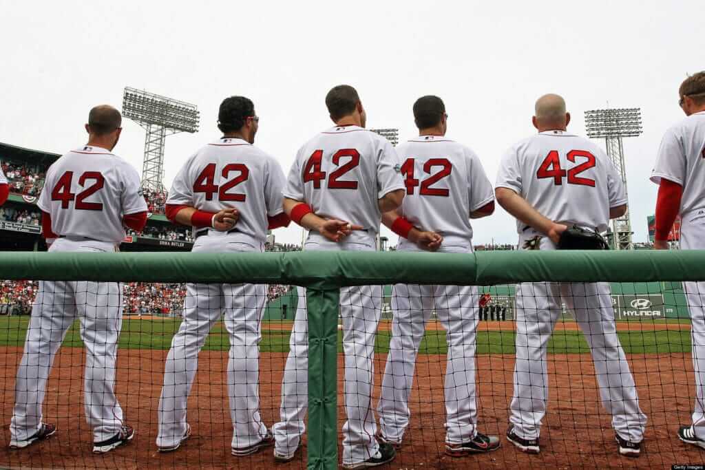
April 15: Today is Jackie Day. As usual, all uniformed MLB personnel, including the umpires, will wear No. 42 and go NNOB, causing consternation for broadcasters (and a few Uni Watch readers), although I love love love it. There will also be a “42” sleeve patch (unnecessary) and a “42” cap patch (ugly, like all cap patches).
Today is also Patriots Day in Massachusetts, which means the Red Sox will have their traditional 11am start and wear their “Boston Strong” uniforms. I believe this is the first time since the advent of those uniforms that Pats Day has coincided with Jackie Day, so we’ll see these uniforms get the No. 42 treatment for the first time.
The 10 teams that aren’t scheduled to play today will go 42-clad tomorrow. You can see additional plans, events, and festivities that are in store here.
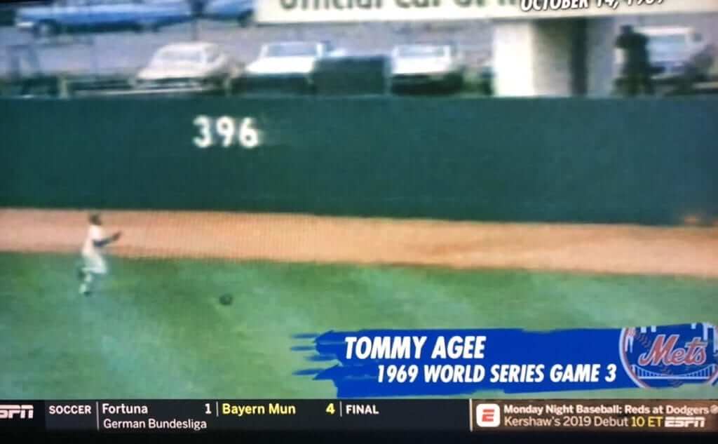
Rough night for my old employer: When I started following baseball in 1972, my favorite player was Mets outfielder Tommie Agee. I quickly learned that the way to tell a serious sports media outlet from a frivolous one was that that the serious ones correctly spelled Agee’s first name as “Tommie,” while the frivolous ones got it wrong as “Tommy.” So I cringed when ESPN ran a little retrospective about the 1969 Mets during last night’s Mets/Braves broadcast and got Agee’s name wrong (see above).
Turns out that was the least of ESPN’s problems last night. At one point they had Hank Aaron in the booth for an extended chat (he sounded great), and they showed an image of Aaron and Jackie Robinson. Great idea, what with Jackie Day taking place today, except for, well…:
Hey @espn! That’s Sam Jethroe, not Hank Aaron! Hank never played for the Boston Braves! #SundayNightBaseball #braves pic.twitter.com/dPs2kjlL9q
— Patrick Williams (@patr1ckw) April 15, 2019
Hey, we all make mistakes. It happens.
(My thanks to @data_guy for the Agee screen shot.)

Click to enlarge
The old woman and the sea(food): My mom turned 95 (!) last week. She wanted to celebrate with a lobster lunch, so yesterday my brother, the Tugboat Captain, and I took her out to a seafood restaurant that was one of her favorites back when our family still lived in the town where I grew up. She hadn’t taken apart a lobster in several years, but it turns out that it’s like riding a bike.
The Ticker
By Jamie Rathjen

Baseball News: Now that the Yankees have P Adam Ottavino wearing No. 0, they currently have players on the roster representing all the tens digits from zero through nine. Do any other MLB teams meet that standard? (From Eric Abneri.)

Football News: Pro golfer Tiger Woods’s caddie, Joe LaCava, is a huge New York sports fan, so he regularly wears team apparel while caddying — including a Giants RB Saquon Barkley jersey at the Masters — and also has a Giants-themed yardage book (from Phil and Joe Loch). … The CFL’s Calgary Stampeders have been selling off the team’s alternate black helmets, saying that all teams have only one helmet this season (from Wade Heidt). … Auburn’s spring game featured what looks like a different number font compared to last season (from Meason Boomer).

Hockey News: Lightning G Andrei Vasilevskiy got new pads for their series against the Blue Jackets, proceeded to lose twice, went back to the old pads, and lost again (from @TheGoalNet45). … Every NHL arena has an extra referee’s uniform that is always No. 35 and an extra linesman’s uniform that is always No. 85, just in case the officials’ luggage gets lost. That’s what apparently happened to ref Francois St. Laurent in Calgary on Saturday (from @Univers47). … In the Greater Ontario Junior Hockey League playoffs, two teams used mirror-image Penguins-style unfiorms.

Basketball News: The Hawks’ NBA 2K esports team, Hawks Talon GC, now have their own uniforms and court for use in the game (from @unavion). … Iowa United, a team in this summer’s The Basketball Tournament made of alumni from the state’s four Division I teams, will have former Iowa PG Nicholas Baer wear No. 40 in honor of former Hawkeye PF Chris Street.

Soccer News: The NWSL’s Chicago Red Stars revealed this season’s first shirt. They have ironically undergone a bit of an identity crisis with their solidly city flag-based scheme, having worn both white and blue as first choice in the past, as well as black last season (from Allie Kutrubis and Steve Johnston). … League-mates Utah Royals have a new second shirt. … The NWSL also has a new NOB font to go with its new number font, which hadn’t appeared yet because no teams wore NOB in preseason. … Twitter-er @UntillTheNight sent us this picture of New York City FC center-back Anton Tinnerholm wearing long sleeves, which Adidas was to no longer offer MLS this season. As NYCFC’s second kit was held over from last season, it would seem they still had some long-sleeved shirts around; Tinnerholm has worn short sleeves with the first kit. … Bayern Munich fans continued their season-long uni-related protest last week against not only the use of colors besides red and white in the team kit, but now the mint-green color of this season’s second shirt, calling it “something you would wear on holiday.” … Japanese team Yokohama F. Marinos released a shirt ostensibly comemmorating the creation of the city’s port in 1859 as one of the first Japanese ports to be opened to foreign trade. … A game was delayed for five minutes when a player from Scottish junior side Renfrew FC was told to remove his underwear (from Mark Coale).

Grab Bag: Reader Justin Hicks tells us that golfer Alex Norén apparently fixed a hole in his glove with a bandage at the Masters. … Cross-listed from the football section: Tiger Woods’s caddie, Joe LaCava, is a huge New York sports fan, so he regularly wears team apparel while caddying — including a Saquon Barkley jersey at the Masters — and also has a Giants-themed yardage book (from Phil and Joe Loch). … The NLL’s Saskatchewan Rush wore jerseys in the University of Saskatchewan’s colors on Saturday for a USask alumni night. “Uni Watch colours!” says Wade Heidt. … The day before, the Rush were on the opposite end of another uni-related promotion for “cancer awareness” by the San Diego Seals (also from Wade). … Reprinted from Friday’s comments: A number of Formula One drivers wore one-off helmet designs for this weekend’s Chinese Grand Prix, which was the championship’s 1000th race (from reader/commenter Dane). … Staying in motorsports, Antonio Losada began a database of MotoGP liveries. … Presidential candidate Pete Buttigieg’s campaign provides color codes as well as “storytelling” for the campaign colors (from Joel Bingham). … Uniform advertising has now spread to rugby scrum caps (from @stumpy7780).
Our latest raffle winner is Daniel O’Connell, who won the copy of Todd Radom’s book, Winning Ugly. Congrats to him, and thanks to Jeff Drumheller for donating the book. We’ll have another one-day raffle tomorrow.
Auburn’s uniforms appeared to have the 75th anniversary patch for the SEC on them, so I believe those were older uniforms from 2016.
Try 2007.
link
They are the old jerseys. In fact, the jerseys worn feature 3 different SEC logo patches. Auburn recycles the old uniforms for the spring game and has for years. Has zero bearing on the upcoming season’s uniforms.
Tried to explain this in yesterday’s comments but it got overlooked apparently.
Sorry, I looked at yesterday’s entry before you left the comment.
Thanks for explaining (again).
Happy birthday to your mom!
Wouldn’t have been more appropriate for MLB to wear their Latin jersey’s for the Mexico series than trying to sell them as “Latin heritage nights?”
The Reds already have their Los Rojos alternate in their wardrobe, so that would have been very appropriate. Hadn’t thought of that — good point!
Further to the football ticker item, the Calgary Stampeders have been wearing 3 helmets for a number of seasons. The team store is selling the third uniform Outlaw helmets (half black and half red like the old Jags helmet):
link
The team has worn different coloured helmets at home and on the road since (I think?) 2011. They introduced a black road helmet which many fans including myself do not like for the Stampeders. We’ve had the unfortunate experience of having to watch these helmets in a couple of Grey Cups:
link
This is really good news that the Stampeders are back to wearing the red helmets for all games, not just at home. If this information is accurate about all CFL teams going with only 1 colour shell for the upcoming season, it will also affect the BC Lions and Toronto Argonauts.
Hi Paul.
I must take a bit of umbrage with your comment that the poppy is “actually an appropriate symbol for the holiday!”
The poppy as far as I know has always been associated with Remembrance Day, observed on November 11th of each year. Wouldn’t Veterans Day actually be a better day in the USA for teams to honour their fallen?
What MLB is doing by using the poppy as a symbol outside the traditional Remembrance Day seems forced and inappropriate. When we observe Remembrance Day in Canada (and I believe for most of the Commonwealth) it is a very solemn occasion, with some pomp and ceremony but I never thought of it as a ‘holiday’.
The one thing we do agree on though is if the poppy is to be used, don’t put “Lest We Forget” on it.
Would be interested in hearing what others think.
Although the poppy is most frequently used on Nov. 11th, and has its origins in the WWI armistice on Nov. 11, its use is not specifically tied to that date. It is a symbol of remembrance for military personnel who have died in war:
link
I too would be interested in hearing what others think, however. I asked Chris Creamer, who is Canadian, and he said he loved the idea of MLB using the poppy for Memorial Day. Obviously, he doesn’t speak for the entire nation, but I mention it just to show that I did give this issue some thought, and that there may be some diversity of opinion.
Canadian Military person here (23 years so far). I can only speak for myself, but I appreciate any act of remembrance. It is true that it can be a solemn time but it is also a time to tell stories, remember and even laugh at moments from the past about friends that are no longer with us. A poppy worn on a sports uniform is a nod to those who have served and at times what seems to be a simple gesture is all that is needed, regardless of the time of year.
The VFW in the US raises monies through sales of the “Buddy Poppy” twice a year-Memorial Day and Veterans Day. I think this gesture by MLB is respectful.
The move to the poppy is an improvement but I’m certain they would not have done this without the corresponding Armed Forced Day camouflage orgy. As Paul correctly noted, the priority is selling apparel, and the justifications and designs follow.
I like the use of the poppy I feel that it’s much more tied to a tribute of those that served than a tribute to the service itself. It’s used year round by the Royal British Legion and there are items for D Day with the poppy on.
Inspired by the poem In Flanders Fields. Written by Canadian physician Lieutenant-Colonel John McCrae:
In Flanders fields the poppies blow
Between the crosses, row on row,
That mark our place; and in the sky
The larks, still bravely singing, fly
Scarce heard amid the guns below.
We are the Dead. Short days ago
We lived, felt dawn, saw sunset glow,
Loved and were loved, and now we lie
In Flanders fields.
Take up our quarrel with the foe:
To you from failing hands we throw
The torch; be yours to hold it high.
If ye break faith with us who die
We shall not sleep, though poppies grow
In Flanders fields.
The American Veterans of Foriegn War (VFW) have been selling poppies on Memorial Day for well over 1/2 century
Since Memorial Day evolved from Decoration Day, which far predates WWI, it makes sense for the US to honor war dead on that date. I, for one love the use of the poppy on the uni, I’ve been advocating it for years. And I’d rather see the poppy on the cap than the star spangled batterman.
Veterans Day is celebrated November 11. It is a day to honor all Veterans (those who served in a time of war).
Memorial Day is celebrated on the last Monday in May. It is a day to honor those who have made the ultimate sacrifice and given their lives in service to the Armed Forces.
minor edit…
…given their lives in service to the Country while in the Armed Forces.
Further to the NWSL items: three teams, or one-third of the league, did not have front-of-shirt ads for the first game of the season: Chicago, Houston, and Washington.
There is a league-wide sleeve ad that they can do nothing about, but besides that the NWSL is relatively ad-free right now compared to other soccer leagues.
Happy birthday to Mom! It’s a blessing that you are able to spend time with her! And the lobster looks great!
I like the Independence Day caps, but it took me forever to figure out what team had the D. I’m so used to seeing the Old English D for the Tigers, I had forgotten the team used something else.
Happy birthday to your mom Paul! 95 and looking good!
Also remember Jackie Robinson. He exuded dignity, pride and proved a box score doesn’t care about color just the player you were that day. Showed any man that has the goods should be allowed to play also. Not sure anyone else had the courage and strength of spirit to do what he did especially his first year. He was special.
For the Independence Day caps, the Brewers cap is also different from the earlier leak. Instead of the woefully incorrect Cooperstown Collection block M, the Crew will wear a version of the Ball-in-Glove logo.
Good catch. Text now adjusted.
All the MLB hat variations are getting out of hand. On a positive note, Happy Birthday to your Mom! 95 is no small feat, what’s her secret?
Good genes — her own mom lived to be 98!
The Mother’s Day caps share the “tie dye” pattern of the Father’s Day caps in the pink fabric elements. It’s a more subtle pattern in the pink, but to my eye it looks worse for it. Whereas the blue looks like a deliberate pattern, the pink just looks like a laundry mistake to me.
Happy Birthday to your mom. I never got into the whole special occasion hats. I might finally pull the trigger on the Independence Day White Sox hat. Kinda reminds me of the 1917 World Series Special jerseys.
-Happy Birthday to your mom Paul. That lobster looks exquisite.
-“The 10 teams that aren’t scheduled to play today will go 42-clad tomorrow.”
So does this mean there will be games with one team all 42 and the other team their normal numbers tomorrow? For example, the Red Sox start a two game series the Yankees, who are off today. Will NYY be all 42 and Boston have their normal #s, or will Bos wear 42 jerseys twice?
Oh, that’s weird — I assumed that all 10 of today’s inactive teams would be facing each other tomorrow. Answer to your question: I don’t know!
!4,000 for a Saskatchewan NLL game is impressive.
Happy birthday to your mom, Paul! Based on your gene pool, you may have another 40+ years of uni-watching in front of you.
I, too, am sick and tired of MLB’s uniform shenanigans. The obsession with holiday specials and patches for every freaking occasion has become absolutely ridiculous.
I would mind the uniform shenanigans less if MLB were even more ridiculous. Where is the Earth Day uniform? Arbor Day? Oktoberfest? Flag Day? Free Comic Book Day? Record Store Day? National Teachers Day? Where are the Labor Day duds with teams wearing Dickies shirts and denim caps in Wobblie red and black?
Don’t. Give. Them. Any. Ideas.
leave the gimmicks to the minor leagues and the exhibitions. no gimmicks for games that count.
The thing that bothers me about those holiday clown caps is they keep changing the color of the maple leaf on the Blue Jays. Keep it red like it’s supposed to be, stars and stripes are always red white and blue.
Two instances of “forgetting the Blue Jays are in a different country”. In the past, any camo stuff used a Canadian Armed Forces pattern for the Jays distinct from the US military pattern for everyone else. This time all 30 are the same.
Secondly, why exactly do the Jays have an Independence Day cap? (The Canada Day maple-leaf cap still exists)
Canada’s camo pattern, CADPAT, was developed in the 1990s, and it served as a major inspiration for the U.S. Marine Corps’ digital MARPAT camo pattern. And MARPAT inspired the camo used by every other U.S. service in the years since. So in a way, the Armed Forces Day caps do pay homage to Canadian camouflage. Or they would, if more Americans knew that our military ripped off Canada’s innovative military camouflage.
Perhaps the reason the Jays’ caps skipped the CADPAT is that the pattern they’re using this year doesn’t appear to be any military pattern that I’m aware of. It wasn’t last year, either, but I don’t remember what the Jays’ looked like.
Also, CADPAT is owned by the Canadian government and rarely if ever released for public use. In most cases when one sees civilian goods claiming to be CADPAT, it’s one of several privately created patterns intended to resemble CADPAT, not the genuine article.
Like the first year Talons, all NBA 2K teams have unique uniforms and courts. Next time I spot a uni update I’ll pass it along.
As much as I dislike the star-spangled uniforms, I’d dislike them less if it looked like they put some thought into them, rather than just slapping a half&half flag filter on every logo. I came up with these which while still an eyesore, bother me less. And, I at least fixed the Orioles apostrophe catastrophe while I was at it.
link
These are almost all vast improvements, but I think it’s worth crediting MLB (or New Era or whoever did the actual deciding) with improving the stars-and-stripes flag filter effect this year. It’s still mindless and half-assed, but by sticking with a straightforward linear pattern the caps are much less ugly than in the last decade or so of seasons. Definitely raises the caps from D-plus to C-minus territory in most cases.
Definitely an improvement, nice work.
Dag-gummit!! If they’re gonna put an automobile logo on the helmet, why not a nice 3-D chrome one??!
link
all star tigers cap looks to be the old jersey ‘D’
Is it just me, or does the Cap logo for Cleveland for the all-star game look shorter than the normal one? Most of the other ones look like the normal logo with an outline but The C for Cleveland looks off.
Watching the Dodgers/Reds game. Is that B on the Dodgers caps the correct size? Looks too big to me.
Yes, too big.