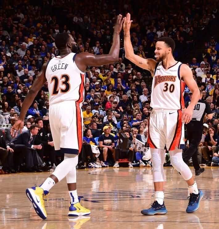
The Warriors are moving to a new arena in San Francisco next season, which means yesterday was their final regular season game in Oakland. Some teams might have worn a jersey patch for the occasion but there’s no room for a patch because of the fucking uni ad and maker’s mark the Warriors wanted to do something more special than that, so they broke out a set of “We Believe” throwbacks — the uniforms that the team wore from 2001 through 2010 — for their game against the Clippers. Additional pics here.
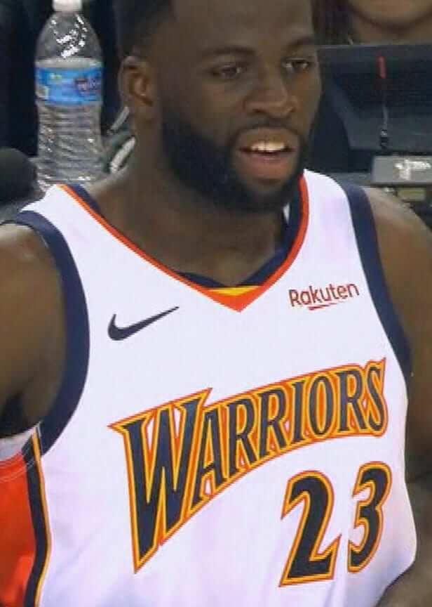
Honestly, I’ve never loved this design (it’s certainly not as good as the team’s current look), although I understand why fans have a soft spot for it. In any case, it was weird to see it with the ad and the manufacturer’s logo:
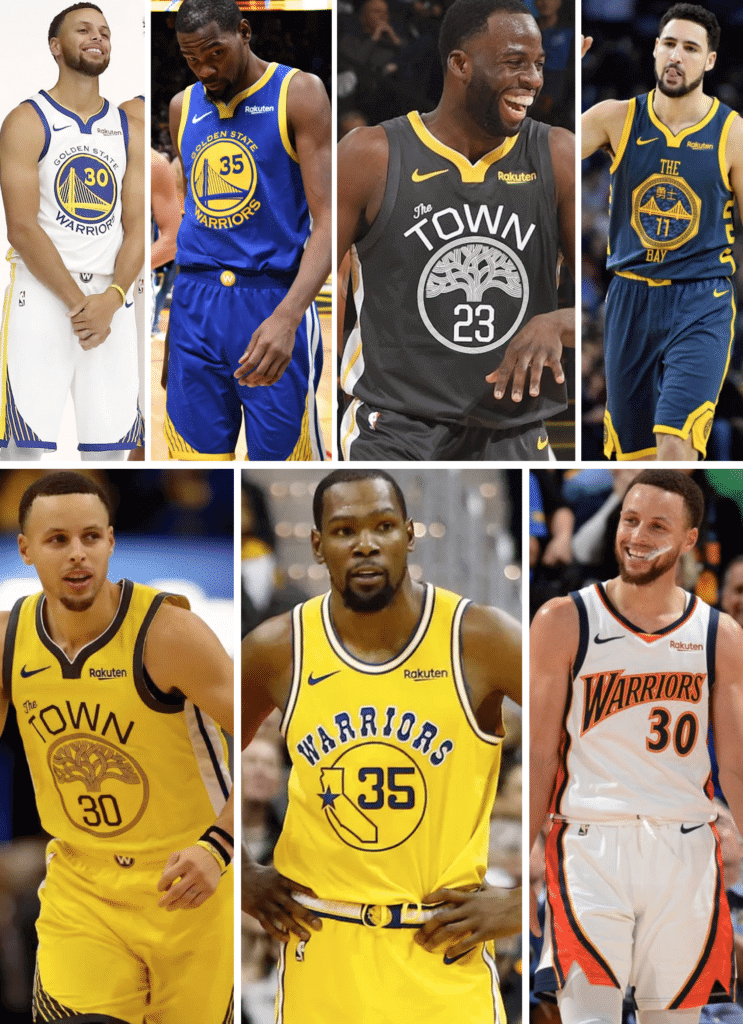
By my count, this makes seven different uniforms that the Warriors have worn during the 2018-19 season (click to slightly enlarge):
The Warriors also commemorated their 47 seasons in Oakland by raising a “47” banner:
I’m not really a fan of retiring numbers for anything other than players, but this is still a nice gesture to the Oakland fans.
New Pitt designs: In one of the uni-verrse’s worst-kept secrets, Pitt revealed new colors, logos, and uniforms for its entire athletics department yesterday. Here are the new logos:
The official new #Pitt logos 🔥🔥🔥 pic.twitter.com/cl7pSfRxwO
— Chris Mueller (@bychrismueller) April 7, 2019
Here’s the new look for the football team:
The Reveal: Pitt Football
Our City. Our School. Our Colors.#H2P pic.twitter.com/XoCamwtVxH
— Pitt Football (@Pitt_FB) April 7, 2019
Pitt now has Pennsylvania shaped warning decals on their helmets.@PhilHecken @UniWatch @GreenGridiron pic.twitter.com/YP1JZJSxuy
— Clint Richardson (@Clintau24) April 8, 2019
In addition, there are new uniforms for men’s and women’s basketball; men’s and women’s soccer; track and field/cross country; and a lot more.
There are lots of photos of just about every Pitt team’s new look here, and there’s more about the redesign process in this video:
Click to enlarge
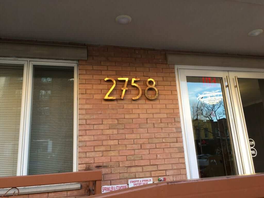
Lucky Seven: I was walking around outer Brooklyn on Saturday and saw the house shown above. Pretty sure this is the first time I’ve ever seen a house number with a European-style 7. Has anyone else out there ever seen such a house? Does anyone out there live in such a house?
ITEM! New T-shirts: I don’t know why this hadn’t occurred to me before, but I was looking at the Goodyear logo the other day and thinking about how our winged stirrup logo is a lot like their wingfoot logo. It turns out that there’s actually a Goodyear font, called Wingfoot Sans, so I had Bryan Molloy, who designed the winged stirrup, come up with these (click to enlarge):
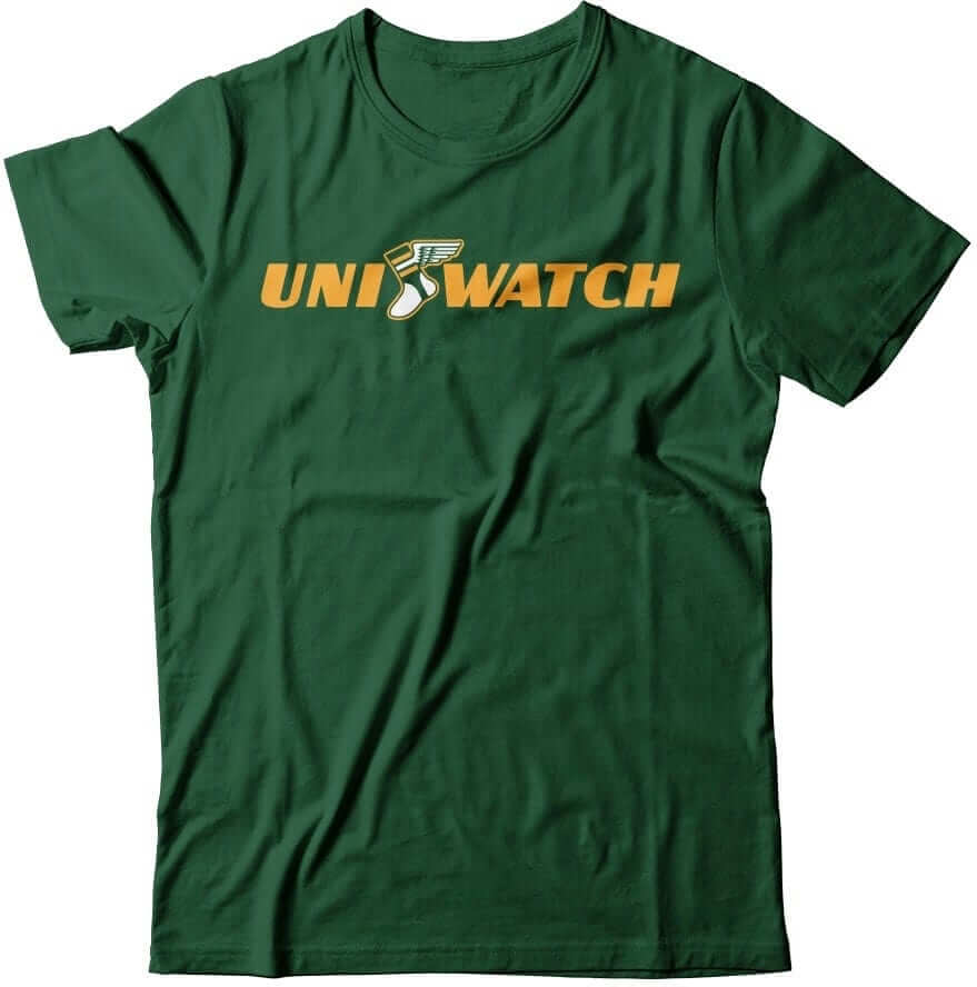
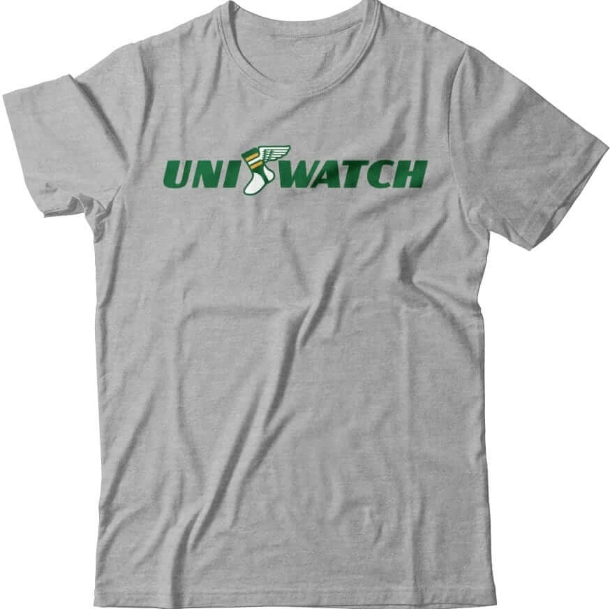
Cool, right? Here’s where you can order the green version and the grey version.
As you may recall, we did a blimp-themed T-shirt, designed by the great Sean Kane, two years ago. But that design didn’t use Wingfoot Sans (I don’t recall if Sean and I discussed it, or if I even knew at that point that Wingfoot Sans existed), and for some reason it also didn’t include the winged stirrup (which had debuted earlier that year). I loved Sean’s shirt, but I love these new shirts even more.
Again: Green available here and grey available here. My thanks, as always, for considering our products.
The Ticker
By Jamie Rathjen

Baseball News: Indians P Mike Clevinger wants the team to bring back red pants (from Tony Crespo). … Diego Bauzá went to the Mets game yesterday and got an ice cream helmet, which he says now has a squatchee but also a New Era logo (look carefully). … The Astros apparently have new socks for their blue alternates. … We haven’t mentioned that Mariners P Mike Leake, who has worn No. 8 for the Cardinals in the past, also does for his current team (from Jeremy Brahm). … The Triple-A Buffalo Bisons wore their Blue Jays-style throwbacks for the first time this season (from Jeremy Shermak). … In this commercial, former Brewers 1B Cecil Cooper is wearing what Chris Rucinski says is a giveaway jersey (the Brewers are having a giveaway of Cooper’s jersey in July) with an ad patch on the sleeve. … The Reds wore their red jerseys in Pittsburgh yesterday. “Quite rare to see them wear red on the road,” says Ralph Domingo.

Football News: Reader Gene Sanny is back with another pencil topper helmet (see yesterday’s entry for more): a Raiders helmet based on that worn by QB Ken Stabler. … If you happen to want a crystal-covered Notre Dame helmet, the school’s bookstore has made it your lucky day (from @therealpiku88).

Hockey News: The city of Denver put up Avalanche NOB/number banners in one of its squares (from Zeke Perez Jr.). … Also posted in Grab Bag: Golfer Corey Conners is Canadian and has a Maple Leafs logo on his yardage book (from multiple readers). … There’s a new statue of former heavyweight boxer Chuck Wepner — the inspiration for the Rocky movies — in his hometown of Bayonne, N.J. Oddly, Wepner posed for a photo with the statue while wearing a University of Maine hockey jersey.

Basketball News: Cavaliers PF Channing Frye announced he is retiring, so teammate Kevin Love briefly wore Frye’s jersey from Arizona when entering last night’s game against the Spurs. “Would not surprise me if this becomes a trend moving forward,” says Mike Chamernik. … Michael Frazier will wear No. 5 with the Rockets. … Todd Robison, grandson of former Texas Tech coach Polk Robison, wore his grandfather’s old 1950s coaching jacket to the Final Four on Saturday (from Tyler Conway). … The Empire State Building was lit up in the colors of the Final Four teams on Saturday, and will be today in the colors of Virginia and Texas Tech. … Virginia’s equipment manager posted a picture of G Kyle Guy’s blue jersey with a Final Four patch. It’s unclear whether that was a hint that Virginia is wearing blue today. … Wahoowa!

Soccer News: German team VfB Stuttgart wore their 125th-anniversary throwbacks for the second time, but with a message saying “Chest out” — the second half of the German equivalent of “chin up” — “for inclusion.” By coincidence, the number font even included a crossed seven, which is less common in typefaces than handwriting (from Josh Hinton). … Scottish team Dundee’s pitch was Northwestern-striped both horizontally and vertically this weekend. … FC Cincinnati and Sporting KC both wore blue (from Blake Sjerven). … This video for the French national team’s centennial shows many of the team’s shirts since the ’60s, including the green and white stripes borrowed from a local Argentine team to avoid a clash with Hungary at the 1978 World Cup (from @Ry_Votro).

Grab Bag: Ohio State and Penn State men’s lacrosse both wore chrome helmets (from Ryan James). … Cross-listed from the hockey section: Golfer Corey Conners is Canadian and has a Maple Leafs logo on his yardage book (from multiple readers). … Uni Watch ACC tracker Rex Henry found a website with team color codes for the big four sports, NCAA Division I, and some soccer leagues.
Our latest membership raffle winner is reader Jim Ellwanger, who won the free membership that was generously donated by Steve Fidrych. We’ll raffle off yet another free membership, donated by yet another generous reader, tomorrow.
Someone should make a list of players who have worn throwback designs in a regular season game that they also wore when that design was the team’s standard uniform. Curry would count.
Shane Doan was an inaugural post-Winnipeg Phoenix Coyote so he threw back to the kachina design late in his career.
Also, for Craig Biggio’s final homestand, the Houston Astros wore throwbacks for one game each of every home uniform he wore in his career, including the navy/metallic gold that closed out the Astrodome and the shoulder rainbows.
No photographic evidence, but Joe Nash may be one of those players.
He played for the 1982-1996 Seattle Seahawks.
The Seahawks 1994 throwback was based on their 1976 uniform (they didn’t bother to switch out the blue facemasks for silver though) which hadn’t changed much, if at all, in Nash’s rookie/NFL strike-shortened season.
Seattle tweaked their uniforms for the 1983 season.
Depending on how exact the throwback needs to be, remember the Anaheim Ducks’ 20th anniversary purple jersey? That version had no shoulder patches. Ryan Getzlaf and Corey Perry were on the Mighty Ducks (while they were mighty) and wore basically the same jersey except with that shoulder patch.
Two more throwbacks to earlier in a career:
Martin Brodeur wore the red and greens very early in his career, so any future one-off throwback (St. Pat’s, or Stadium Series) would qualify.
By special request of the 1970 Vancouver Canucks, the Toronto Maple wore “last year’s” jerseys as throwbacks to 1967. You see, that was the last time the Leafs won, so for any old Leafs fans in western Canada who converted to the Canucks, it was seeing an old favorite vs a new favorite. With Dave Keon still on that team, he and other similarly situated Leafs would qualify too!
Mike Kenn (LT, Atlanta Falcons) was drafted in 1978 and presumably played in the preseason when the Falcons wore this:
link
And wore it again (ok, with different socks) when the Falcons threw back to their ’76-77 set in 1994:
link
Wonder if he saw action when the Falcons played the Jets in 1978…the game where the Jets wore their new green helmets with their old ‘Namath-era’ jerseys:
link
Is the #47 actually retired? It just seems like it was a banner to honor the Oakland fans, not a number retirement. Almost like when a team raises a “300 consecutive sellouts” type banner.
I thought both digits (in double digit numbers) had to be 0-5, so the ref could indicate to the scorer’s table who the foul is on, right? In which case, couldn’t use 47 anyway.
Or is that not the rule in the NBA?
Correct — that’s an NCAA rule, not NBA.
It is possible to signal double digits using the hands.
Fingers Vertical indicate 1-5.
Fingers horizontal indicate 6-9.
Fist means 0.
So 47 would be left hand, four digits vertical, and right hand two digits horizontal.
That’s not an ice cream helmet cup; that’s an ice cream cap cup. Note the seams and bill stitching. Seemingly a new genre of sundae souvenirs!
Right! I noticed that too. One might wonder if New Era is behind this change.
The Mets had an all orange cap sundae late last season. It is smaller than the helmet with the sundae priced the same so I think Aramark (the concessionaire) is behind it: for the same price, less ice cream and probably fee from New Era.
I had no idea that’s considered a “European-style 7” as I know several non-Europeans, including my wife, who write 7s with a hash across it.
It’s not done *exclusively* by Europeans, but it’s almost universal among Europeans, because they tend to write the number 1 with a big serif at the top, so the cross helps to distinguish the 7 from the 1.
I write sevens that way, but I always thought of it as a science 7, not European. My grandpa always yammered about always thinking it was a cursive F, but he tended to yammer about a lot of things.
Weirdly, one of the requirements of being a judge in USA Gymnastics is writing 7s in “European” style.
Re: the Pirates-Reds brawl. Has there ever been a more brightly colored baseball brawl between two teams than that? There was no mistaking who was who. Seeing everyone from both benches out on the field was almost a thing of beauty.
A color v. color game for sure.
Sansabelt baseball pants worn pyjama style just looks really wrong.
Penn State should not wear chrome buckets, no matter the sport. White with a blue stripe. It’s the only way in Happy Valley.
100% agree.
I’m a WVU fan so I hate Pitt. I do like Pitt’s new uniforms though.
If only they would meet on the gridiron annually. Cannot believe this (and WVU vs. UMd. and VT) are not on schedule permanently. WVU showing new football unis this weekend at Spring Game.
I wonder if this switch over to the new uniforms means Pitt Football will no longer be wearing the throwback unis?
I would assume not, which is a shame, the white block numbers and gray facemasks were a much better look.
I was living in the Bay Area when they wore those, and I remember really liking the international orange. It was unique in the league (not the same orange as the Knicks), and was a nice reference to the Golden Gate, which would arguably be more appropriate now they’re moving to SF.
Big day for the “seven slash” on the site.
Chuck Wepner’s great nickname: “The Bayonne Bleeder.”
Corporate logos on uniforms? Bad.
Makers’ marks on uniforms? Bad.
Corporate-named sports arenas? Bad.
Any type of sports merchandise? Bad.
Uni-Watch merchandise ripping off a corporate design? Good.
Just kiddin…but really is this not copyright infringement?
No. We’re not taking the Goodyear logo and passing it off as our own, nor are we creating any possible confusion on the part of the consumer. We’re just riffing on a pop culture icon and humorously noting the odd overlap of a tire manufacturer and a uniform website both using a winged foot as their visual signifier. (Of course, all winged feet — ours, Good Year’s, the link, the link, link, link, etc. — ultimately derive from the Roman god link, so there are several levels of borrowing and blending here.)
Not being from the Bay area – and just a marginal NBA fan – are the Warriors routinely referred to as ‘Dubs’?
Bay Area resident checking in here. Yes, very routinely. Started with the fans, then slowly crept into local media. As an extension, the fan base refers to itsself as Dub Nation.
Membership raffle winner here. Thanks to Steve for your generosity! Finding out I won was definitely a high point in recent weeks, given that I’m about to lose my job. (I intend to pay it forward once I return to gainful employment.)
Oh, man — sorry to hear that, Jim. Hang in there. And hey, we’ve already designed your card:
link
I thought it was weird that whoever (clubhouse attendant?) wrote the note for the Bisons uniform of the day wrote “game hat and top”. Who calls a Jersey a top?
I wonder if the Pitt change back to the old colors will be the first time in known Uni Watch history that everybody agrees was a great move?
Pretty sure everyone approved of the Blue Jays’ latest revision. That’s one example that comes to mind, although I’m sure there are others.
You’re probably right. Uni Watch commentators appear to be overwhelmingly traditionalist so I imagine most of the times when a team ditched an ill-advised “modern” look to return to a classic look it has been met here with approval.
Now, when a team comes out with a totally new look that is unanimously favored here…that will be news.
The new Warriors uniforms are definitely better than the 2000s ones they wore last night, but as a one-off those looked pretty cool IMO. What uniforms do you think look better as a one-off than a full set?
I haven’t lived in or seen a house with the European seven, but I use it when I write. Partially due to studying abroad in Europe and partially due to my terrible handwriting that sometimes made my sevens look like ones or twos.
I’ve always done it that way to make sure there was no confusion between the 1 or 7. I never heard of it being a European thing.
Paul, I know this comment is probably made fairly often, but do you think you’ll ever get over the strong feelings against maker’s marks/ads? I am a uni-purist myself, and the New Era logo on the MLB caps is still driving me nuts, but at a certain point isn’t it just a fact of modern pro sports? I actually find myself not even noticing it on most of the NBA teams anymore
There’s a difference between saying, “It’s a fact of modern pro sports” and saying, “I no longer have strong feelings about it.”
Yes, it’s a fact. And it’s a fact that sucks. Pointing it out on a throwback that never had a maker’s mark in its relatively recent non-throwback life (i.e., the Warrors’ throwbacks in today’s lede) seems like a reasonable observation, no?
It’s also important to push back against maker’s marks so they don’t spread even further than they already have. Do you really want to see maker’s marks on hockey socks, for example? Or NFL helmets (which used to have them but now don’t — a huge improvement!)? And so on.
And it’s also important to call out corporate douchebaggery in the uni-verse as part of the larger fight against corporate douchebaggery in society at large.
That’s my take. Your mileage may vary and all that.
Unfortunately, there are maker’s marks on hockey socks already in major junior.
link
Did anyone else notice that in Pitt’s reveal photos the basketball players are wearing #19, even though there would never be a 9 on a uniform in NCAA basketball?
Usually when that is done it is because they are representing the year on the jersey via the number. It’s 2019, hence, uniform number 19. You’re right – in reality that uniform number wouldn’t be permitted.
If you look close at Snake Stabler’s trademarks single vertical bar face mask it looks like it was a sawed off cage style mask.
It is, and if you look close at mine, you’ll see I did it that way too. I sent other pics as well that showed it, but they didn’t make it into the ticker.
Proofreading:
New Pitt designs: In one of the uni-verrse’s