[Editor’s Note: Today we have a guest entry from our own Alex Hider, who has an excellent behind-the-scenes look at the development of FC Cincinnati’s new badge. Enjoy. — PL]
By Alex Hider
About six months ago, on May 29, Major League Soccer formally announced that the USL team FC Cincinnati would join MLS as an expansion club for the 2019 season. It was an exciting time for the club — in just three short years, they had defied the odds, bursting onto the scene by shattering attendance records and turning baseball fans on to soccer.
But the work for FC Cincinnati was just beginning. The club had just 64 days before they had to present a new logo and brand identity to MLS at the All-Star game in Atlanta on Aug. 1.
“Multiple teams had two years to do something like this. We had four months until we had to unveil the brand,” said Amir Shemony, the Vice President of Marketing & Consumer Products at FC Cincinnati. “Everyone in this building was working two, three, four jobs trying to maneuver through USL and into MLS.”
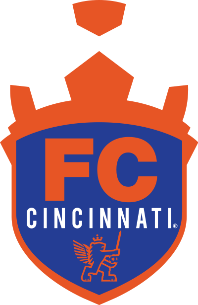
Before it was even confirmed that FC Cincinnati would get a spot in the big leagues, the club knew it would need a new logo. The old crest (shown at right) was topped with a crown that doubled as an unfocused soccer ball, and the floating elements in the logo made it difficult to use in graphics and on merchandise.
“At a point over the last couple of years, we had to just drop the island because you can’t use it,” Shemony said.
The club was also concerned that the word “Cincinnati” wasn’t featured prominently enough on the old crest. The city name was dwarfed by the large “FC” lettering above it, leading some fans to refer to the team simply as “FC.” With hundreds of other clubs using “FC” as part of their name, officials were concerned the team’s brand would be lost.
FC Cincinnati’s original crest was designed in-house. But for its new logo, the club wanted to take advantage of the city’s strong ties to advertising and design.
Shemony says FC Cincinnati considered three local design firms for the job. The team ultimately chose to work with Interbrand, the firm that had recently just completed a redesign for Italian club Juventus.
With only about two and half months to create an entire brand, work began immediately. Shemony says Interbrand signed on with FC Cincinnati on a Friday in April — about a month ahead of the announcement that the club would join MLS — and got to work early the next week.
For the next two to three weeks, Interbrand and FC Cincinnati worked through what they call a “discovery” phase. That meant focus groups with fans — Shemony estimates the team spoke with about 100 people — and three-way discussions with team officials and MLS.
The league was a constant presence in meetings between FC Cincinnati, offering advice and cautioning against ideas that could conflict with another team’s brand. One specific request the league made was to not include a front-facing winged lion on the crest, for fear it would look too similar to Orlando City’s logo.
Early on in the discussion, two things became apparent: The logo would remain a crest, and the word “Cincinnati” needed to be featured more prominently.
“[President and general manager Jeff Berding] knew he wanted that to be up front and focused. … Our club is more than just soccer, our club is the city. This is the city’s club,” Shemony said.
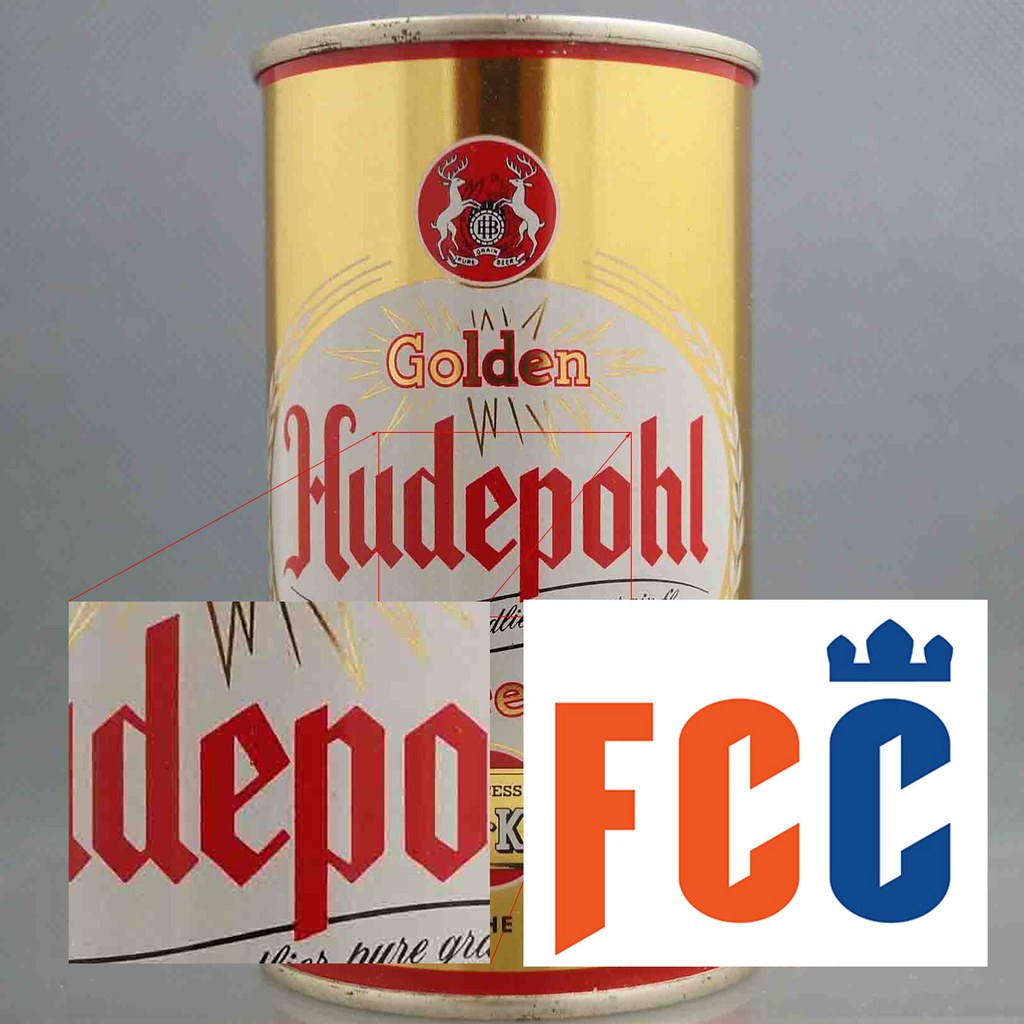
During one “discovery phase” exercise, Interbrand set up a room with tables crowded with dozens of random items. One of those items was an old Hudepohl beer can — a local beer brand that was first bottled in Cincinnati in the 1800s.
Shemony says he was drawn to the angled font elements on the can. He stopped short of calling the Hudepohl script a direct inspiration for the new wordmark, but from that point forward the team knew it wanted to use that font “language” in its crest.
About three weeks into the process — roughly a month and a half before FC Cincinnati was scheduled to present to MLS — the creative team moved on to the logo itself.
From the very beginning, FC Cincinnati decided they would be sticking with an orange and blue color scheme —a color pairing used by no other MLS team.
“We’re lucky that we’re going up to a league where that color space was wide open for us,” said Ryan Brazelton, an executive creative director with Interbrand and lifelong soccer fan who worked on the FC Cincinnati project.
The club did decide to tweak their shades of orange and blue, going with what Shemony calls a “deeper” blue and a “punchier” orange. Shemony described the old colors as “loud” and said that he could see blue and the orange “vibrate” when placed next to each other. By deepening the hue of the blue, he says the “noise” in the scheme decreased allowed the colors to work in a more “symbiotic” way.

The team also added navy blue and grey to the palate, which gave designers the opportunity to highlight certain aspects of the new logo with the new color. In the final version of the crest, the team choose to use navy to highlight the “Cincinnati” against the white elements of the crest to make the word more prominent.
“(Navy) really has a sort of richness, which we really liked. You can just open up a whole new world of things you can do with the addition of (navy),” Brazelton said.
The club considered adding a yellowish-gold color to the palette but ultimately decided against it.
With the colors set, the conversation moved to crest shape — and how to highlight a word like “Cincinnati” with limited space.
Brazelton’s first instinct was to make the crest a circle.
“Circles are great, because they’re very flexible with letter counts,” he said.
But a circle crest was never seriously considered. FC Cincinnati wanted a unique shape for its new logo. In recent years, Inter Miami CF, Atlanta United, Columbus Crew SC, and NYCFC have all unveiled circular crests.
As Interbrand struggled to find a workable shape for the new logo, the designers and the club took a trip to the neighborhood FC Cincinnati will eventually call home — the West End. The neighborhood is home to some of the oldest buildings in the city and is full of classic 19th Century architecture, which provided plenty of inspiration for the team.
“[We] found some amazing crests all over the place on archways of homes, on buildings, up high, down low, everywhere,” Shemony said.
One crest in particular caught their eye: a five-pointed crest located on the Lifehouse Worship Center located on Central Avenue, directly across the street from the site of FC Cincinnati’s future stadium. Not only was the five-point shape wide enough to house a word like “Cincinnati” but it could easily be molded to resemble the panel on a traditional soccer ball — or, the floating element in the old crest [click photo below to enlarge].

“We just felt like there was just this elegant solution in front of us,” Brazelton said. “No one in the MLS has done it, which is exciting. And then, no other tier-one team worldwide had it.”
Ironically, the building that partially inspired FC Cincinnati’s new crest will soon be torn down to make way for the new stadium.
The design group also drew inspiration from Cincinnati’s Music Hall and other architectural elements of the West End neighborhood. See more photos from the tour here.
It had been about a month and a half since Interbrand had come aboard, and the architecture of the new logo was in place. From there, the agency took about a week to play around with elements to include in the crest.
Brazelton said that as many as 10 designers were working on the logo at one time, brainstorming, sketching, and critiquing. The designers were also trying to sketch with storytelling in mind. For example, it was decided the lion’s mane would have seven notches to represent the “Seven Hills” of Cincinnati, and the feathers in the lion’s wing would represent the club’s three-year journey into MLS.
“I worked lots of different wings. Some were just a wing, some of them just fit in the crest. But then it was, what if it could fit in the crest and told a different part of our story? That’s just one element that told different parts of our story,” Brazelton said (click graphic below to enlarge).
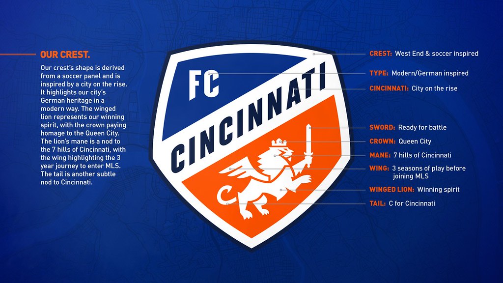
Unfortunately for Paul, myself, and all other left-handers out there, Shemony says the fact that the new winged lion is a lefty is pure coincidence. The club wanted the motion of the crest to move up and to the right, and in order to make sure all four of the lions’ paws were visible the sword needed to be in the left hand.
Though Interbrand declined to share images of work in progress with me, both Brazelton and Shemony confirmed that the agency brought two logos to FC Cincinnati for final approval: the final product, and a skinnier crest with a shape that more resembled the original logo. FC Cincinnati agreed with Interbrand that the wider five-point crest was the way to go.
But the logo wasn’t done until designers decided to shrink the lion element and the “FC” mark to show off the colors in the crest. And even then, there was still plenty of work to be done before the public could see the mark.
“Just getting the logo [done] is an eighth of the way to getting it launched,” Shemony said.
At that point, the logo was approved by Berding, FC Cincinnati’s primary owner Carl Linder III, various MLS officials, and MLS commissioner Don Garber — who, according to Shemony, had chances throughout the process to offer specific critiques.
At the All-Star Game on Aug. 1, FC Cincinnati formally presented the new mark to MLS. The club also had a meeting with Adidas and Fanatics at the All-Star game to prepare the logo for merchandising.
It’s easy to forget that while all of this was going on, FC Cincinnati was in the midst of a soccer season — a record-breaking one at that. The team finished the season with a record of 23-3-8, easily clinching the regular-season USL title.
With playoffs on the horizon, FC Cincinnati saw it as an opportunity for a soft launch of its new brand. According to Shemony, the club quietly began using its new colors in marketing materials as early as August.
If you're a 2018 Season Ticket Member, your chance to renew your membership for our inaugural season in @MLS starts in just six days!
ℹ️ https://t.co/ZATPMjkqlT#JoinTheMarch pic.twitter.com/jWsep831fo
— FC Cincinnati (@fccincinnati) August 6, 2018
“We tested it a little bit, and nobody thought it was out of place,” he said.
After FC Cincinnati’s season came to a close with a 1-0 playoff loss to New York Red Bulls II, the team shifted its focus to the brand unveiling. In addition to producing an introduction video, the club was also building a 3-D model of the crest and planning a launch party for season ticket holders and media members.
They were also keeping an eye out for logo leaks. Shemony confirmed that the new crest leaked twice in the week leading up to the unveiling. One retailer accidentally put unreleased merchandise out for sale, and a third party mistakenly pushed out a web design test, putting it online for the world to see.
The club had a plan in place to deal with the leak, and held meetings to discuss how to move forward with MLS, but declined to comment further about the process.

Immediately after the leak, supporters dubbed the new winged lion “Gary.” One supporter group even traced the negative space in the lion’s body to spell out the new name. Both Shemony and Brazelton called the find “a stretch” but lauded the fans’ creativity. “Gary” has already inspired a Twitter account and countless memes shared among supporters.
While reception has been overwhelmingly positive, both Brazelton and Shemony have seen a few common complaints. Some detractors say the crest is too plain, with not enough nods to the city.
“There’s been some comments about, ‘Hey, if you take Cincinnati off that crest and there’s nothing about Cincinnati in there.’ Well, why are you taking Cincinnati out of our crest?” Shemony said.
Some fans were disappointed that the logo didn’t include a lozenge — the diamond-shaped pattern commonly associated with Oktoberfest. FC Cincinnati has used the lozenge on its uniforms and in marketing in the past, and Shemony says that will continue — just not in the logo itself.
“While people think [the logo] is generic, it’s clean, it’s bold, it has the right colors, it has the right elements for storytelling, that that’s what’s most important,” Brazleton said.
FC Cincinnati’s redesign will continue to evolve in the coming years. There are already plans to release tertiary logos that contain partial elements of the new logo, though the team wants to establish its new logo first before gradually releasing the tertiary marks over the next few seasons.
For Shemony, he feels the new FC Cincinnati brand will be one that generations of future fans will wear and celebrate for years to come.
“It’s how it’s going to be in 50 years,” he said. “We feel this can stand the test of time.”
As for Brazelton, he’s honored to have shaped the identity of his favorite soccer club.
“I’m a huge fan, and I put my heart and soul into the process and this particular mark along with a lot of others here,” he said. “I had a couple of my buddies tell me good job and that feels good. And my mom likes it.”
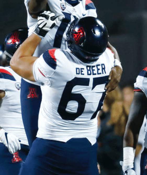
There are three ways to handle the “de” part of de Beer’s name: all caps (DE BEER), small caps (DE BEER), or lowercase (de BEER). When de Beer played at Arizona, they went with small caps:
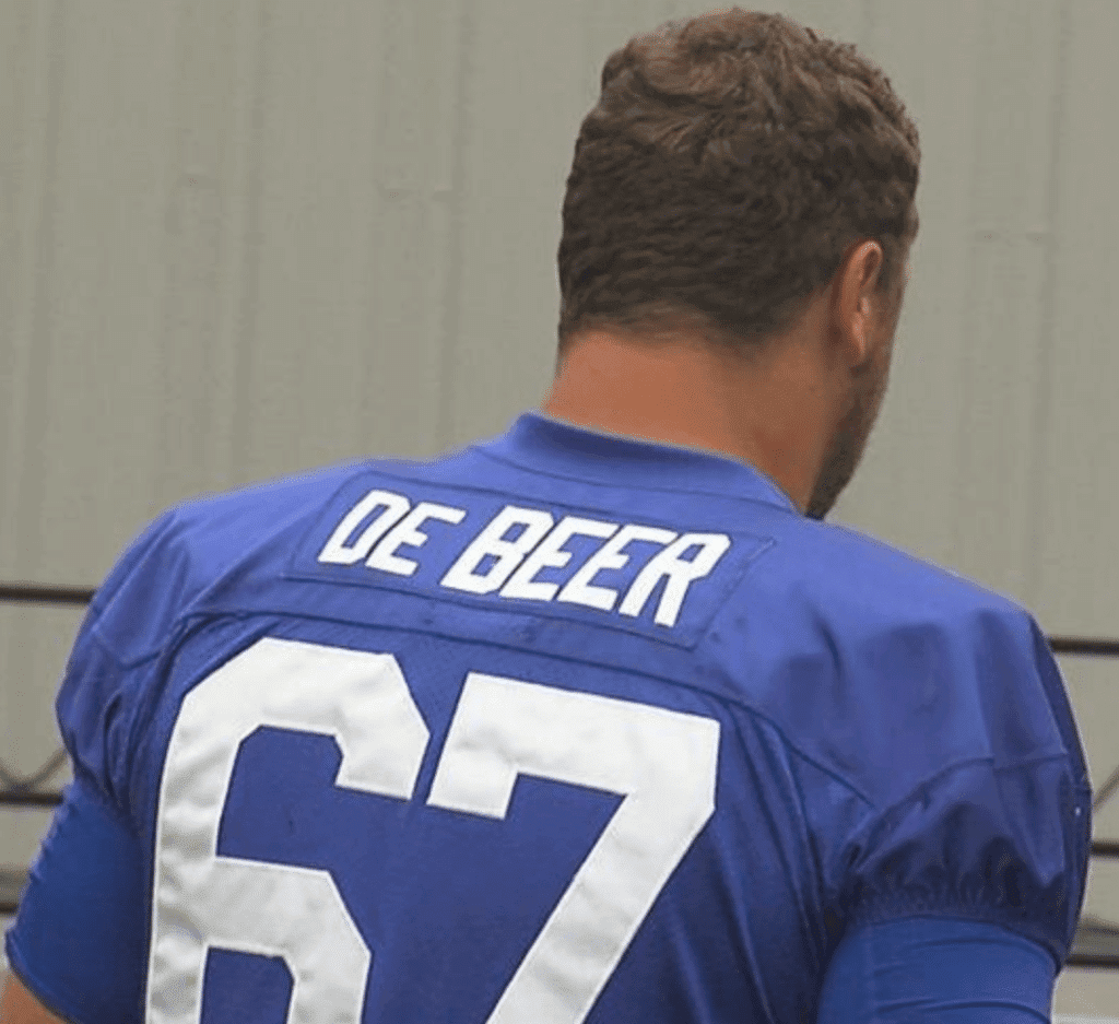
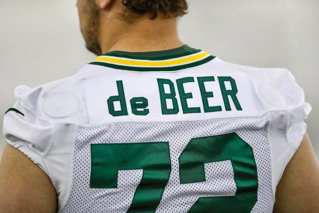
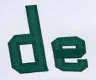
Pretty fancy with the lowercase letters, right? But wait, let’s zoom in for a closer look:
(My thanks to Jon Meerdink, Jace Rauman, John Okray, and @MF_Packers, each of whom played a key role in this one.)
“Here’s a Milwaukee Brewer hitting the ball…and a Milwaukee Brewer catching the ball!” ~ Mel Allen describes the action when the Kansas City #Royals have to wear #Brewers uniforms in a game after their uniforms go missing! (This Week In Baseball – June 1977) #TWIB #MLB #History pic.twitter.com/NAEPrty9V6
— Baseball by BSmile (@BSmile) November 29, 2018
Brew Crew times two: The great BSmile came up with this old video clip from the famous 1977 game when the Royals had to wear Brewers road uniforms for a game in Milwaukee because KC’s uniforms had been stolen (but not their batting helmets, judging from the video footage). Both teams wore powder blue on the road at the time, so the visual disconnect wasn’t too jarring, at least from a distance.
Update: Longtime readers may recall that I wrote about this game nearly six years ago. That entry had lots of screen shots from the video but not the video itself. Thanks to Mike Chamernik for the reminder!
You have to wonder what the advertisers even think they’re getting out of this arrangement, right? I mean, wouldn’t your ad just be lost in the sea of logos?
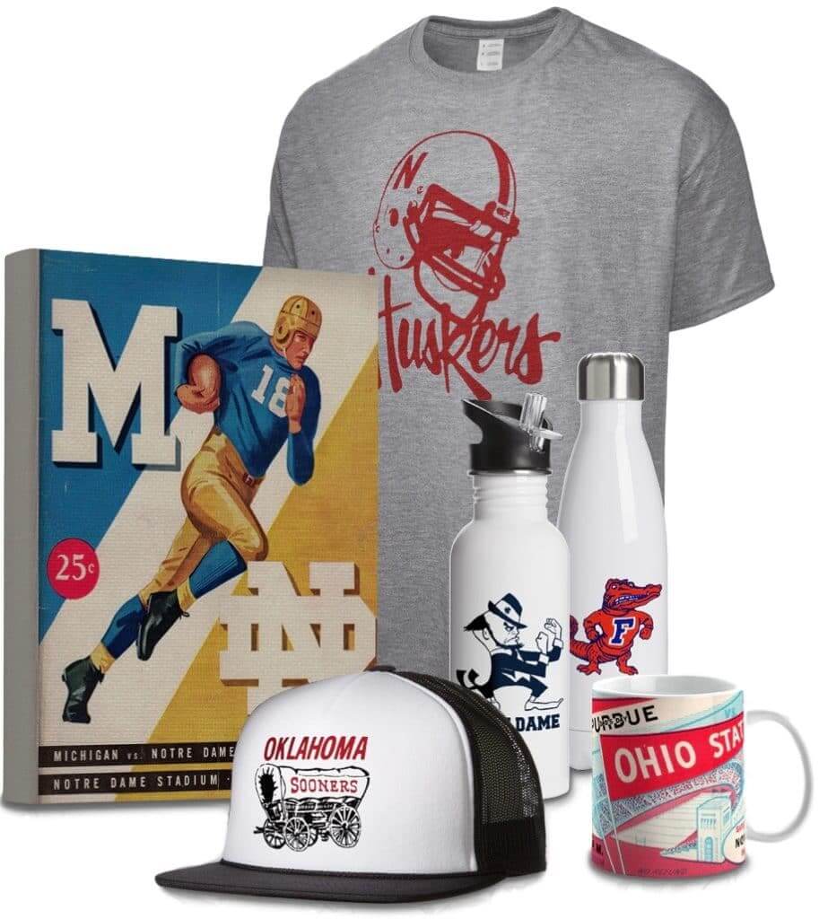
LAST CALL for the Vintage Brand raffle: In case you missed it earlier this week, we’re doing another raffle with the folks from Vintage Brand, who specialize in retro-styled sports stuff (like the items shown at right; click to enlarge). The winner will get to choose anything from the Vintage Brand site.
To enter the raffle, send an email to the raffle address by 7pm Eastern today. One entry per person. I’ll announce the winner tomorrow.
In addition, Vintage Brand is offering a site-wide 30%-off sale. The discount will automatically be applied to your order at checkout — not bad!

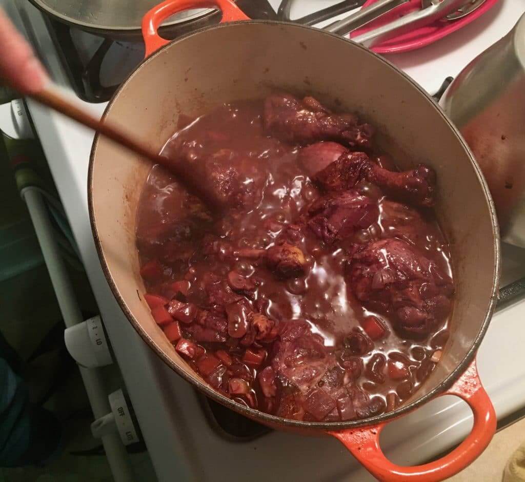
Culinary Corner: Tuesday was cold and blustery here in Brooklyn — a perfect day for a braise. I thought about doing short ribs, or lamb shanks, or even a rabbit. But in the end, I decided to do coq au vin.
Like most braises, coq au vin started out as peasant food — a way to tenderize a tough, sinewy, old rooster (that’s the coq) by slow-cooking it in red wine (that’s the vin). Of course, nowadays it’s more or less impossible to buy a rooster, so I just used supermarket chicken. The classic coq au vin recipe calls for a whole bird, cut up, but the Tugboat Captain and I both prefer dark meat, so I just got three pounds’ worth of legs and thighs. Here’s how we cooked it:
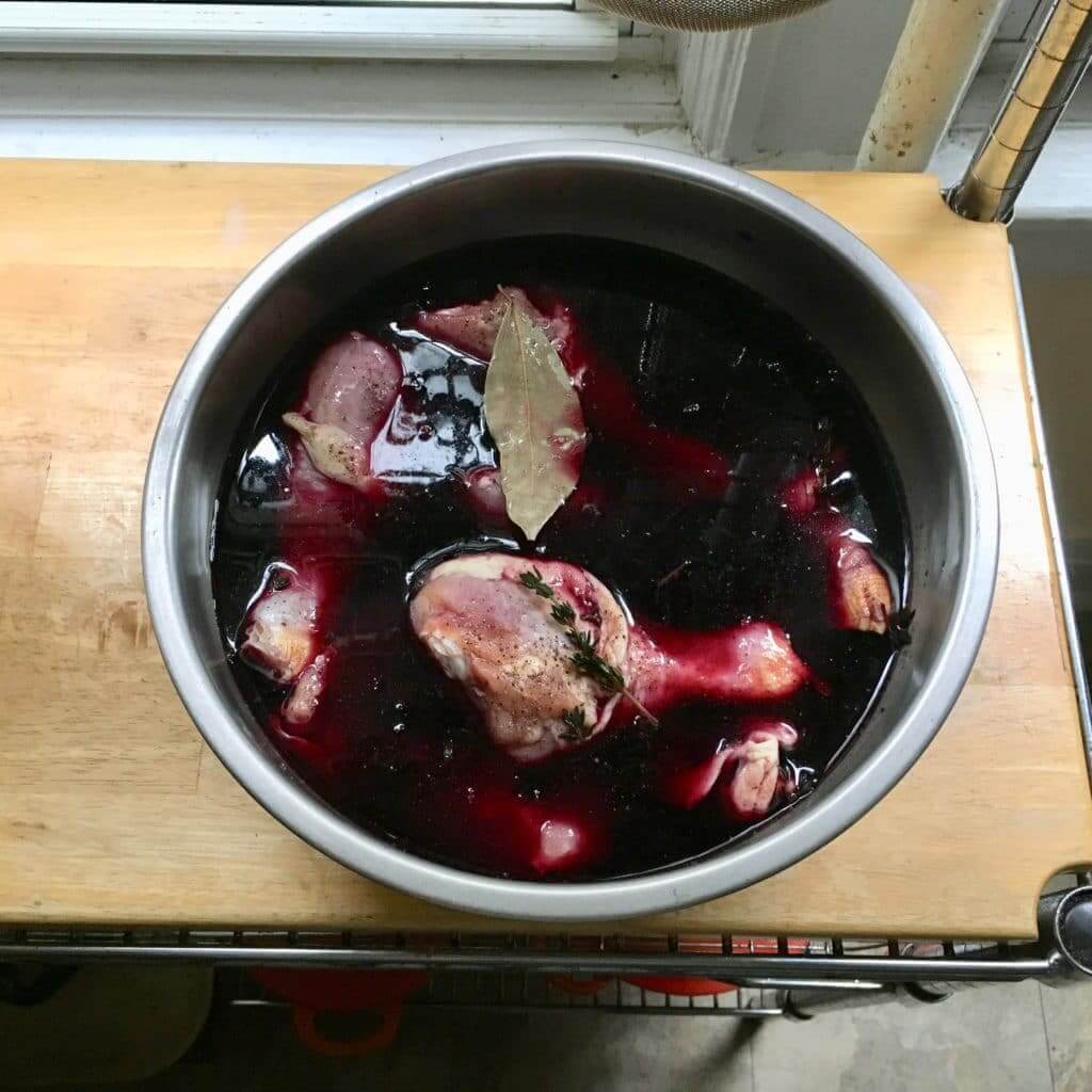
1. I seasoned the chicken with salt and pepper, put it in a big bowl with a bay leaf and some thyme, poured in a bottle of inexpensive, full-bodied red wine, covered the bowl, and put it in the fridge for four hours (for all these photos, you can click to enlarge):
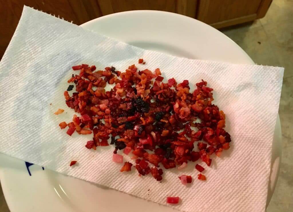
2. We took the chicken out of the fridge. Then we took about four or five ounces of bacon, cut it into little pieces, cooked it in a Dutch oven over medium-high heat for about 10 minutes, and used a slotted spoon to remove the cooked bacon and set it aside while leaving the rendered fat in the pot:

3. I removed the chicken from the wine marinade (it was now very red), patted it dry, browned it for a few minutes per side in the rendered bacon fat, and then set it aside:


4. While I was working with the chicken, the Captain cut up a large carrot, a large onion, and about four ounces of mushrooms. Once the chicken had been removed from the pot, we used that same rendered bacon fat to cook the vegetables, adding a bit of tomato paste, some minced garlic, and a bit of flour along the way:


5. At this point the recipe called for two tablespoons of brandy. We didn’t have any in the house, and it seemed a bit ridiculous to buy an expensive bottle just for two tablespoons, so I bought one of those little airline-style bottles for a buck and a half. We pushed all the vegetables to one side of the pot, poured the brandy into the other side, and lit it on fire (the burst of flame was much larger than the photo indicates!):


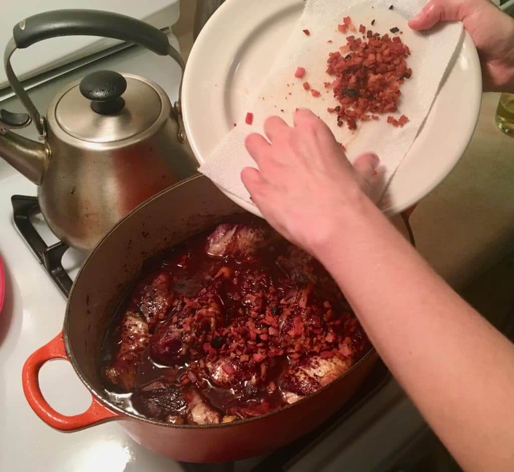
6. We took the wine that the chicken had been marinating in, added it to the pot, and boiled it for about 10 minutes to reduce it by about half. Then we added the chicken to the pot, along with half of the cooked bacon bits, and then covered the pot and let it simmer over low heat for an hour:


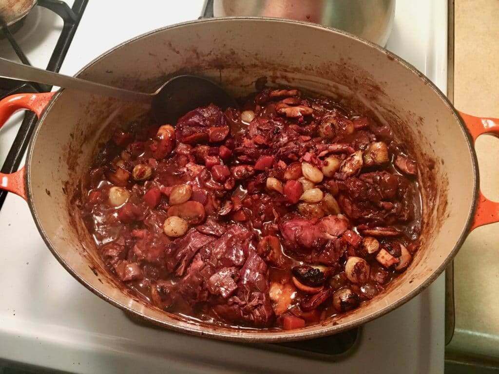
7. After an hour, we removed the cover from the pot but kept it simmering. Here’s how it looked at that point:
While the chicken kept cooking, the Captain cooked some pearl onions and some more mushrooms in a skillet. Then we added those to the pot, along with the rest of the bacon bits:


———
And that was it! We served it with some leftover mashed potatoes. Admittedly, it just looks like a brownish mess, but trust me — it was really good.

By Paul

’Skins Watch: A Canadian youth hockey association called the Manitoba Mohawks, whose logo shows an indigenous man in a traditional headdress, is changing its name and logo, with the association’s president calling it “the right thing to do” (from @ohhsourry and Phil).

Baseball News: The A’s have chosen the site for their new ballpark. Lots of additional details here (thanks, Brinke). … The Reds, who recently unveiled 15 throwback uniforms to celebrate their 150th anniversary next season, have now announced that they’ll also be giving away six throwback-clad bobbleheads (from our own Alex Hider). … New BP caps for the Rochester Red Wings (from @FletchTopper). … The Cardinals’ 2019 promo schedule includes seven jersey giveaways.

Pro Football News: Reader Brad Eenhuis was watching a 1972 Vikes/Steelers game at Three Rivers and saw this interesting end zone design. … The Bills are wearing their throwbacks for the second consecutive week. When’s the last time a team did that? Even better, the game is in Miami and the Dolphins will also be wearing throwbacks. Should be a very good-looking game (from Todd Grossmann). … Here’s a good full-body photo — more straightforward than the one we saw yesterday — of the AAF’s Arizona Hotshots uniform. … Speaking of the AAF, it appears that the Salt Lake Stallions may have a white jersey in addition to the grey one we discussed yesterday — or maybe it’s just the lighting (from @akaggie). … After switching back and forth between his old helmet and a newer model, Pats QB Tom Brady appears ready to stick with the old helmet for the rest of this season. He’ll have to make the change next year, when the old helmet will no longer be league-certified. … The Bucs are apparently going mono-red this Sunday (from John Sabol). … Here’s a good backgrounder on why the Cowboys will be wearing their mono-white alternates tonight. … The Seahawks’ had trouble with their radio-equipped helmets on both sides of the ball last Sunday.
College and High School Football News: Virginia Tech will wear maroon-maroon-white this week. “It’s the same thing they wore for Game 11,” notes Andrew Cosentino. … Ben Zoss is an assistant football coach at Morton High School in Illinois. His mom, Julie,
has been doing some DIY sewing projects with some of the team’s old jerseys, and her latest one is this nifty jersey-based backpack.

Hockey News: Chicago Steel players will each wear a unique helmet designed by area students and artists tomorrow night. The helmets will later be auctioned off to raise money for pediatric cancer patients. Further info here (from Steve Johnston and Marc-Louis Paprzyca). … Here’s a well-reported business story on Adidas’s approach to its partnership with the NHL. … The St. Louis-area O’Fallon Brewery is selling this 12-pack with period-appropriate jersey-based bottle designs honoring notable Blues enforcers from yesteryear. “My favorite bottle is the one with the referee!” says Mark Richter). … The Toledo Walleye are wearing Blackfish jerseys for Game of Thrones Weekend on Jan. 4 and 5 (from Johnny Ichrist).

NBA News: Raptors F Kawhi Leonard has inked a new endorsement deal with New Balance (from Griffin Smith). … The Suns will debut their “Los Suns” alternates tomorrow. … Sports Illustrated has ranked the 30 best jerseys (not uniforms, sigh) in NBA history (from Mike Chamernik). … Amoeba Records — a California record shop — has a Lakers-themed T-shirt (from Adam Herbst). … The Heat are 0-6 when wearing their Miami Vice alternates.

College and High School Hoops News: This article about the old TV show The White Shadow includes the following tidbit: “[Show star Ken] Howard even insisted the fictitious team’s uniform colors — orange and blue — be the same as those at his former high school” (from Adam Herbst). … Virginia student manager Grant Kersey has appeared in a few games this season wearing No. 1 with “Virginia” as the NOB. He now has his own No. 13 jersey (from our own Jamie Rathjen). … Also from Jamie: Maryland wore black at home last night. … New grey alternates for the UConn women’s team. … UTEP and New Mexico State went red vs. orange last night (from Brandon Silvertstein). … Meanwhile, UNC and Michigan went maize vs. blue. Dan Tarrant, who was watching that game, says, “It occurred to me that not only are the teams wearing the same colors they wore during the 1993 NCAA title game, but the uniform designs are basically the same as well. Seems like that would be pretty rare considering how often college teams change up designs.” … Florida State wore their turquoise N7 alternates last night (from Ben Reiff). … No photo, but Wade Toppe reports that Purdue C Carsen Edwards’s NOB remains “C. Edwards,” despite there being no other Edwardses on the roster this season. Vincent Edwards had been on the team the past couple of seasons.

Soccer News: New jersey advertiser for the Houston Dynamo (from Ignacio Salazar). … The Lansing Ignite’s uniforms will be made by Moneyball Sportswear, a local company (from Josh Hinton). … New jerseys for the San Diego Sockers.

Grab Bag: New logo in the works for Disney’s Hollywood Studios. … If you’re a sneakerhead and a video gamer, you’ll probably like Nike’s new PlayStation sneakers. … USF students don’t like the school’s new logo. … The U.S. women’s field hockey team is playing a three-game series against Belgium this week. They like to alternate between wearing red and blue, which usually results in two distinct kit matchups for a given series. This time, it’s U.S. in blue vs. Belgium in red and U.S. in red vs. Belgium in white (from our own Jamie Rathjen). … Best thing in today’s Ticker: An absolutely fascinating article about an apparel company’s attempt to produce an American-made flannel shirt (NYT link) — something that hadn’t been done in decades. It’s filled with great photos, fun characters, and faaaascinating details about textile design and production. Don’t miss (big thanks to Tom Turner).
Great job, Alex! (I’m left-handed as well.)
#metoo Lefties rule.
(if that didn’t come up it was supposed to be a left fist emoji)
RE: USF logo….
“The new logo is disgusting,” one respondent wrote.
College kids need to learn more words. “Disgusting” is not a good description.
also,
“USF invited more than 60,000 people to take the survey, the university said. Of the 772 anonymous responses, 245 came from undergraduate students.”
A 1.29% response rate? I don’t know that I would say that is a *meaningful* survey.
I’m not overly concerned about the new South Florida logo, until it starts showing up on all the sports teams’ uniforms. But I don’t see “The [other] U” going away any time soon.
Coq au vin is a great call, haven’t made that in some time. Samuel Smith’s is an even better call.
I thought that “Gary” was going to be one of those things I can’t unsee. But I can’t even force my eyes (even with the overlayed letters) to see it.
Weak.
At least now we know what their mascot’s name is going to be.
Same. I scrolled back up, thinking I’d missed something obvious, like FedEx’s logo, but the G looks like a C and that’s it.
Nothing wrong with “Gary” as an inside joke among hardcore fans. But to my eyes, the only plausible letters I see are “Car.”
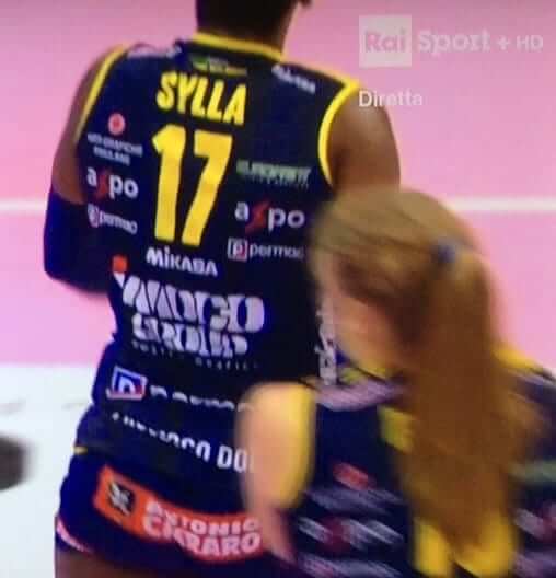
That volleyballer Sylla needs a teammate named Charybdis
also wonder if those advertisers pay a set rate per square centimeter or if location on the uniform differentiates pricing.
I think this is a situation where it is fair to call these companies sponsors. I’m sure that women’s volleyball does not generate much revenue from television or ticket sales and the league likely doesn’t exist without these companies.
Copy edit – the link for the diamond shaped pattern in the lede leaves out the ‘r’ in pattern.
I am also wondering about this quote, “”… it has the right elements for storytelling, that that’s what’s most important,” Brazleton said.”
Storytelling in a uniform is not one of my priorities. I view it as something that often leads to bad design decisions. Is it really deemed that necessary a part of the process? How about something just looking good?
Typo fixed.
Did anyone else involuntarily shudder when they read that quote?
Storytelling is an important, even vital, part of any logo design process. All design, if it’s done well, serves a purpose, and for logo design, most of that purpose is to communicate something.
Which means that it’s the job of the logo to do the communicating, to tell whatever story one intends to tell. So if a company feels the need to explain what the logo is saying, then the logo itself is, by definition, a failure. A badly designed logo. Should details of the new Cincy logo make me think of Cincinnati? Probably yes. But either they do or they don’t, and if they don’t, then a press release explaining to me what the logo should have made me see just gilds the lily of the design failure.
Like, the lion wearing a crown to make me think of “Queen City”? Maybe, though the fact that it’s a male lion, and therefore by definition not a queen, and the fact that the maned lion on its own is a common symbol of royalty, undercut the value and impact of the crown. But the shape of the mane to make me think of Cincy’s seven hills? Zero people looking at that logo will ever see the four-pointed mane and think “seven hills,” and they probably shouldn’t, so that’s a double failure of design. The first failure is the attempt to communicate something that doesn’t need communicating; the second failure is that the logo doesn’t even come close to communicating that thing anyway.
I’m interested at your approach to this, as for a lot of my favorite logos, I see no apparent story being conveyed other than their historical associations with the teams (and implicitly the cities the teams were in..)
no apparent story being conveyed other than their historical associations with the teams (and implicitly the cities the teams were in..)
And in most cases that’s sufficient. I mean, take a sentence in English. One can always object to even the best-composed sentence, “But it won’t mean anything to anybody who doesn’t already understand English grammar and vocabulary.” True! But beside the point. Any symbol must exist within some system of language to be understood, whether it’s a word, a mathematical equation, or an icon or logo. An existing team’s history and visual identity is like the grammar and vocabulary of a language, so a new logo that relies on, references, or builds upon that grammar and language can be very successful.
I can see that, but I just don’t see how one judges a logo without that time passing. If anything, the attempt at “storytelling” would leave a bad taste in my mouth. Obviously, your mileage may vary.
last item indeed linked to a good story, but did you mean to use “product” as a verb?
No. “Produce.” Now fixed!
I hope de Beer makes the Packers official roster because he would have the most popular retail jersey on the team
Uni Watch actually wrote about the 1977 Brewers-Royals game a few years ago: link
The Dolphins will also be wearing throwbacks for consecutive weeks. Dec 9 vs the Patriots.
Paul, how many of your culinary corner installments involve:
Your reading a recipe vs.
having the recipe in your head vs.
winging it?
Just curious.
Good question! It varies. Generally speaking, I tend to follow recipes the first time I make something and then fuck around with the recipes for subsequent renditions. If it’s something that isn’t too complex, I pretty much establish my own way or doing it and don’t need to refer to a recipe after the first few times.
In this case, I hadn’t made coq au vin for many years, so I looked around on the web for a recipe, found a couple that looked good, ultimately settled on one, and mostly followed it (with a few deviations).
Chicken recipe sounds fantastic!
Haven’t had time to get to the UPS store and send your BBQ sauce. I’m off work for a couple weeks during Christmas. Hopefully BBQ Clause will get it shipped in time for the Holidays.
Great article. I like the crest, but one thing stuck out to me the first time I saw it: the lion’s tail looks very similar to the “C” in the Cleveland Tourism logo, which I think is also on the Cavs’ “city” uniform.
Here’s the Cleveland Tourism logo: link
My first instinct was the tail looked like the Cavs C, but I see where you’re coming from!
Paul- Very strong Culinary Corner today. Better than some cooking blogs. Do you have a specific “uniform” that you wear to cook with? I wear an apron for most big cooking projects. I was very meticulous about finding the right apron. Chef gear is kind of like sports uniforms. It has to be functional, fit correctly, serve a specific purpose, but also visually appealing.
However, like a lot of sports, no specific wearable equipment is required. If you want you to can just go for it.
I probably *should* wear an apron (esp for a recipe that includes lots of sloshing wine and splattering bacon fat), but I don’t. No uniform of any kind. Just whatever I’m wearing around the house!
Thanks for doing the FCC story, but ugh, it doesn’t just bury the lede, it completely ignores it.
“Gary”–the centerpiece of the logo and primary symbol of the team–is the lion of St. Mark the Evangelist, the patron saint of Venice. The team’s original marketing materials and Berding confirmed this when the team was launched.
What does that symbol have to do with Cincinnati? Nothing, of course. Lindner is a devout Christian and like several other owners, he wanted his team branding to be about him and his interests (VGK, Bobcats, etc). Berding and his staff came up with the nonsense idea that “Gary” was a symbol of “evangelizing soccer” to cover for it. It still has zero to do with Cincy.
Everything else in the new logo is clumsy, retroactive attempt to appease the critics who say it doesn’t reference Cincy. But they’re right. Their logo is a lion (a increasingly overused cliche in US soccer logos at all levels – the lion has no history or symbolism here) and a religious symbol. And it’s Italian. Was Cincinnati dubbed the Venice of Ohio? Should modern sports logos reference and highlight a specific religion?
It’s a joke, hardly representative of a city that should demand better. And the author should do a bit more research.
The thing is that the team did not mention the connection at all at the MLS launch – they just called it “the winged lion.”
It may be worth a mention, but it wasn’t emphasized by the team themselves.
Paul, so are you going to propose to your girlfriend on Christmas or what? You’ve been dating long enough and you live together.
Wow. Has it occurred to you that (a) maybe we have a different concept of “long enough” than you do, and/or (b) maybe she could propose to me instead of me to her, and/or (c) maybe we have no interest in the institution of marriage, and/or (d) maybe there are lots more complications and issues in our relationship than you can glean from my blog posts?
I’m not saying any of those is the case. I’m just stuck by the number of breathtaking assumptions in your comment. Honestly, what could lead someone to ask such a personal question?
Well i’ve read you daily since inception, so with your family/travel/food posts over the years, I’ve kind of gotten to actually care about your life & well-being. Like you’re an honorary family member who I just don’t see.
Thanks, Johnny — I appreciate that, and the impulse behind it. And I’ve certainly felt a similar connection to other people whose work I’ve followed. But I hope you can also understand that that’s not really an appropriate question to ask.
Speaking of inappropriate questions (no, I am not about to ask you one!), when is the next installment of “Ask Paul Anything?”
Seems to have been some time.
Lee
Good point. OK — soon!
Maybe a “Question Time” segment is on the horizon?
Nice backpack, Ben. Glad to see my alma mater is still showing its Potter — er, Hog Pride!
With the 1 shell rule in the NFL, how is Tom Brady alternating between 2 helmets?
link
Too bad Cincinnati didn’t have more time to design their logo
I think that new logo for the Rochester Red Wings is very creative and cool!
Agreed! A sleeper candidate for the best new revision in MiLB this offseason.
I must have misread the item from Sports Illustrated ranking NBA jerseys – I thought it said “best,” but then I saw Raptors Barney, Sixers black, Knicks with BFBS, Pistons teal horse, I can’t take it. Serves me right for clicking that link.
Now, the Culinary Corner entry was oustanding! Thanks.
apologies to all the cincy FC fans but that logo reminds me of the Food Lion (low end grocery store) logo
link
Food Lion is “low-end”? I’ve never thought of it as such. (Granted, we don’t have FL up here in the northeast, but I’ve been in my share of FLs while traveling and they always seemed like your pretty standard suburban supermarkets.)
Living right in the heart of Food Lion country (and having worked there as a teenager), I would say that “low end” is probably appropriate when compared to other supermarkets in the area.
It kind of depends on how you understand the term…Food Lion’s stores are kind of no-frills, their prices are usually lower than other chains’, their selection isn’t quite as good (although you can certainly get most national brands on common items), and they are less likely to be located in affluent areas.
Gotta admit this is one topic I never thought I’d be commenting on here…
Does anyone have any insight as to what the small sew circles sewn onto the Green Bay Packers practice jersey may be for? They’re to the left and right of the players name plate. I noticed the same thing earlier this year during pre season during episode of Hard Knocks with the Cleveland Browns.
Sensors. Sort of like Fitbits.