
By Phil Hecken
Follow @PhilHecken
A short while ago, I was contacted by Trevor Tierney, a designer who has reimagined all 32 NFL teams. If that name sounds slightly familiar to you, well, it’s because he was selected by Paul as the “Best Overall Design” winner in Paul’s ESPN contest to redesign the Jacksonville Jaguars held earlier this year. If you didn’t click on that link, here’s Trevor’s winning design. Of that, Paul remarked,
Small design elements can sometimes resonate in a big way. That’s the case with Tierney’s entry, which features unusual striping on the sleeves and the pants. In both cases, the gold stripe in the center pops just enough to provide some warmth throughout the design. A modern-looking uniform set that somehow feels a bit traditional — a nifty trick. Well done.
I’m wont to agree with Mr. Lukas here. Curious, I asked if Trevor had more redesigns than just the Jags and indeed, he had done an entire NFL “rebrand,” though I would call these more redesigns than rebrands. We’ll take a look at those today, with brief descriptions from Trevor. Interestingly, Trevor had also realigned the conferences and divisions along with his redesigns (for example, putting the Bills, Patriots, Giants and Jets together in the “AFC East”).
While traditionalists, and I’d include myself in that, have often pushed back at changing the conference alignments of the NFL (and even moreso for MLB), but maybe it’s time for that as well, at least in theory. But that’s for another day (and probably another website).
So, today I’ll bring you Trevor’s AFC (as it currently exists) redesigns, and next time we’ll look at the NFC. I’m loathe to ever critique designs (especially since I can’t do better, at least graphically, than 99% of them), but I want to point out that Trevor has used the previous Nike template for his designs — which has resulted in truncated pants striping (a design element I can’t abide) — so I tried to picture all these new designs with full pants striping. I have to say, some of these are really interesting and have out-of-the-box thinking! Many keep the “classic” unis we’re used to seeing with just some very minor tweaks. Either way, enjoy! Click any image to enlarge.
AFC Rebrand
By Trevor Tierney
AFC East

BUFFALO BILLS:
Bills has a minor logo change thanks to Rant Sports. Used a western font for “Bills” and last name nameplate. Red stripe mimicking red stripe of the Bills logo itself.

MIAMI DOLPHINS:
Dolphins return to helmet wearing logo, but updated. Sublimated waves on shoulders. Inspired by Miami Vice and the Heat uniforms the Dolphins have a black alternate. Miami word mark on helmets and dolphin logo patch on front of jersey.

NEW YORK JETS:
Jets return to a kelly green helmet and older logo. Jet patches on shoulder sleeves and also includes a gray alternate. Military themed kind of.

NEW ENGLAND PATRIOTS:
Patriots return to all white helmet and updated logo. Alternate gray jersey with 13 stars on pants and revolutionary war cannon patches on shoulders.
AFC North

CINCINNATI BENGALS:
Bengals inspired by the current white color rush uniform, I designed the rest of the set. Flipped the helmet colors and used older word mark for jerseys.

CLEVELAND BROWNS:
Browns finally get a helmet logo. Simple uniform set with unique pointed stripe on shoulders and going down pant. Returned to brighter orange instead of the current dark orange.

BALTIMORE RAVENS:
Ravens see minor changes. Helmet has logo on one side w number on opposite. Raven wings sublimated into shoulder area of each jersey. Brought back the gold pants as well.

PITTSBURGH STEELERS:
Steelers use the colors in their logo in the uniform more. Shoulders have stars of yellow, red, and blue. Gray alternate and more pant options.
AFC South

INDIANAPOLIS COLTS:
Colts go with matte gray helmets and include grey throughout the uniform set. Added third color creates more uniform possibilities.

JACKSONVILLE JAGUARS:
Jaguars return to two toned helmet, but not as flashy as the gold. Jerseys and pants have claw marks with minimal gold, but not removed like the current set.

HOUSTON TEXANS:
Texans inspired by the Oilers with the black, baby blue, and red. Helmet logos like the eagles, but instead with the Texan horns.

TENNESSEE TITANS:
Titans return to white helmet and include the greek theme more. White chrome facemark and alternate logo on helmet.
AFC West

DENVER BRONCOS:
Broncos return to more of a royal blue and includes mountain logos. Logo a mix of old and new and helmet goes matte gray. One of the few teams w 4 different uniform sets.

“SAN DIEGO” CHARGERS:
Chargers move back to SD and go with a classic with return of powder blues and primary as well as helmet numbers under the bolt and yellow pants. Navy blue alt as well.

KANSAS CITY CHIEFS:
Chiefs change helmets to headdress looking logo. “KC” appears on front of jerseys. Arrowheads on sleeves.

“LAS VEGAS” RAIDERS:
Raiders moving to Vegas decide to throw gold into the mix. Sublimated stressed flags on shoulders create more of an actual raider look.
And there you have it, the AFC. Thanks, Trevor — we’ll check out your NFC designs next time around!


Kreindler’s Korner
I had the distinct pleasure of featuring the wonderful artwork of artist Graig Kriendler on two occasions over the summer and fall of 2017, and more recently, in August of 2018.
For those who don’t wish to click the links, Graig paints baseball heroes (and regular guys) from the past, and is an immense talent.
Occasionally, I will be featuring his work on Uni Watch.
Here’s today’s offering (click to enlarge):

Title: “Runaway Train”
Subject: Walter Johnson, 1914
Medium: Oil on linen
Size: 20″ x 20″Expectations for Walter Johnson’s performance during the 1914 season were pretty high. Though he had pitched incredibly well for the Senators since his rookie year, 1913 was the season that really made the right-hander perhaps the foremost hurler in all of baseball.
The pride of Allen County, Kansas captured the Most Valuable Player award from Chalmers Motors that year with some impressive numbers. Johnson won thirty-six games and lost only seven. That figure led the entire major leagues, as did his winning percentage of .837, his ERA of 1.14, his twenty-nine complete games, his 346 innings pitched, his 243 strikeouts, and his eleven shutouts. The batters in the American League were practically helpless against him, averaging a mere .187. Walter also only walked thirty-eight of them – less than one per nine innings. He also had multiple winning streaks of fourteen, ten and seven games. Five of those thirty-six games were by 1-0, six by 2-1, fifteen by one run, and six by two. He was a perfect 7-0 in relief and was an astonishing 20-3 on the road. In the field, he handled 103 chances without an error. And offensively, he batted .261 with an impressive .433 slugging average.
His stellar season earned him a $5,000 raise to $12,000 for the 1914 campaign. But perhaps most importantly, that spring, Walter renewed his acquaintance with Hazel Lee Roberts. The daughter of a Nevada congressman, she was a beautiful debutante in the Washington social scene. Though in attendance at the President and Mrs. Taft’s silver wedding jubilee at the White House in 1911, she was also quite an athlete herself – a part of the Carson City High School girls’ basketball team, Nevada state champions in 1909. She would become captain of that same team in 1910. And in those same years, she acted in her high school production of Julius Caser, sketched and wrote poetry. She was also active in the suffragist movement, playing a prominent role in the demonstration for women’s voting rights in Washington in 1913.
It was at the Dewey Hotel at 13th and L in Washington, D.C., where their paths crossed for the first time. The first class apartment-hotel included a number of congressional families as its tenants, as well as many of the ballplayers on the Senators. When the two of them met, by all accounts they were instantly smitten with each other. They were married on the night of June 24, 1914, at a small ceremony at the Roberts’ new apartment on Monroe Street.
That year, the ‘distracted’ Walter Johnson won ‘only’ twenty-eight games.
Thanks, Graig! You can (and should!) follow Graig on Twitter.

Colorize This! Returns…
…with George Chilvers
Long time readers know that for years I’ve run a feature on Uni Watch called “Colorize This!” which feature the colorization efforts of Uni Watch readers, most often run as a sub-lede. Lately I haven’t had any submissions for this, although I have done a few ledes with new colorizers being featured.
Today, long time friend and colorizer (colouriser) extraordinaire George Chilvers is back with a fantastic soccer (football) colorization. Great to hear from George and pleased he’s made a triumphant return! Click to enlarge both the colorized photo as well as the original that is beneath it!
Here’s George:
Hi Phil
Hope you’re keeping well.
I have realised I haven’t wheeled out the Amazing Colourising Time Machine for you for a little while, so I’ve taken off the dust covers, oiled the sprockets and wound it up with the big key and it’s here ready for a trip. So if anyone wants to jump aboard there’s plenty of room (no need to push at the back) and once everyone is seated with their seat belts fastened I’ll set the dials to the year 1910 and the place to Barcelona in Spain.
We arrive at the studio of a photographer where in front of us we find the local football (soccer) team arrayed in front of a quite magnificent painted backdrop. The team had just won the Copa del Rey, which was considered the Spanish Championship in those days. They wore the now famous azulgrana kit, but back then the shirts were halved rather than the current stripes. The team of course have gone on to great things in the following century or so.


I hope you’ve enjoyed today’s little trip out, and if so could people please let me know so I can keep the Time Machine ready for another trip.
Best wishes to all
George
Thanks George! Great stuff as always. PLEASE let him know if you enjoyed this so he graces us with more of these beauts in the future!
Duck & PAC & ACC Tracking
Due to traveling, I was “off” last weekend, which means there was no SMUW. I had given Terry, Joe and all the trackers the weekend off as well, but Dennis Bolt — my Duck and PAC tracker — as well as Rex Henry (the ACC) did provide their usual material. Since I didn’t run it last weekend, I’m running that portion today. Dennis and the whole SMUW crew will be back tomorrow (and with it being rivalry weekend, who knows what we’ll see teams trotting out today). First the DT, then the PAC & ACC Tracker…

Welcome to the 2018 Oregon Ducks Uni Tracker. This little project was originally begun way back in 2008-09 by Michael Princip, who retired after several seasons, whereupon the project was continued by Tim E. O’Brien. He, too, retired from the tracking, but the project has been ably kept up by the man who also tracks the Pac12, Dennis Bolt.
Here’s this week’s Uniform Combo for the Ducks (you can click to enlarge):

You can read about this uniform, and MUCH MORE, by checking out the Duck Tracker here!
PAC Tracking

PAC-12
More here.
Follow Dennis on Twitter here.
Thanks Dennis!

ACC
More Here.
Follow Rex on Twitter here.
Thanks, Rex!

Sale reminders: Paul here. There some bargains to be had over the next few days if you shop wisely:
• Our flex-fit Uni Watch alternate cap, originally priced at $29.99, is only $19.99 from now through the end of Monday. Order yours here.
• Ebbets Field Flannels is running a site-wide sale. From now through at least the end of Monday, you can get 25% off your order by using the checkout code CYBER18. That effectively reduces the price of our Uni Watch classic cap from $49 to $36.75.
• You can get 15% off of our StripeRite socks — and off of everything else on the American Trench website — by using the checkout code BFCM. This discount is available through Monday. (Regarding the socks, we’ve now sold out of the green design, which means the three-packs are no longer available either. But the blue and black designs are still available.)
You can see all of our other Uni Watch products, including a few that you may have forgotten about, on this handy one-stop-shopping page. My thanks, as always, for your consideration of our products.
Contest reminder: Paul here, still. Don’t forget that I’m conducting a design contest for the potential new NHL franchise in Seattle. Here’s the skinny:
• Your entry must include a team name, a primary logo, full home and road uniforms (jerseys, pants, socks, helmets), and an inaugural-season logo that can be worn as a patch. If you like, you can also include secondary logos, an alternate uniform, and a center ice design, but those aren’t required.
• You can draw upon Seattle’s rich hockey history or start from scratch. Up to you!
• Your designs can be created in any digital or analog medium (Illustrator, Photoshop, crayon, whatever) and can be submitted in any standard digital format (JPG, PDF, TIFF, etc.). You can also create a video presentation, upload it to YouTube, and submit the YouTube link as your entry.
• The files you submit should be named after yourself (PaulLukas.jpg, for example). If you’re submitting multiple files, please either number them (PaulLukas1.jpg, PaulLukas2.jpg, etc.) or use some other designation (PaulLukas-homeuni.jpg, PaulLukas-logo.jpg, etc.). Files that don’t follow this format will not be considered.
• In keeping with longstanding Uni Watch chromatic policy, entries with even a hint of purple will not be considered.
• Email your entry to Uni Watch HQ (note that this address is just for contest submissions — please don’t use the usual Uni Watch email address). If you have more than one concept, feel free to enter as many times as you like.
• Deadline: Monday, Nov. 26, 7 p.m. ET.
The best entries will be showcased in one of my upcoming ESPN columns. Good luck!
Naming Wrongs update: Paul again. After we did the Naming Wrongs shirts for the Bradley Center (in Bucks and Marquette treatments), we had a lot of requests for MECCA shirts, and those are now ready. We have five designs — gold with a court layout, gold with the center-court diamond, green with a green-rainbow stripes, green without the stripes, and grey:
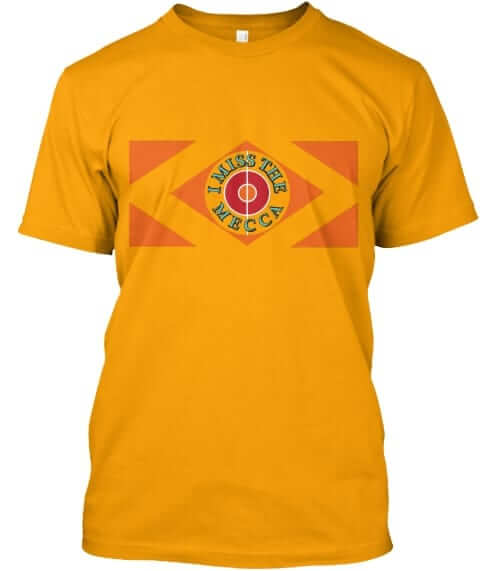
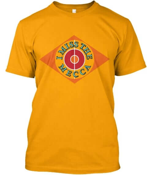
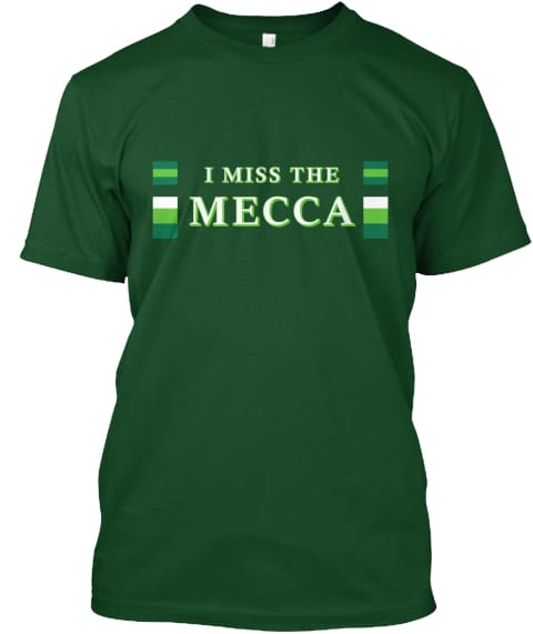
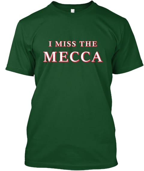
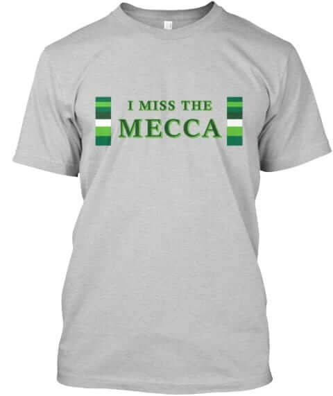
These shirts are now available in the Naming Wrongs shop, where card-carrying Uni Watch members can get a 15% discount. My thanks, as always, for considering our products.
Uni Watch News Ticker
By Phil

Baseball News: Love this old photo of Rickey Henderson in wedding gown white. That uni is perfection (from Goat Jerseys). … Here’s a look at some new Seibu Lions alternate uniforms for 2019. Graveyard Baseball explains they combine the past colors of black (1950-1972) and bright blue (1979-2008). “We Are One” is on the new sleeve patch. … More Japanese unis: The Yokohama DeNA BayStars unveiled a throwback uniform for the 70th Anniversary. The BayStars was called TAIYO Whales, when it founded. The throwback uniform will be worn in exhibition game (Mar.10 2019). From @BigDaddy45. … Great shot of baseball legend Babe Ruth shopping for a new wooden console radio while wearing his New York #Yankees road uniform! Bruce Menard notes it’s from the 1930’s. I’m not sure who’s posing with Ruth (I think it could be Bobby Jones, golf great, while B thinks it’s possibly Billy Werber).

NFL/CFL News: Oh good. The Philadelphia Eagles announced they’re wearing their all-black alternate uniforms for their Week 12 home game against the New York Giants. As far as BFBS jerseys (and pants?) go, these aren’t the worst in the league, and one could make the argument that since the Eagles already have black in their color palette, they’re not even BFBS. … In case you did not know yet, the name announcement for Halifax expansion team happened on Friday night (from Wade Heidt). … “This was on the Houston Texans FB page; possible decal or patch?” asks Al Gruell. (*Update* It will be a helmet decal.) … Reader/tweeter Ignacio Salazar found this Houston Oilers drink glass gem hiding in the cabinet back at his mom’s. 100% guaranteed to make your drinks colder and better tasting. … Check out this 1972 Bears/Cardinals game where at least one player is wearing a road jersey with wrong number style from everyone else (from MBDChicago). … The Bills will be throwing back Sunday against the Jaguars, who will be wearing mono black. … Yesterday, our pal Chris Creamer had a nice article detailing the Calgary Stamps uni history. The Grey Cup is this weekend, and the Stamps will play the Ottawa RedBlacks.
College/High School Football News: Taking a bow in Kenan Stadium Saturday will be UNC Tar Heel slot receiver Thomas Jackson, a former walk-on who displayed over 5 years the same traits that earned his father the nickname “Bulldog” in the late 1960s. Submitter James Gilbert points out he’s wearing his dad’s number, too! … Temple will be wearing all white today (from Blake Fox). … Tweeter Josh Claywell notes he “didn’t know the Colts put their logo on the Indiana state football trophies. Also, that patch in the third photo looks an awful lot like an NBA Finals logo. Also also, Webo is Western Boone.”

Hockey News: In what I can only assume is somewhat of a rarity for the AHL’s Stockton Heat vs. the San Diego Gulls, a color vs. color game was played. The Gulls wore purple jerseys and socks for Cancer Awareness (from Gregory Smith).


NBA & College Hoops News: In case you missed it, on Wednesday, the Golden State Warriors debuted their ‘Classic’ jerseys to honor their 1975 NBA championship team. Damn, those are beauties. … The Oklahoma Sooners Women’s team debuted their anthracite alternates yesterday (via Paul). The Men’s teams also got the anthracite unis. … Good look at the TOSU alternates; here’s another (from B Turner).

Soccer News: Who doesn’t love mash-ups (besides almost everyone)? Reader Neil Smith writes, “I saw this article on soccer shirt mash ups (combining years’ worth of designs into one collage shirt). Hope you find it interesting/useful.” … Every sport has its own “ugly” jerseys, but these soccer kit tops may be the worst of all. … Speaking of awful jerseys, Manchester United’s fourth jersey has leaked online. … Did Aresenal’s new jerseys for next season leak online? … Here are uniforms from Dallas and Utica City FC of Major Arena Soccer League (from Marc Viquez).

Grab Bag: My pal Jimmer Vilk looks to be parting with a ton of his electronic football figures (hey Gene Sanny — has he been in touch with you yet?). Not all of them, though, as he’s saving a few to turn into ski jumpers. … While there aren’t a lot of ladies in Formula One ranks, there could be a less obvious reason for this than we thought: It’s tough for them to fit well into the cars (NYT Link). From Paul. … Reader Jon Solomonson “Stumbled onto someone’s post/blog regarding a bowling trip in Japan, and the Etiquette Guide that was distributed to them,” He adds, “The characters are very “Speed Racer” like. They have translated it as well.”
I can’t quite see the colts as anything else but blue and white- and I tried after picturing it in my head what it would look like on the field. I think they will always be blue and white to me. The other updates were pretty nice. I love the idea of the Texans going back to the OIlers colors! Great color combo.
Trevor’s design for the Colts is a throwback nod to the brief period when the Colts did wear silver trim:
link
link
Is it? He seems to like grey..a lot lol
I’ve always wondered if it was a conscious decision by the Bears to go with one-color block numbers on their 1972-73 road whites. My guess is it was just a bit of oversight in an era when “branding” wasn’t taken so seriously.
It was “jersey technology” at the time. The Bears jerseys with the block numbers were mesh fabric worn for warmer games; they still had the durene jerseys with the rounded numbers with the orange outlines. The block numbers were screened on (or were heat pressed or something like that). They also had warm weather blue jerseys with no stripes but the normal rounded numbers (with outlines) sewn on; the wore their normal durene jerseys with stripes when it got colder.
I guess the jersey makers couldn’t get the stripes with outlines and numbers printed onto the mesh fabric correctly until a bit later in the 1970s – by 1974 the Bears had the full stripes and correct numbers on their mesh jerseys.
Thanks for making sense of this! I remember the stripeless navy jerseys, too. So that was a warm-weather dark jersey, interesting!
Good post. Function over form with the mesh.
The Browns should never ever have a helmet logo. Why mess with perfection?
Couldn’t agree more!!!
I would argue the 2014 uniforms were perfect, too.
Exactly! I think their current helmets look pretty cool
The use of the hypocycloid colors on the Steelers Jersey is a smart and subtle touch. The Chiefs helmet in one word ….. NO.
Great job on the colorization George!
I’ve always thought adding a touch of gold to the Raiders’ unis would be proper for the Vegas move. Just a thin line/ pinstripe around the shield and outside the stripe on the helmet, the numbers on the jerseys, and outside the pant stripe.
I sincerely hope not. Trevor put a lot of work into those but the Raider set makes me ill to my stomach.
I like the ideas for some of the AFC redesigns. Some would never work, already great traditional uniforms for some teams: Raiders, Chiefs, and Colts come to mind. And since there was a comment about realigning divisions, let’s get real crazy and reenvision an NFL where teams have just two jerseys. A dark/color for home, and a white for road.
Great work trevor but can i get mr yuk over all those skanky swooshes in the upper right hand corners?
Yeah…I don’t understand why these amateur designers put a logo – any logo – in their work like that. It’s just…odd. Unless you work for Nike and these were spec designs that came from professional focus groups or something, it reeks of corporate brainwashing. And I’m someone that loves Nike.
Interesting azulgrana-related fact: Real Madrid have lost all four games they’ve played this season against teams that wear red and blue stripes. Besides Barcelona, it’s also CSKA Moscow, Levante, and Eibar (today).
Keep up the good work, George!
Not fond of some of the pants striping (Dolphins, Broncos and Broncos) and never thought I would say this phrase: I like the Jags’ two toned helmet.
Not much for me to get excited about in those redesigns. So packed full of BFBS,GFGS. Some teams need help but I don’t see much help here.
Buffalo Bills – Love all three of these – grade: A+ but lose the gross corporate logo in upper rt hand corner
Miami Dolphins Love the aqua and white set. The BFBS made me vomit in my mouth a little. Grade C+ because of the BFBS. Would have been an A+ for bringing back the vintage logo on helmet LOSE THAT NIKE LOGO IN UPPER RIGHT HAND CORNER
New England Patriots I don’t mind the grey uniform too much but would rather see red jersey than blue Grade B+
New York Jets Fine with these A- but DUMP THAT NIKE SWOOSH ALREADY
Cincinnati Bengals I liked the classic B-E-N-G-A-L-S helmet but I know that will never come back so I can live with this set and those stripes. B+ but that nike swoosh is TRASH
Cleveland Browns Loved that fukk out of these. Even though I like the plain helmet with no logo this one doesn’t hurt too bad. Grade A minus………….why do these have Nike swooshes in them???
Baltimore Ravens – Big BIG fan of these. I wish the gold pants were FULLTIME! (If you had made the swoosh gold I would have been okay with it)
Pittsburgh Steelers the white and black are fine but that grey looks like piss. C+ (the gold swoosh saved you here from failing grade)
Houston Texans A+ for getting away from navy blue but the helmet is dumb so C+ there = overall grade of B+
Indianapolis Colts I like the change to the grey helmet. – A minus
Jacksonville Jaguars The jags colors do nothing for me and this is no worse or better than what they have no grade = B minus
Tennessee Titans I actually like the new set of unis they have but these are decent too. B+
Denver Broncos A+ on these just because I am so tired of their current uniforms
Kansas City Chiefs – these are okay uniform wise but that helmet is awful and if I cant wear a headdress to a game why can players wear one during the game. Plus their current KC in the arrow is classic. C+ because helmet is out of control
Los Angeles Chargers- grade B – looks like what they already have
Oakland Raiders D+ – the raiders are perfect as they are today (except for Gruden’s coaching)
Great work and effort by why the nike logos, seriously?
Some nice designs in there! But oof… murdered my Broncos haha. Too much going on in that redesign.
I appreciate the update to the Chiefs uniforms, but why mess with perfection? The helmet would never make it on the field. I would have suggested maybe lose the arrowhead on the helmet, and leave the KC there, enlarging it? Not cover the whole helmet, but make it the size of the arrowhead that is currently there. Also the Chiefs took their name from the mayor of Kansas City at the time they were being lured to KC, Harold Roe Barlte, and his nickname, “The Chief”. Unlike Washington, their name is not derogatory towards Native Americans, so the headdress on the helmet would just bring controversy.
I hope I never live to see them go GFGS. I actually would love to see them lose gold altogether, and just be red and black. Go with some black shadowing around the numbers, and just a solid red stripe on the pants or just leave them all white for home.
How about we fix the inconsistencies with the KC on the helmet and the logo everywhere else?
What about grey face masks? Black? Hell lets get the nose bumper issue fixed?
I appreciate the effort and the time you put in though!
One word for the entire set.
Yuk.
Why does this site keep giving time to mediocre work (today), or plagiarists or even conmen? Just because somebody has concepts doesn’t mean they deserve to be highlighted.
Definitely NOT Bobby Jones in the picture with Babe Ruth.
Love the Miami Nights looking alt for the Dolphins!
Many thanks to Graig and George for their Saturday morning eye candy!
The Warriors didn’t wear those gold uniforms when winning the 1974-75 title. The uniforms worn last night debuted in 1975-76. The Warriors uniforms read “Golden State” in the title season. Same uniform otherwise but still bad history lesson by the team. You’d think they’d know better and could simply check their own archives or watch a 1975 NBA Finals game on YouTube.
It looks like Ohio State ditched the throwback idea.
I wonder why the Buckeyes didnt wear them?
Welcome back George. Great work on your colorization.
That Rickey Henderson photo was perfect eye bleach after those awful redesigns.
There are some decent ideas in some of those concepts, but the only one I liked as a full set was the Chargers concept, mainly because of fixing the orientation of the shoulder bolts. The sideways bolts of the past decade-plus have driven me nuts.
I would like these designs a WHOLE lot more if the pants striping ran completely down the leg instead of being in an ugly little block. Every time I’ve seen pants striping like that it looks awful
Bills: A- The red needs to be more vibrant in all of the unis
Dolphins: B. Don’t like the font very much and the BFBS uniform looks awful, along with the Marlins and Heat BFBS look. The first two look fantastic, along with the wave design on the pant stripes and shoulder.
Jets: B- I don’t like the Kelly green look…maybe because I wasn’t around to see it. But it looks better then their current look. Love the alternates though.
Patriots: A. Love the new logo on the helmet, and the alternate unis. Not to sure about the cannons and the stars along the helmet and pant stripes though. Much better than their current look
Bengals: C+. Like the idea of the the flipped colors helmet, but the tiger stripes need to be orange on the home and away unis. Loses their look.
Browns: B. Like the lighter brown/orange. Not to sure about the helmet logo. Kinda reminds me of the Boston Bruins logo. Like their current helmets better
Ravens: A. Love the raven wings and the purple alternates. Still don’t get why Paul doesn’t like purple on unis.
Steelers: A. Like the idea of the blue, gold, and red lines on the shoulders. Love the gray alternates.
Colts: A- No major changes in the jersey and pants, which is good. Not sure about the grey in the home look, or in the helmets in general. Maybe keep the grey helmets with the alternate.
Jags: B- Love the BFBS. Two tones helmets are good, not great. White unis good. Not to sure about the blue. It’s rwally hard in my opinion to pull off a really good looking uniform with those colors, but that’s one of the better ones I’ve seen.
Texans: C-. Not to sure about that chalky blue. Again, wasn’t around while the oilers existed. Not to sure the blue helmets would look good at all with the red unis. Like the horn part of the helmet though, saves it from D+
Titans: A- Love the unis a lot. Would be an A but the helmet stripe is weird. Starts thick at the bottom, and gradually disappears at the other side. Shooting for a sword there?
Broncos: A+. Love the unis! Absolutely the best! Was going to give it an A because of those orange unis, but couldn’t bring myself to do it. The best part is the Rocky Mountains on the helmet and on the pant stripes. Oh man, I can’t get over these!
Chargers: A+. Love these. Powder blue for the bolts is the best. Like what you did with the pant stripes. Very clever with the navy blue unis, making the inside of the bolt navy blue. That fixes a huge problem.
Chiefs. *deep breath*. Ok, they were cool when I first saw them. Then I hated them. Was planning on a big fat F. The helmets. The gold unis. But now they’ve grown on me again. The helmets are still crazy. Fix that with the first two unis. The gold has grown on me, and the helmets match those, even though they are still crazy. Like the arrowhead idea on the shoulders though. Final grade, C+
Raiders: B- I’ve liked every grey uni you’ve designed, its an underrated look for all teams, including my Seahawks. The font is iffy, and the gold idea was clever, and fitting, but don’t like it. Can’t wait for NFC
Probably not a colour vs colour game in the AHL. Those are just warm up jerseys that are typically auctioned off and the money goes to cancer research. I like this site but the hockey portion is a tire fire…