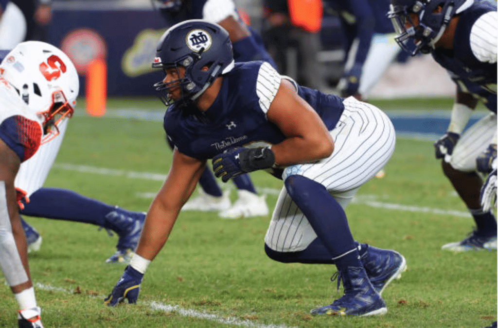
Paul here, checking in from Virginia, where I’m spending the weekend. Phil is also traveling this weekend, so we’ll have an abbreviated entry today, beginning with a look at Notre Dame’s Yankees-themed uniforms costumes from yesterday’s game against Syracuse. I’ll say this much for the Irish: At least all of them went high-cuffed with their pinstriped pants, which is more than most of the real Yankees can say. Aside from that, it was about as silly as you’d expect. Lots of additional photos here.
At the other end of the aesthetic, there was the annual UCLA/USC game, which once again found the Bruins and Trojans going color vs. color, to spectacular effect:
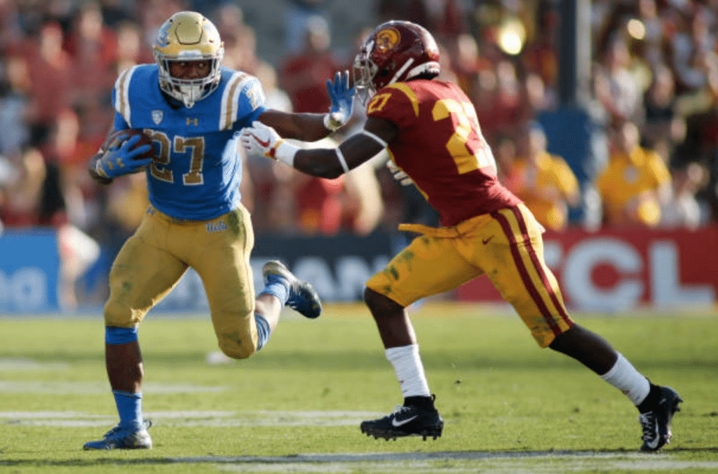
Lots of additional photos from that one are available here.
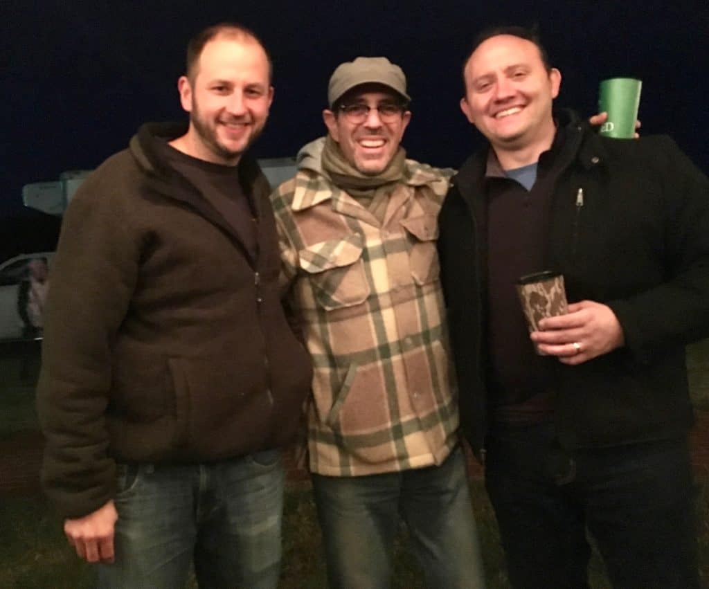
Fellow travelers: The guy on the left is longtime Uni Watch reader Fran Simmonds, and on the right is his buddy Tony, with yours truly in between. Fran and Tony live in Rochester, N.Y., but Fran liked my story about last year’s oyster roast on Virginia’s Eastern Shore so much that he decided to drive down for this year’s edition, which took place last night. I was attending this year’s event as well, so Fran spotted me and introduced himself — a nice surprise!
As for the oyster roast, it was pretty much the same as last year’s, by which I mean it was tremendous. These two video clips capture the spirit of the proceedings:
Although the guy in that second video got himself a pea crab, the crabs were in much shorter supply this year. I only got one myself — dang.
Contest reminder: In case you missed it on Friday, ESPN.com’s hockey editor has asked me to have a design contest for the potential new NHL franchise in Seattle, so that’s what we’re going to do. Here’s the skinny:
• Your entry must include a team name, a primary logo, full home and road uniforms (jerseys, pants, socks, helmets), and an inaugural-season logo that can be worn as a patch. If you like, you can also include secondary logos, an alternate uniform, and a center ice design, but those aren’t required.
• You can draw upon Seattle’s rich hockey history or start from scratch. Up to you!
• Your designs can be created in any digital or analog medium (Illustrator, Photoshop, crayon, whatever) and can be submitted in any standard digital format (JPG, PDF, TIFF, etc.). You can also create a video presentation, upload it to YouTube, and submit the YouTube link as your entry.
• The files you submit should be named after yourself (PaulLukas.jpg, for example). If you’re submitting multiple files, please either number them (PaulLukas1.jpg, PaulLukas2.jpg, etc.) or use some other designation (PaulLukas-homeuni.jpg, PaulLukas-logo.jpg, etc.). Files that don’t follow this format will not be considered.
• In keeping with longstanding Uni Watch chromatic policy, entries with even a hint of purple will not be considered.
• Email your entry to Uni Watch HQ (note that this address is just for contest submissions — please don’t use the usual Uni Watch email address). If you have more than one concept, feel free to enter as many times as you like.
• Deadline: Monday, Nov. 26, 7 p.m. ET.
The best entries will be showcased in one of my upcoming ESPN columns. Good luck!
I’m driving back to NYC later today, and we’ll have full content tomorrow. Thanks for bearing with us this weekend. — Paul
Too much bandwagon hate for those ND/Yankees unis. I don’t love them, but they were fun as a one-off for a game at Yankee Stadium. They should have had gold helmets.
Instead of dismissing a swell of opinion as a “bandwagon,” have you considered the possibility that perhaps the people who said they don’t like the uniform sincerely don’t like the uniform?
Crazy idea, I know.
Fair enough. Point made and taken, and you’re right.
I just felt like I don’t like the way they look, but for enjoyed them for one game in the specific scenario.
Fair enough. Always better to argue a case on its merits instead of asserting that the other side is operating in bad faith.
It pains me to see a storied program like ND go the route of these idiotic theme uniforms. AND I’m a lifelong Yankee fan.
On a positive note, does anyone do Color vs. Color better than USC-UCLA?
Personally I loved Notre Dame’s Yankee theme unis. At first I hated them but then I realized that the first pictures that everyone saw of the uniform back in August really didn’t do it justice. But to see actual ND players in the unis on TV was a thing of beauty imo.
I think the phenomenon you’re describing is not “bandwagon,” it’s “kneejerk.” As in, my own first reaction to the ND/Yankees uniforms was intensely negative, without even thinking about it, motivated in part by the sheer unfamiliarity of Notre Dame looking like the Yankees and of the Yankees uniform elements being so strongly represented on a football uniform. That instant, unthinking critical response is a kneejerk response; my reaction was in no way informed by my perception of the popularity of the opinion.
And this would seem to be an example of the fact that a kneejerk opinion can be correct.
Being of Irish ancestry, I know a good number of diehard Notre Dame fans, and most have taken a so-bad-it’s-good approach to the unis. You shake your head and chuckle ruefully. Making the Yankees/Irish mashup uni the really bad pun of college football uniforms.
The whole thing reeked of cutesiness. Is it out of line to think that maybe Yankee Stadium should have been honored to host Notre Dame in their iconic, usual uniforms?
Oh hell yeah! Time for some college football uni tracking Canadian rules style!
And then there were the 4 conference champions:
link
They battled on Saturday hoping to add some more hardware to the trophy cases. The national semi-finals for the Uteck and Mitchell Bowls and a berth in the Vanier Cup:
link
-Uteck Bowl in Quebec City:
Laval Rouge et Or switching up the uniform combination again. Looking more like the “Rouge et Noir”. Laval went black/red/black. Visiting St. Francis Xavier X-Men wore white over navy.
link
-Mitchell Bowl in London, ON:
Western Ontario Mustangs went silver/purple/purple. The visiting Saskatchewan Huskies wore the same look they have been wearing during this road playoff winning streak. White over green.
link
Saskatchewan has kept a pretty standard look for helmet and uniforms this season. Differs a lot from a few years back when they had multiple helmets and uniforms.
Bonus:
Not only is there pro and university football in Canada. There is junior football as well. Think of how hockey has junior hockey, kind of same idea.
-Canadian Junior Football League championship, the Canadian Bowl, occurred this weekend in Saskatoon, SK:
Prairie conference champion Saskatoon Hilltops wore their standard yellow/blue/blue. BC conference champions Langley Rams wore mono-white:
link
Canadian university athletic nicknames are sooooo good.
Plenty of good nicknames. And there is always the possibility of the Huskies vs. Huskies in the Vanier Cup. Maroon-clad Huskies from Saint Mary’s and green-clad Huskies from Saskatchewan. Which has actually happened.
How the Huskies vs Huskies looked in 1990 Vanier Cup:
link
Also met each other in 2002 Vanier Cup:
link
That link looks a lot better than what he would be stuck with in the major professional sports in the USA!
I thought I would like the ND uniforms. I was wrong.
not only were the ND costumes horrible, but Syracuse’s were awful and didn’t even have the benefit of a clever excuse
Navy’s set yesterday was grim too.
so as not to be relentlessly negative, Army looked great
Syracuse was dressed as pumpkin spice Stanford.
Oddly, I don’t think the ND-Yankee uniforms are that bad.
If you don’t look at it as a Notre Dame uniform and take away the pinstriped sleeves, it turns into an almost OK uni. By no means great and maybe not even good but there are worse NCAA uniforms.
Anyone see that the philly / NO jersey colors this week were decided by a golf bet?
Sorry if this is a repeat.
Yeah, it’s been mentioned here a few times, but I understand that not everyone reads every post or every comment every day.
1. ECHL – like
2. Silly
3. Not giving proper respect to the tradition of their look
Other than that, ND looked OK
Two points on the Notre Dame look yesterday:
– After seeing them, I starting thinking as long as they were going to “tie in” (for lack of a better term) to the Yankees uniforms, they should have gone all out and used a white pinstripe jersey with the ND logo where the NY sits and an all navy helmet with the ND in the front like a batting helmet. I guess they still would have to put numbers on the front of the jerseys, but otherwise they could have had it looking a lot like a football version of the Yankees…
– I’ll nitpick with Paul here and say that even if a one-off uniform looks a little goofy or “costume-ish”, it’s still a uniform by definition because everybody on the team is wearing it.
it’s still a uniform by definition because everybody on the team is wearing it.
Yes, of course. Anything a team wears is a uniform. But some uniforms are created with the essential purpose of being costumes. This is one of those uniforms.
Santa’s elves and the Seven Dwarfs essentially wear uniforms – but if they are clownish, I like that they are referred to as costumes. A running joke on UW that needs to keep running.
If you’re looking for a well outfitted football game, look no further than Harvard-Yale:
link
Agreed, except Harvard needs to wash their white pants…
:-)
Good one. :) It’s cool that at least one old school team wears the “natural cotton” color that generic football pants came in for decades.
Was watching the USC-UCLA game when the announcers discussed the color-vs-color uniform match-up and its recent re-introduction. I think all their info was spot-on, but I don’t remember the time of the game when this was brought up.
Here’s something kind of interesting, and sorry if I missed it on the ticker during the past week, but on the team Instagram account, the Carolina Panthers announced that they would be wearing their black jersey/black pants combination today against the Lions. Which wouldn’t be a big deal, but the game is in Detroit, where the Lions always wear blue.
Has anybody heard that the Lions were going to wear white at home, or has the NFL approved a color vs. color game since the black would be a stark enough contrast to the Lion’s blues?
Lions are probably in their grey uniforms today.
Wade, you are correct, that’s what they are wearing now. Forgot all about those. Or maybe just blocked them from my memory.
Confirmed. Not an attractive game.
The ND unis didn’t look so bad when NBC wa showing an aerial view of Yankee Stadium.
In all seriousness, I think what made them so bad, at least to me, was that it was Notre Dame wearing them. They aren’t one of these schools that needs to wear crazy costumes to attract student-athletes. They already have a uniform that could be on the Mt. Rushmore of college football units. Why the need to pretend to be someone else? You dont see Alabama, Penn State, or USC doing this.
Not having a full SMUW is tough.
Here is what I liked:
Harvard – Yale
USC-UCLA
Indiana-Michigan
What I didn’t like
ND-Syracuse
Vanderbilt in mono black with white helmets
OSU in mono black with orange chrome domes
Just one guy’s opinion, just the games I saw.
There is only one true OSU. You must be referring to Oklahoma State or Oregon State.
I didn’t type TOSU. :)
Just discovered the big jersey vendor won’t let me order a #37 Joe DeLaney Chiefs jersey. Given I can get other deceased player’s jerseys if I wanted them… (Sean Taylor, Derrick Thomas, etc.) I wonder why DeLaney isn’t allowed.
I don’t know the exact answer to your question, but it may be because it’s spelled Delaney. Not DeLaney. Maybe try that.
I did. It doesn’t care about capitalization. (Btw, my phone autocorrects to the DeL spelling. Have no clue wh)
Capitalization doesn’t matter to the form.
Possibly, at the request of Delaney’s family.
Which is to be respected.
When two NFL QBs are on the field at the same time how does the NFL handle the green dot rule and the one helmet rule?
one must wear a secondary helmet. this is the only exception for the one helmet rule, is to have one green dot helmet and one non green dot helmet.
Uni-watch has become unwatchable. This website, while I understand the need to make money, has become total garbage with the advertisements. It’s just such bullshit, and completely hypocritical with Paul crying about NBA unis wearing advertising patches meanwhile his website turned into a Sunday paper flyer. 15 years of beautiful content blown up by adverts. :/
Sorry you think there are too many ads on Uni Watch. Frankly, I agree. But when I told people earlier this year that I was going to scrap the ads and move a paid-subscription model, everyone plotzed. Basically, people think they’re entitled to free content. And you seem to think you’re entitled to free *ad-free* content. It’s a no-win situation.
As for your accusation of hypocrisy, I suggest you read this:
link
̶D̶a̶m̶n̶ Dame Yankees
One – At least we have an idea of what the Yankees uniforms will look like with the Under Armour logo.
Two – My kingdom for USC/UCLA every week
Three (and more importantly) – TWO straight years of you practically being in my backyard and I missed it. I’m just going to circle the calendar for next year’s Oyster roast and assume you will be there
Nothing better looking than the USC/UCLA game midday with the sun shining on these beautiful uniforms. Best looking game in CFB.
Objectively speaking, from a pure design aspect, what was wrong with the ND uniforms? They seemed to have many of the design elements that this audience would approve of.
As a Notre Dame fan, I prefer gold helmets, overall but I thought they were pretty cool.
The Yankee-style Notre Dame uniforms are beautiful.
And colour-vs.-colour match-ups should be illegal.
Yet another comment on the ND uniforms.
I thought they were perfect for what they were. I know a lot of the traditionalists on this page don’t think ND needs the crazy alternatives, and normally I would fall in that camp. But the fact of the matter is that recruits love costumes like these. I think ND handles it the best way possible. They don’t do BFBS, they only wear them once, and it is attached to a specific game in a specific location each year. They are clearly doing it better than OSU, OU, UM (was not a fan of those all yellows last year) UF, etc.
On the uniforms specifically, I thought the sleeves weren’t the best, for some reason UA seems to try and make them work to no avail. I would’ve kept it the same but got rid of the sleeves and had pinstriping in the numbers.
I also know that Paul has pointed out that the teams that make it to the CFP traditionally have classic uniforms, not the ridiculous costumes, and therefore don’t need gimmicks like this. While that’s a good point, Clemson makes it regularly and they at least can mix and match, OSU has those awful black uniforms, and OU has those wood themed ones, and Bama, well Bama has the best coach of all time.
In the end, they do it for the players, and as a die hard domer, I can stomach one game a year of this, so long as they don’t add black.