
Paul here, checking in from Virginia, where I’m spending the weekend. Phil is also traveling this weekend, and the rest of the Uni Watch crew has the weekend off, so we’re filling the gap with a weekend post from the past — a really good one that originally ran in 2015. Some of the links no longer work, but you’ll still get the gist. Enjoy.
The Greatest Uni Year in Baseball
By Phil Hecken
Ahhh…1969. Woodstock, the Moon Landing, the Beatles were still together. The Manson Murders, the Stonewall Riots. Lots of things were happening in that eventful year.
It was also, in my humble opinion, the absolute apex for baseball uniforms — the best year, bar none, of all the years in baseball. Baseball had just expanded (for the third time in less than 10 years) to include four new cities, three of which never had major league teams before, and spread out across the USA and into Canada (San Diego, Montreal and Seattle, plus Kansas City). Teams still wore flannel, but the uniforms were tailored and fit a bit snugly. Stirrups were (of course) still worn, but slightly higher than they had been for decades. Only two or three clubs (technically) had an alternate uniform, but not everyone wore only white or gray. Almost every club wore the Jerry Dior patch. We still hadn’t witnessed the scourge of pullovers and sansabelt polyester.
In short, it was perfection on the diamond. Sure, not every team would be wearing the “best” uniform in their history during this year, but many were. I only wish I weren’t three years old when it took place.
Lets take a quick look at the uniforms each team wore in 1969. I think you’ll agree with me that you’d be hard-pressed to find another year when baseball uniforms looked so good. Click any photo below to enlarge.

Not their greatest uni, but still solid. Pinstripes at home, gray on the road, classic “A” on the cap.

Dressed to the Nines shows the O’s with a vest (and with all clubs who wore one this season, it was a true vest, not the sleeveless shirt of recent vintage, like the Rockies still wear). Other than the thicker font, this is definitely one of the O’s best ever unis. And the roads said “Baltimore.”

Classic home uni, basically their best look ever. I’m not as big a fan of the block outline “BOSTON” for the road grays (in a non-Tuscan font), but still a good look. Almost perfect.

Not their greatest uni (that would be what they were born in), but still a good looking set nonetheless. The caps still had the “halo” on them — probably the second greatest cap in history — and second only to another cap worn in 1969. The contrasting sleeves and stirrups bring it down just a smidge, as does the “ANGELS” on the roadie.

This is just a gorgeous set — probably the second best set in their uniform history (I prefer the zipper-front, non-pin just slightly more), but as a home and road combo, it’s probably their best historically. They may have had a bad year in 1969 (as well as 1909 thru present), but uni-wise, they were great.

OK. Not the best ChiSox home uni by any means (but they’ve had plenty worse over the years), but that road uni is beautiful, and (I’m sure some will disagree with me), one of only two seasons where a MLB club wore darker sanis than stirrups — a unique look they quickly jettisoned. But those roads were awesome.

It doesn’t get much better than this. Seriously, it doesn’t. When you think of the quintessential Reds uniform, this is it.

While this isn’t one of my personal favorite sets, there’s no denying this one is still pretty good looking. The zipper-front vest (!), the stirrups — that would look good today, and was still one of the better sets in the Indians history.

Best uni set in Tigers history. Classic. The block “DETROIT” on the roads should be brought back.

I’ve often said the 1965 (first “Astros” uni) set was their best, and they were still wearing that look in 1969 (they’d keep this until 1970, before swapping in the orange cap and uni elements). Still a beautiful uniform today, I was hoping they’d bring it back on a full-time basis.

A beautiful set, and almost their best look ever — for that, they’d need to wear their button-front powder blue roads, but it’s pretty close. The Royals don’t look bad in gray…they just look better in light blue.

Lets face it — the Dodgers have looked great for decades, and this uni is great looking, just adding to the uni awesomeness that was 1969.

Their best set was probably their first uni set in 1961, but this is still stellar. Their 1969 roadie is still their best road uniform ever.

Without question, this was the best uni the Expos ever wore. A new team, a new country — that crazy cap. Fantastic.

Lots of incredible stuff happened in 1969. The Mets taking down the mighty 109-win Baltimore Orioles to win the World Series was just one of those things. And those are certainly the greatest uniforms ever worn by the Amazin’s.

The Yankees have pretty much been wearing the same set since the 1930s. It looked great then, it looks great now, and it looked great in 1969.

A white, a gray and a gold (the horror!). I kid, of course, but the A’s were always one of the more progressive clubs when it came to uniform design (or at least they used to be, now they’re just like everyone else). But that vest set in 1969 was still gorgeous. Not their best ever (yes, I liked their next set — with the polyester pullovers and multiple caps/tops — because they basically invented it) but still a fine, fine uniform for 1969.

This was basically the set the “Whiz Kids” wore more than a decade previously, and it was a great set. Maybe not as great as when their red became maroon in the next decade, but a great set nevertheless.

Easily one of the best sets the Pirates ever wore (yes, I have a soft spot for the mustard Pirates set that would follow — again, because it was the first polyester uni in the bigs, although it led to mayhem when almost everyone followed suit). But this one was an all time classic. For some reason, the Pirates did not wear the Jerry Dior patch this year.

Another new club for 1969, I’ve always felt the Padres homes were their best home uni ever. I confess to liking their all gold road unis introduced a few years later a bit better than the ’69 roads, but this was still a fine set.

McCovey, Mays and Marichal all wore this uniform and looked damn good doing it. Just a great looking set.

This was one of the greatest uniforms of all time, and it’s a shame the Pilots only lasted one year (although the team the Pilots would become, the Brewers, basically used the shells of these uniforms in early 1970). The road uniform was perfection, and the scrambled eggs cap remains (IMHO) the greatest cap in MLB history.

This is basically (and arguably) the greatest uniform the Redbirds have ever worn (I’ve always loved this particular uniform, with the zipper-front and shoulder striping — a look that needs to return on some team). But the 1969 set, with the red cap on the road, is pretty damn close to perfection.

Once the original Washington club left for Minnesota, the Senators Part II never really had great unis, but this was probably the best of the bunch. It wasn’t bad, but it was pretty basic — almost like they were just biding time until they moved to their next venue. Basic, but not bad by any means. The classic ‘curly W’ and script “Senators” was still a fine way to round out the greatest uniform year of all time.
OK readers — what do you think? Clearly, opinions are just that, and I’m sure many of you will disagree with me — but if you do, what do you think was a better year for unis? Sure, we look back fondly at those crazy uniforms of the mid/late 1970s nostaglically, but there were some bad unis in the group. But hey, I’d love to hear what you think. Fire away.
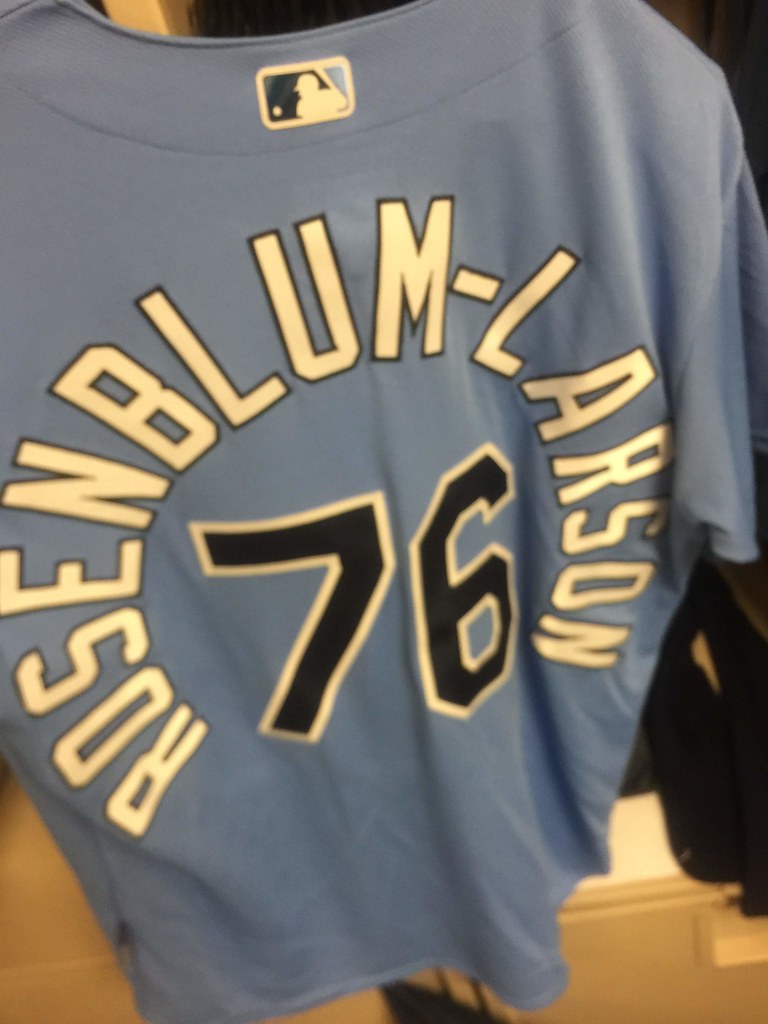
NOB jobs, continued: Reader Alex Rabens has a cousin, named Simon Rosenblum-Larson, who was recently drafted by the Rays. He just received the uniform for his spring training instructional league invite — check out that NOB! Fifteen letters, plus the hypen. If he ever makes it to the bigs, that would beat out Salty for the MLB record. Of course, there have been other long-surnamed minor leaguers who never got the big league call-up, so we’ll have to wait and see whether Rosenblum-Larson is a contender or a pretender.
Contest reminder: In case you missed it on Friday, ESPN.com’s hockey editor has asked me to have a design contest for the potential new NHL franchise in Seattle, so that’s what we’re going to do! Here’s the skinny:
• Your entry must include a team name, a primary logo, full home and road uniforms (jerseys, pants, socks, helmets), and an inaugural-season logo that can be worn as a patch. If you like, you can also include secondary logos, an alternate uniform, and a center ice design, but those aren’t required.
• You can draw upon Seattle’s rich hockey history or start from scratch. Up to you!
• Your designs can be created in any digital or analog medium (Illustrator, Photoshop, crayon, whatever) and can be submitted in any standard digital format (JPG, PDF, TIFF, etc.). You can also create a video presentation, upload it to YouTube, and submit the YouTube link as your entry.
• The files you submit should be named after yourself (PaulLukas.jpg, for example). If you’re submitting multiple files, please either number them (PaulLukas1.jpg, PaulLukas2.jpg, etc.) or use some other designation (PaulLukas-homeuni.jpg, PaulLukas-logo.jpg, etc.). Files that don’t follow this format will not be considered.
• In keeping with longstanding Uni Watch chromatic policy, entries with even a hint of purple will not be considered.
• Email your entry to Uni Watch HQ (note that this address is just for contest submissions — please don’t use the usual Uni Watch email address). If you have more than one concept, feel free to enter as many times as you like.
• Deadline: Monday, Nov. 26, 7 p.m. ET.
The best entries will be showcased in one of my upcoming ESPN columns. Good luck!
One of those hyperlinks under the White Sox section led me to a spam porn site. Not sure how that happened. You might want to look into it, though.
Lots of the links are broken, and the White Sox one goes to a spam porn site. Probably want to check that before you post and old article next time.
Looks like Paul fixed it. Sorry about that.
Here is something for our homemade ticker today:
Hockey news:
The WHL’s Kootenay Ice wore Cranbook Colts throwback uniforms last night. The Colts were a junior “B” or junior “A” team at times from 1971 to 1998. The junior team that existed in Cranbrook prior to the place getting the WHL when the Ice relocated from Edmonton.
link
Those White Sox roads are glorious! Love the MLB logo on all the uniforms, though it looks a little crowded on vests. I only have a few teams where I think they had better uniform years. I prefer Royals in road gray, but there are a few teams I wish had tried powder blues as I think it would have looked unique (or terrible!) with their color scheme (San Diego or Oakland).
Concerned Reader: I hate it when I copy something to my clipboard, then some time passes and I forget it’s still there.
No, the best cap on the field in 1969 was the Expos. The Expos that year were a team with great caps and mediocre uniforms. The best Expos unis, by far, were the racing stripe set that followed with the power blue roads. Easily top-five uniforms in the history of baseball, whereas the inaugural uniforms aren’t even top-ten in 1969.
The points of continuity with 50 years ago are interesting. A number of teams have stayed pretty constant since then, but a number of teams have moved away from and then re-embraced their 1969 looks. The Sox, Astros, Twins, and Nats all wear updated versions of their caps from that year after periods of distinctly different uniforms. Braves and Orioles sort of, too. And Cleveland’s block-C caps strongly echo their 1969 navy-on-red look in terms of color use and balance.
Idea for a weekend series: Dressed to the Nines, in which the league-wide uniforms are compared among the years that end with a 9. I think that 1939 and 1989 could give ‘69 a run for the money. Looking at year-by-year uni spreads, it sort of feels like the 9’s represent nice crossover years when the trends of the outgoing decade have been refined and a handful of new elements are coming into play.
I think the years 1992-93 are relevant in this discussion as well. Teal and purple are introduced to the league, a number of teams undergo makeovers, do away with pullovers, adopt the headspoon look, etc. But I am partial to 1969 most of those unis are perfect.
Funny how in Jim Bouton’s “Ball Four” he describes the 1969 Seattle Pilots as looking like “clowns.”
Been a Cards fan my whole life, and I’ve never understood people who say the road grays look better with the red hats. The red always looks like a mismatch to me (and to all the Cards fans I know who care).
Exactly!
It sounds weird to say, but with the red caps it’s almost too much when paired with the gray uniforms.
Red shoes, Navy Belt, Red Undersleeves, Navy Cap.
Classic look, great color contrast, makes a distinction between home and road beyond the gray, and keeps a huge part of Cardinals headwear history alive.
Every team looks great with the exception of the Indians. I’ve never liked when they go heavy on the red. It just looks off for some reason.
Love the big Chief Wahoo on the front though!
The Red Sox home uniforms lose points because they have no piping.
I wish MLB would have a Traditional Weekend similar to Players’ Weekend but each team wears flannel uniforms and hats that look like how they did in 1969 (Made by Ebbets Field Flannels), all bats are natural colored ash Louisville Sluggers, gloves are real leather and tan colored Rawlings, ballparks use organ music only, stirrups are properly worn by everyone in uniform and bloused just below the knee, black leather cleats with the flap over the laces, hats are low-crown and curved brim-basically everything that made 1969 the best uniform year in baseball. This weekend could be in April or May so the weather is still prime baseball weather.
What do y’all think?
Samuel, I will second your suggestion, but have the game in the summer. Better yet, have a doubleheader in late June.
June wouldn’t be bad either-I just said April or May because baseball still feels “new” and the weather isn’t too hot yet.
But either way, no later than June.
Great idea – now, if they could play those games in 2:30, not over 3 hours!
Going off of the Seattle Hockey Contest:
I still don’t understand why you don’t like purple. Seriously its not that bad.
It’s kind of endearing and funny on his blog, but it seems a bit petty and unprofessional for an ESPN piece to me.
Liked how Milwaukee Bucks alternative floor looked last night, looks a lot more like a new arena with it
Phil-
Love the concept of “The greatest uniform year ever”…must have taken quite a bit of work to review so many years’ worth, would love to know the process behind that. (For example, did you go through each year and start eliminating them based on some bad looks? What source did you use that allowed you to see all the unis together in a given year?)
Do you plan on doing a similar feature for the NFL, NBA, and NHL?
Phil.
We’ve discussed this before, and I agree with you that 1969 was THE best year for MLB uniforms. Ditto with the caps…..Pilots and Expos are a dead-heat, Padres, KC and all the rest; not a bad one in the bunch.
As important as the main designs were, the small details were just as important…the tailoring…the fonts and font thicknesses, number fonts and thicknesses…the way most wore their stirrups. The flannel material looked better. It was a great period for MLB uniforms, and I am biased because I was a kid then. My uni watching began when I somehow got up close to a Met player by the railing and saw the letters were stitched on.
The Pilots uniforms make your opinion correct. That home uniform is perfection.
I just want to clarify that the Twins uniforms in ‘69 were the same as in ‘61. That uniform was from ‘61-‘71.
IMHO-Best caps 1)LA Angels with halo 2)Expos tri-color 3)Seattle Pilots. I so wish the Angels would go back to the beginning for their uniforms.
lol. cubs did NOT have a bad year in 2016!!!!!
Article is a repost from 2015, so it was correct.
I was just about to ask when this article was written. It sounds like what a really petty and gloating Mets fan, whose team has just beaten the Cubs in the playoffs (in 2015) and is looking back to their comeback pennant-race victory over the Cubs (in 1969) would write. As the saying goes, “this has not aged well”.
Lifelong Oriole fan. Go way back, like when the “Birds” won 90 or more year in year out. The 1966 -70 uniforms is as gorgeous as it gets. We have a new Head man and I ask him now, please…please…PLEASE…go back to that look. I just says “winners”. The Orioles font used today sucks, and it has no flavor. Why they keep putting that on is beyond me. I’ve always have been a person that believes, if you go to a new look, and if it doesn’t work, then go back to the uniform you had the most success in. So for me, the 1966 – 70 / 1979 -83 wirh the Orange top, but black cap with orange brim. Just classy.
I agree, 69 was a wonderful year for baseball uniforms. So was 1970 and that year’s All Star Game would have been the home/road reverse of 69, pretty much. The problem I have is I can not find color photos of the pre-game all star line up for 1970. You would think that yearly ritual would be well documented as far back as color photography existed. But: no! There’s photos of Nixon throwing out the first pitch, and Pete Rose sliding head first into Indians catcher Ray Fosse, but no pre-game line-up pics from 1970. And they must exist.
I just want to see the White Sox road uniform (that some think was blue) along side all the other teams. Only the Brewers wore powder blue road unis in the AL that year, so it should settle the question of what color those Sox roads really were.
I will never understand those that think the Cardinals road uniforms look better with a red cap vs the navy blue. Not only are the navy caps a great look on their own, but they keep an historic and long-lasting element of Cardinals uniforms past in the present. It’s a classic look that Bill DeWitt III never should have messed with.
The perfect Cardinals road uniform is red shoes, navy belt, red under sleeves, and the navy cap. With mostly red accessories, the navy pops, and adds a contrast to the road grays that would otherwise be overloaded with too much bright red.
I have long said that 1969 was the best year in uni’s – for MLB and all the major sports. Easy to quibble a little but take a look at NFL/AFL, NBA/ABA, and NHL for late 60’s – glorious.