Click to enlarge
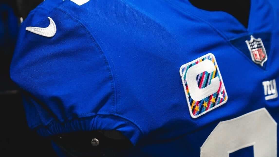
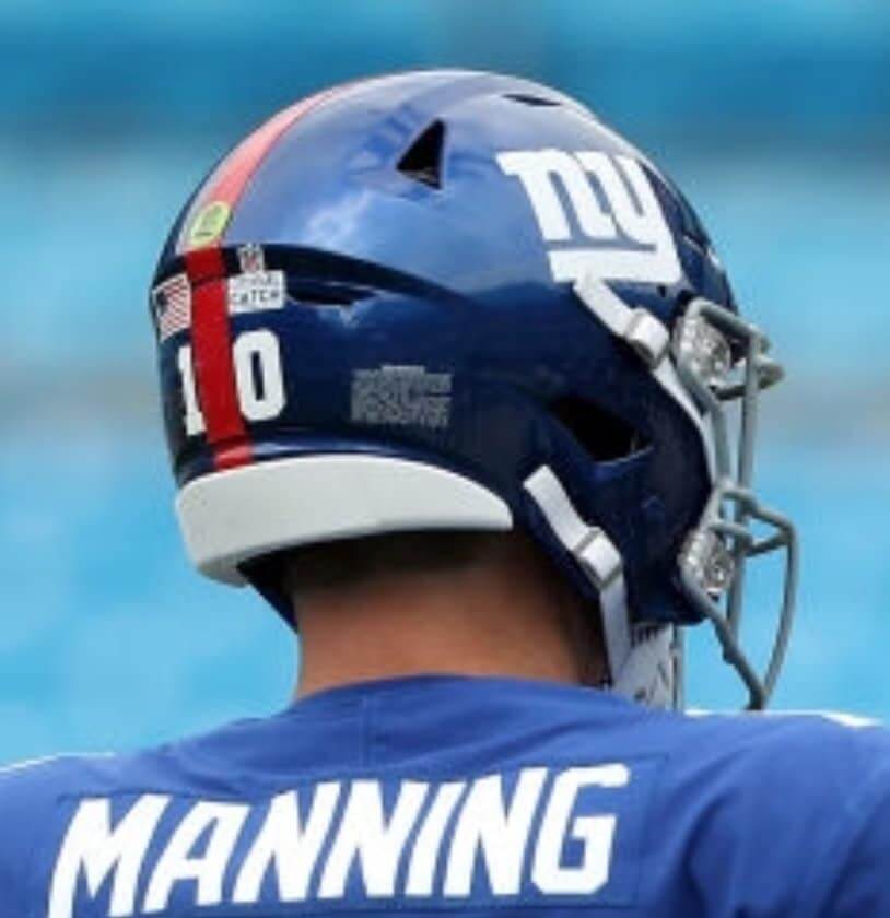
Rainbowtober — the successor to the late, unlamented Pinktober — got underway in the NFL yesterday, as players in select games wore rainbow-themed captaincy patches, gloves, and other accessories. There were also sideline T-shirts, coaches’ pins, and “A Crucial Catch” helmet decals, which replaced the standard NFL logo decal:
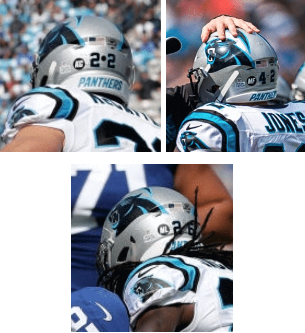
In addition, Panthers players wore black helmet decals, each one with a different set of initials. The initials were for cancer patients at Levine Children’s Hospital:
• After wearing black socks earlier in the season, the Panthers went back to wearing blue socks yesterday:
OKAY @OBJ!
One-handed grab. Too easy. 😳
📺: FOX #GiantsPride pic.twitter.com/QWWFjecEG7
— NFL (@NFL) October 7, 2018
• As you can see in that video clip, the Giants once again wore their white pants on the road, which goes against their established protocol from the past few years. It’s not yet clear whether they’ve abandoned their grey pants altogether or if they’ll still wear the greys on the road with their white jerseys.
• Speaking of the Panthers, several of their players arrived at the stadium wearing jerseys from other sports:
Kawann Short and Rashaan Gaulden rocking some sweet jerseys walking in today. pic.twitter.com/0GATUN5u6Q
— Max Henson (@PanthersMax) October 7, 2018
We've got some baseball fans on this team apparently pic.twitter.com/dSNNWLuSwI
— Max Henson (@PanthersMax) October 7, 2018
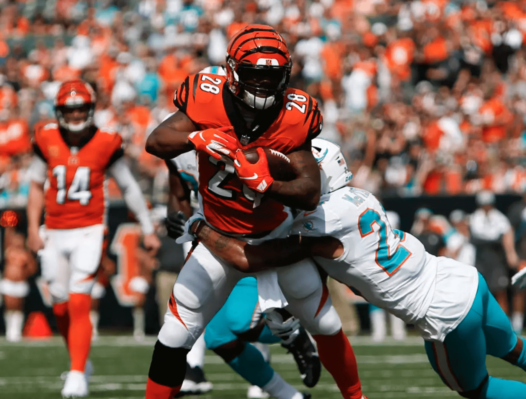
• The Bengals wore their orange alternates:
• The Browns wore their mono-turd Color Rash set (but, on the plus side, have retained their excellent striped end zone):
.@Browns rookie @denzelward picks off Joe Flacco!
📺: CBS #Browns pic.twitter.com/6KK4Lu2x7l
— NFL (@NFL) October 7, 2018
• The Jets went mono-green:
He's GONE!
77 yards!@IsaiahCrowell34 goes the distance for the @nyjets!📺: CBS #Jets pic.twitter.com/fWbclb6nPM
— NFL (@NFL) October 7, 2018
• The Chargers wore their powder-blue alternates and went with the old-school L.A. Chargers midfield logo:
.@AustinEkeler goes the distance for the @chargers!
📺: CBS #FightForEachOther pic.twitter.com/fmYxd9ZNxG
— NFL (@NFL) October 7, 2018
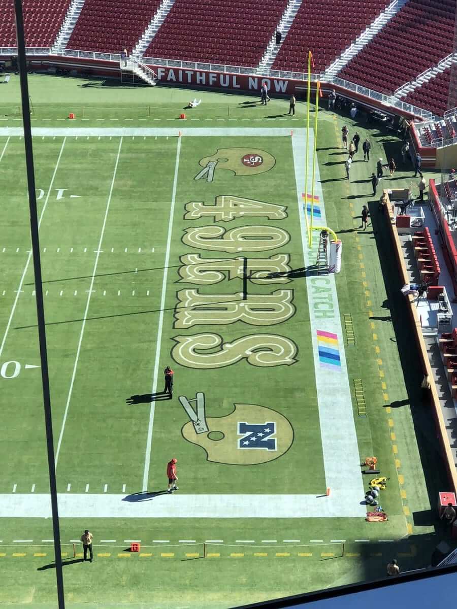
• The 49ers went with a retro-style end zone design, featuring helmet icons with two-bar facemasks (!). Too bad they didn’t use the old three-star NFC logo, instead of the current four-star version (click to enlarge):
• As we’ve discussed before, NFL gloves seem to lose their effectiveness in the rain. So with rainy conditions in Kansas City, several Chiefs and Jags skill position players went bare-handed. Interesting, so did placekick holder Dustin Colquitt, who I had written about last week.
• Packers kicker Mason Crosby changed his cleats after missing three kicks — and then went on to miss two more.
• Only one team wore white at home: the aforementioned Panthers.
• Here’s a list of players who protested during the national anthem.
(My thanks to all contributors, including Chris Biderman, Mike Chamernik, Gabe Cornwall, Chris Mattox, and David White.)
For all photos in this section, click to enlarge
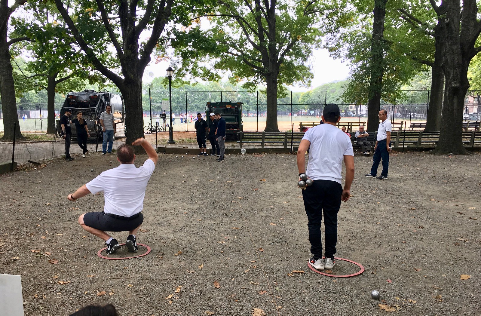
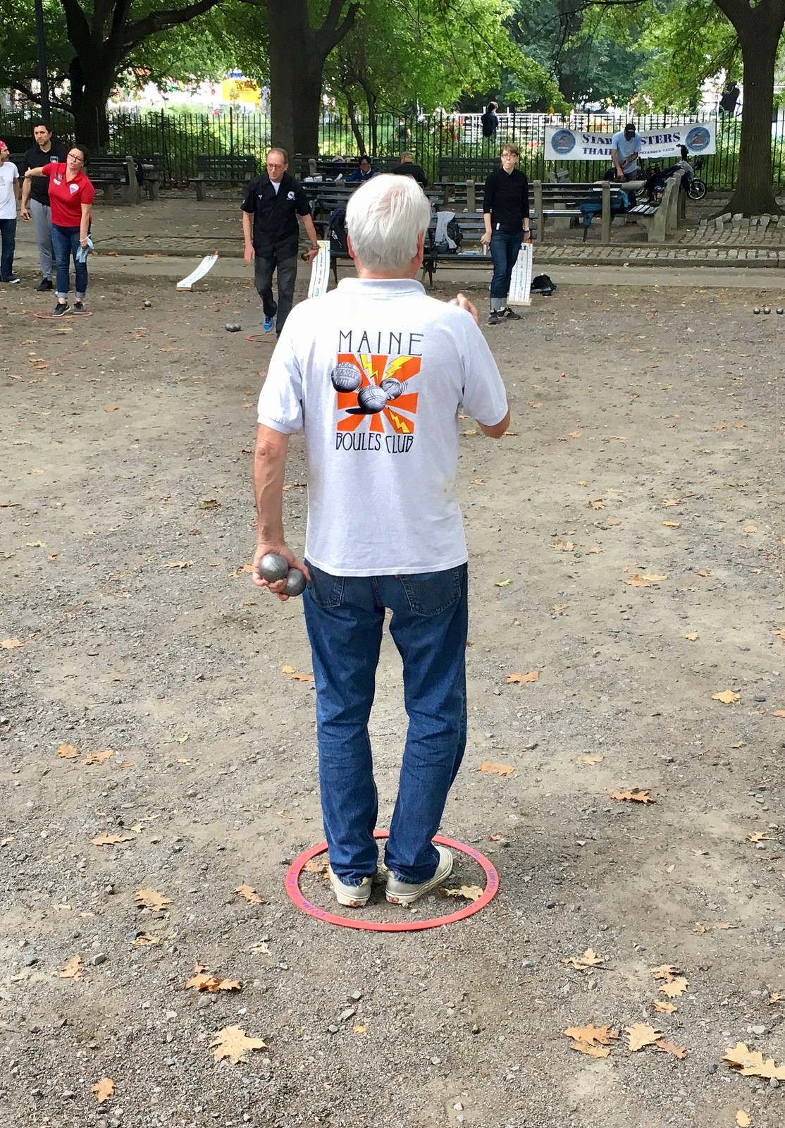
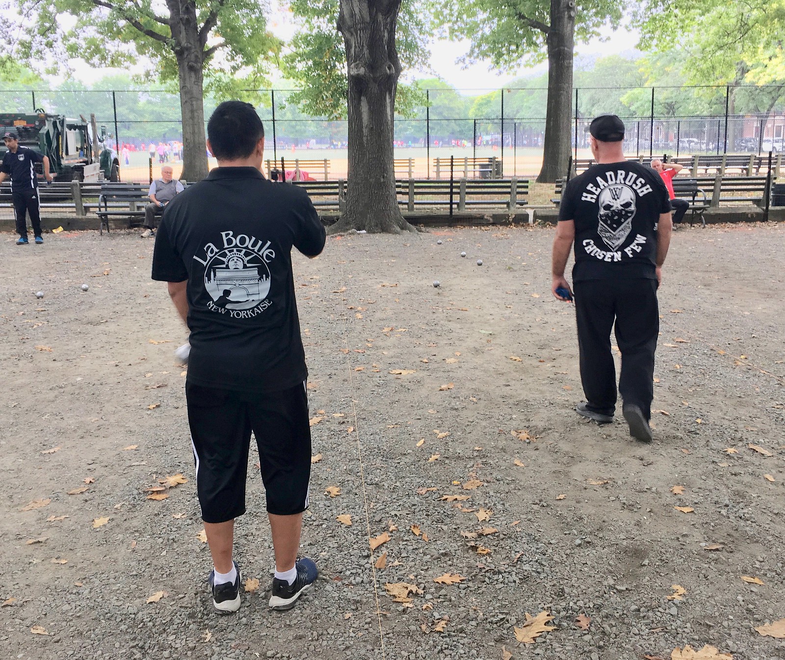
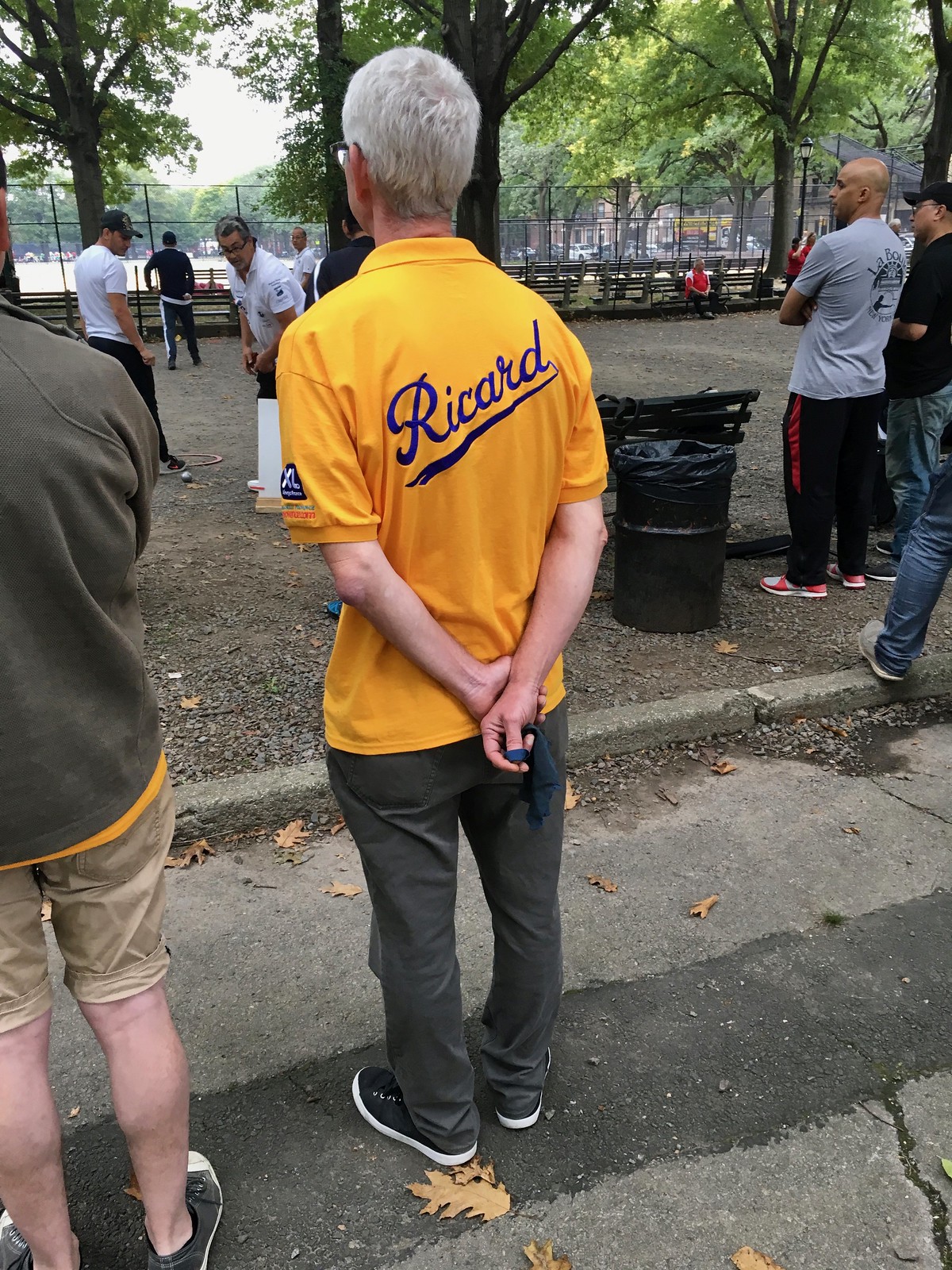
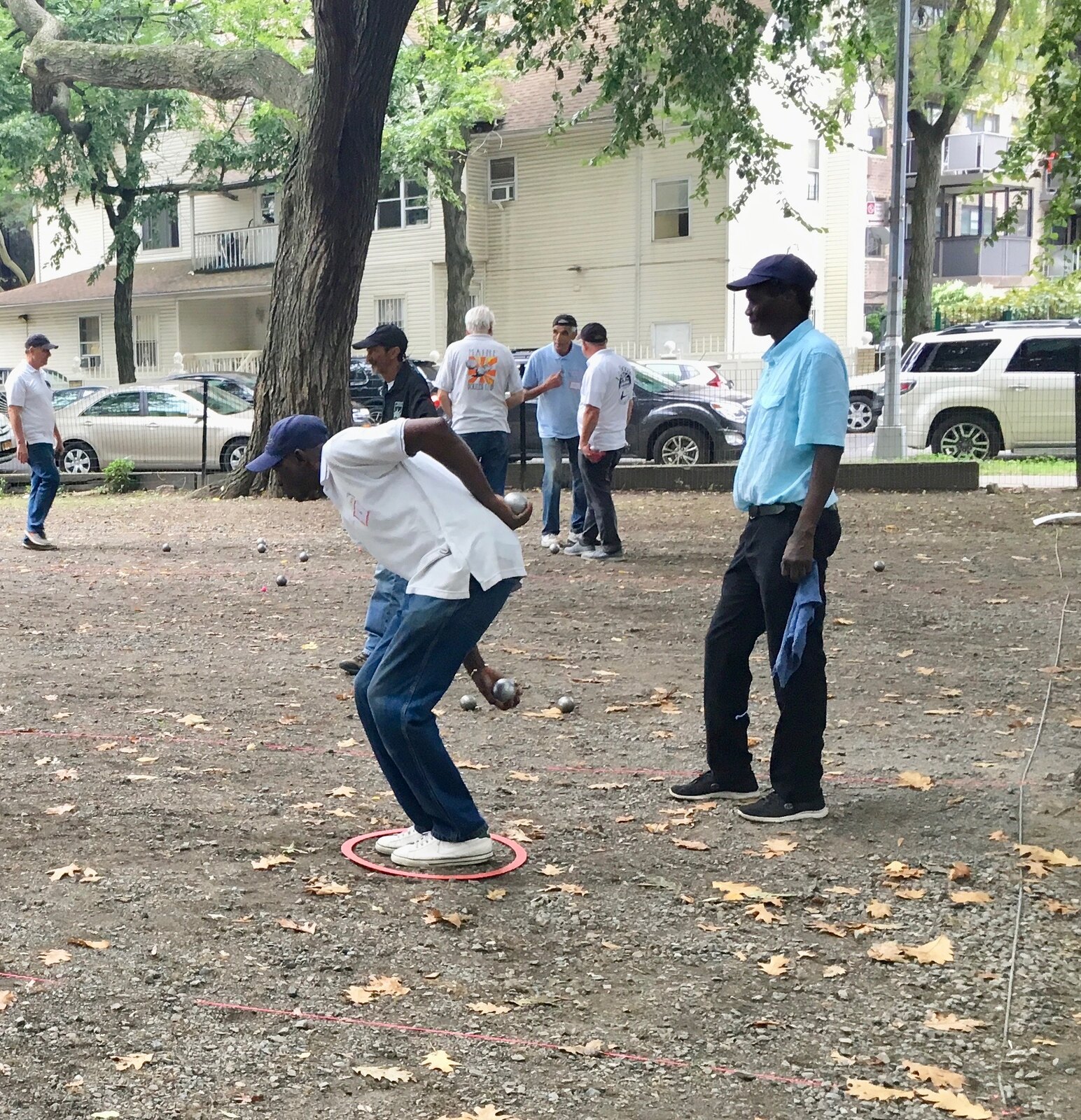
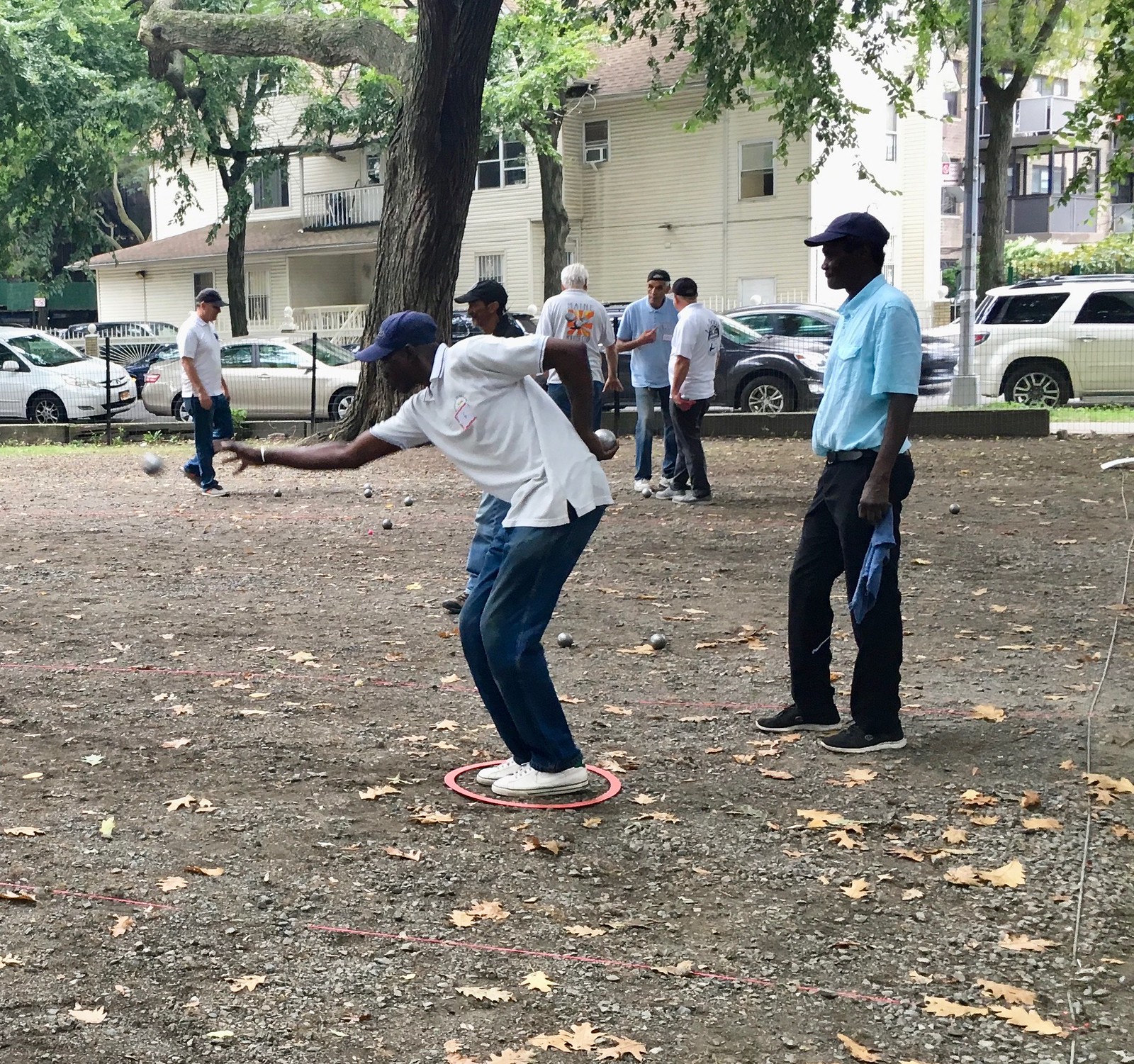
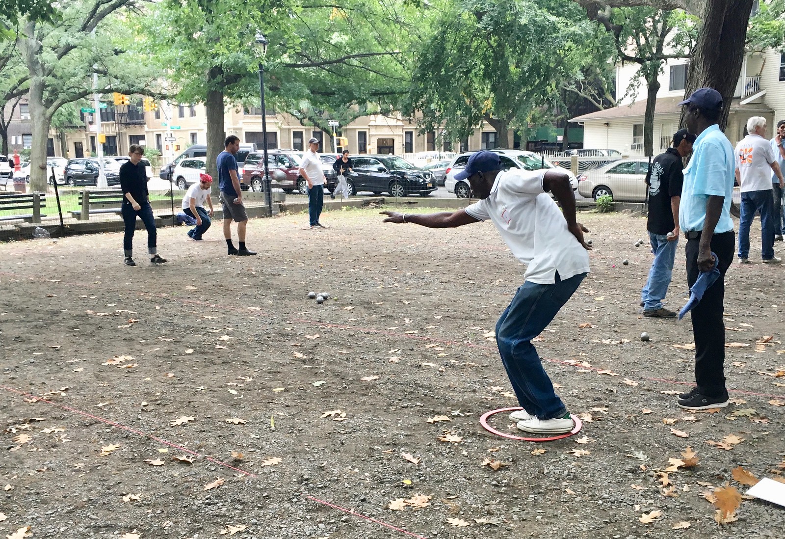
Uniforms in the wild: On Saturday I stumbled upon a bocce tournament on the outskirts of Prospect Park. Or at least I thought it was a bocce tournament — as I quickly learned, it was actually pétanque, a game that’s similar to bocce but uses different balls and a different court.
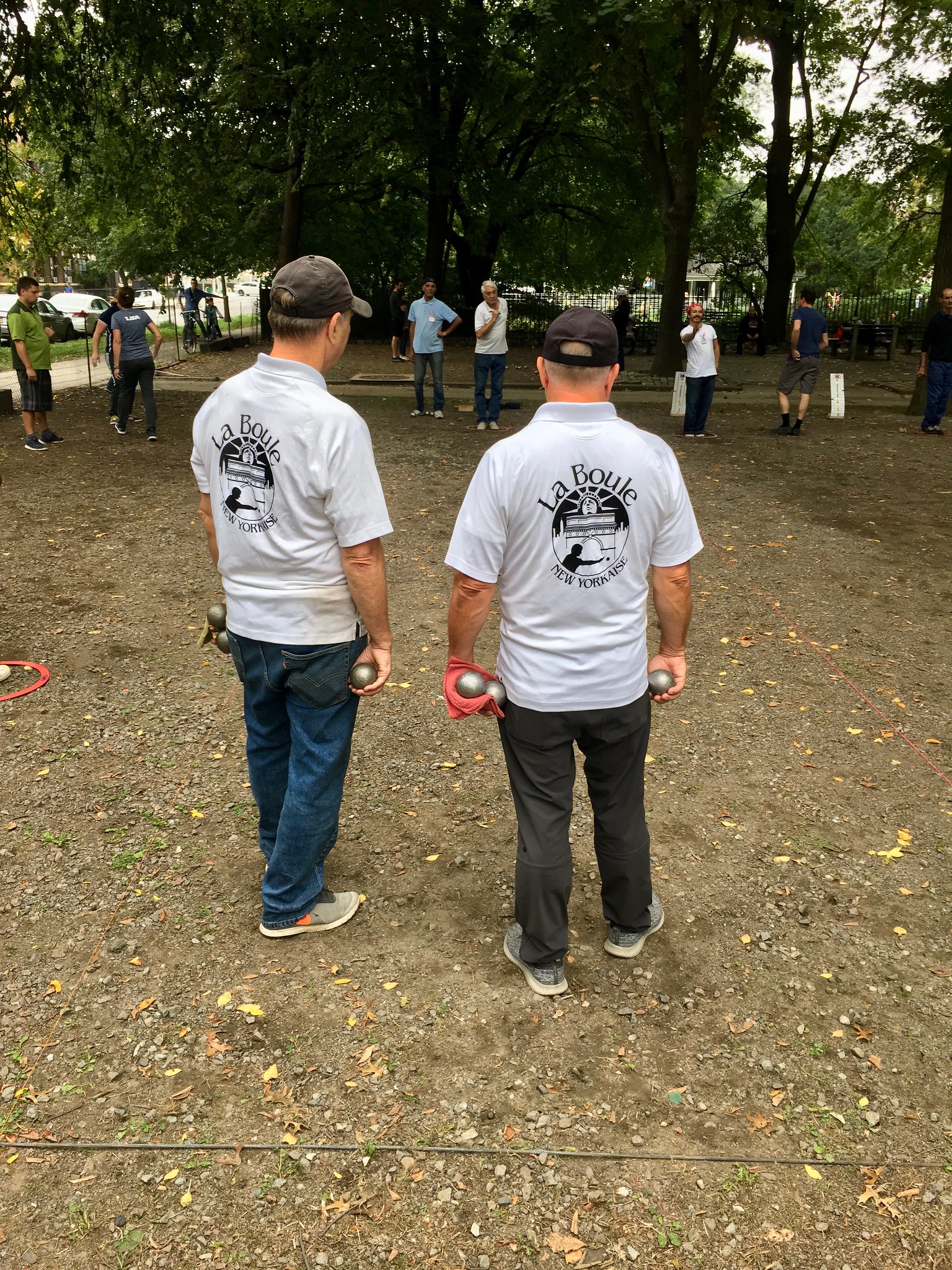
It was a national doubles tournament, with pétanque teams from all over the country and few from Canada. Two days, cash prizes in the $3,000-ish range — not bad. Many of the players had very nice jerseys:


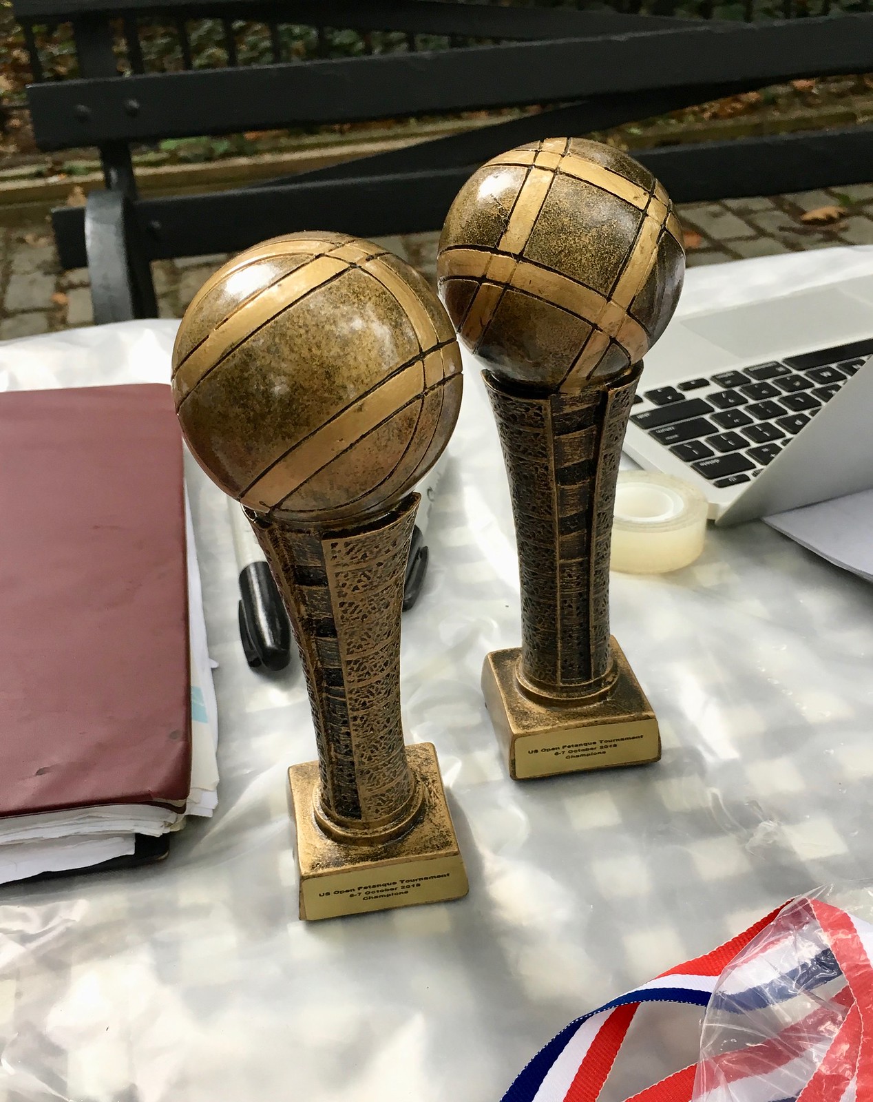
Pretty cool trophies and scoreboards, too:

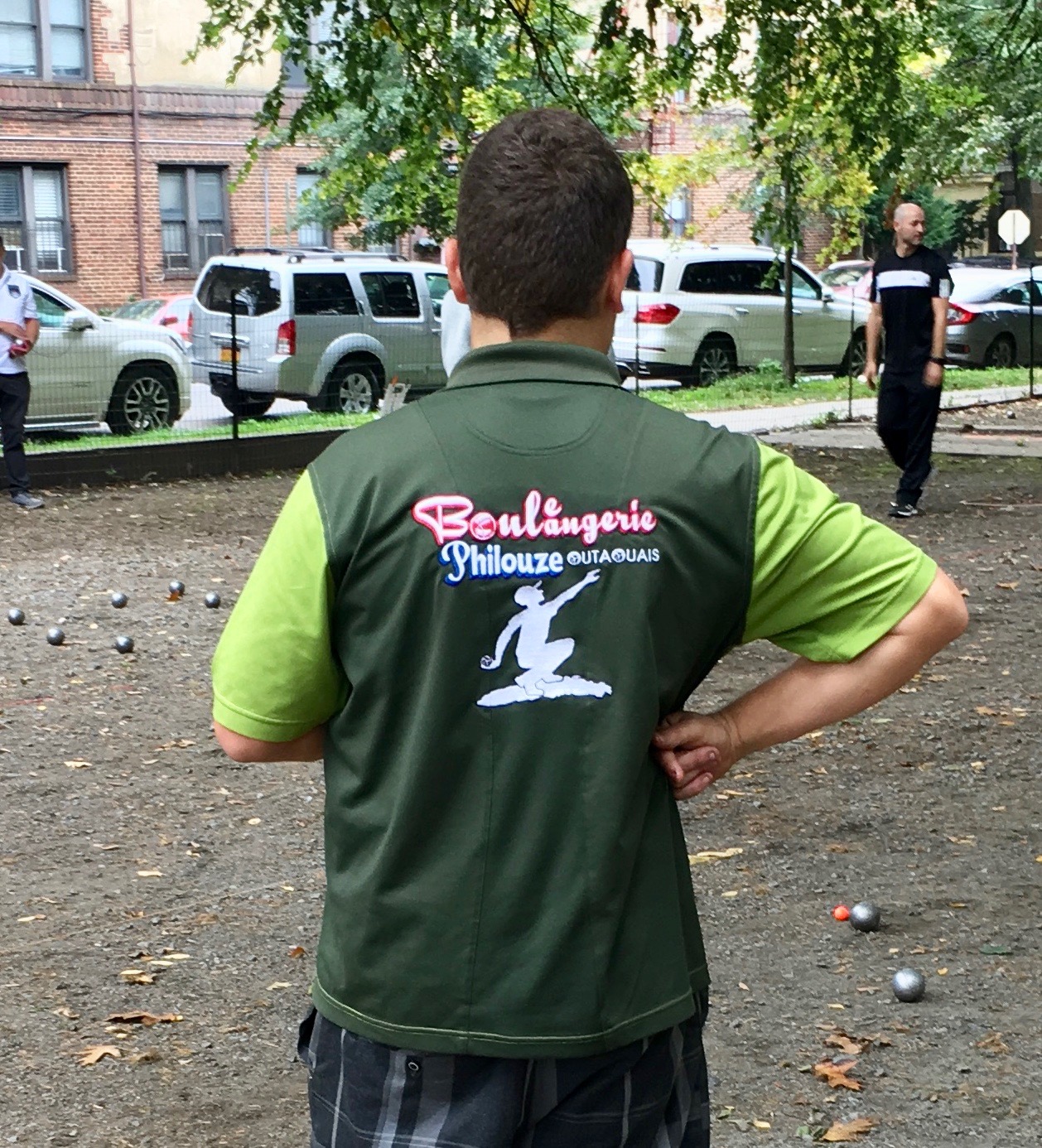
I particularly liked watching this guy, who didn’t have a uniform but had very nice form on the court:

Here’s a bit of video, just so you can see what it was like:
I love that something like this takes place about a mile from my home and I can just randomly encounter it. Whenever I get frustrated with NYC, something like this can make me fall in love with it all over again.
For all photos in this section, click to enlarge
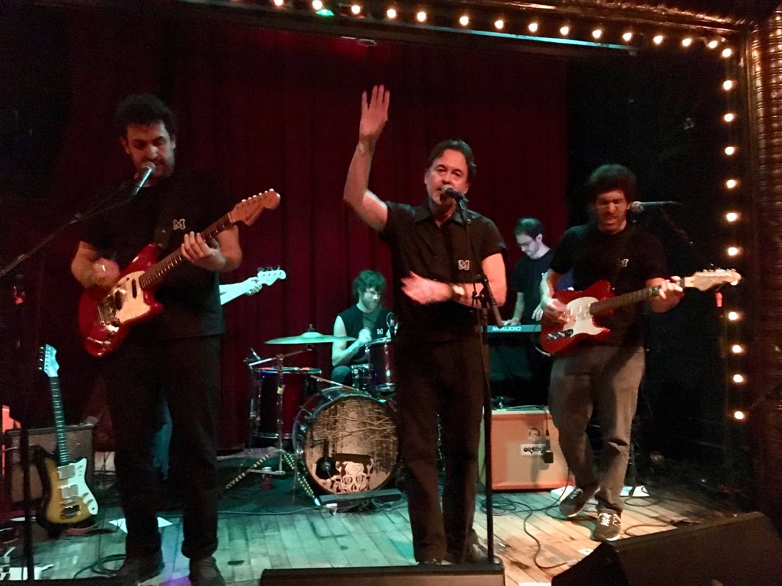
More uniforms in the wild: Last Thursday night I saw the Moles, an indie band fronted by the great Australian singer/songwriter Richard Davies. I’d seen them several times before, but this time there was something different: They were all wearing black shirts with a little “M” patch — a uniform of sorts. I asked if I could get a group shot, and they happily obliged:
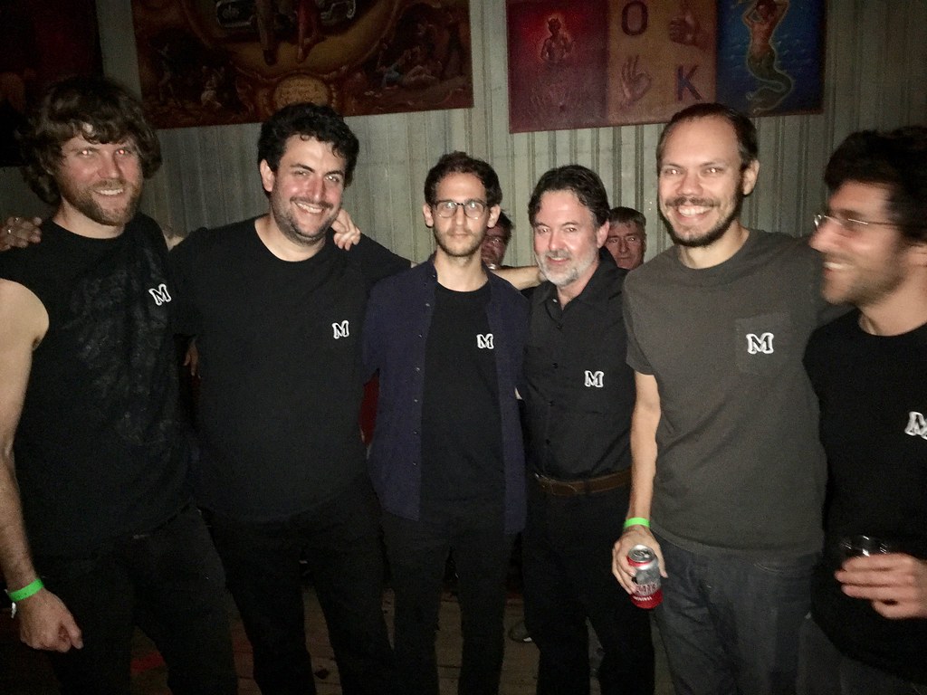
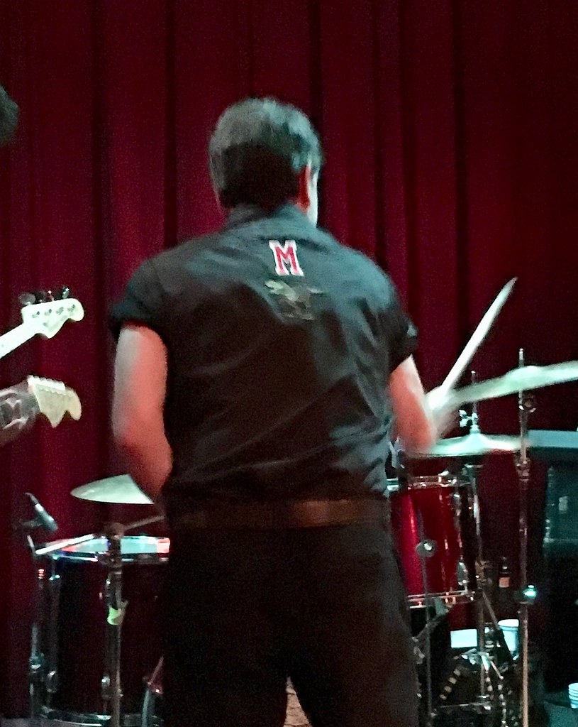
In addition, Davies — but not the other band members — had a bonus “M” on the back of his shirt:
Still more uniforms in the wild: I was walking a few blocks from my house yesterday when I noticed that one of my neighbors had installed new fencing around the shrubs outside of his house (click to enlarge):
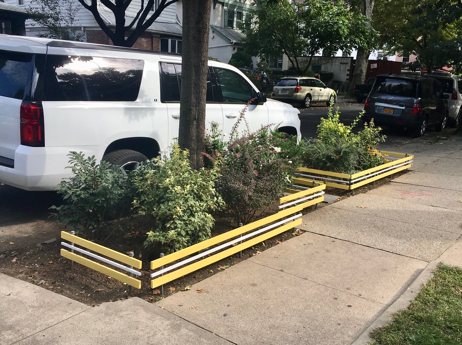
I love that yellow-white-yellow striping. Very uni-ish, no? It would look great on a sleeve, or a stirrup, or a waistband. I haven’t yet met this neighbor, but I may need to do something about that.
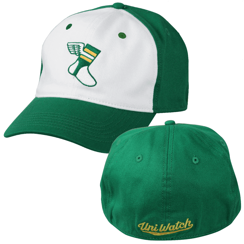
ITEM! Big savings on Uni Watch headwear: In our continuing efforts to unload a big pile of unsold merch find the sweet spot for the Uni Watch flex-fit alternate cap, we’ve decided to cut the price from $29.99 to $24.99. If you’ve been on the fence regarding this cap, hopefully this will push you over the fence, or something like that. You can order yours here.
In addition, our friends at Ebbets Field Flannels are currently offering a site-wide 20% discount (use the checkout code PLAY18), which effectively reduces the price of the Uni Watch classic cap from $49 to $39. All fitted sizes are in stock — get yours here.
The Ticker
By Jamie Rathjen

Baseball News: Here’s an article on the 1968 Tigers road uniforms presenting several theories about what determined the position of the jerseys’ sleeve numbers (from Jeffrey Sak). … The Brewers wore their home navy blue alternates — the ones with “Brewers” on the chest, instead of “Milwaukee” on the chest — for yesterday’s NLDS game in Colorado (from @janke_11).

Hockey News: Two items from Saturday’s Flames/Canucks game from Wade Heidt: First, the Flames have throwback locker room nameplates to go with their throwback uniforms. Second, both starting goalies, Mike Smith and Jacob Markström, wore masks painted to look like older masks with visible ears and hair, which Wade thinks may be the first-ever matchup of such masks. … I don’t believe we’ve mentioned specifically that the Hurricanes’ new alternate has a greyed-out North Carolina state flag on one shoulder (from Alan Kreit). … New silver grey alternates for the AHL’s Syracuse Crunch (from Lukas Favale).

Soccer News: New third kit for Polish team Wisła Kraków (from Ed Żelaski). … All Scottish teams playing from this weekend until Oct. 20 — men’s and women’s, professional and non-league — are to participate in an annual promotion for the charity Show Racism the Red Card. This includes patches, which of course had a mixed record of staying on, warm-up shirts, and actual oversized red cards. … Former USMNT defender Jeff Agoos posted a shirt from his late-’80s college days at Virginia, when the team were outfitted by Diadora.

Grab Bag: New cycling world champion Alejandro Valverde revealed his incarnation of the rainbow jersey yesterday. … The Queensland Reds of Super Rugby, the southern hemisphere rugby union competition, revealed their first-choice kit for next season. The shirt is in the state’s traditional maroon for the first time since 2006.
Brewers have been wearing their navy and gold “Brewers” uniforms on most road games this season. This and their navy and yellow “Milwaukee” uniforms are now used regardless of home or road games.
Exactly.
That shrub fencing reminds me specifically of the Packers’ sleeve stripes.
Very similar to the Boston Bruins striping on their black home jerseys also.
I loved that “Unis in the Wild” segment. I think bocci is an underrated spectator sport. Before marriage and kids, I’d go and watch some league games between older gentlemen who seemingly lived for those nights and took it as serious as their home made wine they brought along as well.
Loved it too. Today’s feature has an old timey Wide World of Sports feel to it. Looking forward to more!
Taste the rainbow!
Sorry for not knowing this, but what does the rainbow represent? ALL cancers? LGBTQ pride stuff (as I have seen NFL “pride” items in the past)?
If it’s the latter then the “Crucial Catch” motto seems a tad off-center.
All cancers.
Though NFL now has Rainbowtober, the CFL still sticking with Pinktober. As seen with the gloves and tape in the Winnipeg at Ottawa game of Friday.
link
I can’t be the only one who thinks those Browns Color Rash jerseys would be perfect with just a little bit of white trim, right? Paired with white pants (sans “BROWNS” on the side), it would be miles better than their current set.
They are 2-0 in them, so why not?
I think a Unis in the Wild report from a local bowling alley, on league night, is in order.
Yes!
Wwhich patches or decals are *ok* to appear on uniforms, and which *should* not? I’m not meaning to add any commentary here, just curious where is the line.
1 Corporate advertising
2 Charity advertising (I include here the Jazz ad-patch, pink-tober, rainbow-tober, sign language/braille alternate minor league jerseys)
3 Other awareness-related uniform alterations (e.g., Latin, Chinese alternate team names in NBA)
4 Decals for recently deceased members
5 Anniversary Patches for team/league
6 Opening Day / Playoff / Championship Series patches
7 NOB / NNOB / numbers (traditional jersey elements now, but long-ago they were not present)
The first three are clearly meant to promote something specific, while the last three are in commemoration of something team- or league-related, and the last are typical jersey elements but could be considered as unnecessary clutter especially in the case of NNOB.
Don’t forget team/city names, which couldn’t always be taken for granted like they are now:
link
link
And of course many football jerseys still lack team/city identifiers.
you forgot league logos, makers’ marks, and national flags.
FWIW I’m ok w #4 and #7 in your list, and #5 in sharply limited circumstances (10, 25, and then 25 yr intervals). Would prefer the rest to go the heck away or at least be restricted to sports I don’t ever watch.
oh, and captaincy designations. they’re mostly ok except when they get tarted up into something else
Interesting that the Bengals wore their orange alternate jerseys against the Dolphins this week, and the Bears are planning to wear their orange alternate jerseys against the Dolphins next week.
Bears are probably wearing orange in Miami because those jerseys will absorb less heat than the standard navy blue. Titans did the same in Week 1 (light blue alternate instead of standard navy). And Carolina often wears light blue instead of black for day games at Tampa Bay.
Another uni-notable item yesterday was that DeAndre Hopkins of the Houston Texans was wearing white socks in last night’s game, while the rest of the team wore navy blue socks.
link
And in this same video is Cowboys #31 Byron Jones not wearing white socks with his blue. Actually looks like he isn’t wearing any socks with his shoes, with the blue stopping before the shoe. Here is what I believe is the NFL official sock rules:
“The stockings worn by players must be white from the top of the shoe to mid-calf and approved team color from mid-calf to the bottom of the pant leg, which is pulled down below the knee.”
Pretty morbid for the Panthers to wear black decals with initials of child cancer patients.
Well, it is a team color. But I agree that the symbolism isn’t ideal.
Paul: you state “the Giants once again wore their white pants on the road, which goes against their established protocol from the past few years. It’s not yet clear whether they’ve abandoned their grey pants altogether or if they’ll still wear the greys on the road with their white jerseys.”
The answer to your question can be found in the uniform schedule that the Giants released in September, and which was included in the Ticker at the time. link
They are wearing white pants with the blue jerseys for every game except the 9/16 game against the Cowboys. They are wearing grey pants with the white jerseys for every game except the 10/11 Color Rush game against the Eagles. Seems pretty clear to me.
Ah, thanks! I should have checked that.
It was rainbowtover, but the Iggles and Vikes appeared to still be pinktober yesterday.
The Browns’ color rush uniforms are actually an improvement which is a scary thought. Thank god they are finally changing them and hopefully they’ll get rid of the stupid wording on the pants. I wouldn’t mind seeing the simplistic 1980s uniforms return. But then again making the Browns look good has always been a challenge with their color scheme. Now if we could just get the Buccaneers to change their alarm clock jerseys we might not have something to complain about every single week. CREAMSICLES!!!!
Is there a reason why the Chargers don’t go full throwback with the powder blues? Clearly this version is designed to fit their current modern look but that throwback is one of the best uniforms any team has ever worn. I think I am not alone when saying when the team moves into its new stadium, they should switch their uniforms to the throwbacks on a permanent basis.
One other observation to make. The Jaguars have clearly made a big improvement with their uniforms for this season but can they do something about the pants? It feels like they need some sort of piping because they are just so bland. They have gone from over the top ridiculous to something so simple, perhaps too simple. It feels like they have completely eliminated gold from their scheme but I think it would work as trim on the numbers and as a secondary color on their paints. (main stripe of white, teal or black)
yep. the goofy location of the stripes on these jerseys looks bad. the originals had that right.
I didn’t even have to read which game Paul saw, the picture instantly jumped out as pétanque as I grew up playing it. Being the first person in my family not born in France I grew up with lots of french culture, including having a French chef for a dad (I know it’s a stereotype, but he really is French and a chef).
The game of pétanque I remember the most growing up was playing with my grandma in her driveway, they lived in a “town” of 8 people in the middle of nowhere France, during the 1998 World Cup. She was superstitious regarding watching the French team play, so during the semifinal against Croatia we played until 11ish pm as it was getting too dark at that point to keep playing. I even remember one of my cousins running out to update me on the score, including running out for when Croatia scored and then having to run back out as France had responded while he was running out for the first goal. The weekend prior we had a huge family gathering as it was the first time my parents had both been back in France since the early 80s, so we had a family pétanque tournament, no jerseys, just fun, including a méchoui.
Sorry for the long family story, but it is about pétanque.
A bit of uni history about to be made…unless Cleveland makes an amazing comeback, Chief Wahoo is about to leave the MLB playing field for the very last time, at least in an official capacity (and subject to any future throwback games or whatever). The team is wearing the caps with Wahoo, which several online articles point out is perhaps particularly galling on a day variously considered to be Columbus Day or Indigenous Peoples Day, either way a very fraught occasion for Native Americans.
Good riddance.
WaWho?
hehe.
As it turned out, both Native-themed (to put it neutrally) teams were eliminated today. Probably means nothing, but it’s hard not to think of it as some kind of karma thing.
Thomas Hickey of the Islanders switched from #14 to #4. Anybody know if there is a story behind that? Sounds like a blurb that would be in Newsday, but I’m not in NY anymore…
Hi Mike,
Call it the Lou effect with his arrival to the Islanders. A number of players have number changes due to Lamoriello not liking players having numbers over 30.
Tom Kuhnhackl changed from 34 and got 14. Thomas Hickey is getting a more traditional number for a defenceman.
Here is a story providing good explanation:
link
Love the research into the 1968 Tigers sleeve numbers…
The Ducks’ thirds look great in action. I know they’re only supposed to be for this year (their 25th season of play, thanks to the 04-05 lockout), but I’d really like these to stick around in some capacity.
The 49ers are getting ready for what was going to be the Sunday Night Football game, which got flexed, against the Rams on the 19. The 49ers are going throwback with the 94 road whites.
The Moles! Richard Davies! I don’t normally expect to get my music news from Uni Watch, but I’m glad to see evidence of them in action. Hope they played “This Is a Happy Garden”….
They did not, alas. But they did play “Bury Me Happy”!