Big news yesterday out of Carolina, as the Hurricanes announced that they’ll be wearing Hartford Whalers throwbacks this season for the first time (but only for two games). I wrote about that, including some reaction from people in Hartford, in this ESPN piece, which was published yesterday afternoon.
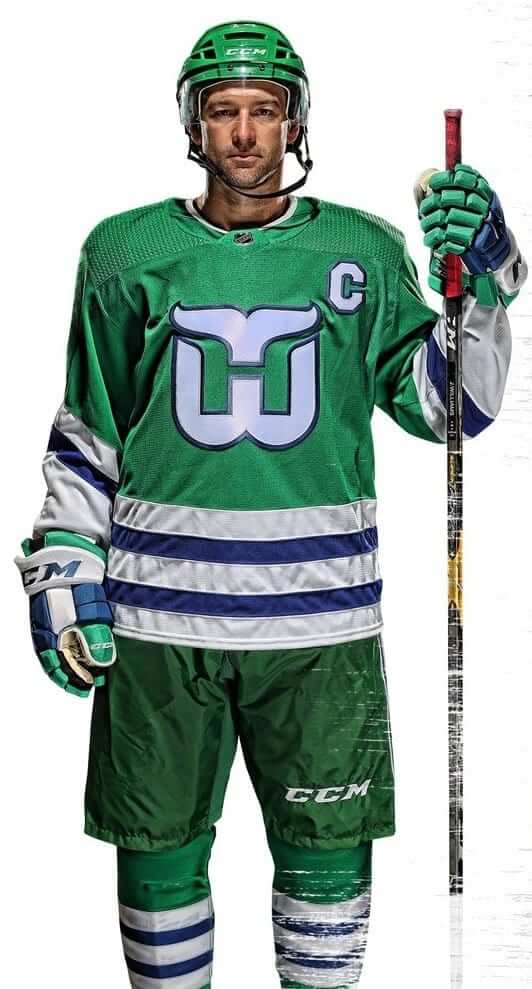
Kudos to the ’Canes for posting the full-uni shot shown above. So many teams now just post jersey photos, because that’s the only uni element that’s available for sale, which in turn has led more and more fans and media members to stop talking or thinking about uniforms. Yesterday on Twitter I even saw someone refer to the Green Bay Packers’ throwback uniforms as “third jerseys.” Grrrrr!
One thing you can see in that photo: The belly stripes are higher than on most hockey jerseys. That was an intentional move by the husband-and-wife design team Peter Good and Janet Cummings, who designed the Whalers’ logo and uniforms. When I interviewed Good in 2016, he said:
We did a lot of research, looking at the other teams’ uniforms. We felt there was something very clunky about most hockey uniforms. They had this lower center of gravity — massive tops and then the jersey comes over the pants, which makes the players look like they have shorter legs. So we tried to raise the center of gravity by raising the stripes [on the torso] higher. But then we got in a conflict with uniform makers, who liked to do things the way they’d always been done, so we had to compromise there.
So it sounds like they wanted the stripes to be even higher. I’d say they went high enough, wouldn’t you?
Meanwhile, my annual NHL season preview is now available. Check it out here.
Click to enlarge
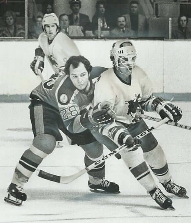
Nose job: We’ve all seen unusual masks and visors that have been rigged up to protect players who’ve suffered facial injuries, but I’ve never seen one quite like the one shown above, which was worn by left wing Paul Henderson of the WHA’s Toronto Toros back in the mid-1970s. Pretty interesting helmet, too. Great photo!
(Big thanks to Jerry Wolper for pointing me to this photo after seeing it tweeted by hockey historian Mike Commito.)
The Ticker
By Yianni Varonis, making his Uni Watch debut

Baseball News: The Fenway Park scoreboard, which also includes standings, features individually hand-painted number plates. But because the Red Sox were winning so many games, while the Orioles were losing so many, stadium officials realized midway through the season that they wouldn’t have enough plates (paywalled article) to count to 100 wins and losses (from Jeff Israel). … A fan was recently ejected from Dodger Stadium because she wore a T-shirt depicting a uterus. … Here’s a really great video about the American-made baseball glove manufacturer Nocona (from Justin Kellough).

NFL News: The Patriots will wear their Color Rash uniforms twice this year (from Nick Jones). …Very interesting story from The New York Times about how NFL players’ pads have gotten smaller and small, for a variety of reasons. … Omar Jalife points out that former Cowboys QB Roger Staubach at different times wore a jersey with a truncated one stripe on the sleeves like here and here, while he at other times wore a jersey with the common two stripes like here and here. … Construction workers in the Los Angeles area recently wore Chargers- and Rams-themed construction hats (from our own Brinke Guthrie). … Speaking of the Rams, the team wore throwbacks last night and the field at the L.A. Coliseum was adjusted to match. … An oddity from last night, though, as it appears that the crew that was painting the midfield logo missed a part of the facemask.
College Football News: Several items from Phil: CBS Sports has released its list of the worst college football uniform each Power 5 team has worn this century; it’s suspected that Kentucky will wear its chrome helmets this week against South Carolina, while South Carolina will wear this; Syracuse will wear orange helmets, white jerseys, and white pants vs. Clemson, while Clemson will wear orange helmets, orange jerseys, and white pants; Tulane has unveiled unique helmets featuring oversized logos for Friday’s game; this is what Tennessee will wear on Saturday against Georgia; Rutgers unveiled “blackout” uniforms; and this is a good read about the process by which Penn designed its new uniforms. Thanks for all of that, Phil. … Towson unveiled new 50th-anniversary throwbacks for its home-opener this week in this video (from Ben Rosenbaum and Benjamin Wolfram). … Houston will also wear throwbacks for this season’s homecoming (from multiple readers). … This is what Stony Brook will wear this week. … Each game, Virginia Tech selects a different special teams player to wear No. 25 in honor of former HC Frank Beamer. This week, wearing the jersey number will be P Oscar Bradburn (from Andrew Cosentino).

Hockey News: The NHL’s most notorious “What if?” uniform is probably this Blues design, which coach Mike Keenan reportedly nixed at the last minute. But did you know that the Penguins also had a near-miss with an outrageous uni design? It’s true — details here (from Phil).

NBA News: When former Lakers SG Kobe Bryant won an Academy Award last year, Jimmy Kimmel gave him two mini-jerseys, Nos. 8 and 24, to put on his Oscar. The key moment from that exchange is documented in this interview clip (from Mike Chamernik). … A Uni Watch reader’s son’s youth team wears a Jazz-inspired jersey that includes the “5 for the Fight” patch logo (along with an additional ad).

College Hoops News: Thanks to a new deal between UCLA and the credit union Wescom, Pauley Pavilion will undergo a minor makeover and name change.

Soccer News: FC Barcelona has unveiled a newly designed crest that it will wear next season provided it passes approval by a group of delegates in October. Embedded in the story is a video that shows the evolution of the crest throughout the years (from multiple readers). … CNBC recently aired this piece examining the skyrocketing price to purchase a soccer kit. … The Cincinnati Enquirer recently clarified to its readers that the black, form-fitting garments FC Cincinnati players wore under their kits and around their chests weren’t sports-bras, but equipment that monitored their heart rates (from Brice Wallace).

Grab Bag: This USA Today article ranks Team USA’s best Ryder Cup uniforms “from hideous to stylish” (from Phil). … A Tennessee high school AD has been placed on administrative leave after saying, girls “pretty much ruin everything,” in reference to the school’s new ban on athletic shorts in a video announcement to students. … The Boy Scouts of America had to recall 110,000 uniform neckerchief slides because they violated federal law by containing too much lead. … GQ details the new trend of firefighter uniform-inspired street clothes. … The Canadian Armed Forces have eased their restrictions for beards while soldiers are in uniform in an attempt to increase morale and recruitment. … Thursday marked the 20th anniversary of Google creatively displaying its logo on its webpage to mark special occasions and honor great individuals. To celebrate, Google shared a slideshow of notable doodles from over the years.
the Rams’ jerseys looked horrible last night with those goofy shoulder stripes that narrowed to a point both front and back. the whole logic of that look was for the jersey stripes and the helmet stripes to have the same shape evocative of a ram horn.
Is that it? I was looking at them and thinking something was off with the shoulder stripe. Wasn’t sure if I was just not remembering how they looked in the 70’s and 80’s or if there was indeed a difference. I hope they can correct that and aren’t limited because of the new jersey styles.
When those jerseys were designed football jerseys still had sleeves that went down to just above the elbow. The Rams jerseys started looking like this by the late 80s/early 90s as sleeves got shorter and shorter. The current Nike template doesn’t have much real estate for the shoulder stripes/ram horns, making them look really odd.
I knew in my heart that was the reason. I guess I was in a denial situation, hoping against hope. Heck, I’m still gonna hold out hope that someone comes up with a way to fix that. What do I got to lose?
My minor complaint about the Whalers throwback. Should go with white helmet ear loops and chinstraps instead of black.
I imagine the goalies for the Hurricanes will break out some matching goalie gear and masks for these games. Look forward to that.
Will enjoy seeing the uniforms on the ice again for this limited time. Appropriate the the opponents will be the Bruins during these games. Though I would have selfishly loved to have seen these uniforms vs. the Canucks. A battle of the blue and green vs. the green and blue, which did not happen during the period the Whalers and Canucks shared time in the league.
If the Whalers stripes went much higher, the crest would have the appearance of a whale’s tail rising out of a wavy sea. I’m not as sure as Paul is that that would have been such a terrible thing!
Barcelona’s new crest is a perfect example of how logo modernization should work. The character of the mark is not only preserved but enhanced by the application of a few tweaks rooted in current design practices.
I was greatly amused that you included information on the change of dress regulations for the Canadian Armed Forces (22 years and counting). Great site I love all the uniform updates, Keep it up!
I’ve always been a huge fan of the Whaler’s uni however I disagree with the Canes using it. I’m sure the majority of Whaler fans are not happy with this.
If there were a majority of Whaler fans, they never would have left Connecticut.
Like there’s a huge majority of Canes fans out there.
I would be upset too…I would be absolutely incensed if the Dallas Stars brought back the old North Stars jerseys with the N logo.
Verbeek!
The NHL season preview is up:
link
Spotted a typo for the Blue Jackets – “canon” should be “cannon”.
Thanks — I’ll get them to change it.
For the Blue Jackets, the new jersey is about the cannon. For the Hurricanes, the new jersey is about the canon.
Clever.
Great seeing the Whalers uniform back, one of the best in sports; awesome logo, great color combo using green, the most criminally under used color in American sports. Though I can totally understand the bitterness of fans in Hartford. When a abandoned market never gets a replacement franchise, especially a one team market, seems a bit harsh to draw on the nostalgia of that relocated team.
Also, in Paul’s ESPN article one of the fans he quotes say “could care less”. Assuming that wasn’t a typo and Paul was simply quoting one of the many people out there who cannot use that phrase properly. I’m not sure which bothers me more, hearing that or “irregardless”.
I agonized over that quote. It’s bad diction, but it’s what he said, so I felt I had little choice but to quote him accurately. (If he had said “irregardless,” I probably would have declined to use that sentence and found something else to use.)
Could you use “[sic]” with that quote and leave as-is, or is that not how the abbreviation is properly used?
I’m fairly certain most copy editors, including the ESPN copy desk, would not approve of using “[sic]” in this context.
I correct anyone who says “could care less,” to me. I imagine it comes off as smug or something, but it is the least I can do stop the assault on the England language. I’m guessing as a professional writer it must drive you nuts, especially when other writers use it, which I see happen far too often on the internet.
I share in your fight, Greg. Never give in. -C.
Not sure how I feel about the Carolina Hurricanes wearing Hartford Whalers uni. If I was a Whale fan I’d be pretty pissed that my team’s colors are being worn in a city that “took” my team away from me.
I think this topic has been discussed a lot before in the comments section. I’d say it is acceptable for the Titans to wear Oilers uniforms, Stars or Lakers to wearing uniforms from their days in Minnesota, etc. because those cities got replacement teams. But for the Canes it may be in bad taste, similar to the Thunder wearing Sonics uniforms, or the Avs wearing Nordiques uniforms.
Natinals wearing Expos, Orioles wearing Browns, Winterpeg Jets wearing Thrashers (though I can’t imagine why they’d ever want to do that) . . .
The Penguins jersey has been been well documented (along w/several other slec jerseys) on Icethetics
And without the vomit GIFs, thankfully.
Yes, but Paul is less of an NHL cheerleader.
Just imagine if the Pens lines up against the Flyers in their hideous teal-and-wordmarks ultra-‘90s concepts that never saw the light of day. Ugh.
Live in Raleigh and have been following the Canes ever since the move, having done the drive to Greensboro in the early years. I love this. Always liked the Whale, and hoped the Canes would be able to work it back in somehow. The Whale is part of our history, and we should embrace it. Plus, the franchise will NEVER admit it, but there are understood whispers around town this is a not so subtle dig at the hockey world that has inundated us with ‘Bring Back the Whale’ since 1997 where the franchise is appropriating and adopting the one thing here in Raleigh that you thought got under our skin the most. Hopefully the team starts winning again, this city really does love hockey, there just hasn’t been anything to cheer for in 9 years.
*Insert Dallas Stars’ mooterus jersey joke here in reference to Dodgers fan*
And about the Rams/Chargers hard hats, it seems only the suits going on TV are wearing those judging by the actual construction worker in a plain white hard hat in the pic
Proofreading: One thing you can see in that photo: The belly stripes higher than on…
Got it.
Should be Nokona with a K.
Did the Jets uniform thing go away or did I miss the article?
I’m still sifting thru the entries. Winners will be announced soon, probably next week.
‘The 53-year-old arena will be known as Edwin W. Pauley Pavilion presented by Wescom.’
presented by. giggle.
I know this is a small point but I don’t think I’d ever noticed before that the Whalers logo, when they were still in green, was really composed of two crests. Upper and lower. I guess I’d always thought it was a single crest stitched on the jersey.
Once they went to the blue jerseys, it was a single crest.
Hi. Maybe you guys covered this already? Anyone know when Yadier Molina started wearing Jordan branded catchers gear? Anyone else in MLB does this too? Thanks!
“Yesterday on Twitter I even saw someone refer to the Green Bay Packers’ throwback uniforms as ‘third jerseys.’ Grrrrr!”
But you use the phrase “jersey schedule” several times in your NHL preview. Is there a reason for that? Or just an oversight?
It varies. Some third jerseys have been worn without any changes to any other equipment, while others have full alternate kits.
Yes, but the phrase “jersey schedule” appears in reference to several teams whose new alternates do involve changes to the entire uniform (Columbus, Washington, etc.).
I know it’s not generally considered the Whalers’ signature uniform, but the navy set they wore in the mid-’90s was a solid look in its own right. I wouldn’t mind seeing that for a game or two in the future.
It is a good look. The jersey design is still sported in major junior hockey if you have a need to see in action on a highlight reel. WHL Seattle Thunderbirds proudly wear the look:
link
In those links to photos of Staubach, man-oh-man those old Cowboys blue jerseys looked great! So much better than their current dark shirts.
Question from the NHL preview: Isn’t it pretty rare for teams to have a different design for a patch on home and road jerseys as the Florida Panthers are doing? It’s one thing to change colors depending on the base color of the jersey, but to have a different designs seems a bit much.
It’s not a different design. The state flag version of the Cross of Burgundy is still present on the patch with the red background, it’s just hard to see.
Hail and well met, Yianni. Great work today.