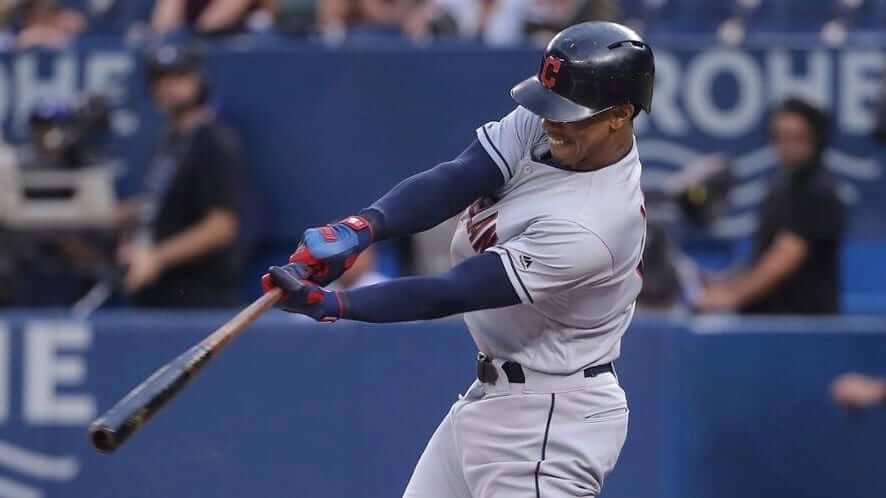
Notice anything different about this photo of Cleveland shortstop Francisco Lindor (shown above), which was taken during last night’s Indians/Jays game in Toronto?
If you’re an adept uni-watcher, you probably noticed that the Chief Wahoo patch, which usually appears on the left sleeve of Cleveland’s road greys, is missing from Lindor’s jersey. And it wasn’t just Lindor — all of the Cleveland players were Wahoo-free last night, as you can see in this video clip of the game’s final play:
According to this AP story, the de-Chiefing is only for the four-game Blue Jays series and was “partially driven” by the failed 2016 lawsuit that sought to prevent the Indians from using their team name and Wahoo logo in Toronto. It’s not clear if the team was concerned about further legal action or if it was more a matter of being sensitive to the issues that had been raised, although this story on the team’s website suggests that it was the latter. Also, if the move was “partially driven” by the 2016 lawsuit, it’s not clear what else was driving it. I emailed a team representative late last night to ask about those issues, and I’ll update this post if and when I hear back from him. (Update, 9am: Just heard back, as follows: “What is reported in this story is factual. We’re not going to comment any further, though.”)
Wahoo, of course, will be mothballed for good at the end of this season, so this four-game benching is just the latest nail in his rapidly closing coffin.
Wahoo wasn’t the only thing missing from Cleveland’s jerseys last night. They usually use nameplates for their NOBs, but eagle-eyed reader Darrell Dawson noticed that the lettering last night was direct-sewn (click to enlarge):
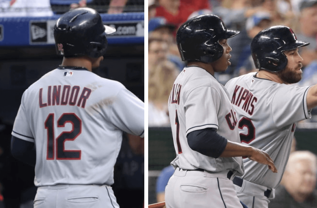
According to Bill Henderson’s jersey guide, the last time Cleveland went with direct-sewn lettering was in 1985.
(My thanks to John Sabol, who was the first to notice the missing Wahoo patch last night, and to Phil, who was the first to point me toward the AP story.)
Ticker intern reminder: In case you missed it on Tuesday, I’m currently in the market for a new Ticker intern. The position would require being on Ticker duty on Thursdays and creating the Tickers that appear on Fridays.
Full details are available here.
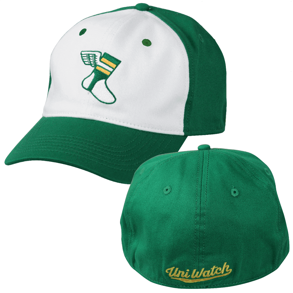
Cap inquiry: So here’s something I’ve been wondering about: We’ve sold a decent amount of our flex-fit “alternate” cap, but not nearly as many as I had expected based on some of the polling feedback we’d gotten earlier this year. Is there a reason for that?
Just to backtrack for a sec, my thinking with the alternate cap was that we’d basically do the opposite of the classic cap that we’re selling via Ebbets Field Flannels. For example:
• The classic cap is solid green; the alternate cap has a white front panel.
• The classic cap is wool; the alternate cap is stretch cotton.
• The classic cap is available in fitted sizes or with an adjustable strap; the alternate cap is flex-fit.
• The classic cap has nothing on the back; the alternate cap has the Uni Watch script on the back.
• The classic cap costs nearly $50; the alternate cap costs $30.
In short, I was trying to provide something for everyone. But the response to the alternate cap, while not bad, has been a lot less enthusiastic than I had expected (and much less enthusiastic than the response to the classic cap, too).
So I’m asking for your feedback: Did I do something wrong here? Did I simply misread the preproduction tea leaves? Something else? Feel free to post about this in today’s comments. (And if you want to buy one of these caps, you can do that here.)
Jets-redesign reminder: In case you missed it on Thursday, I’m running a Jets-redesign contest. Full details here.
The Ticker
By Kris Gross

Baseball News: The Orioles are hosting O’stoberfest to celebrate Oktoberfest on Sept. 28. The promotion will include a giveaway ceramic beer stein and “German-style” food (from Andrew Cosentino). … “Over five consecutive games from Aug. 26 through Sept. 1, the Royals wore five different jerseys,” says Trent Guyer. “And over a nine-game span during that same time from Aug. 26 through Sept. 5, they never wore the same jersey on consecutive days. If they stick to expected protocol, Friday will be road gray, making it 10 days without wearing the same jersey for consecutive games.” You can see the game-by-game breakdown here.

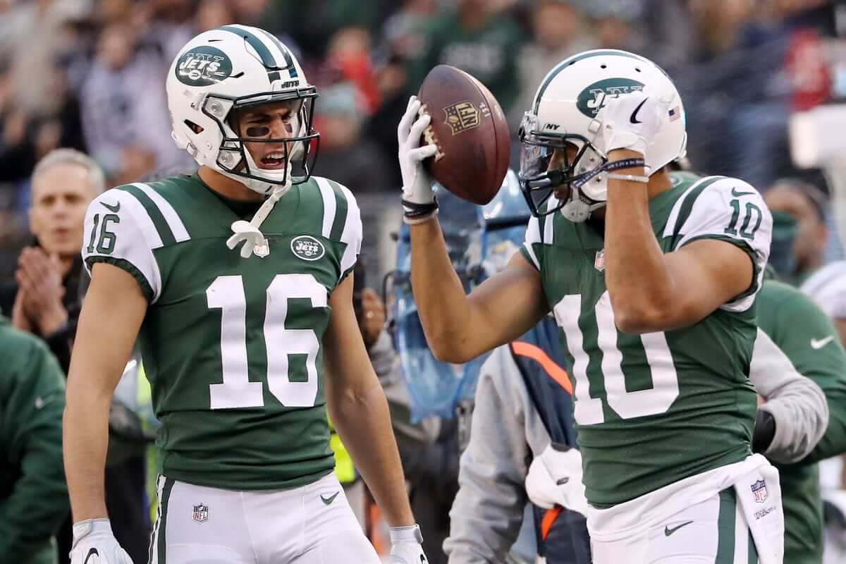
NFL News: The Eagles wore Super Bowl champions patches for last night’s season opener against the Falcons. … The Bears won’t wear captain patches this season, as they’re going week-to-week with team captains (from Zack Pearson). … A Colorado store is selling all Nike gear at 50% off in protest of the Colin Kaepernick ad campaign. … Did you know that former Raiders QB Ken Stabler modified his facemask with a hack saw? (From Matthew Toy.) … Here’s a gallery showing all of this season’s NFL sideline knit caps. … Vikings QB Kirk Cousins filed a trademark application for “You Vike That!,” to be used on T-shirts and such, but the Vikings and the NFL are holding up the application. “It’s in limbo until they decide to challenge it or not,” explains intellectual property attorney Anthony Verna. … The NFL has a new line of hats showing team logos and the teams’ home states. “The Raiders’ cap does not have a state, since they will (probably?) be moving from Oakland to Las Vegas in a year,” notes Mike Chamernik. “Also, the Giants’ hat only has New York, while the Jets’ has both New York and New Jersey; the Panthers’ cap has both North Carolina and South Carolina; and the Patriots’ cap only has Massachusetts.”
College Football News: Here are this weekend’s uniform choices for Oregon, TCU, West Virginia, South Carolina, Colorado, North Carolina, Virginia, Virginia Tech, Appalachian State, Texas State, Tulane, and Stony Brook (from James Gilbert, Sean Welsch, Ethan Dimitroff, and Phil). … These are some sweet helmets for Western Illinois (from Jack). … Here’s the reason Marshall has black collars on their jerseys (from Brice Wallace). … Apparently Burt Reynolds was responsible for the Florida State uniform redesign. More info here (from Griffin Smith and Phil). … Speaking of Reynolds, great spot by Eric Stangel who noticed a mid-scene number font change on Reynolds’s jersey during The Longest Yard. … The NCAA’s new uniform regulations mean more lectures on uniforms (from Chris Mycoskie).

Hockey News: Lightning goalie Louis Domingue’s new mask pays tribute to the team’s past. The design features depictions of former Lightning greats Vincent Lecavalier and Martin St. Louis (from Wade Heidt). … New uniforms for Vermont (from Nate Rathjen).

College Hoops News: Here’s our first look at new uniforms for South Alabama (from Clint Richardson). … New Butler jerseys have slogan and former coach Tony Hinkle’s initials on the inner back hemline (from DB).

Soccer News: The UEFA Nations League unveiled a gorgeous new logo yesterday (from @tasty_magic). … France played their first game since winning the World Cup, and they debuted their new crest and winner’s badge (from Gregory Mascrier). … MLS will use white and gold balls in September to promote awareness for childhood cancer (from Josh Hinton). … Also from Josh, Barcelona’s 2018-19 third kit has leaked. … San Antonio FC will pay tribute to the San Antonio Thunder with these warmup tops tomorrow (from Aaron Zamora). … An artist spent 750 hours creating a mural on Everton’s team history (from Ryan).

Grab Bag: Pro golfer Rickie Fowler wore yellow shoes yesterday to pay tribute to a friend who recently passed away (from Griffin Smith). … Texas volleyball had NOB inconsistencies last night (from Robin Murphy). … Champion, the old-school sports brand, is getting into esports uniforms. … The Washington, DC police are switching their uniforms from light blue to navy blue (WaPo link). … With Serena Williams being told she can’t wear her catsuit at the 2019 French Open, some designers have come up with some proposed outfits for her (from Phil).
on the wacky NFL hats with state outlines, the Rams also forego the gimmick, though their LA neighbors include it.
The Rams have a California outline as well, you just can’t see it on the image.
Also, the Washington football team has a Maryland outline.
The caps feature a state outline with the logo inside with team logo again on top. If you look closer at the Rams’ hat, you can sort of see this second logo.
As for the ‘Skins, they do play in MD at least. At least they didn’t use Washington state like the license plate cover.
Yeah, it’s just hard to see the outline on the Rams’ hat because it’s in navy blue, but viewing the close-up of the hat, it’s clear that it’s there.
And I just took a really close look at the Washington cap. It looks to me like the line defining the Potomac border of the District continues underneath the braid, as there’s just a bit of burgundy showing through. Likely, if you removed the logo and just had the outline, DC would be just a not-quite-squarish blob there.
Whoops, meant to reply to MJ below for the Washington comment.
I hear you. But the DC blob would be less blobular than the bland rectangle that is Colorado…
Word of the day: “blobular.”
The Broncos looks like Wyoming, not Colorado
Yep, was about to say the same thing. Of all the iconic things about Colorado, the state outline ranks dead last.
More NFL hats: the Redskins hat definitely has Maryland. It does not have Virginia, and it does not appear to have the District of Columbia.
Also: I have an authentic mid-’90s Indians jersey and I am 99% sure the NOB was direct-sewn but I don’t have it in front of me to confirm this. I acknowledge I may be wrong.
You can see the California outline in blue if you zoom in. The logo follows the shape.
I get that it’s all about NYC, but as a Giants fan in NJ I think they should have found a way to include a silhouette of the Garden State on the hat since it’s where they play. However, imo I think the hats are ugly anyway so it’s not like I’d buy one either way.
Wait a minute. I just saw that the Jets hat DOES have NJ included on it but the Giants one doesn’t. Wonder why that is.
Most people from the wrong end of New Jersey are Giants fans, not Jets fans. Just another puzzling irregularity with this series and its execution.
Regarding the UniWatch hats – My problem with the alternate hat is the white front panel. I don’t want a hat that will easily show dirt. Having a white front panel is just asking for trouble. I keep trying to catch a classic size 7 3/8 and keep missing out.
Agreed. I’m not fond of white on caps, period, for that same reason. Plus, I think just the front panel being white makes it look like a trucker hat. Also, I only wear fitted caps, and if it’s old school wool, that’s a huge bonus. Add the fact that I’m a HUGE fan off EFF products, and my cap choice was a no brainer. If only it had the standard EFF green satin underbrim, it’d be absolutely perfect. ;)
And I love the white panel, but truly dislike the word-mark on the back. I prefer that a cap live and die by it’s logo or design, much like how I dislike most football jerseys that feel the need to put the team name in small type above the front numbers.
Different strokes – sometimes when you try to include a little something for everyone you end up with a little something not liked by everything too. Doesn’t mean that you shouldn’t keep trying though.
Honestly: I’m not nuts back-of-cap elements myself. But when I asked about putting the script on the back, the response was overwhelmingly positive. So we went with it. But your point about trying to please everyone and thereby maybe *displeasing* everyone at least a little bit is well taken.
I’m not a fan of back of Cap treatments, but I’ll deal with it if I like the rest of the cap. Not a deal breaker for me.
Maybe people just don’t have $30 to spend on a hat?
Polls are fickle, not factual. If I recalled, you provided one-option with your poll…that’s it…almost a knee-jerk reaction.
The poll for the hat was anonymous.
It’s almost the opposite of when you asked if people wanted to pay to subscribe to this site (which wasn’t as anonymous and overwhelming).
$30 right now is a lot for people, and sorry, not everything is going to be a hit and has to be a success.
Maybe if you could find a different item to market at a lesser price point, or find a different way of getting feedback than a one-option poll than “yes! I’ll buy” (heck, even a pre-buy) that would guarantee sales would work better
Totally agree and understand that 30 clams is not chump change.
Also agree that polls are not determinative.
(And for the record, I asked a *lot* of questions about the cap, not just one. Do you want something on the back or not, do you prefer snapback or flex fit or other, etc., etc. Did my best to act accordingly.)
Then I was thinking of the XXL hat that had the 1-option poll…thank you for clarifying
I believe Ebbets had a sale this summer where the Uniwatch cap was included – that may be part of the reason for less alternate caps being sold
Flexfit is my least favourite type of cap. I’ll take snapback, velcro, fitted over that type any day.
The flexfit thing is sort of my issue. I have no idea what size I would get in flexfit since I don’t normally buy fitted hats. I keep saying I’m going to go to a hat store and figure it out so I can order the hat, but then I forget. I wish I had a better explanation, but at the end of the day it’s just forgetfulness.
I love the hat, I’d probably buy one if it came up six months from now, but I just bought a Purp Walk hat (which I LOVE) and that’s enough for now.
I was among the group that was refunded due to the XL not drawing enough interest to be offered. I’m not a huge fan of the flexmfix thing but it hasn’t stopped me from buying a few in the past.
I too was in the group that was refunded from the pre-purchase of the XXL caps. However I may go ahead and take a chance on the L/XL one and see how it fits. I also echo the sentiments of the flexfit caps…I usually wind up going into the band and making small cuts to allow for a fit that’s not as snug. I have made a few caps work like this and I’ve made some caps non-wearable, as they just didn’t respond well to being altered that way…my loss, since it was me who made the alterations. As far as the way the cap looks, I really like it, and am disappointed that the XXL didn’t get as many sales, so as said above, I’ll probably take a chance on the L/XL.
Typo from from Soccer Ticker: “France played their first game since winning the World Cup, and they debuted their new crest and wininer’s badge”
“wininer’s”?
Thanks. Fixed.
I would have liked the alternate cap to have a snapback, not the flex fit. Never been a fan of flex fit caps.
^^^This.
^^^ This, this. Would have preferred a snapback. I really like the design (I also purchased a classic cap) but just don’t like the fit of flex fit caps.
I understand people’s misgivings about Flexfit hats but I’ve always thought snapback hats felt cheap. Give me a fitted hat or velcro any day.
Just heard back from the Indians spox. He says: “What’s reported in link is factual. We’re not going to comment any further, though.”
Typo: “UEFA Nationals League”
Should be “UEFA Nations League.”
Also, here’s some of the other stuff MLS is turning gold in September: link
Though, that doesn’t include the captain’s armband or the corner flags.
Side point: I went to Audi Field on Monday for a Virginia/Maryland game and the gold nets were still there after D.C. United’s game Sunday but none of the other field elements were, i.e. they used normal MLS balls and generic red corner flags.
Typo fixed.
I keep forgetting to purchase a hat despite the frequent reminders. Will remedy that this weekend.
Overall, I think readers have the best of intentions, but neglect to follow through, or they simply point out which one they would buy if they would buy one.
I know, if I don’t buy an Indians hat with Chief Wahoo, it’ll be lost to history before I know it…
Good riddance.
It’s too bad the Pats hat doesn’t include all of New England on it. Between the dark blue MA outline and the fact that the Pats logo covers up most of the MA outline anyways, you can barely see it, which takes away the point of the hat. Now if they used Pat the Patriot, and a red outline, NOW we have something…
Oops replied to the wrong comment thread. I’m a dope.
Still waiting for an alternate cap that fits my melon. I need XL/XXL.
Did you know that former Raiders QB Ken Stabler modified his facemask with a hack saw?
Krist, yes! We all knew that.
Regarding the alternate cap: I would love to buy one, especially because it’s flex fit. But cotton shrinks in extreme heat (I live in a humid climate) and cotton also dries out my hair (sounds weird, but I also don’t buy ’47 caps for the same reason). If the alternate cap was a polyester flex-fit, then I’d buy as soon as they were available.
Since you asked…
I may have been one of the first to purchase the fitty dollah wool version and it’s great. However, I actually prefer most of the characteristics of the trucker cap (lower profile, flex fit, adjustable) — things I look for when I buy one. But that white panel…I’ve held off on buying it because of that. Any chance you can make it without the white panel (either make it gold or burgundy) OR make the cap entirely one of the alternate UW colors (gold/burgundy)? I didn’t bite on the accursed color alternate, but I’d totally fork over more dinero for a solid cap (or even multi color cap) without the white front crown.
Holy mackerel, a fitted burgundy and gold UW cap would be amazing.
Second on the burgundy and gold, although I might prefer the adjustable back.
Regarding the hats:
I bought an EFF one right away as I collect hats and I know how EFF hats fit me.
“Dad hats” are much more unpredictable in their fit. Even strap and Velcro adjustable ones are often too shallow. With flex fits, I am a size 7 3/8, which tends to fall right on the edge of sizing. The slightly smaller size is usually too tight (and not deep enough) and the larger size is too big. Given these factors, and the $30 price, I passed. I also never indicated that I would purchase one, based on what was being offered, in any of the polls, while I did indicate that I would purchase the EFF cap and did.
I would have purchased an alternate if it was more of a New Era type SnapBack or strapback, as those are deeper fitting and I would know I could wear it.
Hope this helps.
Regarding the caps:
I indicated I would and did purchased 2 EFF hats (a sized and an adjustable) practically the minute they went on sale. I own many EFF hats and know that they fit me well.
Regarding the alternate cap, these types of caps frequently fit shallow, thus making them uncomfortable, and my size is right at the cutoff point. One size fits too tight (and likely too shallow), and the XXL size would likely be too big. As such, I never indicated that I would purchase an alternate cap in any of the polls.
If you were to offer more of a New Era type snapback or strapback I would probably go for one. I also generally do not like white front panels.
There’s something about the look of that Indians uniform that really comes together without the logo. A sharp, classic design.
I agree. I like the direct application of the names, too. Really looks clean on that grey jersey.
I’ve been a defender of the block-C unis from the get-go. They’ve always looked distinctively Cleveland-ish to me, especially the block-C cap. I’m loathe to admit this, but seeing the unis with the unadorned sleeves, there’s just something missing. Not Wahoo-as-Wahoo, but the unis need some element beyond the block lettering to avoid sliding into too-plain-ness. Maybe a new sleeve patch, which would require a new post-Wahoo mascot design, or possibly just a brighter shade of blue or bolder striping. Something. The unis without Wahoo seem kind of blah to me. I’m a fan of the idea behind the block-lettered unis, and I’m pleased to see the back of that awful caricature, but the post-Wahoo unis need more adornment.
The Football as Football project made an sweet looking logo for the Browns using the crest found on the city flag. Something with that basic design for the Indians would work great as new primary logo and sleeve patch.
I wasn’t inclined to buy the alt hat initially, since I had already purchased the other hat. I did end up buying an alt as a way to continue to support Uni Watch financially. I’m glad I did, though, because I actually prefer the fit of the alt. Just wondering how many people didn’t buy an alt because they had already had the EFF hat …
I keep on forgetting to buy a hat Paul, so thank you for the reminder today. I just put in my order for the hat!
Regarding the alternate cap my only issue is budget. It is reasonably priced but I am currently tight on discretionary income right now. The cap is gorgeous.
Paul-
I didn’t consider the Flexfit cap because they never properly fit my head. I’m usually a 7 and a small for a ‘47 fitted. Pretty much all of the Flexfits I’ve gotten have been a minimum of 7 1/8, even the S/M versions. As a result they gap on my head. That was really the only issue for me-like the design and the price point is in line with what I’d expect to pay.
I bought the alternate cap, because it was the perfect design for me. I loved the panel, the flex fit, the wordmark, and the price point. It was my first ever UW purchase, and i love it. There are always trade offs, but I for one thought it was much superior to the (for my tastes/budget) than the “regular” hat.
The Orioles are so bad they’re offering free Beer and Brats and calling it an Oktoberfest? When will the Buck Showalter era end…
If they want to boost attendance, have free crab cake night.
I’m an alum of a Baltimore-area university who lives out in LA, and it’s no joke that the way to get Marylanders to attend an event is to offer crabs. We had two alumni events out here years ago where the school put on a big crab feast, and people were beating down the doors to get in. Once the school stopped springing for crabs, nobody ever showed up again.
All of that being said, I’m not an O’s fan but I love that O’stoberfest stein.
Alt hat: With a big head, I was willing to bite on the XXL if it were available, but I’m hesitant to shell out on the current sizes if I can’t try it on first.
Also, is it possible that the alt hat was offered too soon? Your potential audience had just shelled out $50 for the Ebbets hat – maybe the alt should’ve been next year’s model?
I bought the fitted hat. I don’t do flex fit or snapbacks because they just don’t fit my head/feel right (mostly because I’m a 7 7/8 fitted). Has nothing to do with design.
That being said, I found the fitted hat I bought was a skosh smaller than the same size hat sold by New Era. I’ve only worn it once or twice because of that.
Take it from a fellow Bighead (7 3/4): invest in a hat stretcher. It’ll bring your old caps to life.
I don’t “get” adjustable caps. Every other clothing item we wear is something that fits, why not a hat? Is someone else going to be wearing it?
Hi all… the Indians post got me wondering: With the Indians in the process of retiring Chief Wahoo, why is no one clamoring for Atlanta to stop, already, with the tomahawk chop chant??
Anyone have any insight? I’m really curious.
As I’ve said many times: When it comes to Native iconography, the Wahoo and the ’Skins name are the low-hanging fruit. One is a garish caricature, the other is a dictionary-defined slur.
Other stuff — the Braves’ tomahawk imagery (not just the chop but the jersey insignia, and also the team name), the Chiefs’ arrowhead logo, etc. — are on the next tier down, at least for most people. But some of us, myself included, have been opposed to those elements all along. Here’s a Braves-related piece I wrote last summer, for example:
link
Thanks, Paul! I figured you had written and I’d just forgotten. And I see your point about the low-hanging fruit.
What do you mean, “no one”?
I first personally witnessed protests against the Braves identity in general and against the tomahawk chop in particular in 1991. There’s a long history of folks protesting and writing against the Braves and their fan culture.
Thanks! That’s very interesting!
Only having Mass. on the Patriots cap is weird to me. Given interstate rivalries, I doubt anyone in the other five states would buy one…
I just bought the Alternate literally 5 minutes ago because I thought I already had, and didn’t. I love everything about that hat (FlexFit, white front, logo, UniWatch on the back). I love Ebbets Flannel, but $50 for a hat is bonkers. And I own almost 200 hats.
Also, an Arrowhead is just…and arrowhead. It’s definitely not nearly as offensive as Wahoo or ‘Skins. It was a weapon/use of protection and defense of the Native Americans. I don’t find the Arrowhead on the Chiefs helmet offensive, nor calling their awesome football stadium Arrowhead offensive. Same as the arrow on the Florida State helmet, or the tomahawk logo on the Braves logo. Also, the term Braves, is that the official term for a “young Native American”? Again, doesn’t seem offensive. It’s like the “Cubs”, baby bears. Anyway I meant to more comment on the awesome alternate hat. The Native Iconography discussion always gets me in trouble LOL
Also, the term Braves, is that the official term for a “young Native American”?
No.
If memory serves, the team adopted the name when they were in Boston. “Braves” was the nickname for the “foot soldiers” of the Tammany Hall political machine, and both adopted American Indian symbols. Going forward, perhaps the Braves could keep the name and boil away the unfortunate imagery, much as the Golden State Warriors have done over the last 50 years.
Tammany Hall was New York, not Boston:
link
Boston Braves owner James Gaffney was a member of Tammany Hall.
Boston Braves owner James Gaffney was an alderman and contractor for Tammany Hall.
Chiefs is a weird one. The team is named for H. Roe Bartle, known as “The Chief.” He was the former mayor of KC and brought the Dallas Texans football team to KC. While a scout council executive in Wyoming, an Arapaho Chief incorporated Bertle into his tribe through a blood brother ritual and gave him the name, “Chief Lone Bear.” I am not saying the arrowhead logo is right or wrong.
I was reading reactions to the Wahoo removal at letsgotribe.com and a commenter said they should have a Goat logo because a group of goats can be called a Tribe.
Years ago I saw a cool Cleveland Spiders uni concept that had a single thin stripe down the pants end with a spider, like the line was a web. I loved the little detail.
I do logos and unis for my fantasy league. One team was the “Braves” but I always called them the “Trades” in our newsletters because the manager traded a lot. So he changed the team to Tradesmen (Trades for short) and we modified the tomahawk logo into a wrench. It looked great.
I do logos and unis for my fantasy league. One team was the “Braves” but I always called them the “Trades” in our newsletters because the manager traded a lot. So he changed the team to Tradesmen (Trades for short) and we modified the tomahawk logo into a wrench. It looked great.
That sounds awesome! Do you have images you can share?
And thanks to you and everyone else who’s set me straight about James Gaffney and Tammany Hall.
You can easily fix the Chiefs.
Remove the I. Call them the Chefs. Change the arrowhead to a Chef’s hat.
Done.
Great Googly Moogly!
There was a candy bar (I think) commercial in the 90s or 00s where a guy accidentally paints “Chefs” in the end zone of a football field.
link
Now I get your reference Eltee!
I haven’t purchased a hat yet because it is sold on a website with a BFBS background. Black isn’t an official Uni-Watch team color… Just kidding.
But really though, as someone who sells products of his own, I have learned to never ever ever ever take it seriously when someone tells me they are going to buy something. “I’ll buy _____ if you make it.” Yeah…ok.
I know that doesn’t help much since you are probably sitting on a large stash of unsold hats, but going forward it is something I’m sure you’ll be keeping in mind since you’ve seen how it went this time around.
I would for sure buy the flex-fit hat if it came in alternate colors (green and gold are colors of a rival school… silly, I know, but we’re all sports fans here so I’m sure you understand). However, I’m not holding my breath since I’m sure the market among us for an alternate colors hat is super-niche.
Anyone who didn’t know about the state outlines on the NFL hats would probably wonder what the point of the rectangle on the Denver hat was. The other haters clearly feature state outlines. That one just seems like a pointless rectangle.
I love the Alternative Cap and got it as soon as I could get my hands on it. I only ever by the stretch fit hats these days so coupled with the great design (love the white panel) and my love of the stretch fit (used love wool now i wouldn’t dream of having one) it was a match made in heaven.
Side note – I get complements around the office all the time so either there are some closet Uni-Watch readers i don’t know of or the design is just that good.
Thanks Paul!
Hiya Paul. Indicated I’d buy the flex fit alt but I’m 7 1/2 – 5/8 …
RE: The Alt hat, I was clamoring for one. I just haven’t pulled the trigger yet. I think a combo of it being a flex fit vs the ’47 franchise style relax fit (pretty much the only hat that looks good on my head) and the white front which will get dirty quickly have slowed my purchase. I plan on it, and now that you mention sales weren’t what you thought I will do it to support the site, taking a risk that it might not fit EXACTLY as I like :)
Incredibly odd that the Jets have NJ on their caps but the Giants don’t. Even though I live in South Jersey and Eagles country I can say with some confidence that if we were trying to square in on more Giants or Jets heavy areas of the NY metro area that North Jersey would be strong Giants, and the most Jets heavy area is out in Long Island. If you were putting NJ on a hat it would be the Giants, definitely not the Jets. Pretty sure someone even did a statistical analysis using facebook fan data to demonstrate this.
I love Louis Domingue’s tribute to Vinny Lecavalier and Marty St. Louis. As a Lightning fan, I can appreciate that.
1997 snickers commercial: link
I knew I picked up that Chef’s idea from somewhere…
There is no way that commercial is over 20 years old. I refuse to believe that. Not possible. Is it really?
I’m with ya. We’re old.
link
Maybe this is old news, but the article above says that the tribe will be wearing asg patches on their sleeves in place of Wahoo nest season. With a new secondary logo to follow in 2020. First time I’ve heard that tidbit.
I like the new white/green hat, but hate flex-fit. If it would have just been a plain ol’ adjustable version I might have picked one up.
How about an Expos-inspired Tri-Color version?
On your Tri Color Expos hat, change red to Gold and blue to Green. Leave the white as is.
Paul, I didn’t buy the alternate cap because I already had the Purp Walk cap. I prefer an unstructured fit, so when the Purp Walk cap became available I jumped on it. And frankly I love the site but I don’t want more than one UW cap. I have bought other items in the past like the Radom rain check print, and I will look for other good merch in the future.
As a French guy I’m pretty sad Nike couldn’t even properly place the two stars on our new crest, they aren’t centred at all… smh
Regarding the hats, the only thing that’s stopping me from purchasing is the fact that they’re fitted. I tend to change my hair length frequently and fitted caps never fit right. If you offered a “dad” hat (low profile, unstructured, adjustable via slider), I’d scoop one up in a heartbeat.
I was going to buy the alternate cap but the shipping price (to Canada, at least) is more than half the price of the cap. And I’ve had had problems with Ebbets Firld Flannels shipping an order to Canada — waited months for t-shirts I ordered and they charged me for to become available. And they never did. So the classic cap was always a no-go for me.
I like both hats and own the alt currently. I liked the white panel when it debuted but it hasn’t grown on me now as an owner. In fact i find myself wearing it backwards more often than not.