[Editor’s Note: Paul is on his annual August break from site. Deputy editor Phil Hecken is in charge from now through the end of the month, although Paul is still on the clock over at ESPN and may be popping up here occasionally. Today we have a very special post from our own Alex Hider, who found there’s one thing he misses about the old Cincy Reds ballpark. Enjoy! — PH]
Retired Jersey Signs at Cinergy Field
By Alex Hider
As a Reds fan, there aren’t many things I miss about Riverfront Stadium/Cinergy Field — the concourses were cramped, dark and dank; the astroturf was always stained and dirty (thanks Schottzie) and the multipurpose nature of the stadium made for bad sightlines for baseball.
Even architecturally, Riverfront somehow lacked character compared to other cookie-cutter stadiums of the era.
But there is one thing I truly miss about the old ballpark — the retired jersey signs.
Given the Reds’ eclectic uniform history, it was a fitting tribute to honor the best in team history with an extra large, era-appropriate jersey.
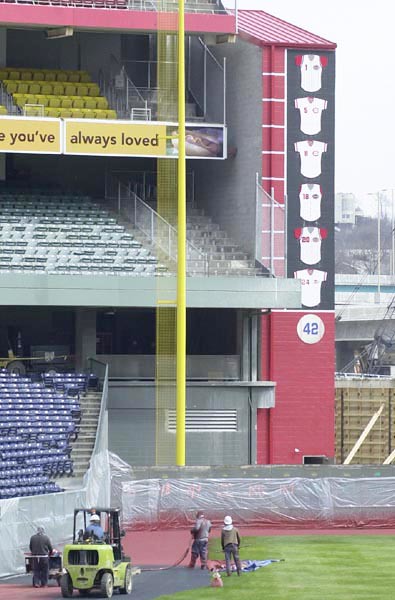
The signs weren’t there for long. In fact, they were probably only a feature of Cinergy Field — not Riverfront Stadium.
As you can see, the area above the left field wall was blank as recently as 1995. The stadium was renamed Cinergy Field in 1996.
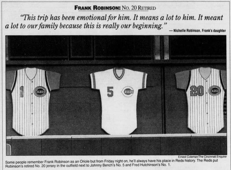
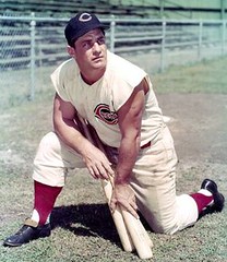
The earliest photos I could find of the signs come from 1998. Prior to ’98, the Reds had removed three numbers from circulation: No. 1 for manager Fred Hutchinson, No. 5 for Johnny Bench and No. 42 for Jackie Robinson. That number would double by the end of the 1998 season.
I don’t think it’s a stretch to assume the Reds added the signs to coincide with the numbers retirements for Frank Robinson (No. 20), Joe Morgan (No. 8) and Ted Kluszewski (No. 18).
Both Hutchinson and Robinson were both honored with 1962-1964 vest jerseys. Bench obviously received the Big Red Machine pullover treatment.
I find Morgan’s and Klu’s signs fascinating. Check out the number fonts. I think we can safely say that font has never appeared on a Reds jersey before.
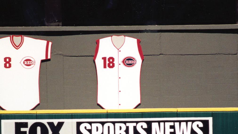
Kluszewski was best known for removing the sleeves from his jersey, so I love that Reds removed the sleeves from his sign. But it’s probably inaccurate that they gave him a red undershirt.
Klu did often wear a sleeveless red undershirt when the Reds adopted vests in 1956 and 1957, but the C-Reds logo on the sign makes it clear that his sign is based on the 1947-1955 era jersey. Every photo I could find of Klu from those years shows him sleeveless without an undershirt.
The 1947-1955 era jerseys also didn’t include a number on the front of the jersey — which is kind of vital to a retired number sign. The Reds probably would have been better off using the 1956 or 1957 home jersey as a basis for Kluszewski’s sign.
Only Cincinnati Reds received the jersey treatment. Jackie Robinson’s No. 42 was displayed on a baseball-shaped sign.
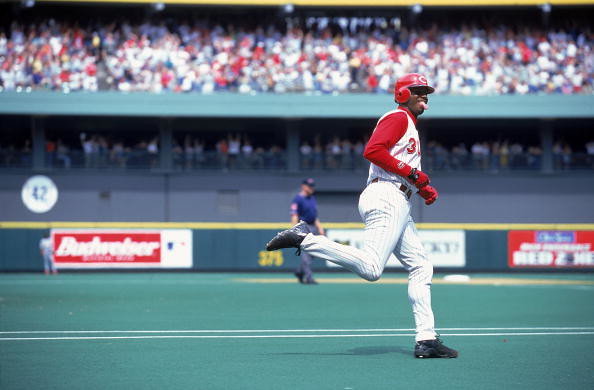
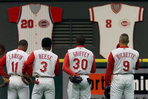
The Reds would add Tony Perez’s No. 24 pullover to the wall in 2000. A season later, the Reds removed the left-field stands to accommodate the construction of Great American Ballpark.
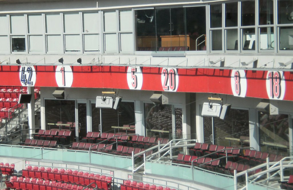
That’s when the signs moved to the exterior of a covered stairway near the left field foul pole. Before the renovation, the jerseys were arranged left to right in the order in which they were retired. Starting in 2001, they were arranged numerically in ascending order from top to bottom.
The signs came down with Cinergy Field in 2002. Since then, the Reds have retired four more numbers: No. 10 for Sparky Anderson, No. 11 for Barry Larkin, No. 13 for Dave Concepcion and No. 14 for Pete Rose.
None of them got the jersey treatment — just a neon number on Great American Ballpark’s facade behind home plate.

Griffins Design Contest
In case you missed it, I’m running the third annual “Grand Rapids Griffins Jersey Design Contest,” in which readers are asked to submit jersey design concepts for a third (or alternate) jersey for the team.
Like past years, the team is asking for a jersey (only) design, but other than that, it’s pretty wide open.
All of the details are here in this post, but the important big detail is the contest submission deadline, which is Tuesday, August 21st, 2018 (by 11:00 pm E.D.T.). Everything else you need to know is in that post.
OK? OK!
By Alex Hider

Baseball News: David Wright, who’s currently on a rehab assignment in the Mets’ farm system, is now wearing a C-Flap (from Paul). … Could these be the A’s spring training caps for next season? (From Michael Davie). … Orioles CF Adam Jones wore some multi-colored, bright shoes to the ballpark yesterday (from Andrew Cosentino). … We missed this one — a few months ago, the Washington Post produced a set of illustrated baseball cards (WaPo link) for the All-Star Game. The card for Dodgers’ OF Matt Kemp did not include the team’s signature red front number (from Tom Denne). … Doug Brei notes that in this 1970s Giants defensive playbook, the team used Wrigley Field’s dimensions instead of Candlestick Park’s (note the notches by the foul poles). … In the ’90s, Reds owner Marge Schott tried to market apparel for her (in)famous dog, Schottzie. To boost sales of the merch, she suggested that Reds players wear dog-eared caps for a game. Somehow, that idea got shot down (from @reetae27). … This gallery notes the “forgotten jersey” for every MLB team (from Phil). … The Single-A Lakewood BlueClaws will wear pink jerseys tomorrow for cancer awareness (from John Cerone). … The Wisconsin TimberRattlers will wear these sharp pullovers for Wisconsin night on Aug. 21 (from @wazze100). … Chris Grayson, an outfielder for the Sioux Falls Canaries, suffered a tear in his right pant leg yesterday (from Tony T.). … The Smashing Pumpkins hail from Chicago, and lead singer Billy Corgan is a Cubs fan. The band stopped by Wrigley and threw out the first pitch the other day, and the band all got jerseys when they stopped by Wrigley Field (all except guitarist and LA native Jeff Schroeder). Note they received “authentic” jerseys with the block of non-striped fabric near the butt (from Noah Sidel). … President George H.W. Bush looks sharp in his 1940s Yale baseball jersey (from @wahlbergLines). … The Houston-area team representing the Southwest region in the Little League World Series appropriately wears tequila sunrise jerseys (from Hal M.).

NFL News: The Rams have a banner at their training camp that details every uniform they’ve worn since the franchise began in Cleveland (from Mark Holmes). … The Steelers’ color rash uniforms in Madden NFL 19 has some strange extraneous under-arm striping. (from JJ). … This HBO graphic must not have been updated since last year — the Browns are featured on this new season, not the Bucs (from Nate Neumann). … The NFL is now selling caps in the style of Carhartt workwear (from Jacob Bogage).
College Football News: South Alabama has officially unveiled their new uniforms. … Tulsa also revealed its new set (from @bearphoot). … New uniforms for Lafayette of the FCS’ Patriot League (from Phil).

Hockey News: What will the Kings’ third jersey look like? This blog post investigates (from Phil). … Northeastern unveiled new men’s and women’s hockey jerseys to go along with their new athletic logos yesterday. … Illinois will wear orange, gray and white jerseys this upcoming season (from @mrmichael21).

Basketball News: Could the Knicks be adding a gray outline to the wordmark on their blue jerseys? (From @chillymak). … SportsCenter created a graphic showing new Rockets G Carmelo Anthony in a jersey for every team he’s played for. But the Hawks, who owned Anthony’s contract for five days and later sent him the jersey he never wore, had some fun with ESPN’s graphic on Twitter. … North Carolina will wear these uniforms during their preseason training trip to the Bahamas (from James Gilbert).

Soccer News: Manchester City midfielder İlkay Gündoğan had surgery to fix a deviated septum in the offseason and wore a mask during the team’s opening game this weekend (from Max Weintraub). … Forest Green Rovers of England’s League Two haven’t received their jerseys from manufacturer Hummel, so they’ve been wearing makeshift sky blue jerseys (from our own Jamie Rathjen). … Also from Jamie: Arsenal fullback Hector Bellerín switched from No. 24 to No. 2 — the fourth different number he’s worn for the Gunners. But according to Jamie, there’s at least one other player who’s worn more numbers in the past quarter century; he says Andrew Considine of Scottish club Aberdeen has worn seven different numbers since debuting in 2004: 36, 25, 21, 6, 5, 3, and currently 4. … Uni ads outside of the maker’s mark are banned in international soccer. But in the ’80s, before strict rules were put in place, some countries wore ads for international matches (from Rob Carey). … Aston Villa wore their new third jerseys in a Carabao Cup match yesterday (from Scott Whitt). … This is what 3rd Degree‘s MLS tracker looks like through about 25 matches.

Grab Bag: New athletic logos for Northeastern. Here’s the obligatory hype video. … Trent Guyer found a “foot measuring device” — not a Brannock Device — for sale in a store display catalog. … Great story from Atlas Obscura that notes some of the more aesthetic gas stations around the world (from @walbergLines). … North Texas is selling T-shirts with Cherokee language.
great job on those retired reds #s, Alex! Never knew any of that. thanks for sharing and contributing today.
Plural or Singular agreement needed in Baseball section:
Could THESE be the A’s spring training capS for next season?
or
Could THIS be the A’s spring training cap for next season?
or maybe
Could THESE be the A’s’s spring training capS for next season?
Back in 1994, the shirts worn by the Republic of Ireland had Opel splashed across the front of them.
I don’t believe the Opel kits were worn during competition though.
link
The current kit is sponsored/advertised by “3” (a high speed data network). Again, this isn’t worn during competition.
link
Does the person that compiled the “Forgotten” jerseys even watch baseball?
“As hard as it might be for Yankee fans to believe, but the New York Yankees have actually worn a jersey that did not feature the iconic pinstripes.”
They wear jerseys that do not have pinstripes at least 81 times a year – and would not have in that game as it was in Fenway.
I always feel worse about myself for getting sucked into those clickbait articles where you have to keep advancing through the entries instead of simply scrolling down. I don’t know what I was expecting on this one, but I made it through Los Angeles before bailing on the whole thing and up to that point there was maybe one jersey I had “forgotten”.
The only impressive thing about that article was that it let you scroll down through the entries rather than having to go from screen to screen and build up the bait site’s clicks for the sake of selling ads.
Their Giants example is the 1999 TATC jersey, but they don’t seem to realize it? “Thankfully this design did not last very long.” Weirdly they specified the Marlins pick was the TATC.
Also “The Chicago Cubs are one of the few baseball teams who have not changed their look or jersey throughout their history.” The Cubs used to change ALL THE TIME. Yeah they haven’t changed at all in 20 years, but they used to do all kinds of weird stuff.
I almost stopped reading when he disparaged link They are only “forgotten” in the sense that not enough people know how amazing they are.
Seems like a lot of the uniform rankings/listicles out there are written by people who aren’t particularly interested in sports, or uniforms for that matter.
One of the worst articles I’ve ever seen. Beyond the Giants and Yankees fiascos already mentioned, they choose a Pirates design worn every Sunday — so cleary not “forgotten”– and missed the Pirates 1997 red vest jersey which was TRULY forgettable…
Adding to the pile-on here, but yeah, that might be the single worst uni-related article I’ve ever read. The Cardinals’ powder blue road unis “forgotten”? Sheesh.
Agreed. Awfully written article. He refers to the St. Louis unis as “Baby Blue” and also says “They Cardinals are identifiable by their red jerseys”. When did the Cardinals ever wear a red jersey?
To keep piling on this terrible article, the Tigers’ alternate lasted one game not one season.
Hope I’m not too late for the pile on. The Rangers entry isn’t a bit forgotten either. They should have listed their turn back the clock uniforms Juan Gonzalez refused to wear, since they only wore it once. Not a uniform they wore for 10 years or so.
The pic of the Tigers “alternate” is actually of the batting practice jerseys they wore for a few years.
My turn. Absolute garbage article; according to Okkonen, the Tigers have worn an Olde English D for 105 of the 118 seasons in the American League, including a nearly unbroken run (1960 being the exception) since 1934. The roadies are almost as consistent; either a block or script ‘Detroit’, in one or three colors, since 1930.
Can’t forget the picture of the Padres’ “Current Camouflage Jersey,” which includes David Wells, who retired in 2007.
My favorite is the final one in the article though: singling out the Nationals’ “2016 Father’s Jersey” (not Father’s Day) as “barely readable,” saying “Most teams want to have their team names emphasized, but the Nationals went in the opposite direction on this one.”
And bizarrely, their picture for the Braves appears to be from Jackie Robinson Day.
This was the most poorly researched uniform listicle I have ever read in my life. He had no clue about anything. My stopping point was he had no clue that the White Sox throwback in 2001 was actually worn in 1917.
i loved the part of his uniform “research” where he stated “Mark Malone was the greatest Wideout for the Pittsburgh Pirates in their bumblebee uniform.
what an idiot
That sure looks like Bob Feller wearing the forgotten 1909 Indians jersey. Huh?
We might have hit the Mark Malone WR point now. :-)
I was thinking the same thing earlier today when the “piling on” comments began at 11:40 a.m. above (also found later regarding Marge Schott).
Thanks for calling it…love how it took only 24 hours to invoke.
Oops (anyone remember Rick Perry?), the Malone was a QB reference below was regarding the Cherokee shirt, not Marge Schott.
I just noticed another thing about this “so bad it’s good” article. The teams are numbered as if they’re counting down to the worst. But the teams are in alphabetical order.
Author: “C Hinbest” – hmmm… the “best” Chinese writer? Did they outsource overseas to contractors found on Fivver? Or did a Uni-watch reader write this as satire?
Here’s a look at the Reds “Schotzie” cap Marge wanted ’em to wear!
link
Wow…those are more ridiculous than I thought! A little disappointed it didn’t happen — just for the sake of the story.
I want to know how Marge Schott convinced Ozzie Smith to wear that ridiculous cap.
She signed his paycheck.
What? He never played for the Reds.
She got Eric Davis too.
link
Correction: That’s North Texas with the Cherokee writing, not North Dakota.
The Cherokee language shirts are from North TEXAS, not North Dakota.
Correction: North Texas has the Cherokee shirt, not North Dakota.
… and Mark Malone was a QB.
(Sorry about the multiple posts. My comment wasn’t showing up, so I made it again. Then they both showed up.)
Good job on the lede – too bad such a unique retired numbers display was replaced with something way more standard.
Ticker stuff:
“Forest Green Rovers of England’s League 2”
“Two” needs to be spelled out.
Also, re: my numbers item, it’s in the context of only the past 25 years or so, which is roughly how long the practice of giving a player one number for the entire season has existed.
I can’t be sure seven different numbers is a record, but it’s rare for anyone to stay with one team that long.
Thanks Jamie! Went ahead and fixed the Tick issues as well.
Schottzie is correct spelling.
Good lord; that “forgettable jerseys” rundown appears to have been written by a high-school student. Not to mention all that’s wrong with this:
Yikes.
Rumour has it that the Los Angeles Kings third uniform will be grey.
The LL team from Houston’s jerseys for representing the Southwest were already designed before they won their regional. The tequila sunrise is just coincidence.
True. And the same goes for Little League Softball, except the colors were maroon, royal, and navy for their Southwest teams.
The 47 x Carhartt caps started with MLB this season. I guess I’m not surprised to see it leaking to other leagues.
Here’s a uniform feature that I don’t think I’ve ever seen before. The Fukuoka Softbank Hawks of Japan’s Pacific League used to have silver embroidered borders around black numbers on their home jerseys, but a few years ago they went to sublimated lettering.
link The triple digits aren’t even the most interesting feature: the sublimated numbers actually have a super-thin black border surrounding them, and the silver borders have two different shades: a brighter one at the bottom and left of the numbers, and a darker one to the top and right, simulating the effect of a light source shining on them from the bottom left.
This feels like something that’s been done in soccer and maybe in hockey. But in baseball? Sublimation isn’t even a thing in baseball.
Nice photo of Marge and Schottzie. I was in that office many times, with Schottzie sitting on top of me on her couch at the end of the office. True.
UTEP with new unis based on the El Paso landscape.
link
UTEP with new unis based on the El Paso landscape.
link
Great stuff today, Alex! I wonder what became of those jersey placards? It seems they would be a great addition to the Reds’ museum if they’re not going to be displayed in the ballpark.
Thank you! Sounds like the signs may be on display at the Reds Hall of Fame and Museum at GABP…I have to plan a trip over there.
link
They are on the side walls of a stairwell. The main feature of this stairwell is a peice with one ball for each of Pete Rose’s hits.
Two of the jersey signs:
link
link
Rose Hit Wall:
link
Re: the ridiculous Schottzie cap –
in today’s world, that might be “just another promotion”; some minor league teams have even looked worse.
You all do know, I hope, Marge Schott was a blatant racist and bigot. Liked her Nazi stuff too. She has no place in this blog.
Alright well let’s never look at a picture of anyone who took steroids or who ever has committed a crime in major sports. Hell, I’d they cheated on their wife, that’s morally wrong so let’s keep them out too.
Seriously….the article isn’t about her, it’s about the Reds. Stop being so sensitive.
Oh, come on. So was Tom Yawkey. So were most sports owners in history. Should we ignore their existence too?
It will be the first time (I believe) a University of Wisconsin baseball jersey will have been worn in a game since 1991, when the Badgers dropped the sport.
Looking at those Smashing Pumpkins “authentic” Cubs jerseys, and I can’t stop noticing that when the team makes a jersey like this for a guest (including 7th inning stretch guests), they’re not 100% authentic: the “3” is too squared off and not rounded enough. For whatever reason, in the Cubs’ number font, the 3 is rounder than the 8, but on these guest jerseys, the 3 is as squarish as the 8. Has anyone else noticed this?
Good catch.
I will offer my own good catch – Corgan was given the number zero for his jersey, no doubt a sly reference to the song “Zero” which was a hit for the Smashing Pumpkins back in the day.
I was wondering about that! Great touch!
If they wanted a forgotten one for the Cardinals, I’d nominate the 2 years in the 50s when they dropped the Birds On The Bat for a generic script “Cardinals.”
Might as well name a “real” forgotten jersey for my Chicago Cubs: the gray road alternate with block lettering from 2014-15.
* Nobody asked for them
* they’re based on a 1920s design which is itself forgotten
* the numbers are slightly too small so the NOBs look huge
* they still look similar enough to the regular gray road uniforms that one of the players accidentally wore the wrong one once
* this was their third road jersey (after the gray with the regular font and blue with the bear logo) while they have no alternate home jersey
In 2014 when the Cubs wore all those throwbacks to celebrate Wrigley Field, I kept thinking that they were auditioning for a home alternate; perhaps a more traditional one without NOBs since they seem to want to keep NOBs on the classic pinstriped home jerseys. I really wish they’d introduce one; pwehaps something based on the very plain ice-white 1940s uniforms.
Also also, by now, any Cubs uniform without the special number font looks like a mistake. Especially that one.
They really missed an opportunity when they let Majestic use its boring default number font on all the throwbacks that predate actual numbers on jerseys. They could have used today’s font and it would have looked perfect.
Oops, that should be directed at Mike Engle.