By Phil Hecken, with Ron Bolton
Follow @PhilHecken
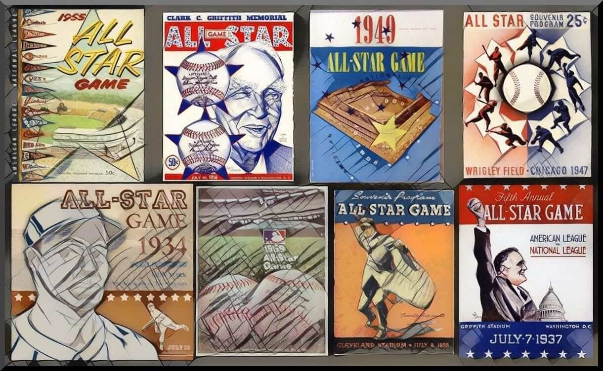
This Tuesday, in Nationals Park in Washington, D.C., the 2018 Major League Baseball All-Star Game will be the played. It’s the 89th All Star Game, and the “first” to be hosted by the Washington Nationals (Washington D.C. has played host to several other All Star Games, in 1937, 1956, 1962, 1969). The current Nationals were “born” the Montreal Expos, who hosted one game in 1982, in Montreal. As most of you are (hopefully) aware, the All Star Game tradition was begun in 1933, and held as part of the 1933 World’s Fair at Comiskey Park in Chicago. It was initially intended to be a one-time event, but it proved so popular, it has become the “mid-summer classic.” And it wasn’t just Major League Baseball who held All Star Games, the Negro Leagues did too, although those were known the games were known as the “East-West All-Star Games,” and were held between 1933 and 1962, and multiple games were often held during the same year, including some games in Washington, D.C. You can see a complete listing of those games here. You may have seen a new mural devoted to Washington’s Negro League stars was unveiled outside Ben’s Chili Bowl, kicking off the festivities for All Star “week” in D.C.
I’ve enlisted the services of my buddy, Ron Bolton, who posts as Old Time Baseball Photos on the Twitter, to give us an historical look-back at some of the past mid-summer classics. You can click any photos below to enlarge. Enjoy! Here’s Ron…

County Stadium, Milwaukee, WI, July 12, 1955

The great Willie Mays robs another great in Ted Williams of a 2-run home run that would have given the American League a 7-0 lead in the top of the 7th inning of the 22nd All-Star game.
After his heist, Mays would lead off the bottom of the inning with a single to help spark a National League comeback. They would score two runs in that inning and three in the eighth to tie the game at 5-5 and send the Summer Classic to extra innings.
The game would continue to the 12th inning when Cardinals slugger Stan Musial would go long on Red Sox pitcher Frank Sullivan for a walk-off home run and giving the National League an improbable 6-5 victory.

Mickey Mantle hit the only other home run in the game when he took Phillies ace Robin Roberts deep with two men on in the first inning to give the American League an early 4-0 lead.
45,643 were on hand for one of great classics of the Summer Classics and the game, due to extra frames, took three hours and 17 minutes to play.
Comiskey Park, Chicago. IL, August 13, 1944

The great Josh Gibson slides home and past Ted “Double Duty” Radcliffe during the 1944 Negro League All-Star game during a 98-degree heat wave in Chicago. Gibson later would hit a 440-foot home run, the eighth-inning blast hit the amplifiers past the center field wall and bounced back into play.
The West would win behind a home run from Double Duty and a triple by his brother Alec. For his heroics, Double Duty was rewarded by the fans with several new suits, a $25 war bond, and some greenbacks.

Gentry “Jeep” Jessup of the Chicago American Giants was the winning pitcher. The game was almost canceled when the players held out for more money than the $60 they were offered. When you consider the game was a sellout with a crowd of 46,247 on hand you can understand why there was friction on the payout. They eventually agreed to play for $150 per player and it was game on.
Griffith Stadium, Washington D.C., July 10, 1956

Pinch-hitter Willie Mays of the New York Giants connects off Whitey Ford of the Yankees for a two-run home run in the 23rd playing of the midsummer classic. Mays fourth inning blast scoring the Cardinals Ken Boyer increased the National Leagues lead to 3-0, later Boyers teammate in real baseball life Stan Musial would add a solo shot off Tom Brewer and the NL would hold on to a 7-3 win.

The NL would need only three pitchers to finish the game with the middle pitcher, Warren Spahn, giving up all the runs that the AL would score in two innings work, it was their final pitcher of the game in Johnny Antonelli who worked the last four innings pitching shutout ball for the save.
Polo Grounds, July 10, 1934

Carl Hubbell of the New York Giants has the honor of being the National League starting pitcher in his home ballpark in the second showing of the Summer Classic. And what a show did Hubbell and his legendary screwball put on! In his three innings, he held the formidable AL lineup scoreless while giving up just two hits and pitched himself into baseball lore when he struck out in succession some of the biggest hitters the game has known. The remarkable feat began in the first inning after Hubbell gave up a lead-off single to Charlie Gehringer and issuing a walk to Heinie Manush, With two runners on already and no outs, Hubbell buckled down and fanned a dangerous one-two-three punch in Ruth (looking), Lou Gehrig and finally Jimmie Foxx.
In the second inning, he picked off where he left off and whiffed Al Simmons and then Joe Cronin giving him five strikeouts in a row! After Bill Dickey broke up Hubbell’s dominance with a single, the southpaw proceeded to strikeout AL starting pitcher Lefty Gomez to finish the first two innings with six strikeouts.

Hubbell’s final inning was uneventful but scoreless as he only gave a walk while striking out none and left the game with his NL mates up 4-0. However, In the fourth inning with King Carl now out of the way, the AL bats lit up NL pitching scoring nine on nine hits in the next three innings and would be all that was needed in a 9-7 win.
Ebbets Field, Brooklyn, NY, July 12, 1949

The Dodgers Jackie Robinson greets the Stan Musial after the Cardinal hit a home run in the 1949 All-Star game. This is also a historic summer classic as it’s the first All-Star game to have African-American players participate. Joining Robinson on the National League side his teammates catcher Roy Campanella and pitcher Don Newcombe and on the American League side it was Larry Doby of the Cleveland Indians.
Jackie’s debut was solid as he hit a double and scored three runs in an 11-7 loss for the National League. The Yankees superstar Joe DiMaggio was the American League hero with two hits and three runs batted in while the National League goats were their gloves with five errors resulting in four unearned runs.

The AL win in the 16th annual summer classic improved their record in the series to 12-4.
League Park, Cleveland, OH, July 24, 1911

While officially the first All-Star game featuring MLB players took place at Comiskey Park on July 6, 1933, many will cite that the first “All-Star Game” actually took place in 1911 at League Park in Cleveland and it was referred to as the Addie Joss Benefit Game. In this photo is Gabby Street, Home Run Baker, Walter Johnson and Smoky Joe Wood, who all took part in exhibition game.
Addie Joss was the Cleveland Naps top hurler and during spring training in April of 1911, he was diagnosed with tubercular meningitis and within days would tragically succumbed to the infection. Joss was just 31-years-old and left behind a wife and two young children.
Being Joss was so beloved across the league, a benefit game was arranged to raise money for his family. The game pitted his old team, the Cleveland Naps, against an All-Star squad of Street, Baker Johnson, Wood along with other greats like Napoleon Lajoie, Bobby Wallace, Sam Crawford, Tris Speaker, Eddie Collins and even the ornery Ty Cobb. As for the score, the Naps lost 5-3 to the All-Stars but more importantly the game raised nearly $13,000 to help pay Joss’ medical bills.

On a side note – I really do cringe when I see autographs on a photo, not a particular fan of the practice.
Thanks Ron! Great stuff as always.


Kreindler’s Korner
I had the distinct pleasure of featuring the wonderful artwork of artist Graig Kriendler on two occasions over the summer and fall of 2017.
For those who don’t wish to click the links, Graig paints baseball heroes (and regular guys) from the past, and is an immense talent.
Occasionally, I will be featuring his work on Uni Watch.
Here’s today’s offering (click to enlarge):

Title: “Third Choice”
Subject: Casey Stengel, 1938
Medium: Oil on linen
Size: 16″ x 20″Casey Stengel has one of the most recognizable faces in baseball history. It’s almost as if he walked straight out of a Norman Rockwell painting to grace us with his presence. From the facial expressions and gesticulations to his famous Stengelese , there was truly nobody like him. And when you think about it, it’s amazing how much baseball he saw in his lifetime. Coming up to the bigs in 1912, he witnessed the last good years of Honus Wagner and Christy Mathewson. Ty Cobb was in his prime. When he retired from his managing post with the Mets, Mickey Mantle had entered the twilight of his career. Sandy Koufax, Juan Marichal and Bob Gibson were the premier hurlers in the league. The game had been integrated, expanded and no doubt seemed quite different from those ‘quaint’ days of the early 1910s.
I had always wanted to paint the man, but never had the opportunity to do so. Eventually, a client was interested in having something of him done, and I jumped at the chance. He gave me carte blanche with the piece, as his only stipulation was that he wanted the portrait to have character – Casey’s age and team were entirely up to me. The no-brainer response would have been to just paint him as a Yankee, which is where he became famous. However, at that time, I was a little tired of painting those old pinstripes. I wanted something different.
I decided to go with his stint in Boston, specifically his first year – 1938. At that point, the Braves were no longer the Braves. New ownership in the middle of the decade brought a name change, and they became the Boston Bees. Though their success in the standings might not have changed, they did have some pretty cool uniforms, especially the away grays in 1938. It worked out nicely that the image I chose to use depicted the man before managing his first game with the club, at the Polo Grounds in April. The image displayed a nice quality of light, and showed off the togs in just the right way. I particularly loved the angular font on the chest mixed with the gold and blue colors. Aside from the Phillies, there was no such combination in either league. And that hat! I had to look around pretty hard to find an actual surviving example of it, just so I could get it right.
And then there’s Casey. Casey just being Casey. What else needs to be said?
Thanks, Graig! You can (and should!) follow Graig on Twitter.

Too Good…
for the Ticker
It was just a small ticker item yesterday: (“Alan Filipczak noticed that the bottom of the Pirates’ “P” cap logo is shaped like a keystone. Pennsylvania is, of course, the Keystone state.”). It also generated several of the few comments. But his whole e-mail was much larger (which I’ll reprint below) and Alan also sent an additional follow up to this.
The whole thing is pretty fascinating. Here’s the first e-mail:
I was watching a Pittsburgh Pirates game recently and a graphic of their P logo came up on the screen. While looking at the bottom/lower left corner of the P, I had the passing thought of “it’s kind of a keystone shape.” Naturally, I immediately realized that Pittsburgh is a city in Pennsylvania–the Keystone State–so I felt kind of embarrassed that I hadn’t noticed it before or was unaware of this detail.
But then I did all the internet search combinations I could think of, expecting to see a plethora of articles about the keystone detail. Instead, I hit a dead end and couldn’t find any mentions at all. I thought I’d at least find a forum thread on Creamer’s site, but no dice. So now I’m turning to Uni Watch with this conundrum, because if anyone had covered it, it would be this blog. So please…tell me which of these is true:
1. This is a well-observed phenomenon, and I stink at internet searching.
2. It’s a coincidence, and the base of the P was never meant to look like a keystone.
3. It doesn’t look like a keystone–I’m seeing things.
4. It’s an intentional under-the-radar uni-detail that the Pirates have kept hidden from us like so much buried treasure.I took a minute to enlarge that section of the P and put it next to a typical keystone shape. It’s not a perfect match, but there’s something there, right? What do you think?

I think he’s on to something. But wait, there’s more…here’s the e-mail I received yesterday:
I’m not sure if these details are well-known, but there seems to be much more to the Pirates’ P logo than I ever realized. The discussion in yesterday’s comments about the “Keystone serif” included a comment by Ryan M pointing out some similarities between the P logo’s points and Pittsburgh’s ubiquitous hypocycloids.
For comparison, check out the attached image.
Thanks for your time!

Fascinating. Definitely worth some further study.
OK. Now, on to the ticker…
Uni Watch News Ticker
By Phil

Baseball News: I’m sure we’ve seen this Sports Illustrated cover before, but it’s always fun to see Bo Jackson in a Memphis Chicks uni with a red jersey and powder blue pants (from Bruce Menard). … The Everett Aqua Sox wore these conquistada en uniformes jerseys the other day (from OT Sports). … Some neat video here on a “Golden Ticket,” which is a lifetime pass to all baseball games (usually given to vets, but not always). From Shaun Hairston. … Great 1970 All Star Game program cover from newly opened Riverfront Stadium (from Bruce Menard). … The South Bend Cubs had their
Star Wars night with BB-8 themed jerseys, and an all-caps MCNOB treatment (from Tom Shriver). … If you read this article closely, it sounds like the Padres will have new uniforms for the 2020 season. … The Orioles wore Maryland flag jerseys and caps last night (from Andrew Cosentino). … When your favorite team sucks, you notice them sometimes doing odd uni things. Niko Goutakolis noticed “Blue uniforms hanging in the locker room, in anticipation of the 1 pm game to(day). The #Mets have not worn the home blue uniforms on a 1 pm start since 2015. Not sure why it’s taken three years.” … Here’s a look at the Down East Wood Ducks Halfway To Christmas jerseys (from Chitty²Bang²). … Here’s a nice deep dive on the MLB All Star Game logo for D.C., “How D.C.’s All-Star Game logo came together: ‘It very much tells the story of the city’” (Washington Post link). From Bryan Martin Firvida. … “So the local Boston station, WCVB Channel five, might want to update their Blue Jays logo, eh?” writes Kevin McLaughlin. “It’s one thing to use an old logo, but it’s totally another when it uses the worst one they had! This was on the 11 p.m. news last night (Saturday).”

NFL News: More signs of some changes in Cleveland: Brownie the Elf signage hanging up at Browns Training Camp facility (thanks to Robert Hayes).
.
College Football News: We’ve seen YUGE NOB before in football (as well as baseball), but I’m not sure anyone has ever had a larger NOB than the University of Tennessee did a few years back (from Russell Denny). … Here’s a look at the 2018 West Virginia Football schedule (from Poster Swag). … Former Iowa State quarterback Seneca Wallace has opened a restaurant in Ames with lots of uni-related decorations, including a wall hanging of his old number depicted in a long-since discontinued font and color scheme (yellow with a blue dropshadow) from his playing days (from Kary Klismet). … Since BYU has released its “color schedule” for what fans should wear to each game in 2018, this has led to speculation as to what unis the team will wear each game.

Hockey News: The Lexington Legends will honor the former AHL and Lexington’s first minor professional ice hockey team ‘Kentucky Thoroughblades’ for one night only, on Friday, August 10 when they wear these special edition jerseys (from Lexington Legends). The Kentucky Thoroughblades were an AHL Affiliate of the @SanJoseSharks that played at Rupp Arena from 1996-2001 (from Minor League Promos).

NBA/College/High School Basketball News: This one comes from a guy who is usually the bulk of the soccer ticker, Josh Hinton: “Mike Schmitz on Twitter: “Clippers got a good one with Shai Gilgeous-Alexander. Has all the ingredients to be the best PG from the 2018 draft class (excluding Doncic). Tools, touch, almost always makes the right play, high intangibles. Still shocked he went outside the top 10.” Josh went on to note, “Shai Gilgeous-Alexander went double decker NOB during the summer league.” … You know you’ve always wanted to see Dave Winfield in a Minnesota Gophers hoops uni, right? (from Throwback Sports). … West Vancouver (BC) Highlanders HS basketball team wear shorts that look like (…wait for it…) tartan kilts (from Brock Jackson).

Soccer News: Gamba Osaka of the Japanese league have just released these really awful shirts (from @ZedMinor). … Not quite “‘skins Watch” but close: Gregory Koch writes, “Interesting…. MLS article on #AudiField refers to “the [Washington] NFL team” while mentioning the Capitals and Wizards by name.” … Yesterday’s Third Place World Cup game between Belgium and England was an absolute thing of beauty. With France going all bleu and Croatia in their checkerboards today for the final, we’re getting treated to some great kit matchups in the final round! … I’m just gonna leave this article (from CNBC.com) here: “The real World Cup final isn’t France vs. Croatia, it’s Nike vs. Adidas”

Grab Bag: There are cornhole boards, and then there are CORNHOLE boards. Tony Caliguiri explains, “One of my beer league hockey team mates made this for our friend from Buffalo and his wife who is an Eagles fan. With light up holes!” Check out the Bills custom cornhole board and the Eagles custom cornhole board. … Meghan Markle’s first appearance at Wimbledon since becoming the Duchess of Sussex was met with much excitement. But some fans thought she looked like a line judge. … “This has to be a first,” says Jeff Wadelow. “Two NFL head coaches playing golf and wagering what jersey color(s) they will wear when they play each other this year.” … In the final round of the World Series of Poker, one of the final two players was wearing a Tim Tebow Florida jersey (good spot by Maple Jordan). … Here’s another look (from Griffin Smith).
Walking in my neighborhood last week, I passed a man wearing a T-shirt that had the logos of all the Pittsburgh sports teams together. This shirt, in fact:
link
I should have told him there was a paw print missing. [No, f]or the Riverhounds, of course!
Yes, there has to be a way to work in the ‘Hounds’ logo. Although, considering that they beat LouCity a month ago, I could do without it ;).
Re: Pirates logo
Kudos to syn_tax for this comment on yesterday’s post:
“Not sure if you’re in Pittsburgh or not, but the keystone is generally well-known in the logo. People often refer to the lettering used on jerseys and as the logo since the late 40s as “keystone serifs”. In fact, during last night’s Negro League Tribute, Steve Blass (Pirates’s tv color man) used that term while discussing Buccos uniforms.”
A cursory search for “keystone serif” yielded little more than a small Reddit thread. I can’t believe this isn’t part of the uni-canon. Yet. Let the research continue.
Thanks for the kudos. I would be curious if the “keystone serif” terminology originated at some point because of the Pirates (I would suspect so). it isn’t particularly common parlance in typography. I once knew the trade name of the lettering as used in a 40s uni catalog, but it has slipped my mind. . .
Mentions of the other MLB teams using the lettering in the 40s abound, but worth noting it was used by the Jacksonville Red Caps and several milb squads. The lettering certainly became ubiquitous as the Pirates lettering during their great stretch during the Clemente era, and then basically all the Pirates milb squads used some variation of it.
The Pirates appear to have begun using this script in 1947, the same time as the New York Giants. It would be interesting to look at the manufacturer’s catalog if the period (Wilson? Rawlings? Spalding?) to see if this was a standard font available for any team to use. That both teams used it suggests to me that it’s “hidden keystone” is — in regard to the Pirates — a happy coincidence.
It’s “similarities” to the Steelers hypocycloids is more of a stretch. The Steelers logo began as the logo of US Steel, which later transferred it to the American Iron and Steel Institute. It was not initially designed to represent a Pittsburgh sports team.
Good find regarding the Giants! I think you’re right–little more than a happy coincidence. Of course, that would contrast yesterday’s mention of how Steve Blass calls it the “Keystone serif” and it’s widely known in Pittsburgh to be a hidden keystone. Looks more like a stock font.
You’re right of course about the origin of the hypocycloids–I used to find it odd that the lids of paint cans had the Steelers’ logo minus the “ers” part. But in much the same way that the Steelers co-opted the US Steel logo, it’s basically the city of Pittsburgh’s logo and it’s possible that it was incorporated into the Pirates’ P as a tip of the cap to US Steel.
Actually…it all just seems like a happy coincidence.
Looking at the Giants wordmark, we see both the “hidden” keystone and the hypocycloidesque curves–especially in the G and S.
link
So unless the Giants ripped off the Pirates in the 40s, there is no connection between the Pirates’ font and the Pitt/Penn regional elements.
Case closed?
The Steelers didn’t start using the Steel logo until the 1960s anyway. I don’t think the Pirates would have beat the Steelers to the punch on that one.
I think it’s a happy coincidence. Now the next time the uniform is updated we can hear all about hypocycloids and keystones.
The Padres focus groups is a great PR move. Show that there are no clear winner between brown/ yellow vs blue/white and in 2020 just do what the owners want. Which will be a mishmash of either set and there will be several unis worn every week. Sounds like 2018 to me.
#2
You guys are only seeing a connection because you want to.
There is not a chance in hell the Pirates selected that font of the letter P because it was similar to the Steelers logo or because there “is” a keystone at the bottom.
Not a keystone.
And a hot dog is a sandwich.
When it comes to a quintessential 1990s hockey uniform, the Kentucky Thoroughblades uniform would be it. Had a lot of the elements stereotypical of new uniforms in that era.
Re: West Vancouver Secondary Highlanders tartan shorts. Though interesting look, not anything new. The photo in the Ticker is from 2015.
West Van has worn tartan shorts dating back to at least the 1950s as indicated in this article:
link
Here is a photo of a West Van player in the tartan shorts after winning the Provincials in 1982:
link
Do I see Robin Roberts of the Phillies in a Braves jacket?