By Phil Hecken
Follow @PhilHecken
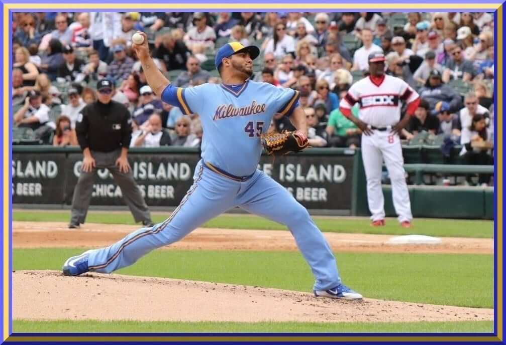
Beautiful looking game in Chicago yesterday (well, beauty is of course in the eye of the beholder, but if you loved the uniforms of the 1970s and 1980s, this one was for you). The Brewers threw back to circa-1982, a year they played in the American League and in which they went to the World Series. Their opponents were former AL rivals the Chicago White Sox, who just happened to already possess the perfect 82 Beach Blanket Bingo uniforms of their own. It’s a matchup you might have witnessed on the South Side some 36 years ago.
For reference, here’s a look at Bill Henderson’s writeup of the uniforms worn during this time period:

It seems like the Brewers (or the White Sox, who are responsible for furnishing the uniforms) did a pretty good job of replicating the unis:


Let’s see: gold front panel/blue ball-in-glove cap? Check. Script Milwaukee? Check. Pullover jerseys and sansabelt pants? Check. NNOB? Check.
The team seemed to do an excellent job of recreating the uniforms, right down to the smallest details — I like how they even made sure to get the fonts correct — notice the “5” above has the same telltale notch as it did back in the day. About the only discrepancy I could find between the original uniforms and the throwbacks was the helmets: back in 1982, the helmets were blue with a white panel painted on it, while yesterday’s helmets were solid blue. Both had the ball in glove logo.

Nicely done. Of course, I’ve given up complaining about players wearing a much more form-fitting uniform (as was the style in the 1980s), and hoping for any hosiery, much less stirrups, is usually a fool’s errand. But other than these minor quibbles, the Brewers looked great.

The White Sox, of course, had have their own 1982 era throwbacks for several years, so they looked superb:

It was a good looking matchup between both teams:

There are a few teams I think should return to powder blue, and the Brewers are definitely one of them. This may be a “fan favorite” (and I admit I do love the script Milwaukee wordmark), but the Brewers actually have a couple different powder blue iterations from which to choose. I actually preferred the Hank Aaron era powder blues, when the team wore gold sanis under blue stirrups. But this would be equally acceptable for a throwback. And when worn with high cuffs, this one really still looks pretty good today:
I’m sure many of you who didn’t grow up during a time when uniforms like this were considered just normal, and par for the course, think stuff like this looks dated and/or ridiculous, but for those of us who saw unis like these in our formative years, it was a nice trip down memory lane.
I sure enjoyed it.
You can see more game photos here and here.


Kreindler’s Korner
I had the distinct pleasure of featuring the wonderful artwork of artist Graig Kriendler on two occasions over the summer and fall of 2017.
For those who don’t wish to click the links, Graig paints baseball heroes (and regular guys) from the past, and is an immense talent.
Occasionally, I will be featuring his work on Uni Watch.
Here’s today’s offering (click to enlarge):

Title: “A New Home”
Subject: Joe Jackson, 1911
Medium: Oil on linen
Size: 18″ x 22″Like most baseball history buffs, I’ve always been fascinated with Joe Jackson. It’s hard not to be, as his tale has been so incredibly intriguing on every level: his beginnings as a mill hand, how he acquired his nickname, his otherworldly statistics, the Black Sox scandal in 1919, the aftermath, and even how his merits and foibles continue to be debated today. Though gone since 1951, in 2018, he remains very much alive.
In this painting, he appears with the Cleveland Naps in 1911, his first full year with the club. The photograph I had used for reference was especially appealing, not only from a standpoint of light and (possible) color, but also its unique design. It’s the architecture of Comiskey that really sells it here, with the awkward slope of the roof coming straight down onto Jackson’s neck, and then that movement being echoed by the shadow shape on his shoulder and down his arm. Speaking in terms of classical picture making or portraiture, that structure of the ballpark should have had some serious editing done to it to make the image more ‘successful,’ whether that’s changing its shape or getting rid of it altogether.
I guess the fact that it comes down and seemingly cuts his head off just resonated with me in some way. Perhaps it was a metaphor for the treatment he received from Commissioner Kenesaw Mountain Landis in 1920? There’s probably some of that in there, but I also just think it was that shape that made the piece so interesting. In a way, I found that I was breaking the rules of picture making by leaving it there. And I guess when you speak of Joe Jackson, the idea of questionably breaking the rules is a familiar motif.
Thanks, Graig! You can (and should!) follow Graig on Twitter.

Too Good…
for the Ticker
Got an e-mail from UW Pal Ray Hund.
The message was short, but the goodness inside was not to be missed (check out the pics after the e-mail):
The 1968 World Series between the Detroit Tigers and St. Louis Cardinals featured at least two players who did not wear protective helmets while batting: 1) Mickey Lolich and 2) Norm Cash. The homerun Lolich hit in game 2 (see pic) is the only one he ever hit in his entire career. And old guys like me gotta love the floppy victory cap Dick McAuliffe is wearing in the winner’s locker room.
Ray Hund


Thanks, Ray.
I’m not sure if this is a popular opinion or not, but those 1968 road flannels with their tv numbers were (IMO) the best Tigers roadies ever, and easily one of the top 10 all time road uniforms for all teams.
OK. Now, on to the ticker…
Uni Watch News Ticker
By Phil

Baseball News: Here’s a great photo of the legendary Satchel Paige doffing his cap to the photographer as a member of the Dragones de Ciudad Trujillo (from Alex Cheremeteff). Looks like Ol’ Satch had some problems aligning his buttons! … OT Sports had some photos from Brannock Device Night (in which Paul threw out the first pitch Thursday). … CROSSOVER: Philadelphia Eagles players joined together for a charity softball game that benefits the building of sports complexes in Haiti. Half the players wore Kelly green softball jerseys while the other half wore light gray. The jerseys were a nod to former day’s when the Eagles wore Kelly green. Owner Jeffrey Laurie participated in the home run derby that preceded the game. About 25,000 fans “crowded” into Citizens Bank Park for the event. From John M. — also posted in NFL. … Here’s more on that from John McMunn: “a picture of Philadelphia Eagles owner Jeffrey Laurie in uniform for the AO1 charity softball game at Citizens Bank Park on Friday evening. Note that he is wearing jersey #7 which I assume is a nod to Ron Jaworski.” … There’s a note in this article about Johnny Wyrostek of the Phillies in the left-hand column, who wore eye-black in 1946 (great find from Jerry Wolper). … The Peninsula Pilots of the Coastal Plain League sported some interesting jerseys (from Marc Víquez). … In yesterday’s ticker I mentioned all the Cubs wore their cuffs high for Friday night’s game. Turns out there was a specific reason (from Topher Flounder). … Cut4 had a nice review of Todd Radom’s new book, Winning Ugly. They interviewed Todd, so he provides some perspectives. Good read. Also some good responses to my tweet on that. … Next weekend (June 8-10) the Marlins will wear their teal throwbacks to help celebrate their 25th Anniversary season. … “Grandaln (#9) a switch hitter has reason for two helmets, but Kike Hernandez (#14) is purely a right handed hitter,” writes Stetson Pevear. Still, he has two helmets. I can’t tell if the top helmet has a C-Flap or not. I could not find any 2018 pictures of Kike without a C-Flap.” He followed up with a “mystery solved” e-mail: “I was just watching the game and Kike comes to bat with a helmet without a C-Flap. So mystery solved/confirmed. He has two helmets, one with and one without a C-Flap.” … The Durham Bulls debuted their Copa De La Diversion jerseys which were made by OT Sports on Friday. … How bad are things for my (and Paul’s) team? The Mets were scheduled to distribute Todd Frazier replica batting practice pullovers to the first 15,000 fans through the turnstiles before Saturday’s game, but they announced before gates opened that they would not be giving them out because of a “quality control issue in the production of the item.”

NFL/CFL News: I am not sure how factual any of this is, but check out this twitter thread on possibly uniforms for the LA Rams (from Patrick Thomas). … CROSSOVER: Philadelphia Eagles players joined together for a charity softball game that benefits the building of sports complexes in Haiti. Half the players wore Kelly green softball jerseys while the other half wore light gray. The jerseys were a nod to former day’s when the Eagles wore Kelly green. Owner Jeffrey Laurie participated in the home run derby that preceded the game. About 25,000 fans “crowded” into Citizens Bank Park for the event. From John M. — also posted in baseball. … Here’s more on that from John McMunn: “a picture of Philadelphia Eagles owner Jeffrey Laurie in uniform for the AO1 charity softball game at Citizens Bank Park on Friday evening. Note that he is wearing jersey #7 which I assume is a nod to Ron Jaworski.” … In a preseason game Friday, the Calgary Stamps & BC Lions played a color vs. color game (from Tom Pachuta). Not only that, it was orange versus red. Wade Heidt notes that in addition, the BC Lions wore new orange socks. They had worn only black socks at home and white socks on the road since they switched to this uniform design in 2016. … “I found a pretty good article on the Saints uniforms on Nola.com,” says Douglas Malicki. “I didn’t know they planned to wear different color helmets for home and road games at one point, pre dating by many years what is the norm in college football these days.” — UW Pal Scott Turner notes this includes “a photo of a “navy-tan” prototype from 1985 that I’d never seen or heard of before”. … Little bit of chatter here on the Steelers new throwback unis, including the question “do they throw back far enough?”

Hockey News: According to Kyle Arnott, here’s a Columbus Blue Jackets “prototype jersey (in a style I haven’t seen before!) just popped up on eBay and it’s already out of my price range—I envy the lucky person who ends up taking home this incredible find.” … Kyle Arnott seemed to have a theory on the CBJ prototype. … From @FoShizGriz, now that the NHL Finals will have first game in Washington, it appears that the restaurant next to arena can’t use the term “Cup.” … Saxon Brack found what appears to be a Dallas Stars prototype sweater. … This is cool: “In this story, the word “Fuck” has been replaced by “Zamboni” throughout,” writes Tris Wykes “Developer who loves hockey. So awesome.” Agreed.

NBA News: The Nuggets recently began to phase the powder blue out of their color scheme. Their 2017-18 uniforms relied more heavily on a deep navy blue than on its powder counterpart. Now, as uniform and logo aficionado Conrad Burry reports, they’re taking a head-first dive into the threads of their past.

Soccer News: The Hibs have launched their new home and away kit for the 2018/19 season. The Easter Road club unveiled the striking new designs which they describe as “a nod to the past as well as the future,” (from Ed Żelaski). … The Republic of Ireland marked the beginning of Pride month by incorporating the rainbow flag into their team kit as they faced the USA in a friendly yesterday (from Ted Arnold). … Arsenal’s 2018-19 away kit has leaked (from Josh Hinton). … Also from Josh: Toluca’s 2018/19 home and away kits have leaked … San Marino’s Men’s National Team 2018-19 away kit was released (Josh again). … U.S. soccer player Jaelene Hinkle didn’t want to wear LGBTQ ‘Pride Month’ jersey, so she refused to play. … “Noticed something while watching @ATLUTD tonight – notice how the club badge is centered perfectly in the red stripe on Martinez’s kit (right), but it splits two stripes on Gressel’s kit (left),” tweeted Robbiñ’ Seasoñ. “Curious as to why that would be.” … Doug Keklak sent in this video and said, “haven’t seen that one before. Richmond Kickers’ USL broadcast was using outdated logo for Pittsburgh Riverhounds FC in score bug and fixed it mid-game!”

Grab Bag: NASA is getting ready to mark the 50th Anniversary of the Apollo Program that landed a dozen Americans on the moon! Friday night they revealed the official anniversary logo. Check it out! (from James Gilbert).
Jeffrey LURIE, not Laurie.
Absolutely correct. Auto-spell checker changed it and I missed it. Thx for the pickup.
SI had an article today with the hypothesis that Lurie wore Nate Sudfeld’s jersey because it fit him best. Possible but I think there were others he could have chosen from (there was a Kelly green and a silver/gray jersey for each player). I know Lurie has a great deal of respect for Jaws that why I think he chose #7. Just a guess on my part.
The #7 jersey is QB Nate Sudfeld. Lurie said he would wear the jersey of the player that won the eagles charity autism 5k event a few weeks ago to the softball game.
The Brewers were in the AL East, not the West.
Initially the White Sox were in the East and the Brewers after moving from Seattle were in the West. But in the name of competitive balance the two teams switched divisions. I believe it was before the 1972 season as the White Sox led by MVP Dick Allen made a serious run at the A’s that year.
The White Sox and Brewers were division rivals from 1994 through 1997. Both were in the AL Central.
The White Sox were never in the AL East.
Correct. The White Sox were never in the AL East; the team that swapped places with the Brewers was the Texas Rangers, who were in the AL East as the Washington Senators.
If I may, White Sox always in AL West. Milwaukee Brewers were in AL West until 1972. The Brewers and the relocated Washington Senators switched divisions in 1972. Brewers moved to AL East. The Senators became the Texas Rangers and moved to AL West.
link
link
Great looking baseball game in Chicago yesterday. I hold on the the hope that baseball fashion is cyclical and powder blue road uniforms make a comeback someday.
It is always more fulfilling when both teams wear period era throwbacks in same game, rather than 1 team just throwing back which we can often see.
It seems that if an MLB team brings back the full powder blue uniform, jerseys and pants included, it will do what the Phillies do and use it as a home uniform. Too bad. Still, teams look infinitely better when the jersey and pant colors match, rather than doing the softball look.
Ideally, the powder blues should be road uniforms, but in theory i don’t have a problem with them being worn at home. However, I hate the look when the home team is wearing powder blue and the road team is wearing gray, unless it’s a dark gray like the Diamondbacks. I wouldn’t mind the road team in white for these games, a la the KC A’s.
I agree totally that the blue jerseys need matching pants. The powder blue jersey with white pants looks like damn Smurfs, and makes me want to hurt kittens.
I question the legitimacy of the blue jackets jersey as well. Pro player was not the uniform manufacturer that year it was Ccm/koho. I don’t think they would make a prototype in a replica style jersey. Probably fan made.
Love the throwbacks. Great how the Brewers used the correct font. The reason they did was probably because that was a special font Sand Knit made for them (the 5 being the most unique number). Sand Knit made a lot of consumer athletic gear too and people of a certain age remember this label
link
Notice Sand Knit was based in Wisconsin, so they had a great link to the Brewers and apparently still do, so someone made sure they honored that font. Don’t think Sand Knit it still a standalone company though.
Good summation of the Brewers-White Sox game, Phil. Great-looking matchup.
Good lede today. As a High School Baseball coach, I have tried to impliment powder blues for years at my current school. The “problem” our AD claims is it does not allow kids to wear their own pants. The belief is that every kid owns white pants and that if you let him wear his own he wont wear out the team set that has to last the majority of a decade. If you think about pinstripes and how kids dont own those, it affects the number of programs that in turn get to wear them. I also blame this approach for the rise in white fronted hats in HS Baseball. The majority of teams at the HS level only wear white pants now so the white fronted hat “works” with the home white and colored road tops.
BONUS COMMENT: BEST HOCKEY TICKER ALL YEAR!!!! Plenty of prototypes and a funny story. If you don’t normally check the hockey section today is the day
FYI, the throwbacks the White Sox wear are technically 1983, not 1982. The difference is a patch for the 50th anniversary of the All Star Game (plus, 1983 was the first division winning White Sox team ever, so that’s why people associate the uniform with that one year)
While Lolich and Cash did not wear helmets, they likely used protective inserts, because as Paul noted, the AL required them as of 1958.
link
This may sound strange. I’m 14, and I enjoy powder uniforms! I am a Cardinals fan, and my dad liked those powder Unis, I guess that rubbed off on me.
The Atlanta United crest placement is a little odd but it is related to the size of the shirt. I believe small and medium gets the crest centered within the stripe and large and above get the half and half treatment. If I recall, it’s so that the crest isn’t too close to the armpits or something along those lines on the smaller cuts.
That CFL game color-vs-color was just brutal.
The two worst unis in the league appearing together for the first and hopefully last time. YECCHH!
Yep – bit surprising that they would do red vs. orange that does not contrast well. Both teams’ black home pants fairly similar too.
Still think Montreal has worst unis in the league, considering the logo and their busy design.
Since we are thinking about 1980s throwbacks today, thought about how I missed what BC at Calgary would have looked liked in the 80s.
Home Stampeders in white pants with silver trim in there too:
link
Visiting Lions in the orange and brown:
link
Regarding the post on the CBJ prototype jersey and the Dallas Stars “prototype “, I don’t know definitively on those two but I know Starter made Philadelphia Flyers fashion jerseys in the 90s. There were 3 versions that I know of: Black, a powder blue, and a green/turquoise. The black preceded the Flyers 3rd jersey by several years. So it’s possible that these “prototypes” are in fact fashion jerseys.
Loved watching highlights of the Brewers-White Sox game. Kept thinking I was going to see LaMarr Hoyt pitching to Carlton Fisk for the White Sox and Paul Molitor and Robin Yount hitting for the Brewers. Bring back the powder blues!
Eagles owner Jeff Lurie wore number 7 because there were 2 sets of jerseys for each player (kelly green and light gray).
He wore the unused #7 jersey by 3rd string QB Nate Sudfeld (who played in kelly green). Even had “Sudfeld” on the back of the jersey.
Lurie apparently just grabbed an unused jersey that fit him. So no significance to why he wore that number.
Teams that should bring back powder blue: Royals, Cards, Phils, Brewers. Rays ;)
Blue Jays, Twins… bring back the Expos and put them in their powder blues.
Forgot those. Good catch. Maybe put the Nats in powder blue?
The Chicago Cubs should be wearing either their 1940s powder blue vests, or their 1978 powder blue and white pinstripe road uniforms.
those 1968 road flannels with their tv numbers were (IMO) the best Tigers roadies ever, and easily one of the top 10 all time road uniforms for all teams.
Far too plain. Add orange trim to the lettering/numbering, and you’d be talking. Make it a script “Detroit” and you’d be talking. Even some orange stripes on the stirrups would help.
So something like what they wore link then?
What is going on with NY Giants uniform this year? Are they going back to the older jersey model with the fly wire? Or was that just for the rookie thing.
Regarding the soccer friendly between Ireland and USA, the USMNT also wore rainbow numbers on the back of their jerseys.
link