The Astros played their home opener last night, so they wore their gold-trimmed jerseys and caps for the occasion. I’d say this was one of the better executions of this trope that we’ve seen, because gold meshes well with Houston’s color scheme. Lots of additional photos here.
They’ll wear these uniforms again tonight. As of now, those are the only two games for which this design is slated to be worn, although it wouldn’t surprise me to see them say, “Hey, everyone loved this so much that we’re going make it our Friday alternate,” like the Royals did in 2016. We’ll see.
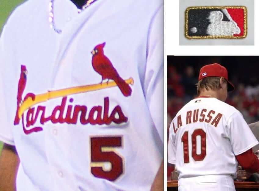
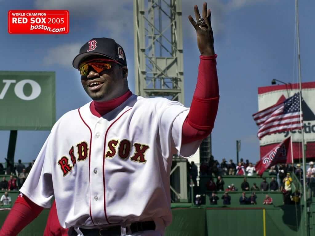
How does the Houston design compare with other MLB championship uniforms? Let’s take a look, beginning with last year’s edition and going back to 2005, when the trend started (for all photos, you can click to enlarge):
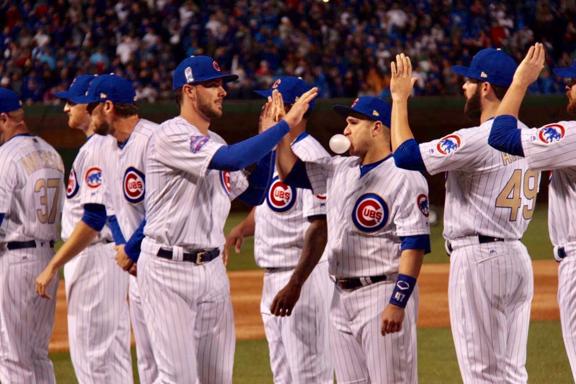
2017: Cubs
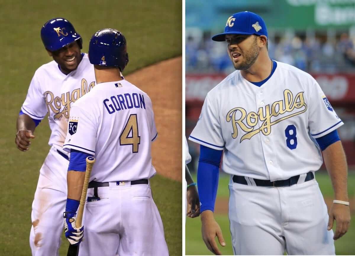
2016: Royals
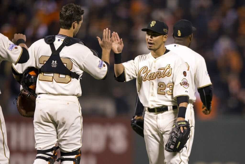
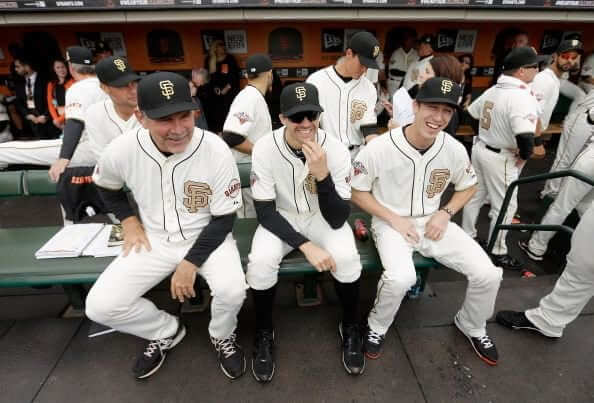
2015: Giants
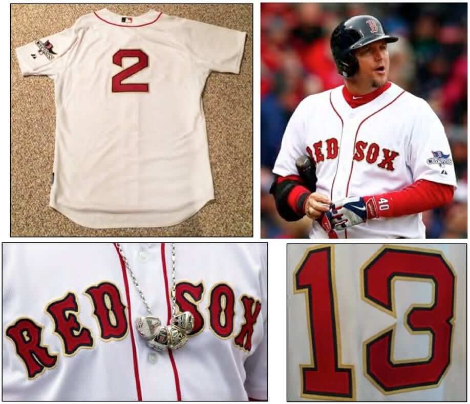
2014: Red Sox
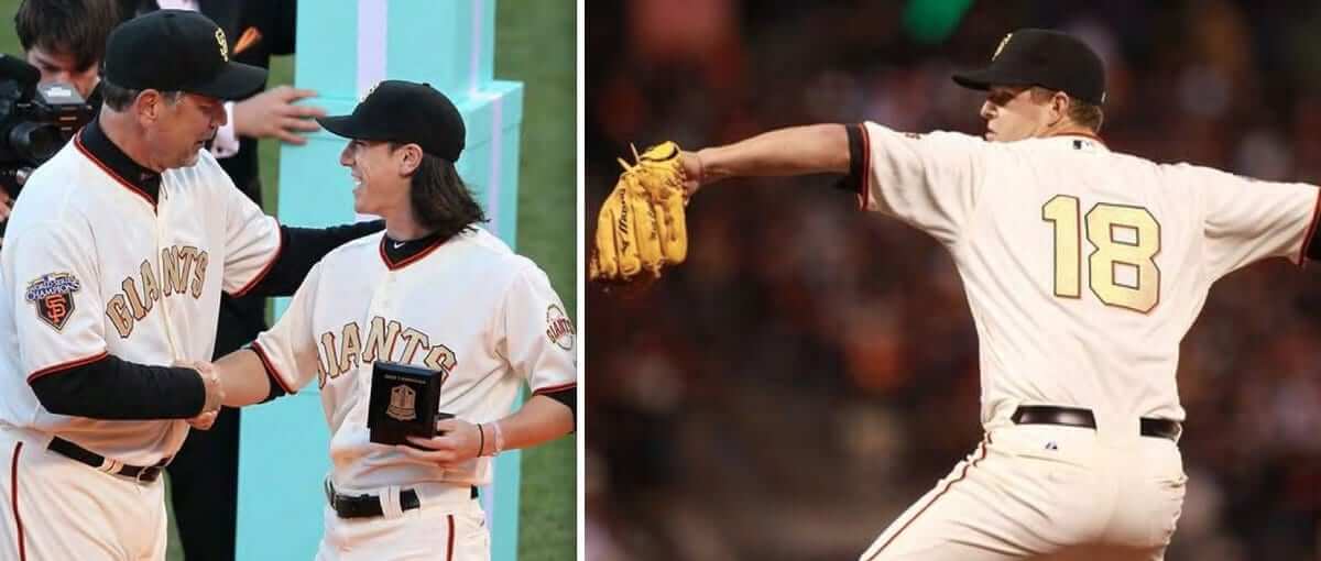
2013: Giants
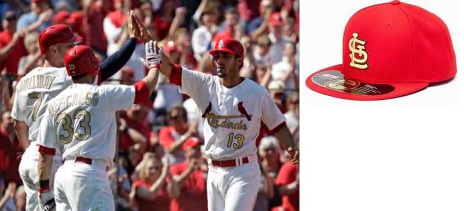
2012: Cardinals
2011: Giants
2010: None. The Yankees were champions and opted not to wear a gold-trimmed uniform.
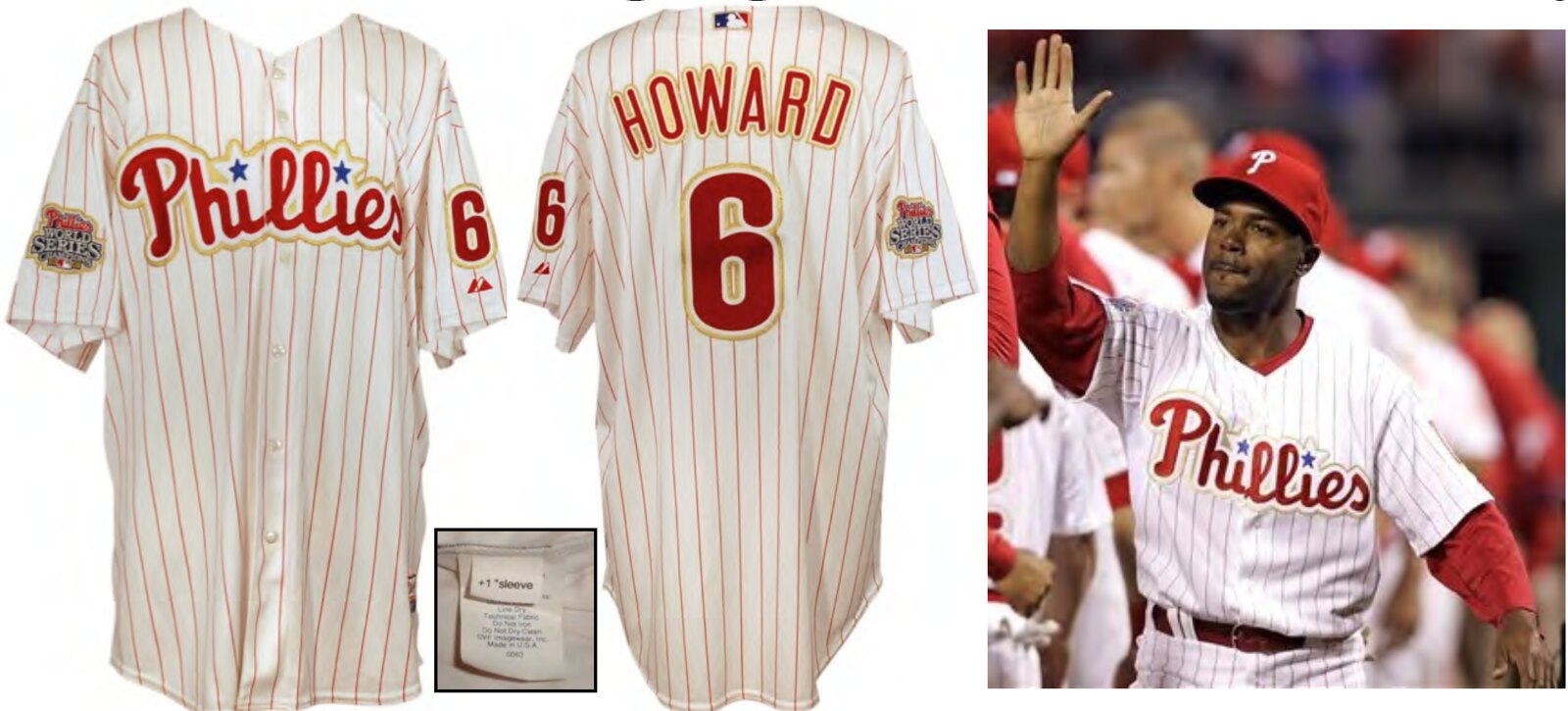
2009: Phillies
2008: None. The Red Sox were champions and opted not to wear a gold-trimmed uniform.
2007: Cardinals
2006: None. The White Sox were champions and opted not to wear a gold-trimmed uniform.
2005: Red Sox (ring ceremony only)
Meanwhile, the ’Stros had a wee bit of difficulty unveiling their championship banner last night:
Fun to see the players chuckling about the snafu. Life is so much more interesting when things don’t go exactly as scripted, right?
(My thanks to Mike Chamernik for banner video.)
Click to enlarge
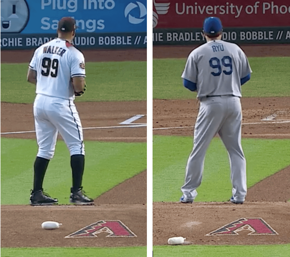
Another MLB numerical first: History was made in last night’s Dodgers/D-backs game, as starting pitchers Taijuan Walker and Hyun-Jin Ryu both wore No. 99 — the first time that has ever happened, at least according to Christopher Kamka, who crunched the numbers over at baseball-reference.com. Unfortunately, Turk Wendell, Mitch Williams, and Barbara Feldon were all unavailable to pitch in relief.
It’s sort of the opposite of a Rays/Jays game from last year — almost to the day! — when both starting pitchers wore single-digit numbers (a feat that was rare but not unprecedented).
(My thanks to Andrew Edling for bringing this one to my attention.)
Click to enlarge
Collector’s Corner
By Brinke Guthrie
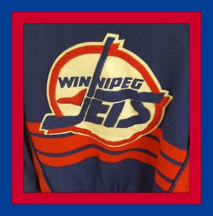
Time for some hockey stuff, eh? I love the old-style varsity jacket look, and this Winnipeg Jets varsity jacket just looks outstanding. All wool with chenille logo on the back, and embroidered conference and league patches on the sleeves. Can’t quite make out the maker — but we can tell that this one for the Montreal Canadiens is from Shain of Canada.
Now for the rest of this week’s picks:
• Got some poster art for ya this week. First off, how about this 1972 Stancraft New York Jets poster! Clearly Joe Willie in the middle there. The artist here is George Bartell. And this Jets poster seems to have had a bit of airbrushing on the Jets helmets, am I right? (Want to see the rest of the 1972 Bartell series?)
• Doesn’t get much better poster-wise than this Damac 1979 Detroit Lions poster from Chuck Ren.
• One more Chuck Ren poster, this time for the Seattle Seahawks!
• Boston Bruins fans, transform that plain black puck into a Bruins biscuit with these 1970s Bruins puck stickers.
• This 1970s powder blue Houston Oilers duffle bag was Made in U.S.A., according to the tag.
• Interesting late-1970s New York Jets watch. The numbers are in silhouette, which would make it harder to read in the sun, right?
• These wristbands are an Officially Licensed Product of the NFL (or at least they were in the 1970s) and are presented here in the blue/yellow of the L.A. Rams.
• These 1970s “MVP” model Adidas baseball cleats are trimmed in Baltimore Orioles orange. I surely don’t recall seeing any retail Adidas shoes with trim other than white (you could get their soccer shoes with yellow stripes back then, but even those were German imports), so maybe these were used at the pro level after all.
• Another O’s item: This 1970s-1980s bumper sticker from WMAR-TV2 tells everyone you’ve got the spirit! Here’s another version from 1983.
• Some nice vintage NBA logos on this 1970s bath towel.
• And we wrap up this week’s entry with some hockey items spotted by reader Will Scheibler, including this Indianapolis Racers belt buckle, a Kansas City Scouts coffee mug, and a very cool pair of Philadelphia Blazers key chain figurines.
Seen an item on eBay that would be good for Collector’s Corner? Send any submissions here.
The Ticker
By Alex Hider

Baseball News: The Marlins have reportedly mothballed their orange jerseys, which sounds like the latest in a series of late-breaking decisions by Derek Jeter’s new ownership team. … Phillies manager Gabe Kapler has been wearing a cap without the New Era logo this season. Kapler wore caps with the logo during spring training (from Joe). … Astros IF Alex Bregman has new batting gloves for Autism Awareness month (from Megan Brown). … Reds CF Billy Hamilton had his 3D batting helmet logo come loose during yesterday’s game. We can probably chalk that one up to the chilly weather (thanks to all who submitted). … As you can kind of see from this photo, the Brewers have cleaned up the ads on the outfield wall by requiring white text on either blue or green backgrounds. Much cleaner look (from Dylan Buell and Drew). … The Reds flipped the home and road bullpens at Great American Ball Park this season, and it’s throwing off manager Bryan Price (paywalled link). … The Louisville Bats will wear throwbacks in July (from Alexandra Ottaviano). … Could the Trenton Thunder be wearing throwbacks this season? The team made these throwback caps available for sale (from Aaron Pinto). … This Astros fan has the ultimate patch collection (from Ignacio). … Check out the satin unis worn by this baseball team from Wickett, Texas in the 1940s (from @jhlichty). … Baseball uniforms really are weird, when you think about it (from @brandongutie).

Pro Football News: New uni number assignments for the Cowboys and Vikings (from our own Kris Gross and @RipVanWhiskey, respectively). … Pro Football Journal found a 1976 photo of Tampa Bay Bucs guard Tony Alward in a NNOB jersey. The next week, his name was restored. Andres Cardenas also snapped a screencap of Bears RB Walter Payton with a NNOB jersey during a 1983 game. … Dave Buchanan found these USFL logo buttons on Facebook, being sold by a company that does estate sales. … The New York Times has done more reporting on the horrible working conditions for NFL cheerleaders.
College Football News: NBA star LeBron James’s media company, Uninterrupted, has sent a cease and desist letter to Alabama concerning copyright infringement. The ’Bama football team is producing a show called “Shop Talk,” which involves former players talking football during haircuts. James has his own barber shop-based show called “The Shop.” … More Nike tear issues, this time at Florida spring practice (from Hunter G.).

Pro Basketball News: Despite reports that the NBA would be introducing new “City” edition jerseys next season for all teams, the Jazz are reportedly keeping their “Red Rocks” uniforms in the rotation next season (from Christopher Jones). … Over the weekend, Pelicans F Anthony Davis shocked the NBA community by threatening to shave his famed unibrow. Turns out it was just an April Fool’s Prank (from Josh Hinton). … This thread may have some hints as to what Nike has in store for the WNBA’s warmups (from @TheSkyShowCHI). … Cross-listed from the college football section: LeBron James’s media company, Uninterrupted, has sent a cease and desist letter to the University of Alabama concerning copyright infringement. The school is producing a show called “Shop Talk,” which involves former players talking football during haircuts. James has his own barber shop-based show called “The Shop.”

College Hoops News: Loyola Chicago’s Clayton Custer was asked by Dan Patrick on his radio show yesterday if he gets to keep his Final Four jersey. Custer said he may have to give it back so the team can reuse it next year (from Griffin Smith).

Soccer News: Tottenham Hotspur’s kits for next season have leaked, and a slight badge change is coming along with the switch from Under Armour to Nike (from John Muir). … Vfl Wolfsburg of the Bundesliga made a fourth kit to avoid a kit clash against Hertha Berlin SC, as Hertha were the home side and all three of Wolfsburg’s kits were too similar to Hertha’s home kit (from Josh Hinton). … New away kit for FC Copenhagen (also from Josh Hinton). … Tim Dunn found a website that’s selling stirrups for soccer players. Footballers, you know what to do. … DC United had a community relations table at the White House Easter Egg Roll on Monday. According to John Muir, the team was giving away mini banners commemorating the team’s 1996 championship — banners that included the team’s new logo. They were also giving away programs from the team’s final game at RFK, which contain a passage about the team’s uniform history.

Grab Bag: This 1999 Washington Post piece about uniform retailing used the term “planned obsolescence” to describe how teams quickly change uniforms to drive merchandise sales. I think it’s safe to say that for many teams, this is still the case 20 years later (from Thomas Juettner). … Golf Digest reports that Tiger Woods (and other Nike golfers) will wear pink on Sunday during The Masters, but I’ll believe it when I see it (from Colin Dilworth). … This is what golfer Daniel Berger will be wearing each day of The Masters later this week. … Reader Dan Siegel has a design concept for the NHL’s expansion franchise in Seattle. … Not surprisingly, Nike is taking over the high school athletic apparel scene in Oregon (from Travis McGuire and @aDub503). … Looks like Blondie Gets It™️, at least judging by yesterday’s installment of her comic strip (from
Patrick).
2011 photo in lede is of Cubs.
Ack! Fixed.
And fixed the italics at the end of the Ticker too.
Typo in baseball section: “Tenton”
Got it.
The Astros banner snafu….
That’s apparently the grounds crew trying to get the shroud off. They’re going at it with leaf blowers and pole saws!!
“…a screencap of Bears RB Walter Payton with a NNOB jersey during a 1983 game.”
What are those striped things covering the players’ upper arms. EVERY single player has them. I’m stumped. ??
I think they’re called “arm pants”. It’s been so long since I’ve seen a pair that I can’t really remember.
Re: Tottenham Hotspur’s “slight badge change,” they actually switched manufacturers last summer for this season. They’re just changing the badge back to what it was before.
Proofreading: “Vfl Wolfsburg” in soccer should be VfL.
“Cadinals” in the 2012 entry in the lede.
Also, in the Blondie strip, isn’t it Blondie that Gets It and not Dagwood?
Adding on to what Jamie said,
Nike added a shield on the outside of the spur this season (the first season with Nike as Spurs made the switch from Under Armour) but according to 2018-19 kit leaks, Spurs’ badge won’t have the shield outlining the spur next season
link
(The image directly under the headline is fake; scroll down to see the leaked kits.)
Sounds like the current Marlins identity is heading into oblivion piece by piece. First that beautiful 25th Anniversary logo with not even a hint of the current colors or logo. The throwbacks they’re wearing this June. Now ditching that gaudy orange top (though unfortunately it’s the only one of the 4 they have currently that actually says “Marlins” – but moves the robo-fish over the “I” for no apparent reason). Hoping Jeter & Co. blow us away with a fresh modernization of the 1993 logo set in teal & black this fall!
In the ticker: 2018-19 will be Tottenham’s second year with Nike. They switched last year.
Typo – “2012: Cadinals”
Got it.
Typo in the photo headers:
“2012 – Cadinals”
I love a Get Smart reference with my morning coffee.
Too bad he missed adding Wayne Gretzky to those list of 99’s…
-Jet
I thought about it, but it almost seemed too obvious, and therefore not as funny.
Then go with Rick Dudley and Wilf Paiement.
I will not argue that NFL cheerleaders working conditions are ideal. Far from it. But coal miners, for example, have “horrible” working conditions. When the headline states “no sweatpants in public”, we’re not talking about black lung, being buried alive, methane explosions, etc.
I value you sharing this topic and thank you for your consideration.
In most states, your “work” is at will and I’m the grandson of a Kentucky coal miner.
Of course, exactly the same argument was made a century and more ago to justify the casual dangers of early industrial work. Sure, you had a one-in-ten chance of being killed on the job in the most grotesque manner possible, but it’s not slavery, so workers should be grateful they’re getting paid at all.
Someone always has it worse. That doesn’t justify abuse or exploitation of those in marginally better conditions.
Exactly. “Hey, kids are lining up for those child-labor jobs, so how you can you say we’re exploiting them?”
As others have pointed out, it’s Blondie that “Gets It®” not Dagwood. He’s just thinking of his stomach again, per usual.
Typo: “the ’Stros had a LOT of difficulty unveiling their championship banner” I can’t stand understatement! It took a long while for the grounds crew members to remove the black cover; any longer and I would have thought it was a [foreshadowing of the coming season].
Just wondering….In last night’s championship game, Michigan wore their blue uniforms. This was their third different uniform worn in the tournament. Has that happened previously by any other team in the NCAA tourney?
I’m sure it has happened a fair amount, but I just went to check for one example and found Florida in 2012. White against Virginia and Norfolk State, orange against Marquette, and blue in a loss to Louisville.
It is, I believe, a first for Michigan in the NCAA tournament. They wore white and blue in 1992, maize the entire way through in 1993 and all following Steve Fisher years, and then were out of the tournament for a long time. Since Beilein has come in, Michigan has occasionally worn white or blue uniforms in the first two rounds and then gone to maize after. Last year they wore blue in the Sweet Sixteen in response to Oregon, the higher seed, wearing yellow.
That Jets poster isn’t airbrushed; those are the 1964 helmet decals, maybe the best image I’ve ever seen of them!
Is it worth $50? Hmmm….
no air brushing on the Jets poster…..looks like the helmet logo from 1964….white oval w/green outline.
Another soccer club will be switching to Nike next year: Sevilla FC.
link
wearing an outfit with a tucked in shirt and no belt looks funny to me, even in the office. I think baseball unis would look strange without the belt to break up the jersey and pants.
That’s what striped waistbands are for
bring back sansabelts!
I think it should be “Blondie Gets It™️” since Dagwood only cares about the concessions.
Tiger Woods not in red on the last day of a major tournament? I just don’t see that happening at all.
First let’s see if he *makes it* to the last day of the tournament.
If you haven’t seen the leaked Titans jersey, it reeks of planned obsolescence.
In a mostly ok design, there are one or two features guaranteed to get under the skin. Not irritating enough to demand they be chucked before they hit the field but definitely enough to ensure fans will demand new threads as soon as the five year holding period ends.
Like a sweater that’s not quite itchy enough to give away but that never breaks in.
It reeks. Period. If that is a red herring, then well played. But this is a step back from what they had, and what they had wasn’t all that good. For all the time and hype that went into the reveal, this is a major disappointment.
Concerning Tiger wearing pink on Sunday, and not his traditional red…Pink is a light tint of red.
Awesome that we get a Barbara Feldon reference today! As a kid, I was torn between her and Mary Ann on Gilligans Island.
“Oh Max…”
Ditto.
99 never did it for me. Mary Ann on the other hand…
SO…your posting articles from the Onion now (Baseball uniforms are weird). Whats next? THe National Enquirer? Elvis sighted wearing Purple Jumpsuit at Nashville Sounds game!
It’s satire, but it is ridiculous for a sport to have it’s participants wear button-front shirts and clunky belts during competition, save for the token Turn Back the Clock game.
The Barbara Feldon reference warmed the heart. Well done.
Paul, this showed up on Twitter, you might want to add it to the ticker.
link
If these are real, I can’t make my decision about them until I see the uniform in full.
Yes, I’ve seen the photo. We don’t know if that’s the actual design, and I prefer not to put unconfirmed pics of questionable legitimacy in the Ticker.
Unveiling is tomorrow. We’ll all find out soon enough.
I don’t know what team those keychains are supposed to be from, but they’re definitely not the WHA’s Philadelphia Blazers. The Blazers were red and yellow, and they definitely did not have a logo with blue in it.
I thought it might be the Kamloops Blazers.
Kamloops Blazers started to exist in 1984 – after the name change from Kamloops Junior Oilers.
It may just be the Sport Billy logo:
link
link
I thought Kamloops too, or even the old Buffalo Braves of the NBA, as bizarre as that sounds. Since one of the figurines has a sticker peeling off, it almost looks like these were created as plain white items, and the sticker and paint job were someone’s attempt to customize them…
-Jet
I do believe that those are USFL patches, not buttons. I see embroidery upon closer inspection.
Proofreading: Spurs made the switch to Nike this season, not in 2018-19 season.
Also, Vfl Wolfsburg should be VfL Wolfsburg
Forgive me if this has already been discussed, but this cracked me up: link
Like many comments on there, I never saw anything but a closed mouth — but now that it’s been pointed out, I can’t see unsee the open perspective.
same here…wow…
-Jet
Paul, stumbled upon this last night. No idea it existed. What a gem!
link
Oh man, thats great!
Lee
Oh man I was only a teenager back then, but I remember watching those segments once in a while. Would’ve never guessed that was Paul.
The other oddity with 99’s was in 2014, which was the first time #99 Pitcher (Rudy Owens, Astros) faced #99 Batter (James Jones, Mariners).
link
Funny that the guy has all those Bruins puck stickers to sell. I remember reading in several different sources that players HATED to get their first NHL goal at Boston Garden, because the Bruins were the last team in the league to use game pucks without any ornamentation at all. You scored a milestone goal in Boston, you got a practice puck to mark the occasion.
Loved the Seattle Totems design. Well done. Now if only the NHL would get its act in gear……
+1
Don’t know that it would ever happen; while Seattle isn’t technically infringing on the Vancouver market (not as close as Buffalo and Toronto), I think they might squawk about the blue and green color scheme.
Not sure how relevant tear issues are for jerseys that can be a year or more old, which is what you get with spring practice jerseys.
You see, I’m probably younger than some of your beards, so I would have gotten the 99 joke if you said Anne Hathaway (who played alongside Steve Carell in the movie adaptation) instead of Barbara Feldon. I always say I was born in the wrong generation…
I missed the game, but did the managers use shoephones to call to the bullpen? Sure hope so!
link