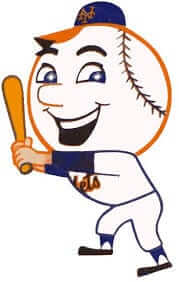
As longtime readers are aware, I’ve been trying for years to determine the identity of the artist who created Mr. Met — not the live mascot but the cartoon character, who made his debut on the cover of the Mets’ 1963 yearbook. That yearbook also included a page introducing the new character, but no artist was credited and the Mets no longer have any idea who created the little fella.
In 2012, I did an ESPN column about a New Jersey artist named Charles Palminteri, who in the early 1960s had created a very Mr. Met-like character for a Rheingold beer ad campaign. Palminteri said Rheingold never used the character, at least not that he was aware of, and he said he had nothing to do with the final version of Mr. Met that debuted in the ’63 yearbook. It was unclear whether the artist who created the final version (who, based on further research that I did in 2015, may have been the late cartoonist Al Avison) was inspired by Palminteri’s drawings or if both artists just happened to come up with the same basic concept of a baseball-headed character.
Today we have another piece of the puzzle. It comes from reader Dennis D’Agostino, who recently directed me toward something the rest of us had missed. While it’s true that Mr. Met debuted on the front cover of the ’63 yearbook, he also appeared on the back cover — in a Rheingold ad. Check it out (click to enlarge):
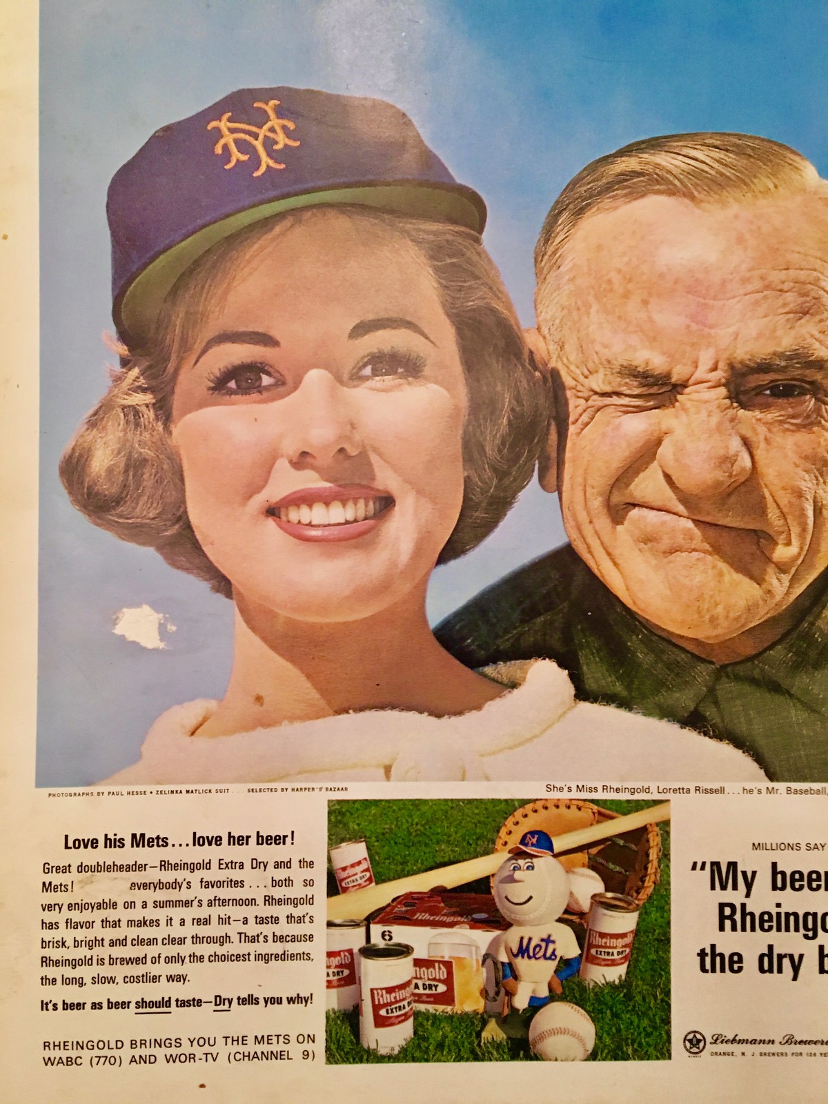
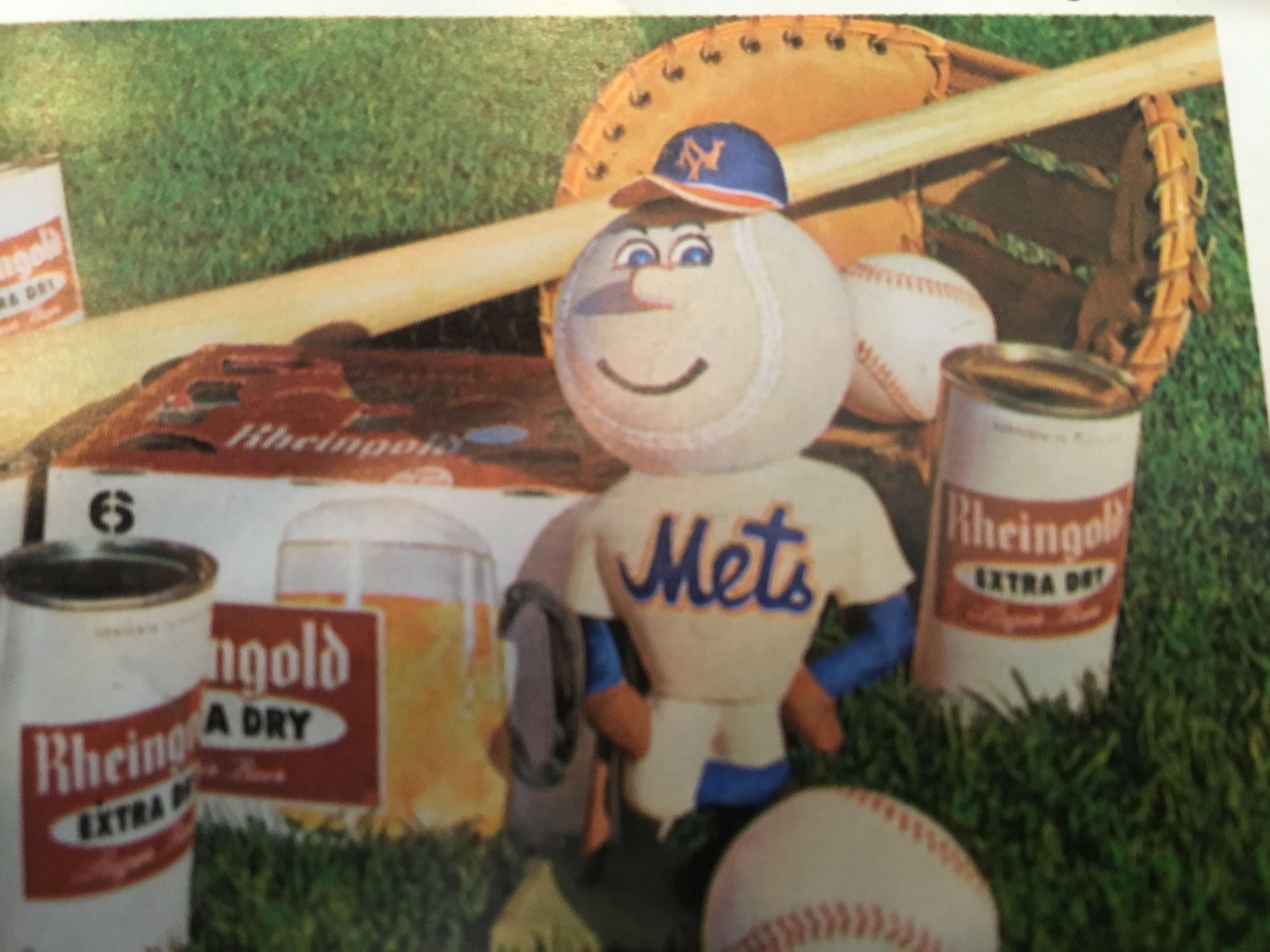
Now let’s take a closer look at the bottom of that ad:
Palminteri is now his mid-80s but is still active in the art and design worlds, so I got in touch with him and showed him the Rheingold ad. He said he’d never seen it before, but he was happy to see that Rheingold apparently made use of his drawings after all.
But does the character in the ad look more like Palminteri’s drawings or like the official Mr. Met cartoon? Let’s look at all three versions side by side (click to enlarge):
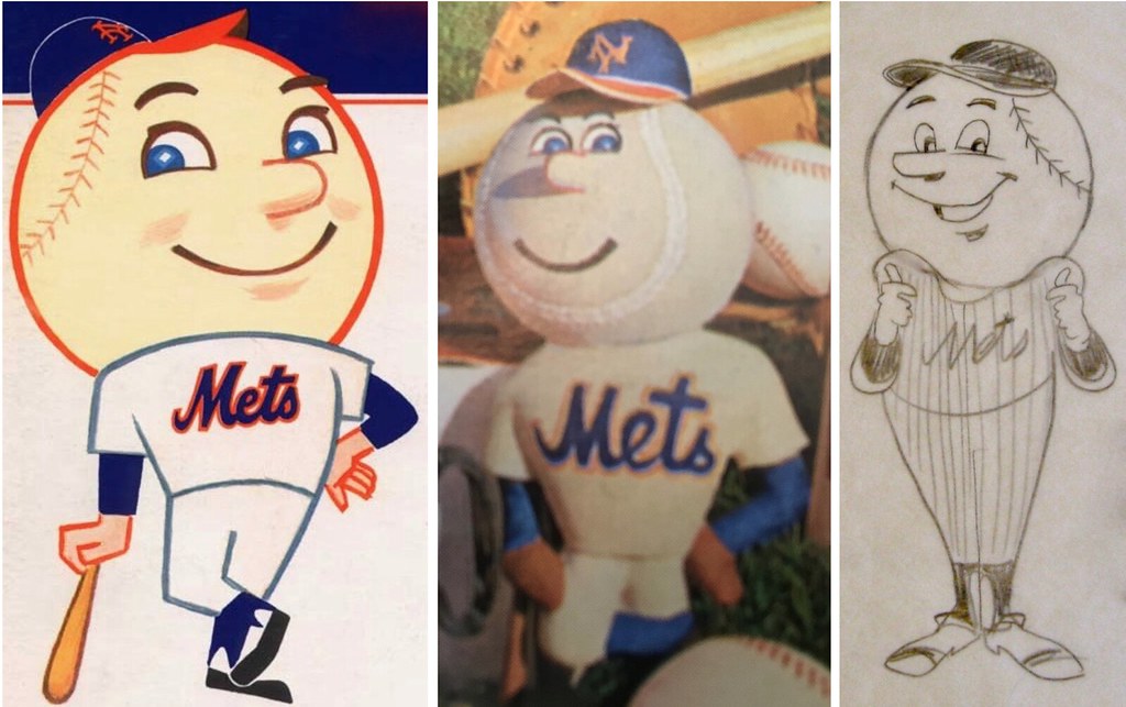
On the one hand, the Rheingold version has an orange-brimmed cap, a non-pinstriped uniform, a broad chest, and (I think) baseball diamoned-shaped pupils, just like the official version of Mr. Met. On the other hand, the Rheingold character has close-set eyes and a slightly goofy face, more like Palminteri’s version.
This Rheingold ad discovery still doesn’t resolve the question of who drew the final version (although, again, I have strong reason to believe that it may have been the late cartoonist Al Avison). But I think this makes it much less likely that Palminteri and the mystery artist coincidentally came up with the same idea. I now strongly believe that Palminteri’s original drawings, which were created for Rheingold, served as the basis for the final version of Mr. Met.
Little by little, we’re getting there. Big thanks to Dennis D’Agostino for bringing the Rheingold ad to my attention and adding this piece to the puzzle.
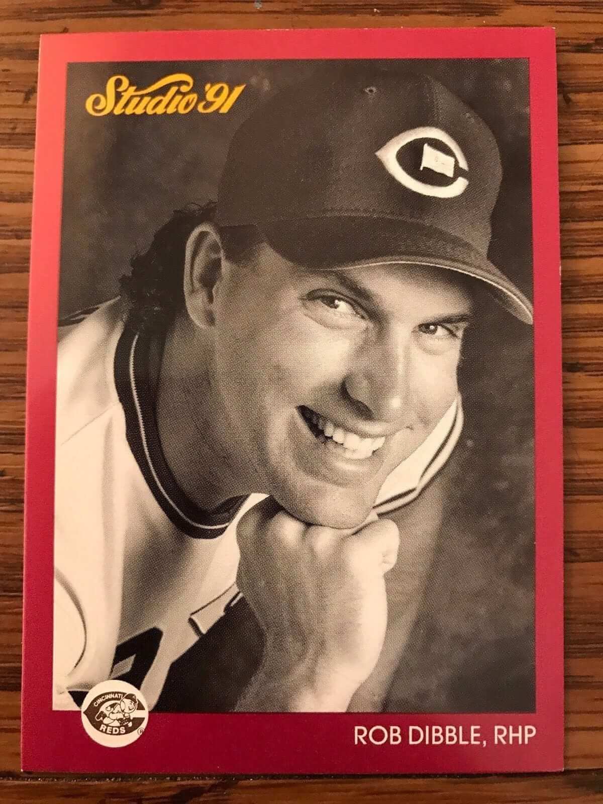
Pin update: We may have a new addition to our roster of MLBers who’ve worn pins on their uniforms, as Noah Petro spotted the Rob Dibble baseball card shown at right (which you can click to enlarge). It shows Dibble wearing an American flag pin in the exact same spot where Sam McDowell had worn one — in the center of his cap’s wishbone-C.
The question, though — at least for me — is whether Dibble ever wore the pin during a game, not just for a baseball card photo shoot. Personally, I don’t think he did. Some photo research failed to turn up any pin-clad photos of him. Also, I saw him pitch quite a bit during his career, and I have no memory of the pin, which I would surely have noticed.
So for now I’m putting him in our pinned MLBers gallery, but with a bit of an asterisk. I’ve reached out to Dibble and will let you know if I learn more.
Update: Just heard back from Dibble. He said he wore the pin in spring training, but not during the regular season. I’d say that’s enough to merit inclusion on our pinned roster.
Click to enlarge
Collector’s Corner
By Brinke Guthrie
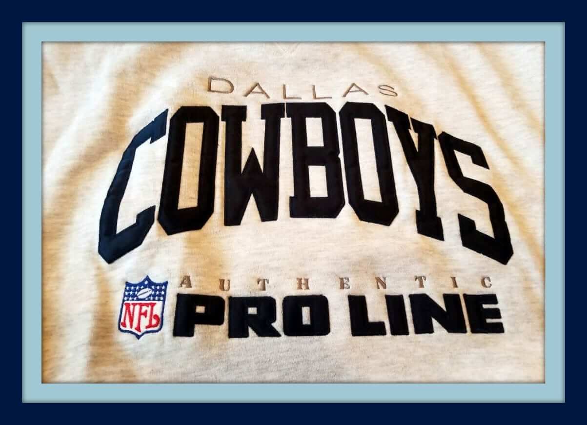
For pure comfort, you couldn’t beat Russell Athletic’s NFL Pro Line sweatshirts from the 1990s — this one for the Dallas Cowboys. Had one just like this but in navy. That’s all embroidered on there, by the way — no screen-printing.
Now for the rest of this week’s picks:
• This 1970s bumper sticker proclaimed you were one of Cleveland’s CAValry.
• Ack! Check out these great two-bar 1980s NFL helmet stickers from Hallmark. Here’s another set just for the 1971 World Champion Colts.
• How about these 1970s baseball, hockey, and football radios! The football one sure looks like Namath, and the hockey one is positively Bobby Clarke. Can’t tell who the baseball player might be, can you? Looks like all three of these are in working condition, and in great shape cosmetically.
• This 1970s San Francisco 49ers travel/duffle bag is in great shape, and shows the helmet with a white facemask.
• Here’s a 1970s NFL logo ashtray. No teams, just the NFL shield.
• These 1960s NFL “metal coasters” were lids from the tops of Hormel meat tins — including the ill-fated Browns “CB” logo.
• This 1970s Cricket table lighter includes all MLB team logos.
• This wooden footlocker was endorsed by the NFLPA — no official team logos or jerseys on this one. Players include Alworth, Butkus, Page, and Lamonica.
• This 1970s Chicago White Sox thermal mug features Bill Melton, Chuck Tanner, and Wilbur Wood.
• Can’t say I’ve seen one of these before: a T shirt with art from a Topps baseball card wrapper on the front.

New raffle: As we shift into March Madness season, the good folks at 19Nine have generously offered to provide one set of retro shorts and one T-shirt to a lucky Uni Watch reader.
To enter, send an email to the raffle address by this Friday, 7pm Eastern. One entry per person. I’ll announce the winner on Monday. Good luck!
Uni Watch Hit Parade: Yesterday I became aware of an absolutely killer track by a South Korean band called Say Sue Me. I’d never heard of them before, and some further investigation reveals that most of their material is a bit more twee than I generally care for, but their new single, “B Lover,” is an absolute monster of power pop perfection. I played it five or six times in a row yesterday, and today’s forecast calls for more of the same. Dig:
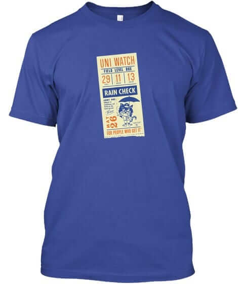
T-shirt reminder: Just a few days left to get our latest limited-edition Uni Watch T-shirt, designed by the great Todd Radom. It comes in a wide range of colors (including deep royal, as shown at right; click to enlarge) and is available from now through this Thursday, March 15. You can order it here. If you want a color or style that isn’t shown, get in touch and I can take care of you. My thanks, as always, for your consideration.
The Ticker
By Alex Hider

Baseball News: Angels superstar Mike Trout was hit in the head by a pitch on Sunday, and says he’ll try using a face guard on his helmet (from @HatOnHeadWear). … The Astros visited the White House yesterday, and presented President Trump with a No. 17 jersey (from Gregory Zitelli and Justin Zayid). … Oakland Raiders punter Marquette King visited A’s camp and wore a Raiders helmet while taking BP (from Ignacio). … Folks are struggling to read the names and numbers on the Cubs spring training unis (from Bob Gassel). … Check out the Petco Park bobblehouse that Jeff Stranger got for his birthday! More on Bobblehouse here. … The Cardinals posted this great video about the woman behind the “birds on bat” logo (from @mrmichael21). … Per our discussion about ripped pants yesterday: It seems not even the Babe himself was immune to torn trousers (from BSmile). … The Rochester Red Wings will wear Star Wars unis on May 4 (from G. Mittelstaedt). … Speaking of the Red Wings, they’re suing a local company for making “Rochester Red Beams” apparel (from Matthew Cole). … Frank McGuigan found this Oneonta Tigers baseball while cleaning out his closet the other day. The team was a short-A affiliate for the Tigers based in upstate New York before relocating after the 2009 season. He says he originally found the ball while cleaning out a used ball bin in a Little League clubhouse in New Jersey. … Brad Blunt found this awesome Nashville Sounds polo at a Houston thrift store. … The Cincinnati Bearcats have a new 1950s throwback jersey in honor of Sandy Koufax, who played for the ’Cats for a few seasons. … Stetson Pevear spotted this vintage Alabama baseball jersey at the college’s Gorgas House Museum. More on the jersey’s owner here.

NFL News: The Titans barely teased their new jerseys in a video yesterday (from Phil). … Cross-listed from the baseball section: Raiders punter Marquette King visited the Oakland A’s spring training and took batting practice in a Raiders helmet (from Ignacio). … This photo from a 1959 Giants game featured a player with a backwards helmet number (from Topher Davis and Jason Simpfenderfer). … Brady Phelps shared this photo of a custom-painted Jaguars surfboard. … Free agent QB Case Keenum was at the Houston Rockets game last night and was wearing a T-shirt with a throwback Rockets logo (from Ignacio).

Hockey News: As mentioned in the Ticker yesterday, the Penguins wore St. Paddy’s day warmups on Sunday. Interesting that the jock tag on the jerseys identifies them as “authentic game jerseys,” considered they weren’t worn in a game (from Joseph Pitirri). … We’ve got a good ol’ fashioned nickname fight! Ryan Hartman joined the Predators at the trade deadline. He always went by “Hartsy” with his old team, the Blackhawks — but “Hartsy” was already claimed by the Predators’ Scott Hartnell. … The jersey that Alex Ovechkin wore during the Caps’ outdoor game earlier this season had three fight straps built into it (from Casey). … This hockey team in Beijing modeled their sweaters and logo after the Minnesota North Stars. Even better? According to Timothy Chiu, the character on the sweater, 北, translates to “north.”

NBA News: Bucks PG Brandon Jennings’s NOB was riding pretty low last night. Here’s Khris Middleton’s NOB for comparison (from Marcus Messer). … The Hawks have an in-game promotion where fans get to play against streetball legend Hot Sauce one-on-one. ESPN reporter Darren Rovell gave it a shot while wearing a Domnique Wilkins-era jersey — and era-appropriate shorts length to boot (from Mike Chamernik). .. Remember when the Delaware 87s of the D-League wore SpongeBob uniforms earlier this season? Well, the guy who is playing SpongeBob in a Broadway version of the show got his hands on those unis (from Hit The Glass). … Cross-listed from the NFL section: NFL QB Case Keenum was at the Rockets game last night and was wearing a T-shirt with a throwback Rockets logo (from Ignacio).

College Hoops News: The Washington Post put together shareable GIFs of all 68 mascots from this year’s tourney. … The 2004 McDonald’s All-America game featured both JR Smith and Josh Smith, so the latter went FNOB during the game (from Glen Brockenbush).

Soccer News: Poland’s kits for the World Cup have leaked (from Ed Zelaski). … Here’s a list of the top 15 kits in the history of Italy’s Serie A (from Jeff Benzos). … Southampton wore special kits with extra red for their match against Newcastle this weekend. The backs of the kits are usually white (from Alex Evans).

Grab Bag: It looks like the Ohio Machine of Major League Lacrosse will have new jerseys this season (from John Flory). … The Toronto Rock of the National Lacrosse League wore 20th anniversary unis on Saturday, including red helmets (from Wade Heidt). … The United States Patent and Trademark Office unveiled a new patent grant design cover at SXSW over the weekend (from Adam Herbst). … It’s March, so you know what that means: bracket season! Here’s a “Great American Sandwich Showdown” bracket (from James Gilbert). … Yesterday’s Google Doodle was dedicated to William Henry Perkin, a chemist who discovered the first synthetic dye. The dye’s color? Purple. Sorry, Paul (also from James Gilbert).
Looks like they used a tennis ball for Mr. Met’s head in the ad.
The last item in Collector’s Corner, the 1975 Topps baseball T-shirt, was among a line of shirts sold online by Topps in recent years. I have a shirt with the 1968 baseball card wrapper. Topps still offers a limited line of shirts, with the 1958 and 1963 baseball card wrappers among those available at the moment.
link
Topps does sell these types of shirts, but the one listed was printed by some hipster company making vintage-like stuff.
link
Paul, the guy selling this shirt has an even better one with a closeup of the shirt tag, which I just know you’re gonna love:
link
-Jet
Nice!
Nickname fight just shows how unimaginative or (PCish) players have become. Long gone are the days of The Rocket, The Flower, The Hammer, Hound and Cowboy, Concrete Charlie, Puddin’ Head, Whitey, Splendid Splinter. Seems like sometime around the 90s it all became adding a letter or two to a shortened last name.
You realize most of those nicknames were ascribed by others (often sportswriters), not by the players themselves, right?
I remember hearing a conversation on sports talk radio a few years ago about the nicknames for the players on the Blackhawks, and how they were all a variation on the player’s last name. I got the impression that these were names that the players and coaches used to refer to each other, not what outsiders like sportswriters and fans were calling them. So in an interview, one player would refer to Patrick Kane as “Kaner”, and Patrick Sharp was “Sharpsy”, etc. You are probably correct that nicknames like The Hammer come from sportswriters, but that is different from what players call each other in the locker room. That’s why some of the nicknames that players used for their NickNOBs in that MLB Players Weekend promotion were so boring. There is what your friends call you, and there is what the public calls you, and they often aren’t the same thing.
A backpacker is traveling through Ireland when it starts to rain. He decides to wait out the storm in a nearby pub. The only other person at the bar is an older man staring at his drink. After a few moments of silence the man turns to the backpacker and says in a thick Irish accent:
“You see this bar? I built this bar with my own bare hands. I cut down every tree and made the lumber myself. I toiled away through the wind and cold, but do they call me McGreggor the bar builder? No.”
He continued “Do you see that stone wall out there? I built that wall with my own bare hands. I found every stone and placed them just right through the rain and the mud, but do they call me McGreggor the wall builder? No.”
“Do ya see that pier out there on the lake? I built that pier with my own bare hands, driving each piling deep into ground so that it would last a lifetime. Do they call me McGreggor the pier builder? No.”
“But ya fuck one goat..”
Perhaps this has already been discussed, but could it simply be that Mr Met was inspired by Mr Redlegs? If Chris Creamer’s site is accurate Mr Redlegs predates him by about a decade.
Oh, for sure. But the question I’ve been delving into isn’t about originality; it’s about who was the artist who drew all the versions of Mr. Met (including the umbrella-toting version on the rain check that served as the inspiration for our current Todd Radom-designed T-shirt).
Those original Mr. Met depictions all had a strong sense of *character* about them, so I want to know who drew them. That’s all.
Those radios in Collector’s Corner are just… odd. It’s an interesting design choice, to have three designs from three different sports fit the exact same pose. Also, what’s with the Broadway letter stickers with the baseball radio?
Typo: …”featured both JR Smith and Josh Smith, so the later went FNOB during the game.” Latter
Got it.
God knows I love me some Korean pop but B Lover is very blah to me. No accounting for taste
Blah? BLAH?
I say thee nay! Such a great tune. Stuck in my head at this very moment!
A roster of unusually high numbers…
I wouldn’t even know how to fully research this, but it’s possible that the White Sox could be the first team whose active roster contains 6 players with a number in the 70s, 10 players with a number above 60, and 15 players with a number above 50. Players numbers sometimes change before the season, but there are some veterans on this team that have been wearing these high numbers for a few years. I think it is something interesting to follow as spring progresses.
link
I can’t say “Rheingold” in my head without saying it in the voice of the immortal Bob Murphy, Mets announcer back in the day.
In today’s Collectors Corner, i think the baseball version of the transistor radio resembles Carl Yastrzemski, just my opinion.
It would have been a bummer to buy the football radio based on the picture on the box thinking you were getting a Namath-like radio, only to get a red and white uniform inside.
I do love the sleeve number decals though!
Tony Conigliaro was the first name that popped into my head for that baseball player. Interesting we both thought of Red Sox considering the batter has an “A” on his hat and some unidentifiable logo on his shirt…
-Jet
Funny. My first thought was that it was either Yaz or Tony C! I think the face looks a little more Yaz-like and obviously Yaz was a lefty. But the sleeves look more like the muscle sleeves Tony C wore. Of course, the image might just be throwing us all off because of the white pants and red stirrups.
Proofreading:
From what I’ve read, JR Smith goes by “J.R.”
Paul, great job on the Mr. Met history! I am a long time Mets fan from the mid 60’s and all my life i’ve never realized his eyes represented a baseball diamond, I will never look at Mr.Met the same way again! Also- great find on the St. Louis Cardinals logo designer and to see all the original materials she created was amazing!.
I thought the Titans uni tease actually provided some interesting clues. There were good indicators of things like trim line weights and pattern (ie, single-line trim flush to the main fabric of numbers and/or color blocks), and also the clue that they’ll be using that red/orange color a bit more. So we’re looking at an evolutionary design.
Which could still mean a disaster analogous to the Bucaneers new duds. But something like the current Seahawks uniform (in effect rather than actual appearance) which I like and feel was an improvement over the steel blue outfit, is also on the table.
Steve, on a completely different matter: What’s it like in Duluth right now, what with the curling gold medalist living there?
Reasonably awesome, from my perspective. There were a lot of happy, bleary eyes in town the Saturday after the win. Their return home was a huge deal and there was a large crowd at the airport to welcome them with a full police escort, followed by a well-attended celebration next door to the curling club the next day. They’ve spent most of the last two weeks out of town on publicity, but in their brief trips home they’ve jumped back in and been totally classy.
Tyler George, for example, plugged on twitter that he would be at work for a day, and spent his day taking selfies with anyone who asked. John Landsteiner hopped into his Monday open doubles league, won, then put his gold medal on his opponent and took pics.
You know this, but they’re the most down-to-earth guys you can imagine. Your visit here was responsible for me meeting John Shuster in the first place, and he couldn’t have been kinder. I’m hoping to catch the charity bonspiel coming up in a week. And then life will go on and I’ll probably accidently bump into one of them at the store or something.
They are legends here now. This city still has murals of Kara Goucher, who medaled at a world championships and ran marathons in the Olympics. Shuster & co will be the picture on the wall at the end of Hoosiers forever here.
Awesome. Thanks for sharing!
Also the zigzag pattern at 0:03 implies a more futuristic/unorthodox design, which could also go either way. It could be great, like the Seahawks, or horrible, like the Bucs.
We are calling the Seahawks’ set great now? The asymmetrical use of the word mark on one side, the sleeve designs which purposely make the Nike maker’s mark pop… I think we could say that after a few years we’ve gotten used to the unorthodox design, but I’d reserve great for teams like Green Bay, Kansas City, Oakland, and Indianapolis.
The sleeve designs are shaped like the tops of totem poles (if you don’t believe me check out their alternate logo). I love the bird designs down the pants, and the navy blue and neon green just pops.
I wouldn’t call Kansas City “great”, just mediocre. Agree on Green Bay and Oakland, really dislike Indianapolis’ unis. Another great set is Washington, they just need to lose the utterly racist name.
Was that the same Dennis D’Agostino who wrote the “This Date in Mets History” book around 1982 or so?
Don’t know (but wouldn’t surprise me). Dennis?
Fun lede today on Mr. Met. I find it fascinating the Mets dont have a clue who did the logo. When you mentioned the beer ads having a potential impact on the logo, it reminded me of an article I read from Todd Radom a few years back on this site (I believe) about how the O’s got their funbird character from a beverage distributor around the same time. Here is a link to the article
link
Have a great day gang
Re: Titans teaser video
Looks like primary jerseys will still be navy blue with some silver involved possibly on an alternate uni. The strangest thing to me is the zigzag Columbia blue pattern shown at 0:03 of the video. I’m also excited about the red swoosh, possibly indicating more red in their branding?
Some Korean pop stars were invited to an opening ceremony at a Hanshin (Osaka/Kobe) Tigers game last season. They were given jerseys with numbers and NOBs, and on them you get to see link, because the Tigers (like most Japanese teams) have thinner fonts for players with long names, and even a wider font for players with short names!