Click to enlarge
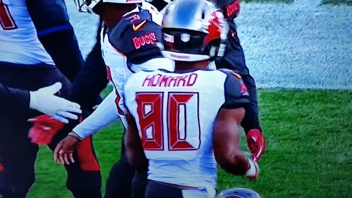
Several jersey snafus yesterday for the Bucs, beginning with tight end OJ Howard, who somehow lost one of the red panels on his 0 (or maybe one of the LEDs on his alarm clock went out). Don’t think I’ve ever seen that particular uni glitch before.
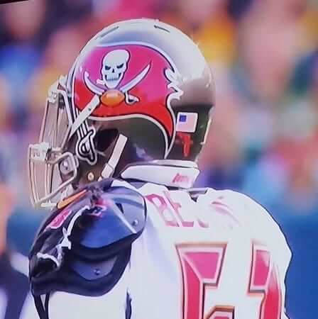
In addition, linebacker Kendell Beckwith suffered a torn jersey:
In other news from around the league yesterday:
• It was a big day for monochromatic uniforms, beginning with the Bills, who went mono-blue:
• The Titans went mono-navy:
• The Jags went mono-black:
• The Saints went mono-black yet again — ugh. Such a miserable look for a party town like New Orleans.
4th & goal, smacked with a block, and @a_kamara6 STILL finds the end zone.#SaintsGameday | #CARvsNO pic.twitter.com/CFd5HnfwlE
— New Orleans Saints (@Saints) December 3, 2017
• And in yet another mono move, the Chargers wore their Thursday-night uniforms on Sunday (click to enlarge):
An ELECTRIFYING run by @Melvingordon25!
⚡⚡⚡#CLEvsLAC pic.twitter.com/WKQTbEXZSg— Los Angeles Chargers (@Chargers) December 3, 2017
That makes five different games with a mono-colored team (plus the Seahawks, but of course they always go mono at home).
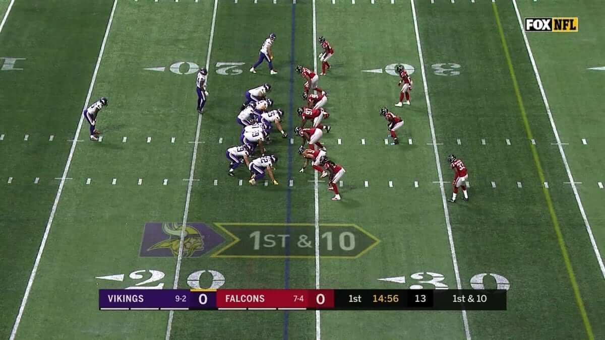
• In Atlanta, the hashmarks for the Vikings/Falcons game were in the wrong spot. That was a carryover from the SEC championship game, which had been played on Saturday (click to enlarge; additional info here):
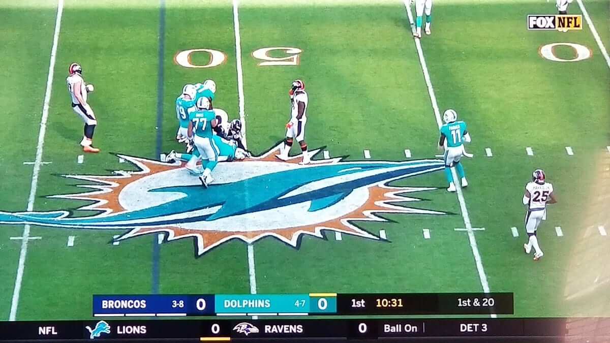
• In another field-related development, the Dolphins’ midfield logo is usually outlined in white, but yesterday they added a navy outline (click to enlarge):
• In an apparent NFL first, Chiefs defensive back Marcus Peters was so upset about a penalty call that he threw the official’s flag into the stands. He was flagged for unsportsmanlike conduct and then left the field, mistakenly thinking he’d been ejected. He later returned — without socks:
All my yrs of watching the NFL.. I don't think I ever seen a player do this. Marcus peters is wild for that pic.twitter.com/WqBooRlFoJ
— Skip Baeless ⚡ (@_TrueInMeans) December 3, 2017
(Update: Not a first after all!)
• As if the Rams on-field uniforms weren’t enough of a mess, head coach Sean McVay was wearing the old gold-horned logo, which is no longer the team’s official logo:
• There were lots of cleats for causes, although there didn’t seem to be nearly as much buzz about this year as there was last year.
• Not a single team wore white at home.
• Here’s a list of players who protested during the national anthem.
(My thanks to @aj_crisp21, Jamie Burditt, Preston Feiler, and Jonny Rockford for their contributions to this section.)
Stickers reminder: In case you missed it on Friday, our friends at StickerYou have now set up a little Uni Watch sticker shop on their site. If you click on the “Make Custom Stickers” button, you’ll see that we’re offering a bunch of designs that originally ran on our T-shirts. You can order a full sticker sheet of the same design, or build a mix-and-match variety sheet.
Are there other sticker designs you’d like to see? Would you like to see Naming Wrongs stickers? Anything else? Let me know.
Also: Remember our recently launched Uni Watch shield T-shirt? Rob Ullman, who designed that logo, went ahead and ordered a few dozen stickers of the shield, which he’s selling on Etsy. You can buy those as individual stickers, instead of a full sheet. But once those few dozen are gone, that’s it, so move fast.

Click to enlarge
Appointment required: On Saturday afternoon I went to the Prospect Park Zoo. Like many zoos nowadays, they have a set of peacocks that are free to roam around the grounds. This one didn’t follow the rules about having an appointment.
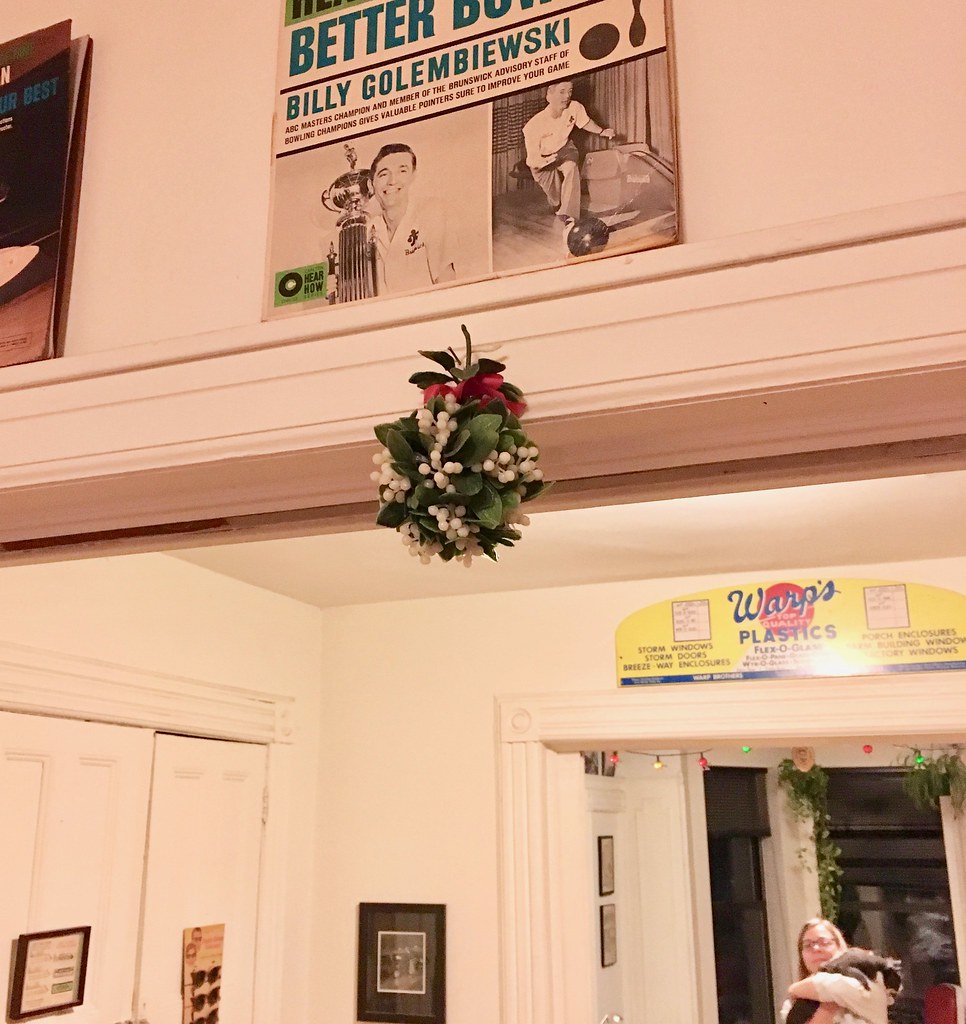
Best purchase ever: Now that we’ve hit December, the plastic mistletoe that I bought in 1993 at the now-defunct Woolworth’s in Herald Square has emerged from the cupboard and been hung in its usual spot. Twenty-five seasons and counting — not bad for something I originally bought for $2.99. Let the Yuletide necking commence!
The Ticker
By Jamie Rathjen
College Football News: May be hard to see, but Boise State’s silver helmet numbers now have orange outlines (from Erik Hulme). … In the same game, only Fresno State had a Mountain West championship game patch, while Boise State didn’t (from @bsuorangecrush). … Multiple readers pointed out that some Ohio State players had black stickers on the front and back of their helmets. Those are for “Zone 6,” a proprietary name and logo for the team’s wide receivers. … New Nebraska coach Scott Frost, who was a Cornhuskers QB from 1995-97, was given a helmet with his old No. 7 for photo ops (from Brett Baker).

Hockey News: The Panthers are inconsistent with their McNOB styling. It’s unclear if this is a glitch or if it’s because the players specifically request the raised or base-aligned “c.” The team actually has four Mc/Mac-surnamed players (from Matt Campbell). … Matt also put together a comparison of the NOB habits of the McGinn brothers: Panthers winger Jamie, Hurricanes winger Brock, and Tucson Roadrunners (AHL) winger Tye. … The Stars are now 5-0-0 in their yellow laces (from Dennis Squrrth Jr.). … Quinnipiac debuted team-colored camouflage jerseys on Saturday. … David Firestone has an update on the crest of the Italian team HC Feltre from yesterday’s Ticker. It’s “clearly based on Mr. Horsepower,” the logo of the auto shop Clay Smith Cams, he says. The team plays in Serie B, the third tier of Italian hockey behind Serie A and the Alps Hockey League (a joint effort with Austria and Slovenia).

Basketball News: Louisiana Tech wore grey and sleeves against Division II Miles College (from Chris Mycoskie). … Both matchups in a doubleheader at D.C.’s Capital One Arena were color (or grey)-vs.-color: Temple vs. George Washington (from Matt Eliot) and Georgetown vs. Coppin State (from @bryanwdc).

Soccer News: Southampton debuted a white/red third kit, which is, as last year’s edition was, one-use-only to avoid a clash with fellow red-and-black-clad team Bournemouth. … On Saturday, Manchester United midfielder Nemanja Matić was wearing team-branded texting gloves; you can tell because the thumb and pointer fingertips are lighter (from @BandaBear15). … From the NCAA women’s championship: Stanford has a pretty unique front number position. … Two examples of calendar-related number/NOB combinations: first, Scottish striker Stevie May signed with Aberdeen this summer. He was persuaded to wear No. 83 so that his shirt, “May 83,” commemorates the month and year in which Aberdeen won the Scottish Cup and European Cup Winners’ Cup 10 days apart. … The second one has no intentional meaning for its wearer, but if any of you need to remember when Paul’s birthday is, the shirt of Brighton & Hove Albion midfielder Solly March will get you really close.

Grab Bag: Reader Jeremy Brahm found another team besides Alabama associated with a houndstooth pattern: Thai women’s volleyball team Khonkaen Star. … Due to heavy air pollution in Delhi, several members of the Sri Lankan cricket team wore surgical masks during the current test match against India (from Graham Clayton). … A Chicago hotel has intalled a curling sheet on its rooftop (from Tris Wykes).
FYI – the hashmark problem in Atlanta – the problem probably is pretty subtle – the hashmarks were reinstalled for the NFL game offset 7″ toward the middle of the field.
Given the written sentence, I’m guessing most folks would guess that they were at college width:
link
ed
Correct, it’s not that the hashmarks were carried over from the SEC Championship, they were placed incorrectly during the changeover from the SEC Championship.
You couldn’t give away mistletoe this year.
I was thinking the same thing when we hung ours!
Definitely not at our office
Would a change in number font have to wait 5 years? I’m not saying anything new but you know it’s just a matter of time before those Bucaneers number font rightfully gets retired/banished/expunged (never to be seen again)
Last time I can think of a team changing their number font without a full uniform overhaul was the 2001 Rams. That was an unusual case because they’d just changed their uniforms in 2000, but actually postponed implementing the new font until 2001, wearing standard block numbers in 2000. And then they got rid of the gold side panels in 2002… just goes to show how much the uniform design cycle has changed in the last two decades.
Also notable is 1993 to 1995 New England Patriots. Had the new uniforms in 1993. Switched up the look of the numbers on consecutive years in 1994 and 1995.
I consider the 1995 Pats unis to be different enough to be an overhaul, though, albeit a minor one. If it were just the italicized font, it’d be one thing, but the rearrangement of elements, with the addition of the subtle vertical striping pattern, make it different enough for me.
I think mono black, with a black helmet (all black, not the nonsense the Jags wear), is about the only mono look that works. This also assumes a halfway decent uniform design with pant stripes, and some contrasting socks. If Baltimore had pant stripes and purple socks with their mono black look it wouldn’t be awful.
Same thing with New Orleans. When they originally wore black pants from 1976-1985, they had a gold-white-gold stripe pattern, and when they brought black pants back in 1999, they had a solid gold stripe. But when they decided to go only with black pants in the 2001 season, they made them solid black, with black socks to boot, and thus the Saints’ uniform suckage was born.
If they’d just go back to the 1999 pants, that’d be an improvement right there. Of course, pairing those with gold socks would be even better.
Aside from the fact that they don’t have a black helmet, that is (even though they did try one once). But my point about the additional gold trim still stands.
Yep, gold helmet kills their mono look, even if they went with the striped pants. Then again their gold/black/gold (and even gold/white/gold) looks are so great I cannot understand why they even bother with the black pants.
I think any team with gold or silver helmets looks better with matching helmets & pants, especially when wearing colored jerseys. Always hated the one year SF won the Super Bowl with white pants. I think it was the Steve Young Super Bowl win.
I like the Charger’s mono blue look. Stripes on pants are the key to making the appearance of mono colour unis tolerable.
Yeah, the design is good for the Chargers, I just think mono looks with a contrasting helmet look brutal. The helmet seems horribly mismatched when it is lighter than the mono jersey and pants. If say Denver went mono orange with the blue helmet and blue socks that wouldn’t be as bad.
All mono looks are bad (with the exception of all white). Makes NFL teams look like HS teams.
I agree. White is the only exception. If you’re gonna go mono, your helmet needs to match. The Bills, Titans and Chargers looks horrible.
“Louisiana Tech wore grey and sleeves against Division II Miles College” Was this a sly tribute to the women’s team? The Lady Techsters used to wear sleeved uniforms.
The rooftop curling sheet reminds me of a similar setup I saw not far from Madison Square Garden around this time, one or two years ago. I tried it once and was not impressed.
My parents had a plastic mistletoe when I was a kid. My younger brother stuck a couple of the berries up his nose. Luckily my grandfather was able to manipulate them back out.
Rams Head Coach Sean McVay was also wearing gold (tan) pants. Maybe he’s making a subtle statement :)
After the University of Miami finishes playing, the Dolphins usually ratchet up the field painting. The end zones were aqua and the logo was outlined for better definition. Some years, the Steelers do the same thing when Pitt finishes. I didn’t watch any Temple football games but in years past, they had the end zones at the Linc painted cherry/white, which is harder to mask than in Miami (both teams wear orange) or Pittsburgh (both teams wear gold, and navy/black are close).
I think Temple only does a full paint on their endzones if it is before an Eagles bye week when they have a sod replacement scheduled. About the only time you see any marking underneath a black painted Eagles endzone is after an Army/Navy game.
RE: Miami and Pittsburgh, never understood why they don’t do orange and yellow writing respectively of the city name in their endzones, rather than plain white, since those colors match up with the pro and college teams. Then, as you say, add the flourishes come December.
Temple painted endzones for five out of six home games this year…only one they didn’t was the Navy game, which was a Thursday night ESPN game…the Eagles midfield logo was also well visible at the UConn game, which happened to be their homecoming. They did not have a Temple midfield logo at all this season. You would think they’d try and make the field look nice for nationally televised games or “important” games like homecoming but Eagles first…
As for Miami, they’ve lately been using a generic “MIAMI” font in white letters with an orange outline, and I was at their last home game vs Virginia a few weeks ago, and they literally removed the grass at midfield and replaced it, pretty much as soon as the game ended. Attached is a link to a picture of that.
link
Interesting, I haven’t caught many Eagles games this year but I can never recall seeing any Temple markings on the field in past years. Either they schedule really well to avoid that, or they do a great job covering it up for Sunday.
Temple had two home games before the Eagles (a Saturday and then a Friday), two more Saturdays before the Eagles, a Thursday game four days after the Eagles and a week+ before they came home, and their last game was a Saturday in the Eagles bye week…
RE: Bucs number fail… “Don’t think I’ve ever seen that particular uni glitch before.”
That’s ‘cuz there’s never been such a horrid, segmented number font before!
A decade ago, Bart Scott threw a referee’s flag into the stands.
link
No idea if it was done prior to that.
Zebras in knickers!
I know he didn’t toss it into the stands, but the Eagles DL Claude Humphrey wasn’t thrilled with the ref’s call during Super Bowl XV.
link
Quick update on the stickers, for those who are interested: I’ve got about 15 left, so if you’re interested, don’t sleep on ’em. Thanks so much to those who have ordered…I sent them out Saturday morning so they ought to start showing up today or tomorrow. And as always, thanks to Paul for letting me play in his sandbox!
The curiosity in ‘90s-era QB Frost being presented with a Nebraska #7 helmet being, that the number has since been retired.
You missed Seahawks mono blue versus Eagles mono white.
Someone didn’t read the lede very carefully.
Sigh. Caught by an exception again. I was looking for the pictures. I would think probably the best uni matchup of the day would have warranted at least one picture…
link
You’re right.
Best uni matchup of the day…
link
The Black Knights are the White Knights against Navy…
link
Odd that the flag on the sleeve is facing the wrong direction.
I am not certain when the code was formalized to have the blue star field to the front of military uniforms. My best guess is that this may not have been code in 1943 when the unit being honored was assembled. The flag is period appropriate, with 48 stars.
Flag code is widely ignored when it comes to sports uniforms.
Per US Flag Code:
No part of the flag should ever be used as a costume or athletic uniform. However, a flag patch may be affixed to the uniform of military personnel, firemen, policemen, and members of patriotic organizations. The flag represents a living country and is itself considered a living thing. Therefore, the lapel flag pin being a replica, should be worn on the left lapel near the heart.
When the flag is displayed, it’s supposed to be displayed so that the blue field is shown to the observer’s left. However, with military uniforms today, a change was made to put the star field forward (as if taking the flag into battle).
It’s. Not. Facing. The. Wrong. Direction.
The blanket rule, for over a century now, is that the flag should always be displayed with the union (the blue bit with the stars) on the upper left. Including on clothing. About half a century ago, the general rule was modified so that flags displayed on aircraft should be displayed with the union on the forward side of the airplane, as though it’s flying freely as the aircraft moves forward. In 2003, the U.S. Army made a new rule that applies only to current Army uniforms calling for flag patches on the right sleeve to be displayed as though soldiers are airplanes.
If you ever see a flag patch with the union on the right, that patch is either (A) Attached to the starboard side of an airplane; (B) Attached to the right sleeve of a post-2003 Army uniform; or (C) Wrong.
So, to test whether an Army football uniform inspired by a WWII combat unit got the flag on the sleeve right or wrong, we simply have to ask, “Was World War Two fought before or after the year 2003?” If before, then the flag should have the stars on the left. If after, then the flag should have the stars on the right. Simple as that.
Link to Warriors Instagram jersey tracker is broken…also Vegas Golden Knights went white at home vs Arizona yesterday….
Buccaneer O.J. Howard is a tight end, not a wide receiver.
Thanks. Fixed.
Anybody else notice that the way his name is crumpled up makes the W look like an M?
Army just released 10th Moutain Division all white uniforms for AN game. Love the Panda “Pando” commando undershirt
link
The peacock didn’t have an “appiontment.”
Thanks. Fixed.
I commented last week how i was miffed at Miami for not having matching stripes on their pants and helmet. Then Dallas does the same thing with their white pants last Thursday! All hope was presumptively lost until Boise State made their numbers match their jersey numbers. Now was that so hard!?!? It looks good and really compliments their jersey numbers. Way to go Broncos!
The Chargers uniforms reminded me of how badly they need to return to the Dan Fouts era look of royal helmets, yellow pants, and white jerseys at home:
link
Oh yeah, the bolts need to go on the shoulders, not the sleeves.
And what is up with the distance between the 1 and the 4 on Fouts’ jersey? This doesn’t appear to be the case on his old blue jersey:
link
I believe NFL TV numbers are only on the shoulders due to the camera angle. HS numbers are usually on the sleeves, because they are seen from the sidelines and stands. For this reason, we will never see the bolts where they should be.
The Panthers’s Mc/Mac inconsistencies made it into the Ticker yesterday…at least for Jamie McGinn (#88), it’s a family preference that equipment managers honor since his Buffalo Sabres stint.
link
Thus, Occam’s Razor suggests he is the exception to general policy.
At least the Chargers mono-blue is fine by me, and would even border on good if the helmets matched and they didn’t go with the garish mono-sock look.
Oh, and about the socks – I’m totally fine with one-color socks, but when the pants and jersey are the same color, it just looks… off.
Gosh the Bengals logo “B” is the worst….ever.