Click to enlarge
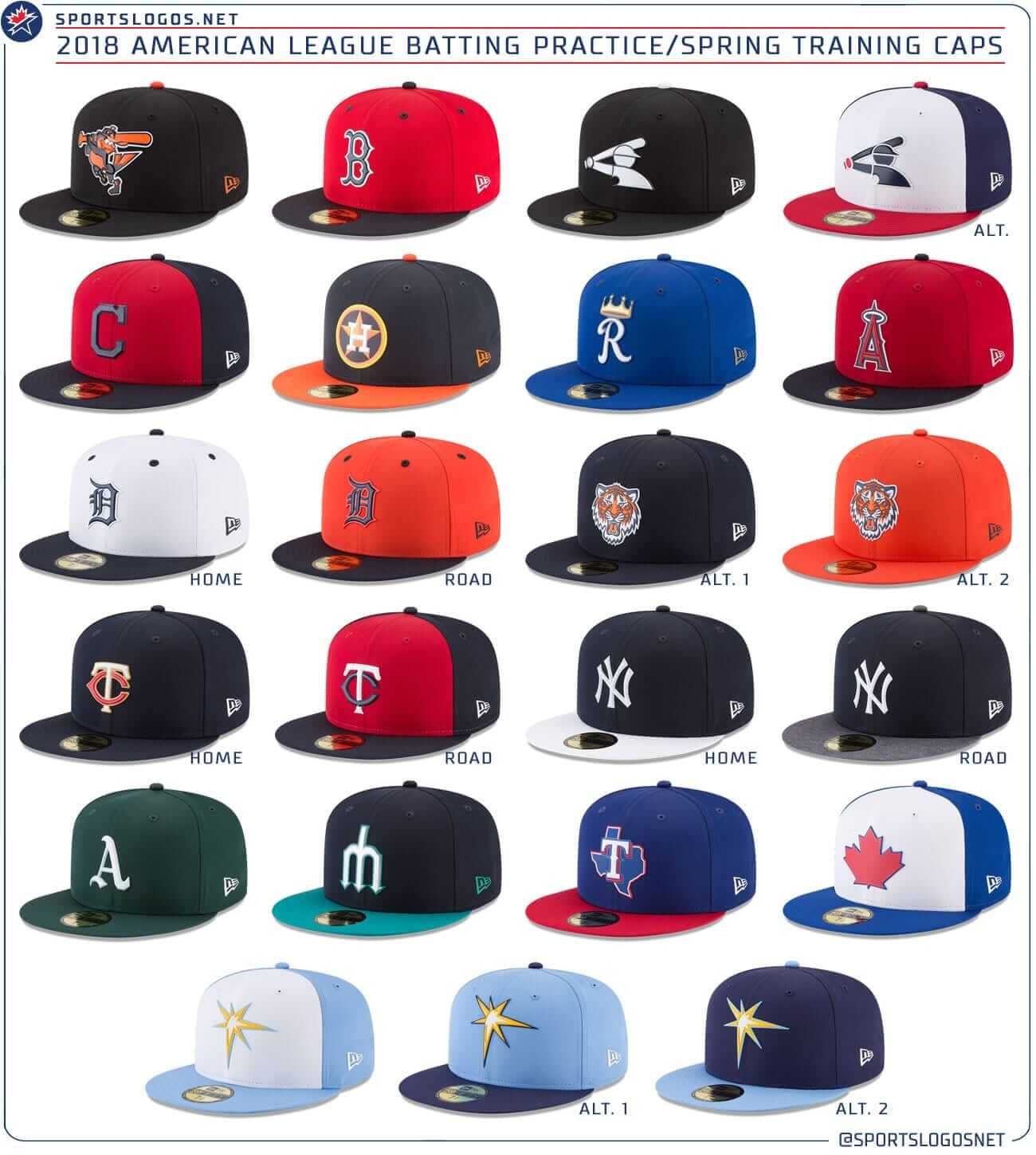
The 2018 MLB season — aka the Last Season Before the Under Armour Takeover — will be here before you know it, and MLB primed the pump a bit yesterday by unveiling a new set of BP and spring training caps.
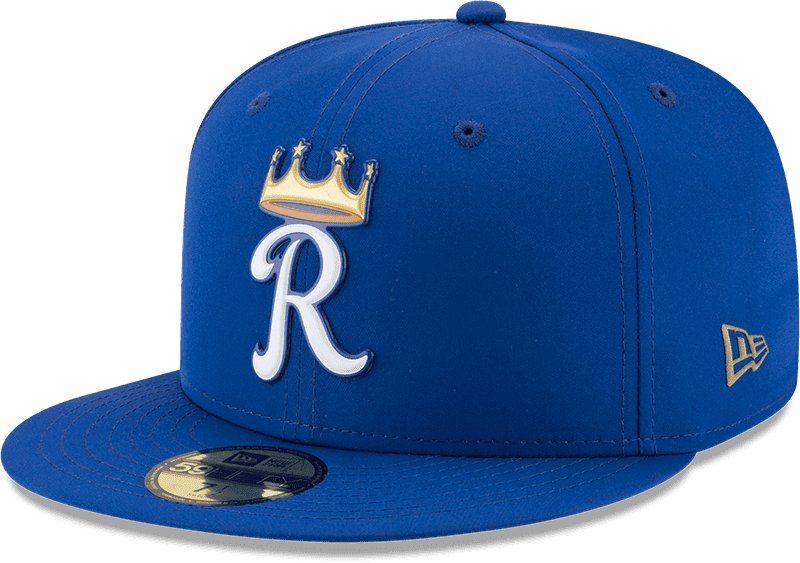
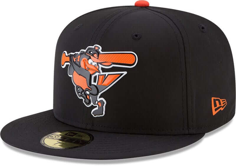
When we describe these caps as “new,” it’s important to distinguish between the graphic design and the materials, because many teams are sticking with last year’s graphics but all teams are getting new cap materials. The fabric is lighter and, as you can see in the Royals cap shown above, the front logos are now raised and rubberized, not embroidered. It makes a particularly big visual difference for logos with lots of surface area (click to enlarge):
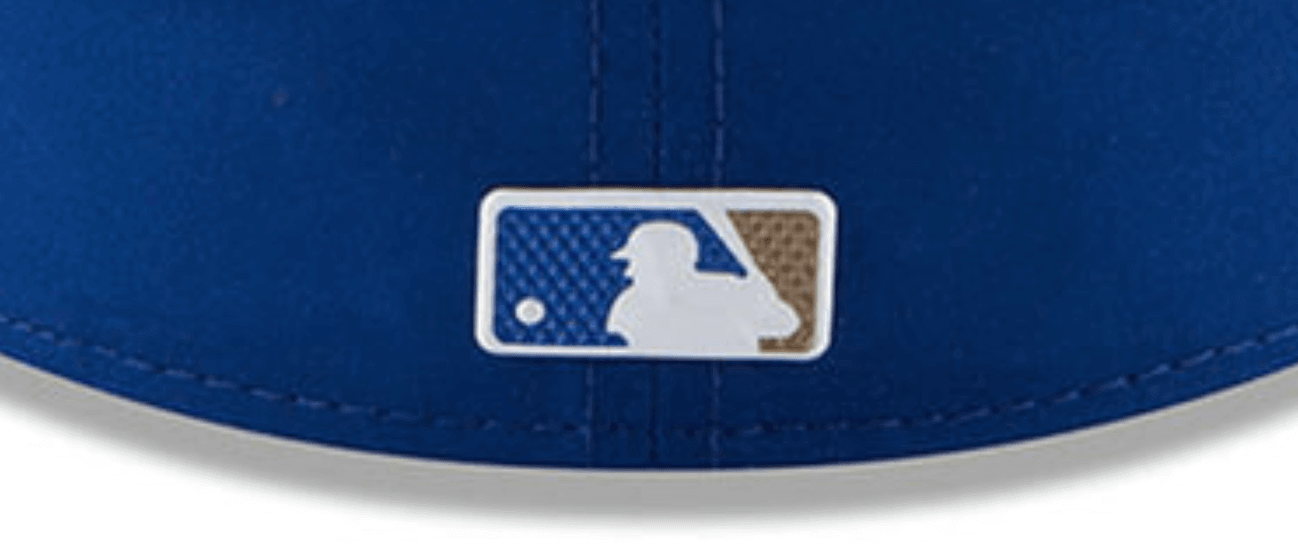
The MLB logo on the back of each cap is also getting the rubberized treatment:
In addition, the New Era maker’s mark on the left side will be printed, not embroidered. This means you’ll no longer be able to remove the logo with a seam ripper, although I assume some enterprising folks out there will find a new form of creative mischief for blocking this particular ad. I look forward to seeing how that plays out.
When the caps are worn for Grapefruit and Cactus League games, they’ll have the “FL” and “AZ” graphics added on the right side, as we’ve seen in recent years. (Those graphics were never embroidered to begin with, of course.)
For those keeping score at home, MLB has now used rubberized/plastic logos for Independence Day caps and now BP caps. It seems like the All-Star Game and maybe Player’s Weekend would be the next logical steps. Would they ever go all the way and abandon embroidered logos completely, even for regular game caps? Hope not, but it seems conceivable.
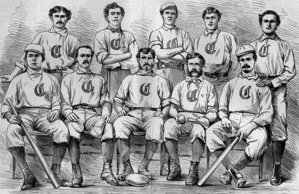
BP caps have always been somewhat forward-looking and trendy. (MLB’s press release for the new caps even includes a quease-inducing quote about the caps being “on-trend.” Kill me now.) So it’s surprising to see that two teams are using their new caps to showcase a throwback look. The first such team is the Reds, who are throwing waaaaay back (click to enlarge):
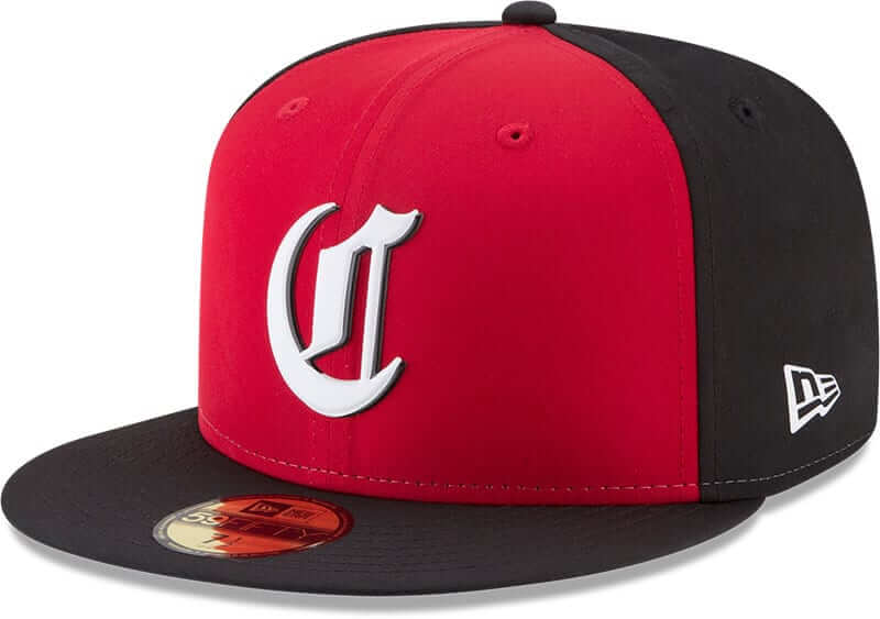
If you’re a serious baseball historian, you should recognize that “C,” because it’s based on the logo used by the 1869 Cincinnati Red Stockings, the team that’s generally acknowledged to have been the first professional baseball squad (and also the first team to go high-cuffed!):
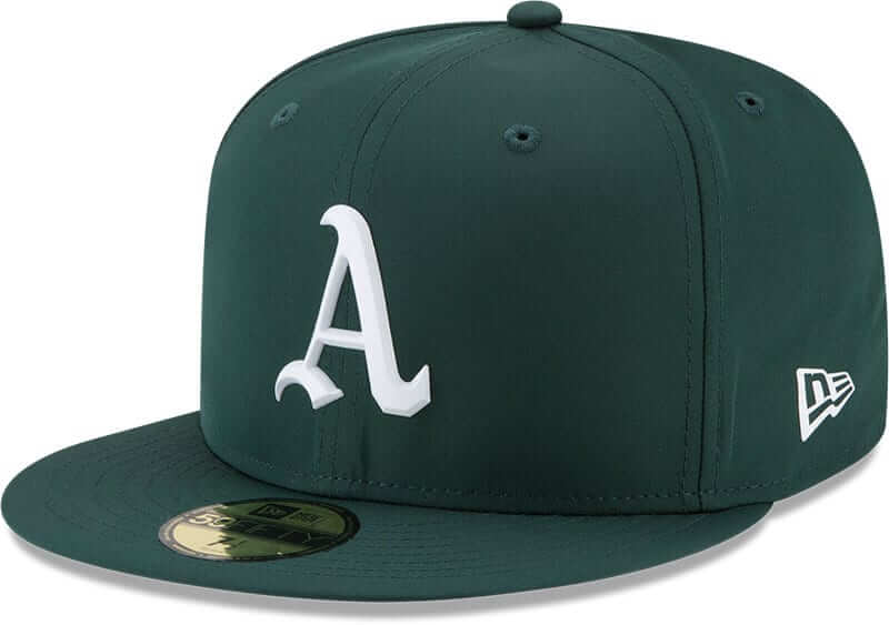
The other team going with a retro look, albeit a much subtler one, is Oakland (click to enlarge):
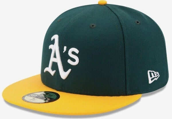
If that “A” looks a bit off but you can’t put your finger on what’s different about it, here’s a side-by-side comparison with a standard A’s cap:
The new BP version is based on the one used by the Connie Mack-era Philadelphia Athletics. Interesting that the A’s would choose to go that route:

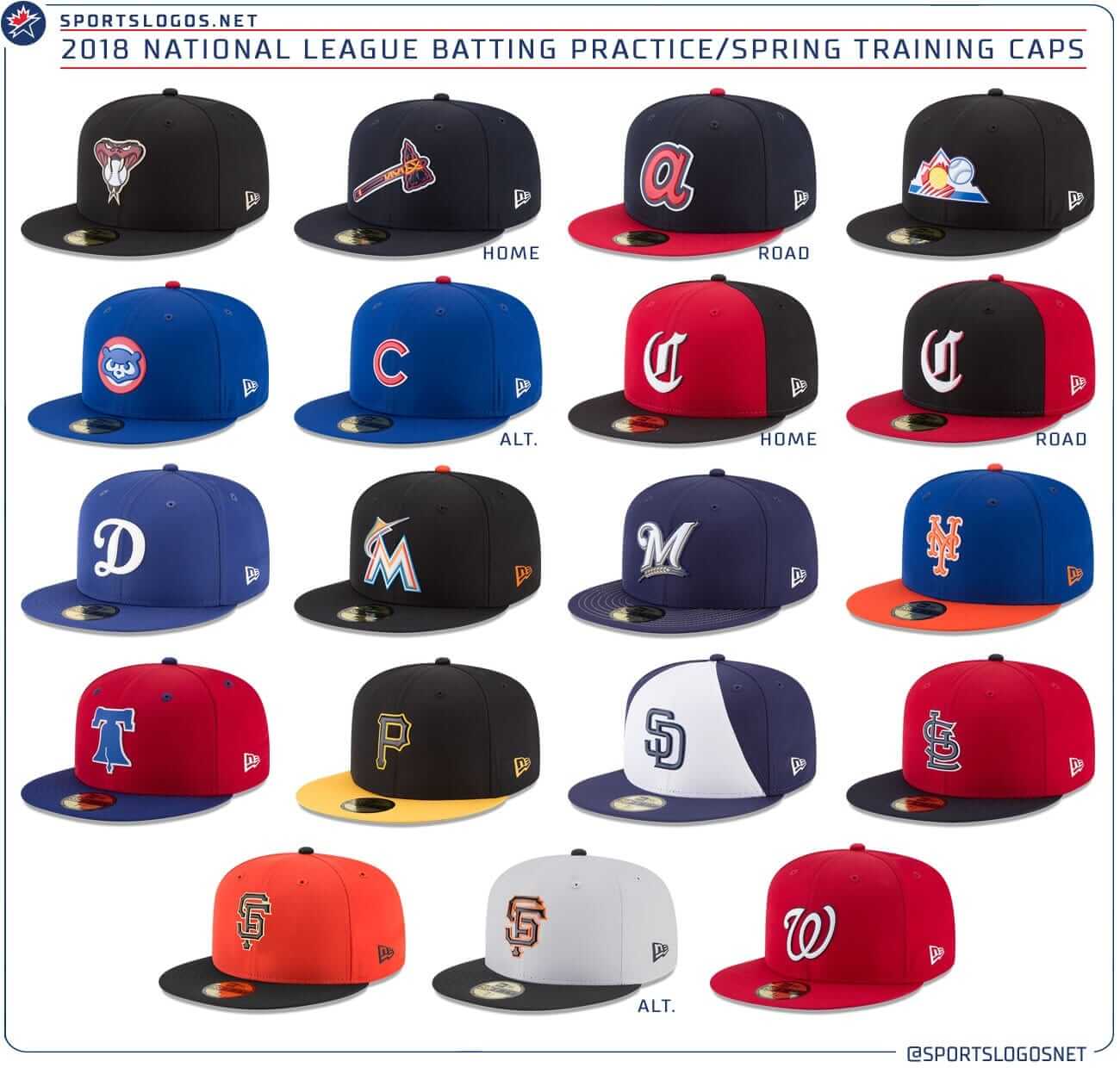
As for the other new designs, some are good, some not so good, but they’re all just BP caps, so I find it hard to get too worked up about them one way or the other. You can see all of the new designs in these two graphics whipped up by SportsLogos.net (click to enlarge):
One final thought: As stated in MLB’s press release (and parroted by several willingly credulous media outlets), the rubberized team logos on the caps are not logos; they are “badges.” This is, of course, newspeak nonsense, but it’s worth noting that “badge” was also the term that the Golden State Warriors used when unveiling their ad patch back in September. Is “badge” going to become the new annoying marketing term for uniform graphics? Stay tuned.
Click to enlarge
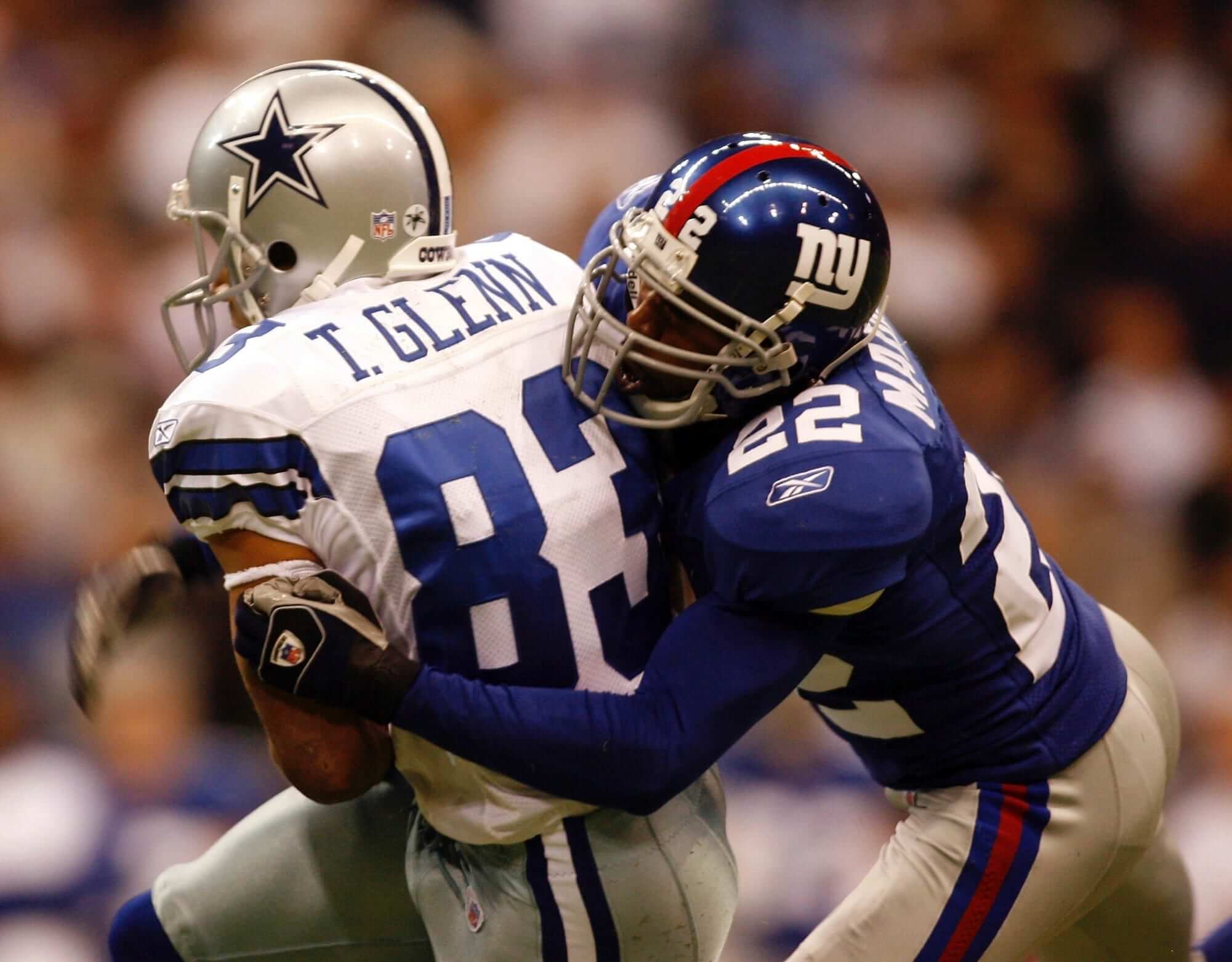
Terry Glenn, RIP: As you’ve probably heard by now, former NFL wide receiver Terry Glenn died in a car accident yesterday. He’ll always have a special place in Uni Watch lore because of a stunt he pulled during a game against the Giants on Oct. 23, 2006. In that game — and, as far as I know, only for that game — Glenn snuck an Ohio State buckeye decal onto the back of his helmet. He had played college ball at OSU and was giving a shout-out to his alma mater.
I’m not aware of any other OSU player who’s gotten away with this. Anyone..?
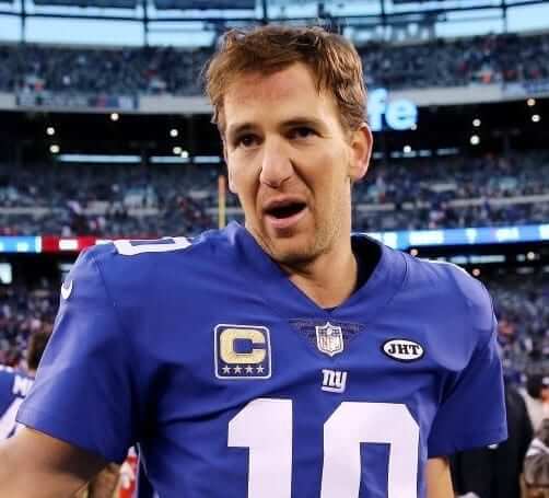
Patchwork: Major omission in yesterday’s installment of Monday Morning Uni Watch, as I neglected to mention that the Giants added a “JHT” memorial patch for Joan Tisch, the widow of former co-owner Bob Tisch.
The funny thing about this one — aside from my not mentioning it yesterday — is that the Jints had already added a helmet decal for Mrs. Tisch two weeks earlier (as I reported at the time). Now that they’ve added the patch, the decal has been removed. Weird for a team to start out with a helmet memorial and then upgrade it to a jersey patch.
Collector’s Corner
By Brinke Guthrie
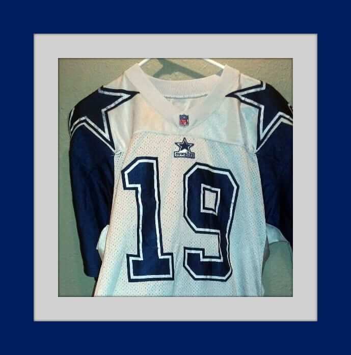
The day after tomorrow we’re treated to the annual doubleheader of turkey and football. One of my favorite uni memories has to be the terrific Cowboys double-star jersey from Apex, which debuted on Thanksgiving Day 1994. And here’s the design on punter John Jett’s jersey one season later.
Dave Venneri, a friend of mine, was a PR/advertising manager for Apex in the 1990s and was very involved with the Cowboys. He told me the design started with Michael Lewis, the co-founder and creative director of Apex One. “He wanted something bold and memorable for the double-star treatment,” says Dave. “Something that looked great on camera as well as on field — something totally unique, bold, and brash. He worked in partnership with Jerry Jones and Jerry’s son Stephen on getting the concept bought in with the Cowboys. Obviously the NFL needed to get behind the concept too, as it needed to be approved by NFL Properties.”
Just to cap things off, here’s a great Apex Cowboys commercial from 1994, which proved prophetic.
Now for the rest of this week’s picks:
• Along with the Sunoco NFL Action 72 stamp album and the NFL Playbook from American Express [both of which are treasured items in my own collection — PL], the NFL Fun Book from 1978 defined what cool NFL graphics were like during that era. If you’ve never seen one of these, I suggest you take a look — there’s not much out there of its type that can beat it. Seventies retro cool to the max, man.
• Just right for Uni Watch HQ: a 1960s Mr. Met shampoo bottle.
• Another Mets item for you- a truly old-school Mets warmup jacket made by KM Pro.
• Here’s a sign that won’t be on the wall at Uni Watch HQ anytime soon; This vintage Vikings metal sign says, “Sound the Horn and Wave the Sword — Purple Power Is Here.”
• Wash up with this 1970s California Angels Soapy Soap “baseball.” The seller has several other teams, too.
• One more for the Halos: Nice graphics on this Angels three-ring binder. The seller says it’s from 25 years ago, so that would be 1992, the last year for that logo. They’d go to the retro CA in 1993.
• These 1970s Baltimore Orioles pins let you know “The Bird Will Fly!”
• A 1970s Cleveland Browns cowboy hat, of course. Made by AJD, the folks who did those original striped trucker caps.
• This 1960s lined Green Bay Packers jacket was made by Brill Brothers of Milwaukee, as part of the Golden Thread Collection.
• Here’s a 1970s kids Vikings parka from the Sears NFL Shop, with the usual huge pull ring showing on the pocket, of course.
NBA Uni Tracking
By Collin Wright
More than a month into the season, color-vs.-color games remain much more the exception than the rule (figures are accurate through Sunday but do not include last night’s games):
[table id=36 /]
The Ticker
By Alex Hider

NFL News: For whatever reason, ESPN rendered the Falcon on Atlanta’s helmets in red on a graphic last night (from Chris Brueckner). … Rams LB Alec Ogletree had a nifty tape job done to his fingers on Sunday. He occasionally wears gloves but more often goes with the bare-handed/taped look (from Pro Football Journal). … Packers DE Mike Daniels promises he didn’t have an accident on the field during Sunday’s game, saying he’s just a sweaty guy (from Shaun Meulemans). … Seahawks QB Russell Wilson is investing in Vicis, a company that makes high-tech football helmets (from Phil). … Jay Reyes found this backpack with both Raiders and Eagles logos at a store in New York. … Pepsi is currently running a commercial featuring “Deion Sanders from 1995.” However, the spot actually shows Sanders wearing a 1996 Cowboys jersey, as evidenced by the wordmark above the number. That didn’t exist in 1995 (from Stephen King and Jamie Burditt). … A few weeks ago at a NASCAR race in Phoenix, Cardinals CB Patrick Peterson sponsored driver Ray Black, and Peterson put his personal logo on the hood of the car (from David Firestone). … Vote for the best uniform matchup of week 11 here (from Uni Watch Facebook Page). … When the Weather Channel tried to show a live feed of the Georgia Dome’s demolition yesterday, a bus pulled up at just the wrong moment. … Seahawks TE Jimmy Graham dropped two key passes while wearing two different sets of gloves in last night’s game.
College Football News: Tonight is Eastern Michigan’s Senior Night. To honor those playing their final game, it looks like the Eagles will be incorporating the numbers of each senior into their helmet logo (from Shane Brown).

Hockey News: Canadiens G Carey Price has new white pads (from The Goal Net). … Byron Magrane found a 1990 newspaper clipping from the Sharks’ first logo/uniform reveal. Here are the sweaters they unveiled at the event (also from @batsdingerbond). … The Florida Everblades and the Evansville Icemen of the ECHL recently wore superhero jerseys for a Hulk vs. Thor matchup (from Adam Childs).

NBA News: Currently, “Dallas Mavericks” translates to “little cows” in Chinese. That apparently doesn’t sit well with the Mavs, so the team is letting fans pick the new official Chinese translation (from Jared Peterson). … This Eastbay catalogue must have been printed before Paul George was traded from the Pacers to the Thunder (from Mark Wiley).

College Hoops News: Louisiana-Lafayette wore some spiffy throwbacks yesterday in their game against Iowa (from Chris Yandle). … Oklahoma State wore turquoise unis in honor of Native American Heritage Month last night. With Texas A&M in maroon, it turned into a nice color-on-color game (from Shlomo Sprung and Chris Howell).

Soccer News: AMS Clothing is a small clothing manufacturer that is producing uniforms for a number of African national soccer teams, giving the countries a sense of national pride (from Michael Mrozinski). … Lots of stripes in this EPL matchup between Stoke City and Brighton yesterday (from Josh Coles).

Grab Bag: Matt Kenseth raced for the final time as a NASCAR driver on Sunday, and used a throwback paint scheme to his rookie season (from David Firestone). … Jeff Ash found this 1967 AP article about the U.S. women’s skiing team having the “sexiest” uniforms. Key quote from skier and future lip balm spokeswoman Suzy Chaffee: “We’re going to wear metallic silver uniforms that look like they were painted on us. Those metallic things make you feel as if you have nothing on. Psychologically, it’s great. And it works psychologically on your opponents, too, I think. They look at us and think we’re something from the moon.” There’s no accompanying photo, but Jeff found this shot, which shows the uniform referred to in the article.
Proofreading:
“Terry Glenn died in car accident yesterday”
“so team is letting fans pick”
Fixed.
definite and indefinite articles are way overrated
Yeah, but, Paul, now you get to look at these new uniform treatments and say, “Badges?!? We don’t need no stinking badges!”
Ha! Comment of the day, and the day just started.
Nice.
I don’t know that “badge” and “logo” are necessarily mutually exclusive terms. A shame that it’s taking hold in the uni-verse’s lexicon, but it’s possible to have a “badge” of a “logo”.
New Era would’ve saved some ink by just calling them logos, obviously, but they probably wanted to make a note of the fact that these logos were pre-made and put onto the hat rather than embroidered one stitch at a time, so in this particular instance “badge” doesn’t bother me, unless you were looking for some less-evocative synonym.
These “badges” do seem cheap to me as far as how they’re put on (they’ve been doing it for NFL hats for awhile now and it’s seemed that way as well) and if stuff starts falling off of hats in the middle of games there will obviously be a re-think; so for now I still prefer embroidery. But there’s no denying that logos can certainly be printed a lot clearer and with more detail than they can be sewn.
“Badge” sounds official, it implies authority. Who wears a badge? A sheriff, a police officer, other officials of the state. Wearing a badge makes you powerful and cool.
In a sports context, it’s just marketing bullshit.
So you were looking for the less-evocative synonym, as I suggested. I don’t disagree that it’s marketing BS, but I also don’t mind a different term for a thing OF a logo that’s pre-made and put on a piece of clothing, rather than the logo stitched directly onto the piece.
There’s no need for a less-evocative synonym, or for *any* synonym. It is the team logo, so we should call it a logo, the end.
I don’t know if it’s the same material, but I’ve seen law enforcement agencies using chromaflex badges on more casual shirts, jackets, and caps where you might normally see embroidered ones.
It would be interesting to see how they’d work for “busier” minor league logos. It’s kind of wasted on the simpler MLB ones.
It is worth noting that “badge” has long been a common term for the logo in English football. It is so well established that the act of rasing the shirt’s logo to one’s lips to show love for the team is called “kissing the badge”, never “kissing the logo”.
When you do an image search on the term “kissing the badge”, you get a whole page of images such as link, and some images, like link, that go back well over a decade. Whereas an image search on “kissing the logo” turns up nothing related to sports.
Because of the fact that “badge” is already a well-established term for a sports team’s logo, encountering it in connection with baseball or basketball teams’ logos did not strike me as odd. The word does not invoke police or other authority figures when used in this context; it’s just part of the normal range of sports terminology.
And there’s nothing wrong with having synonymous terms; English more than any other European language is famously replete with them. The term “badge” sits nicely alongside “logo”, as well as “insignia”, “emblem, and “symbol”. In most cases any one of these terms is equally applicable; though it is possible to conceive of instances in which one of these words feels more appropriate than the others.
This is typical of English, in which a set synonyms tends to consist of words whose ranges of meaning broadly overlap without the words being 100% interchangeable in all settings.
Interesting! Thanks for the primer.
But it’s still bullshit on this side of the pond. There’s no history of “badge” being used in a sports context in America or in baseball, nor is there any behavioral ritual of kissing anything. This is just New Era trying to make something sound cooler than it is. Marketing bullshit.
Sorry, have to disagree. (For the record live here in US) and badge is the better of the two terms. More professional and used for s sewn-on patch (all European crests/badges are sewn onto the kit itself). Just like kit is interchangeable with uniform, pitch is interchangeable with field, and badge is interchangeable for logo.
Actually, all of those terms are more soccer-centric and have no currency in baseball.
Refer to a baseball uniform as a “kit” and you’ll be laughed off the field. The same treatment should apply to “badge.”
Again, I disagree. I know several who apply these terms in both rugby, croquet, and cricket. And while it may be true that saying pitch when referring to the baseball playingsurface, the reverse would apply for *real* football or rugby. Understand your POV to an extent but calling it marketingBS to simply call it a badge is ridiculous.
And, addressing an earlier comment you posted, not only do most credible MLS and USL fans call their team’s insignia a badge or crest, you self-admittedly stated that Rakuten and GSW called their sponsorship a patch.
I have to go to bat one last time for my original point, which I believe has been mostly glossed over.
Let’s take a look at this photo: link
What’s on Chris Sale’s sleeve? It’s the White Sox logo, surely, but that’s not the word most people would use to describe it: it’s a patch. You say “if it’s the team logo, we should call it a logo. The end”, but I submit that there are certainly exceptions to this rule, and a lot of us feel that these logos/badges/decals on these new hats merit another exception. It’s easier to call what’s on the game hats just “logos” because they are inseparable from the hat itself, whereas these new decals are not.
I don’t think it’s totally illegitimate to want to come up with a new term for what we see on these new hats in order to differentiate them from what we’re used to seeing. If you don’t like “badge” for x and y reason, that’s fine and I don’t really like it all that much either for what seems like similar reasons; and if you don’t want to participate in that search and continue calling them logos, that’s fine too. But to totally dismiss others’ search for a different term seems short-sighted to me. These new decals are, as far as an on-field visual is concerned, completely new territory. Why can’t a new term follow with it?
Wait a minute — now, in your next-to-last sentence, you’re calling them *decals*?
By any objective standard, they are not decals. You’re so desperately in search of synonyms (for reasons that still aren’t clear to me) that you’re basically inventing new meanings for things.
I agree that there are some other terms that could be used for a cap logo. “Insignia,” for sure. “Mark,” too. But “badge”? No way. That’s trying to create status where no such status exists.
In short: I’m not opposed to synonyms. But “badge” is not a synonym.
If the reasons still aren’t clear to you even after my last comment, then I’ll leave this conversation at that.
You’ve stated your reasons, but I still don’t see the point behind them.
It’s a baseball cap. A baseball cap has a logo on the front. At various points in history that logo has appeared as a patch, as flat embroidery, as puff-embroidery, and as various types of raised/3-D materials. But the logos themselves have always been, you know, logos.
If you want to call it a “rubber logo,” that works. If you want to call it a “raised logo,” that works. But “badge” does not work (it connotes status where no such status exists), and neither does “decal” (which is, by any objective standard, inaccurate).
Why not use a *descriptor,* instead of a faulty synonym? Descriptors add meaning and aid in understanding; synonyms, when sloppily applied, obscure meaning and sow confusion (and in some cases are just marketing bullshit).
More plainly stated, I don’t think “badge” and “decal” are actually synonyms at all.
This is an interesting discussion.
I think the context of where the design appears and the materials really do matter.
In this case, I actually think “decal” works pretty well. Decals are substantially flat, usually synthetic logos adhered to a surface with glue. It’s why we use the term “decal” even for the embroidered sticker that appears on the Cubs batting helmets.
I think given these new caps are broadly flat, plastic pieces glued rather than stitched on, the “decal” moniker could apply.
Wait a minute — how do you know they’re glued rather than stitched on? Most chromaflex and related graphics are sewn on.
(And I for one do not use “decal” [or “sticker”] for the Cubs’ batting helmet logo.)
Just looking at the images, there aren’t any stitches visible.
link
link
Compare that with this image that has distinctly visible stitches.
link
I feel that if we took what New Era has put on that Royals cap and slapped it on a helmet instead of cap we’d call it a decal.
I feel that if we took what New Era has put on that Royals cap and slapped it on a helmet instead of cap we’d call it a decal.
You might, but I wouldn’t. We already have a model for this: all of the raised/3-D helmet logos that teams are wearing. Personally, I don’t call those decals, because they’re not flat. I called raised logos or 3-D logos.
So when did the term “logo” come into wide use? I’m thinking the late 1970s.
Are you joking? The word “logo” goes back well over a century.
“You might, but I wouldn’t. We already have a model for this: all of the raised/3-D helmet logos that teams are wearing.”
And that’s fine. I lean towards decal as acceptable because the insignia on the BP caps are pretty flat but that’s just me.
Also definitely no stitches.
link
Wow — that photo. It had honestly never occurred to me that the logos might just be glued on. There’s something very “ewwwwww” about it.
I find the word “logo” overused, so I make an effort to insert a synonym wherever possible. There may be subtle distinctions between “badge”, “logo”, “insignia”, “mark”, “monogram”, “crest”, and “symbol”, so I try to keep on top of the situation in which I find the design.
So? What synonym would you use in this case? Don’t leave us hanging! ;)
Insignia! Sorry if that came off a bit anticlimactic.
I know that it’s perilously close to purple for your tastes, but Texas A&M wears maroon, not red.
Fixed.
Interesting how Brighton & Stoke’s respective kit-makers (Nike & Macron) took opposite approaches to the color of the panel on the back of the shirt:
link
Interesting. These caps caught me off guard. I’d have bet money that the mesh caps from last year’s Home run derby would be this year’s BP caps. I’m curious to get my hands on one to examine the material and logos. While the rubberized logo seems tacky at first,I can see it catching on. Sweat stained embroidered logos can get pretty grody.
I hate everything about these new ST caps, the rubberized badge cheapens the look of an official MLB hat.
And they’re charging the same price too! Production cost has to be cheaper than embroidering the patch, so cheaper to make, still a high mark up. Not happy!
They should have knocked a few bucks off when they started putting their dumb “flag” on the side.
The new San Jose Sharks sweaters made it look like they inherited the original colors of the Pittsburgh Penguins, as well as the triangle in their logo. I remember the writer(s) of the New York Times making fun of the idea of a team having broken sports equipment in their logo that inaugural year.
Just thought of the original Patriots’ logo with a deflated football…
In that picture, the 1s have a bottom serif. That’s not the style the Sharks used originally.
ESPN didn’t “render the Falcons logo in red,” they just extruded it. The accents inside the feathers of the wing are red, and ESPN created 3D versions of the helmet logos for the MNF package. If you look at the Seahawks, you can see the same built-up approach in the elevation of various elements. The Falcons logo is correctly colored, just constructed in a novel way we’re not used to.
It just looks weird because of how far outward from the base of the design the red elements are projected, but yes, the logo colors are correct. This is pretty much a non-story here.
BREAKING: Falcons logo rendered in red because Falcons logo is red
“The Florida Everblades and the Evansville Icemen of the ECHL recently wore superhero jerseys for a Hulk vs. Thor matchup (from Adam Childs).”
Jacksonville Icemen……team moved to Jacksonville, FL this season
Cheap looking new caps. However, I love that the Rockies are incorporating the great looking Colorado state flag into their design. Now they just need to render it in team colors.
Regarding the Falcons “in red” on the espn graphic. Not sure why that is notable, the logo has red highlights on the wings similar to how it is depicted in that graphic.
I know retail isn’t usually covered, but the the “new” Retro-Classic caps are maker’s mark free. Also have white under brims, flat logos, and 100% wool.
link
They are so, SO tall though. I bought the Pirates one a couple months ago and immediately returned it once it arrived; the crowns are way higher than they were back in the day, for sure. Need to make low profiles in these for us curved-brimmers.
The good thing is that these are 100% wool, so they’ll shrink with a good soak.
I’ve noticed the gray on the Yankees road cap is much darker than previous caps. A sign of things to come with the ST uniforms, perhaps?
No changes to BP/spring training jerseys for 2018.
skier and future lip balm spokeswoman Suzy Chaffee
Glad to see she never legally changed her name to Suzy Chapstick. The commercials made me wonder.
link
You beat me to it, Jimmer!
Giants-Chiefs was by far the best looking NFL game this week.
I’d still rather have the rubberized logos than before where the bp hats had too thick outlines.
Personally I thought the ones 10 years ago were the best when they used the 39thirty hats.
That turquoise set for OSU is sweet. Any chance of TFTS?
Those are the N-7s. More here.
Interesting that, for me at least, the shots from OSU’s game make it look turquoise, but the images on Nike’s site make me think more of the Tennessee Titans, TB Rays, or Manchester City, before, say, the Vancouver Grizzlies road unis.
Memorials going from helmet stickers to jersey patches? Different sport, granted, but when Jean Beliveau passed, the Habs used helmet decals while waiting for the jersey patches to get produced.
I think I understand the spirit of your comment (and I don’t follow the NFL closely anymore): I think you’re saying that it’s one thing as a quick-turnaround placeholder, but if it’s been a couple of weeks and then a switch, maybe that’s unusual.
Yes, exactly, that’s what I was trying to say.
When Art Modell died in September 2012 shortly before the season began, the Baltimore Ravens wore an “Art” helmet sticker for Week 1 of the regular season and switched to a jersey patch on Week 2 which they wore the rest of the season through Super Bowl 47.
Will the lakers wear purple ever again?
Aside from throwbacks, no NBA team has worn an alternate jersey so far. Only the standard white and colored. And the Lakers’ standard colored uni is the gold one.
I’m not a big NBA, so I don’t see many highlights or whatnot. Lakers haven’t worn purple this season? In the past it was yellow at home and purple on the road (vs home white for the other team), right? So now that they can do color on color they are just wearing yellow full time?
I’m guessing Paul doesn’t mind this at all.
Never thought of it this way, but if it’s up to the teams now, a standard yellow-gold road jersey is pretty headache-free. It contrasts well enough from traditional home white, and even better against most colors. Honestly, the purple jersey might as well be relegated to a “clash” jersey like soccer.
I’m not Paul and I grew up in New Orleans (where Mardi Gras and LSU are popular), so I appreciate a well-used purple and I kind of miss that traditional Lakers look, but oh well.
Re the Athletics new BP cap: would it be more accurate to state that the “A” is more closely based on link used during the franchise’s first season in Oakland? link a nice clip from Picture Day in 1968, and a link of link to corroborate.
Precisely my first thought. It is the 50th anniversary in Oakland for the Athletics after all.
Yes, but that “A” looks odd on that drab shade of green the A’s use today. Love my A’s… hate that hate.
*** HAT *** LOL
You beat me to it, teenchy. This “A” was used in the first few Oakland seasons. The apostrophe-S was added in ’70, and the “A” was changed in ’73.
When the A’s wore ’68 throwbacks, it bugged the hell out of me that they got the cap wrong by using the Philly-era “A” instead of the correct one. See: link
“AZ” hyperlink on the BP caps piece directs users to a create your own Mets templated jersey.
Fixed.
Those Louisiana-Lafayette throwbacks employ the Pelicans’ font.
I understand the practical application of the rubberized patches. It allows for increased graphical clarity and expanded design options over traditional stitching. A bit of a linear progression given clothing industry’s proclivity to opt away from traditional stitching anymore as a cost-saving measure.
It bothers me that it hasn’t changed the price point of the caps (or clothing for that matter). If you’re going to make a shift in your company’s product, at least make a price shift to match instead of pocketing the profits.
Do we know for a fact that the rubberized method is less expensive to produce?
At the very least it has to be quicker, since the caps and logos can be produced separately.
Are the stitched caps hand stitched or machine stitched? If hand stitched one would assume the cost of labor to stitch makes it more expensive than the machine printed rubber logos?
Machine.
Generally they are more expensive because a mold must be made for each logo. When ordering a bazillion of them, it may be different, but I wouldn’t expect it to ever approach “significantly cheaper” territory.
I definitely like the Tigers’ white caps. It’d be nice if they could work them into a game on occasion, like maybe for a Sunday home game or two in June or July.
While I’m usually against white caps in general, you’re right, these would look pretty snazzy paired with the Tigers’ home whites.
My favorite of the lot, though, is definitely the orange one with the tiger.
Besides the Reds and A’s, I would also include the Mariners and the White Sox as going for a retro look with their BP caps. Both going with a 70’s-inspired look, even if the Mariners are using their current colors.
But (a) those aren’t new (they’ve been using those designs since last year) and (b) there’s a big difference between throwing back to the 1970s and throwing back to the 1860s.
That old timey C looks like crap on a cap with black. Yuck.
When Under Armour takes over as MLB’s outfitter in 2019, will they be manufacturing the caps as well? I previously thought the deal applied just to jerseys and pants, but the mention of them here in a story about caps had me wondering. The ESPN article here (link) says that Under Armour will make ALL on-field apparel. Is New Era out?
Never mind. The article qualifies that statement with “that is currently made by Majestic.”
In the Hockey section, the Icemen are in Jacksonville now. (They used to be the Evansville Icemen)
I am disappointed that the Washington Nationals didn’t go with the interlocking DC logo. Another missed opportunity.
Oddly enough, the 1996 Cowboys unis had the Nike swoosh on the sleeves, as today’s unis do (though not reversed on the right sleeve), but “1995” Deion’s jersey doesn’t have a maker’s mark on the sleeve, even though it has the 1996 team wordmark below the collar. Weird.
Also, it looks like the details on Deion’s jock tag have been blocked out.
They had no makers marks anywhere that year. Apex deal was gone when Converse bought them to get the NFL license, and Jerrah had gone rogue and signed with Nike by himself- Nike then had no league affiliation other than shoe/gloves. So until Nike officially started in 96, they went with no mark. Even coaches on the sidelines were plain white or plain navy. Looked weird.
Wish I could see what’s going on here, but none of UW’s graphics (or even ticker icons) display any more. Clicking them returns the message: “The owner of offload.uni.watch has configured their website improperly. To protect your information from being stolen, Firefox has not connected to this website.”
Weird. I’ll forward this to my webmaster. But in the meantime, have you tried another browser?
I have, and get an error with those as well. I don’t know if this might help your webmaster, but the error message differs depending on the browser:
* IE: “Turn on TLS 1.0, TLS 1.1, and TLS 1.2 in Advanced settings and try connecting to link again. If this error persists, it is possible that this site uses an unsupported protocol or cipher suite such as RC4 (link for the details), which is not considered secure. Please contact your site administrator.”
* Chrome: “offload.uni.watch unexpectedly closed the connection.”
Thanks for the response!
Have you tried using link rather than link? That made a difference for me when I was getting all kinds of security and certificate warnings when attempting to access the site. But I don’t think I ever encountered the depth of problems that you seem to be having, however.
Oh, yeah, I should have mentioned that. Omit the “www” and just try link
That’s the URL I am using, unfortunately. My office’s firewall could well be the problem, so there’s no need for any further trouble on my behalf. If anyone else is having similar errors, though, it might bear investigating. Thanks, Paul (and Paul)!
As a lifetime A’s fan I’m a bit disappointed with their BP hat offering. That “Connie Mack” style A looks odd on dark green. Blue and white Philly A’s would be fine, heck even a Charlie Finley kelly green hat would be better. It’s one of the weaker designs in the group.
Since we can’t have actual secondary helmets on the NFL field, I think it would be cool to use rendered ones for the promos for MNF. Although I can already hear some suit at the NFL or ESPN offices shoot it down because of “brand recognition” or the like.
I love the Chunichi Dragons BP cap!!
Was this the Giants first home game since the death? I know they were in SF last week. Perhaps they wanted to “debut” the patch on the home blues?
RE: the BP caps. Much like Paul, I don’t put much seriously thought into them because they’re BP. I don’t mind the chromoflex logos, and I do like teams pulling out different logos from the norm for these. Wish the Yankees would have used the top hat, or at least kept the pinstripe motif of the previous home BO caps.
Nope. First game after her death — the game when they added the helmet decal — was at home.
Nov 2: Joan Tisch passed
Nov 5: Helmet decals. Home game, but maybe not enough time for patches.
Nov 12: Helmet decals still. Away game. Maybe patches are ready and waiting for the home blues.
Nov 19: Patches.
My offered hypothesis: Brian isn’t wrong.
Three days is waaaaaaaay more than enough time to get patches made, especially if the team is already spending the week at home. Trust me on that — they can be made in a few hours and sewn on in a few more.
OK Paul, I will. Because I can stipulate that Nov 3 is a business day, yielding more than enough time to petition the relevant NFL bureaucrat to make an emergency change to the coming week’s uniform.
The NFL Fun Book shows the Seahawks’ original helmet – still one of my all-time favorites. Their uniform set back then was pretty good-looking.
Regarding the batting practice/spring training caps – I find it interesting some teams have just the one cap, while others have multiple … and the Tigers have four! Any rhyme or reason to that, other than trying to bleed as much money from fans as possible?
“Honey – I need all four of those new Tiger caps for Christmas this year! I promise I will wear all of them!”
Did anyone ever confirm if Cowboys vs. Chargers will indeed be color vs. color on Thursday? The Chargers said they were going to be wearing their powder blues on Thanksgiving earlier in the season and Dallas has confirmed they are wearing navy at home so I am wondering if we might get a non mono color vs color games? Dallas usually likes to do something unique with their uniforms on Thanksgiving. It would be especially interesting if it’s 2 shades of blue.
Based on the Gridiron Uniform database, the Cowboys are wearing their regular home (white) uniforms on Thanksgiving, with LA in powder.
link
The same site shows the Cowboys in their throwback all white/Color Rash on TNF week 13.
link
Lee
I love that Apex Cowboys commercial. Only problem I ever had with it was the place they filmed it is absolutely, unequivocally NOT 822 miles from the Georgia Dome. That is not what north Texas looks like.
Not crazy about the PK80 tournament with only Nike teams invited.
College sports has become NASCAR, instead of Chevy, Ford and Toyota it is Nike, Adidas and a little Under Armour.
Having a poll for best NFL matchup of the week is a good idea, but the presentation of the results is nearly useless. Instead of showing where games finished, there’s a chart of how many votes each team got for each spot–and no indication of whether “1” means best or worst! Probably the fault of Google, but is there anywhere to see a simpler tabulation of results?