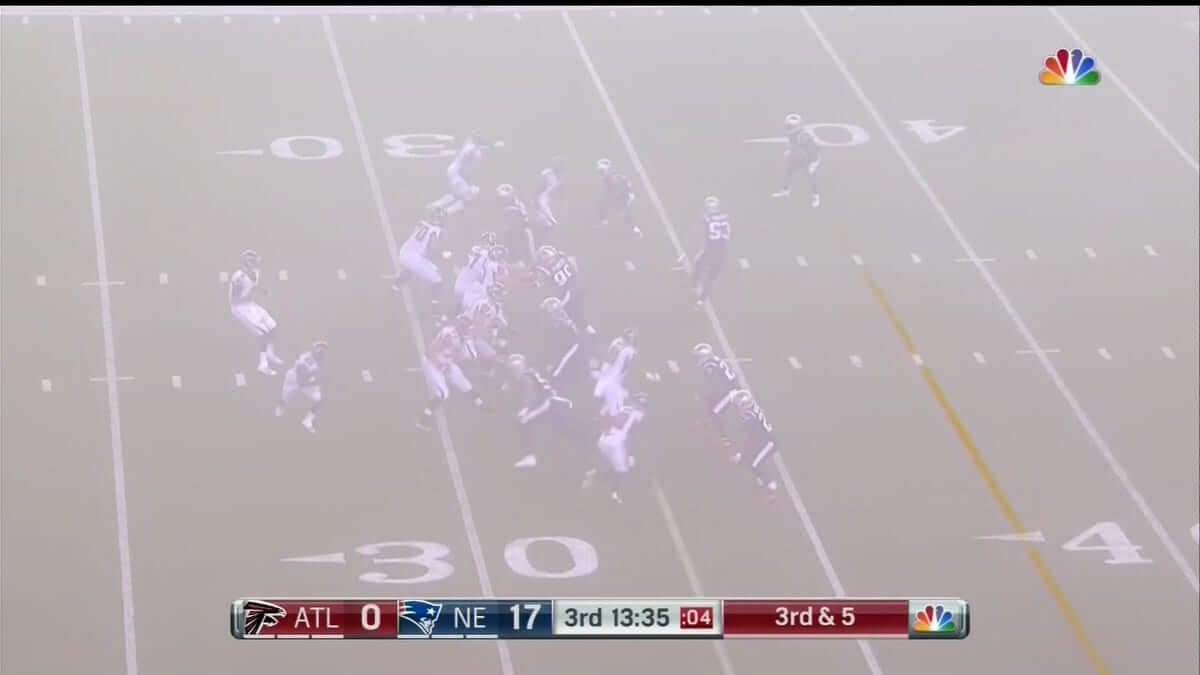
The Rash spread to Sundays yesterday, as the Patriots wore their mono-navy Thursday-night uniforms for last night’s game against the Falcons. As I wrote a few weeks ago, I’m not a fan.
Perhaps the football gods agreed with me, because some fog rolled in during the third quarter that mercifully obscured the proceedings on the field (click to enlarge):
The Rash will continue to spread on Dec. 10, when the Bills wear their Thursday-night uniforms for a Sunday-afternoon game against the Colts. Sigh.
Meanwhile, in other news from around the league yesterday:
• The Browns, who had gone mono-white for all of their previous games this season, reversed course and went mono-turd. Not a good look (click to enlarge; additional photos here):

• The Seahawks went mono-grey, otherwise known as the dirty-laundry look (click to enlarge; additional photos here):
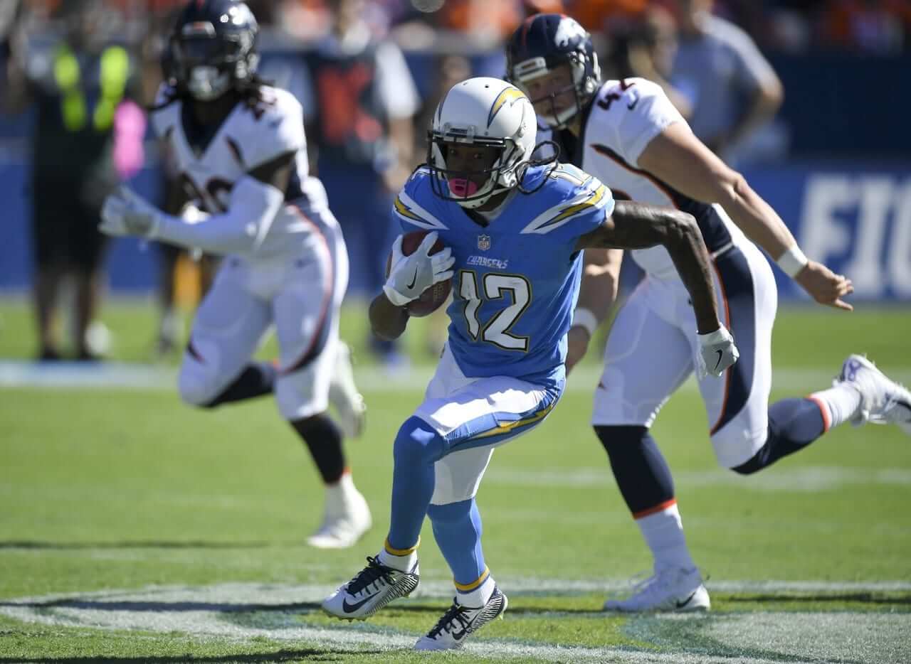
• On the plus side, it’s always a good-looking game when the Chargers wear their powder blue alternates, as they did yesterday against the Broncos (click to enlarge; additional photos here):
• Not sure if we’ve covered this before, but Saints running back Mark Ingram Jr. is now wearing RNOB.
• Two teams wore white at home: the Dophins and Rams.
• Here’s a list of players who protested during the national anthem.
(My thanks to Asher Hoffman for his contribution.)
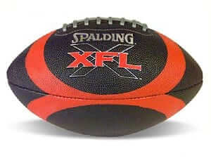
XFL contest reminder: In case you missed it on Saturday, Phil announced our latest jersey design contest, this time to reimagine a team from the XFL if the league were still operational today.
The deadline is Oct. 31. Full details here.
The Ticker
By Jamie Rathjen

Baseball News: Very cool DIY project by reader Michael Enriquez, who made these Astros (tequila sunrise) and Nordiques cornhole boards, using a circular feature in each team’s logo for the holes.

Hockey News: The Kelowna Rockets (WHL) wore Pinktober jerseys, but with their original late-’90s primary logo, on Saturday (from Wade Heidt). … Cross-listed from the baseball section: Michael Enriquez made these Astros (tequila sunrise) and Nordiques cornhole boards, using a circular feature in each team’s logo for the holes. … Here’s a look at the NWHL’s Metropolitan Riveters (based in Newark, N.J.), who have a modernized Rosie the Riveter as their jersey crest (from Sean Behan). … New uniforms for the Auburn club team.


Soccer News: FC Barcelona’s membership will vote on potential naming rights for the team’s stadium, Camp Nou, in the first half of next year. … A few things from the final day of the MLS season: Houston Dynamo goalie Tyler Deric was wearing a baseball cap, something occasionally seen when goalies are facing the setting sun (from @g_malcs). … Here’s what the Mets’ stadium looks like when set up for soccer, as New York City FC played there instead of their usual Yankee Stadium due to the MLB playoffs (from Jim Vilk). … Plenty of change kit shenanigans in the UK this weekend: Hibernian and Celtic both changed to mono-black and mono-lime green, respectively, in their Scottish League Cup semi-final. Both teams’ colors are green and white and designated away team Celtic’s two change kits are, for whatever reason, also green, leaving them looking a bit like a Color Rash game. … Three Premier League teams rather bizarrely changed when they didn’t need to: Watford (from yellow to red), Leicester City (from blue to black), and Arsenal (from red to black). … Additionally, Leicester and their opponents, Swansea City, wore warm-up shirts for Show Racism the Red Card in English and Welsh.
Grab Bag: New Pinktober badges for the Los Angeles Police Department’s transit services (thanks, Paul).
Odd how Miami has been wearing their blue (hard to call the new color aqua) pants at home lately. White pants at home with the white jersey looks much better.
I like the colored pants with a white jersey, if only to bring some color to the all-white look. Not a fan of the stormtrooper look.
I agree with Rich. Generally speaking – I don’t think jerseys and pants should ever match in football.
What really shouldn’t match is the pants and the socks. The fins need to pair coral socks with the blue pants.
It’s a matter of opinion, of course, and while I generally don’t like the “monochrome” look, there is still something cool about all white.
I mean, imagine Penn State wearing blue pants with their white jerseys. It would be a travesty.
I think all white can work so long as you are using colored socks (or at least striped socks). Colts do all white and they look good. I tend to think for teams with white helmets it sort of looks off balance with white jerseys and colored pants.
Aside from white I do agree that the jerseys and pants should never match.
The main problem when teams wear dark pants (yellow and silver/gray notwithstanding) is that they almost always are matched with socks that are the same color, giving us the leotard look. The only teams that really pull off dark pants are Chicago, KC and Washington (when they wear the burgundy pants, although they should wear yellow at all times) – contrasting socks, pants match the helmet.
The only teams that really pull off dark pants are Chicago, KC and Washington (when they wear the burgundy pants, although they should wear yellow at all times) – contrasting socks, pants match the helmet.
Wouldn’t the 49ers also meet that standard?
Were you referred to the 49ers non-Color Rash black over black uniform which used red socks?
Also the Browns actually avoid the leotard look this weekend by wearing orange socks. They also tended to wear white socks with their brown pants in their previous uniform set.
I don’t think contrasting socks automatically solves a dark pants problem (Browns being the classic example) but they certainly help.
Good question. I didn’t think about them. I guess, to me, gray/silver and yellow/gold are close enough to light pants that I forgot to consider the Niners and Saints. But sonce gold is definitely darker than yellow, I suppose you’d have to say they meet that standard, as do the Saints on the rare occasion they bother wearing their gold pants.
I disagree. What’s a good look at home for the Dolphins is to wear their color jersey over white. Come to think of it, the home team wearing their color jersey at home is always the best look.
Greg is right on about the Dolphins. White over white got the Dolphins to five Super Bowls and two championships, including the 17-0 season. Miami has played in ONE AFC championship game since introducing the dark pants, and they got their butts handed to them by Buffalo.
I believe the Premier League requires teams to wear their change kits a certain number of times per season regardless of need. Would explain why certain teams change kits when it doesn’t seem to make sense.
Interesting. Why the requirement? To showcase/promote retail product?
not sure why and dont care enough about futbol to research, but as a uniwatcher i did locate a helluva kit tracker here
link
This is what I suspect, yes (not that it’s required, but that’s why they’re doing it).
I recall reading they have to wear a non-primary kit at least eight times during the Premier League season.
Found an article from 3 days ago about these games featuring the clash kits being worn. The article states:
“There is no requirement to wear a kit a minimum number of times, and a ruling stating that clubs should only wear an away or alternative kit a maximum of eight times a season no longer exists.”
link
True or not though, there are probably enough times for a kit to clash that choosing not to wear your primary strip seems needless. Using Arsenal (red) as an example, there are enough other EPL teams wearing red/claret to warrant a clash kit 8 times (Man U, Liverpool, Stoke, Southampton, Burnley, West Ham, Bournemouth, Crystal Palace off the top of my head) that what should have been a nice red/royal blue matchup didn’t happen. I am guessing blue would have similar clash issues. Other than Watford going yellow and Swansea/Tottenham going white, most teams have high enough clash potential without doing it just because.
Spurs, Swansea, Brighton, Newcastle, Huddersfield, West Brom all incorporate white in their home kit this year. Players, fans, and the PL itself want the kits to change up some. They play thirty eight matches. Take Watford for example. Nobody else’s home kit is yellow, so theoretically they could wear it every game if their opponent doesn’t want to wear a neon green or yellow. It’s practical for teams that release three kits to wear them during league play.
As an Arsenal fan, it is noticeable that they often wear a change strip when playing teams with white shorts/socks away. I have no proof of this, but anecdotal observation of the Premier League suggests if two clothing components (out of shirt/shorts/socks) match the opposition then a change is required.
I think if the Patriots had worn red socks it would have been an awesome uniform.
I definitely like the Pat’s “color rash” blue jerseys more than their regular home ones.
Except the color rash jerseys don’t have TV numbers, which I thought were required by the league. Replace the logo under the UCLA stripes with TV numbers and you’ve got a solid home jersey.
I’m with you on this. I’m generally not a fan of mono unis, but this looks better than their normal home combo, which could tell you how much I dislike that. Maybe they could find some white pants lying about, pair them with the jersey worn yesterday. And, really, you’re only a red helmet & red socks away from completing the “Pat Patriot” look.
Swap in red socks and a white helmet and they would really have something.
I don’t generally like any dark mono unis but I would go so far as to say the Pats looked much, much better last night than they do in their regular abominations. I like the alternate jersey (not as much as the classic red, though) and the pants were saves by the prominent white and red piping. Not bad at all, in my opinion.
*saved
As a Pats fan, I’m a HUGE fan of these jerseys. Not so much with the mono pants, but if they switched to the navy jerseys with white pants from the mono-white uniform full-time, I’d be one happy guy.
As big of a Seahawks fan I am…. Just not into the all grey dirty laundry look. Maybe pair the gray over blue? Blue over gray? Not all the gray at once.
Not a Seattle fan but I like the all-gray look. I don’t think it looks like “dirty laundry” at all.
For a uniform that looks like a laundry malfunction, how about the Giants. Faded blue jerseys against the Navy Helmet, with dingy gray pants.
Giants don’t wear grey pants at home any more.
Same here. I think it looks pretty decent as a road alternate.
Giants should go back to the grey at home under the blue. The white just seems too bright to me. I realize that really doesn’t make a lot of sense. But when I read the comment about the faded blue, I figured that’s what I might have been seeing.
What about no gray at all? They have a perfectly good light-colored (white) uniform, and a perfectly good dark (navy) uniform, and they can mix and match as they like. Why make an alternate that is basically a copy of what they have, just less crisp-looking? Gray is fine for baseball, but not so much for football IMO. If the Seahawks wanted to bring back the metallic silver from the Largent Era, I am all about that, but not as a jersey.
So would I. I miss those uniforms. I grew up watching them in those. Don’t know how it would look with the current helmet though.
Allow me to help, go back to the Largent era uniforms completely. Those are some of the best uniforms ever in the nfl. I can’t stand one single element of the garbage they wear now.
Wow, NYCFC even brought their own advertising to put on the outfield wall at Citi Field! I’m impressed with the recent trend for pro leagues to cover the baseball infield.
This never happened in the original NASL; when the Minnesota Kicks played in Metropolitan Stadium, they used a tarp with the team’s logo to cover the mound area:
link
Just how tight is that pitch? Look at how close the 10 yard hash mark (for corner kicks) is to the edge of the 18 yard box. That’s a joke.
Does NYCFC have a real soccer stadium in mind someday, or will they play on what are almost 9v9 sized fields?
link
I don’t know if the situation has been improved, but I do recall NYCFC players complaining that the covered infield at Yankee Stadium was terrible for playing soccer.
Louisville City, a USL side, plays at Slugger Field which is home to the AAA Bats. LOU cover the dirt with carpet-like surface that causes slipping to occur frequently. Real football sides have no business playing at a baseball stadium
Now I am not a soccer fan, so my opinion count for little, but I have always found indoor soccer more exciting because of the small playing field. It seemed to me like it upped the action, led to more scoring plays etc. I’ve wondered if it is just me, or if the average american who is typically anti-soccer would also find indoor soccer much more exciting for the same reason.
I used to attend Indoor Soccer in the 80s in Atlanta and YES it is SO MUCH MORE EXCITING THAN OUTDOOR SNOOZEFEST.
INDOOR SOCCER = FAST PACE AND EXCITEMENT OF HOCKEY
During the 2004-2005 NHL lockout, local (St. Louis) indoor soccer franchise games were televised. It was good stuff. I recall that our Bosnian community (largest in the U.S.) were hard core fans.
I’m not anti- outdoor soccer (well, I am against the flopping and the lack of respect for the refs that accompany it these days), but if forced to choose, I’ll take the indoor game in a heartbeat. Especially now that it’s back to single-point scoring. They went through a goofy phase for a while with a 3-point line and making closer goals two points. Thankfully it was just a phase.
Fun fact about undersized pitches in baseball stadiums: Last year the then-Western New York Flash (since moved to North Carolina) played an NWSL game at Frontier Field in Rochester on short notice because their normal stadium was unavailable. The field only used the baseball outfield, so it was only 58 yards wide. Everybody complained.
link
That is ludicrous. There has to be a local college soccer field or high school football stadium nearby that has soccer markings on it.
NYCFC has been averaging about 23,000 fans a game. Will be looking for a larger crowd for the playoff match. This is the stop-gap which feels similar to their regular home anyway, being in a large baseball stadium.
Don’t know New York area compared to many readers, but would need the seats plus many American football specific stadiums many not be wide enough anyway if the seats are close to the field.
My thought for another viable option would have been to use Red Bull Arena. New York Red Bulls do not have a home playoff game.
Don’t you think that NYRB wouldn’t allow their local rivals to play at their pitch?
Isn’t the whole point of NYCFC that they are a CITY team (yes, I know it has to do with Man City affiliation), rather than a regional team?
Red Bulls identity is rooted in the New York/New Jersey MetroStars and have been based in New Jersey from the birth of MLS.
Why would NYCFC move to New Jersey? I guess the Giants and eventually the Jets ended up there, but it doesn’t seem like something MLS would want.
Josh – quite possibly Red Bulls would not, but I am not sure? If it made business sense and the Red Bulls could profit from it than why not? Red Bull Arena is in New Jersey. Maybe that might be a location issue with NYCFC fans?
It is not unprecendented that teams have allowed a local rival to use their digs. Has happened at least a few times. It has happened in New York. The New York Yankees played in Shea Stadium in the 1970s while Yankee Stadium was under renos.
Have no issue with NYCFC using Citi Field for a game. It may be home field advantage for them to play on the thinner pitch as they are used to that.
Tom – The suggestion about Red Bull Arena was just for the stop-gap temporary location for this one playoff game. NYCFC will not and should not move to New Jersey. They are proposing to build a stadium at Belmont Park site:
link
I really like the Patriots colour rush uniforms, I think they are a much better design than the existing uniforms.
Replace the logo on the sleeves with numbers, and go with the silver pants that have red and navy stripes. That would be a great uniform.
Greg – great minds think alike! (See my above comment, posted at the exact same time as yours…)
Metropolitan Riveters, formerly the New York Riveters and based in Brooklyn and formerly red white and navy…they’ve picked up Devils colors because of their move to Newark and a partnership. The dots in the hemline carried over. The old logo (maybe it’s still “official” but deemphasized?) had Rosie superimposed over an outline of a Statue of Liberty head…technically not wrong since the Statue is under joint NY/NJ jurisdiction through the Port Authority, but since Mike Richter and Henrik Lundqvist use/d it a lot on their masks, I’d bet we won’t see that much, given Rangers connotations.
Now, cornhole logos. Cool idea, but so clever I’m not sure I’d be able to see the cutout as the target! Thinking along those lines, the Dodgers’ full script logo with the fly ball and flight path would be a bad-ass logo on a cornhole board and would be consistent with that theme.
“but since Mike Richter and Henrik Lundqvist use/d it a lot on their masks”
Not to mention the Rangers’ 1996-2007 alternate jerseys…
Ha! Yes sir, absolutely true.
As seen in the photo near the top today, the computer-generated scrimmage line and first down line were starting to fade in the fog.
The Down and Distance graphic that NBC puts on the field was still alive and vibrant. See the 6:00 mark of the clip below (the best reference I could find):
link
The LAPD isn’t wearing pink badges. They created a pink version of their standard uniform patch. From what I’ve read the patches won’t be worn on uniforms but will be sold to raise awareness of breast cancer. The LAPD also had a patrol vehicle painted pink. The lone vehicle is an active member of their fleet and will be used on duty. I’ve you happen to be in LA and see a pink police SUV dont be fooled. It is an lawful and authentic police vehicle to be is used as a part of their regular police mission.
another way to tell it is an authentic LAPD vehicle is if you are administered a wooden shampoo by the drivers of the car.
:)
Found this really interesting softball uniform at Rochester’s Democrat & Chronicle archive. It had this caption: “The 1936 photo shows the Kodak Park team that won the world amateur softball championship in Chicago.”
This link should take you there directly:
link
If not, it’s number 34 on this gallery: link
Oooh, that’s tremendous!
Yes. Yes it is!
All are wearing light colored belts as well.
And everyone in uniform IS uniform. So many times in these vintage pics a player or two is wearing an old/different/DIY version. Great photo!
I don’t like the mono, but I still maintain (as others in these comments have) that I would love to see the Pats color rush Jersey (with silver pants and added TV numbers m) be their primary home jersey with a white version for the road.
Agreed. It’s much, much better than their regular blue jerseys.
I’m not ready to praise any jersey that uses those truncated hoops. How come the Panthers have it figured out?
For the NWHL, they also have LNOP (League Name On Pant).
you and your site need too stop bashing have YOU or any of YOUR STAFFF WORKED FOR NIKE,REEBOK OR ANY JERSEY DESIGNERS AND HAVE ANY DIRECT INPUT TOO TEAMS NEW JERSEYS?
Ridiculous claim.
Have you ever disliked a movie? Wait, have YOU ever directed a movie? If not, stop bashing!
Have you ever gone to a restaurant and disliked the meal? Wait, have YOU ever been a chef? If not, stop bashing!
And so on.
Think harder.
Baby’s First Internet.
Lack of punctuation and the all caps are a dead giveaway.
As much as I loathe the Pats, I must say if they added some TV numbers to that navy jersey and paired it with some white pants, they’d have one hell of a uniform.
Agree, but then why keep the silver helmet when it wouldn’t go with anything? Might as well just go back to the original “Pat” helmet.
proofread: you and your site need to stop…
this is for Ant
The Mono-Turd was one of the funnier things you have said.
I like the gray Seahawks look, only if it was a tad darker? Then again I liked the Patriots silver jerseys too, so I’m weird.
I thought the “color rash” uniforms were for only Thursday night games? How often can they wear them?
Does anybody else find it distracting when the Chargers wear yellow gloves? I feel like I spent the whole game waiting for penalties that never were.
On a completely unrelated note, I literally laughed at the NFL Network’s commercial for their upcoming Vikings-Browns broadcast. They tried very hard to make it seem that the Browns are a watchable team.
From 2017 NFL Operations Guide
link
Item 2. Approved Glove Color.
Gloves, wrappings, elbow pads, and other items worn on the arms below or over the jersey sleeves by interior offensive linemen (excluding tight ends) must be of the color that is mandatorily reported to the League office by the club before July 1 each year. Such reported color must be white, black or other official uniform color of the applicable team, and, once reported, must not be changed throughout that same season. Players at other positions (non-interior linemen) also may wear gloves provided they are either (i) a solid white, solid black, or a solid color that is an official uniform color of the applicable club, (ii) a bi-color combination of black or white with one (1) official uniform color of the applicable team, or (iii) a tri-color combination of black or white, and/or up to two official uniform colors of the applicable club. For clubs with a third official uniform color, player (non-interior linemen) gloves may also incorporate a third official uniform color as an accent only. Clubs are not required to designate to the League office by July 1, the color of gloves that will be worn by their non-interior linemen.
At least 1 premier league manager this week already wearing the poppy.
So teams can wear their color rash jerseys extra times if they want, but the Rams can’t get any accomadation regarding their Navy jerseys and wear anything else instead!
I’m sure a lot of you would love to see Alabama wear crimson pants. Or Ohio State wear scarlet pants. Or Michigan wear blue pants. Or Auburn wear blue pants. Or LSU wear purple pants (which it did once and it looked so awful). Or USC wear cardinal pants. Or Penn State wear blue pants.
NO. Never. Never!