Got a note yesterday from reader Crispian Routh, as follows: “Now that the Color Rush games are mercifully over, it got me thinking. What if the Thursday games were Throwback Thursdays instead? I know the NFL’s one-shell rule makes it harder to do throwbacks, but what if that rule was abandoned?”
Crispian is far from the only NFL fan to have said, “I wish they’d done Throwback Thursdays instead of Color Rush.” Literally dozens of people have told me the same thing, and I actually said the same thing myself in the little bio graf at the end of one of my recent ESPN columns.
But Crispian went a step further: He mocked up how this season’s Thursday games could have looked if they’d gone with a throwback program. I’ll let him explain:
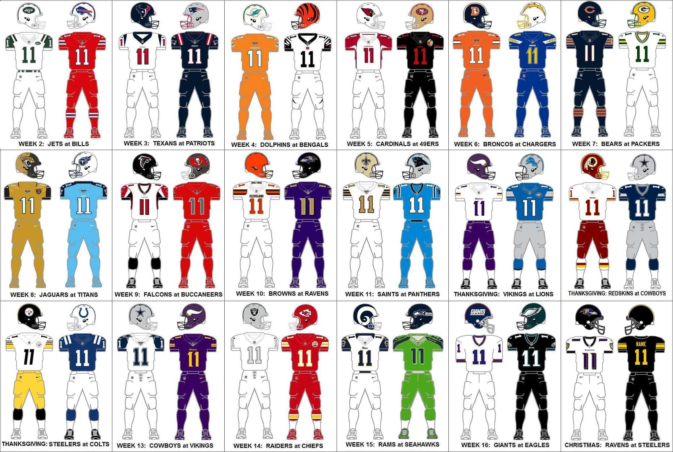
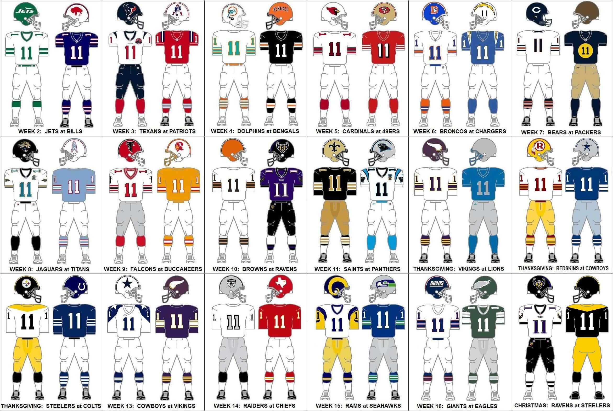
Using uniform graphics from the Gridiron Uniform Database, I reimagined all of the Thursday games (excluding Opening Night, but including all three Thanksgiving Day games) and the Christmas Day game in throwback unis.
I realize not everyone will agree with my uni choices. Some teams, like Denver and San Diego, had multiple great unis to choose from; Dallas fans probably don’t want to see their “jinxed” 1970s blue jerseys; and some prefer black cleats over white cleats, or vice versa. Also, there are two teams, Houston and Carolina, that don’t have throwbacks to choose from, so I used unis from their first seasons, including their inaugural season patches.
Quibbles aside, the point was to just show how much better throwback games would look compared to the Color Rush games. You can be the judge.
To see the difference between reality and Crispian’s fantasy, here’s a graphic showing all of this season’s Thursday-night uniform pairings as they actually looked, followed by a graphic showing the same teams in his proposed throwback pairing (click to enlarge):
.
A few thoughts on this:
• One might argue that this isn’t really a fair fight, since Crispian conveniently suspended the one-shell rule for his imaginary throwbacks but Nike didn’t have that luxury for the real Thursday-night uniforms. (Yes, I’m actually sympathizing with Nike. Someone take a screen shot!)
• That said, even if the one-shell rule had been suspended this season, it’s still a no-brainer: The throwbacks look better than the mono-tards. (And “Throwback Thursdays” is a few jillion times less cringe-inducing that “Color Rush.”)
• Regarding the Texans and Panthers: Instead of going with their existing uniforms and inaugural season patches, I’d suggest going with Houston’s original white prototype helmet and Carolina’s original prototype uniforms. These would be more along the lines of phantoms than throwbacks, but it would still honor the throwback spirit of reviving an old design.
Nice job by Crispian to show us how this could actually play out. Like he said, you can be the judge. What do you folks think?
Lord of the rink: Last night I watched a PBS special about the great architect and furniture designer Eero Saarinen (the whole thing is embedded above). He’s most famous for designing the Gateway Arch in St. Louis, the TWA terminal at JFK Airport, and the womb chair (I was lucky enough to grow up with one of those in our living room), but he also designed lots of other stuff, including Yale University’s hockey arena, which opened in 1958. I didn’t know anything about this arena, but it has an amazing exterior and a really interesting series of wooden rafters on the inside.
The TV show spends a few minutes talking about the arena (that segment begins at the 34:57 mark). At one point one of Saarenin’s old associates explains, “Saarinen sent people out from his office, all over the country, to look and see what a great hockey rink would be like. They came back and said, ‘They’re all horrible! They’re all just barns with ice in the middle.” So I guess that was the state of mid-century hockey arena design.
The show is really good. Watch the embedded version shown above!
The Ticker
By Paul

Baseball News: Reader Erick Kriewaldt found these Brewers and Packers “Mug o’ Nuts” containers in his grandparents’ attic. “My grandma thinks they’re from either the late ’70s or early ’80s, when my dad and uncle were growing up,” he says.

NFL News: When the 1959 Colts won the NFL championship, the players each received a gold Rolex watch. … Here’s a really good spot regarding a small inconsistency with the Chiefs’ uni numbers. … I put this in the baseball section, but I’ll put it here as well: Erick Kriewaldt found these Packers and Brewers “Mug o’ Nuts” containers in his grandparents’ attic. “My grandma thinks they’re from either the late ’70s or early ’80s, when my dad and uncle were growing up,” he says. … For years I’ve had this photo of Bucs QB Doug Williams’s “shark tank” helmet, but I’m not sure I’d seen an in-game shot of it until now (from Jacob M). … Speaking of crazy facemask rigs, check out what Cardinals OL Dan Dierdorf wore after breaking his jaw in 1977 (from Donovan Moore). … There’s an emoji for Chargers QB Philip Rivers, and for some reason it shows the lightning bolts on his jersey as being red (from Jared Buccola). … Here’s a seat cushion from the 1964 NFL title game between the Browns and Colts. I didn’t realize seat cushions existed back then. When were they invented? (From Dave Robertson.)
College Football News: Here’s what Pitt will be wearing today for the Pinstripe Bowl (from Jerry Wolper). … In a related item, here’s a video clip on what Northwestern will be wearing for that game (from Matthew Simpson). … A North Texas player in yesterday’s Heart of Dallas Bowl had one of the wing decals on his helmet peeling off. … Here’s Youngstown State’s patch for the FCS championship game (from Robert Hayes). … Each player in the Gator Bowl will get a customized bobblehead of himself (from Michael Rich). … Temple went with stars/stripes helmet graphics for yesterday’s Military Bowl (from John M.). … Here’s what Colorado will be wearing in the Alamo Bowl. … Florida players went bowling last night. Their attire was Jordan Brand, if you care about such things. … Baylor and Boise State went grey vs. white last night in the Cactus Bow. … In a related item, a Boise State player had some helmet decal issues last night in that game.

Hockey News: When the calendar turns over to 2017, all NHL teams will be adding the NHL centennial logo as a jersey patch. Here’s how it looks for the Blue Jackets (from @BenKehoe). … An Adidas-made Penguins practice jersey has surfaced on eBay, and SportsLogos.net honcho Chris Creamer has confirmed that it’s legit. Of course, it’s only a practice jersey, so it’s hard to care too much one way or the other. Wake me when there’s an Adidas game jersey to see. … Members of the Red Wings’ 1997 Stanley Cup championship team had a reunion, complete with jerseys and championship-anniversary patches (from Adam Globerson). … More on the Red Wings reunion: Nicklas Lidstrom wore a jersey with a captain’s “C,” which annoyed Dustin Burns. “Lidstrom was wearing the “A” in 1997,” he says. “He didn’t become captain until 2006-07.” Steve Yzerman, who was the captain of the ’97 squad, also wore the “C” at the reunion. … Wade Heidt was watching the Spengler Cup tournament in Davos, Switzerland, and noticed that the penalty box seating is pretty plush. … Blues G Jake Allen has new gear for the Winter Classic (from David Lee).

College and High School Hoops News: DePaul’s heavily slanted back uni numbers make it hard to center the NOB (from Joe Ringham). … Note the discrepancies on the team in white. Some players have sleeves, some don’t. Different number fonts, too. “That’s a JV game by Meadowbrook High School in Ohio, my mom’s alma mater,” says Ian Lee. “My dad explained that this is because players like No. 33 are on both the varsity and JV teams. So to save time, they play the JV game in the varsity jersey.”

Grab Bag: Interesting story on the fabric used on British train seats (from WIlliam Yurasko). … During a 1988 Aussie rules football game between Sturt and Port Adelaide, Sturt player Andrew Underwood had emergency repairs made to his jumper with masking tape (from Graham Clayton). … Love the precision of this schematic for a U.S. Border Patrol patch (big thanks to Dave Lang).
Couldn’t they get around the one shell rule by using big decals?
link
What, make them look like the gumball machine mini-helmets?
A word about the big decals…
Workers who use helmets in their everyday jobs, for example construction workers and firefighters, are very limited in the number of stickers and decals they can place on their helmets. The reason is that if the helmet cracks, it’s not safe any more, and if that crack is hidden under a sticker, that makes it harder to find. So wrapping a whole helmet in one of those vinyl appliques could conceivably cause a player to wear a broken helmet just long enough to have his skull broken.
Here’s an OSHA document discussing it:
link
This is an excellent, excellent point that I had not heard before. Thank you! I’m going to add it to my FAQ page on the one-shell rule.
Very interesting.
I work in the area and knew that painting was banned (paint solvents can weaken plastic) but didn’t know that about stickers.
I see hardhats with many, many stickers – not from workers trying to flair up their helmets but to reflect all the certifications they have (e.g. contractors having proof that they’ve passed every owner’s mandatory course so they can go on any site).
So how could one display all their certain without putting them on their hard hat? Maybe a passport system — all of them inside a clear plastic badge holder (kind of like a ticket holder)? You might not want to force construction workers to wear lanyards, because they could be a safety hazard. Maybe a clear plastic window inside of a safety vest…
I just did a safety training webinar about this very thing 20 minutes ago. I didn’t know about the issue before that, so it’s funny to see it come up on here the same day!
Awesome, thanks!
I am a recently admitted lawyer who wants to make a career in labor and employment law, but I must confess that I am not as familiar with OSHA as I should be. That’s what CLE’s are for, I suppose!
I love the visible repairs on the Youngstown State jersey.
But not enough to root for them!
Go DUKES! JMU! JMU! JMU!!
Re: the Chiefs’ “discrepancy”: it isn’t. Teams using standard NFL Block Varsity numbers have this problem (Raiders, Redskins, Packers, etc.). The front numbers are usually smaller than the back numbers by about 2″. Because front and back are of equal width, the back numbers are narrowed slightly so they are taller but occupy the same width across the back of the jersey. (Or the front numbers are shortened, depending on your philosophy.) By the same process, the TV numbers are in most cases much wider relative to their height when compared to the back numbers.
great idea on the Throwback Thursday uni combos. one that i might change: the Vikings vs Lions Thanksgiving…i’d put Minnesota in the 1960 purple pants: link
That sound you just heard was Paul’s head exploding and his breakfast being splattered across Long Island.
I live in Brooklyn, not Long Island. (And yes, Brooklyn is technically part of the land mass of Long Island, and so is Queens, but nobody — NOBODY — refers to Brooklyn or Queens as Long Island.)
Sorry, couldn’t remember which of the two boroughs you were in, and I wanted to imply a bigger downrange dispersal area.
just having a little “purple hate” fun. of course, the less purple the better. might be fun to recreate the 1964 white vs white game: link
and the unfortunate second half: link
Some of these are great but there are problems:
– Because of copyright problems, I’m not sure Baltimore can use that helmet logo.
– A few of the uniforms (Eagles, Giants, Seahawks) would need to be adjusted for today’s uniform template.
– The Color Rush program has some duds but also some very cool looks. The Steelers should use theirs as an alternate, and the Pats and Saints should consider re-designs based on their Color Rush unis.
So maybe letting teams choose between Color Rush and Throwback Thursday is the way to go. The Saints, who had the best Color Rush, kinda mixed the two concepts with great results.
Obviously the throwback designs aren’t going to be perfect. There are going to be adjustments needed, per your first two points. It’s more just the theory being discussed here.
I think there’s a bigger issue to be addressed though: I think the NFL in general has a kind of a difficult relationship with its own past at the moment. Yes, the throwback looks are mostly pretty stellar. But when you wear throwbacks, you then have to show the old footage from when the teams wore those throwbacks, or go back and talk with the guys who wore the uniforms originally. But then — oh, man, a lot of hits to the head. Or a lot of shots of teams playing on Astroturf and heads bouncing off the concrete. Or when you go to talk to the guys, they’re dealing with CTE effects and don’t particularly want to talk.
Obviously some teams have still embraced their history. The Steelers, Falcons, Dolphins, Packers and Bears all have a throwback design, though all but the Dolphins and Falcons throw it back so far that no one alive probably remembers the originals. But of all the things I think the NFL doesn’t want to do right now, looking back seems to be one of them. It’s an awkward spot.
That’s interesting. I see what you are saying, but I don’t know that the NFL is consciously trying to downplay/avoid its history. That would be pretty strong.
Personally I like the idea of Throwback Thursdays rather than a mix. The NFL has a “template” of sorts from the 75th season where teams wore throwbacks. Most teams did it for one game but some, like Green Bay, did several games. In fact Green Bay did a dark and white version of their throwback, wearing the white in a monsoon when they played the Bears.
From a personal point of view, I’d like to see the Jets in their Titans unis (not sure about TM infringement), the Eagles in either their ’48 or ’60’s unis (or maybe the period where they wore the white helmet with green wings, and the Broncos in their original brown and gold/ yellow unis (although I expect people would barf over the vertical striped socks).
On the Eagles in the White helmets, I think Harold Carmichael would embrace it. I have that throwback helmet and had Harold sign it. On that occasion he commented that he really liked the design and wished the Eagles would go back to them.
The 49ers in 94 liked their throwback so much they asked the league if they could continue wearing them. The NFL allowed it, and they wore them all the way to a Super Bowl win that season. They had both white and red versions, though the white jersey (according to GUD) should have had black/white/black striping.
When the PBS station in New York broadcast college hockey in the 70s the announcers called Yale’s rink the Yale Whale but never showed the outside. Those pics are amazing!
The numbers that the Chiefs wear are or have been worn by several teams. The back numbers are actually quite different than the front numbers in design. For whatever reason, when whatever company made those numbers did so, they didn’t just scale the front numbers up to 12 inches. They made a new set that is taller, but not much wider. Similarly, the sleeve numbers are proportionally much shorter and wider than the other numbers.
I’ve seen number inconsistencies on college jerseys a lot. The back numbers seem to be stretched to be taller while leaving the width the same. And then the number outlines on the TV numbers are always thicker to stand out at the smaller scale.
The outlines on the TV numbers should be thicker. Proportionally thicker, that is, in order to look cohesive with the other numbers. That means that if you were to scale a 12 inch number with a 1/2 in. outline 25% to make a 4 inch TV number, the resulting 1/8 in. outline would look too small. Something more like a 1/4 in. or 3/8 in. outline would look better relative to the large numbers.
The teams that use this block font often use a 10″ tall front numeral and a 12″ tall back numeral. The “stroke” thickness on the front is about an inch and a half to an inch and three quarters (eyeing it up) and is just shy of two inches on the back.
This is noticable on the 8s of the jerseys, where the negative space is about 2×3 on the back, but just over 2×2 (square) on the front.
One way around the lack of throwbacks for the newer teams is go the way of the Tampa Bay Rays with the fauxbacks. Give ’em some classic stripes down the pants and throw some shit on the shoulders.
And as much as I love this throwback idea, the intent of this Color Rush scheme looks more and more like a cry for attention and ratings from the non-NFL fans instead of indulging their base who actually gives a fuck what they look like.
I think it would be more fun to throw back to teams from defunct leagues. For example, the Jaguars could wear the unis of the Jacksonville Sharks (WFL) or Jacksonville Bulls (USFL). Perhaps there would be trademark issues, but baseball and hockey teams seem to manage to dress up as old minor league or, in baseball, Negro League teams without issues.
It was nice to see the Wings reunion, but giving Lidstrom the C for his jersey honoring THAT team just seemed wrong. Also of note, Tomas Holmstrom was wearing his familiar 96, but he didn’t wear that number on the 1997 team – he wore 15 that year, and didn’t switch to 96 until the Wings acquired Dmitri Mironov at the trade deadline in 1998.
It’s also amusing to point out that the Red Wings were one of the few NHL teams that wore Nike jerseys in the 1996-97 season. In fact, the Stanley Cup Finals against Philly marked the only time both participants in the Cup had Nike jerseys.
Bad enough they got issued Reebok jerseys for the reunion instead of pulling out some vintage CCM stock, but even more disappointing that they were the crappy Premier retail stock.
No offense taken and I’m sure none intended but but the word, “mono-tards” could be an unfortunate double entendre.
I am betting this was intended as a portmanteau of “monochrome” and “leotard”
I note that the “throwback” Ravens uniform includes their original helmet logo, which they’re legally precluded from using since they stole it from the original designer. I can’t imagine Nike would pay to license it for a one-off usage. (Maybe they could dress up as the Baltimore Stallions of the CFL?)
Nike would not be the ones paying for it; the Ravens would be. (And yes, I agree that it would be unlikely to happen.)
Screw the throwback logo. They should really mess with viewers and play to their true past as the Browns or the city’s Baltimore Colts.
I agree with you. This should be a regular thing (Ravens throwing back to Browns or Colts when playing the Browns or Colts).
The Milwaukee Brewers have thrown back to the Milwaukee Braves when playing the Atlanta Braves. I can’t think of another example of a team playing “themselves”.
The NFL seems to be stricter on this issue than the NHL, NBA or baseball; perhaps owing to the Baltimore/Indianapolis/Cleveland debacle. In hockey, two different teams have been called the Winnipeg Jets; in basketball, it’s the Charlotte Hornets.
This goes along with my dream of seeing the Chiefs play the Titans as the Dallas Texans vs the Houston Oilers.
By the same token, we could see the Dallas Texans play the Dallas Cowboys and the Houston Oilers play the Houston Texans.
FUN!
The NFL COLORRUSH program sucks. Monotards are horrible. Must the socks and cleats match the assinine monotard uniform? Shouldn’t the entire point be to have the best looking uniform for each team, even if you commit to an alternate? How much better would the monotards have looked with colored or contrasting or striped socks?
The idea of Throwback Thursday instead of jackass monotardism is a 10000 percent improvement. As great as my Saints looked wearing 1967 White jerseys and 1975 White pants, imagine how much better they would have looked in 1967 Old Gold pants and striped socks? The other teams’ better choice examples are endless.
My opinion – At some point the Bengals should wear their prototype Orange 1967 jerseys that were used in all of their initial marketing and AFL Press releases- it is a clean and unique look that wascand is different from anything else worn then and now, and the look does have the provinence of being marketed by the tem and the league. I’d pay to knowvwhy Paul Brown flinched at the end and adopted a very familiar “Browns” look for his new Bengals.
For the NY Giants, you gotta use the stylized 1975-76 “NY”logo which would fit the NFL’s assinine one shell rule.
As I’ve said before repeatedly, the story of how and why respective teams chose certain colors and uniform templates are as interesting as the actual uniforms themselves. Did the owner pick the name or uniform? The wife or kids? The GM or the Coach? Why? Family choices or connections? Regional traditions?
Original Tampa Bay Buccaneers owner Hugh Culverhouse announced that his team would wear Green and White, but within months they were outfitted in Orange and Red Creamcicle unis? Why? Is it because they conflicted with the NY Jets, who wore Green and White because the Jets then-owner Sonny Werblin loved St. Patricks Day- his birthday?
These stories are incredibly interesting. I’d love to know more.
Throwback Thursday is an improvement over Color Rush, but I still think Thursday NFL games are a boondoggle. That being said, I’d like to see the Texans in white helmets. The surplus of red, white & blue teams means someone is always biting someone else’s appearance.
Culverhouse originally wanted orange, pale green, and white as the Bucs’ colors; it was their similarity to the Dolphins’ colors that caused red to replace green in the set.
Shouldn’t the Rivers emoji be throwing a pick?
I’ve always liked the expression “old barn” when referring to hockey arenas of years past. It’s neat that the builders saw them the same way.
I love it when architecture makes its way into Uni Watch. Eero Saarinen is one of my favorite architects. His father, Eliel, was a significant and influential architect as well.
The TV show spends a lot of time explaining and Eero was often competing with Eliel — literally and figuratively. In fact, Eliel submitted a design for the Gateway Arch competition that Eero ended up winning. They show Eliel’s model — it was like a giant widget!
link
Saarinen was a true visionary. Something that’s sadly missing in architecture today in my humble opinion. Thanks for the heads up on the American Masters show, Paul. My Tivo is already set.
Ah, I remember the Mug ‘O Nuts. Definitely early ’80s, we had two or three White Sox “batter man” ones. Only glasses we had that could hold the 16 Oz. glass bottles of pop. (Yes, I said pop. It’s a Midwest thing.)
Haha. It took about eight years for me to mock the pop out of my native Chicagoan wife.
There are Massachusites in my family; anyone for tonic?
Tonic it is from another native of the Commonwealth
Are you from the Concord/Lexington area? A guy I knew in college referred to it as “tonic”. I grew up in Southeast MA and we never referred to it as anything but “soda”. I live in West Virginia now, and it’s all called “pop” here. Not just a Midwest thing.
I remember those mugs – they were my family’s everyday dinner glasses for years. Fisher Nuts used to market the NFL mugs in the 80’s. In addition to the one’s with team helmets, they also released a special with the Superbowl logo each year.
link
yep.
link
PBS has the full documentary available for streaming at the moment.
link
Oh! I’ll embed that instead.
If you want to see the part about the Yale arena, skip ahead to the 34:57 mark.
Really, though, you should watch the whole thing. It’s great!
I’m sure this has been addressed before and I just missed or forgot it, but why are there only 2 Color Rash games all season where both teams are wearing colors? There are tons of matchups with possible color combos that aren’t similar to each other. I mean, come on NFL. If you’re going to do something this egregious, don’t half-ass it. Whole-ass it!
Did it not dawn on Atlanta they could have gone solid black versus Tampa Bay? Don’t say insufficient contrast because I’ve seen a black team play a red team (Las Vegas Bowl, Dec. 17th). The Falcons have worn black components of this uniform before, they didn’t even have to design anything.
This is why the whole thing is a failure. The fact is, EVERY SINGLE POSSIBLE NFL MATCHUP can be played color vs color if the league is willing to dictate what the teams wear. Some teams might have to go fauxback or use trim colors as the primary or whatever, but they’re all do-able. Instead… we got garbage.
Jeff, I don’t know if you have Photoshop skills. But if you do, would you like to create mock-ups showing how the Thursday-night games could/should have looked from your perspective?
I was already planning on doing that actually, so I should have something for you before the Superbowl. I’m not sure if it’ll be photoshopped game pics or template stuff like today, but I’m definitely doing it.
Cool. Go for it!
Sweet! Contrasting socks, different colored helmets than uniforms? Looking forward to it.
I think the only one that wouldn’t work is the Jets/Bills that they already tried with Red/Green/Blue colorblindness being the issue.
Exactly. Wasn’t this the original idea of “Color Rush”, to have both teams wearing colors? Most, if not all, could pick colors that would contrast.
Color Rash is an abject failure, where the only redeeming concept (color v color) wasn’t even followed.
Thats not even counting logistics, communication, or execution.
Ugh.
Get rid of the program, get rid of Thursday Night games.
Lee
They can use the throwback decals on their current color helmets. It wouldn’t look as good, but at least we would get to see the cool old jerseys.
The Jets did this in 1993 and 1994 because Boomer wanted the green helmets to stand out; which is supposedly the reason the Jets switched in the first place in the 70’s as the rest of the division wore white helmets.
I wasn’t aware it was because of Boomer Esiason. If true, it’s interesting that one player dictated the Jets’ 75th anniversary throwback look.
I’d love to see some sort of documentation about Boomer Esiason insisting on green helmets.
I have a feeling it was about the Jets as an organization simply not wanting to buy a whole new set of helmets.
Lee
Given the Bills also half-assing it with white decals on red helmets, I’d say I agree with you here.
I agree. No reason not to see Pat Cheatriot on the silver helmet or Bruce on pewter with the correct throwback jerseys and pants.
I thought the led Bronco D logo on the navy helmet was a great idea.
I was not aware of the Ravens original logo issues. Given their short history, I don’t think the using their current helmet logo with their original unis would be that big of a problem
I do remember the Texans original helmet design. I really liked it and think it would be a great idea for their throwbacks.
I had seen the Panthers original concept unis before but had forgot about them. There is also a website “daydream rebrand: Carolina Panthers” that reimagines the Panthers in fauxback unis and helmet logos. Both would be workable.
Not all of the color rush unis were trainwrecks. I really liked the Packers and Saints looks but they needed some color to break up the all white pants, socks and cleats. I thought the Bengals unis were great but would’ve looked better had the helmet been white with black stripes. For me, it was hard watching some teams (Dolphins, Seahawks, Jags, Bucs) in their unis. As a whole, I wasn’t impressed with the program overall.
Like I said in my article, there are many throwback unis that could be used by many of the teams. I’m not an expert in fans favorite throwback unis. I just picked out some that stood out to me. The Chargers, Broncos and Redskins all have many great throwbacks to choose from. The stylized “NY” that the Giants used briefly and the Patriots original “hat” logo are both very eye catching. As a Dolphins’ fan, I would love to see Miami wear their 1972 unis with the wide, thin numbers. The whole point was to show that if the NFL would back off the “one shell” rule, throwback games would be far more interesting to watch than color rush.
Cris, great job. Regarding a Ravens throwback helmet, I think they could use a decal of their current shield logo as an approximation of the “flying B” logo that was discarded in 1999 because of the lawsuit.
I’d really like to see this “one shell” policy go away. I question if this policy has any validity to being safer, but couldn’t teams have 2 helmets that they practice in equally to help with this. And if it was really a hazard, why are the colleges wearing multiple helmets?
link
Thanks. Again if they practiced equally in both, starting in training camp, I think this would negate this perceived problem. Have them switch helmets every day, or have the O & D practice in different helmets, and switch off every day.
Your insistence on calling it a “perceived problem” implies that you know more about this than they do. Unless you’re a neuroscientist, I strongly suspect that is not the case.
I’m not defending the rule. Not trashing it either. As stated on the FAQ page, I’m not knowledgeable enough to fully assess the rule and the thinking behind it. I find it disappointing when people simply dismiss the rule even though they clearly have nothing more than a layman’s knowledge of the science involved. I will continue to argue for a higher standard of debate than that, at least on my website.
Sorry, that’s not what I meant. Regardless if the science is strong or not, and I have no idea, they aren’t going to go back unless there is overwhelming evidence to the contrary. And really why should they, since the downside is much worse than the upside of getting more colored helmets. But what I suggested is a way to have both.
Really fascinated by that Yale rink. Does anyone know / follow a uni-watch type blog that covers stadiums and arenas? I’m an even bigger stadium nerd than I am a uniform nerd.
Ballpark Digest covers all sorts of baseball venues: link
Thank you! Skyscraper City has some good stuff on their message board as well, though it’s a little unwieldy.
For baseball, Baseball Fever’s forums are the most complete I’ve run across. You have to register to see photos, but its worth it
link
Not exactly what you are looking for but,
For hockey arenas HF Boards has this thread:
link
hockeyarenas.net has photos of many arenas – more concentrated on Europe but has North American ones.
Those facemasks for williams and dierdorf remind me of when peyton manning wore a modified facemask early in his career in Indy. I forget what year it was, but he started with a facemask like what marino and bledsoe wore and then after his injury the facemask extended a bit lower. All i can remember is it was before manning switched to the revolution helmet and mask and the colts still had blue facemasks when it happened. Cannont find pics right as i am on a break at work but i’m sure someone else can
Was it similar to what Kurt Warner wore late in the 2001 season, including Super Bowl 36?
link
I like what the NFL did in 1994 and for the AFL’s 50th Anniversary. I think they can easily afford for teams to invest in more than one shell. The league when they put their promotional minds to it does throwbacks better than anybody.And also make a tidy profit from it too.We all win.
I think they can easily afford for teams to invest in more than one shell.
The one-shell rule has nothing to do with finances. Read this: link
Interesting bit about the Doug Williams shark cage helmet:
Wherever that display is, the placard is wrong. Doug Williams had his jaw broken in a game against the Rams at the LA Coliseum on November 5, 1978. He missed the next five games (four of which they lost, and the one win came with 13-year-old me in attendance) before returning for the season finale, a home loss to the Saints (as you see in the photo).
That didn’t happen in 1979. It happened in 1978. Williams didn’t miss any games in 1979.
Is there a petition somewhere to vote for Throwback Thursday and to scrap Color Rash? ;)
It still surprises me that we haven’t seen a team like Pats or Tampa just say screw it and wear the throwback uniforms with the decals on their current helmet shell. I’m not saying it would look good by any means, but I doubt that would matter much to them. I wonder if the NFL would want to avoid that, since that would bring more attention to the one-shell rule and concussions, agitating both sides of the debate?
You’re overthinking it. The reason they haven’t put their old decals on their current helmets is that it would make no sense and look like shit.
I don’t think ol’ Pat would look that terrible on a silver helmet, worn with red jerseys and silver pants. Sure, they’d look kinda like the Washington Sentinels from The Replacements… but that’s not entirely a bad thing.
I don’t think ol’ Pat would look that terrible on a silver helmet, worn with red jerseys and silver pants.
But that’s not what Brian was asking about. He was asking about wearing a throwback uniform (which would mean no silver pants) with the current helmet and throwback logo decal. In other words, throwback everything except the helmet shell — not a mix/match concept.
The reason we even found out about this rule being implemented was because the Bucs in 2013 announced they wouldn’t be wearing their throwbacks as planned, exactly because they couldn’t make Bruce work with the pewter helmets they were stuck with as a result.
Throwbacks look SO much better. The concept of “Throwback Thursday” also makes a lot more sense considering it’s already popular on the Internet. The NFL is ridiculous.
Is there any true conclusive research on this one shell rule? I feel like the NFL did it just for PR.
Thanks for the Eero Saarinen link! Looking forward to watching.
Lee
Texans could wear the Houston Oilers throwbacks, although they probably would need the Titans permission.
The Titans wore Oilers throwbacks for the Hall of Fame Game a couple of years back. Doubt you’d see the Texans wear them ever, or that the Titans would risk confusing the issue by letting them.
The Titans also wore Oilers throwbacks in 2009. One of those games even came against the Jets, who were throwing back to when they were the Titans of New York.
Holy smokes! That Falcons-Bucs game woulda been gorgeous in those throwbacks! The Rams-Seahawks woulda been great, too. Guess I’m off to find these matchups from the late 1970s on the youtubes.
Am I the only one who wonders what’s the point of calling a game the Pinstripe Bowl if the players aren’t going to be wearing pinstripes?
You might be.
The Pinstripes in question refer to the Yankees, obviously. If they’re going to own a bowl game, they’re sure as hell going to find a way to remind you it’s theirs.
With all the crazy uniforms out there, wouldn’t this be the perfect opportunity to have a full pinstriped uni?
The only non-baseball pinstripes I can think of off the top of my head are the few NBA teams that have done it. Are there others?
IF Thursday night football survives to 2019, that would be the NFL’s 100th season and you’d hope it would be throwbacks galore.
Interesting that the Varsity/JV player wears the Varsity uni just to save time, are they that crunched for time that he doesn’t have 60 seconds to switch shorts and jersey?
When I was running the clock a few years back for a local high school, we had at least 10 minutes between the JV and Varsity games
I grew up in Ohio and not far from Meadowbrook. That “saves time” excuse is lame. There’s plenty of time between games. Heck, teams usually wear shooting shirts anyway to warm up in. There should be no issues in swapping a uniform.
If anything, probably cuts down on some laundry someone has to do. Which, to me, is another lame excuse.
You will occasionally see some weird things with JV uniforms. A nearby school used their old (red) varsity uniforms for JV when they got new (blue) ones, and it was not uncommon to see both colors on the court at the same time. School wasn’t going to spend the money on a complete set of uniforms just for JV.
Great work with the throwback Thursday concepts, really hope the NFL drops the one helmet shell so we can see this become a reality! Bring back the eagles kelly green please!
Crispian’s research on this season’s Color Rush games depicts something else that bothers me about the whole concept. The name itself implies there’s a whole lot more color than in a typical game.
But, setting aside the Thanksgiving games that weren’t part of it, we’ve got 15 such match-ups this year. In those games, 13 teams wore white pants and jerseys (sleeve color notwithstanding). One team wearing all white doesn’t really strike me as “Color” anything.
Furthermore, three of the white-clad teams’ opponents wore black pants and jerseys; only one of these teams (the Steelers on Christmas Day, so not even an actual Thursday night game) uses black in a way that doesn’t feel gimmicky or as an accent color–IMO, the Eagles would sooner wear all green or silver, and the Niners, red or gold.
Back to the two color on color match-ups, which seem to me what Nike should be striving for. One of them we already saw last season, between the Jags & Titans, so only Broncos/Chargers, to me anyway, really embraced the spirit of the Color Rush series.
All that being said, I don’t care for monochromatic jerseys & pants in football.
First, I do also love the Throwback Thursday idea.
Second, I also love Paul’s idea for the Panthers to use their original prototype design.
However, technically, the Panthers can have a throwback, as the current logo on the helmet (and jersey/pants) is a slightly modified version of the one they wore for their first 15 years. Subtle, but it would still count I think.
Another thought: along these lines, what if for a weekend, teams only dressed in uniforms that were never actually worn? Not all teams would qualify, but off the top of my head:
– the Panthers’ original design
– the Jaguars “car” decal on silver helmet
– the much-maligned 49ERS helmets
– the mysterious Browns “CB” helmets
– the Texans’ white helmets
– one of the Bengals’ prototypes seen in that old Paul Brown photo
– The Patriots first attempt to replace Pat
– the Green Bay Packers in blue/gold (proposed at least)
– the Seahawks’ silver helmet that fans voted down
– one of the TB Bucs rejected designs that surfaced
– the black Saints helmet (used only in preseason)
– the proposed 1974 white Falcons helmet
– the 1997 proposed Dolphins helmet
– 2002 proposed Bills helmet
That’s about half the league I think. Did I forget any?
You’re basically proposing a Prototype Weekend — which would be awesome!
Especially if teams not listed above took the opportunity to reveal some old prototypes that were never released to the public.