We’ve gotten used to the NHL Winter Classic taking place on New Year’s Day. This winter, however, the Winter Classic is on Jan. 2, while Jan. 1 will be the day for the Centennial classic, which will feature the Maple Leafs and the Red Wings. The uniforms for that game were revealed yesterday.
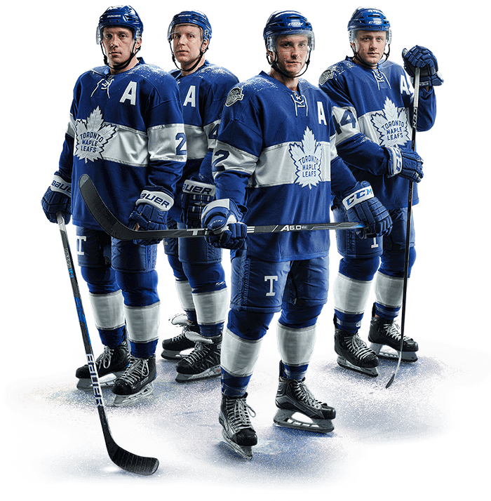
”¨Let’s start with the Leafs. First, although it’s a little hard to see in that photo shown above, there’s a lot of silver trim. The horizontal band across the chest is meant to evoke the early 1920s Toronto St. Pats (although it looks like they just used the Panthers’ new template), and the “T” on the pants is a shout-out to an even earlier incarnation of the franchise, the Toronto Arenas.
Overall: It’s okay, but nothing special. I’d prefer a contrasting border along the jersey hemline to delineate the border between the jersey and pants. Further info on the jersey is available here.
Okay, now let’s take a look at the Red Wings (click to enlarge):
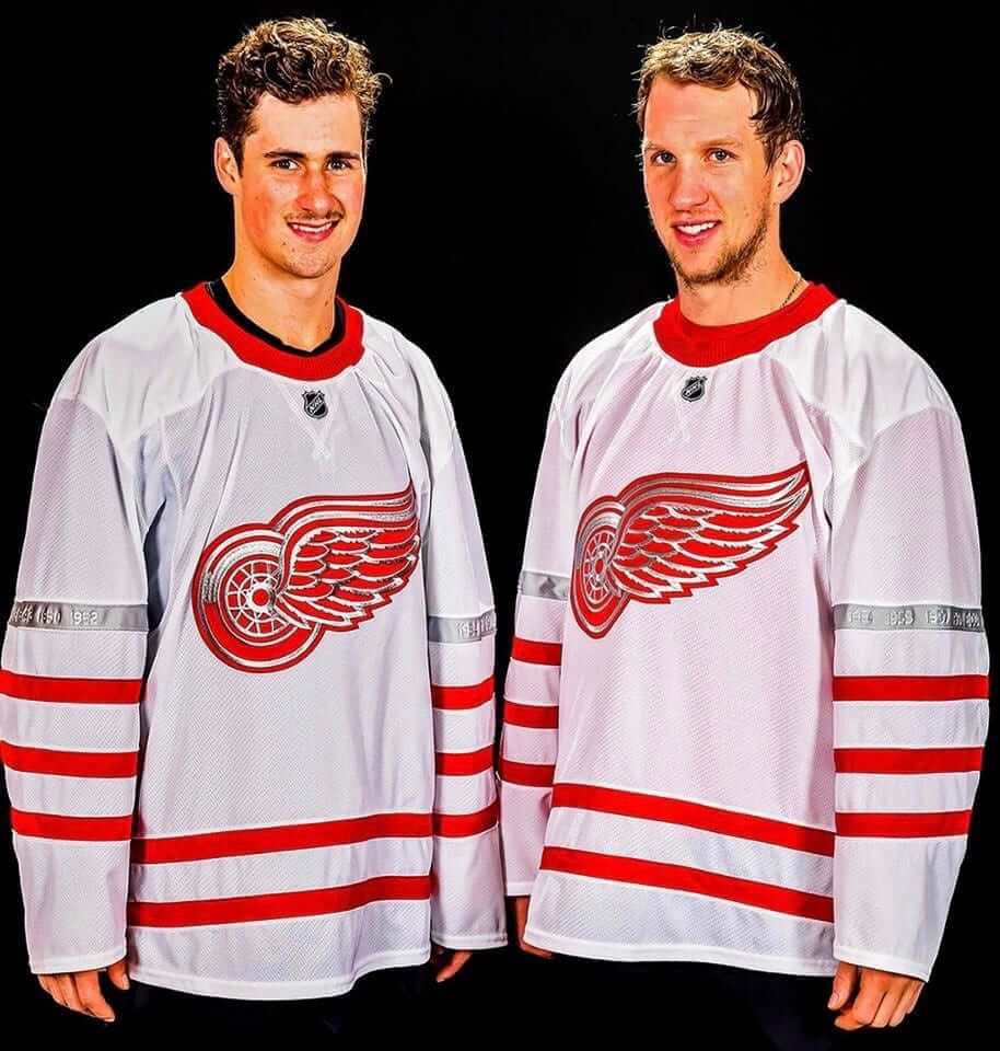
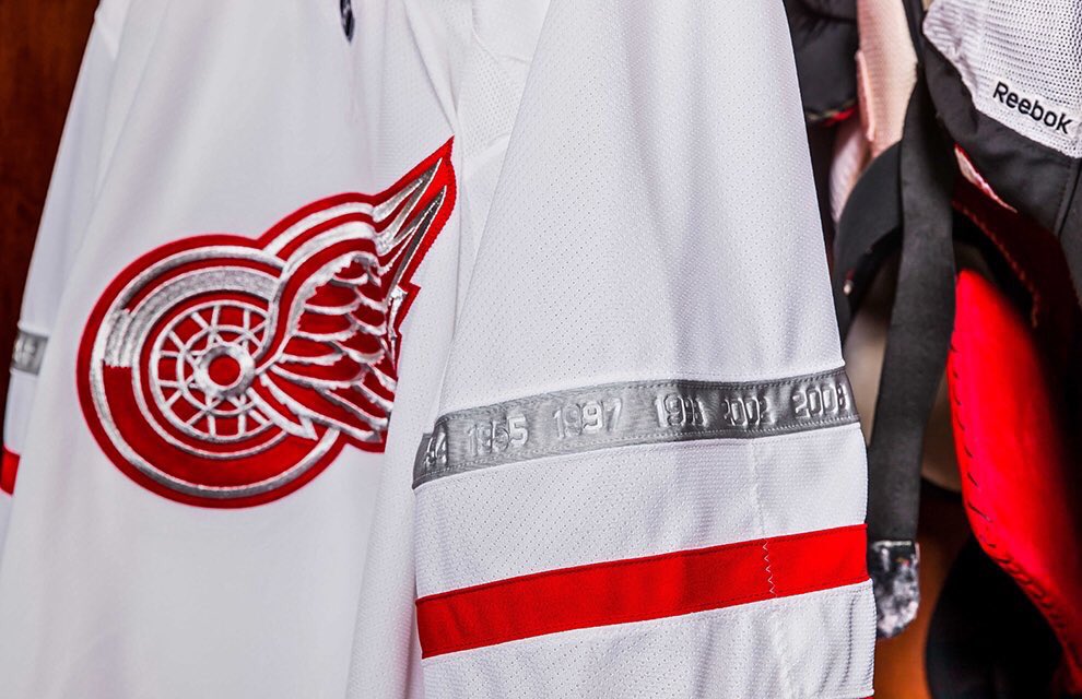
The silver is much more evident on this one. Here’s a close-up of one of the silver sleeve stripes, where are imprinted with the years of the team’s 11 Stanley Cup championships (click to enlarge):”¨”¨
The stripes are supposedly inspired by the old Detroit Cougars. Too bad they didn’t use that whole design, eh? According to this page, there will also be a Cougars-style “D” on the pants, but they haven’t bothered to show us a photo of the full uniform yet — only the jersey. I’m sure that has nothing at all to do with the fact that the jersey is available for sale while the pants and socks are not.
I hate assessing uniforms solely on the basis of a jersey (the pants and socks matter a lot!), but this one feels like a stinker. The silver on the crest feels tacky and overdone, and including the Cups years on the sleeve striping is just a retail/merch gimmick, since none of that will be visible on TV (much less from a far-away seat at the Centennial Classic). Also: The collar, with those two white strips of fabric surrounding the NHL logo, looks like something from Old Navy. Disappointing.
Meanwhile, as long as we’re talking about the NHL: The new Vegas franchise is due to reveal its name and logo this evening. I’ll be covering that for ESPN.
Collector’s Corner
By Brinke Guthrie
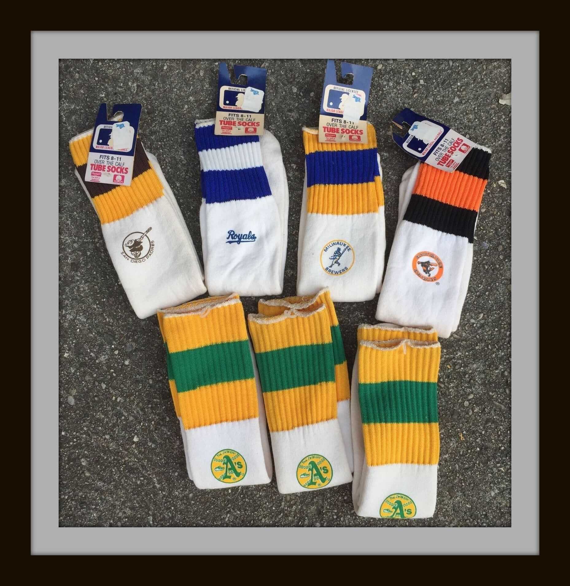
Got tipped off to this selection of 1970s/1980s MLB tube socks from the @BorchertField Twitter account (the only online museum dedicated to the Milwaukee Brewers of the American Association, 1902-1952). As it happens, the seller of these socks also happens to have several other terrific items for sale. The next four items are all from him:
• Very nice-looking 1980s Starter poster showing the different jacket designs for the major sports. Remember, the next best thing to being a Starter is wearing one. And I do hope Starter’s copywriter got a bonus for that line.
• This perfect-looking 1990s Bengals Starter jacket is priced to move. I had the very same jacket and got mine for the same price, as I recall, on sale at a big box sporting goods store in suburban Forest Park. The seller is from nearby Mason, so that explains the Bengals connection.
• More tube socks, this time for the Steelers, Chargers, and Rams.
• Never seen an NFL Cliff Engle sweater with a helmet design before. Usually it’s just the team name. Not the case with this New York Giants sweater.
• Okay, moving on to some other sellers: In case you ever wanted a Philadelphia Eagles sneaker-shaped gear bag, we have one for you.
• Your call to the bullpen will go through every time with this 1974 Padres bullpen buggy from Sportoys. The seller also has a Yankees model.
• Ever heard of “Star Standouts?” These were cut-out figures that you mounted on a wooden base. The company was from Pittsburgh, so these are for Terry Bradshaw (wearing Spalding cleats!) and Mean Joe Greene.
• You’d think that the majority of Miami Dolphins fans would live in, well, Florida. So I’m not sure why they made these Officially Licensed winter gloves for the Fish, but there you go.
• Here’s something more seasonally and regionally appropriate: This 1970s Begnals winter scarf will keep you warm at Riverfront Stadium. I mean, er, Paul Brown Stadium.
• Here’s a nice Rawlings Bills jersey from the 1980s with a heat-pressed NFL shield on the sleeve. They didn’t get the sleeve stripes quite right, did they?
StripeRite update: We’ve been saying all along that the new batch of StripeRite socks would start shipping on Nov. 21, which was yesterday. But American Trench now tells me that there was a backlog at the knitting mill, and the socks will not be shipping until the end of next week, which is Dec. 2. Very sorry about that — thanks for your patience.
The Ticker
By Mike Chamernik

Baseball News: The Braves will wear a sleeve patch for their first year at their new stadium (from Brinke). … A new baseball team in Fond du Lac, Wis., will be known as the Dock Spiders. No surprise that Brandiose had a hand in the design. Other finalists for the nickname included the Barn Owls, Lake Flies, Pipsqueaks, and Shantymen (from Bob Brainerd). … A writer for a New York sports website argued in favor of a Yankees alternate jersey (from Phil). … New uniform and 10-seasons patch for the Lehigh Valley IronPigs (from @Banditmax). … Rice will wear these really cool Los Buhos jerseys (Spanish for “The Owls”) for an upcoming trip to Cuba (from Brad Blunt).

NFL News: Michael Crabtree’s swooshes were off-center last night (from Johnny Bruno). … Raiders OL Donald Penn had a Riddell sticker on his helmet last night (from @SteveBCreations). … Calgary will play Ottawa in the Grey Cup on Sunday. The teams have the exact same red, black, and white color scheme. The matchups inspired Noah Sidel to look up the last time that happened in the four major American sports (by his count): the NHL’s Oilers and Islanders in 1984, the NFL’s Giants and Bills in 1991, the NBA’s Bulls and Blazers in 1992, and MLB’s Indians and Cubs this year. … Kenny Kaplan bought a Browns jersey from a Rawlings catalog way back in 1970. He noticed the typeface on the front of the jersey is different than the one used on the back and for the TV numbers. … You don’t often see memorial armbands in the NFL, but here’s a rare example (from @BSmile).
College & High School Football News: Ohio State will play Michigan on Saturday. The players on the Buckeyes scout team are wearing makeshift Wolverines helmets in preparation. Also, Ohio State is trying to cross out all of the Ms on campus (from Phil). … Former BYU wideout Mitch Mathews wore a BYU baseball jersey to a Cougars game this past weekend. It must be an old jersey, because it has a Mountain West Conference patch on the sleeve. BYU left the conference in 2011 (from Josh Sorensen). … Teams in the Indiana state finals will wear this jersey patch this weekend (from @jameydeckard20).

Hockey News: The Penguins’ player of the game wears an old Pirates helmet in the dressing room afterward. A new sticker is added for each win (from Austin Chen). … The new video for Lil’ Yachty’s song “Minnesota” features some Rangers-inspired jerseys. Full video here.

NBA News: The Heat will retire Shaquille O’Neal’s No. 32 in a game against the Lakers in December. … Stance revealed the socks teams will wear for games on Christmas Day. … The Pistons’ mysterious retro-looking secondary logo has popped up on a sweatshirt in the team’s official store. It is referred to as the alternate ball logo (from Collin Hall). … Not really uniform-related, but I walked past a house in Chicago the other day that had a picture of Kobe in the window. … The Pistons are moving back to downtown Detroit. They’ll share Little Caesars Arena with the Red Wings next season.

College Hoops News: Ohio State wore gray throwbacks last night. … A player on Saint Francis College of Brooklyn wore a black swoosh last night while the rest of the team had white marks (from Matt Bessette).

Grab Bag: Two Michigan high school volleyball teams wore very similar jerseys in the state finals this past weekend (from Chet Miller). … Renderings were released for the new stadium in Columbus for the Ohio Machine of Major League Lacrosse. The highlight is a castle-like structure that will serve as the entrance (from Jason Hillyer). … New logo for Malta’s EU Council presidency. … Good piece here on why a few companies, like Kodak and Bacardi, opted for throwback logos.
Is the Collector’s Corner banner missing? A right paren is definitely missing in the first CC graf.
Thanks. Both fixed.
The Montgomery Biscuits hat contest is over… and the biscuit hat wins!
link
By any normal measure, I should hate that cap. But I find myself strangely drawn to it. Maybe because I haven’t eaten yet today. Mmmmmmm…….biscuits.
So this week in Columbus F=V and E=c^2?
The Bills jersey in the collectors corner is actually a Giants Brad Van Pelt jersey.
thought that might be the case!
Proofreading: “Also: The collar, with the those two white strips of fabric surrounding the NHL logo, looks like something from Old Navy.”
I believe the overlapping v-shape is just stitching/embroidery, not fabric strips. Bruins & Habs both had the look on their outdoor sweaters last year. I appreciate the relief from lace-up collars when not historically appropriate… but this makes the NHL crest stand out jarringly which I don’t like.
Fixed.
I’m curious why you dislike small details that aren’t visible on TV. In my opinion, good design tells you what you need to know from 50 feet, but offers something new to discover when viewed from 5 feet and 5 inches.
I don’t dislike small details per se, but I strongly dislike small details that exist only to appeal to retail customers — details that would not even have been included as part of the design if the jersey were not made available for sale.
I object to the merch tail wagging the on-ice dog.
How can you be sure that they wouldn’t exist if the jersey weren’t for sale?
Being around hockey uniform design for several years, I’ve never heard anything related to sales or merchandise used as reasoning for a design decision on a uniform, other than the logo on the pants. That doesn’t mean it never happens, and of course, a team might have a completely different viewpoint than a designer does, but I don’t think it’s fair to say that every detail not visible from the stands is automatically a retail gimmick.
You’ve said yourself that you care about what the players wear and not what’s for sale, so it doesn’t seem to follow that the basis of your critique is merchandise related. Shouldn’t it be based on the design being pleasing, effective, appropriate, etc?
Being around hockey uniform design for several years, I’ve never heard anything related to sales or merchandise used as reasoning for a design decision on a uniform…
I’ll have whatever he’s drinking.
You’ve said yourself that you care about what the players wear and not what’s for sale…
Exactly. So when the player is wearing a small detail that would not even exist except as an enticement to retail customers, that’s bad design.
Again, I would ask you to prove that this detail only exists to entice retail customers. How is it different than a soccer club adding a star above its badge for a championship or the Bears wearing GSH on their sleeves? Both are minute details that do not factor into the overall visual of the uniform from viewing distance.
You could certainly make the argument that those two examples existed before jerseys were available as merchandise, but I think it shows your claim to be circumstantial. How can those design elements be meaningful tributes meant only to ignite pride in the players while those released today are unequivocally intended to stoke the merchandising fire.
There’s simply no way to prove one side or the other with regard to intent. I think you also tend to dismiss the shades of grey in between, making your opinion (at times) feel less like a thoughtful critique of an individual design and more like a cold, simplistic affirmation of your opposition sports merchandising as a whole. I certainly fell the same about it, and I know it does wag the on-field dog too often, but not in the cut-and-dried, all-or-nothing manner that you present.
I would ask you to prove that this detail only exists to entice retail customers. How is it different than a soccer club adding a star above its badge for a championship or the Bears wearing GSH on their sleeves? Both are minute details that do not factor into the overall visual of the uniform from viewing distance.
Actually, you CAN see the star on TV, and you CAN see the Halas perma-memorial on TV. Those are real design elements that a fan can see while watching the game.
But nobody will be able to see these numbers on the Wings sleeve stripe. All anyone will see is an indistinct blur. You’ll be able to see that “something* is there, but you won’t be able to discern what it is. That is the very definition of bad design, Andrew.
No, I cannot “prove” that these items are added solely for retail purposes (although we both know that there’s not even any reason for these jerseys to exist AT ALL except to sell them, since the teams could easily wear their regular uniforms, both of which look better than the ones they’ll be wearing for this game). But here’s a thought: How many of these types of elements — the largely invisible ones, not something like “GHS,” which *is* visible — existed in the era before jersey merchandising? Right, none of them.
I think we’re going to have to agree to disagree here. Let’s please move on. Thanks.
Agree that this is not always black and white.
Grey or silver-and-white in this case (to bring back yesterday’s argument)?
Within the context of there being too many uniforms for every possible occasion these days, the fact that Centennial Classic jerseys even exist can be considered retail-driven, without even getting to the design.
But I don’t immediately make the connection that smaller details not visible in the stands are therefore completely retail-driven and/or bad design.
One of the NHL’s most in-demand goalie mask artists has stated that he designs them to be immediately recognizable in the stands but with smaller details that reveal themselves upon closer inspection. Those masks generally aren’t available for retail sale, so he couldn’t be accused
of doing so just to sell them to the public… and if it’s a sounds design principle applicable to masks, I think we could extend the logic by having it apply to jerseys as well.
I do find the inner collar inscriptions laughable & somewhat pointless, but this Red Wings element could have worked.
Although another poster was commending it for being subtle (white writing on the silver band), even at close range that doesn’t seem like enough contrast to me?
All the storytelling they do to try to tie it to something historical is a bit of a stretch for me (for Toronto, *similar* template to one of several St Pats designs but different colour, and slapping the Toronto Arenas ‘T’ logo on the pants)… because the uni element which stands out the most (aside from perhaps the Canadiens & Panthers comparisons) is the use of silver. Silver immediately harkens back to the Leafs uni set of 2000-2007, which was a big downgrade upon introduction – verging on blasphemy to some fans who decried the use of a 3rd colour / anything other than blue & white.
So Detroit’s design isn’t perfect, but I prefer it to Leafs – Wings may be the only original six team other than the Rangers that could survive a silver/chrome-ified treatment. A little chrome on the wheel portion of Detroit’s logo makes some sense, but would have been interesting to see it paired with raised white embroidery on the wing to have it ‘pop’.
Although it is the Leafs that went with no waist or hem striping (a bad look from their 2007-10 set, that looks particularly bad here with solid blue pants & socks that are blue from knees up), the Wings would have been more historically accurate to do so – they’ve added two waist stripes here, where the Detroit Cougars jerseys they’re based on had none (and there has been no Wings jersey in their history to have this waist striping pattern).
Although the Detroit design is fairly plain otherwise, knowing this fact makes the waist and arm striping seem unbalanced, when the original Cougars had 4 red arm stripes, but the Wings going with one silver & 3 red.
The Cougars logo at that time was pretty crude so I can forgive them for using the Red Wings logo instead.
So I would have preferred two silver-free, more historically-accurate throwbacks, but will give the edge to Detroit’s jersey over Toronto’s uni.
I’m not totally opposed to silver/chrome on the Wings or small details not distinguishable at 50ft, but they could have done a much better job incorporating them here.
Despite the Leafs’ attempts to convince they’re throwing back to uniform sets from before they were the Leafs, they lose for the more apparent throwing back to their two poorest uni sets in recent memory, with the use of silver and no waist or hem stripes.
What about “slogans” and shit that appear only say, inside the collar ?
Since these jerseys are not “just” for the players and completely invisible to the viewer, is this good design, a potential marketing gimmick, something else? Or, say, sublimated design that’s barely visible from five feet (or 5″), and certainly not visible to the TV viewer/courtside spectator. Is this “good” design, or just because they can?
I’m interested in your perspective on this — not saying these gimmicks are good or bad, but from a purely design standpoint (and realizing the function of a jersey is do be distinguishable from the jersey of the other team, with [hopefully] readable numbers). Is this stuff really “necessary” or do you think the designers add it (possibly even at the behest of the manufacturer) simply to attract attention and possibly extra sales?
Inner-collar slogans, aside from being cheesy and often cringe-worthy, are pointless from a player perspective (any player who needs an “inspirational” slogan to motivate him has major problems from a professional standpoint). They exist solely for retail purposes.
But at least they’re completely invisible during the game, so they’re a non-issue to me (which is why I didn’t even mention the slogan that appears inside the Maple Leafs’ Centennial Classic jersey). I wish they weren’t there — or, rather, I wish I didn’t know they were there — and I wish they didn’t help prop up Big Uni, but they’re ultimately moot. The numbers on the Red Wings stripe, however, will look blurry and indistinct during a game on TV. You’ll be able to see that *something’s* there, but you won’t be able to see what it is. That’s bad design, and it’s driven entirely by retail concerns.
Have you heard that directly from a player? I would think some of these players see the new uniforms come out and appreciate some of those details and the history. I bet there are owners that see that and say “that’s really cool.” I guess it comes down to who the designer is making the design for. Do you have it from anyone in the uni-design world who has said “this was created purely to sell uniforms” or is all conspiracy theory?
Paul, I have two points of contention with your arguments here.
1. I would submit chain stitching as an indiscernible-from-distance uniform detail that is not for retail purposes whatsoever. You cannot see it from the stands or on TV, but it raises the tactile value of the garment up close and while wearing it yourself. Obviously chain stitching was around long before retail jersey sales, and it is a technique that doesn’t need to exist (it is much more difficult and expensive to produce), but it does because it is beautiful. You yourself have expressed your love for chain stitching on countless occasions. If chain stitching were introduced today for the first time as an embroidery technique, and the Blackhawks or Cardinals had never used it before, I’m guessing you would cry “retail-only detail”.
2. You argue that the Stanley Cup dates within the silver stripe won’t show up on TV and are therefor bad design, but you have never once voiced the same concern about any anniversary patch or team memorial whose actual text dates or inscription are impossible to read on TV. Teams design patches with the understanding that nobody but the person wearing the jersey will be able to discern the details. What you are basically arguing is that any team memorial other than a black armband or patch with a huge bold date on it is bad design, because we can’t immediately see it on TV without zooming way in. I happen to think a large part of the fun of uniforms is getting to see the minute details I would never see on TV, which is what makes things like the Bill Henderson guide so much fun.
Here’s where I’m at, Phil:
If it needs to be seen and can’t be (or is made more difficult) because of the concept or execution, then it’s bad. On the flip side, if it’s not essential and it distracts the viewer from what is essential, it’s also bad. To me, the years in the stripe do neither. I think the hierarchy of the uniform is fine:
1. Red Wings
2. Player Number
3. Striping
4. Trim/Details
That’s exactly how it should be, to me. If the years were a contrasting color or listed up and down the sleeves instead of hidden in a stripe, I probably wouldn’t feel the same. If the intent, though is to commemorate two of the oldest and most decorated hockey teams in history for a game celebrating the league’s centennial, then I think it’s a fine solution. I think it’s much more focused and successful than the Toronto version.
I happen to like inner collar design. It’s a place to inject some creativity and identity without disrupting the appearance of the uniform in action. To me, it’s no different than having an interesting liner or label inside your suit jacket or topcoat. From a sports perspective, it’s also no different than the GSH on the Bears’ sleeves or a motto in a banner one might see on a soccer club’s crest. It may not be on the outside, but the prominence in the overall visual of the uniform is comparable; something you might only notice when you have the jersey in your hands.
I happen to like inner collar design. It’s a place to inject some creativity and identity without disrupting the appearance of the uniform in action. To me, it’s no different than having an interesting liner or label inside your suit jacket or topcoat.
Classic apples vs. oranges. If I see a topcoat with a lining, that matters TO ME, because I’m considering owning the topcoat. But if I see something inside a jersey, that doesn’t matter to me at all, because I’m not wearing the jersey — the player is — and I won’t see the inner collar when he’s wearing it.
“But wait,” you say, “maybe I *am* considering buying the jersey.” Exactly. Which is the only reason the slogan is there. Not for the player, but for the consumer. It’s not a design element being added to the uniform; it’s a design element being added to the merchandise. That’s the difference.
This is my point. You’re not wearing the jersey, but the player is. This proves it’s not *just* for consumers.
FFS, Andrew, yes, I know it’s not a fashion jersey — the players will wear it, because it will be put in their lockers. That’s why I wrote about it today. But why will they be wearing it? SO IT CAN BE SOLD AT RETAIL. That’s the only reason the jersey exists, and it’s the only reason the number-imprinted stripe has been included in the design. The players are live mannequins promoting this merchandise.
That’s the current state of Big Uni, where we have an explosion of alternate jerseys/caps that wouldn’t exist if not for the retail merch market (and, indeed, *didn’t* exist prior to the advent of that market). Are all of these designs bad? No. But many of them are, and many of are bad precisely because they have been designed to function more as merchandise than as uniforms.
I agree with you, Andrew. It comes down to who the design is for. Is it for the player, the team, the fans, the owner, the retail market?
The Indians and Cubs should not count as a same color scheme match up. I would the qualifying matchups in MLB are the Red Sox and Cardinals in 2013 and 2004, followed by the Braves and Indians in 1995.
^^^ THIS. Navy blue and royal blue are not the same.
Man, I really botched whatever sentence I was trying to write up there. :-)
I’m thinking for only the road games for the Cardinals when they wear navy hats. Otherwise their home uniforms are pretty much all red.
Yup, came to write this, too. You can’t count the Cubs/Indians.
BoSox/Cardinals work, though I’d lean more toward the 2004 match up, since I believe the red hats on the road started in 2013.
A bit more of a technicality about the Grey Cup teams. The Stampeders are red with black trim. The Redblacks are black with red trim.
-The Stampeders’ home helmet (and primary helmet) is red. Starting in the early part of this decade, they began wearing black helmets with the road whites. Red helmets only making sporadic road appearances during the last few years. Some of us fans do not like their non-traditional black helmet.
The Stamps are the “road” team in this Grey Cup. I really hope they make the decision to wear the red helmets with their road uniforms for the game.
-Of note, the Stamps wore their alternate 3rd jersey at home during the Western Final. The cross pistols on the shoulders of the jersey remained covered. They are not likely coming back. This had been done earlier this year in response to the death of one of their players in a nightclub shooting.
Saw a bit of the game on TV. Noticed that there were fans wearing the black 3rd uniform in the stands. However, the fans have not “covered their guns” as the team has on their jerseys.
The Stamps look ridiculous with black helmets – just like how the Esks look ridiculous with green helmets. It would be like the Yankees wearing grey caps or the Canadiens wearing red helmets. Looks totally out of place.
Yeah, totally fair. I actually hesitated on that before emailing Paul, but I figured it was pretty unscientific anyway. I agree with you.
From first glance the Red Wings jerseys look SUPER CHEAP to me in both pictures, hopefully the on-ice product holds up better than what those pictures tell.
I wouldn’t include the Cubs and Indians in the list of championship games where both teams wore the same colors. Royal blue and navy blue is very different. Just like I wouldn’t say the Dodgers and Yankees have the same colors when they played.
The last World Series where both teams had the same colors was 1995 Braves vs Indians.
The USO helmet (in the makeshift Michigan helmet item) has covered the Riddell logo on the neck bumper as opposed to replacing the bumper.
i mean OSU.
That “fortress” design for the lacrosse stadium in Columbus made me think of the front-office building next to Cooper Stadium where the Clippers used to play:
link
I used to think those arches and turrets were the corniest possible design for a sports stadium but this fortress concept proves me wrong.
Well, if different shades of the same hue (e.g., navy and royal blue) count as the “exact same … color scheme,” wouldn’t the most recent occurrence in the NFL be Giants-Patriots in Super Bowl XLVI (2011-12) (red/white/blue/grey)?
Not just that, but essentially the same exact articles of uniform clothing. Patriots in the silver helmets, navy jerseys, and silver pants, and the Giants in their blue helmets, white jerseys with just red and no blue at all, and silver pants. I forget exactly what Paul wrote about in his Super Bowl 46 preview, but his job was literally done four years earlier.
OK, but the article said the most recent Super Bowl where both teams wore the same color scheme was Super Bowl XXV, Bills-Giants, 26 years ago. Giants-Patriots is more recent, and it has to count if Cubs-Indians counts (i.e., royal blue = navy blue). If only the same shade counts as the same color (not just the same hue), then Bills-Giants SB XXV is the most recent example in the NFL (to the extent the blues match; the Giants at that time had royal jerseys but navy helmets, whereas the Bills used only royal).
Oops, answered the wrong question. I’m not trying to suggest navy and royal are the same, because I don’t believe that. 46 looked identical to 42, but you’re asking when the teams playing against each other on that night shared the same colors. At that rate, I guess it’s Giants and Bills, but you’d have to preemptively assume that navy is not a Giants color–it’s theoretically supposed to be blue, but in practice it looks too dark.
I skipped over Giants/Patriots because of NE’s silver.
Do we have any idea what the backs of the outdoor one-off jerseys for the Wings and Leafs look like? For the Leafs, I wonder whether it’s actually like the Panthers template or whether it’s a Habs derivative. The difference is, of course, whether the torso stripe goes 360 degrees around. And as unlikely as it would be for the Leafs to borrow anything from the Habs, I’d still like to see it. As for the Wings, I would wonder how bad the chrome infection is.
Looks like it wraps all the way around:
link
Red Wings rear view:
link
Thanks.
Still anxious to see how the fonts look on the Leafs’ backs (best guess: royal numbers with white borders for best possible visibility). But for Detroit, wow those one-off jerseys have absolutely nothing redeeming about them. Just objectively worse than the standard jerseys in every way.
Probably just a rendering, but the layout of the Detroit back number & NOB look brutal in that NHL shop link!
The mock-ups on the NHL Shop usually do look bad. For one, the Wings’ vertically-arched NOBs tend to look barely arched on the shop pages, compared to the genuine article. So I’ll take those images with several grains of salt.
“Leafs Centennial Survival Kit.” Woof.
Back of the Leafs new outdoor jersey here: link
Looks like the number is a darker blue than the jersey itself (odd), with a silver outline.
A trip to Vegas, eh Paul? Just so you know, the REAL fans…the ones who have been involved in this since the beginning…are meeting at the Beerhouse before and at Bruxie’s after the festivities. Both places are right next to the arena.
No, I’m not attending the unveiling in person. Will be watching the live stream on nhl.com.
Is it possible that the AHL Tuscon Roadrunners will be sharing an affiliation with the Las Vegas team and the Arizona Coyotes for a short time?
I mention this because a short time back you posted an image from an email that sported the same colors that is currently on the sleeve of the Roadrunners uniform.
It should be noted that in the linked tweet from Ohio State, they forgot to x-out the m in from
Go Blue!
Well it is OSU…cut em some slack ;)
My favorite comment in response to these shenanigans is, “Ohio State fans struggle enough with the alphabet as it is; dropping one letter will only confuse them more”.
Given the Buckeyes’ obsession over Michigan extending so far as to being antagonistic toward the letter M and anything blue, it really has to be tough to be a Blue Jackets fan in Columbus, especially if said fan is also an OSU student.
I lived in Columbus when the Bluejackets were named, etc. I recall specifically that one of the (many) complaints about the team name and colors is the potential for fans being expected to cheer “let’s go blue”. Columbus is totally tOSU obsessed and their fans (at least the many I know) are completely irrational in their complex about Michigan. It’s a great rivalry, but it gets quite redonk there.
Spell check in Collector’s Corner, “the Bignals winter scarf”…or is that a recognized term of endearment?
Fixed.
I was wondering if “Bignals” was some sort of pet name Cincinnatians used for their beloved team.
Just a typo. Oh well.
I can’t tell – are the Leafs / Wings silver stripes just silver (as in the 1990s Canucks), or did they go all-out and do Scotchlite reflective strips (as in today’s Buccaneers)?
link
link
I suspect its the former but the strip on the Wings jersey sure looks like the reflective striping on my hi-viz outdoor gear.
Not often that I disagree with Paul super-vahamently, but I do today regarding the Red Wings “Cup Years” sleeve stripe. I understand disliking “big uni” but totally forgetting about retail, I think they’re a great touch. A cool way to honor the tradition of the team, without having something overbearing visually dominating the jersey. Again, I couldn’t care less about retail in this regard. I really like the touch as part of the uniform the players are wearing.
Re: the Yankees. First off, am I the only person who likes the road greys? Second, though I am a die hard Yankees fan, I’m not 100 percent opposed to an alternate. However, instead of a softball style top or BP jerseys, I would prefer throwbacks. The 1912 Fenway set perhaps? Or maybe Grey for even fauxback navy with “YANKEES” across the chest and a navy cap with the altered logo. Speaking of caps, I would love to see the Yankees wear pinstriped caps once in my lifetime, but I doubt it ever happens.
I pretty much agree with everything you’ve said here regarding the Yankees. While the home unis are off limits as far as I’m concerned, I wouldn’t be averse to changing the road unis if, and this is a big if, it would be an improvement, which a softball top most definitely would not. I like your idea for bringing back the YANKEES road grays, at least every now and then. They’d look fantastic in the UA faux flannel material.
I wouldn’t mind pairing the road BP cap with the road unis, but that white crowned cap would look awful with pinstripes. I also like the idea of the top hat logo on the sleeve. It’s a shame that it doesn’t appear on the uniform now.
Oh, and no NOB. Ever.
What would you think of the home jersey going back to a link construction instead of the current raglan sleeve? I don’t think pinstripes look good on a Raglan sleeve, but the Yankees have worn that since 1973.
Set in sleeves always look better on pinstripes than raglan. I wouldn’t mind that at all.
In an interesting twist, the 2 teams playing in this weekend’s Vanier Cup (the Canadian university football championship game) also have similar color (colour?) schemes of red & gold.
link
They are quote close. A slight bit different. Was not hoping to open this debate from yesterday up again but..here goes.
-The Calgary Dinos are red with yellow trim and a touch of black trim.
-The Laval Rouge et Or are red with gold trim and a touch of black trim.
The Red Wings’ moving into their new corporate named arena is getting worse.
Today the Pistons will announce their first move out of Oakland County Michigan since 1978 to join the Red Wings arena in Detroit. I always loved that going to Joe Louis Arena was walking into a hockey shrine. The concourse is all hockey, the rafters are filled with generations of hockey banners. Such a beautiful aesthetic. Now everything will clash.
It’s so weird for me to think that all the major markets (NY, LA, Chi) have always shared and dealt with this.
All four players in the picture revealing Maple Leafs Centennial uniform have the alternate A.
I thought hockey clubs had one captain and two alternates. What am I missing?
On the ice, you can have three A’s, or two A’s and a C. Not four or more “leaders,” and never more than one C.
Behind the scenes, in the room, or for photo ops, anything goes. I’ve heard of co-captains who alternated wearing the C game by game (Chris Drury and Danny Briere in Buffalo) and I’ve heard of many cases of having a surplus of A’s, but maybe one alternate wears the A every single game and others “pair up” by only wearing the A at home or on the road. For that photo op, they clearly let every alternate have an A.
Speaking of having no rules for photo ops, Roberto Luongo (a goalie) was once captain of the Canucks. He only wore a C as a part of the paint job on his helmet, but for the team portrait, he got a jersey with a C on it.
What’s going on with link? I know they used the Yankees logo for a while, but I’ve only ever seen it link with an link. Not single-color white. Plus, what have they laid over it? And is that jacket BFBS?
Chance,
I was a big Knick fan in the 70s. In 1979, the Knicks left their senses and changed their classic look to the one in the King photo and changed their colors from royal and orange to a darker blue and red. It is hard to see on that photo, but I would strongly bet that the jacket is not black, but dark blue and the NY logo has a red outline. It looks like they placed the word KNICKS over the NY to distinguish it from a Yankee jacket.
Long before Uni Watch, I remember like it was yesterday hearing new Knicks GM Dave DeBusschere say on the Art Rust radio show that the Knicks would return to their classic look in 1983-4. They did, complete with beautiful vertical arched NOBs.
link
Found a closeup of the jacket, confirming my thoughts.
link
“A new baseball team in Fond du Lac, Wis., will be known as the Dock Spiders. No surprise that Brandiose had a hand in the design.”
But the Dock Spider logo isn’t snarling! Someone at Brandiose is off their game.
Cubs and Indians blues do not match. 1991: Twins and Braves matched. 1987: Twins and Cardinals wore the same colors in different proportions.
Saint Francis College of Brooklyn is ST. Francis College. Their Northeast Conference rivals from Pennsylvania are SAINT Francis University.
“Two Michigan high school volleyball teams wore very similar jerseys in the state finals this past weekend (from Chet Miller).”
But what did the liberos wear? Teams wearing similar uniforms are not such a big issue in volleyball, since opposing teams have the net to set them apart. What would be visually jarring is if one team’s libero wore a uniform with the same color as the opposing team; it would look like one team sent a player across the net to even up the sides.
Padres announce 2017 uniforms:
link
The Padres will look pretty good on days they’re not wearing the home, road or camo unis. So generic and dissapointing.
^ this. Question: are they tied with the Clippers for the worst recent rebrand effort?
redesign, not rebrand
NHL.com just concluded streaming their unveiling of the Golden Knights. It was a pretty poor unveiling. They had worked on some video about the process that they couldn’t get to work, and unveiled the logo and colors: Black, Gold, White. Will be interesting to see how they match up against Boston or Pittsburgh, although hopefully now that the Pens are back to Pittsburgh Gold, it won’t look like a scrimmage.
And of course, the video concluded with the speaker encouraging people to buy merchandise.
Pittsbugh gold = yellow
Dammit.
Pittsburgh.
Re: a Yankees alterate.
GUH.
Instead, I think you’re going to see the Yanks go for a slight change when Under Armour takes over in 2020. I’d like to see the road uniforms be the fake flannel (a la University of Maryland) and the removal of the white sleeve trim and the white outlines. Make it plain like it was from the 30s to 1972.
The home? Why change except maybe make the NY logo slightly larger like it was in 1912?
If you really, REALLY want an alternate, make it the fauxback with the red and blue alternating pinstripes.
I absolutely dislike the author’s alternate uniform design for the NY Yankees.
The blue is too bright, a major step away from the Yanks’ “so navy blue it’s almost black.”
I do like the idea of an alternate and agree the batting practice/spring training unis are a great place to start; I love silver in the “New York” model.
As for the hats, I’m not fan of the white model. I really just don’t care for white caps, lol.
If there was any change, I think keeping the standard navy base with the interlocking NY in silver instead of white would be really nice.