By John Ekdahl
Here it is @AFFootball fans the AIRPOWER Legacy Series Sharktooth Alternate Uniform!! #LetsFly #AFAPLS pic.twitter.com/ykZO7b4RuU
— Air Force Football (@AFFootball) August 19, 2016
Last Sunday, Air Force unveiled their “Sharktooth” helmets. The reaction was overwhelmingly positive and even caught equipment manager Scott Richardson by surprise.
Air Force equipment manager Scott Richardson knew instantly on Sunday by the reaction on social media that the newly unveiled shark-tooth helmets were well-received.
But he didn’t grasp the extent of the reach until the next morning, when he saw the three hosts of Fox & Friends discussing it on their show.
“They were sitting around talking about helmets,” Richardson said. “That might be a first for Fox News.”
The helmet, designed to mimic the look made famous with paintings on the noses of the P-40s flown in World War II by the “Flying Tigers,” also made appearances on ABC News, ESPN and was a sensation on social media, drawing 250,000 imprints on Instagram, Facebook and Twitter just from the posts generated by Air Force.
They teased the full uniform set, which was revealed yesterday. They will be worn September 10th against Georgia State. Some more photos of the uniforms via Air Force’s Twitter account below.
Photos of the AIRPOWER Legacy Series Sharktooth Uniforms that we will wear vs @GeorgiaStateFB. #LetsFly #AFAPLS pic.twitter.com/20OqNvLDdG
— Air Force Football (@AFFootball) August 20, 2016
Photos of the AIRPOWER Legacy Series Sharktooth Uniforms that we will wear vs @GeorgiaStateFB. #LetsFly #AFAPLS pic.twitter.com/Flr7vx8VC7
— Air Force Football (@AFFootball) August 20, 2016
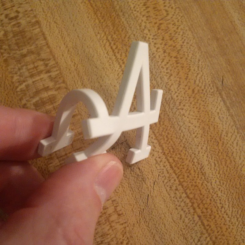
And now a few words from Paul: Hi there. As most of you know, the Dodgers have had all sorts of problems this season with those rigid-plastic 3D helmet logos (which I first wrote about back in April). So now, as you can see above, they’re shifting gears and going with a flexible material, which should be much better. In case you missed it yesterday, I had the full details in this ESPN piece.
I also had my regular Friday Flashback piece on ESPN yesterday, about notable moments in Olympic uniform history. You can check that one out here.
Yesterday, it was announced that the Minnesota United FC are officially joining the league for the 2017 season. The MLS site helps break down what’s behind the colors, design and crest of the new expansion team.
The crest, which will largely stay the same as Minnesota join MLS, prominently features the loon, the animal most closely associated with Minnesota. The blue stripe represents the Mississippi River, while the gray color is a nod to the rough material of the state’s Iron Range. The upward pointing crest and the North Star were inspired by “L’EÌtoile du Nord,” which is the state motto.
The one noticeable difference in the new MLS version of the crest is that the full team name which previously appeared, will now be replaced by the acronym “MNUFC.”
The colors in the palette are pulled straight from Minnesota itself. Black and red from the loon, blue from the Mississippi River, and the gray from the state’s Iron Range.
South Dakota unveiled “Coyote Ghost” alternate helmets yesterday. The players were certainly excited when they got a peek at them the night before.
New Coyote Football alternate helmets for this fall #CoyoteGhost #GoYotes #FeaRED pic.twitter.com/MjFahM7QKO
— SouthDakota Football (@SDCoyotesFB) August 19, 2016

Ralph Lauren revealed Team USA’s closing ceremony uniforms yesterday. We’ll have to wait and see if the reaction from “the internet” is any better this time around.
This year’s closing ceremony uniforms, which will be on parade Sunday, feature classic button-down shirts, crisp white shorts, nautical-inspired belts and boat shoes — all in a palette of red, white and blue — for both the men’s and women’s teams. All of the pieces were manufactured in the United States, creating jobs for laborers throughout the country. So, it’s safe to say, the looks are as American as apple pie.
I LOVE LOVE LOVE those sharktooth helmets!
Trying to watch an EPL match but Liverpool is wearing a retina-burning neon kit.
And the league patches are still tilted!
According to the great Historical Football Kits website, New Balance (the manufacturer of Liverpool’s uniforms) calls that color “Toxic.” Quite.
Headline is incomplete.
And this is on MLS, not you, but strictly speaking, “MNUFC” is not an acronym, as it does not result in a pronounceable word.
Thank you for pointing this out! The term “acronym” has “-nym” (“word”) right in it. So this shouldn’t be hard.
“Muh-nuffk.”
Non-sensible, but pronounceable.
I like the new crest for Minnesota United. I appreciate the styling of the loon, less like the placid representation on the usual usage. Nice subtlety with the aspects of Minnesota, but no love for the western prairies? Perhaps the loon could rest on a gnarly sugar beet?
They’re incredible birds, especially when they’re carrying their young around. But I guess that doesn’t make much of a team logo. And the red eye is a perfect touch.
link
Just a hunch, but I don’t think Liar Lochte will be there. Bet they wished they had photoshopped him out of that press photo.
USAFA numbers could be completely illegible in action. I thought “readability” was a requirement now…
Indy Car drivers at the Pocono 500 this weekend are giving fallen British driver Justin Wilson, fatally injured in the year-ago Pocono race, a custom-sock tribute, wearing special Justin Wilson Tribute Socks manufactured by USWAG, a company Wilson himself co-founded in early 2015 to produce custom socks for racing teams, English Premier League soccer teams, colleges and high schools. Proceeds from the sale of the socks benefit the Dyslexia Institute of Indiana, a favorite cause of Wilson’s, who was himself dyslexic. Additionally, each Indy car team is flying a Union Jack flag at half-mast from its timing-stand tower.
Unfortunately, there’s need for another set of tributes for driver Bryan Clauson, fatally injured in a midget-car crash last month. The cars at Pocono are running memorial decals for Clauson, while Conor Daly, a teammate when Clauson ran in the Indy 500 this year, has switched his car number at Pocono from Daly’s usual 18 to Clauson’s 88.
I am so excited for MLS finally in Minnesota. I look forward to the new midway stadium being built. I read that the U of M will host the team at TCF Bank stadium for their first season…how can that be? I thought MLS had a rule that teams must play on grass.
The Seattle Xbox’s play on fake grass
New England, Portland and Vancouver play on the fake stuff as well in MLS.
Wow. Minnesota United FC is a dumber name than Minnesota Wild. Still, I ask, how do you make a mascot out of a Wild, much less a United FC?
Wild actually has some possibilities. You can warp it to mean nature, like “out in the wild”, or it can be a wild animal of some kind… or wild and crazy… You have to be creative, but it’s doable.
United FC is just literally slapping TWO stupid European soccer team naming styles together and making a big mess out of it. It’s like the “Ford Thundercougarfalconbird” from Futurama, but they’re actually serious about it. It’s even worse since there’s already a United and multiple FCs in the league. I already don’t care about soccer, and team names like that aren’t exactly enticing me to give it another chance.
The entire MLS trend of attempting to copy European names instead of establishing its own tradition is about the lamest thing in sports.
Minnesota United FC is not a new team and its name isn’t the fault of MLS. Minnesota United FC plays in NASL right now, which is second division. They rebranded the team from the Minnesota Stars (and a variety of other names through the years).
Doesn’t matter there’s already a United or FC in the league. The worst part of “United” is its typically used as a merger of clubs — uniting, if you will. There’s no “uniting” of clubs with Minnesota, or even DC. FC is fine. I don’t mind it.
I’m a Columbus Crew guy myself. I appreciate they utilized SC instead of FC.
The last thing I make a choice on team for is its name though. That is pretty petty. I’m not a fan of “Crew” or their Village People “crest” they had in the past. But, I’ll still support them.
Air Force colors are blue & silver, and these uniforms are gray with silver and red helmets.