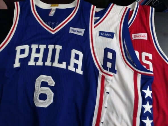
Big development this morning, as my ESPN colleague Darren Rovell has broken the news that the 76ers are the first NBA team to have inked a deal with a jersey advertiser. Starting in the 2017-18 season — that’s nearly a year and a half from now — they will wear StubHub patches like the ones shown above. (By that time, Nike will have taken over the league’s apparel contract and the jerseys will also carry the Nike logo.)
Rovell’s piece has a lot of good info — you should read it. Meanwhile, here are a few quick thoughts:
• It’s interesting that the Sixers announced this so far in advance. Will there now be a race for all the other teams to announce their own advertisers, or will they wait? I suspect the latter — there’s a premium on being first but not necessarily on being second, or third, or ninth. Why rush?
• At least the patches match the Sixers’ color scheme.
• The patches are allowed to be 2.5 inches square, but these patches are rectangular, which means they’re actually smaller than they could be.
• Rovell’s piece includes the usual embarrassing examples of corporatespeak, like this one from StubHub’s CEO: “This is strategic beachhead property for us. We, as a company, have been very transaction oriented. We want to be more a part of the emotional experience fans have with their teams, and we think a deal like this gets us closer.” But the real doozy comes from Sixers CEO Scott O’Neil, who explained that the team would include the patch on some of its retail jerseys because “We have a very strong opinion that little Scottie, who is nine years old, will want to wear what the players are wearing on the court.” How wonderful that they’re targeting nine-year-old children with this twaddle. The whole thing is quease-inducing.
I’m some folks will say, “It’s small, it’s in a team color, it’s not so bad.” I respectfully disagree. And we both know that many of the others won’t be as small, and won’t conveniently match the team colors. #NoUniAds
Any sleeves fans out there? It’s pretty obvious that most Uni Watch readers do not like the NBA’s sleeved jerseys. But I’m sure there must be some readers out there who dig the sleeved look.
If that’s you, I’d like to hear from you. Please send me a note explaining why you like the sleeves. If you’re willing, also discuss how it feels to like something that so many other people dislike. I may quote from your email in an ESPN piece I’m working on. Thanks.

Meanwhile, over on the diamond…:The Royals and Braves wore Negro Leagues throwbacks yesterday in KC, with the Royals dressing up as the Kansas City Monarchs and the Braves as the Atlanta Black Crackers. As you can see above, all of the Royals went high-cuffed for the occasion.
You might get the impression from that photo that the Royals all wore solid stockings, but at least two of them — pitcher Brian Flynn and first baseman Eric Hosmer — wore stirrups:

One nice touch: The Royals not only had throwback batting helmets but used a matte finish for them. Even if you don’t like the matte trend (I’m generally okay with it myself), this is a good use of the non-glossy finish, since Negro Leaguers just used caps, not helmets, back in the day:


The Braves, unfortunately but understandably, wore their regular batting helmets. Just as unfortunately but less excusably, most of them also went low-cuffed:

One happy exception was outfielder Mallex Smith, who went high-cuffed with some nice blousing:

If you look again at that photo of Smith, you can see one of my favorite throwback uniform elements: the contrast-colored back pocket flap. Here are some additional views:


The Royals grounds crew also got in on the throwback theme (click to enlarge):
Fans were encouraged to dress up retro as well. Here are a bunch of tweets showing some of the results (scroll through the tweets shown below to see):
Looks like it was a very enjoyable day at the ballpark. Were any Uni Watch readers in attendance?

Accursed color reminder: Tomorrow is Purple Amnesty Day, the one day of the year when I’ll accept orders for purple-inclusive membership cards. Get ready, all you Rockies, Ravens, and Northwestern fans! I’ll begin accepting orders at midnight Eastern tonight, so you can begin sending in your purple orders then.
And for the second consecutive year we’ll have a Purple Amnesty T-shirt. This one, like last year’s, was designed by my Teesping partner Bryan Molloy. It will become available at midnight Eastern tonight (I’ll tweet the link for it then, so watch my Twitter feed if you like, although of course I’ll also post the link here on the site tomorrow) and will remain available for 27 hours (so our west coast readers will have until midnight local time).
Tomorrow is also the site’s 10th anniversary — not a bad run.
The Ticker
By Alex Hider

Baseball News: The Angels’ Hector Santiago had his “Play Ball” patch on the wrong side of his jersey (from Alex Carson). … A Brewers beat writer says that the team’s jersey choice is left up to that game’s starting pitcher (from Zach). … Bench-clearing brawls look even better when they’re color-on-color, eh? … We may have covered this before, but a number of readers made note of the fanged mouthguard that the White Sox’s Brett Lawrie has taken to wearing. … Looks like belt tunnel logos have made it to the minors (from Kub). … A sharp-looking Little League team is sporting 1976 Phillies road unis (from Matt Hayes). … Nebraska did the whole G.I. Joe thing on Sunday. They also wore camo on Friday (from Chris R). … Lots and lots of stirrups in this high school baseball game (from Ryan Patrick). … Eric points out that Wayne State changed its nickname from the Tartars to the Warriors in 1999, but they’ve failed to update their scoreboard. … It was a battle of condiments when Arizona and Arizona State played on Sunday (from Steve Curry). … Here’s something you don’t see too often: green vs. green. That’s the Great Lakes Loons versus the Dayton Dragons (from Eric Hoffman).

Soccer News: Lots of readers shared this interesting memorial patch design that Sporting Kansas City wore yesterday. The patch honors a fallen police detective. … FC Dallas forward Tesho Akindele has been wearing FiNOB without the approval of MLS (from Jose Palacios). … Mike D. points out that Real Madrid once went with a white-on-white NOB. … New kit for German club teams 1899 Hoffenheim and Dynamo Dresden (from Robert Marshall).

Grab Bag: Reader Chase Stejskal got a new Nashville Predators sweatshirt that came with NFL tags. … Interesting profile of a man from North Carolina who designed a transgender-safe bathroom logo. … Golfer Ken Duke shot an impressive 65 on Saturday at The Players Championship ”” all while wearing a Houston Astros visor (from Douglas Ford). … Texas Track and Field went BFBS during the Big XII Championship this weekend. … Here’s your latest chance to vote on the NASCAR paint scheme of the week. … Interesting article about how universities sometimes use their sports logos for academic endeavors (from Mike McLaughlin). … Here’s an article on F1’s worst and best liveries. “The article is in Spanish, but the first 10 are the worst and the next 15 are the best,” says Omar Jalife, who was one of the voters on the panel that chose the designs.
Alex,
Welcome.
“Bryce Harper has continued to use personalized bat knobs despite the MLB’s new rule banning them.”
1. It’s not “the MLB” or “the Major League Baseball.”
2. Paul has reported that the ban was rescinded, although some restrictions remain.
Meant to remove that when editing the Ticker. Now deleted.
“We have a very strong opinion that little Scottie, who is nine years old, will want to wear what the players are wearing on the court.”
Beyond the general disgustingness of that statement, this might be a record. Literally the first team is already going back on “no ads on the retail jerseys.” Also, I have a laugh at it being a Stub-Hub ad considering all the acrimony between the site/secondary market and the pro sports leagues over the years. Another example of how icky and backwards this whole ad thing is.
Literally the first team is already going back on “no ads on the retail jerseys.”
They’re not “going back” on anything. It was reported from the start that teams would have the option of including the ads on retail jerseys if they wanted to. And if you read Rovell’s piece, like I strongly suggested, you’ll see that they’re only going to have *some* merch jerseys that include the ads.
I read the Rovell piece. I also read this Tweet from him last month. link
While I know it’s not all retail merchandise, and that the caveat of the teams “own retail outlets” was always there when the NBA said patches weren’t going to be on “retail versions of player jerseys” the fact that the very first team to introduce their ad patch is going out of there way to spin a story about producing the jerseys with ads because kids would want them seems to be a definite change in rhetoric.
I certainly agree that the quote is disgusting.
Yeah, seriously, that quote was ridiculous. As if any 9 year old cares about Nerlens Noel that much.
I’m some folks will say, “It’s small, it’s in a team color, it’s not so bad.” typo
I love this quote from the Stub Hub CEO “We want to be more a part of the emotional experience fans have with their teams, and we think a deal like this gets us closer.”
So is it safe to assume that Stub Hub is totally cool being associated with mediocrity and fans’ emotional feelings of disgust if the Sixers continue to be one of the worst teams in the league?
Does anyone else feel that the “Play Ball” patches worn by MLB players yesterday is a step towards advertisements on baseball uniforms, especially now considering that the Sixers’ ad looks very similar? I get that Play Ball is a MLB initiative. I might be cynical, yes I am, but the patch just felt like a step towards “lets do this and get people used to a patch being there so when we begin to sell the space it won’t be a big deal.”
That patch was AWFUL in every conceivable way. The placement sucked (especially right above the P on the Pirates’ alts), the colors clashed, and half of them looked crooked to me. It looked like they put almost no thought into it at all. Really embarrassing.
Agree completely that the MLB Play Ball patch was horrible. When I first saw it the patch reminded me of a plastic name tag an employee of Wal Mart or some retail store would wear. Just God awful in every way.
It seems the execution of the Playball patches was a product of the team’s stitching staff. While not a fan of the patch, I noticed the Phillies’ patches we lined up perfectly with the same pinstripe on each uniform and appeared to have been set above the chest mark with a template tool at exactly the same height.
Chris,
No, you weren’t the only one. I saw those on the MLB uniforms and felt the same way. A tsunami is coming … sad.
-C.
Nah, those patches were awful. They had a border and stood out. Looked like an employee name tag on most players in white unis.
The patches were inept in design and execution. That’s the nicest thing I can say about them.
NB: MLB has already had jersey ads for regular season games played in Japan. This looks to be another step toward normalizing that particular undesirable deviance on an everyday basis. Fie on them.
There’s no way those Play Ball patches were anything but groundwork for ads. Reminds me of how the current Red Sox owners got ads on the green monster (which became the green monster with the exodus of ballpark wall advertising in the 1940s). Actually, there are parallels with both the NBA thing and the Play Ball patch.
Bottom half of the wall was the first to get ’em, in the form of a “tasteful” W.B. Mason ad to blend in alongside the scoreboard. Now there are several, including a towering CVS Pharmacy billboard.
On the top half of the monster, they were a bit more tentative. It started with a Jimmy Fund charity banner for a season or two. The rationale was it was a children’s cancer charity…who is going to argue against putting that up there? So yeah, it has since been joined by four prominent corporate logos.
Is there any word on whether the retail NBA jerseys will include the advertiser patches across the board or just on some? I simply assumed the retail version would since that’s how sports such as football and rugby etc do it.
It’s funny how the Sixers CEO actually referenced kids on that angle since in football that is the side of jersey advertising that is to a very small degree regulated. For example the Celtic home jersey has a betting advertiser so the kids shirt goes without the advert.
link
link
it’s the same for alcohol advertisers.
This reminds me of something similar that I find quite interestingly atrocious. In international football advertisers (cept for a makers mark) are prohibited. This leads to what I think are the best the sport has to offer uniform design wise. Sadly however, the Irish national team does something that I’ve never seen a team do before (and it flies in the face of what the Phila CEO had to say about kids wanting to wear whatever they see their heroes wearing) but they actually put a advertisers logo on the retail jerseys!
link
link
They even get the players to pose in the advertiser jerseys even though they’re technically never ‘field legal’!
link
Ignore first question – see it’s been answered while I was writing my post.
As has been widely reported for weeks now, the standard retail jerseys will not have the ads, but teams will have the option of including the ads on some jerseys.
That’s really neither here nor there from a Uni Watch perspective, since Uni Watch cares about what the players wear, not what’s sold at retail.
Dammit Sixers – after years of being overtly bad and actually garnering a little sympathy, you start off this inevitable slide toward European hockey uniforms in the NBA? Could you once do something that generates positive headlines for the few of us you haven’t alienated?
I don’t think Mallex Smith’s blousing looks good at all. Too much.
I think the kudos for the blousing was more about them actually being bloused. So many players just bunch the elastic below their knee and think that’s the way the pants are supposed to be worn.
The #dressedtothenines tweet from @amore_ke has one of my least favorite grammatical errors, and one that is becoming far too common these days: “100$.” Because it’s spoken as “one hundred dollars,” many people are putting the dollar sign after the number, which is incorrect in American English. I’ve also seen “$100 dollars” which technically is, of course, “one hundred dollars dollars.”
I know it’s pedantic, but I’m trying to fight the good fight against the regular, ever-escalating erosion of the written language.
“$100 dollars” is like when folks say “ATM machine” or “PIN number.” GRRR!
In my first year of college (1980-something), there was a guy down the hall who insisted on saying “CD disc.” He’s probably now an NBA exec.
I have heard of this being called “PNS Syndrome”.
Which expands to “PIN Number Syndrome Syndrome” Which then expands to “Personal Identification Number Number Syndrome Syndrome.”
From the Department of Redundancy Department.
I hate this too!
My least favorite: mlssoccer.com…
Yeah, but that’s probably because someone had already hijacked, mls.com.
Seeing those pictures of the KC/ATL game showcase how much better baseball jerseys look without the NOB. NOB’s seem to be a natural fit for the other sports, but for baseball it just clutters the back of the jersey. I know it will never happen, but baseball would benefit visually by ditching the names league wide.
I strongly disagree. While it may look nice with just the number, in today’s game with so many teams and players, we just need the NOBs to keep track of everyone. The real problem is that teams are lazy about their design, and so NOBs end up being way bigger and blockier than they need to be.
With TV graphics and in-stadium graphics now, there is less of a need for NOBs than ever. I say ditch them entirely and make the numbers more readable; maybe an inch taller.
I do approve of the 1980s Mets’ “name in stamped tape on the batting helmets” thing. That was quirky and fun.
I’m a less than casual NBA fan but adding ads to their jerseys would probably get me to watch more games on television.
Intriguing! Could you explain why? I’m genuinely interested.
Just to see where the patch is and if the company will adjust their logo colors to respect the team colors.
Also looking at an NBA jersey is pretty boring at least an actual logo of some sort is adding something else to look at.
“Get ready, all you Rockies, Ravens, and Northwestern fans!”
How about adding LSU to this call-out? Thanks.
A little love for the Lakers and retro Kings’ sweaters would go a long way, too.
Here’s what I’ll do: I’ll think of every single purple-inclusive team that has ever existed — all 17,283 of them. And then I’ll list them in that sentence.
OK?
You left out New Rochelle High School;)
“It was a battle of condiments when Arizona and LSU played on Sunday (from Steve Curry).”
Maybe it was Arizona and Arizona State, but it wasn’t LSU. The Tigers played Tennessee.
Yeah, it was Arizona State.
Tip off should have been the maroon caps paired with the gold jerseys (although the way schools don’t wear their colors anymore, it probably could have been almost anyone)…
Were the jerseys gold? Or were they yellow?? :)
They were in PMS 123 Gold, CMYK 0/24/94/0, RGB 255/196/37
Official school colors are “maroon” and “gold” (and also black and white). They may also refer to the gold as “sun”.
I’ve chatted with a lot of soccer fans this season about the jerseys they wear to games and something I’ve found interesting is the number of people who choose to not buy current jerseys due to moral objections to the jersey advertiser, I have found this with pay day loan and gambling companies however I doubt that the loss of purchases will exceed the advertising revenue.
On the subject of the NBA sleeves I like the design of the jerseys as an item of clothing but not as a basketball jersey. I would not want to wear sleeves playing basketball and I think it is a retail driven move that is completely unnecessary.
I own but one NBA replica jersey: A navy blue Rockets’ jersey with the vertical contrails and Steve Francis’ number. Butt ugly and an absolute favorite. Sleeves would neither encourage nor dissuade me from making another purchase.
Sleeves would make me marginally more likely to purchase a basketball jersey, but only if these other things were also true:
1) I cheered for any particular basketball team as a fan; and
2) Sleeved jerseys made sense to me as a functional design for playing basketball.
I’m just not that in to basketball, at least not enough that I have any desire to wear any team’s jersey, but more importantly sleeved jerseys don’t “feel” like basketball jerseys to me. I’d no more want to wear a sleeved basketball jersey than I would want to wear a White Sox disco jersey, if I were a White Sox fan. It’s a terrible, counter-functional design that doesn’t belong on the field. Same, it seems to me, with sleeved b-ball jerseys. It’s like, even if I wanted one, I wouldn’t want one.
“I’m just not that in to basketball”
~~~
That’s OK Scotty…it’s totally not into you either.
Oh, I know. The pro game would be much less boring in its final 10 minutes of game time if it cared about me at all. Basketball is like golf for me: Something I’d much rather play than watch, but I’ll watch it and enjoy it if it’s what’s on.
Most people who play pickup/rec league basketball wear sleeves. NBA players even wear sleeves during practice and shootaround. About the ONLY time players wear tanks/jerseys is during games.
The sleeved NBA jerseys just haven’t taken off because most of the designs have been horrible. Not because people don’t wear sleeves. Most people also don’t play basketball in a replica NBA jersey, but that’s another topic.
About the ONLY time players wear tanks/jerseys is during games.
This is like saying MLB players only wear their full home whites during games. Yes, it’s true, but what most of us watch is, you know, THE GAMES. That’s what matters, that’s what counts, that’s what we think of when we think about the look of the sport. The fact that the players dress differently during practice or whatever is true but not particularly relevant.
I think it is relevant in that there have been a lot of player complaints about the sleeves feeling restrictive & not comfortable for playing in. Since players routinely practice & warm up with sleeves there is an issue with the design of the sleeved uniforms.
“Most people who play pickup/rec league basketball wear sleeves.”
I’d say it’s about 50-50 in the games that I play.
I own a West Bromwich Albion jersey that I wear regularly from the 2008/09 season, when they were the only team in the Premier League that didn’t have a sponsor. Hopefully it lasts a long time so I don’t have to get one with a sponsor.
I own a West Bromwich Albion jersey that I wear regularly from the 2008/09 season, when they were the only team in the Premier League that didn’t have a
sponsoradvertiser. Hopefully it lasts a long time so I don’t have to get one with asponsoradvertiser.Fixed that for ya.
“Hopefully it lasts a long time so I don’t have to get one with a sponsor.”
~~~
Why would you have to get a new one? Are you contractually obligated to or something?
i call bullshit. no way on god’s green earth that anyone would go to stubhub to get sixers tickets when you can find them littering the sidewalks outside the spectrum. it’d be like slapping a mcdonald’s ad on the outside of cholesterol meds.
p.s. – yes, i know they don’t play at the spectrum anymore, but i don’t feel like looking it up.
:)
It’s the Wells Fargo Center, formerly known as the Wachovia Center, formerly known as the First Union Center, formerly known as the CoreStates Center, tentatively known as the Specturm II.
I’m still calling it the FU Center, because that’s the most appropriate name for an arena in Philly.
Yesterday’s “battle of condiments” was between Arizona and Arizona State, not LSU.
Press release you’ll never see: “The (insert your favorite team here) and Pepsi Cola have entered a partnership to place an advertisement on our uniforms beginning this season. Said advertisement will be for the 1970 World’s Fair in Osaka because I’ve never liked Pepsi’s logo.”
The park that was used for the 1970 Osaka World’s Fair now hosts an amazing ethnology museum that I’ve been to four times. Never thought I would get to talk about it on Uni Watch, but it’s an amazing place and despite being a little out of the way, well worth going to see.
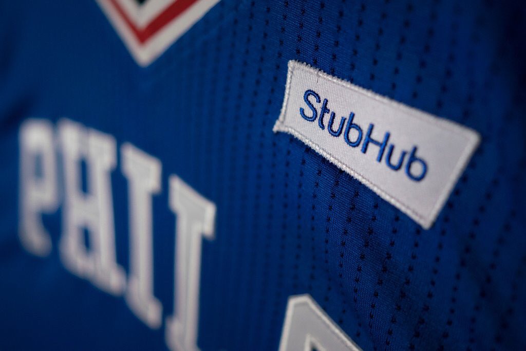
Thing is, Stubhub doesn’t actually use Sixers colors in its logo (which was just redesigned for the second time in less than a year). The patches are in Sixers colors to match the jerseys, not because Stubhub corporate branding happens to match the team’s colors. Stubhub now uses a medium navy blue, a deep purplish blue, a sort of saturated teal, and hints of orange and gray left over from their pre-flurry-of-redesigns identity.
Makes me wonder if conforming the ad patch to team colors will be a thing for other teams/advertisers, or if this is just a special bit of flexibility on Stubhub’s part, a concession the company was willing to make to score its a First! coup in the “jersey sponsorship” space.
I certainly hope that’s how it works. I’m sure no team wants to create an aesthetically unpleasant ad that’s going to piss off fans, nor does any advertiser want their product placed in such a manner. Thus, the Sixers execution is the best possible outcome.
But there will certainly be exceptions. Target’s corporate logo is red. It could probably also be rendered in white, but I doubt they’d want it blue, purple, etc. So how’s that gonan look on a Timberwolves jersey? Ditto for logos that look better in a rectangle (Pepsi) or have multiple colors that can’t really be flattened (McDonalds).
This could be a sh*tshow, or it could turn out perfectly okay. We’ll see.
Keep in mind uniwatchers are a very small percentage of fans, and companies, like Target for instance, have an instantly recognizable logo in a certain color scheme which I doubt the would change to match a teams color scheme.
Think about it form the advertisers standpoint. The NBA allows them to advertise there, and they’re not going to alter their instantly recognizable logo because a very small percentage of folks will think it’s ugly.
It relates to a comment a few comments below about the fact players on the Atlanta team went pajama pants. It doesn’t affect the play of the game, which is what most people are interested it. A small jersey ad? I’m sure a majority of folks will not care, or will not care enough to let it affect them.
Personally I have no idea why players would want to go pajama pants, it doesn’t make any sense to me. It just seems it would be a part of the uniform that could get caught on a base, snagged on a fence, etc.
A small jersey ad? I’m sure a majority of folks will not care, or will not care enough to let it affect them.
If it were that simple, all of the leagues would have moved in this direction a long time ago.
Partially agree. I think my problem is I don’t care about the NBA enough to care if they do jersey ads. I guess if the NHL considered doing it then all hell should break loose.
As a Braves fan, I’m ashamed (and not just for the usual reasons that Braves fans have to be ashamed this season). Maybe throwback-uniform manufacturers should consider producing the pants ONLY in below-the-knee lengths.
“It’s small, it’s in a team color, AND IT’S NOT RECTANGULAR, it’s not so bad.”
The fact that it isn’t rectangular or obtrusive makes all the difference. This is well executed. I hope other teams follow suit, but I’m sure most won’t.
Can’t wait for that Heat uni with a huge Blue AT&T logo in a rectangular white box.
I think you mean that it IS rectangular, right?
The Stubhub logo is not rectangular. It’s a nearly-but-not-quite-rectangular quadrilateral. Look at the closeup Sixers jersey photos: The left and especially right sides of the Stubhub patch do not align with the jersey’s vertical detailing.
It does look better than if it were a rectangular patch with the Stubhub logo inside of it. I mean, still looks like shit, but more like horse manure than pig manure.
Oh — I didn’t even realize that it’s StubHub’s word-balloon logo:
link
Ugh, now I like it even less.
Came here to mention that detail. It’s a word balloon. A subtly shaped word balloon, but a word balloon nonetheless.
Odd aside: I find it … I dunno, interesting, I guess … that the first team to sell the sponsorship is the NBA franchise that has been most synonymous with nothing but losing over the past few years. I’m still trying to figure out what that means to me. The cynic says it’s the NBA’s way of saying, “Hey, if a team this bad that no one wants to watch can sell a jersey ad, it can’t be that bad!”
I thought it was odd that the first advertiser is, in effect, a ticket scalper. Not all that long ago, every pro team and league regarded anything related to ticket reselling as a mortal enemy.
The image Paul linked to is not the logo that’s going on the jerseys. That logo is like two versions ago. Their logos have gotten incrementally less obnoxious.
link (the one that’s going on the Sixers jerseys).
The previous version link.
Re: your distaste for MLB players not going high-cuffed while wearing throwbacks: this is major league game that counts, not a costume contest. Sorry it’s not aesthetically pleasing to you.
Yes, I’m sorry too. So we’re in agreement! That’s nice.
You don’t have to care about the aesthetics of a uniform (lots of people don’t), but uniform aesthetics are why this website exists. So that’s what we discuss here. Simple.
I like it that so many fans get into the throwback games with their attire. Really shows the fans getting into it and having some fun by wearing something appropriate to the game.
I think there are certain applications in the athletics uni-verse that call for purple. Royalty named teams, mountain based, a certain poetic bird for instance. You think purple is too loud, but I think it looks alright for teams it’s appropriate for and can be done tastefully. Purple as a random color choice looks out of place to me (Lakers), and maybe ‘tacky’. But I believe it has a rightful place in the uni-verse. What say you?
Oh, you mean people not named Paul Lukas? Okay, I’ll take a crack: Perhaps of all the colors, it’s the least flexible or the most pushy. You can’t fling it around: It’s going to be the primary hue in the color scheme, and you need to complement it. Either yellow or black as an accent. Tequila sunrise treatments are definitely out! If I were to design a uniform from scratch and have choice over the colors, I’d find purple too much of a headache.
Perhaps of all the colors, it’s the least flexible or the most pushy.
Similar to my longstanding description of it as “the diva of colors.”
The Hornets are truly the only team I can think of that’s used it to its fullest over the years. I absolutely hate purple with black, and I think much of the white in the Lakers’ identity is unneeded.
If you’re willing, also discuss how it feels to like something that so many other people dislike.
I can’t think of another sport besides basketball where so many Uni Watch commenters go out of their way to say they don’t care about it. So I’m used to being in the minority already. Liking sleeved jerseys (as long as they’re properly fitted and well designed) doesn’t make me feel any different.
Speaking of the non-fans of basketball, I’m surprised some of them didn’t chime in on Saturday. It’s rather sad that yesterday’s open thread got three times the comments as the piece on unicycle basketball.
Not to open a can of worms, but I imagine the Uni Watch aversion to the NBA is somewhat due to demographics. I’m going to assume many, if not most, Uni Watch readers, are geeky white males with a more traditionalist bent. The NBA is obviously the most progressive league that tries to be at the forefront of modern pop culture.
For me, it’s my favorite “league,” in that from an entertainment standpoint I think it creates the best product. However, it’s also the only one of the big four in which I don’t have a favorite team, so I’m inherently less passionate about it.
Any league wherein no more than four teams in any given season have a realistic shot at a championship is, almost by definition, not the best product. That is my problem with the NBA.
I understand where you’re coming from. Baseball is my favorite sport and the only one I’m really passionate about, yet it is so clearly the worst/most confused product of the big four sports leagues.
As an ex-fan of basketball, I suggest that the “I’m not a fan” responses are a reaction to basketball getting more hype in these United States than any sport other than perhaps NFL.
I’m a big soccer fan so i’m used to ads on jerseys, and thought that i didn’t care, and happily wore a their jerseys… and then Manchester United switched to Chevy. It’s weird that I didn’t mind whatsoever wearing an insurance or risk management company on my jersey, but i cringed at wearing a big chevy logo across my chest. It just looks NASCARish.
so if this change is inevitable, fine… i don’t care that much. but WHO is doing the sponsoring and what the logo looks like on the jersey will go a long way on weather or not i purchase a jersey myself.
I’ve been somewhat agnostic about these ads, but there is something about actually seeing them that makes it much worse. When they were simply concepts it was easy to ignore, now the hardened realization that this is what the NBA is going to look like makes me sad.
I don’t feel like being quoted in an ESPN article, but I like the sleeved jerseys because of the creativity they’ve allowed. The Blazer’s “Rip City” jersey is one of my favorites in the league, I like the Warriors Chinese version, and I love the faux throwbacks Utah just released. Versions of these could obviously all be done on traditional uniforms as well, but it seems like teams are more averse to messing with the sanctity of the sleeveless. The sleeves have allowed teams to be a little more unique.
As for loving things that people hate, my favorite Star Trek series is “Voyager,” so I know all about that. I’m comfortable with my quirks.
I like the Jazz alt too.
“Enterprise” is my favorite Trek series.
My favorite Trek series is “Deep Space Nine.”
At least people started to come around on DS9 finally. It’s by far the best Trek series.
That minor league team with the logo on the belt tunnel is the Lehigh Valley IronPigs, and I believe earlier the team announced it would be the only MiLB team with the logo placed there this season. Not sure if that is true or not.
The Sixers released a video related to their StubHub ad on Facebook which is extremely disturbing to me:
link
I cannot believe they are marketing this as something for fans to be excited about, bringing the cute Betsy Ross and Ben Franklin mascots into it, and even going so far as to describe the ad as “super clean.” Pure doublespeak in action.
I’m blown away by the degree to which they are trying to sell this as a net positive. I figured they would roll out the “deeper level of engagement with out partners. . . additional revenue to enhance the fan experience. . . yadda yadda yadda” corporate speak, but I didn’t quite expect this:
“We’re thrilled that the NBA has decided to be an innovator among the major sports leagues in this country”
Thrilled? Thrilled?!?! Really? Gag me.
Exactly. I feel naive now for assuming they would pitch this as something like a necessary evil.
Don’t underestimate the amount of the Sixers’ press release that was written by the NBA office considering they have let the NBA office dictate who runs their team.
Brutal general-media report on the Sixers jersey ads here:
link
The headline and subhead say it all:
The First Ad On An NBA Jersey Doesn’t Look Bad At All
So far, the ads look nothing like NASCAR.
True, the Stubhub ad is not as garish as a NASCAR suit. Talk about damning with faint praise. “Not as garish as NASCAR” will be easy for the NBA to achieve even if it starts putting multiple ads on every face of every uniform surface.
Since no one else commented on it, I will. While the Little Leaguers’ uniforms looked great, I was saddened to see the kids all wearing baggy pajama pants. That looked like crap.
I looked at that photo and the first thought I had was that they literally look like they’re wearing pajamas.
Still, they look better than my neighbor’s kid’s team that wears white jerseys with gray pants.
I also thought those little league uniforms were actually more like the Cardinals road uniforms in the mid-70s than like the Phillies.
Interesting that the “green on green”, “you don’t see that often” ticker item was preceded by a stirrup study involving a green on green game that had real nice uniforms – green tequila sunrise and green pinstripes – not to mention the the well worn stirrups.
And lo, purple amnesty day did begin with a purple site, purple links and all things purple.
Even with it being purple amnesty day, my first thought when I saw the site like this was, “What, did Paul lose a bet?”
The Blue Jays/Rangers Blue/Red brawl yesterday was beautiful
So white fans dress up to a time when Afican Americans weren’t fully accepted to play in the mlb? Kind of weird right?
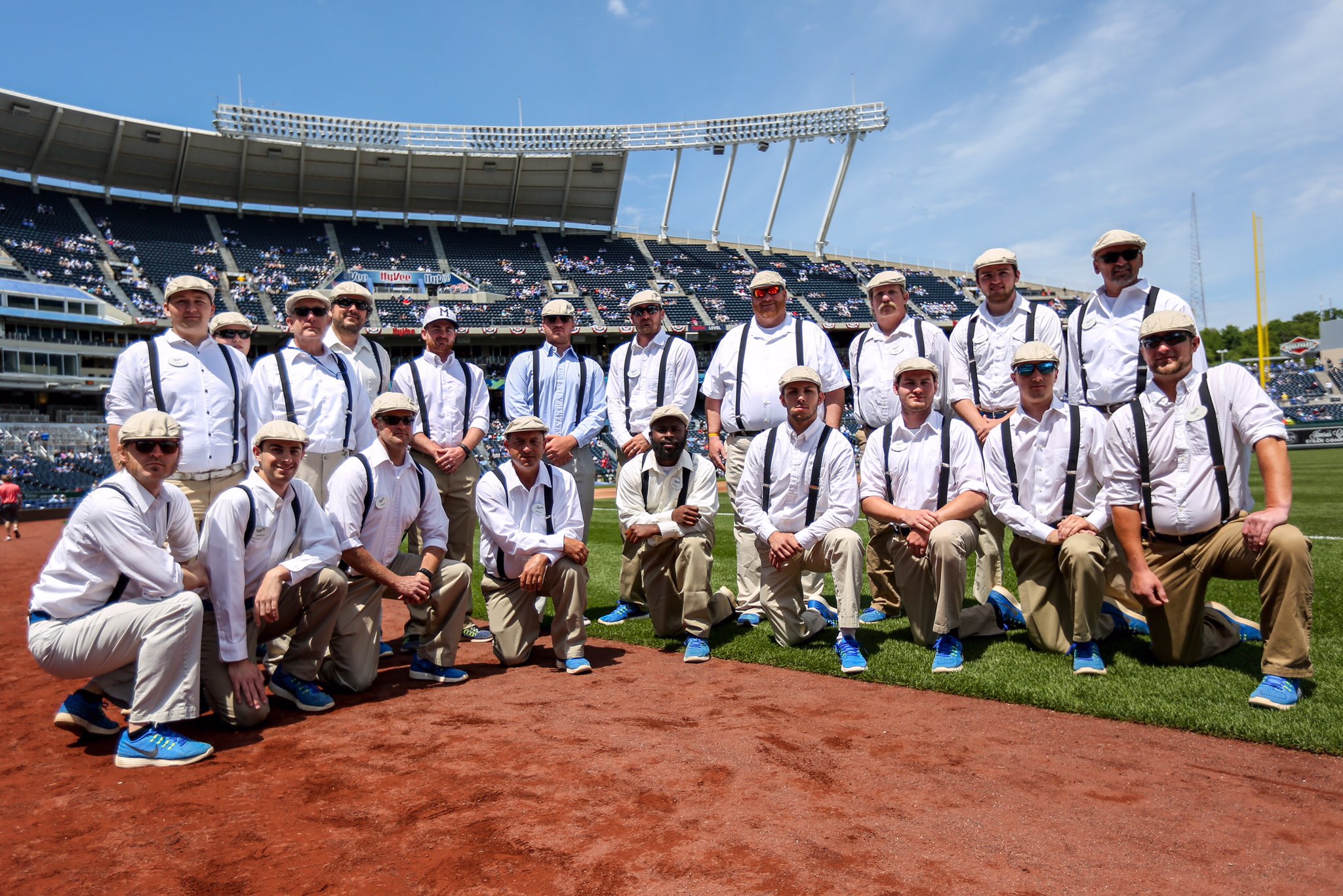
I was at the Royals’ Dressed to the Nines game the other day. Wore a suit and my (deceased) grandfather’s old hat to get in on the theme. There has been an annual “Salute to the Negro Leagues” day for many years, since the magnificent Negro Leagues Baseball Museum is in town, and largely because of Buck O’Neill’s influence.
What I love about the Dressed to the Nines thing is that it’s an organic movement that became part of the promotion. Several (5??) years ago, a small group of fans decided to dress up, like they did in the old days, and in old-fashioned style. This got a lot of publicity and grew a bit the next year, getting the attention of the club who loved it and decided to make it part of the official festivities. It’s so cool to see people dressed up like they did back in the old days, and it brings much-deserved attention to the NLBM. The weather being in the low-60s helped too. Great day at the ballpark!
Please stop complaining about ads on NBA jerseys until you remove the disgusting ads on this website.
I really need to create a FAQ page for this.For the gazillionth time, I am not opposed to advertising per se; I am opposed to advertising where it doesn’t belong.
NBA teams make money from the sales of tickets, broadcast rights, concessions, parking, merchandise, and more. They don’t NEED revenue from uniform ads. Moreover, a uniform already stands for something — the team. Putting an ad on it compromises that.
This website, meanwhile, gives its product away for free. Outside of ad revenue, it has no other funding mechanism except the very small trickle that comes in via membership cards and the occasional merch project. Moreover, media ventures being underwritten by advertising is a model that dates back literally centuries.
If you think those two situations are synonymous, or that my disdain for the former and my participation in the latter somehow makes me a hypocrite, well, you’re entitled to your opinion. But I think you are badly, badly mistaken.
Still, I’d happily get rid of all the ads if the readership were willing to switch to a paid subscription model. What do you say, David — ready to pay up for Uni Watch instead of mooching the content for free?
Page now made:
link
Should’ve done that a long time ago.