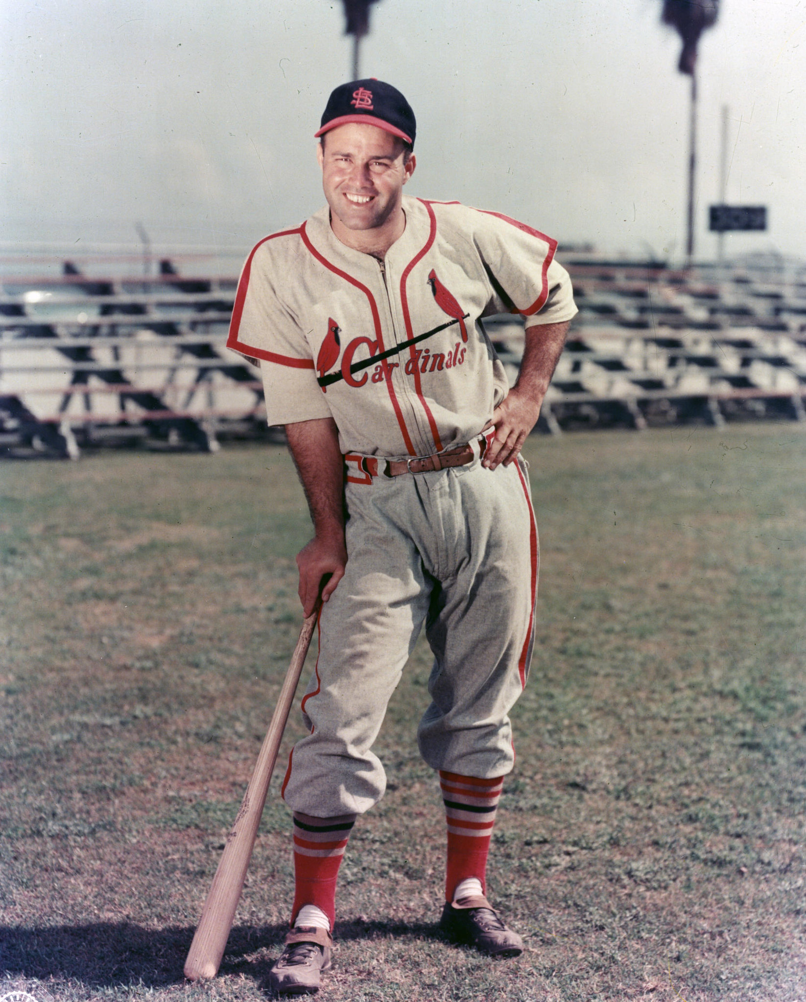
Click to enlarge
Joe Garagiola passed away yesterday at the age of 90. If you had asked me which team he played for, I would have immediately said the Cardinals. But his nine-year career also included stints with the Pirates, Cubs, and Giants, which I probably knew at some point but had forgotten somewhere along the way. Here he is wearing those teams’ uniforms (if you can’t see the slideshow below, click here):
Of course, Garagiola was more famous as a broadcaster than as a player. I was just the right age to grow up listening to him, as he and Tony Kubek were NBC’s main broadcasting team for Saturday games of the week and lots of postseason action in the 1970s and early ’80s. He always came across as warm, smart, witty, just charismatic enough, and self-effacing without ever resorting to what we now call the humble brag. His voice was a very good instrument, too — I loved listening to him. He wasn’t as analytic or detail-driven as today’s broadcasters (that style hadn’t been invented yet), and he was rarely if ever critical of anyone in uniform (ditto), but I felt like I learned plenty about the sport from him.
Garagiola had a knack for tossing off memorable lines, too. One that I always liked was about a player (I no longer recall who it was) who’d gone 0-for-5 — taking the collar, as they said in those days — which prompted Garagiola to quip, “Yeah, that’s an uncomfortable collar when they slap that size five on you.” He tossed off that line with this easy grace that made it sound like some bit of worldly wisdom from your cool uncle. I was probably about 12 years old when I heard him say it, and I can still hear him saying it today.
Garagiola did broadcasting for the Diamondbacks (where his son Joe Jr. worked as general manager) from 1998 through 2012, and they’ve already said they may add a memorial patch for him. RIP.
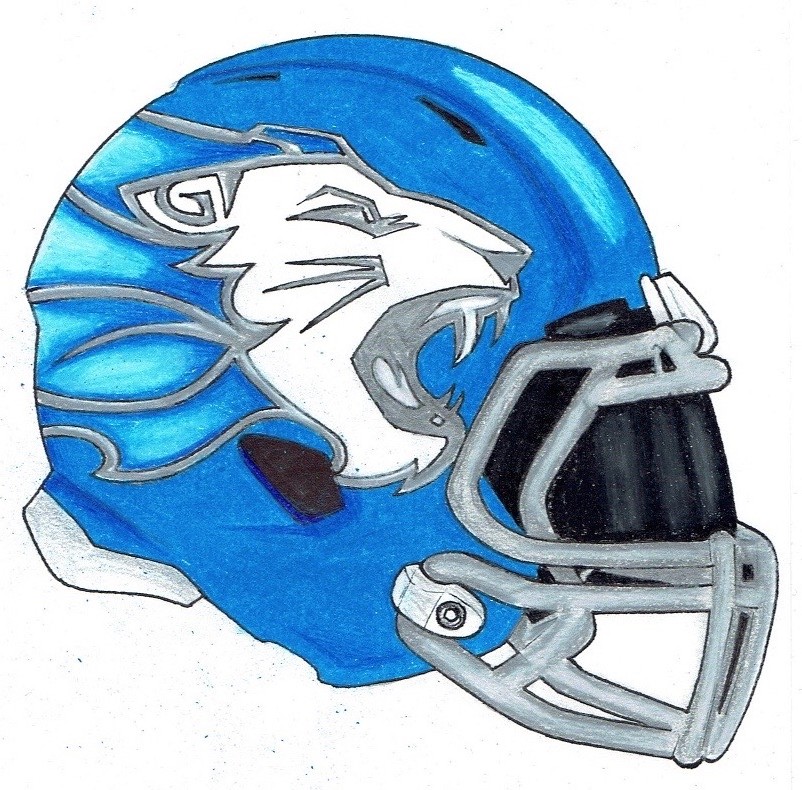
Click to enlarge
Lions-redesign contest results: My thanks to all of you who submitted entries for my recent challenge to redesign the Detroit Lions. The best designs (including Travis Bergeman’s, shown above) are featured in my latest ESPN column, which is available here — enjoy.
Destiny’s child: NBA commish Adam “It’s Inevitable” Silver hit a new low yesterday while discussing the topic of jersey advertising during an ESPN interview. The good news is that for the first time in recent memory Silver did not describe uniform ads as “inevitable” (although ESPN did use that word in an on-screen graphic); the bad news is that he instead used about the worst metaphor imaginable. Dig:
That’s right — the commissioner of a major American sports league grinned and chuckled while describing the spread of uniform ads (and all other forms of sports commercialism) as “Manifest Destiny.” For those who don’t recall their junior high social studies, Manifest Destiny was the small matter of certain people in the 1800s believing that America literally had the divine right, messianic duty, and predetermined fate to occupy and settle the entire continent, which among other things led to the Mexican-American War and the near-extermination of Native Americans. It’s not really the kind of thing anyone brings up nowadays in a positive context (except, apparently, Adam Silver), and it’s hard to imagine any business executive referencing it in an affirmative manner (ditto). Saying uniform ads are akin to Manifest Destiny is basically saying, “Get the fuck out of the way because this shit is going down whether you like it or not, and we don’t really care about the collateral damage” — which, when you think about it, is just a more honest way of saying “inevitable,” so I can at least give Silver props for providing us with a more unvarnished view of how his mind works.
Leaving aside the unfortunate choice of words, Silver’s underlying point about sports commercialism is both repugnant and cowardly. He’s basically saying that greed is our natural state of being (that’s the repugnant part), which conveniently means that none of us — least of all him — has any agency or responsibility in the matter (that’s the cowardly part). “Hey, this stuff wants to happen, it’s natural for it to happen, it’s bound to happen, it’s gonna happen. Whaddaya gonna do?” It’s a breathtakingly cynical position.
There was one other thing worth noting in that interview segment, but I’m going to save that for another day. For now, let’s hear it for Adam Silver, the only executive in America (I hope) who smilingly describes his business plan as Manifest Destiny. #NoUniAds
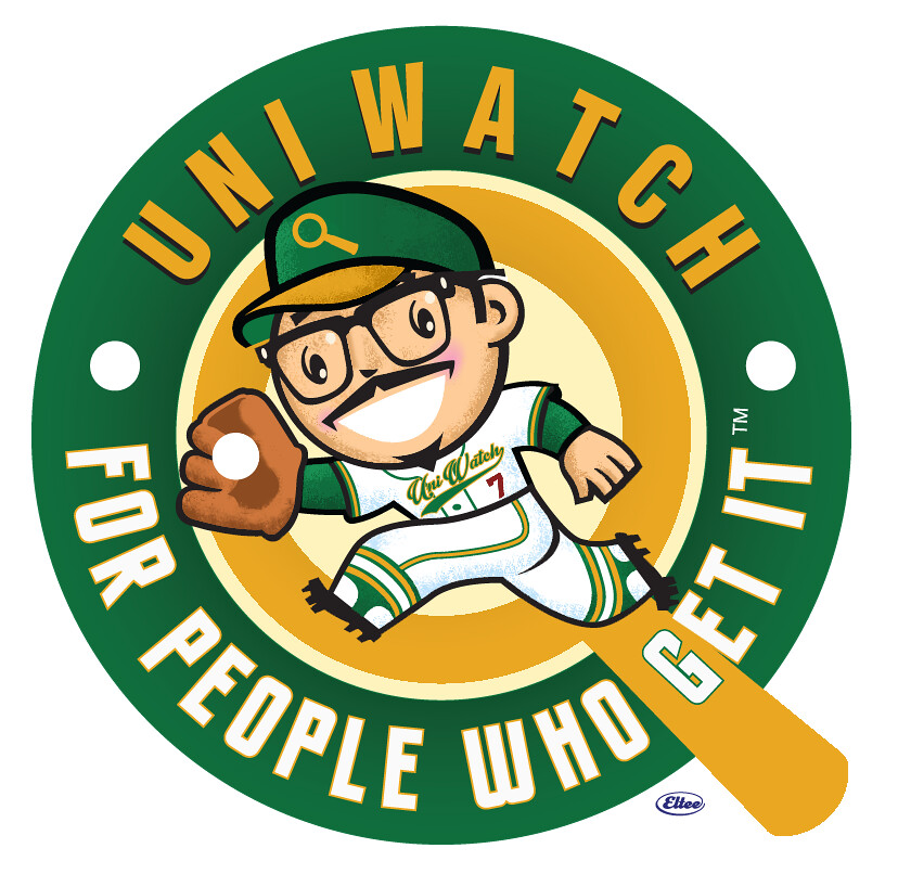
Ask and ye shall … be sold something: When I recently ran that entry featuring Larry Torrez’s caricatures of me, lots of you said there was one design in particular that you’d like to see on a T-shirt — this one (for all of these images, you can click to enlarge):
I wasn’t looking to turn this into another product, but the demand was definitely there, and I’m sort of amused by the idea of my face (or at least a cartoon version of it) appearing on a shirt, so I discussed it with Larry and he agreed to go ahead with it. We’ll split any profits 50/50.
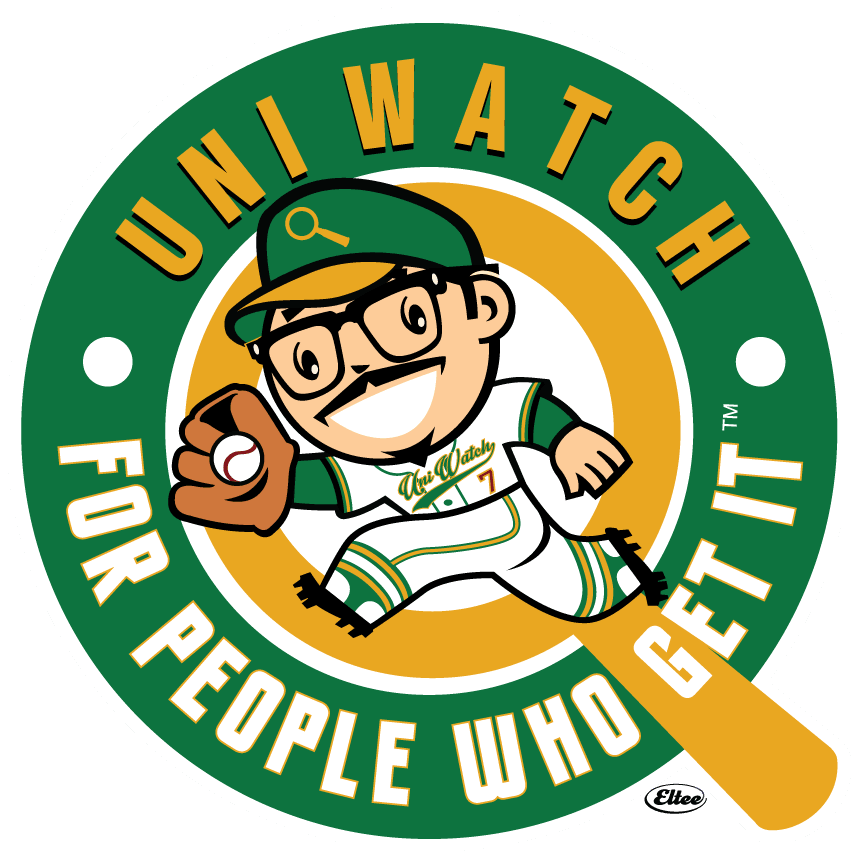
Larry’s original illustration had some airbrush-style gradations and other elements that wouldn’t translate well to a T-shirt format. Even after eliminating the gradations, we were left with a nine-color design, which is way too many colors, so I worked with Larry to simplify the illustration. We eventually arrived at this seven-color design, which we’re both really happy with:
The next question is which color(s) the shirt(s) should be. The obvious options would be white, black, or grey, so we mocked them up, like so:
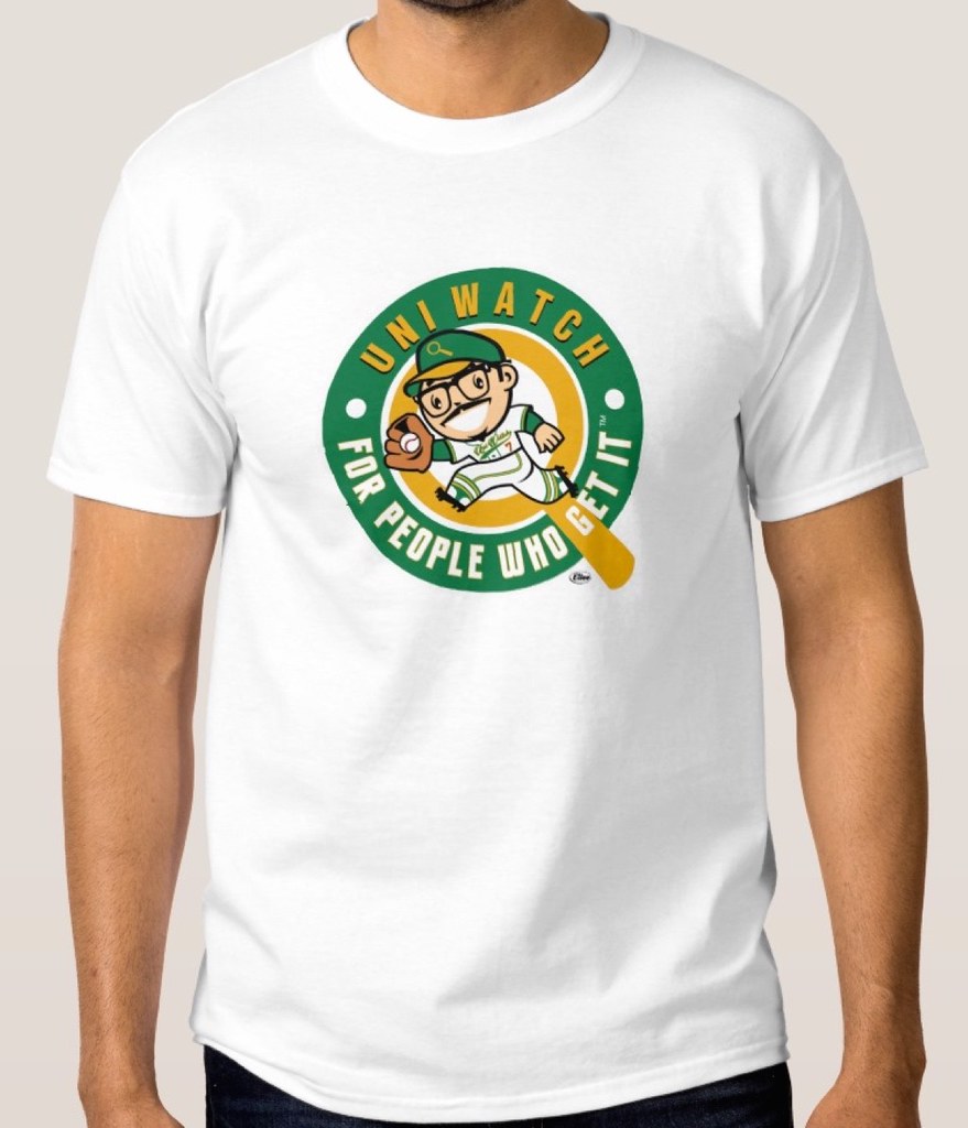
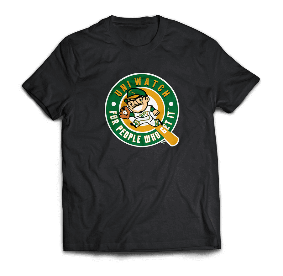
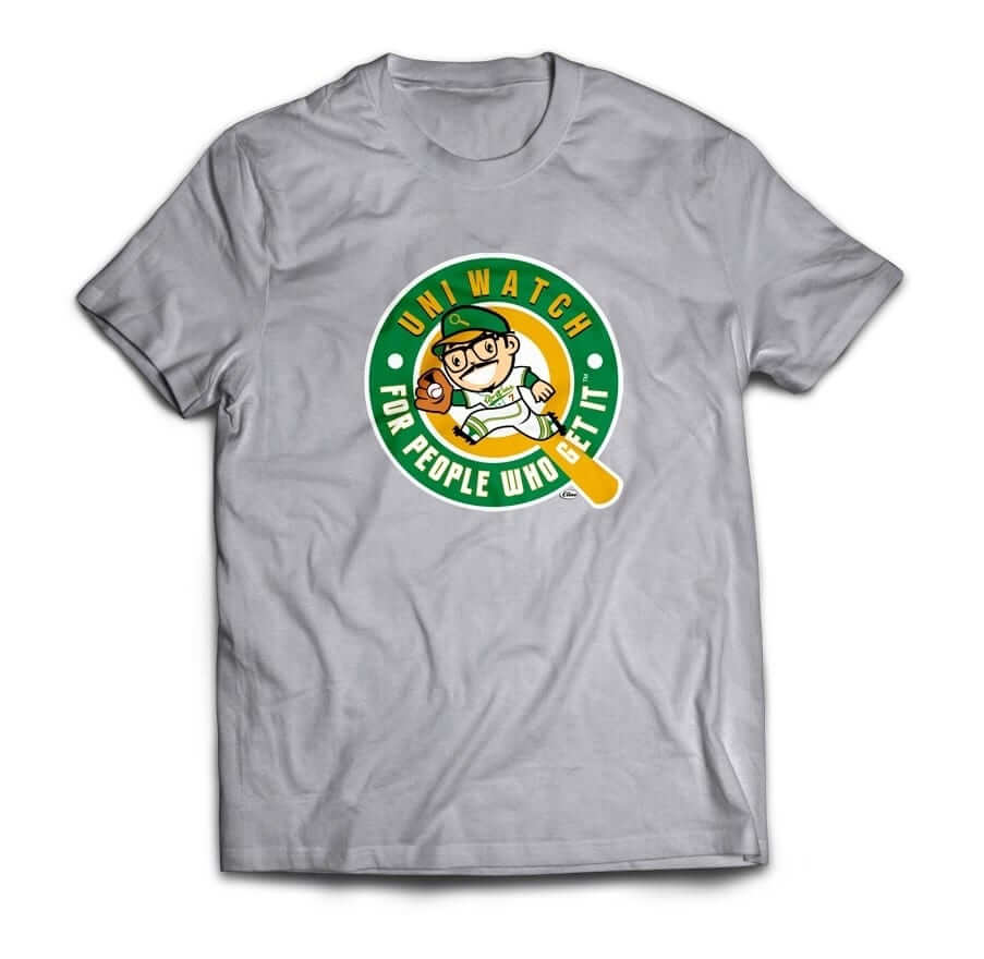
Not bad, right? We know which option we like best, but we’d like to hear what you think. If you’re interested in potentially purchasing this shirt design, let us know which color(s) you like best (you can vote for more than one):
Thanks for your feedback. If we go ahead with this shirt, it will not be part of the Uni Watch T-Shirt Club and will not be a required purchase for this year’s “Collect ’Em All” eligibility. It’ll just be a fun one-off. (And speaking of the T-Shirt Club, the next design will be hockey-themed, and I think you’ll really like what we have planned. I hope to be able to show you something early next week.)
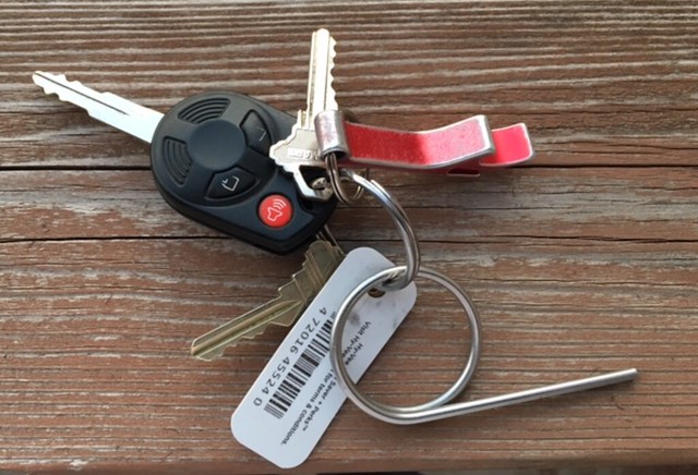
KRC update: The latest installment of my new Key Ring Chronicles column is now up. This entry (as will be the case with all subsequent entries) was written by an outside contributor, not by me. This time around it was Jeff Funcke, who happens to be a Uni Watch reader, and who’s given us the excellent story of the fire extinguisher pin that he keeps on his key ring. Check it out here.
Do you have an object on your key ring whose story you’d like to share? Send photos (preferably showing the entire key ring with everything on it, like in the photo shown above) and descriptions (ideally limited to 350ish words) here.

Sock discount: Our friends at American Trench, who’ve been advertising their excellent socks in our right-hand sidebar for quite a while now, have a new discount offer for Uni Watch readers: If you order some of their rugby-striped socks (shown at right) and use the code unirugby at checkout, you’ll get a 15% discount.
As I’ve said many times before, American Trench socks are superb. They look good, they wear well, they stay up, and they’re made in the USA. Free shipping, too! I’m proud to have them as an advertiser on the site, and I hope you’ll consider them for your sock needs. Thanks.
The Ticker
By Mike Chamernik

Baseball News: New unis for the Chattanooga Lookouts. Paul is particularly happy about the ’Nooga alternate because they got the apostrophe facing the right way. … Although we haven’t yet seen the Yankees wearing one of the new Flexbase jerseys with the buttflap and the side panels, they’re selling one (from Daniel Knag). … Louisville wore very dark-grey “heritage” uniforms last night. … Waterloo (Ill.) High School has tequila sunrise jerseys (from Ethan May). … Two trends in one: Indiana wore pink camouflage yesterday (from ChrisF3105). … The Fukuoka SoftBank Hawks of the NPB will wear “Hawks Festival” Champion Blue jerseys this year (from Jeremy Brahm). … Also from Jeremy: Fans can vote on the CPBL All-Star Game logo. … A bunch of minimalist mascot posters are for sale. … The Nats’ racing mascots will participate in a shootout during a D.C. United game on Saturday (from Tommy Turner). … I don’t think we knew this about the Spring Training hats: The caps’ interior lining — at least for the Nats — has a the same sublimated pattern used on the jersey numbers (from Chris Patton). … Two Missouri JuCos — Three Rivers College and Mineral Area College — went mono-black vs. mono-black last week (from Ben Traxel). … Here’s a really good Royals soda display.

NFL News: The Saskatchewan Roughriders updated their logo for the first time since 1985. SportsLogos.net breaks down the tweaks. … We’ve seen this before, but just because ’90s kids like me love it: Randy Moss and Kevin Garnett swapped jerseys for a photo shoot (from Ben Marciniak). … A little late for Paul’s recent redesign contest, but Tyler Bearde made some L.A. Rams helmets with metallic horns.
College Football News: Rutgers fans got excited when coach Chris Ash discussed the team’s uniform plans at a recent meeting (from Sam Hellman). … Lots of people got very excited yesterday when one of Michigan’s new Nike jerseys appeared to be visible in the background of a photo (from Peter Kuzal).

NBA News: The Bulls and Knicks went red-vs.-blue in Chicago last night — or maybe that should be rojo a azul, because both teams were wearing Noche Latina jerseys (Los Bulls and Nueva York). … The Spurs wore sleeved camo alts at home against the Heat, who wore white alts on the road. … Prior to that Spurs/Heat game, the Spurs gave a sleeved camo jersey with No. 100 to Dick Cole, a 100-year-old veteran (from Patrick Costello). … The Cavs wore blue alts at home against the Bucks, who wore white on the road (from @ZJL00). … Nike really blew it with Stephen Curry, who is currently the face of Under Armour. Curry was originally with Nike but left in part because Nike execs mispronounced his name as “Steph-on” during a meeting and gave a PowerPoint presentation that was originally meant for Kevin Durant (they forgot to swap out the names on the slides). Also, Curry didn’t want to be on the second tier behind Durant, LeBron, and Kobe. … Hawks G Dennis Schröder had his jersey number dyed into his hair — with the European-style cross on the 7! — last night. … The Timberwolves will have a new center-hung video board next year, the largest one “in the upper midwest.” … A message board user is selling a few of Cavs owner Dan Gilbert’s sport coats. … Check out this spectacular Globetrotters/Lakers photo from 1950 (from Jimmy Lonetti). … The Suns wore their purple “Los Suns” jerseys at home, with the Lakers wearing their gold home unis on the road (from Zach). … Warriors F Draymond Green didn’t have the little gold championship tab on the back of his jersey last night (from Michael Cross).

College Hoops News: Here are the uniforms for this year’s McDonald’s All-American Game. They look similar to last year’s set, but much different than 2013 and 2012 (from Phil). … Here’s the story on how Rameses, North Carolina’s ram mascot, came to be (from James Gilbert). … Andrew Cosentino sends in this 1980s Virginia Tech hoops photo. He likes the socks and floor logo; I’m fixated on the maker’s mark on both the uniform and basketball. First, does anyone remember Metro? Second, what font is the Metro wordmark in? … Alabama was wearing something similar to Adidas’s current “cummerbund”-style shorts way back in 1972 (from Rod James). … Here’s a list of the five worst uniforms in March Madness history (from Phil).

Soccer News: Canada unveiled new jerseys. … New kits for Algeria. … New uniforms for the Carolina RailHawks of the NASL. Aaron Huber isn’t a fan of the mono-color crests. … New uniforms for the Tulsa Roughnecks of the USL (from Dylan Goforth). … Good look at how the U.S. jersey and crest have evolved since 1916 (from Phil). … New uniforms for Korea.

Grab Bag: NHL players are still getting boosts from smelling salts. … The mayor of Whiting, Ind., is pushing to build the National Mascot Hall of Fame. … The Sharks, a South African team in the Super Rugby league, award Tour de France-themed practice jerseys after each match. “Polka-Dot: Player with the most spirit during the week,” explains Dan Forti. “Yellow: Man of the Match. Pink: Defensive player of the match. Green: Work Rate of the match.” … NHRA driver Courtney Force changed her driver suit sleeve colors from red last year to blue this year (from David Firestone). … Also from David: a gallery of Sprint Cup pit crew fire suits. … Citizens of New Zealand have voted to keep their current national flag design (from Ed Hahn). … These Ted Cruz football jerseys have shown up in the Ticker before, but it turns out that there are also versions for Donald Trump and Ronald Reagan, which people are wearing to campaign events (from Phil). … Here’s a look at poorly dressed sportscasters through the years (from Jason Hillyer).
I think the “metro” on the Va Tech jersey was the conference, not a brand. If I recall the Metro Conference was in effect in the 70s and 80s, members included Louisville, Fla St, etc.
link
The Metro conference evolved into Conference USA, their high point was when Memphis (State) made the 1985 Final Four. It was a non-football league, and started the decline when Football schools like Florida State and Virginia Tech joined other conferences in all sports.
No, the conference’s high point(s) were Louisville winning the NCAA Championship in 1980 and 1986, not to mention their Final 4 appearances in 1982 and 1983. Memphis (State) was the program that was always chasing Louisville in the Metro days.
Well, as usual, some great concepts for the Lions (and a few stinkers: sky blue/orange? yikes!). I’m not graphically inclined physically or digitally but before I started browsing I was looking for the wraparound stripes over the side of the helmet from the old 60s logo.
Bergeman has some ‘splainin’ to do about those Lions pants though.
Why a “G” on the left leg?
Tron D with a break!
Right leg, yes. I get that.
Left leg seems to be a mirror image. Not a “D”.
link
The Metro was a conference that existed from 1975-1995.
link
I watched the Lions video and it dawned on me…I had never heard your voice Paul. Soundin’ good buddy!
Thanks, Kyle!
But hey, my ESPN columns have all been accompanied by videos for about half a year now. You didn’t watch any of those? (I don’t blame you!)
I have not :) I prefer reading.
Unqualified upgrades for Chattanooga and Saskatchewan in today’s ticker. For both, perfect examples of how to modernize logo/unis to maintain a look over time.
Also, Canada’s new soccer jersey by Umbro makes all the new generic Nike template jerseys look much, much worse by comparison.
really liking that Rams helmet with the metallic horns..
Agreed. If that had been submitted in time for the Rams contest, I definitely would have featured it in the contest-results column.
Re: The Yankees 2016 flexbase jerseys.
They wore the pinstripe jerseys with the ‘butt flap’ on 3/2. They are currently auctioning off a jersey that shows the butt flap. (Apologies in advance for the long link)
link
I don’t think the Yankees jersey has the side panels, just the sweat tail. The pics don’t seem to have the panels, and the auction site jersey doesn’t have panels. I guess the Yankees got a special version of the jersey, to preserve the pinstripes.
The thing that gets me about the “Manifest Destiny” comment is not so much Silver’s douchiness, but the pride he seems to take in effectively killing an art form. Maker’s marks are different in that they are able to take on whatever team color is being utilized, thereby camouflaging themselves. They’re not invisible, but at least they blend in.
I’d go to the Mascot Hall of Fame…if it weren’t in Indiana.
It’s Whiting, though. It’s just around the bend from where I live. It’s a Chicago sales tax-free suburb.
I came to the comments to discuss Whiting. No way in hell. Why on Earth……?
I love the new logo that guy did for you. Although I voted for grey, I was surprised WHITE wasn’t THE color for these tees. I really thought grey would be on the ow end of the voting when I did it.
I also love those posters the guy did in the minimalist style. THEY ARE AWESOME!
The Metro on the VT jersey is not an makers mark. It is the logo of the Metro Conference. They were a member at that tiem.
Love ya Paul. Uni-Watch is a vital part of my news day. But, don’t you think it’s ironic that in the very column that you absolutely toast Silver for his stance on jersey ads (choice of words be damned) you include, in the body of your writing, a blatant plug for a sock company that advertises on your site?
Actually, no, I don’t think it’s ironic at all.
For the gazillionth time: I am not opposed to advertising; I am opposed to advertising WHERE IT DOESN’T BELONG.
NBA teams generate revenue from (among other things) ticket sales, TV rights, parking, concessions, arena naming rights, massive merchandising programs, assorted corporate partnerships (“Official [whatever] of the NBA”), foreign licensing fees, and more.
This website gives its content away for free. The only way for it generate revenue is via advertising (which is how media enterprises have traditionally raised revenue for centuries) and the occasional T-shirt. The one advertiser in particular who’s singled out today — American Trench — happens to be an operation whose product I strongly recommend, and whose owner has become a friend. When I write about them, that’s not craven monetary self-interest; it’s a sincere endorsement of something I stand behind and am proud to be affiliated with.
If you think that’s in any way analogous to Adam Silver, whose league is already awash in cash, wanting to defile his league’s uniforms with advertising, and if you further think such an analogy is “ironic,” well, that’s your prerogative. But I strongly disagree. And I suspect most others would disagree as well.
However: As I’ve said many times, I’d be happy to scrap all the advertising on Uni Watch and switch to a paid-subscription model. That way the site would look cleaner, I wouldn’t have to chase down checks from recalcitrant accounting offices, and you’d feel good knowing that you’re actually paying as you go instead of sponging off the site for free.
What do you say, Mike?
Just an FYI, Rutgers new coach is Chris Ash, not Paul.
Fixed.
Paul’s never claimed this site to be advertising, profit or promotion free. It’s his work and he deserves some profit from in. He’s made the point very clear, very often, that sports franchises are civic entities and therefore should not be used as for-profit billboards, with space sold to the highest bidder. #NoUniAds
Here’s a bit of Joe Garagiola history:
link
Awesome! Thanks for that.
I wonder if that was the first time Paul told the “Scrambled Eggs” story.
I honestly don’t know what it’s for, but should you obscure the bar code on the KRC?
Here’s a thought:
Maybe — just maybe — the guy who sent me the photo of his keys is OK with the photo appearing that way, since he’s, you know, the guy who sent me the photo.
And maybe — just maybe — he’s in a better position than you or I to know whether the bar code is problematic.
And maybe — just maybe — he wouldn’t have positioned the bar code that way or sent me the photo if he had any concerns about it.
And maybe — just maybe — he and I actually went back and forth with several iterations of the photo before arriving at this one, because we were trying to get it just the way we wanted it.
Just maybe.
I don’t understand the tone of your response to what seems to be a question borne out of genuine concern.
What is it about the internet that fosters such hostility… I can’t imagine you’d ever respond to a person like that in “real life”.
What is it about the internet that fosters such hostility…
Good question! But here’s a better one: What is it about the internet that makes people think they’re in a position to raise questions about things they’re manifestly in no position to question?
What is it about the internet that makes people raise questions about things they’re manifestly in no position to question?
That’s a breathtaking statement right there. It’s an invalidation of the entire journalistic and critical pursuit, a nice distillation of the Vlad Putin school of intellectual inquiry. Adam Silver no doubt agrees with this sentiment as applies to outsiders like Paul questioning his business decisions.
But it’s also a question that can be answered: Paul has deliberately fostered a culture of open critical input among his readers. That’s “what it is” about this platform that would lead a reader to raise the question Lance raised. And it’s a perfectly legitimate question: Key fob barcodes typically tie into customer-rewards programs or libraries, and those systems tend to have very weak data security and also tend to be tied to the owner’s home address. Which may seem like no big deal, but the photo also includes all the information a person would need to duplicate keys to the owner’s home. (This is a real thing, and actually happens in real life, such as when a newspaper photo permitted duplication of the master keys to all TSA-compliant luggage a year ago: link.) Neither of these two facts is obvious or universally known, so raising an informed question about security is no more out of line than other critical input Paul welcomes.
Now, maybe Paul and Jeff are aware of the potential safety vulnerability inherent in the photo, and know that the fob bar code is not tied to any data system that could expose Jeff’s personal information. Or maybe they know that those are not keys to Jeff’s residence. Or maybe they’re aware of the risk and don’t care. All possible and valid! But it’s at least as likely that either Jeff or Paul is not aware of the potential risk. Either way, a person who is aware of the risk has no evidence to make assumptions either way about Paul or Jeff’s knowledge or intent on this narrow point. Raising the issue as a question, as Lance did, is a responsible thing to do. If Paul is aware of the issue but knows either that the photo does not carry the potential risk or that Jeff doesn’t care, fine! All Paul has to do is either (A) Not respond at all, because he knows what he’s doing; or (B) Answer with some modicum of generosity and respect, something along the lines of, “Appreciate your concern, but not an issue in this case.”
It’s probably been noted here and I missed it, but USWNT has switched from a triangle arrangement to a straight line for its three championship stars above the new USA crest:
link
I suspect that this means that Nike (I’d say the USSF, but it should be obvious by now who really owns team USA’s visual identity) regards the placement and arrangement of USWNT’s championship stars as just another element to be changed at whim, rather than a fixed element around which to build tradition and identity.
A quick Google search of Germany’s and Brazil’s WC crests show that the stars conform to the shape of the crest, circular for Germany and curvilinear for Brazil’s shield. That the USWNT stars are straight to match the new crest does not surprise me.
The PL/UW shirts lose a bit too much of the magnifying glass portion of the logo. With nothing *under* the glass, it sort of looks like PL in a frying pan.
Then again, I guess it just puts an added spin on the phrase “for people who get it”.
Frying pan — I love that!
Maybe we’ll start calling this one the frying pan logo. Now, what should we cook in the pan (besides me)?
Awesome nickname Dee Gee!
While it is in-line with how you run the site, I find your redesign contests very frustrating (and not just because of how I used the vertical stripes in a unique way and didn’t get mentioned. Well, that’s part of it.)
There were some really, really nice designs that did not get mentioned in the article at all. I imagine people put in a ton of time creating beautiful logos and uniforms and you just mentioned Tom Bierbaum’s work for the millionth time instead (no offense, Tom.) Again, I get it: you’re quirky and the site and the contests reflect that.
I enjoy seeing your winners, but I would also like to see a contest component where people other than you could vote on the designs to validate the designers’ efforts, kind of like those that Phil used to run.
We used to do voting/polls for my ESPN contests, but ESPN.com no longer has that functionality, surprisingly enough.
As I’ve made clear all along, contest results are decided upon by the Uni Watch Executive Committee, which has a membership of one. I appreciate everyone’s efforts (including yours, Bobby — thanks for submitting!). But effort in and of itself does not correlate with quality or interest. The designs that I choose to highlight are the ones that made the biggest impact on me. In this particular instance, that included a futuristic BFBS design, which hardly fits the “quirky” profile you’re trying to impose upon me.
As for Tom Bierbaum, he’s been relegated to the Honorable Mention section for the past two contests (or maybe three, I forget), so it’s not like I’m giving him a massive platform. But yes, I’ve liked his stuff, so I’ve continued to mention it. If he submits something I don’t like, I won’t mention it. That’s how it works: The stuff that I really like makes the cut; the stuff that I don’t like as much, or that doesn’t make as big of an impact on me, doesn’t. I don’t mean that to sound harsh — it’s just reality.
Since Bobby’s taken the trouble to comment on this, here are his designs:
link
link
link
First off, thank you for the thoughtful response.
I also want to clarify that by “quirky” I really meant “reflective of your personal tastes, which are quite particular.” And the site and contests have every right to be, since they are your projects. I guess I just wish our personal tastes had more in common.
I guess I just wish our personal tastes had more in common.
I wish they did too — really!
I totally get that it can be discouraging to work on something and then not see it recognized, or to think that the deck is stacked against you because the judge and jury (who are the same person) don’t see eye-to-eye with you. I’m genuinely sorry about all of that – really. I hope it won’t keep you from submitting more designs for future contests.
For what it’s worth Bobby, your design jumped out at me. I liked the white helmet with the unmatched stripes. The Lions could do a lot worse.
Thanks, snowdan, I really appreciate it. Even though I really was not looking for adulation, it is always nice to get a compliment!
Is it just me or does the G on the bat on the PL/UW logo bug anybody else? Or maybe its the E next to the G. I don’t like how it touches the bat. I don’t know if there is an option to fix it though.
I agree. I really don’t like how the G is outlined in a different color on the original design (though I get why). It’s a little better on the “simpler” T-shirt version, but still doesn’t seem right. I also agree that the E touching the handle doesn’t look quite right, either.
All of that is a nitpick of a really fun design that I really like (those items aside), but those details are a bit distracting. I’m not a graphic designer by any means, so I’m not sure exactly how you’d fix that.
I agree that the “G” is vexing. I’m not 100% pleased with it myself, and I was wondering if people would bring it up today. Now that several of you have, I’ll talk with Larry and see if we can come up with a better solution. Thanks for your feedback!
i’ts sposed to do that… Visual irregularities to make you actually read the label, Wise potato chips? Bohemian Beer? Oh never mind.
I will conform to your conformity request. All kidding aside, these are very good points and will adjust to satisfy as best I can.
We aim to please.
One of my favourite lines of Joe Garagiola was from the 1975 World Series, when Bill Lee threw his blooper or Eephus pitch for the first time: “That ball changed time zones!”
Watching the Lions design video and seeing the results, I just had a “Damn it!” moment. Not because of the results, but because of the very RIDICULOUS design idea that just came to me and one I wish I’d have thought of back when I was designing my entry.
Randy, go ahead and send it in! If it’s good, either Phil or I will definitely showcase it here on Uni Watch.
Hockey players and smelling salts…reminds me of when Tyler Seguin threw his over the glass into a guy’s beer
link
I’ll buy the t-shirt with cartoon Paul on it (I mean, who wouldn’t want one), but I’d prefer it in any color other than white.
Really? It think it looks best in white….Makes the colors pop!
I like the t-shirt..it is ambiguous enough to look like me!
And Paul is a good looking dude!
As a hockey guy, any discussion of bad sportcaster wear has to include Don Cherry (any era) and the Hockey Night in Canada baby blue logo blazers of the 1970s.
link
link
And, as Phil pointed out on Twitter last night, Rick DiPietro seems to have moved into this deliberately awful space
link
The shirt sponsor for the Tulsa soccer team appears to be Oculto Beer. The logo is very interesting. A google search reveals that it is beer “kissed by agave,” and a sub brand of Anheuser-Busch. Tequila-flavored beer? OK
Not a sponsor — just an advertiser. Let’s please maintain that distinction.
Is the shirt advertiser paying for the shirts for the soccer team?
Of course not. They’re just advertising. And if they stopped advertising, it’s not as though the team would suddenly be unable to afford to produce the shirts. This is not advocacy or essential support (which is what a sponsor provides); it’s just advertising.
I’m not a fan of jersey advertising, of course, but in this case I’m not decrying it (that’s a separate argument) — I’d just like it to be described accurately, instead of it having a warm-fuzzy term like “sponsorship.”
I think it would definitely be better to call it what it is – advertising.
Excellent point Paul. The nomenclature “sponsor” comes from Europe, but they really are just advertisers, unless they own the team.
Redesign results days are some of my favourites on Uni Watch and today is no exception!
Love Alex’s use of the circus font, a simple change and great look.
Bobby Tighe’s is the one I would like to see on the field, reminds me of the current Dolphins uniform which has really grown on me. A nice modern version of the team’s look.
Thanks a lot, Wafflebored! You rock. I appreciate the kind words.
This seems apropos:
“Baseball is a game of race, creed, and color. The race is to first base. The creed is the rules of the game. The color? Well, the home team wears white uniforms, and the visiting team wears gray.”
~Joe Garagiola
I first looked at the mockups for the Chattanooga Lookouts jerseys, and I thought it was interesting that they went with front numbers on the wearer’s right side. I can’t remember if I’ve ever seen that with the teams full name (not just a logo) on the front of the jersey, especially in the major leagues.
Then I looked at the photo in the linked article, and it showed the jerseys with the front number on the wearer’s left side. However, one of the little girls is wearing some team merch with the front number on her right side.
My guess is they originally were going to have the front number on the right side, but then switched to the left side…but they had already printed out the merch before they made the change for the jerseys.
On these very pages, the Cincinnati Reds pinstriped grey uniforms were critiqued on their inconsistency regarding the placement of the front numbers. If the graphic on the front of the jersey is balanced, there is no “correct” side for the number. We are simply accustomed to seeing the number on the left; unless there is a crest or insignia centered over the heart, then the number is on the right to fill the empty space.
Did Steph Curry really get offended that they mispronounced his name? What a clown.
Yeah, imagine not wanting to do business with a company that can’t be bothered to learn how to correctly pronounce your name.
I disagree. This is tens to hundreds of millions of dollars and they didn’t take the time to learn his name. The presentation had Kevin Durant’s name on one of the slides. The devil’s in the details……
It really has nothing to do with the millions. It’s just basic courtesy, diligence, and professionalism.
They’ve been spelling my name wrong at work for the past year and a half. I’m not gonna get all sensitive about it. It’s my penance for having such a dumb name.
I don’t know why you’d serve a penance for having a difficult name to spell.
I don’t know why anyone would want a difficult name to spell.
For the t-shirt design shouldn’t the two white dots in the outer ring be grommets?
R.I.P. Joe G.
Joe Garagiola also used to host a daytime game show or two… Joe Garagiola’s Memory Game was one
link
Can we get Ebbets Field Flannels to make a custom version of the hat Paul is wearing in the caricature?
Even better, put an interlocking U/W on it. Maybe add a little maroon?
From Silver I would have respected a more direct “we are money grubbing capitalists who have no respect for past NBA traditions and the heritage of our team brands…”
The Lookouts uniforms look great except for one thing. The numbers are on the wrong side. To me, when numbers are under the first few letters of the wordmark, it looks out of sorts.
I used to collect minor-league baseball caps and I had a Lookouts cap. My dad liked it so much, he ordered one. And he doesn’t wear caps.
So…do you think it’s just coincidence that his name is Adam…Silver?