So here’s something interesting: When the new spring training caps were announced back in late January, the Indians’ design was shown like so:
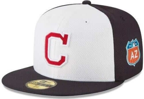
Note the white outline on the “C.” And of course this cap, like all of the Cactus League caps, included the “AZ” patch on the side.
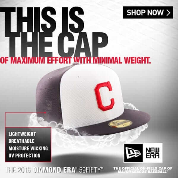
But New Era then began running an ad showing the “C” logo without the white outline:
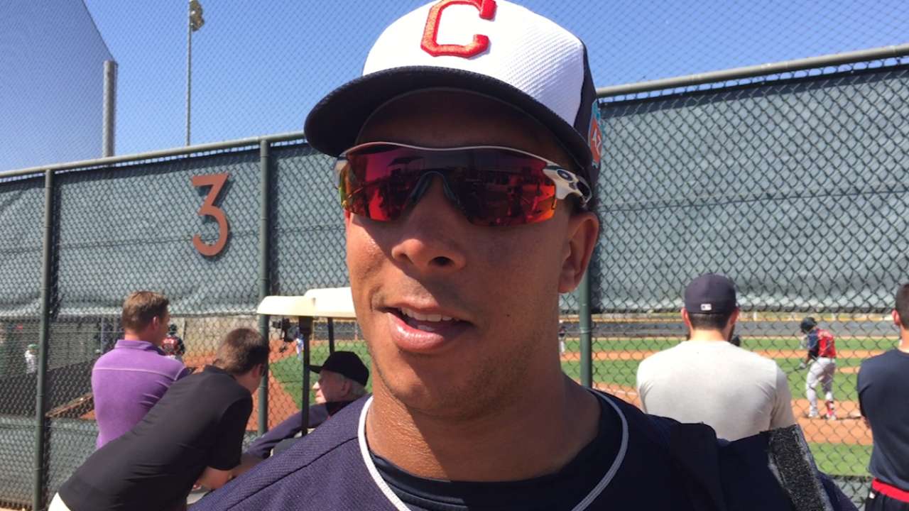
The second cap — the one without the white outline — is the one the team has been wearing this spring (click photos to enlarge):


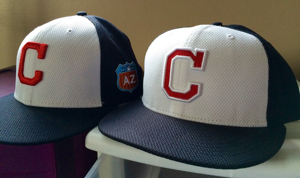
Although the cap without the white outline is the one that the team is wearing, it’s apparently hard to find on the retail side. “I have been unable to find it anywhere except at the Indians’ merchandise shop at their spring training site in Goodyear, Arizona,” says reader Chris Frate, who brought this situation to my attention. “The shop at Progressive field did not have it and neither do any of the usual cap vendors.”
Chris says the cap with the white outline is easy to find — but it usually comes without the “AZ” patch on the side. Weird!
As you know, I don’t much care about spring training caps or retail caps, but this does seem to be an odd situation. Chris ended up buying two caps — one with the white outline and one without (click to enlarge):
One thing’s for sure: With or without an outline, the block-C is soooooo boring. Anything’s better than Wahoo, but the Indians really need to come up with something more dynamic.
ITEM! Uni Watch live appearance: The awesome Brooklyn arts magazine Cabinet periodically hosts “Talk Show,” a live event formatted like a TV talk show (but with no TV cameras), with the host — a guy named David Levine — interviewing guests about their unusual jobs. The next installment is this Thursday, March 24, 7pm, and David will be interviewing a locksmith and a gossip magazine fact-checker. In addition, I’ll be appearing as a “Minor Obsessive” (a regular feature of the show) and presenting a short presentation entitled “The Evolution of Baseball’s Pants/Hosiery Dialectic.”
It’s fun and it’s free ”” you should come! Details here.
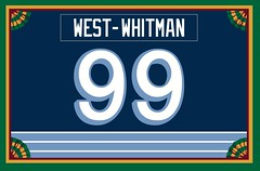
ITEM! Membership update: Membership orders have once again slowed to a crawl, but there have been a few new enrollees in recent weeks (including Bryan West-Whitman, whose Penguins throwback-themed card design is shown at right).
Wanna sign up for your own custom-designed membership card? You can do so here. You can also see all the cards we’ve designed so far (over 1700 of them!), and you can also see how we produce the cards.
ITEM! Key Ring Chronicles debut: Key Ring Chronicles, the new project that I described a week ago, has made its debut on the McSweeney’s site today — check it out here. It’s just a reprise of the story about my quarter, which I’ve told before, but we’ll have fresh content later in the week.

Click to enlarge
ITEM! PermaRec update: The gorgeous stationery design shown above is one of two letters I’ve examined in the latest PermaRec entry. Get the full scoop over on Permanent Record.

ITEM! Another year up the hill: Today is my birthday. Fifty-two is kind of a boring number, but next year will be a prime number, so there’s that to look forward to.
Protocol dictates that I mention the following things regarding my birthday:
• Numerically speaking, March 21 is 3-2-1. My father’s birthday was Jan. 23 — 1-2-3. I like how our birth dates bookend each other like that.
• March 21 is the first full day of spring.
• If you care about astrology, March 21 is the first day of Aries, which is the first sign in the Zodiac cycle. I don’t actually care about astrology myself, but being the first day of the first sign is one of those little bonus-point things that made me insufferably pleased about my birth date when I was a kid.
• When I turned eight or nine years old, we had some sort of outdoor activity planned for my birthday, but it got rained out and I was inconsolable. My father, thinking quickly, said, “Don’t you know? Rain on your birthday is a sign of good luck in the year to come!” ”” a very sweet lie that he came up with on the spot. (He was really good with that sort of thing.) In the 40-plus years since then, it has either rained or snowed on my birthday every single year except once. (One time it also hailed.) It’s something I now look forward to ”” the annual birthday good-luck precipitation. We already had some early-morning snow today in NYC, so I’m primed for a good year.
• I got my Brannock device tattoo on my 39th birthday, so it is turning 13 today.
• I share my birthday with two of the greatest bluesmen who ever lived: Son House and Otis Spann. I’ll be playing some of their records today.
• I also share my birthday with one of my best friends, Matt Weingarden (known to NYC soul music aficionados as Mr. Finewine). Matt and I were born not just on the same day, but in the same year. Last night the Tugboat Captain and I got together with Matt and his wife, Rebecca, for birthday-eve drinks at a New Jersey roadhouse, followed by dinner at a nearby steakhouse. A great night!
• I also shared my birthday with my sister-in-law Cass, who unfortunately died from cancer some years ago. So although this is a celebratory day for me, it’s also a day when I’m thinking about Cass and, especially, thinking about my brother, Roy, who misses her more than anything. I’ll be giving him a call today to let him know he’s on my mind.
Sometimes I like to goof off on my birthday, but I can’t do that this year because I have a bunch of ESPN work to deal with. I’ll be meeting up with some friends for drinks and dinner, though, so that’ll be nice. At some point I’ll look around the room and think, as I do each year on this date, how lucky I am to have so many great people in my life, which is a very nice thing to feel on your birthday — or any other day of the year.
Okay, that’s (more than) enough. Thanks for listening.
The Ticker
By Paul

Baseball News: Interesting 1961 shot of Teddy Ballgame and Yaz, with the latter wearing a wedding band (from J.D. Mbængle). … Midway down this page is the news that the Rays are no longer requiring their minor leaguers to go high-cuffed, and are also allowing them to have facial hair (from Cork Gaines). … While looking for something else, I came upon this shot of an Oregon softball player who goes a little overboard with the eye black. … Yankees C Brian McCann came to bat yesterday with a logo-less batting helmet (from Brian Ites). … One observer’s opinion: Cubs manager Joe Madden has the best dress code in baseball (thanks, Brinke). … Great moment during yesterday’s Pirates/Jays spring training game: switch-hitter vs. switch-pitcher! (From Chris Flinn.) … New mono-gold alternates for Purdue. … The restaurant where I ate last night had this spectacular Joe DiMaggio photo on the wall. Don’t think I’ve ever seen that one before. Great, great shot. … New uniforms for Penn State Behrend (from Greg Reedy). … Good spot by Patrick O’Neill, who noticed that several Reds players didn’t have the MLB logo on their rear belt loops yesterday.

Pro and College Football News: “I have an old friend who is an assistant NFL equipment manager,” says Jake Jahimiak. “He just got back from the annual equipment manager meeting and says the Vicis football helmet was discussed at great length. They are saying this helmet will ‘change the industry’ of football helmets. The helmet has not been field-tested yet, but the NFL will be pushing teams to mainly carry this helmet at some point in the future, and it might be something that’s worked into a future collective bargaining agreement.” … I’ve been saying for years that the one of the biggest and by far the most underrated change in football over the past generation is the rise of super-sticky gloves, and now the league is looking into establishing to some glove standards (thanks, Mike). … Man, can you believe NFL jerseys used to look like this? That’s former Giants DL Leonard Marshall. The photo was on the wall of the restaurant where I ate last night. … Amazing 1980 shot of former 49ers QB Steve DeBerg being fitted with a microphone and a speaker due to a case of laryngitis (from Matt Edwards). … Check out the awesome helmet Xavier used to wear (from Kevin Lancaster).

NBA News: Officials removed a game ball from Saturday night’s Rockets/Hawks game after they caught Rockets C Dwight Howard using stickum on his hands, which had offset onto the ball. Video here (thanks, Mike).

College Hoops News: Ohio State wore red at home in yesterday’s NIT game. That’s because Florida was seeded higher but couldn’t host any games due to arena renovations.

Soccer News: Three quick soccer items today: a new jacket for USA soccer, a new home jersey for Australia, and a new road jersey for Uruguay.

Grab Bag: When goatee-clad Republican presidential candidate Ben Carson dropped out of the race a few weeks ago, I wrote about this ensured that America would be be extending its longstanding streaks of not having had a president with facial hair (the last one was William Taft in 1913) or a beard (Benjamin Harrison, 1893). But! There’s talk that if Hillary Clinton wins the Democratic nomination, she might pick a running mate who happens to have a goatee! Who was our last bewhiskered veep, you ask? It was Charles Curtis in 1933. And our last bearded veep? That would be Charles Fairbanks in 1909. So maybe those streaks will end. And remember the vice president is always just a whisker away from the presidency. … More potential problems for the Wounded Warrior Project. To my knowledge, Under Armour — which has a strong partnership with WWP — has had nothing to say about all of this. Lovely. … The Salisbury men’s lacrosse team has a big team mascot logo on the back of their jerseys (from Kevin Mueller). … Orchestras are trying to update their dress codes (from Ilana Hardesty).

What Paul did last night two days ago: Longtime readers may recall that my friend Amy and I took a trip to Scotland in 2010. One of out best encounters during that trip was a stop at the House of Automata, a completely amazing workshop/museum devoted to vintage automata (mechanized figures driven by springs and gears). The host, Michael Smart, showed us around and also told us that he was a consultant on a then-upcoming Martin Scorcese movie whose plot centered on a kid and an automaton. That movie turned out to be Hugo, which was released in 2011. Amy and I went to see it (pretty great movie, right?) and quietly cheered when we saw Michael’s name scroll by in the closing credits.
Amy now lives in eastern Pennsylvania, but she recently got in touch to let me know that there was an automata convention taking place in Morristown, New Jersey — almost exactly halfway between where she lives and where I live. So we agreed to meet there this past Saturday.
It was amazing! So many cool people with such amazing wind-up devices — some of them old, some of them contemporary. I was wondering if Michael Smart, the guy we met in Scotland, would be there, and he was! So we went up and said hello and told him how we’d cheered when we saw his name in the Hugo credits. He sort of pretended to remember us, although I don’t think he really did (which is perfectly understandable — it was just a 90-minute encounter nearly six years ago).
I shot video of some of the attractions. Believe me, this is just the teeniest tip of the iceberg, but at least it gives you a little taste:
We also saw some presentations, including an excellent one about the restoration of what is probably the most famous automaton of all: Maillardet’s automaton, which was the inspiration for Hugo. It currently lives at the Franklin Institute in Philadelphia, and I may have to go visit it there — look what it can do!
There was lots more, including a ton of self-playing musical instruments. Such a cool day!
Happy Birthday, buddy!
Happy birthday, Paul! I hope there’s cake. Or meats.
Happy Birthday Pee El!
Hope this year is a memorable one for all the best reasons.
Proofreading: “who’s Penguins throwback-themed card design is shown at right” In addition to ‘whose’, that jersey wasn’t a throwback. Fauxback, maybe.
That aside, Happy Birthday, Paul!
Happy birthday Paul!
I am J.D. Mbængle. That’s no first-time Ticker submitter. Changed my name to make it a little harder for future employers and clients to find me on Facebook. J.D. and MBA are the degrees I earned, my first and middle initials are M.B. anyway, and the æ ligature is just straight up obscure. And that’s how I formed my new Facebook name. But that’s me with the Yaz photo in the Ticker.
Tom Perez’s goatee game is not strong.
My longshot bet for Hillary’s veep, Senator Jon Tester of Montana, is known to sport a van dyke from time to time:
link
He’s even featured bearded photos of himself in his campaign ads. Most members of Congress who grow a beard from time to time get clean-shaven during election years.
he sports a mean flattop too.
link
Happy Birthday Paul…a big CHEERS to you!!!
No hockey two straight days?
I agree, the Cleveland cap is bland. Very bland.
But from a design standpoint, I think topping something as iconic as Wahoo is going to be very tough. I don’t fully agree with “anything’s better than Wahoo” for that reason.
99.5 of all the MLB hats are boring.. same with the jerseys themselves..
if the teams try to deviate and make something new and “innovative” they get mocked for bucking tradition
99.5 of all the MLB hats are boring.. same with the jerseys themselves.
Translation: You don’t like baseball uniforms.
That’s fine — you don’t have to like them — but it pretty much removes you from the discussion, because your position is absolutist. Please allow the rest of us to discuss and debate the nuances of the baseball uni genre. Thanks.
i actually like some baseball unis.. but i hate how the “purist” thing that the teams should only wear white or grey.. i like the “softball” tops much better. also don’t get why they went away from the pullover look in favor of a button down one..
i actually like some baseball unis..
So now you’re trying to walk back your “99.5%” statement?
OK, but please be more thoughtful when commenting. If you say, “X,” you’re going to be taken at your word. If “X” isn’t what you actually mean, don’t say, “X”; say what you really mean.
also i say that 99.5% of the mlbs hats are boring because the majority of them are a shade of blue or red and have letters.. i wish more teams would have their mascots or character design on them..
i think MILB has way better hats because they take chances and try to be unique
i think MILB has way better hats because they take chances and try to be unique
Question: Are you also OK with the fact that MiLB caps are constantly changing, and that the “unique” designs basically disappear after a season or two?
I’m not saying that’s a good thing or bad thing — just that it’s characteristic of the MiLB cap scene, so I’m wondering what you think of it.
i am not walking back.. my first part of the statement was geared toward MLB headwear
the second half was geared toward the uniforms as a whole which i did not make any quantifying statement on
i have no problem with that. i think the designs are neat to look at. i am not going out and buying up said hats because they changed their look. also just because team changes designs doesn’t mean there aren’t ways find the old design if one was so inclined to purchase that piece of headware
and as for this particular situation.. the one on the left (raised logo w/o the outline) looks much better than the other one
I think there is nice middle ground where a team can push the limits of “too much”. If the DBacks had kept their pants normal, their new unis wouldn’t be so bad. Tampa’s faux-backs are awesome despite being completely ridiculous.
The problem with the Indians is that they really don’t have much of an identity anymore. They have a mascot that can be considered racist, so they have to toe that line. They don’t have much of a winning team as of late. I mean, how do you give a team like that a new identity? How do you inject new life into that franchise?
what do you consider a winning team though? sure they haven’t won a World Series but they still hold the most AL Central Titles at 7 since it’s inception in 94. they are hardly ever seen as one of the worst team in baseball and hover right around .500 most years if not better.. so it’s not like they are Browns or Cavs without Lebron terrible.. they just get wrapped up in that category because they are in Cleveland
Todd, I think the Tribe own one indelible identity: The navy jersey and white pants. Of all the red+navy teams, that shirt & pant combo is unmistakably Cleveland’s.
“99.5 of all the MLB hats are boring.. same with the jerseys themselves..
if the teams try to deviate and make something new and “innovative” they get mocked for bucking tradition”
You mean make them more like the minor leagues, with angry cartoon characters?
I don’t mind the block C. It’s clean.
Why can’t they go with the funky 70s “C?” It’s from the Wahoo era and pretty iconic in its own right.
link
Stick the chief’s feather on that baby and they’d have a cap that tops Wahoo:
link
Personally, I like the block-C cap precisely because it’s plain. Plainness or simplicity isn’t a design fault on its own. For a team in Miami or Los Angeles, it would be a terrible cap logo, absolutely. But Cleveland’s civic identity and sporting aesthetic leans toward the straightforward. Simple and understated but still bold. You literally cannot get plainer – or more boring – than the Browns and their no-logo logo. And a team doing what the Browns do in New York or Seattle would be a perennial contender for worst-designed team in the history of pro sports. But that look is perfect for Cleveland. The block-C expresses that sort of blue-collar brawny straightforwardness to me.
But putting an outline around it, especially that white on white, is all kinds of bad.
feels too 90’s-esque for me. The styling just doesn’t feel right to me.
While I never had a problem with Wahoo, I think the crooked C may have been my favorite hat. I would welcome its return!
We’ve worked over the Indians pretty good on these pages; they only have themselves to blame for chucking away uniform designs right and left. But unlike, say, the Brewers, the iconography and colors have remained the same all these years. The Jacobs Field-era uniforms served them well, even if they’re not my favorites. The scripts could stand some liposuction, and then I would replace the Wahoo hats with the ones they wore in 1978. A solid red road uniform would warrant consideration, too, but not with the “caveman” design.
I think if they just added a white outline to the current hats they would be so much better. But I grew up with the post caveman block C caps.
Personally, I hate the caveman font and caps.
I really dig their dark blue hat with the dark red block C. Looks like it is from 1935 yet still looks good today.
Happy Birthday, Paul.
Maybe you’ll get a nice, new deck of playing cards as a gift.
Happy Birthday Paul!
That DeBerg boom-box backpack must be for practice, right??
Ain’t no way that thing made the field for a game.
it did…. and later he used the same rig in a broncos game when he got hit in the throat and it paralyzed a nerve in his vocal chords… i watched the game… sounded weird….
Wow! A quick google search led me right to the lede here on Uni-Watch from October 2011. It’s nuts!
link
Happy Birthday, Paul!
Thanks for the reminder of how effin’ cool automata are. Curiosity led me to this site:
link
Yeah, that guy had a table at the show. Really great stuff! Nice guy, too.
Happy birthday Paul, hope you can make it upstate to Auburn to the Hunter Dinerant. The famed Genesee Beer sign is right across the street. Enjoy your birthday.
I have family in Auburn. I know exactly where that is!
Happy birthday, Paul!
Happy Birthday!
Happy Birthday!
Great Notch Inn! Spent a few college nights over there when I was at MSU for undergrad.. interesting crowd.
i understand why they are doing it of course, but that new helmet’s upper facemask area is going to really encroach on the logo space. wonder why they can’t find a way to cut down on some of that facemask at the top corners. i know it fits the flow of the face opening, but jeez…
Steve’s Sizzling Steaks?
Kee-reck.
Typo in opening paragraph.
….thanks for bringing this situation to my attnention.
Fixed.
Happy Birthday Paul
The city of Cleveland really does need help with their sports logos but least they are living up their nickname, the Mistake by the Lake.
Great Notch Inn (Rt.46W Woodland Pk)
Steve’s Sizzling Steaks (Rt.17S Carlstadt)
Both in NJ
You actually show three versions of the Cleveland cap. The first from January is flat red with a raised white outline. The second, from the New Era ad, is raised red with a flat red outline. And the third, from the Spring Training pics and the one Chris (not me) purchased, is raised red, no outline.
Route 52!
Fishkill, NY!!
(…and all the other towns the lovely road cuts through Dutchess, Putnam and Orange counties!)
I have a potential explanation for the Indians’ cap discrepancy. If I had to guess, it’s in the ease/difficulty of construction.
When New Era assembles a design like the mock up of the Tribe’s 2016 cap, it goes about the sewing process a bit differently. Think back to when the Diamond Era was first introduced (2013). Many of the logos had a raised outline and flat logo. The way that is put together is the logo is constructed in the same Diamond Era fabric as the cap, cut out, and sewn on. Then the outline is stitched on around it as a raised embroidery. It ends up looking pretty cool, but I’m sure it’s a longer process.
The caps the Indians are wearing are just a regular ol’ raised embroidery like you’ve been finding on caps since the ’90’s. So in short, it could be the Indians, New Era, or both, decided to just do the easier thing and ditch the white outline, making their caps easier to produce. OR, New Era made a mistake in mass production. Either way, that’s the difference in how they’re put together.
And also: Happy Birthday, Paul!
Happy Birthday, Paul! My wish for you is a cake with fifty-two grommets.
Happy birthday Paul from a fellow 52er.
Idea for Cleveland: I know they’ve done a cap with the script ‘I’ from their wordmark before. Could they do a cap with the script ‘C’ they used to use on their road uniform? link
oh god no..that’s one pudgy awkward looking c…
though that does look like something Nike would put out in the early 00s
Happy Birthday from north of the 49th! All the best from DJ Doc and MC Mic Control…we’ll send you a birthday shout-out from the Impending Loom…streaming live from 8-10pm PDT tonight at link
Well, we played a few songs in your honour:
Lighthouse – Lighthouse Live (at Carnegie hall) – one fine Morning
DJ Food – Kaleidoscope – The Aging Young Rebel (feat. Ken Nordine)
…and a couple of random songs involving meat! Hope you had a good one!
Happy Birthday, Paul! Thanks for the awesome Automatacon video.
New uniforms for Penn State Behrend (from Greg Reedy).
Better than most most MLB uniforms nowadays, if you ask me. I love that typeface.
Why am I not surprised that two of my favorite Brooklyn obsessives not only share a birthday, but are pals? ;-) Happy birthday to both you and Mr. Finewine!
Thanks. Matt and I have been pals since 1995, and I’m proud to count him among my very best friends. Great guy, great DJ, great friend.
Funny to remember the Indians once used the wishbone “C” that is now considered intellectual property of the Cincinnati Reds and the Chicago Bears. It leads me to believe the Wishbone-C was thought of as common property, like “Kilroy was here” graffiti. (The thing is, nothing looks more like a wishbone than the “Y” on the Yankees’ hat.)
One thing’s for sure: With or without an outline, the block-C is soooooo boring. Anything’s better than Wahoo, but the Indians really need to come up with something more dynamic.
If the C were bisected by a vertical red feather, that would look pretty nice, don’t you think?
I’m not in favor of anything that draws upon Native American imagery. But that’s just me.
Take the C out entirely, just use a feather.
FWIW – the official Style Guide files show the Indians’ BP cap mark sans outline.
The diamond era caps with the AZ (Or FL) patch are spring training caps.
The caps with no patch are going to be the batting practice caps this year. Teams will also have the option to wear them for games.
It is possible that the Indians may indeed wear both versions this year. We may see the one with the white outline and no patch debut as the BP cap when the season begins.
Was just going to write a similar thing. Having gone through each team on mlbshop a month ago(most ST caps seem to be out of stock now and do not show), not every team has a patch-free version, and the ones that do specifically label them as “Game Diamond Era” caps.
Happy Birthday Paul! link
Paul…wishing you the Happiest of Birthday’s…and many more…!!!
Happy Birthday Paul!!!
The debut installment of Key Ring Chronicles is up:
link
The NFL is looking to set standards for glove tackiness? From the article:
“The challenge is the tackiness, and the gloves now are so tacky that it’s taking away from the true skill level. ”
I couldn’t agree more. Nothing ruins my Sunday more than an acrobatic one-handed catch, or watching a player pull one in that should have been incomplete.
No-Fun-League indeed.
The couple of references to “raised” letters above “raises” an issue that I’ve wondered why it hasn’t been discussed. Obviously, the issue here i amore than white outline vs. no outline. The cap on the left with the raised “C” is an example of what I believe is referred to as “puff stitching” that emerged and became the standard in the mid to late ’90’s. The batting practice hats that came out 2 years introduced a logo with a raised outline and flat letter creating a “sunken” look. When I go t my pirates hat, I was impressed and look sand saw most of the teams had that “sunken” template. Was surprised that such a significant (though admittedly subtle) change did not draw more discussion….
The couple of references to “raised” letters above “raises” an issue that I’ve wondered why it hasn’t been discussed. Obviously, the issue here is more than white outline vs. no outline. The cap on the left with the raised “C” is an example of what I believe is referred to as “puff stitching” that emerged and became the standard in the mid to late ’90’s. The batting practice hats that came out 2 years introduced a logo with a raised outline and flat letter creating a “sunken” look. When I got my pirates hat, I was impressed and look and saw most of the teams had that “sunken” template. Was surprised that such a significant (though admittedly subtle) change did not draw more discussion….
As an Indians fan who intensely dislikes Chief Wahoo, I think that the folks at fresh brewed tees handled it pretty well. The design could do without the under brim stuff, but I would definitely love this.
link
I’m a huge Tribe fan and admit I love Chief Wahoo. My favorite Indians hat is what’s now their alternate road cap, solid navy with Wahoo. Ironically, unlike a lot of Wahoo detractors, I also really like the primary road cap. I just don’t like the block C as a primary identity and I really dislike the red cap and the red-brimmed home cap.
as a tribe fan i feel that the block C needs an outline.. especially on the red hat(which is my least favorite).
as far as i know, the still have the all navy and navy w/red brim Chief Wahoo hats in their rotation
i wouldn’t mind them taking this design, adding a white outline and making this the alternate hate
link
Happy Birthday, Paul, and thanks for the cool automata video.
If you yet haven’t seen it, I recommend highly Giuseppe Tornatore’s film of a couple years back, “The Best Offer”–a really smart discourse on art and art-commerce disguised as a crime/mystery, starring Geoffrey Rush, and featuring the restoration of a human-sized automaton. Really good stuff.
Forgot to thank you for the “Bone Tomahawk” tip–really one wild-assed film!
Isn’t that a fantastic flick? Glad you liked!
Happy Birthday Paul! You also share a b-day with my dad.
Happy birthday, Paul. Many happy returns!
Happy Birthday Paul!!
You also share it with Benito Juarez, the 26th Mezican president and the one in office during the Cinco de Mayo battle against France.
Also, his birthday is a national holiday in Mexico, so you would have grown up having the day off. A good bonus for every kid
As mentioned by others above, the simple fix for the Tribe is the crooked C.
Also, Buck Williams and I disagree with you: 52 is a cool number.
link
Happy 52, Paul!
There’s a new NFL coaches group photo from the Winter Meetings. Take a look at Ron Rivera’s socks; they are glorious!
link
Did your dad really say, “Don’t know you?”?
Ugh — no. He said, “Don’t you know?”
Fixed. And sorry, Pop.
Happy Birthday. Hope it’s been a goodin.
Happy b-day Paul.
Paul,
I read a book about a year ago that was recommended to me by my mentor (I’m a relatively new high school history teacher). It’s called “The Turk” by Tom Standage, and it’s all about a very real chess-playing automaton that traveled the world fooling people as to how it worked and if it was actually magic or not. Given your visit to the Automata museum, you might like it – I breezed through it in a day.
link
– Brian
Paul, I don’t know you personally, and all I can go by are the words you choose to write, but it’s been my observation that you seem to be a very angry person. Regarding your response to Tony C, and many others I’ve seen, you seem to be needlessly aggressive and dismissive. How does Tony’s response prevent you from discussing the nuances of uniform design? Lighten up, man. And if you don’t want people engaging with you, don’t write a blog. Jeez.
Let me get this straight: Tony C dismisses 99.5% of MLB uniforms as worthless, and you think *I’m* the one who’s angry?
I appreciate that you referred to me as a “young man,” however, especially on my 52nd birthday. Thank you!
Happy Birthday Paul. Now at 52 you are playing with a full deck.
Happy Belated Birthday, Paul!
Your birthday is World Down Syndrome Day. March 21st was selected since Trisomy 21 (i.i., 3-21) is the extra chromosome that most often results in Down Syndrome.
Our daughter was born with Down Syndrome. When she was playing Tee Ball, she always wore 3 and her older brother wore 21. He still wears 21 (when he can choose) to honor her.
I got both hats also because I like having all the on fields for the Indians. Nothing tops wahoo I love him. Wahoo and Albert belle crushing a home run and giving me a high five when I was 7 drew me to the tribe. I do like the script I logo they had on hats for a little while.
Maybe now would be a great time to have a “Redesign the Indians” uni contest (especially the cap). There are lots of ideas out there – I’d like to see some of them.
Absolutely agree. I feel like this site takes every opportunity to bash the Indians and yet never offers any sort of idea for a counter-design/concept.
Nick, I’m not a designer, nor do I claim to be. I’m a critic, an analyst, a commentator.
I do not “bash” the Indians. Over the years I have provided lots of fairly detailed critiques and analyses of their visual program (including but not limited to Wahoo). I also provide a forum — this website — where people can discuss and propose “counter-designs/concepts,” as you put it. I would like nothing more than to see the team adopt a strong identity to replace their current one. If you can contribute a proposal for that, please do.
Hey, all I said was I’d like to see some of the ideas realized. Drew is the person who said “bash”, not me.