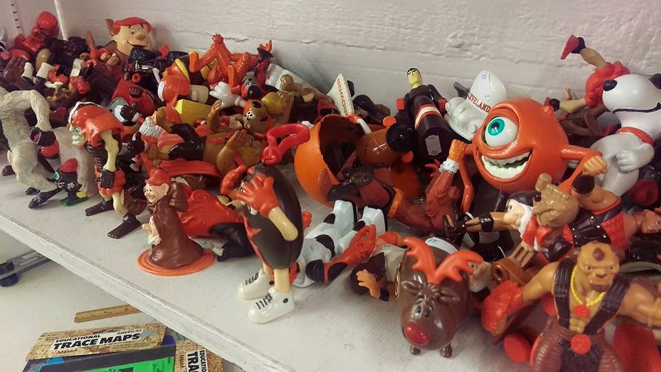
Click to enlarge
Matt Texter is a musician and graphic artist who lives in Erie, Pennsylvania. He likes to collect oddball items and frequently visits thrift shops in search of interesting finds. It was during one such visit, at a local Salvation Army, that he recently came across the shelf full toys and action figures shown above. At first glance, there was nothing unusual about them. But then he realized what set them apart: They’d all been painted in Cleveland Browns colors, and in some cases they had little uniform elements painted onto them as well.
Whoever did the paint jobs was pretty obsessed. Check out some of the toys:
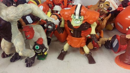
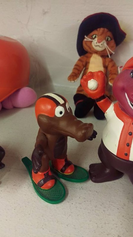
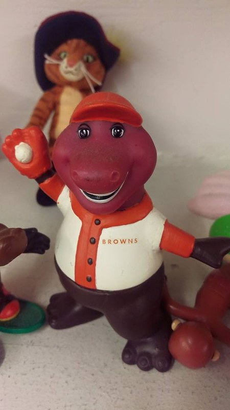
“Once I took a closer look, I realized how detailed they were,” says Matt. “All hand-painted. They’re some of the coolest folk art pieces I’ve seen in a long time of digging in thrift shops. There must be 200 or 300 separate pieces, priced at 49 ¢ each. I didn’t buy any of them, but I plan to go back to ask about buying the whole lot, even though I’m a Steelers fan. The effect of all of them together is what generates the most impact. If I am able to score the whole lot, I’ll be excited to put them all out on the floor to just look at them.”
Pretty cool. Who painted these, and why? How did they end up in a Salvo? If anyone knows, do tell.
(Big thanks to reader Tony Kellogg for letting me know about Matt Texter’s find.)
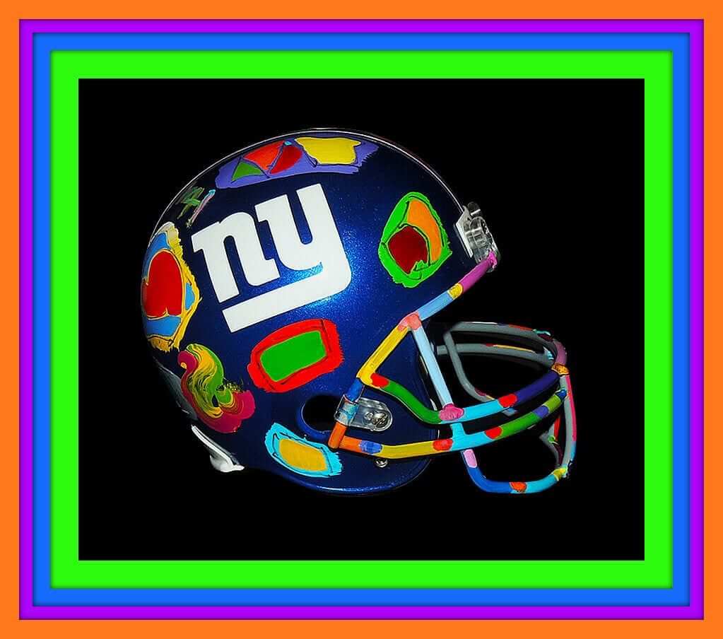
Click to enlarge, if you dare
Collector’s Corner
By Brinke Guthrie
Now this Peter Max-painted Giants helmet is FAR OUT. “Super Bowl XLII Champions.” This would look terrific at Uni Watch HQ ”¦ if Paul wants to cough up $7K. [Not gonna happen. ”” PL]
Looking for something a bit more conservative and budget-friendly? Collector’s Corner has lots of suggestions that should meet your needs:
• Here’s a 1969 “psychedelic” print ad that shows women lining up in NFL team-branded clothing. Gotta love that groovy late-1960s vibe!
• That, my friends, is how a uniform is worn. Note the sleeves — they have stripes! So do the socks! The numbers are embroidered, and the socks are perfect height. This was the Dallas defensive front when I lived there — from left, that’s George Andrie, Bob Lilly, Jethro Pugh, and Larry Cole. Doomsday.
• I like this 1970s all-white Milwaukee Brewers rain jacket, c/o “Me and My RC.”
• Here’s a classic-looking Green Bay Packers varsity jacket from Sears, Roebuck & Co.
• Raise your hand, all of you who remember the 1960s ABA Oakland Oaks, represented on this nifty pin.
• This 1960s Colts coffee mug from Chase & Sanborn is in perfect shape.
• Here’s a sheet of 1970s NHL logos for media use.
• Check out the logos on this 1960s NFL bed sheet. This was the same set of logos I used to have on an NFL thermal poncho. Sure wish I could see that one again.
• Look at the artwork on the cover of this 1967 Eagles yearbook — doesn’t get any better than that. Great Eagles/Giants artwork here and here, too.
Rarely ever see a helmet pointing to the left, as on this 1980 Browns matchbook.
Follow Brinke on Twitter: @brinkeguthrie

Baseball News: On Friday I wrote about the White Sox and their upcoming 1976 throwback game, the exact date of which hasn’t yet been announced. Now we have our first look at the jersey (from Ryan Gamble). ”¦ Not sure I’ve ever seen emerald green-striped stirrups before. That’s the Worcester Braveshearts, a collegiate summer team (from Brian Bednarski). ”¦ Looks like Nats TV broadcaster FP Santangelo blacked out the Nike logo creep on his left sleeve. Good for him (screen shot by Noah Petro). ”¦ Reds P Michael Lorenzen was wearing teammate Johnny Cueto’s glove last night. ”¦ Mets fans never get tired of Bill Buckner jokes. ”¦ Stetson Pevear has noticed that Dodgers 3B Justin Turner appears to have some sort of repair — maybe duct tape? — on the index finger area of his glove. ”¦ While working a 1987 Phillies/Expos game, Phils broadcaster Harry Kalas was doing the out-of-town scoreboard and made a point of mentioning that the Orioles were wearing orange jerseys as a slump-buster move (great find by Andrew Dixon).

College Football News: New nose bumpers for Michigan State. I don’t really like them — the circular format doesn’t work well within that horizontal space (from Mike Cole). ”¦ Looks like lots of little changes for Kansas: silver numbers, new helmet stripe chrome facemask, KU on one side and a jayhawk on other (from @gimmethewooby). ”¦ A thoroughbred racing jockey — not sure who — wore silks and a helmet patterend after a Nebraska football uni (from Barry Spears). ”¦ Speaking of Nebraska, it looks like their new uniform, slated to be unveiled later this week, will have an even more annoying fabric pattern than Adidas’s standard annoying fabric pattern. ”¦ Here’s a fairly detailed assessment of UMass’s new uni set (from Nicholas Phelps). ”¦ Yesterday was ACC Media Day, and some Miami players were wearing Nike jerseys. In case you missed it over the weekend, the Hurricanes have new uniforms from Adidas, which Phil reviewed here. ”¦ Meanwhile, all attendees received an ACC Media Guide, which had an amusing surprise — the words “Fuck this shit” lurking on page 145. Guess someone involved in the guide’s production was an unhappy camper. ”¦ The collar on Florida State’s home jersey now matches the road version. ”¦ New uniforms for Presbyterian College.

Basketball News: Samantha Logic of the WNBA’s San Antonio Stars had one of her numerals peeling off the other day. ”¦ Ray Allen got a really cool jersey-based birthday cake (from Matt Edwards) … New court design for Northern Colorado (from Ryan Pfeifer).

Soccer News: New third kit for Norwich City. And if you’re thinking there seems to be very little distinction between the team’s, home, road, and third kits, you’re right (from Brian Mazmanian and George Chilvers).

Grab Bag: Ooooh, check out this timeline of spacesuits (from Randy Peterson). ”¦ The FIA is retiring No. 17 for F1 driver Jules Bianchi, who died last week after spending nine months in a coma following a crash at last October’s Japanese Grand Prix (from Andrew Jobe). ”¦ New Marvel Heroes jerseys for Round 21 of National Rugby League. ”¦ Here’s something I didn’t know: High-end bicycles are easy to counterfeit. ”¦ About freakin’ time.
You realize that Sanabelt ad is fake, right?
I was wondering, actually. Is it? If so, I’ll take it down.
Don’t get me wrong, it’s still kinda funny.
Here’s a google image search for “sansabelt action zone”.
A. I find it hard to believe that only ONE ad would exist.
B. Many of these sites note it as being fake.
link
But, hey–I could be wrong.
Click on that link, scroll down to & click on the “If Your Husband Ever Finds Out” ad, and you get a wealth of ’em. My favorite: “Enjoy Celery: Nature’s Toothbrush … For Your Colon!”
And Harry Kalas even knew that the Orioles had last worn orange jerseys in 1984!
I had this version of that Packers varsity jacket. Not made buy/sold by Sears. I wonder what the difference is??
link
How did they end up in a Salvo?
Maybe the owner was turned off by the new Browns uniforms and didn’t want to repaint them.
My initial thought was that they got dumped in a box in someone’s basement back in 1996 when the team moved to Baltimore and donated after a death or something, but I think a couple of those characters are newer than that.
The collection speaks to a very passionate devotion to the work. So I’m having a hard time coming up with an explanation for its presence at a thrift store that is not really, really depressing. If Matt committed to documenting and sharing the collection in some way – a blog, a series of UW features, whatever, I’d gladly chip in $5 toward a buy-the-lot fund.
Or they married a Bengals (or Steelers or Ravens) fan.
C’mon, no self-respecting Browns fan would do that.
Isn’t “self-respecting Browns fan” an oxymoron?
Worst. Paint jobs. Ever.
Browns toys…..
At first glance I thought they were all mismade, or even possibly prototypes or something. Cha-Ching!!
Then I realized they were all Cleveland colors. Still pretty cool.
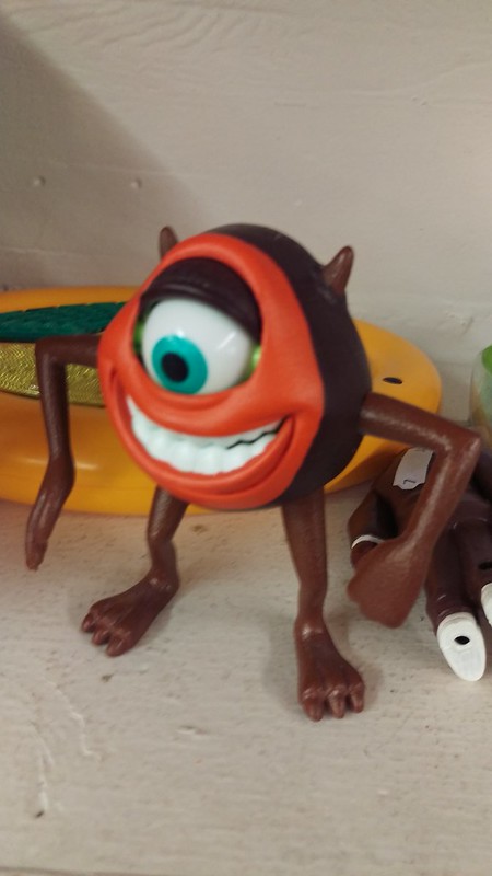
It’s odd to see things (Mike Wazowski, for instance) in the wrong/different color!
MIKE WAZOWSKI!
“We have a 2319! We have a 2319!”
Sully in the brown and orange really threw me off…
and i wonder did the person donate them because the oranges don’t match anymore?
Any effort going to be made to apply the new Browns Orange? :-P
man, I really miss Harry Kalas’s voice. Phillies games are never going to be that good to watch ever again.
The school with the new basketball court design is Northern Colorado — not North. The school was an old football rival of my alma mater (Pittsburg State).
Thanks. Fixed.
@Brinke…
Rick Barry & Pat Boone…who could forget?!
link
I had a Rams varsity jacket handed down to me from my cousin in the early ’80s, then got a new Vikings one a couple of years later. We were loyal Sears shoppers; I had almost all the jerseys. (Only one I didn’t have was a Bears one, Dad was a Packer fan and did not like Walter Payton, so that was a no-no in the house.)
The Giants’ helmet insignia is rendered in Old English characters in that Eagles’ program. If the Giants ever opt for a heavy metal identity, look no further!
:^)
I don’t think gothic/olde english lettering always equals metal… but that version of the logo would be better than what they’re actually using.
link
Pacers are going to wear “Hoosiers”-inspired jerseys in 2015-2016…
Ewww, why? NBA uniforms just do not look good with mismatched shorts & jerseys. Maybe, and I stress MAYBE, if they still had shorter shorts and knee-high socks, it could work if the socks matched the jersey color. But for a modern uniform? Ugh. No.
I say the same thing all the time about MLB jerseys not matching pants, but teams keep doing it.
Fair enough. To me, baseball uniforms, with their full length pants (or ideally, high cuffs and striped socks/stirrups) and hats, they’re closer to NFL uniforms where not matching is normal.
Now we just need the Detroit Pistons to pick up Flint Tropics uniforms, and then we could have a 100% fake game in the NBA.
Seriously though, I’m asking “why?” too. It just reeks of minor league kitsch.
Would the Pacers then break out Western U unis for 2016-17? Maybe they could bring Shaq and Penny in for the festivities for that game.
The “new” home FSU uniform collars match the ones they unveiled for the CFP, so Nike had already made them the same
What on earth is KU doing? In my opinion, KU football got it pretty much right in the 90’s (minus the drop shadows).
link
Look! Team colors! Mascot on the sleeves! I actually own one of these jerseys.
Even the link styled uniforms of the 2000’s were pretty classy, even if they were kind of a ripoff.
The Worcester Bravehearts striped stirrups mention in the ticker was also in the ticker yesterday.
Twice! Also those are definitely NOT emerald green.
Enormous spelling error in Christmas sweater merchandising:
link
In the words of a certain airline commercial, “Great gogly mogly.” And, if I remember, the setting for that commercial was Kansas City.
I think you might be thinking of link.
“Hey, you spe…”
“Ehhh!!”
Best part!
I’ve said it before (although I don’t know if I said it here), I think the ’76 White Sox togs were ridiculous; the faux lapel/collar, cut off at the seam across the shoulders, and the short jersey meant to be worn without tucking.
The worst part of it, of course, is the fonts; while the circus style font across the jersey in livable/laughable, the pairing of it with a completely modern font on the caps and helmets was just dumb. After that, there isn’t a single ChiSox fan that can say one word about the different Old English D’s on the Tigers’ unis and caps.
Au contraire. In 1976, I became a White Sox fan, primarily because of those uniforms. Yeah, the fonts mismatched. Yeah, they looked a little bit like leisure suits. But they worked. And they belonged to Bill Veeck, which meant they were meant to be ridiculous, but in a totally entertaining and enjoyable way. Veeck is the greatest owner of all time, in any sport, a guy who understood that sports is important, precisely because it doesn’t matter very much. I’m not a Sox fan anymore — moving to a city that had its own ballclub, coupled with the the grim corporatism (compared to Veeck) of Jerry Reinsdorf and the death of Comiskey Park boiled that loyalty out of me a long time ago — but in the late Seventies, man, it was fun.
I was too young back then (and as a native Detroiter grew up a Tigers fan anyway), but if I’d known about those Sox uniforms when they had them, I’m sure my outlook at that age would’ve been one of indifference. (The first time I can recall taking any note of sports uniforms was watching Super Bowl XVI, which is also the first sporting event I can remember watching with any deliberate intent – and I had just turned 7 at the time.)
Certainly, if I would’ve had any uni-awareness back then, I probably would’ve looked at the Veeck Sox unis a bit more favorably than I do in current times. Though, really, the only two issues I have is the use of the then-modern logo on the cap with what is basically a fauxback jersey, and the incomplete collar.
The originals had an incomplete collar, too.
The fact that it was a faux collar is why I regard it as one of the worst uniforms in MLB history. If the collar had been full, or if it had been a collar-shaped colored panel around the neck, then I’d regard it as a very good jersey that’s just mismatched with the cap. Maybe the single worst devil-in-the-details failure in the Uno-verse.
My brother and I had those 60’s NFL bed sheets for our twin beds… but that was in the 1970’s so they had to have been hand me downs.
Maybe, maybe not. They have AFL/AFC teams on them, so they’re most likely not from the 60’s at all.
Those are definite 60s. Look at the Oilers, Broncos, etc.
link
This has potential…
Norwich City doesn’t really need a change kit. Their colors are unique in English football (really, they’re pretty unusual, period: how many teams dress in bright green and canary yellow?). They are one of the “small” clubs in the Premiership. The variety of kits is more about trying to generate a revenue stream by selling replica shirts than about trying to look distinctive on the field.
Those sales are a cash cow for clubs: between 2010 and 2014, Real Madrid sold an average of 1.5 million shirts a year, at about $75 a pop. That’s more than half a billion dollars in sales, which is part of the reason they can afford to collect superstars the way some folks collect Disney figurines for repurposing as Cleveland Browns tchotkes. If Norwich City sells even 20,000 shirts a year, that’s a million and a half dollars in revenue, which could be crucial for a club struggling to stay in the Premier League. Increasing the selection of “officially licensed shirts” increases the chances that a fan will see something he likes, and shell out the cash.
Does anyone else think that KU uni’s sublimated pattern looks like a basketball net?
A subliminal sublimated message!
Regarding the Kansas helmets:
Maybe I’m wrong, but I don’t think they’ll have “KU on one side and a Jayhawk on the other.” I think the blue helmet with have KU on both sides and the white one will have a Jayhawk on both sides.
You’re probably right… but seeing how we’ve had teams like Boise State using helmets with a logo on one side, number on the other, it wouldn’t actually be shocking to see them do both logos on the same helmet.
Also, remember the helmet Louisville will be wearing for its season-opening game — bird on one side, “L” on the other.
It’s certainly *possible*…but the point is that that’s not what the pics show. Those are two DIFFERENT helmets. The center stripes don’t match, and it’s very clear that the white helmet with the jayhawk is also white on the opposite side (you can see a patch of white after the stripe) while the KU logo is on a blue background. Matt’s correct, at least about what we see here.
Re: the topic Mets fans like to joke about:
What do Bill Buckner and Billy Graham have in common?
They can both make an entire stadium of people stand up and shout “Oh, Jesus”! B^)
It’s interesting that there are two white helmets in the photos and one has a KU on the right side and one has a Jayhawk.
Beautiful dark collared white White Sox jersey. Yawow.
I interviewed Pacers exec Todd Taylor on the story behind the team’s new Hoosiers/Hickory uniforms:
link
white sox 1976 hats are also out.
link
Yes, that was the basis of last Friday’s entry:
link
whoops. i even read that entry…
Emerald green striped stirrups??? Pretty sure that is lime green and navy… ???
It still amuses me that the MLB team that started the throwback trend is going to throw back to what could arguably be considered the first fauxback uniforms.
And I’m sticking by that argument: that the Veeck Sox unis are fauxbacks, because (aside from the hat logo) they were designed to evoke a bygone era.
I’m also sticking by referring to the 1976-81 White Sox unis as the “Veeck Sox”. It just seems like the perfect shorthand for this set.
I’m not sure why that’s amusing… if anything, just give them credit for being consistent.
“Fauxback” might be the apt word; IIRC, Veeck said the uniform was to be a combination of elements from different eras in Sox history. The collar was from the 1900s, the script from the teens or 20s, etc. I think the “modern” part was the cap logo and/or the contemporary fabrics.
The MLB Authentic tag on the Abreu jersey is a but worrisome. The jerseys are not supposed to be tucked into the pants; an exposed tag would look very tacky.
There’s two reasons why those all-too-enjoyable/all-too-horrifying swears ended up on the bottom of that ACC football media guide page.
1. The person who put that together had to input all 14 ACC teams’ schedules and records from the previous year by hand, one by one, because of the way the pages are formatted. By the time you put in that much small type, you’re going to be in a bad mood, guaranteed.
2. The person who put that together had to look at all those terrible Wake Forest losses and realize that the program isn’t going to get any better anytime soon.
It’s kind of like a choose-your-own-adventure book, except that either way, someone lost their job.
I wonder if it wasn’t compiled by students… meaning that whoever did it has now graduated and doesn’t give a shit.
The rumors of Auburn switching to the newer Under Armour template have turned out to be the real deal. At long last, Auburn is back to more prominent sleeve striping (they aren’t shaped like little soup bowls any more) and the an full pants striping.
link
No more white shoes for Brett Gardner, according to tonight’s broadcast. Apparently Yankees powers that be didn’t approve…
Sorry about the Sansabelt thing. I honestly thought it was legit.