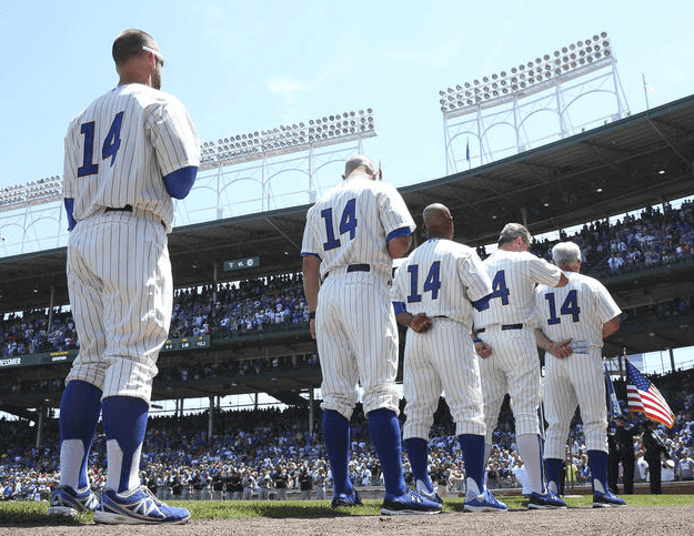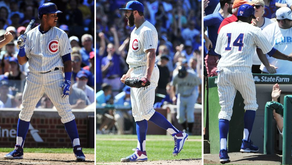
The Cubs and White Sox held the first of their two late-1950s throwback games yesterday. As I explained last week (and as you can see above), all the Cubs wore No. 14 in honor of Ernie Banks. All of the White Sox players will wear No. 9 for Minnie Minoso when the teams again wear throwbacks on Aug. 14.
Interestingly, all of those No. 14s were rendered in the Cubbies’ current number style, complete with the red outline. Although I haven’t been able to find a good color photo, I’m about 99% sure that the Cubs’ numbers during this period did not have the red outlining. If so, that’s a surprising lapse.
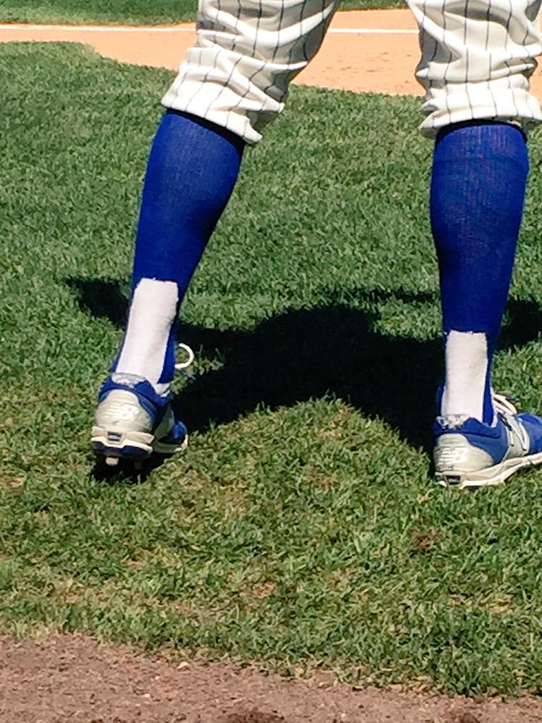
Turning to the all-important lower-leg region, the good news is that the Cubs all went high-cuffed. The bad news is that they wore two-in-ones — a really disappointing move (click to enlarge):


The worst thing about this is that the new Under Armour two-in-ones, while not as good as real stirrups, are much better than the standard Twin City Knitting two-in-ones.
The White Sox also went high-cuffed. Most wore solid black socks, although at least one of them wore genuine stirrups (click to enlarge):
One interesting detail: The Cubs’ Ernie Banks memorial patch, which they’ve been wearing all season long, was omitted. I understand why they did it — after all, they were all wearing No. 14, which was a high level of remembrance — but it’s still a bit odd that a game dedicated to Banks will go down as the one time this season that the Cubs didn’t wear the Banks patch (click to enlarge):

By contrast, the Chisox’s Minnie Minoso patch was included on the right sleeve, where it’s been all season long — it’ll be interesting to see if they retain it on Aug. 14, when they’ll all be wearing No. 9 (click to enlarge):
(Special thanks to Ben Schmuck and Phil for the two-in-one photos.)
And speaking of throwbacks”¦: In case you missed it, Saturday was the 25th anniversary of the first throwback game in MLB history, and I marked the occasion with a big ESPN column on the best throwback uni worn by each MLB team. Enjoy.
Raffle reminder: In case you missed it last week, I’m raffling off a pair of Mizuno MLB All-Star Game cleats, Size 10. To enter, send an email with your name and shipping info to the raffle address by 7pm Eastern tomorrow, July 14 ”” the date of the All-Star Game. One entry per person. I’ll announce the winner on Wednesday the 15th.

Baseball News: I’m quoted at length, as is SportsLogos.net founder Chris Creamer, in this article about the Hartford Yard Goats’ new logos. ”¦ Here’s something I didn’t know: The baselines in the 1965 MLB All-Star Game were red, white, and blue. You can see more of that in this headline video (big thanks to Sean Farrell). ”¦ man, it’s a big drop down from the MLB ASG to the triple-A ASG. ”¦ While I’ve had more than enough of military appreciation nights, at least the Charleston RiverDogs managed to come up with a uniform theme that didn’t involve camouflage. The green unis were supposed to look like plastic green Army men. ”¦ Game of Thrones jerseys upcoming for the Staten Island Yankees. ”¦ Twins closer Glenn Perkins received a goalie mask from his bullpenmates — you know, because he gets saves, a goalie makes saves, etc. ”¦ Blue Jays and Royals and an umpire — all in blue yesterday (from Craig Sarson). ”¦ Star Wars jerseys for the Brazos Valley Bombers (from @ballparksocial). ”¦ The Pirate Parrot — that’s the Buccos’ live mascot — has two assistants with “Birdkeeper” NOBs. ”¦ Check out this Jackie Robinson Christmas tree ornament, which has his No. 42 but doesn’t have the Dodgers script. Interestingly, the listing says the ornament is “Licensed by Mrs. Rachel Robinson, c/o Estate of Jackie Robinson,” but I guess it wasn’t licensed by MLB (from David Cline).

NBA News: If you tried to create a composite logo for each NBA team, drawing upon each component of a team’s visual history to come up with an “overall” logo, it might look like this (from AW Rader).

Soccer News: Man, even if you like green and gold as much as I do, that new Norwich kit is really, uh, something (from Brian Mazmanian). ”¦ “The Women’s Super League season kicked off this weekend in England,” says Yusuke Toyoda. “Most teams are affiliated with top men’s teams and wear the same unis — Arsenal Ladies and Manchester City Ladies wore their club’s new 2015 kits, but Liverpool (still wearing Warrior instead of New Balance) and Chelsea (with a makeshift shirt sponsor) wore last season’s unis.” ”¦ Also from Yusuke: CD Guadalajara, a third division team in Spain, released a rainbow-themed jersey supporting LGBT rights. ”¦ An online petition is urging FC Barcelona to drop Qatar Airlines as its jersey advertiser. ”¦ New home kit for FC Shakhtar (from @espitt).

Grab Bag: For nearly 30 years now, the only sneakers I’ve purchased or worn have been Chucks. But the other day I saw these two-tone Vans at a vintage shop and thought, “Why not?” Broadening my horizons, little by (very) little. ”¦ Player badges at the British Open have changed from round to oval (from Chris Flinn). ”¦ NASCAR driver Cole Whitt, who’s sponsored by KFC, has a Col. Sanders-themed racing suit. ”¦ Unusual scenario for Saturday’s welterweight title bout between champion Keith Thurman and challenger Luis Collazo, both of whom wore red trunks, red gloves, and red shoes. ”¦ Interesting piece on the history of the polo shirt. ”¦ New Rugby World Cup uniforms for Japan (from Jeremy Brahm). ”¦ Matthew Blinco recently visited the San Diego Hall of Champions and took some swell photos. ”¦ Several riders in the Tour de France are using a new time trial helmet design.

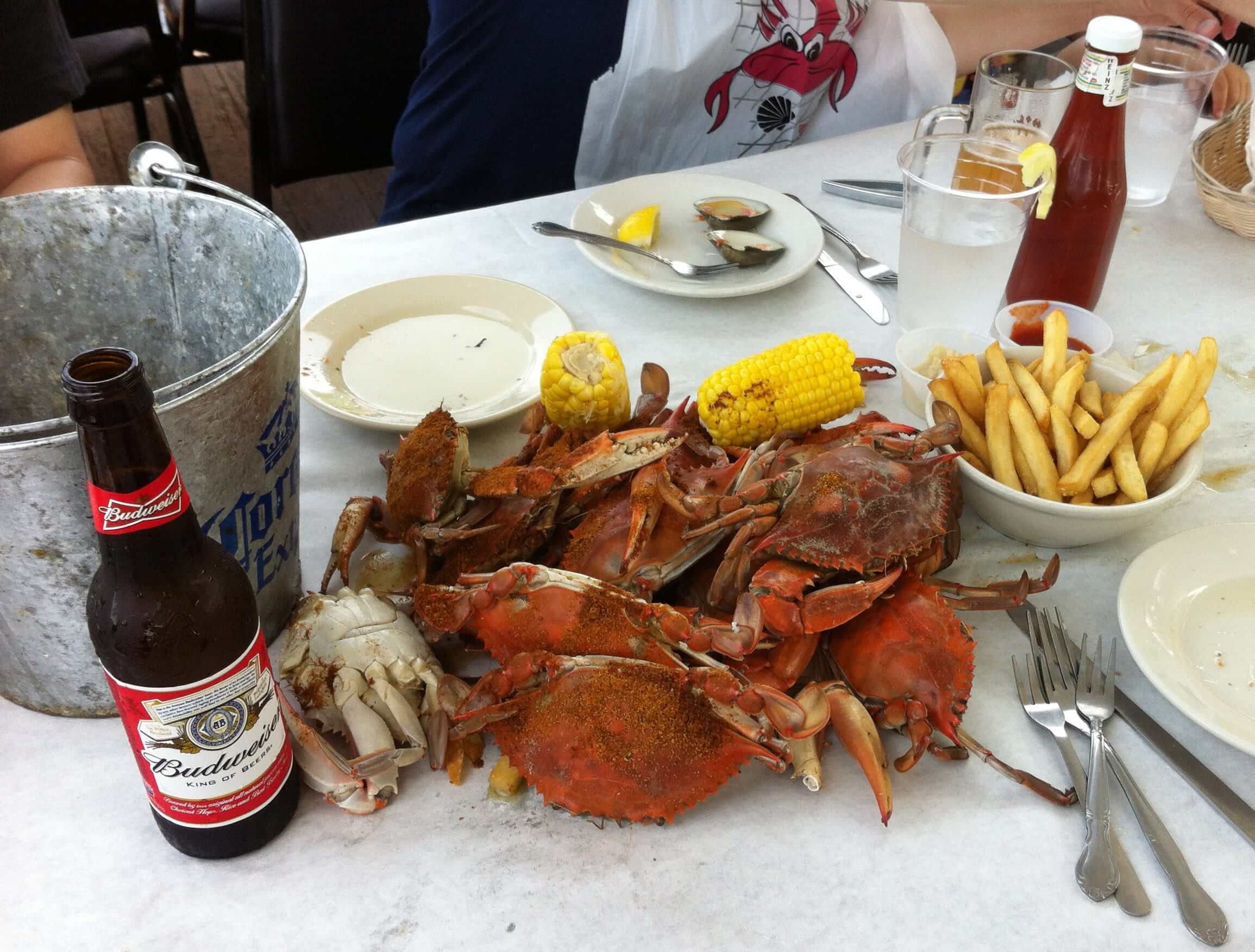
What Paul did last night yesterday: Yesterday was a perfect summer day, at least here in NYC — sunny, hot but not too hot, low humidity, a nice breeze. It was a perfect day, in other words, to go out to my favorite seafood shack out in Sheepshead Bay and chow down on some Maryland-style crabs. So that’s precisely what my friends Carrie, Howard, Sujan, Emily, Eric, and I did.
Hot crabs and cold beer — an unbeatable combination on a summer day (click to enlarge):

Typo in second sentence: “(and as youp can see above)”
Fixed.
I thought Dexter Fowler wore blue stirrups for the Cubs.
I live in Maryland and haven’t picked crabs yet this season. That is so very unacceptable.
As a life-long MD resident, with all the places that now make okay to great crab cakes locally, i’m happy to never pick crabs by hand again.
The reward never equalled the struggle for me. :)
As a Marylander my only critique of the crabs pictured is that they need about 10x more Old Bay.
I agree, they are extremely light on the Old Bay.
and you need a bowl of vinegar for dipping
1. The 3rd and 5th Cubs from left in the top picture (can’t tell who’s who of everyone is #14!!) are wearing real stirrups.
2. My kids bought me my first pair of Vans for Father’s Day. My new summer casual shoe but I still keep a couple pair of Chucks around, because Chucks are awesome.
Something tells me that there would have been complaints if the Cubs HAD worn the Banks memorial patch on Sunday…..Damned if you, damned if you don’t
I’m in agreement here — not that Paul necessarily would have complained, but if you’re throwing back specifically to a period to honor a player, you’d think they’d make the uni as accurate as possible (which, with the red trimmed-numbers and 2-in-1’s, plus the Majestic patch, they clearly did not). At least keeping the memorial patch off the uni made it somewhat more authentic to the actual uni Ernie wore.
By all wearing #14, the Cubs were effectively each wearing Ernie’s uniform. So symbolically, including the patch would have meant Ernie Banks wearing his own memorial patch. Which seems kind of creepy to me, akin to commercials where anthropomorphic food cartoons urge eating themselves.
By all wearing #14, the Cubs were
effectively each wearing Ernie’s uniform. So symbolically, including the patch would have meant Ernie Banks wearing his own memorial patch. Which seems kind ofcreepyto me, akin to commercials where anthropomorphic food cartoons urge eating themselves.You are correct, the Cubs didn’t add red trim to their numbers till the ’90s, when they also added NOB.
Just to clarify, for a while during the 60’s the Cubs did have red trim on their road uni numbers, but not on the home pinstripes.
NOB and red trimmed numbers were added to the Cubs’ home uniforms in 1993 if memory serves.
Wouldn’t have pegged Paul to be a Budweiser guy. Interesting.
Does it even count as a beer?
Absolutely not
you don’t drink good beer when you pick crabs. Any InBev product will do
Twitter says the Cole Whitt KFC tweet is not existing…
Drooling over those hardshells. That was my faviorite thing about growing up in the Chesapeake area. It’s been ages since I’ve had them. People down south just don’t understand.
Picking crabs wearing a lobster bib? That’s heresy.
Did you get those fuzzy pants with the Vans? (jk)
I understand that 2 in 1s weren’t worn in the Ernie banks era but in general I love them. That’s what was given to us when we were little kids just starting to play and so when I see them I harken back to a simpler time. I don’t really understand the vitriol as they are better than the baggy pants but albeit not as good as stirrups.
That’s just my two cents. I’m trying to stand up for the 2 in 1s!
They remind me of MLB when I was growing up in the 80s. It seemed a fair amount of players wore them. I’d love to know the history or rationale behind them. Players today don’t care if they have a stirrup look or not (and most go low-cuffed so you never see it anyway), so why did they need to have pretend stirrups then? Couldn’t players have gone with solid-color socks, as many do today?
I get that the look of stirrups is authentic old-school basbeall, and a million times better than pajama pants (I keep waiting for a guy in a rundown to trip on his own pants – has that happened yet?) but when I played youth baseball I always found that strip of extra fabric under/around my foot to be really annoying, and much preferred a smoother, seamless feel on my feet. Can see why most ballplayers would not like to wear actual stirrups.
Not sure about the red stripe, either. Cubs uniforms I’ve seen from the late-60s into the ’90s did not have trim on the home uniform numbers. I think the red outline on Cubs home uniform numbers came into play in 1993 when they took away the blue collar and blue sleeve stripe.
When did the Cubs add the bear-head logo to their sleeves?
The reason I ask is because the throwbacks from yesterday’s game did not have the bear-head logo.
1962.
They actually had the blue sleeve stripe in 1993, when they started putting names on the home uniforms for the first time ever, and then it was removed the next year. The blue sleeves looked good with the blue numbers but seemed a little out of place when the numbers got red borders.
(Those hemmed sleeves used to be standard and then have gradually disappeared from most teams’ jerseys. I’m trying to think of teams who have never dropped theirs: the Phillies on the road and the White Sox on the road come to mind. I like seeing those stripes on otherwise-dull gray uniforms, but not with pinstripes.)
I’m hoping, with all the throwback uniforms the Cubs have been wearing in recent years, that the Cubs will go back to something more traditional at home soon, or at least as a home alternate like Cleveland and the Twins do. All of the Cubs’ 1930s through 1960s home uniforms look amazing and timeless.
link Too busy for my taste. Go back link to see timeless perfection. (Well, the blue on the sleeves has faded from all those day games. But before the fading, it’s perfect.)
Well, they were wearing red-outlined numbers on their away unis at the time (speaking of which, a pink background!?):
link
That is, when they weren’t wearing blue-outlined red numbers on the away unis:
link
As all over the place as they were, it wouldn’t shock if at some point they did likewise on the home unis. It’s a better look anyway:
link.jpg
At some point earlier in the team’s history it’s possible they had red trim on the home uni numbers, but the pinstripe set (introduced in 1957) didn’t have the trim until 1993…
Looks like Arsenal ladies don’t have the buttons like the men.
No they have buttons as well – link
Bad news for Jackie Robinson. There is a definite jinx attached to the Hallmark ornaments — and being dead doesn’t necessarily save you!
link
Kidding aside, I liked the Hallmark baseball ornaments — when they had the league license. Logoless jerseys aren’t any fun.
Sure that’s not Sasquatch in those vans?
Who is wearing the really thin stirrups in the lead photo? 2nd from the right? Are those built in?
Those look like the older style 2-in-1’s.
MLS All-star Game Kit has link. That is “interesting.”
Bad link.
Some of those composite NBA logos are really nice. Be interesting to see that method applied to the other 2 of the big 3 leagues.
That Clippers one is a million percent better than their new look.
The Pistons (spits on ground) really need to bring back that mascot. I would almost like them if they did.
I loved the Cavs, Suns, Warriors, & Nugs.
Agree about the Clippers but its more like one billion.
Small nitpick
The WSL season in England resumed after the World Cup hiatus, not kicked off.
Sox should have had numbers on their sleeves.
Shame since the sleeve numbers are one reason those unis are so cool.
Also no stripes on the socks, big missed opportunity.
The Sox will have number 9 on the sleeves when they do their tribute in August. Not sure if they’ll have the proper striped socks (red white and black stripes on black stirrups).
I though Paul’s comments regarding Brandiose in the Yard Goats article were spot on. You can tell a Brandiose design from a mile away, for better or for worse.
Recently one of the Brandiose guys was on a Padres podcast where he essentially “non-confirm confirmed” that they have been working with the Padres in the anxiously awaited redesign which most fans think is coming next year. It makes sense – SD-based sports design company working with SD-based sports team and all that. But considering how consistently similar Brandiose’s designs have been up to this point I’m a little worried the Padres may end up looking like a minor league team.
Like all San Diego sports fans, here’s hoping for the best and expecting the worst.
Does a team bring Brandiose in after the name has been selected, or is the firm part of the name-selection process?
There is certainly a common thread among its designs, and many seem to have animals or give human traits to non-human things. (Did the company do the Nuts?)
Varies by project.
Thanks! I was always curious about that.
Yes and no. There’s certainly a default Brandiose look that’s visible a mile away. But Brandiose has also produced some projects, not coincidentally their best work, that don’t scream “Generic Brandiose Team.” The updated Mr. Redlegs, for example, or the quietly underrated Spokane Indians. If the Padres redesign turns out to be bush-league, with an overly cartoony swinging friar and hippy-dippy lettering all rendered with too-thick outlines and one-too-many primary colors, I’ll blame the client, not the studio.
Yeah, the guy mentioned in the podcast how proud he was (/they were) of the Spokane Indians stuff. It’s not bad, but still does look minor league-y to me. Honestly, as long as the Padres redesign includes brown and the SD monogram I won’t be too bothered.
I enjoyed the article, especially glad that the two things I picked up on as a Nutmegger were noticed: Whalers’ blue and green, and the NYNH&HRR typeface.
Odd little detail, Minnie Minoso wasn’t on the White Sox in 1958.
Ernie Banks and Minnie Minoso were both in Chicago from 1953-1957, along with 1961-62, and 1964. So out of the 8 possible seasons to throwback to in which both men called Chicago home, they officially went with none of them.
Fantastic piece of trivia that I just discovered now:
* Winning pitcher for the Cubs in the game yesterday: Jake Arrieta.
* Minnie Minoso’s mother’s maiden name: Arrieta.
Some of those composite NBA logos look better than the current ones. I’m particularly fond of the Cavs and the Wolves.
When the Coyotes new jerseys were announced, Howler’s M captaincy patch was where it was on the old jersey. It’s now been updated, confirming that is where the patches will be.
link
link
Honestly shocked there was nothing about the Rockies in camo on Sunday.
I have no idea why they would do it, and I would have SWORN someone would have sent something to you about it, which is why I didn’t. I figured by the time I saw it in the 5th, you’d have 4-5 people say something by then…
Clementes? Or Randazzos?
Clemente’s.
So does the fact that a major league baseball game can take place with everybody wearing the same number basically mean there is no reason to continue to have numbers on baseball uniforms?
Baseball does seem to be the sport where there is never in the moment of action a time when a player would need to quickly identify another player by sight…
So why bother? Wouldn’t baseball uniforms look cleaner, and more “uniform” without numbers at all?
I’ve never heard this analysis before. Certainly not on April 16 each year.
Well, imagine trying to play an NFL or NBA game with everybody wearing the same number…
I guess numbers for baseball players were strictly for the fan’s benefit…in the old days, you needed a program to tell the players by their number. Now, the scoreboard, PA announcer, etc. tells everybody who is at bat…
Beauty summer meal Paul looks deelish.
I ordered crabs at a crab shack in Everglades City FLA and they served them chilled, not good.
3 things about the HR Derby:
1. ‘Gillette Home Run Derby Presented by Head and Shoulders’ is quite a mouthful.
2. Champ Pederson was wearing a frankenjersey of his brother Joc. The funny part is that it was Dodger blue/Dodger white.
3. Todd Frazier needs major hairline help.