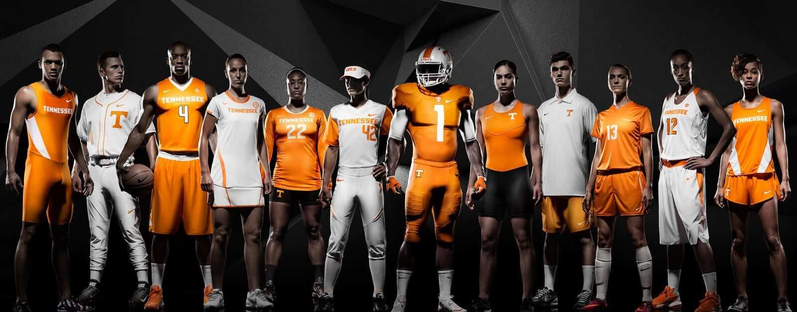
Click to enlarge
Tennessee’s athletics department unveiled new uniforms yesterday. Although the new designs are department-wide (see above), the only ones most of you care about are for the football and basketball teams, so we’ll take a look at those today, beginning with the basic home and road football unis:


Nothing wrong with that (although the checkerboard looks better on the pants than on the helmet, and checkerboard patterns always makes me think of pet food anyway). The tops and bottoms can be mixed and matched to create mono-orange and mono-white — we’ll probably see lots of those, although I prefer the non-mono configurations.
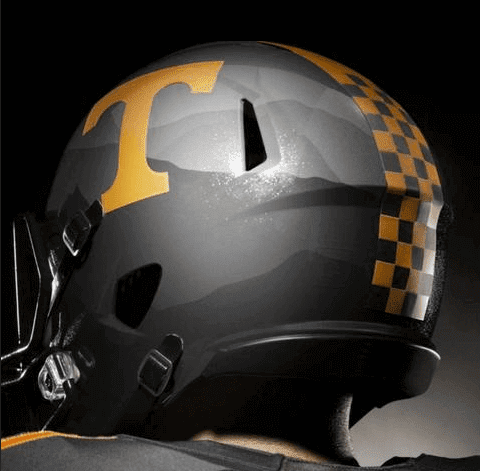
There’s also a GFGS alternate, which looks pretty awful, although the mountain ridges on the helmets, meant to evoke the Great Smoky Mountains, are a nice touch (but it remains to be seen how discernible the different shades of grey will be when watching a game on TV):

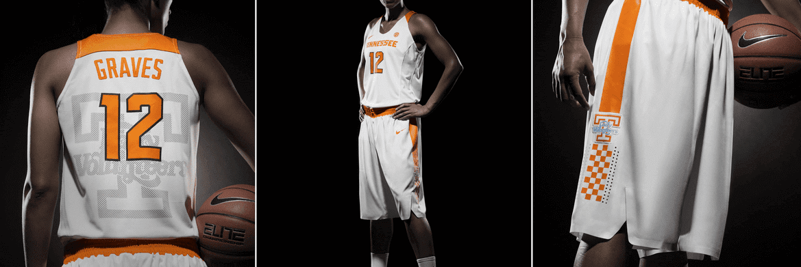
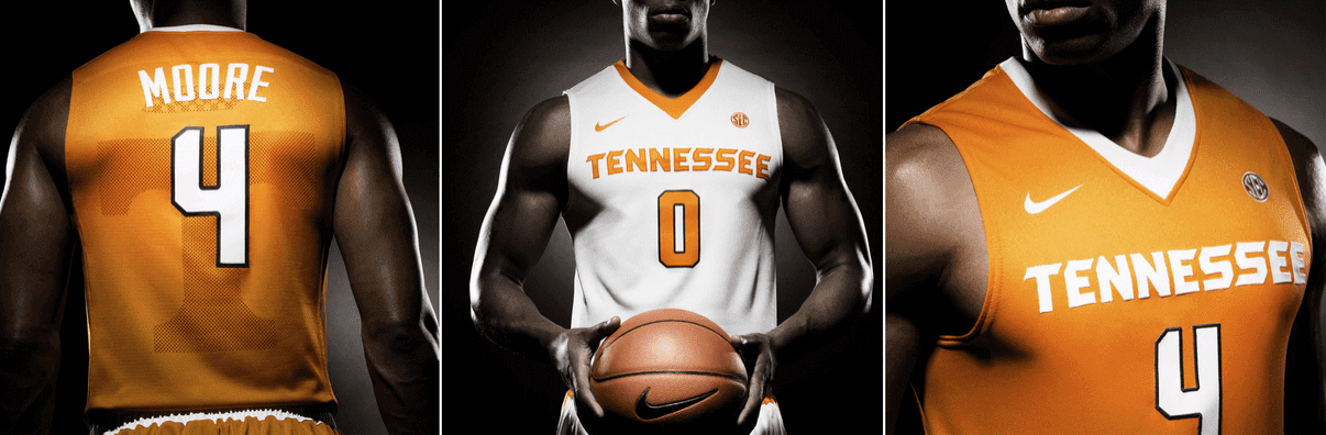
The primary basketball uniforms are a similar mix of white, orange, and checkerboard trim. They generally look fine from the front but are saddled with some unfortunate sweatback designs on the rear (for these three-across groupings, you can click to enlarge):
Once again, the GFGS alternate is the dog of the group — yeesh:

There’s more, of course, much of it couched in that annoying Nike-speak that we’ve learned to expect by now. Further info here, and there’s a very good photo gallery, showing many of the school’s other teams, here.
Taking pandering to new heights ”” or depths: The Wisconsin Timber Rattlers have decided that July 4 and 5 will be Military Appreciation Weekend (even though Independence Day has nothing to do with the military and is actually when we celebrate the Declaration of Independence’s ratification). The good news is that they’re not wearing camouflage; the bad new is that they’re wearing the most over-the-top pandering design I’ve ever seen. It’s basically a self-caricature of everything wrong with this type of promotion, like something they’d show on The Simpsons (click to enlarge):

Wow. Gotta give them credit for coming up with so many different NOBs and managing not to reference the Declaration of Independence even once. Good work! I was wondering who got to wear the “United States” NOB, so I checked the team’s roster and found that No. 14 is worn by Natanael Mejia, who’s from the Dominican Republic. Nice.
LAST CALL ”” design contest reminder: Today is the last day for submissions in my “Redesign the Clippers” contest. Details here.

Mike’s Question of the Week
By Mike Chamernik
I work in the sports department of a newspaper, and this scene unfolds seemingly every night: A Cubs game is silently on in the background and all of us are at our computers working away. Some commotion flashes on the TV and someone says “Rizzo homered again???” Nope. It was a replay of a home run from earlier in the game. But because the TVs are on mute and no one is really paying attention, it looks like the first basemen went deep a second time.
My proposal is that TV replays should be shown with soft-focus clouds in the corners of the screen, like flashbacks in soap operas. It would save a lot of undue excitement and stress for those who keep games on in the background or on mute at home, work, the gym, a restaurant, a bar, or wherever.
All of which leads to my question this week: What innovations do you wish existed for television broadcasts of sporting events? Also, what are some of your favorite telecast displays and devices? I always liked the first down line for football games, and miking up refs and players is a good time. What are your least favorite innovations? I know that ESPN’s K-Zone has annoyed a lot of people.
Post your responses in today’s comments.
The Ticker
By Mike Chamernik

Baseball News: The Blue Jays wore their Canada Day alternates yesterday. The big surprise was that the Red Sox got into the act by wearing Canadian flag sleeve patches — apparently the first time a Jays opponent has honored the holiday. ”¦ Also for Canada Day, here’s what the Thunder Bay Border Cats of the Northwoods League wore. Players who weren’t in the game sported comical hats on the bench (from Will Scheibler)…. Sun Sports broadcast a portion of last night’s Indians/Rays game with the images mirrored (thanks, Matt Larsen). … Rapper/producer Lil Jon threw out the first pitch at the Padres game yesterday and wore the team’s jersey. Because we’re talking about Lil Jon, here’s a bunch of photos of him in hockey jerseys and with the Stanley Cup. … Also with the Padres, the team wore throwbacks yesterday and two coaches wore hats with different shades of brown (from Kyle Rancourt). … And related to that, White Sox C Tyler Flowers’ jersey didn’t match the same shade of gray as his pants the other night (from Chalk LaRak). … The Chattanooga Lookouts have a stars-and-stripes version of their logo painted on the field (from @bearlydoug). … Fox Sports Ohio showed Marlins headshots during a Brewers/Reds probable pitchers graphic on Tuesday night (from Mike Griak). … Jerry Grefenstette was watching a Willie Mays documentary and noticed that the 1966 Giants had some numeral inconsistencies on their road jerseys. … Astros OF George Springer has a stuffed Astros cow named Earl that he brings to the clubhouse. … Adrian Beltre’s 2011 AL championship ring was stolen in a burglary. … For a game each April, the Albuquerque Isotopes and their opponents not only wear Negro League throwbacks, but players on the same team will wear throwbacks for different Negro League teams. It sounds like a really cool concept, though I haven’t been able to find pics of multiple unis in one shot. Here’s a look at how the throwbacks look on their own (thanks, Frank Mercogliano). … Joe Kuras found a 1970 photo of two Pawtucket Red Sox players, Juan Beniquez and John Clifton, wearing different uniforms. Beniquez was in a set that the Red Sox wore through 1967 and Clifton was in the uni the Sox wore starting in 1968. “It has been written that at that time the Paw Sox wore hand-me-down uniforms from the parent Boston team and it did not appear that the owners had much if any money to spend on uniforms,” Joe says. … New maroon-and-gold cleats for Arizona State.

NFL News: Here’s a Steelers logo I’ve never seen before. It is on an official NFL hat that belongs to Mark Hirschfeld. … Douglas Ford found perhaps the most useless game-used item for sale on the internet: a Dolphins’ lineman’s clear visor. … These Titans 1999 prototype jerseys don’t include the shoulder yoke the team later adopted.

College Football News: The Rolling Stones didn’t get N.C. State’s permission before producing T-shirts with a modified version of the school’s logo for the group’s Raleigh concert (from Phil). … The Bearcats have nameplates in their locker room that feature the Cincinnati Stripe (from Sean Hare). … More than just logos and unis go into college football branding (from Phil). … Daniel Barrera spotted some pants logo inconsistencies in this Texas A&M shot. The two logos on the left players are not centered on the stripe, but the one on the right is.

Hockey News: A youth hockey team decked out in 1911-12 Canadiens throwbacks posed with Montreal C Tomas Plekanec (from Mike Engle). … New Oilers-esque uniforms for the Bakersfield Condors (from Phil).

Soccer News: New Le Coq Sportif kits for Fiorentina (from Phil). … New home jersey for Athletic Club de Bilbao (from Anne Celestino). … New jerseys for the Polish club Lechia GdaÅ„sk SA (from Ed Å»elaski). … Rayo Vallecano of La Liga have new rainbow-striped uniforms to help promote tolerance (from Phil). ”¦ Looks like USWNT goalie Hope Solo had her sleeves cut off the other day.

Grab Bag: Here’s a look at Tennessee’s switch to Nike (from Phil). … All Indiana student-athletes receive a blue blazer (from Andrew Bradley). … Here’s an interesting look at how the American flag has become a popular “bro-ified” clothing style and accessory for young adults (thanks, reader who didn’t give his/her name). … “German-based shampoo-maker Alpecin, a sponsor of pro cycling team Giant-Alpecin, is dropping its ‘Doping for the hair’ campaign during the Tour de France,” says Sean Clancy. … Delaware became an Adidas school in late March. “Talking to someone at school, this is new in the sense that all sports will be outfitted by one company,” says Erik Autenrieth. “Before, even though the school had a deal with Under Armour, basketball had Nike and baseball had their own deals with Wilson and New Balance.” … Here are the Rugby World Cup jerseys for the United States (home and away) and other countries (from Tim Dunn). … New logo for Arkansas-Little Rock (from Phil). … New logo for ESPN College Football. … Subtle tweak for Facebook’s logo (from Brinke). … Michael Perozich found a great 1975 John Facenda-narrated video on professional lacrosse. In addition to shots of mouth guards, mask-less players and goalies wearing old catchers masks, you can see a player with a CCM hockey helmet that had the old two bar face mask from a football helmet. … Jason Cimon notes that Carroll Academy, a Mississippi private prep school, has appropriated Ole Miss’s brand as its own, including Colonel Reb. “It’s interesting because we’ve discussed the presence of Confederate imagery, but this institution is actually implementing not only the ‘rebel past’ to their namesake but also to the cultural identity,” he says. “The school is funded by a white supremacist organization called the Council of Conservative Citizens. I am wondering why the university hasn’t sent a C&D. Possibly because Colonel Reb is public domain since being retired?”
QotW: I loved the one-off innovation of the NFL game with no announcers, just the sounds of the game.
Dang it DG, you beat me to it! I was going to make some snarky remark about that (even though I sort of thought it was cool).
Can you imagine how cool it would be nowadays with bigscreen TVs and crazygood surround sound systems??
we can dream can’t we.
I think Sky used to offer an “ambient sound” option for pre mier league games, with no announcers so you could hear the chants.
I thought early British replays had a large R in the upper corner. I thought it was a great idea during live games (as opposed to halftime/postgame highlights).
QOTW: ref cams. Rugby’s experimented with it, and there’s a video on YouTube of an AHL ref with a GoPro mounted on his helmet.
It’s a pretty unique view that the fans don’t normally get to see. I’m not sure how useful it would be during broadcasts, but I dig it.
Ref Cam.
link
The NHL did this with their game centre this year. As a referee myself I found it very interesting, but unfortunately it was a little difficult to follow a whole game from. It was cool to bounce in and out of, but not to watch a whole game.
That said, I would watch a weekly highlight show every week of these no doubt.
link
link
The Phillies wore a Canadian flag on their caps on Canada Day in 2006.
I find it curious that the Timber Rattlers went with the “non-American” spelling of “armour.”
But I do appreciate “Seal Team 6.”
The U.S. government often uses archaic or British spelling and vocabulary, but as far as I can find the Army has spelled it “armor” since at least 1940.
I see, “Army”, “Navy”, “USMC”, and “Coast Guard”, but where’s “Air Force”?
I noticed that too. How do they have Coast Guard and not Air Force?
I like that the Timber Rattlers went to great lengths to salute many groups. I wonder if the players were able to select what they wore on their backs.
Nice job!
Yes. It’s wonderful!
Too bad they didn’t pull this stunt on May 16 (or thereabouts) when it would have, ya know, actually been appropriate.
Phil, who are we kidding. You would have blasted them on May 16, (or thereabouts), too.
It’s not unusual for minor league teams to pull “stunts” with uniforms. At least the Rattlers tried something different. Not all the names on the back refer to the military.
Would it have been cooler to insead have the name of a different signer of the Declaration of Independence on the backs of the jerseys? Yup. But then you would rip them for the sleeves or something else.
Would it have been cooler to insead have the name of a different signer of the Declaration of Independence on the backs of the jerseys? Yup. But then you would rip them for the sleeves or something else.
Translation: If something sucks in one or two different ways, that’s marginally better than if it sucks in three or four different ways. But it still sucks.
” You would have blasted them on May 16, (or thereabouts), too.”
~~~
I might have ‘blasted’ them for pandering, but at least that date would have been more appropriate for such a stunt.
And I also don’t have a problem with MiLB teams doing all sorts of weird and wacky promotions — they’re not the bigs, I get that all these stunts put fannies in the seats. If you follow my twitter feed, you know I try to highlight all the crazy stuff MiLB teams wear for whatever (I’m NOT a fan of all the Star Wars nights, Back to the Future stuff, etc, but I get that it’s what MiLB teams do). My issue here is simply the timing, and trying to conflate the Fourth of July Independence Day holiday weekend with the military. That’s NOT what 7/4 celebrates.
I hope you see the difference.
Honest question: if the names on back were not military related, would you be OK with it for July 4th? I must be getting softer as I age, but I actually like the red/white/blue uni with the stars on one sleeve and stripes on the other (somewhat like those Maryland wore a few years back). I don’t like the NOB options, but I think if they simply stuck to the actual players’ names as usual, the unis are pretty sharp.
Not sure who you’re asking, but I’ll respond: Remove the NOBs and it’s still pandering, for all the reasons I’ve already explained many, many times.
Just in case you missed it:
link
link
Not what I meant; should have made my question clearer (for you or anyone else) since I’m well aware of your position on “pandering” uniforms and sports events. I was wondering what you/others thought of the actual look of the uniform, i.e., the sleeve stars/stripes look. So, if the team didn’t present it as “military appreciation”, didn’t have the silly NOBs, but simply presented that uni as a July 4th theme, what would you think of it? Again, I kind of like it, although I generally am not real keen on flag-based uniforms.
Flag-based “patriotic” uniforms only make sense if we assume that a team’s ordinary uniform is inherently not patriotic. Personally, I regard baseball itself as fundamentally and characteristically American, so in my book baseball is inherently patriotic. (Which is in part why I prefer to celebrate Independence Day by taking in a ballgame, as I’ll be doing this year.) To my mind, a really patriotic display goes something like this: Everyone assembles, salutes the flag, sings the national anthem, then a team of guys wearing crisp white uniforms plays a game of baseball against a team of guys wearing clean gray uniforms, then when that’s over somebody slips a cassette tape of John Phillips Sousa marches into the PA system and they shoot fireworks into the dusk sky. Oh, and during the game-playing part, one consumes beer and cased meats with gusto. Short of shooting black-powder muskets at actual live British soldiers, it just doesn’t get more patriotic than that. Flag-themed jerseys actually detract from the Americanism and patriotism of the event for me.
Do you consider it pandering for a USA National Team (see the US Rugby Jerseys for the World Cup as an example) to use elements of stars and stripes in their design?
Tennessee’s secondary (or tertiary?) color is smoky grey so their alt’s aren’t really GFGS.
Tennessee’s official colors are orange and white. Smoky grey was added two year’s ago as GFGS. Tennessee actually has more history with black than grey, as the team wore black jerseys until 1922, which makes the 2009 BFBS jerseys more in keeping with tradition.
Look at the official school color pallette, Smoky gray has been there for awhile.
The athletics department only recognizes Orange and White as school colors.
Any use of gray was most assuredly a GFGS situation, whether it has been formally adopted as part of their color scheme or not.
Lee
QOTW: This is more of a personal adjustment than a league thing but I figured I’d share anyway lol. Sometimes if the game is on the radio that I’m watching on TV, I’ll do my best to sync up the radio broadcast with my TV. I like the greater detail the radio broadcasts give over TV announcers sometimes. Especially in Hockey games.
Then if I’m really bored I’ll turn the color off and pretend I’m watching old school film of a game with the radio broadcast as the audio.
I too, have been fooled by a live action replay shown much later during a baseball game. I’ll be working on something else, and have the sound down as well. My preference is that such replays either be slo-mo or place at the end of the game. The image itself could be altered to differentiate itself from the live broadcast.
Visually, you’re not going to see replays in the corner of the screen, because replays are saved for a lull in the action. It would be defeating the purpose of the replay.
How do you get the tv to sync up with the radio? I guess one way to do it is if the radio is behind the video, you could pause the tv (if you have that capability) and wait for the audio to catch up.
Secondly, many years ago I heard a broadcaster talking about the difference between tv broadcasters and radio broadcasters. Since TV has the visual aspect you can see whats going on, and the tv broadcasters really only do a minimal job of delivering additional information.
Where as with radio, the sound is the medium. They have to try to recreate the game in as much detail as they can so the listener can understand what’s going on. It’s pretty much two completely different ways of delivering the game.
That Steelers ligature is at least 10 years old.
The NFL commissioned a bunch of alternate insignias for apparel about 20 years (or so) ago, such as the “NE” hat Tom Brady wears, the S-shaped Seahawk that was on this site a week ago, and the sideways horseshoe and “I” for the Colts. It looked like the league was trying to goose revenue for teams without secondary emblems, outside of using the wordmarks.
i still have this Browns one link
Those were all made the last time Nike made the NFL uniforms.
QOTW:
Not an innovation, but an annoyance: When NFL camera operators zoom in on the QB or RB before the snap of the ball. If I can’t see all the players, I can’t pre-snap read at home like the nerd I am.
MNF and SNF are the worst for this. Zooming in isn’t going to help me decipher the phoney “Omaha” cadences. Maybe the camera operators need a play clock buzzer or warning system if they linger too long on a pre-snap zoom.
Agreed.
“Beniquez was in a set that the Red Sox wore through 1967 and Clifton was in the uni the Sox wore starting in 1968.”
~ If you look closely at the jersey Beniquez is wearing, you’ll see that the “S” in Sox is different than the traditional Boston Red Sox type. Maybe it’s actually a minor league uniform from Winter Haven or Winston-Salem (both of whom he played for in 1969).
WRT Tennessee’s alternate uniforms, that cool gray color, which Tennessee calls Smokey, truly is part of the university’s identity and primary color palette, so it’s not really not GFGS in their case.
link
It’s totally GFGS – they only added gray to the color palette a few years ago around the time adidas introduced gray football uniforms. I look forward to flipping channels on a Saturday this fall and seeing Texas A&M, Arkansas and Tennessee all wearing gray uniforms indistinguishable except for the colors of the uniform numbers.
Actually, if you go back into the university archives, the uniforms used in the early 20th century were in fact gray, NOT black. Tennessee brought the gray back as a nod to their history. I know people want to bash teams that wear black and gray alternates, but in the case of Tennesee it is both a historic color and now an official color for the school. Therefore, it is very much NOT a case of GFGS.
QotW: One thing that drives me nuts and needs to be fixed: when a batter hits a home run, I often see the score graphic in the corner of the screen updated to include all the runs that score on the homer, including the batter, as soon as the ball goes over the wall and before the runners actually touch home plate.
Don’t do this. It makes it look like the team hitting the homer already has that many runs, plus the batter when he comes around the bases.
Agreed. The score should only be updated as each player crosses the plate; after all, hitting the ball out of the park is not an automatic score. All it takes is one mistake running the bases to nullify a run or more.
Not the topic in this thread, but I am just asking: How many times have you seen a base running error on a home run in the major leagues? The main possibility is the batter passing a runner tagging at first base. Then, asking the TV graphics guy to push the button four times, synchronizing his push as each runner crosses the plate, is just not realistic. Understand your point, but maybe pushing the button after the batter rounds third would be more reasonable.
Asking the graphics guy to synchronize pushing the button with the runner touching the plate is not even mildly difficult; it’s done all the time on plays when the runner is sprinting to home and not jogging. Japanese TV likes to show the numbers in a giant font with the new total spinning into existence on top of the old one. It’s simple.
Alternatively, if it’s that much of a hassle, they could cut the score graphic entirely (in favor of one that just says “HOME RUN” or whatever) and then put it back up once the batter has come home and all the runs have scored.
Where do we draw the line for “GFGS” when, as others have pointed out above, a school actually adds it to their color set? I’d like to see when Tennessee added it. Was it before or after this trend started?
IMO, just because a school adds the color to their set doesn’t make it NOT GFGS. It just gives them an easier excuse than all the others.
My understanding is that Smokey has been a UT color for decades. I’m from right outside Knoxville, though, and I don’t remember it being used — ever — before adidas came out with their alt.
Well, UT sports haven’t officially added it. From yesterday’s press release, “Tennessee Orange and white are the official colors of The University of Tennessee Athletics.” link
Additionally, this article on school traditions makes no mention of smoky grey (link).
So maybe it was added as an official color of the university as a whole at some point, but it is not an official color of the athletics department.
Furthermore, as a lifelong Vol, I’ve never seen any regular use of smoky grey until the last two years. There have been periods where black and navy blue have been used substantially in UT-licensed gear, but smoky grey has only begun to appear since grey became en vogue.
Is the UT football player actually shooting a rifle in that one photo? That seems a questionable choice…
I think lot of devices used in TV broadcasts are attempts to capture part-time/new viewers.
The “illuminated”/haloed puck in hockey (so newbies could keep track of it), the little pointy name boxes above race cars so you can tell who is who– just a couple of examples.
Now if they could stop having commercials after every play, pitch, lap, and point–THAT would help lock in viewers!!
Watch some soccer ;)
Pssshhh, please. ;^)
A few ideas that were surprisingly turned down for the Timber Rattlers…”Drones”, “Awesome”, “Obesity”, “Childhood Diabetes”, “NSA”, “Reagan.”
You left out “Badass”.
“Exceptionalism”, “Speak English”, “LOL”, “Relaxed Fit”, “Income Inequality”, and of course, “French Fries”.
I’ll play along: Big Gulp, Stand Your Ground, Deep-Fried, Blockbuster, Aggrieved, Pro Combat.
Blue Lives Matter
“
FrenchFreedom Fries.”“Affordable College,” but only if it’s worn by a dude on the DL.
Reading off those names sounds like the lyrics to “America, F*** Yeah!”
Disappointed that “Bed,” “Bath,” and “Beyond” didn’t make the cut.
Winner winner chicken dinner.
I’m rather fond of “Sportsmanship” and “Books.”
%@#& yeah!
I’m hoping there’s a player of Korean ancestry who gets to wear the “Korea” jersey.
(Assuming, of course, that his ancestors come from the South and not from First Secretary Kim’s Glorious Paradise. Then he’s be commemorating America’s enemy and not its ally.)
QOTW: Although I liked the innovation of the yellow first-down stripe for football telecasts, every embellishment of it causes pain. I especially hate when it turns red on fourth down.
Having the team logos and down/YTG superimposed on the field is a bit much, especially when it’s duplicating information that’s already on the bug. NBC’s marker is especially hideous.
Duplicating information is a pet-peeve of mine too.
Lee
Beautiful!
Duplicating information is a pet-peeve of mine too.
This is exactly what I was going to say. Before the snap, of the ball, maybe – but to keep it there the entire time is ridiculous. More catering to the casual fan.
I’ve been seeing more baseball cameras directly behind home plate. If you watch a few pitches from that POV, the standard offset center-field view feels like a primitive mistake. Getting to see the pitcher, the batter, fielders, runners, and the ball if it’s put in play on the same screen is well worth giving up the clear view of the catcher’s mitt, especially in this era of hi-def screens.
Yes!!!
I think those Titans prototypes look really sharp. If the team ever decides they don’t want the light blue shoulders anymore, I’d be fine with that, so long as they stick with something like these, and don’t go overboard on a rebrand.
QotW: Formula 1 does put the word “Replay” on the screen when showing one:
link
Love the Ref Cam in hockey. Wish there was more use of Skycam in hockey and basketball. When it’s used, it’s usually above the crowd, but I would like to see it above the ice or court.
There’s a new show on Golf Channel called Altered Course. They are using drone cameras to follow the players. Couldn’t do it in a real tournament, but it looks great.
I read an article a few years ago that a laser company was looking into projecting the first-down line directly onto the field, but eye safety concerns were prohibitive.
Qotw; home teams should show all interesting replays. I don’t care who it “benefits”…for example, in hockey, show the visitor’s goal that I missed while I was looking at the funny shaped bubble in my drink.
* I like the overhead cable cam in football, basketball and soccer. It’s just a cool angle and shows the whole field/court.
* Electronic line judge/goal line technology in tennis and soccer.
* Someone else mentioned this on a podcast somewhere, but at Wimbledon, when it’s match point in the final, NBC shows the peacock and the “Championship Point” graphic.
Most networks change their network bug from semi-transparent to full color at the end of a game, so that when that highlight is shown on other networks, their logo pops up in full color.
Oh, and in soccer, NBC Sports (or more likely, the Premier League’s production company) puts a tiny red card next to the team if someone’s been ejected. That’s helpful.
It’s on the IMG world feed graphics (the ones you see if you’re watching a match on Extra Time), not on the NBC graphics.
Really not getting how the NBC peacock intruding on match point is a *good* thing.
I don’t have a good reason. It just says “IMPORTANT TENNIS THING HAPPENING” to me in a simple, clean way.
It’s also because when other networks and affiliates use the highlights of match point (as they will), the NBC logo is there as a reminder that, “Oh, yeah, someone else carries this.”
Back when I was a kid, I used to imagine how cool it would be if I could choose a player (or race car driver, or whatever), punch his uniform number into my remote control thingie, and then see the entire game from his perspective, with the camera always on him.
I still think that would be cool today.
kind of how you can listen to a scanner at a NASCAR race and listen in on any individual driver? That would be pretty cool. I can’t imagine we are too far away from being able to put cameras into football helmets.
I used to wish for the same thing! I imagined a hidden camera in a player’s flip-up sunglasses. When I was in Little League and just learning how to play, my grandfather gave me the most valuable piece of advice: when you’re at the game, unlike when watching on TV, you can focus all your attention on the guy who plays your position. Watch what he does; watch where he positions himself, even when the ball isn’t hit to him. I got a lot of enjoyment out of games I otherwise wouldn’t care about because of this.
Such a camera would be a godsend to kids learning how to play any sport.
You might like a film called “Zidane: A 21st Century Portrait,” in which 17 cameras focused solely on Zinedine Zidane during a match between Real Madrid and Villareal.
link
And that inspired Spike Lee’s Kobe Doin’ Work. Both films are highly enjoyable.
this was also done in the early 70’s with a film called Football as Never Before following George Best for an entire game.
Football as Never Before
link
Zidane: A 21st Century Portrait
link
Kobe Doin’ Work
link
Have I mentioned before how much I love YouTube?
Lee
I know a few years ago DirecTV had this available for five cars per NASCAR race (maybe they still do it, ditched it as the costs kept climbing). It would give you stats and in-car camera and scanner audio as well as the broadcast audio in the background for the particular five chosen for that day. Each driver was a different channel. I didn’t watch it that way all the time but rather enjoyed it when I did.
Judging by yesterday’s unveiling, the mountains on the new UT helmets will not be very visible during games. I didn’t even realize the helmet had more than one shade until I saw the stills the athletics department tweeted out.
I’m glad they didn’t screw with the football uniforms too much. I could do without the checkerboard on the helmets, and I never want to see the Vols in anything but Orange and White, but on the whole these are satisfactory.
Although all the images above show Power T nose bumpers, there’s a helmet in a tweet with a VOLS one. link I wonder if they will vary these or if the tweet just contains an error.
Guess I will not attend a Timber Rattlers game this weekend.
The link for the ‘second Military appreciation day’ is from 2012. I do not see anything on the schedule for additional military promotions – at least in July.
The link for the ‘second Military appreciation day’ is from 2012. I do not see anything on the schedule for additional military promotions — at least in July.
Oops — my bad. Will remove that part from the text.
QOTW:
It would be awesome if you could mix between different audio sources (broadcast, team radio, local radio). This will help, especially, with some of the awful commentators in college athletics.
You can do some of this when watching a game on MLB.TV. Options include home/away TV announcers, home/away radio, & ballpark sounds. It’s a nice feature.
My innovation is that I think players uniforms should be equipped with tiny microchips of some sort that would allow for not only greater analytics of that player…but theoretically you could toggle call outs to display some of that info in an overlay fashion to the broadcast.
Think of what NASCAR does down where the broadcast team can talk about other things because the little text window with the arrow pointing to each vehicle shows their position, distance from leader, current MPH etc.
I’m no code guy. But I could dream that you could also use this tech someday to customize your broadcast a bit….to select to follow one player’s signal specifically.
I think the NHL will have this next year, since tney are putting chips in the sweaters.
Not sure if any of the data is for TV ir just the clubs’ analytics depts.
QOTW: I actually liked the video game-ish puck tracker on NHL broadcasts.
Kudos to whomever came up with 3 separate broadcasts/announcers for the Final Four this year; one for each team’s “homers” and one “neutral” set of announcers. It was enjoyable toggling between them during games.
FoxTrax?
This commercial says it all.
link
QOTW:
Much more annoying than showing a home run from earlier in the game is when they show one from the previous day’s game.
QotW: I really like NASCAR, but the thing I hate about their broadcasts is this: speeding down pit road is a penalty. They have telemetry on-board the cars and show the speeds of the cars everywhere EXCEPT pit road. Why not show a replay with the timing lines and a clock? Or the speeds of the cars on pit road? I don’t know if NASCAR forbids it but I really loathe it.
(Side complaint: I’d rather they use lap times instead of lap speeds. I can relate to the difference of 29.4 seconds vs. 29.5 seconds a lot easier than 184.502 mph vs. 103.985 mph, as pertains to how much better one is compared to the other.)
Those Timber Rattlers unis (pandering aside) are awesome. I like the number font and the name in white knocked out of the blue strip a LOT. I’m not sure I’d want a major league team to copy the font, but I’d like to see the stripe with reversed-out name…very Flyers-y.
That would call into question NASCAR’s absolute authority on such matters, wouldn’t it? :)
I think NASCAR forbids showing in-car telemetry when the cars enter, travel and exit pit lane to protect “tricks of the trade” teams have; seeing one car’s pit road tach setting (they are programmable IIRC) would make it easy the other 40+ cars to figure out how they are getting beat into/out of the pits….sort of like stealing signs in baseball?
I would like to have telecasts show an ever-present scoring pylon-type running order display rather than the ‘ticker’ type often used…turn on the race station, see instantly where my favorite driver is(usually outside the top 10), then switch channels.
When I first started going to minor league baseball games in the 80s, it was fun to see the hand-me-down jerseys from majors to minors. Usually you could see the ghost numerals or n.o.b. I often end wondered what the typical life-cycle of those jerseys were and if they got handed even further down.
I always liked the light blue trim the Tennessee women’s basketball team used. It’s too bad that appears to be gone (but maybe it already was?)
I think they’re keeping it as part of the Lady Vols logo.
Well that Wisconsin Timber Rattlers is only Single-A play so it’s not like 90% of the population even knows they exist (hint: they play with the Dodgers affiliate Great Lakes Loons in the town over from me who have some wacky uniforms/combos). As for Tennessee’s set I actually like the GFGS on the basketball uni, not the football one.
**somehow this got on the July 1 ticker and I don’t know why**
Agreed. The grey basketball jersey looks fantastic.
Do we know the order in which the signers of the Declaration of Independence signed it? (It looks link)
Because then you could put those NOBs with the jersey numbers:
1 Hancock (with a giant Cincinnati-style NOB for realism)
2 Morris
3 Rush
4 Franklin
…
Don’t tell me that wouldn’t be awesome.
Mockup made with MS Paint:
link
Even a confirmed NOB-hater like myself would wear one of these!
I had been hoping that the Declaration contained the words “United States” in beautiful calligraphy right on the top line, but link so I’m not sure if putting this on the front would work. Maybe “united STATES” would still look good, in a 1970s “san diego PADRES” kind of way.
I’ll make a really nice mockup once I get home, if anyone is interested.
The maker’s mark on that piece of parchment is a sublime touch.
Mark in Shiga, that is FANTASTIC! Nice work.
That would be AWESOME!
Hancock’s name would be larger than the others, of course.
Now THAT makes sense! It’s patriotic and educational.
I think so too. Who can even name the signers beyond the famous Hancock at the top, and perhaps other famous figures like Benjamin Franklin and John Adams? The men who signed that document were risking their lives, probably to a greater extent than even someone on the front lines of a war today — had the British Empire retained the colonies, they all would surely have been hanged as traitors.
These are names we should know, and Independence Day is the day to remember them. 1 Hancock to 56 Thornton, so there’s more than enough room for everyone on the roster.
Why haven’t the Phillies done this already?
So, who in the Timber Rattlers approved the USA Flag jerseys with the NOBs “Korea” & “Vietnam”? I get they are the names of military conflicts, but those will look even worse when taken individually (instead of as a team whole).
Or for that matter, “Cold War.”
On a related note, What’s the point of having separate NOBs that say “USA” and “United States”? I mean, I realize that the Timber Rattlers are not concerned about overkill here, but isn’t this just straight up redundant?
It’s typo. The “USA” one was supposed to be “U! S! A!”
I can’t find pictures right now, but interesting that Robinson Cano has apparently come out of his slump by going High Cuffed…
I still don’t understand all of the criticism for the Timber Rattlers deciding to have Military Appreciation Day this weekend. They are NOT celebrating Independence Day, nor are they celebrating Armed Forces Day (May 16). MLB teams have several Military Appreciation Days throughout the season. I think the criticism, or whatever you want to call it, is misdirected.
Maybe you think it’s fine to pervert and subvert the meaning of Independence Day by running a military-appreciation promotion on July 4th. But some of us feel otherwise.
“Taking pandering to new heights – or depths”.
Says the guy who “panders” a Uni-Watch watch.
They ARE wearing the MiLB Independence Day caps, and their jerseys have stars and stripes.
You don’t think that’s conflating Independence Day with the military?
What? They AREN’T celebrating Independence Day on Independence Day?
Lee
I guess the Timber Rattlers just don’t like America that much. Oh well.
It’s okay that they’re not celebrating Independence Day on Independence Day?
To be fair, neither is the US Government.
The official observance of the Independence Day holiday is tomorrow, Friday, July 3.
The Feds are officially observing Independence Day on Friday, July 3, because of the Uniform Monday Holiday Act of 1968. “Close enough for government work.”
I forget but are the Padres throwing back to any other of their past sets or just the brown pinstripe one?
Just that one. For “Wayback Wednesdays.”
Someone beat me to the punch by mentioning the F1 replay bug.
Speaking of pandering, has anyone else seen the Army commercials for Independence Day? Bugs the hell out of me for two reasons:
1. The Declaration of Independence itself had nothing to with the military, as Paul points out.
2. American independence has not been seriously threatened since the War of 1812, so the military has nothing to do with our continued independence.
link
I actually like the mountain motif on the helmets and think that’s a clever touch. If the gradation isn’t visible on TV (and therefore, very likely not visible in the stadium), okay, I get that. But I like the design idea.
Re: QOTW — For everyone that wants access to a variety of audio sources, you can actually do that on MLB.tv. It’s my favorite feature on that site, even though I only get to use it when they have free games (I just pay for my Orioles radio, given that I’m in the SF Bay Area now).
I’d been doing that myself for years for soccer games once I got a DVR that allowed me to synch up better, so it’s nice to have it made easy.
QotW:
Innovations in sports broadcasting I like: The bugs, in general (altho some of them get too big).
I like the 1st down line.
I love RedZone. It makes watching football bearable once again, NFL football has waaaaay too many commercials.
Things I don’t like: In game interviews with players or coaches (useless). Actually just about ANY interviews with players or coaches, pre/during/postgame. Zzzzz…
I don’t like that there is down & distance within the bug during football games, and then its also shown graphically on the field. One or the other.
I haven’t read everyone elses, so I am sure I will be doing a lot of “oh yeah, me too”. Those are the ones I thought of off the top of my head.
Lee
“Things I don’t like: In game interviews with players or coaches (useless).”
Wow I about that. Yes please get ride of the 5th or 6th inning interview with manager, the interview with the hockey coach on the bench and please no more coach interviews on their way to or from the locker room at half time.
I always thought that they probably have other things on their minds and need to deal with them.
Ug sorry about the spelling mistakes. That’s what I get for trying to post with my “smart” phone.
Agree on ditching the interviews, especially any interview that talks over the game. Only exception is if Charles Barkley can ask the questions, especially during WBNA games. That’s something I’d watch.
“Most of my friends seem to like announcers who just give you the score and the clock and otherwise shut the f*** up.” Billy Clyde Puckett, Life Its Ownself
QoTW:
Would love to see a few things removed on baseball broadcast. I just want the score and the balls/strike count. I would rather not see 4 different “bugs”, it becomes information overload.
Not TV specific but since I shell out for the NHL and MLB online packages (since my home town teams is across the country from me), I love being able to get the my teams announcer but also have the choice of the other team. Bonus feature of the MLB package, other than when the play the Giants, getting to listen to Vin Scully announce a baseball game is a shear delight and always an education.
I can’t remember the last time I’ve seen a replay marked with “REVERSE ANGLE” which always seemed
gratuitous. (is how that comment should have ended, making this follow-up comment delightfully ironic)
Reverse angle replays should be labeled as such. In fact, all replays should be labeled. I believe Across The Pond they used to put a big R in the corner of the screen when showing a replay. Don’t know if we need to go back to that, but some kind of notification would be nice.
Shoot, this is a missed marketing opportunity…networks could always have a little bug that says “This replay brought to you by ____.” Not advocating that…just surprised it hasn”t been done yet.
This reminds me of when my father-in-law spent his last few days at the hospital. He was given morphine, which already messed with his head, but then he was watching a baseball game where they’d show the pitch-by-pitch sequence for a batter. That REALLY messed him up.
And if I had read one more comment down, I’d have known they used the R in Mexico, too…
I agree that replays should be marked, and the big R sounds like a good solution, but I think, if you know it’s a replay, what angle it’s seen from can be intuited.
Mexican soccer telecasts back in the 1980s used a fairly large flashing R in the upper left part of the screen while replays were being shown. It was very similar to this font:link.
One of my favorite new technological innovations is ESPN Axis, when it is used with restraint and to really enhance the analysis of a specific situation.
I thought the final day for submissions for the Clippers Redesign is tomorrow? At least that’s what it says on ESPN.com and what I’ve had in my head. Can someone confirm the actual deadline?
QotW:
Dislike: NFL player self introductions that hide what’s happening on the field. I don’t care if it’s just a huddle, I want to see it.
Like: The introduction of “rules analysts”.
Dislike: American produced soccer broadcasts that zoom in too far obscuring the runs off of the ball.
Dislike: Joe Buck.
personally, i like uniform design elements that don’t necessarily show up on TV. Then it’s “for the players” (at least, when done properly) rather than for marketing points. So if the smoky mountains are only visible to people on the field, i’m cool with it.
Man, I keep seeing more and more MiLB red and blue July 4th caps in my Twitter feed.
At this point, are there any minor league teams that are not doing the MLB flag caps this year?
RE: QOTW
For EVERY sporting event, if a replay/rebroadcast is being shown during things like rain/weather delays (baseball), or suspension (golf), the picture should have the notation continuously/always on the screen, not intermittently. When it’s intermittent, I feel like they’re trying to bait the audience to think it’s a live broadcast until the disclaimer shows up. This drives me nuts.
You want to know the difference between live action and a replay? Two words, score bug. Replays don’t have one. For those who keep a score bug during a replay, just wait a few moments, it will go back to live.
Thanks for the responses everyone, lots of good stuff here.
I can’t believe that up until about 15 years ago, the score bug wasn’t constantly on the screen during games. I watch old games on YouTube, NBA TV, ESPN Classic or wherever, and I have zero idea what is going on! They flashed the scores every once in awhile, mainly coming out of or going into commercial breaks.
And remember what was said at the time? (I do.)
“You CAN’T do that! What if the game is lopsided and people are channel surfing and they come across this game and they know INSTANTLY what the score is and it’s 34-7? They’ll never stay! If we keep them from knowing what the score is for a bit, maybe we can hook them.”
Seems ridiculous now, but, TV people.
I wish they would have kept the number font Adidas introduced, that look with the checkerboard sublimation looked great. Honestly I loved their 2014 unis, heck even the GFGS unis popped (though it gets negative points for how obvious the tire treads are, you can barely see it on the orange unis, and only on closeups).
I think the GFGS look would have benefited from going with a white helmet, or at the very least using white checkers on the stripe. Metallic grey looks bad, either go with silver or go with matte, don’t put any sparkle in a helmet like that.
Overall the don’t look bad and I’m glad to see they limited the use of grey in non GFGS unis (even sticking with the more traditional, and more functional (that shade of orange is too light to use grey as an accent effectively), black for the basketball accents). Now the question is how often will they wear the GFGS and will they mix and match the look (hopefully the answers are rarely and never, respectfully).
I really hate the liberal use of superimposed graphics during NFL telecasts. I don’t need a loud, colorful arrow or tell me which way the offense is going. I’m also capable of discerning the line of scrimmage without a superimposed line. What was wrong with the old system, where the score, game clock, play clock, and down/yardage to first we’re all confined to a little box out of the way in the corner and I could see the filed without distractions?
I wonder if we’ll ever see an athlete ballsy enough to demand to be left out of the lineup for a game because they conscientiously object to the apparent message conveyed by whatever the uniform in question might be.
It would be great for NASCAR telecasts to have the driver numbers/colors going down the right of the screen (ala the pole position pole) instead of having the driver positions scroll across the top. That way you could see everyone’s standing at the same time in a very simple way, instead of waiting 5 minutes to see if your driver moved from 19th place.
Things I don’t like: The football hover cam. The hockey PP camera from behind the net.
Thing I miss: the 80s split screen showing pitcher and base runner leading off first.
When fans sitting behind home plate feel the need to wave while on the cell phone, it would be nice if the networks had the ability to fuzz them out so we wouldn’t be subjected to their behavior.
Also, I’d like a chip or some sort of electronic device on or inside a football so we can absolutely know when the ball crosses the goal line.
Another thing I don’t like is the tennis zoom-in slo-mo cartoon. What is that supposed to be? A cartoon recreation to show me if the ball was in or out. Really?
(Although there is drama wondering if the pretend ball will land in or out of the pretend line)