
[Editors Note: Today we have a Special Lede from Mike Chamernik, who loves the Bucks, and accompanied Paul to the logo unveiling a couple months ago. I’ll also have a link to Paul’s ESPN review, and add a couple words at the end. Click on any photos below to enlarge. Enjoy — PH]
By Mike Chamernik
When the Bucks changed their logo and uniforms in 2006, I was excited. It was probably just for the sake of change -”’ at 16-years-old, I was amused by new shiny things.
As a Bucks fan and as someone who bought NBA and NFL jerseys with whatever money I could scrape together, I purchased a Michael Redd jersey that winter. I wore it to school. In my physics class, one of the girls that sat at my table, Erica, saw me and said, “Hey, Christmas colors!” She was dead-on. That was the end of my fascination with the Bucks uni and logo set that they kept through the end of the 2014-15 season.
Everything about the look began to bug me. The red was much too bright and too liberally used, and it clashed with such a dominant dark green. The wordmark and beveling were cheesy; a fake way to appear forceful and serious. The main and alternate logos were unattractive. The alternate unis were garish. Nothing about the Bucks’ appearance was pleasing.
The new uniform set, released on Saturday, is worlds better compared to the old one.


I don’t want to fall into the same trap I did when I was 16, though, so I’ll use more objective reasoning when analyzing the Bucks’ new home and away jerseys. Here’s a stab at that:
• I’m a fan of simple lettering, numbering, and other designs, in a less is more way (especially for basketball uniforms, where there’s not space to get creative). The Bucks did this. The block letters and numbers are sharp and match the connotations I get when I think of a Rust Belt city like Milwaukee.


• The city name on the road set is a good call, a little more traditional. A word like “MILWAUKEE” could be a cluster on a basketball jersey, but it fits right here.


• The green is darker than it was before, which is an improvement.
• The Bucks introduced cream into their color scheme. Since the logos were released in April, fans have wondered if the team’s home unis would be cream, not white. That is not the case. Though the Bucks could have owned the cream-at-home corner and made it a sort of franchise signature, I prefer the white. It allows the side piping, letters and numbers to pop more. And, personally, I don’t care for cream. It tries evoke nostalgia but instead just appears off-white.


• About the side panels: they’re a homage to the Bucks’ 1980s uniforms. It’s a good reference. The uniforms were very good looking and the team was a perennial contender. The touch of blue stands out.


• The side piping and logo on the shorts are both fine. Basketball shorts look weird without something on the sides of them.


• The “Fear The Deer” tags (the Bucks’ slogan) on the hem is a little gimmicky but benign. They are more meant for retail, I’m assuming. Players tuck their jerseys in, but fans who buy Swingmen replicas do not.
• I don’t care for the “M” logo on the collar. It’s just too busy. It’s like the designers wanted to get as many of the new elements of the Bucks’ redesign into the uniform as possible. And, it doesn’t match the home’s green collar.


All in all, count me as a fan. If I were unbiased, I’d still like the overhaul. Since I am a Bucks fan, I just enjoy that they scrapped the Christmas colors.
Thanks, Mike! Nice review.
OK — if you want a different take, here is Paul’s ESPN article with his synopsis of the new uniforms.
As for me — I can’t much disagree with anything Paul or Mike have said, and I’m a big fan myself of these new uniforms. If you want to check out fan reactions, more looks at the home and road unis, plus a uniform history, check it out here.
But no matter what Mike, Paul or I say — there is still one final arbiter of the success of the new uniforms. Let’s check in with him:
@PhilHecken I'd wear that!
— Jim Vilk (@JimVilk) June 6, 2015
Well, there you have it Uni Watch readers. It’s unanimous. What say you?

Colorize This!
Occasionally, I will be featuring wonderful, high-quality black and white photographs that are just begging to be colorized.
Last weekend, I had posted a photo request for colorization — received one submission which I’ll run today, and also a “quick” colorization from Bruce Menard, which follows:
First up is David Magana, who colorized Ronnie Poore’s Rams/49ers photo:

Hi Phil,
It’s my first ever attempt at colorizing in photoshop so please be kind to the amateur.
Thanks,
David M
Bedford, TX/i>
The next submission comes from Bruce Menard, who colorized a photo of the Great Yogi in a Navy uniform:


Hi Phil,
Just thought I’d send you the before and after of that picture of Yogi Berra in the Navy. It was a “quicky” I threw together this morning for the D-Day anniversary.
Cheers!
~Bruce
Thanks guys! Great stuff!

Uni Tweaks Concepts
We have another new set of tweaks, er…concepts today. After discussion with a number of readers, it’s probably more apropos to call most of the reader submissions “concepts” rather than tweaks. So that’s that.
So if you’ve concept for any sport, or just a tweak or wholesale revision, send them my way.
Please do try to keep your descriptions to ~50 words (give or take) per image — if you have three uniform concepts in one image, then obviously, you can go a little over, but no novels, OK? OK!. You guys have usually been good with keeping the descriptions pretty short, and I thank you for that.
Like the colorizations, I’m going to run these as inline pics — click on each one to enlarge.
And so, lets begin:
First up today is Ryan Melson with his solution to fixing the Jaguars:

Paul & Phil,
A few years ago, I emailed you a History of the Subtle Changes over the years of the Browns Uniform over the years.
I’ve never loved Jacksonville’s unis, especially since Nike’s new design a few years ago. The teal color dates the uniforms and logo, so I dropped it from the color scheme completely.
I set the yellowish-gold as the base color, with gold jerseys as the primary home jersey (to give some variation from the Saints) and black jersey as an alternate.
Let me know your thoughts.
Cheers,
-Ryan Melson
And we close today with Joshua Murphy who “fixed” the LA Clippers new logo — I’m only showing one of Josh’s concepts, but there is a link to his entire rebrand project below:

Hi UniWatch
Big fan of the site and up until now I never made an online submission – I am a brand designer professionally and after seeing the Clippers leaked logo I felt I had to do something to correct it. Check out the PDF and go ahead and post to the site if you’d like. Hopefully you’ll agree this is a good improvement on the current leaked solution and maybe the Clippers will agree ;) Take care.
JOSH MURPHY
Founder | UX Design
And that’s it for today. Back with more next time.
T-Shirt Club ”” LAST CALL for Canada Day: In case you missed it earlier this past week, the Uni Watch T-Shirt Club’s July designs — one for Independence Day and another for Canada Day — are now available. But we’ve decided to end the Canada Day campaign a bit early in order to ensure that the shirts will be delivered to Canada in time for the holiday. The Canada Day shirt will be available until 7pm Eastern TONIGHT (instead of 11pm on Monday). Please plan accordingly. The USA shirt will still be available through tomorrow night.
Here are the two designs (click to enlarge):
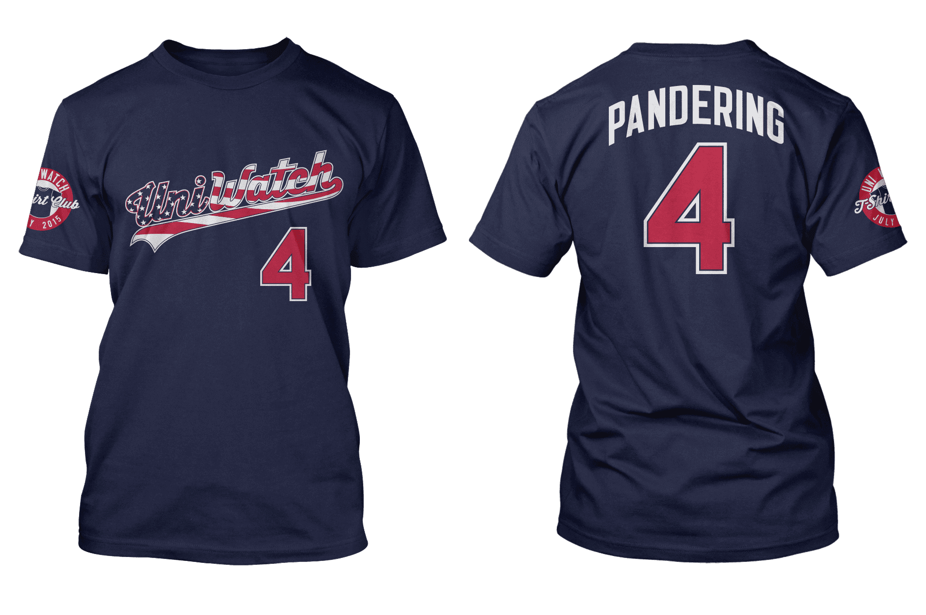
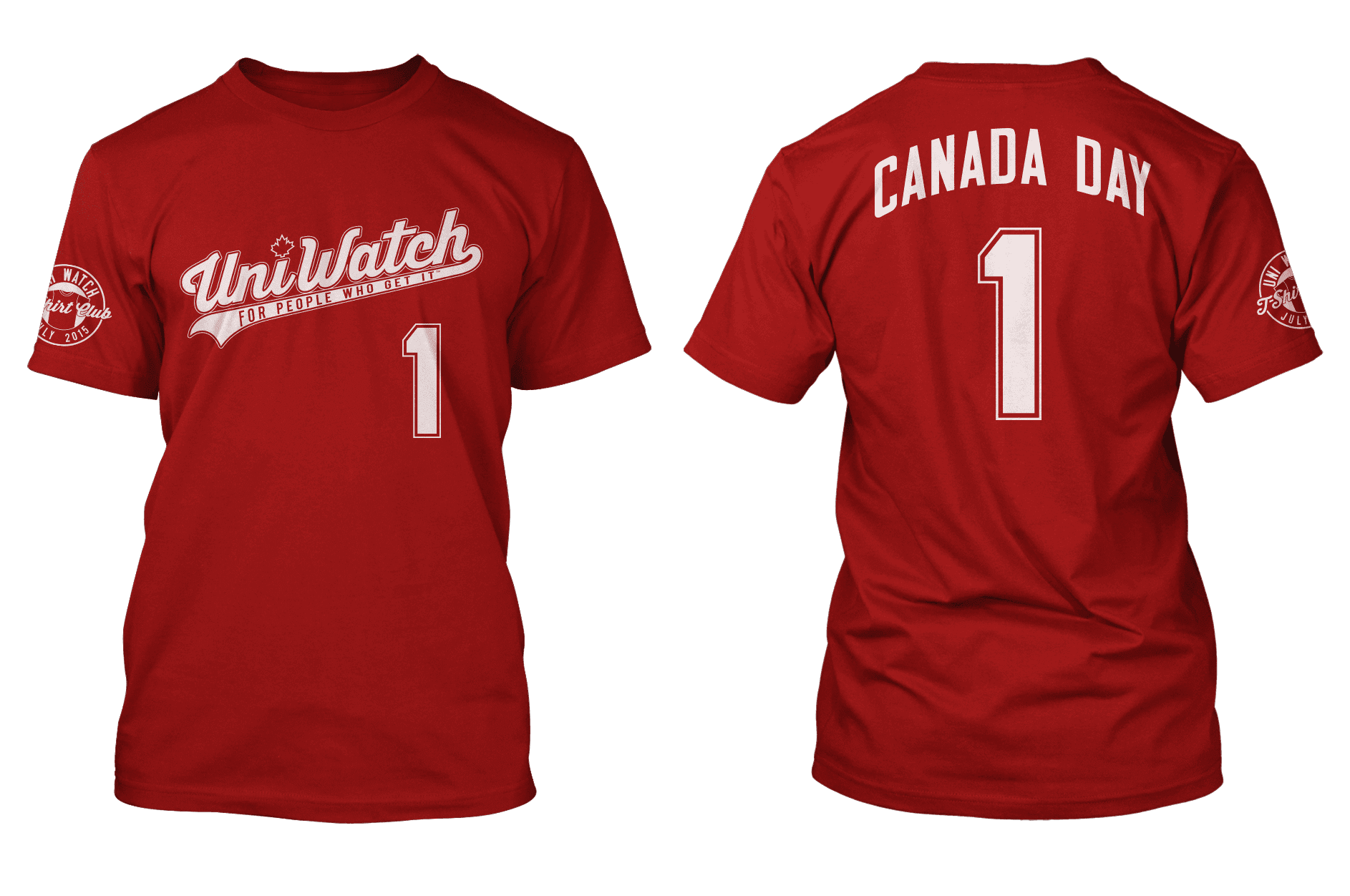
You can order Independence Day here and Canada Day here, and there’s further info here. For those who have issues with the “Pandering” NOB on the Independence Day shirt, that topic is discussed in depth on this page.
Uni Watch News Ticker:

Baseball News: The other evening was Elena Elms’ first time at Chase Field, home of the Diamonbacks, and she writes, “I see they have different color championship logos to match uni colors with year won.” … Heres “a #NattyBoh Orioles logo on an Under Armour shirt in Minneapolis” (from Tater Q). … Last night the Tampa Yankees wore these Strike Out Cancer jerseys (from MiLB Promos). … The Tennessee Smokies wore Pinktober BC-themed jerseys last night (via Tennessee Smokies). … Also from MiLB Promos, the Myrtle Beach Pelicans became the Hurricanes (note font is Toronto Blue Jays, circa the 1970s-80s, which is similar to the Blue Jays’ font today). … In preparation for the All Star Game in Cincinnati, the Pillbox Cap and mustache on the Scripps Building is coming along (h/t Trés Lawless). … Mathew Green was watching The Donna Reed Show and noticed this strange design on the back of a baseball jersey. … Next Friday (June 12) is Full House Night for the Frisco Rough Riders (via Cameron Craig). … More guys going with protective head gear: Dan Jennings, previously struck by liner, starts wearing cap insert (from Roger Smidstra). … The South Bend Cubs had cancer survivor night last evening, and the players wore pink jerseys (via Joe Reimers). … Couple of MLB 15 The Show mistakes noticed by Austin Glover, who writes, “I noticed that on Canada’s version of the baseball game MLB 15 The Show, Russell Martin has what appears to be a matte helmet on, although the Jays don’t use matte helmets. Since the cover was made before the season, I have a strong suspicion that they just photoshopped the picture below or one similar from when he was a Pirate. Speaking of the Pirates, Sony neglected to make their helmets matte. I guess the people behind The Show just don’t ‘Get It’.” … Here’s the latest cap to get the flag desecration America F*ck Yeah treatment (from Seth Caskey). … The Toledo Mud Hens are having Bacon & Eggs night in Aug (vs the Iron Pigs of course), and “these popped up in the shop” (h/t The Real Kub). … “From a recent high school softball state tournament game in Kentucky. Daviess County is in white/red, Central Hardin is in Columbia/navy blue,” writes Josh Claywell. “Gotta love all the logo creep, from the Daviess County player wearing Under Armour socks and cleats with a Nike hat, to the Central Hardin coach wearing an adidas polo and cleats, the Central Hardin player wearing what looks like Mizuno cleats and an MLB arm pad. Also, notice the weird shoulder panels on Daviess County’s jersey. That sure as shit reminds me of one of those things you can scan on a smart phone (I forget the name, dammit).”

NFL/Football News: Do you remember when the Detroit Lions wore blue pants and gray/silver socks? A lot of people would like to think it never happened (from RN’s Funhouse). … Nice follow up to yesterday’s WFL-themed lede comes from Bill Jones, who writes, “We just started selling our newest WFL Card Set – The QB Collection – today. I thought you might find this set interesting. Our Series 4 set, featuring more players and moments from the 1975 season – is up next.”

NBA News: Whoa. Check out this pretty interesting set of NBA stickers from 1969 (or at least that’s the copyright date), from Stirrups Now). I think it’s actually from later than that, since the Trail Blazers didn’t actually enter the NBA until 1970 (although certainly this could have been made with that knowledge in 1969).

Soccer News: “I made this handy Women’s World Cup bracket that includes broadcast information for each match. At the very least people can enjoy matching flags to nations” (from Coachie Ballgames). … The Syracuse Silver Knights are looking for a Design Intern for the Summer and Fall (via Jim Vilk). … Here’s some more cross-sport promotion from the City of Chicago: The Chicago Fire are supporting the Chicago Blackhawks with “this cool Twitter avatar” (from Mark Grainda). … Beautiful uni-matchup in the Women’s World Cup with Netherlands in orange/white/orange and New Zealand in all black with silver accents (from Saurel Jean).

Grab Bag: We’re frequently bemoaning the high cost of polyester jerseys here in America, but George Chilvers points us to this England rugby kit rip-off, which notes £120 is staggering record-high price for World Cup replica shirt. … At long last we have a look at a full view of new Tennessee font and new “My All” graphic from Nike (via Robby Gross). … “Goodell is taking over tennis!” exclaims WeHaveFive), as he presents this screenshot of the NFL logo over tennis. … Here’s an interesting article about football teams that adopted the Adidas “diamonds” kit template of the mid-1990’s (from Graham Clayton). … Cino Commisso was watching the NHL post game and noticed the Gatorade props look like Stanley Cups to him: “The red G sticks out, and the bottle is silver a la Stanley Cup.”
And that’s all for this fine Sunday — hey, how about that American Pharoah? Triple. Crown. Winner. — I live about 20 minutes from Belmont, and over my lifetime I’ve probably been to that track 50 or more times, including about 10 Belmont Stakes (probably 5 of which featured a Triple Crown Attempt — each time resulting in failure). Growing up in the 1970s, we had Secretariat (probably the greatest horse of all time), then Seattle Slew (whose owner, trainer and jockey I got to meet once) and Affirmed winning in 1973, 1977 and 1978 respectively. So — when spoiled like that as a young child, one kinda expects a triple crown winner every few years — or at least once a decade. Nope. Hadn’t happened since 1978 (many of you readers may never have been alive for the last one) — and it is truly a remarkable achievement. So, I was extremely pleased to see it happen (on tv, this time) yesterday.
Big thanks to Mike for penning today’s lede and everyone else who contributed by email or twitter. Have a great Sunday and I’ll catch you all next weekend.
Follow me on Twitter @PhilHecken.
Peace.
“It appears that King Corcoran is the unofficial mascot of Weekend UniWatch, which I think is a fine thing, indeed.”
–Cort McMurray
The only thing I have to say about the Bucks new uniforms is that the little blue patch on the side is stupid, and just ruins the whole thing once you notice it.
Do you like the black patch?
Yes.
(No, not really)
It’s just as stupid, but it’s not as visually jarring.
Do you remember when the Detroit Lions wore blue pants and gray/silver socks?
Best Lions road uniform ever.
No its not. Second worst uniform in the teams history, behind the black jerseys.
Agreed. Blue pants for the Lions was tacky and ahistorical. Silver helmets and pants, with blue and white jerseys, is a classic look for the Lions. They move away from it at their peril.
I’m on the fence about whether or not blue pants were right for the Lions. (The gray socks were a mistake; some kind of stripe pattern would have likely worked well.) I understand that this broke tradition a bit, but at least it helped distinguish Detroit from Dallas a bit.
But the team’s “second worst uniform” ever? When the current set is a head-scratching mess of bad numerals, ugly striping, a black face mask, and a shade of blue that’s almost what the Panthers wear?
Come on, man. Let’s have a little perspective.
I think the gray/silver socks are what made it work. White socks with silver/blue stripes that matched the jersey might have been better, but it was 1998 and no one had sock stripes. (Ok, yeah, the Bears & Chiefs & a couple other teams did… you know what I mean.) It gave them a look they could have owned.
As far as worst Lions uniforms go… their first attempt at black trim (2003-2008) was much worse than what they’re currently wearing, and then there’s ’68-’71 where they had a white stripe on the helmets but not the pants. Nevermind the whole red & black thing in 1948 that we can all just pretend didn’t happen because no one remembers it.
“Ok, yeah, the Bears & Chiefs & a couple other teams did…”
And Baltimore…and Miami…and San Diego…and Washington. Sock stripes never really went away, especially not with colored pants.
“…their first attempt at black trim (2003-2008) was much worse than what they’re currently wearing…”
In terms of using black, it was pretty much the same.
link
link
I grudgingly defend the 2003 set because the numbers were tastefully blocky, and the blue was still somewhat Lions-ish.
Oddly, I do find that I prefer the more detailed helmet logo that’s in use today.
I didn’t previously know about the ’68-’71 striping inconsistency, but it’s minor, if kinda dumb.
“Nevermind the whole red & black thing in 1948 that we can all just pretend didn’t happen because no one remembers it.”
I’ve never been able to find pictures of that.
The new Bucks unis are very good looking and a winner. I like the Jags concept but having a cat’s head on the side of the helmet is what keeps the panthers, jags and patriots uniforms below avg. I recall last year someone on this site submitted a fake throwback for the panthers, the jags helmet needs that same look.
Ditching the teal and going with urine color as main theme has a mizzou feel but definitely a step in the right direction.
I don’t know to whom you might be pandering with all that, but Missouri looks terrible, and so does this “Jags” concept. Anything combining the Jaguars and “throwback” ought to be something like this:
link
Anyway, about Ryan Melson’s design:
Spots on the shoulders look awful, as does the gradient blur on the knees. Words on pants get stupider every time I see them…this should NOT become a thing. Words on the front of a pro football jersey are questionable, and in this case, fairly obnoxious. And the patch is junk…it needs to go away, but I *much* prefer it being on the sleeve, rather than the front of the jersey, so…good idea, there.
The yellow jersey is crying out for some hint of white, and a good place might have been in-between the black numerals and black outlines, but no…just more yellow.
I’m glad that you dumped the two-tone helmet they’ve been using, and yet kept the new cat face — it’s one of the few good things they’ve done lately. Not crazy about changing the tongue, though. Before, he might have just been eating a weird popsicle, but now, I think he has some sort of liver problem.
Also, I’m a bit unclear on how the presence of teal “dates” a uniform. Is it because teal was over-used for sports uniforms in the ’90s? Well, if teal can “date” something as being from 1995, then the hodge-podge of contemporary tropes that you’ve churned out here clearly dates your uni concept as being from 2015.
Think about it.
(And thanks for sharing this.)
Great call about the words on the pants – I agree that is
C
R
A
P
not sure how I missed that the first time.
The Donna Redd Show -> Donna Reed
San Francisco Rough Riders -> Frisco (Texas)
Toled Mud Hens -> Toledo
Though Frisco does become San Francisco when doing a Full House-themed jersey, right? :)
Bucks unis – the little blue patch is great! Definitely an homage to old Bucks teams, as well as Marquette University.
Jags concept is excellent. Actually looks like a Jaguar.
Clippers concept? Aside from the Ships Wheel logo – which is great, I’m ambivalent. Am I missing something, because I don’ think LA is spelled “Los Angelos.” Is that a play on “Los” ? Seems like too big a mistake to miss when you proofread.
I was going to complement the rebrand on salvaging a misbegotten Clippers rebrand; the ship’s wheel logo is excellent. But spelling it “Los Angelos” is a monumental blunder that undercuts the effectiveness of the entire project. It’s like a model for a Hugo Boss suit walking the runway with his pants on backwards.
Agreed. Any credibility this had is gone.
At first I thought it was intentional. I still think it is, but why? It’s not like the NBA or the Clippers will come after the designer for trademark infringement; if it does, it would be over “Clippers” and not “Los Angeles.”
By the way, I love this rebrand effort way better than the team’s actual rebrand. The only thing I disliked about it is the change to navy blue; it looks way too much like the Detroit Pistons’ “Motor City” alternate jersey, plus the Clippers have always been a baby blue or royal blue team.
On the other hand, branding it the “Los Angelos Clippers” might allow this shirt to be sold at swap meets… J/K
From his pdf proposal: “I believe that it’s absolutely crucial to spell the city name out in the primary mark and I have done so.” I think he meant: “I believe that it’s absolutely crucial to spell the city name out INCORRECTLY in the primary mark and I have done so.”
I saw that line too and winced. I don’t think it’s intentional as there are other spelling errors in the proposal as well. “To” instead of “too”, “elude” instead of “allude”. I think his concepts are way better than the leaked versions, too bad the overall proposal would be looked at poorly for these problems.
Looking at that Bucks lettering, I get the impression that they’re trying to make it look like something hand-cut from the 1950s. Fifties lettering is usually more attractive than this, though.
With apologies to Bucks fans, it looks like another forgettable uniform for a team that’s been forgettable since Sidney Moncrief left.
At first glance I thought of the Brooklyn Nets. I guess simple straightforward lettering is the next thing in NBA unis.
Very nice colourisation David for a first attempt. I’m impressed.
(And Bruce too, but we expect that :) )
nice work. just like i pictured it. love those old yellow jersey Rams unis.
Thanks George…and yes, excellent 1st time colorization David. Cheers!
loved those lions unis! and I’m a fan of the bucks, too.
Second worst set in their history, behind the black jerseys.
The 1948 black jerseys, or the 2005 black jerseys?
And where do the black pants (1948-50) fit into your ranking?
link
UniWatchers need to know!
I like the new Bucks threads… more of classic feel instead of garish.
I’ve had the same thoughts on the Jags since the first time they tried to change up their unis…. back when they added all the thin piping and the teal shine black helmet… just lose the teal already. If the tongue needs to stay teal as a quirky accent fine, but drop it from the uniforms otherwise. This has other elements that make it less of a classic feel that I am partial to, but the dropping of the teal outweighs that for me. I said recently out loud in front of my wife “Man, I just hate teal.” She said “Really, I didn’t know that….” Then she reminded me of our 1995 wedding colors, which she chose, but i never complained about. I said “That should difinitively show how much I wanted to marry you.”
Love the Bucks new look
As nice as the Bucks’ uniforms are, Jesse Alkire could have done better.
Jesse Alkire could make them “clean” and “modern.”
link
Yeah.
The Minnesota Wild and the Republic of Italy do well with Red and Green. I don’t know what the author has against it. I think the new Bucks’ set is nice, but that’s all it is , “nice”.
The South Sydney Rabbitohs of the Australian National Rugby League competition also do well with red and green:
link
Ok, so why is there one “N” in the TN word mark that is not slanted to look like the shape of the state? Kinda stands out. Not in a good way.
There’s also 2 different styles for the letters E and S. Don’t question it, it simply has to be that way.
Dumb as hell.
If they want the Transformers font, they should just use the Transformers font.
link
Should I point out that the Transformers logo has 2 different S’s? Because it does.
link
I think the negative reaction by some Lions’ fans to the 1997 pants is driven by the disappointing season they had, which played a key role in the early retirement of Barry Sanders.
Regarding the Milwaukee Bucks, don’t understand why they would stray from using the color red, which was associated with roughly 15 years of success. They’ve had a very long drought, to say the least.
Red goes well with green in small doses, or if the red is darkened a bit. If the Bucks had limited the red to trim on the lettering and thinner striping, like their first set, it might have been longer lasting. Restraint doesn’t seem to be a valued attribute these days.
“I think the negative reaction by some Lions’ fans to the 1997 pants is driven by the disappointing season they had…”
(1998, actually.)
Same old story, again and again. People rate uniforms not on how they look, but how well the team happened to perform.
I call it “We Never Won Nothin’ in Those” Disease.
On the flip side, be prepared to suffer with the Seahawks’ ugliness for a LONG time…
Bucks unis: numbering/lettering is just a little too clunky as to be a discredit. Like they tried too hard to be simple. Being simple should be exactly that and they went out of their way to be plain.
Jags concept: 2 thumbs up, except for the oversized “JACKSONVILLE” word mark on the white jersey. Too collegiate. That aside, I like the rest a lot.
Love the Lions blue pants. Second best uniform in the teams history, behind the black jerseys, which will always be tops.
Let me guess…you’d like to see the black jerseys with the blue pants, hm…?
Sure. Why not? Sorry if my aesthetic preference offends you. I was born this way, I can’t help it. Don’t judge me.
Count me in as someone who likes the new Bucks look, and who dislikes the old Bucks jersey…but the “Christmas” thing is kind of silly to me. The old Bucks jersey was bad because it didn’t look good. The whole Christmas thing is not a good reason.
The Clippers are moving to Los Angelos?
The misspelling of Los Angeles is a callback to the team’s days in San Diego. Obviously.
LA Clippers re-rebranding: The logo is better but the LA and C should just not be combined in a logo. I don’t see anyway of making that look good. Just go with the LA part of it.
Also the misspelling of Los Angeles is quite distracting for me.
Have the Pirates even updated the style guide with the matte helmets? I don’t think anybody knew that they were going to wear them past spring, which is why they aren’t in MLB The Show. If they aren’t in the style guide, they won’t be in the game.
Same story with the D-Backs.
That doesn’t make it any less frustrating for us gamers though. With freakin everything today getting DLC and update patches, there’s no real reason that things like matte helmets shouldn’t get fixed, even if they aren’t “official”. The team is wearing the damn things, put them in the game!
MLB The Show is so frustrating when it comes to uniforms. They say if it’s not in the style guide it won’t be in the game, but there are more than a few things they’re missing besides the matte helmets. I’ll have to go through and look it all up.
It is very frustrating. I just wish I could have one peak at the style guide to see if it’s really MLB’s fault or SCEA’s fault.
Heck, it’s just a username and password away. So close, but so far away. It would be great if we could get Paul or somebody else to either confirm or deny a whole list of errors in the game. I would guess that he doesn’t have that kind of time, though.
If just the first post on this OS thread could be checked against the style guide, so many people would just be happy just having the piece of mind.
link
Btw, congrats to Stan Wawrinka who just won the French Open in the tennis equivalent of a a Jax Jaguar outfit
link
Well, you know… if you knew you could get away with playing tennis in your boxers, wouldn’t you?
If only they were teal.
Then they could be “dated.”
Hey, I had those 1970 NBA stickers plastered over my bedroom as a kid!
As Paul mentioned in his article, the Bucks (their best uni is still the one worn when they entered the league back when I was putting NBA stickers on light switch plates) blew it when they rejected this idea:
link
Like MKE…if I could be like MKE…
Overall I’m liking the Bucks unis. They’re definitely an upgrade from the current set.
A couple quibbles:
– On the home shorts, there’s not enough contrast between the white and cream on the notch. Maybe a thin green border to set it off? Though that might ruin the negative space ‘M’.
– I agree with Paul that the drop shadow on the jersey’s team/city would be an improvement. Maybe on the numbers also – I’d have to see it to be sure that it doesn’t look too much like a Lakers rip-off.
Nothing matches here. Side panels don’t match pant inserts? Jersey lettering fonts don’t match the M neck insert? Sky blue and black in side panel come out of nowhere? This uni-set looks like five different designers worked independently on different details then submitted their work to the outfitter who assembled the final uniform… but without a lead designer overseeing the consistency.
And the green and creme are simply… drab. Creme colored neckline seems like make-up rubbed off on the white.
Ugh. Ugly.
I don’t want to act as if Milwaukee’s uniforms are a complete train wreck, but they definitely have some problems that few others seem willing to address.
The side striping is inconsistent in a way that just doesn’t make any sense. The main stripe on the white uniform is mostly green. The main stripe on the green uniform is…mostly green. Why not white? Or even cream?
And why would they put cream right next to white? There’s not enough contrast there; it gives the impression that certain sections have just become discolored somehow…
link
And the font is just way too square. I know that people want to see it as “old-school,” but in this case, it just seems harsh, particularly on ‘S’ and ‘5’. (Note that ‘B’ isn’t like that…hmm…)
And finally…what’s the deal with that little rectangle of bright blue? Have the Bucks *ever* been that color?
link
Nothing “M” matches.
Sorry, don’t care for those new Bucks uniforms. That said, they weren’t designed for me. I’m way out of their desired demographic. Those folks clearly dig the new unis, so the Bucks’ designers have accomplished their goal.
The adaptation of the vintage striped side panel, though well-intentioned, is as bland as last year’s adaptation of the Robert Indiana MECCA floor design.
The NBA I grew up with is long gone, as are its sweet unis.
The holes in the Bucks’ jersey mesh are small Ms link
Oh for the love of Celestia… give me a freakin break.
As if the buyers of counterfeit jerseys are going to care if they have normal mesh or M-mesh on their “looks really close to the real thing but cost $100 less” jersey.
Paul bemoans the absence of block shadows in the final design in his ESPN piece, but I think one reason they were probably scrapped is that there’s barely enough room for Milwaukee on the road jerseys as they are now.
That MO State jersey today was atrocious. I’m embarrassed to have graduated from SMSU.
Are you out there Traxel?
The NHL’s international broadcast feed is STILL using the old Lightning logo in the graphics:
link
The South Sydney Rabbitohs of the Australian National Rugby League competition wear red and green:
link
With each passing game I dislike the Cavs’ blue alts more and more.
I felt bad for the LA Clippers redesign guy and couldn’t actually believe he would spell it “Los Angelos”
I found his original brief posted in Bechance 2 months ago, and it’s spelled correctly.
Maybe someone decided to have some trolly fun with his submission?
anyway, before the internet has too much fun at this fella’s expense: link
The NBA stickers are from the 1971-72 Topps Basketball set. Here is a look at the 4 different stickers which also included ABA teams.
link
Wow. So the Bucks make a huge deal out of making cream and green their colors and then they wimp out by going with white as the home uniform?
That.
Is.
A.
Major.
Disappointment.
Am I to understand that the Bucks side panel colors go blue, black, green, white, green, cream then the rest is green? That’s not a color combination, it’s like a weird secret code from a secret agent movie. The typeface looks like it was created by a little kid with a ruler. Cream is a great color if you’re a 1970’s housewife shopping for paint for the bedroom walls. I told Larry Harris that silver home jerseys with purple lettering and trim were the way to go; that foo should have cocked a more attentive ear to my freely given edicts.
That said, the drop shadowed lettering would have likely brought me on board.