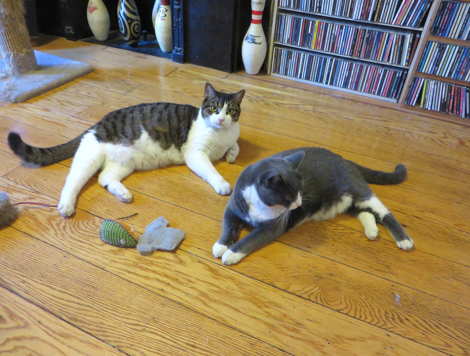
Photo taken yesterday; click to enlarge
Uni Watch mascots Tucker (left) and Caitlin turn 10 years old today — or 56 in feline years. Aside from their steadfast refusal to look at the camera at the same time, they’re pretty damn awesome, and it’s no exaggeration to say that Uni Watch wouldn’t be possible without the endless stream of entertainment and affection they provide for me each day. They’re the best cats in the uni-verse and the universe, and I can’t imagine life without them. They’ll be getting lots of catnip and other birthday treats today. Good kitties! ”” Paul
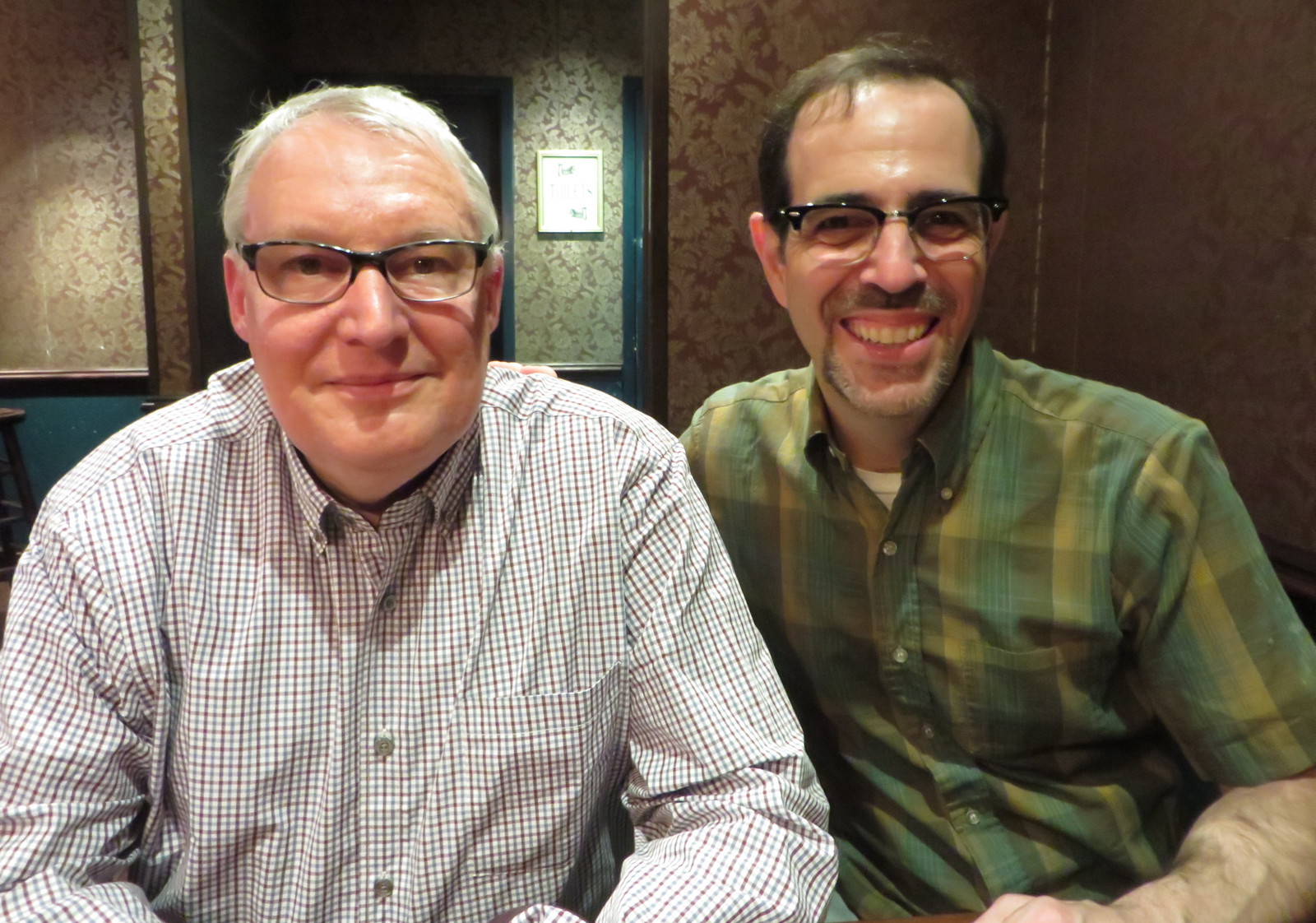
Tommy and Paul; click to enlarge
Tommy time: If you’re a longtime reader of the site, you’re probably familiar with the name Tommy Turner (or as he’s sometimes known, Tommy the CPA), who’s been contributing a steady stream of Ticker items, most of them DC-related, for many years now. Tommy and his lovely wife, who live in Richmond, Virginia, are vacationing in NYC this week, and I had the pleasure of meeting up with them yesterday evening at a midtown tavern.
Like so many Uni Watch readers, Tommy’s a bit of a character. He says he has “prodigious amounts” of jerseys, helmets, and other collectibles, and he seems to remember exactly what he paid for each of them (usually at a steep discount).
Interestingly, Tommy is a camo-loving Marine Corps veteran and a lifelong ’Skins fan who has no problem with the team’s name. He’s aware of my positions on those issues, obviously, but that hasn’t dampened his enthusiasm for Uni Watch — or, more importantly, his tremendous graciousness and generosity of spirit — because he’s a true gentleman who doesn’t little differences of opinion get in the way of the big picture. And the big picture is that he’s a uniform guy, so we had plenty to talk about. He also insisted on picking up the tab at the end of the evening, which was completely unnecessary but very much appreciated.
Thanks so much, Tommy. It was a privilege to meet you — enjoy the rest of your time in NYC.
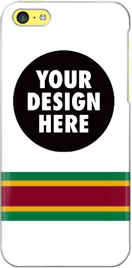
Design contest reminder: In case you missed it, I’m currently running a contest, with a cash prize, to design a Uni Watch smart phone case. Full details here.
As an aside, many of the designs that have been submitted so far feature a white background. As you can see, I used a white background for the mock-up shown at right, so maybe people were following my lead, but I want to stress that the base color does not have to be white. If you go to this page and click on “Layout,” you’ll find a link that will show all of the available background colors.
Uni Watch News Ticker
By Mike Chamernik

Baseball News: Yesterday, the White Sox and Orioles faced off in front of an empty ballpark in Baltimore due to the riots around the city. It was the lowest-attended baseball game ever and it was quite a weird sight. The players had some fun with it though. Sox OF Adam Eaton cracked a joke, O’s C Caleb Joseph signed autographs for invisible fans, O’s 1B Chris Davis tossed a ball into the stands, and O’s broadcaster Gary Thorne called an Adam Jones double like a golf announcer. Here’s a photo gallery of the game. And as an extra touch of video game realism, the online “The Show Live” O’s/Sox matchup on MLB The Show 15 featured an empty stadium. … In a related item, the Orioles’ weekend set against the Rays is being relocated from Baltimore to the Trop this weekend, but the O’s are still the home team and will wear white uniforms. Also, Rays players will not have their usual walk-up music or other rah-rah moves that they’d normally have if they were the home team (from Andrew Cosentino). … Not only did the Padres wear their Wednesday throwbacks yesterday, their game notes were retro, too (from Brady Phelps). … I believe we’ve seen this before, but just in case: Chicago’s St. Rita High School wears 1980s White Sox beach blanket uniforms. “They’re still wearing the same style stirrups that we started wearing while I was there in 2000,” says Marc-Louis Paprzyca. … Staten Island’s Tottenville High School wears tequila sunrise jerseys (from Alan Borock). … A Rangers fan zinged Josh Hamilton with a modified jersey (from Cody the Chicken). … One more from Cody: The Indians put a team-themed Grateful Dead logo on their lineup card yesterday. … Former Cubs and Bears trainer Andy Lotshaw wore a great dugout jacket (from Christopher LaHaye). … Douglas Ford found a video of a few members of the London-based band Jungle performing in MLB gear. … Hanley Ramirez’s helmet ocasionally falls off when he swings. ”¦ A pickoff throw from Pirates P Gerrit Cole tore a hole in 1B Pedro Alvarez’s glove last night (from Chris Flinn).


Pro and College Football News: The 49ers will unveil a new alternate uniform at their draft party tonight. Paul will have full coverage on this tomorrow. … New uniforms for UConn and UNLV. As many people have already noted, the UNLV set looks a lot like Rutgers’, and the uni numbers on the black and red jerseys are going to be very difficult to discern. But maybe everyone will forget about that and just focus on the “Welcome to Las Vegas” sign that will now be appearing on the back of the helmet.

Hockey News: Fans voted for the best uniform in Chicago Wolves history (from Jeff Wilk). … A fan at last night’s Wings/Lightning Game 7 wore a Steve Yzerman Lightning jersey. Yzerman played more than 1,500 games for Detroit, but he is currently Tampa Bay’s GM (from Matt Larsen).

Soccer News: New all-white third kit for Sporting Kansas City. The team will wear the uniform this Sunday against the Chicago Fire. … FC Bayern renewed its contract with Adidas through 2030. “It’s not the biggest surprise since Adidas owns an 8.33% share in the club,” says Yusuke Toyoda. … Montreal Impact forward Dominic Oduro had a fleur-de-lis shaved on his head (from James Nagasawa).

Basketball News: New court and slightly different logo for Kentucky (from Jon Arthur). … Georgetown is holding a contest for fans to design a new court for the Hoyas. … After attending the Bucks logo unveiling with Paul a few weeks ago, I came up with a uniform idea. When a team changes its look nowadays, the colors, logo and uniform alterations all represent something. There’s a story to be told. What’s a great way to show that a team is tough, gritty and professional? Literally… blue collars! Teams should totally start wearing blue collars and playing up the symbolism. Bonus points if blue isn’t even in the regular color scheme. My other idea is that teams can sew heart patches on their sleeves.

Grab Bag: Here’s a look at the history of U.S. Postal System uniforms (from John Henderson and Andrew Rousch). … Both Maryland governor Larry Hogan and Baltimore mayor Stephanie Rawlings-Blake have worn Under Armour gear during public appearances over the last few days. UA is based in Baltimore and even sought to produce the city’s police uniforms a few months ago (from Scott Szymendera). … Here’s a great bunch of old ads featuring women playing sports (from Will Scheibler). … GoDaddy will not sponsor Danica Patrick next year. … Douglas Ford thinks the Mayweather/Pacquiao poster looks familiar. … “A fan of VFA Australian rules football club Werribee has created his own scoreboard memorial of the club’s biggest score, against Coburg in 1993,” says Graham Clayton.

What Paul did last night late yesterday afternoon: I had to make a stop in the East Village yesterday while I was on my way to meet Tommy Turner and his wife. It was a beautiful spring day, and I was in a great mood as I passed a work crew painting a Modelo Especial ad onto the side of a building at the corner of 12th St. and Ave. A. That’s when I noticed something interesting — take a look (click to enlarge):
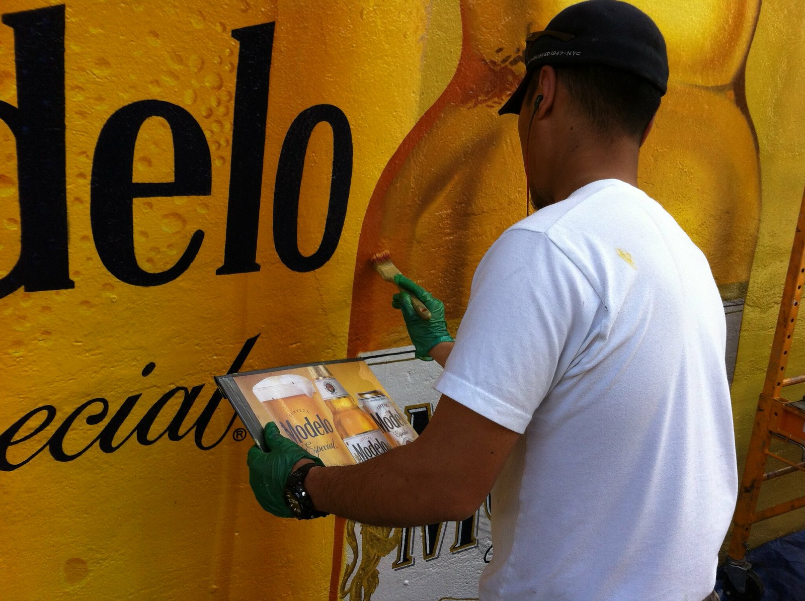
As you can see, the painter was using a print ad as a guide for the painting. I watched him work for a few minutes and it was really fascinating to see how he’d look at the print ad and then make a small adjustment based on what he saw there. So cool!
Why do I have this feeling that the Niners new alternate jersey is going to be black?
Looking at their pro-shop: link
Look at the item in the bottom right listed as elite team/alternate… so i think you may be right on the black
BUT more importantly, whats the deal with the one-off, abandoned 49ers logo helmet within the page banner?? could use that logo while keeping a single shell…..
The NFL bans multiple helmet logos, except for throwbacks. Stupid rule, possibly even stupider than one-shell.
A red and black jersey split down the middle? Shit, I’d pay to see that, but I’d also pay to see a circus sideshow.
On that 49ers page, you can spend over $100 for a jersey that looks like the on-field product.
But you can also spend that much on jerseys with different fonts and colors that look like counterfeit knock-offs. I could never figure that out.
I wouldn’t read too much into all those black jerseys in the 49ers online pro shop. Those are retail “fashion” jerseys, and almost every team has something similar in its merchandise inventory. To wit:
link
link
link
link
that’s not their pro shop.. the official site takes you here link
NFL alternate jerseys must be team colors by rule, and black isn’t a 49ers color.
Packers alternate is blue; also not a team color. They have some flexibility on the alternates.
That’s a different case – some NFL teams have separate logo slicks with different PMS values for their regular logo and the “classic” logo. The Packers list green, gold and white on one page, and blue/gold/brown/light brown on another page.
Sure it is. It’s the color of the outline around the logo.
The link lists black as a secondary color.
“Why do I have this feeling that the Niners new alternate jersey is going to be black?”
Because “incorporating Black injects youthful energy and edge, and evolves the 49ers Brand without abandoning the franchise’s core character.”
Also, I hear they’re going to calling themselves “SF” rather than “San Francisco” because “using the colloquial ‘SF’ will resonate in a profound way with a younger demographic.”
I’m undergoing speech/desire dysphoria.
An excerpt from the leaked press release:
We at the 49ers wanted an alternate jersey with attitude. It’s edgy. It’s in your face. You’ve heard the expression, “let’s get busy”? Well, this is a jersey that gets “bi-zay”, consistently and thoroughly.
We’re talking about a totally outrageous paradigm!
Just saw a couple pictures online of the new alternates. Yep, it’s BFBS. In fact, black monochrome with red numbers and no white outline on them. Not a fan of it at all, especially with the regular gold helments.
I would listen to a game if Gary Thorne was calling it all like that.
Gary Thorne is an all-timer. Always liked his work for ESPN on NHL and MLB telecasts.
They’re not moving the Rays/O’s series to Tamps or to Tampa. It’s moving to St. Petersburg.
I still call it Leningrad.
:)
Fixed.
Weren’t the Dolphins supposed to unveil a 3rd jersey this month? Man, I’d love a throwback for the 50th anniversary season. Knowing the Dolphins, it’ll be orange or navy blue.
Concerning the UConn and UNLV unis: I think the UConn uniform looks great and is significant more for what they are doing away with than anything else. Thank goodness last year’s unis did not stick around long. I love the UNLV side star on the pants. Subtle but unique to them and better than the in your face/back of head helmet stickers on the back.
link
Huskies uniform is a huge improvement. Splendid! Perhaps the first serious gridiron identity for them since they went Division 1. No nonsense, good colors.
“… New uniforms for UConn…”
I like them, too, Dan, mostly. My beef is with the color red (even as an accent) for a school and a state with a long history of just blue. I know that the basketball teams have had red accents for years now, and I know that nobody except 13 other people in varying stages of dementia agree with me, but I ‘m just attached to that historic simplicity thing.
. . . the few, the proud – and the correct!
Agreed on the “removing things to improve”. I like seeing a bit more red in the uniform.
I also prefer the simplification of not having “CONNECTICUT” or “HUSKIES” or anything on the front above the numbers, even though I can’t remember if it was like that last year.
Ugh. Shoulda looked first: From last year, removing the topfront UCONN, and the outlining pinstripe of navy on white (A, or white on navy H), is loads better.
I concur… less is way more better.
Wow, an actual sign painter sighting. That’s a dying breed I think. I would have thought most companies would use a vinyl adhesive sign. And as I write this I did a quick internet search because I was sure someone would have written a magazine article about this if PL hadn’t and found a recent documentary on the subject: link link
There’s an interesting painted billboard renaissance happening in North Brooklyn. It seems to all be between two companies – Sky High Murals and Colossal Media. They’re located and seem to do the majority of their work in the semi-industrial area between Williamsburg and Greenpoint near the East River. Guys on ladders with little reference printouts, like your photo. Take a ride up and check it out sometime!
Speaking of the Las Vegas sign, the designer recently passed away.
link
Just popping in to say (click to enlarge)…
Wait, you can embed images in comments?
I can.
That Padres throwback design is yummy. Can’t wait to see their perfect navy version.
Can’t wait to see their perfect navy version.
Would that be the one with the orange trim?
Best to Tucker and Caitlin from our Bikini and Tikit.
Packers blue is the original team color. Defines throwback, not exception to the rule
lksandlkjiujhblekwhrliwqua bk dcfbvjskve bdsk bkcx bzjb cfahds hnbkjn wekj4h7y34rfe bkhldfsiuyghf bvujikhbfgb
Oh, sorry – my cats came by to say ‘o hai’ to your kittehs.
Happy Birthday, Caitlin and Tucker, the most brilliant cats in the Uni Verse. Not bad lookin’ for their age, either.
They really look the same as they did when they were, say, three yrs old. Even better, they *behave* the same as they did back them (esp. Caitlin, who’s still an inquisitive little monkey – very kitten-ish!).
As for blue collars, I heard the Oilers wore Columbia blue to mimic the denim shirts worn by oil workers. Later, they went with a silver helmet to look like a hard hat.
And, why do teams move their “home” games to their opponent’s stadium. This weekend, both the Phillies and Nationals are on the road. Not only could Orioles fans attend those games, but they’ll be able to get better seats than they would for a Camden Yards game.
I reasons I’m aware of explaining why Bud Adams chose Columbia blue for his Houston AFL franchise are:
1) It was a close match to what the University of Kansas(Adams’ alma mater) football team worn at the time.
2) It was the eye color of Mrs. Adams.
3) It was a pre-emptive strike against Lamar Hunt’s plan to secure the color for his Dallas AFL franchise.
The denim-look explanation is a new one to me.
And I read that the switch to silver helmets was to give Houston a more ‘space-age’ look when they moved to the Astrodome:
link
Kinda short notice to get a third party involved in a venue-switching situation. And you’re assuming the Phils and the Nats would be willing to allow this. Given the latter’s dealings with Peter Angelos, I’d be surprised if they would even consider it.
The NFL has moved two games to Ford Field on shorter notice.
Even better, why not just switch home dates? They’re both in the AL East, meaning that they’ll be seeing each other a couple times during the season. The O’s make this a road trip, and the Rays return the favor later this season.
Happy birthday to the cats, but is it some sort of inside joke among feline owners that all cats are born on the same day? I had at least 2 friends post on Facebook that their cats turned some age or another within the past day or two.
Littermates?
My two are littermates, and there were three other kittens in that litter. Don’t know where they ended up.
Also, evidently that Chris Chase fella who wrote the blog entry in the second link regarding Kentucky’s new logo never was able to find Waldo and could only find 3 of the 6 differences in Highlights Magazine if it took him 15 minutes to spot the differences between the old and new UK logos.
Er, it looks like the “K” in the new symbol is horizontally symmetrical. Is this what Chris Chase didn’t grasp?
Orioles and White Sox play in front of no fans… reminds me of those old Marlins/Braves match-ups at Dolphin Stadium.
That painter has some serious talent. That is just awesome. Ads aside, sometimes really good murals can dress up an urban area. Some really talented people create some works of art on walls in our cities.
To clarify: For anything of that size, I’m pretty sure he must have gridded it out and probably used a projection for the basic layout. By the time I saw him, he was just doing the fine details. I doubt the reference printout was his only guide for the entire project.
Most likely… they used perforated paper to get the lines in, then it’s paint by numbers and touch up. Learned how to do this whilst working for the big mouse.
Not revealing trade secrets here… done this way to knock out big canvases fast. One of the first things we learned. That and pinstriping trashcans.
Are the Mets WEARING this?
link
or giving them away???
The Binghamton Mets (AA) are wearing them on the 3rd for Austism Awareness night.
*Autism
Yep. I googled reverse imaged searched . . . and didn’t find it, but “Mets Autism” in image search worked
And they’re doing a jersey auction afterwards, not a giveaway.
Binghamton Mets. thank goodness
I hadn’t heard of the band Jungle until yesterday, and today they’re in the ticker. Weird.
For a brief second, it looks like there is someone else’s name on Pedro Alvarez’s replacement glove in the video. Anyone else catch that? Or am I seeing things?
“Interestingly, Tommy is a camo-loving Marine Corps veteran and a lifelong ’Skins fan who has no problem with the team’s name. He’s aware of my positions on those issues, obviously, but that hasn’t dampened his enthusiasm for Uni Watch – or, more importantly, his tremendous graciousness and generosity of spirit – because he’s a true gentleman who doesn’t little differences of opinion get in the way of the big picture.”
But thankfully, I’ve heard Tommy hates purple and BFBS, because otherwise you guys just wouldn’t have been able to hang, amirite?
I’ve got you now Tommy Turner, and I’m taking you to the principal!
I was so scared that the Indians?Grateful Dead thing was going to be a Wahoo Steal Your Face. That would have been horrendous.
The Dead’s iconic skull is probably the best multitasking emblem in existence. If there were a basketball in there, they would be an NBA team.
This may just be me being dense, but…in the pic of the empty Oriole Park (the first one in the ticker), there are three guys sitting behind home plate. They’re presumably working, or at least there in some official capacity, since they’re all wearing credentials of some sort. If that’s the case, though, why weren’t they required to be wherever they would normally be, instead of in the stands, just because the stands happen to be empty?
For the record, the Scott (Me) that always talks about Philadelphia sports is not the Scott that asked the question above.
To respond to the question – they could be team front-office employees (they don’t look to be dressed like ushers). If that is the case, then why not?
They could be advance scouts – I believe they usually sit in the stands.
Yes — scouts.
Those 3 people were a pair of scouts and a pitch count operator, so they were sitting in the exact same place that they would sit normally.
link
Which … “pitch count operator”? Clicking a counter every time a pitch is thrown is actually a job? Or does whoever’s charting pitches responsible for performing that task as well? And since when have teams employed a dedicated person to chart pitches anyway? That always used to be a job for the next day’s starting pitcher…
Pitch count operator for the scoreboard. Doesn’t mean the two teams weren’t charting the pitches themselves from the bench.
No reason that task requires sitting behind home plate, though. Would be just as easy to do it sitting near the actual scoreboard operator, up in the press box as I understand it.
Some of those pitch count boards also indicate the type of pitch. If this was one of them, the operator would get a better view from behind the plate.
Interesting take from ex-NBA Creative Director on new marks.
link
Dude likes the Cliparts’ new logo better than the Bucks’? I’ve lost all respect.
On Creamer’s message board, he was referred to as “frequently banned.” It must take more than demonstrably bad taste to accomplish that.
Surprised to see the Modelo ad is actually painted, and not a Vinyl wall wrap pre-printed elsewhere.
So disappointed if the Niners alt is indeed black. When they went back to a style and colors like the 80’s, it seemed common sense had kicked in. Of course with this owner and GM, I am being proven more wrong every day.
Saw the new 49ers unis…all black (pants and all)…In 85 degree weather in Santa Clara (Indian Summer)….It’s genius *sarcasm*
Hahahahahahaha…. sometimes I hate when I’m right.
The no-shows for the second half will now include players.
Who the hell designed the UNLV uniforms? Some amateur? For starters, they used an old, bad uniform template that all the amateur designers on the Chris Creamer board have been using for years. And even worse, UNLV unveils their new uniforms using this ridiculous template! Why not unveil the finished product like UCONN and everyone else does?
The whole thing lacks any professionalism, it’s strange a somewhat major college program would stoop to this. Why didn’t the uniform manufacturer have any part in the unveiling?
link
Niners new alts, apparently.
At least they have red socks. Um. Yeah.
In moments, the 49ers now have the honor of having the very worst NFL uniform in the entire league. Not even close. UGH!
Did that Washington jersey have gold nameplate lettering?
Oh, they’re all like that I guess. Well, never mind.
So, yeah, now that it’s actually official, the 49ers’ new black jersey is, for all intents and purposes, an updated version of the old 90s Starter black fashion jersey (one such example shown link).
Interesting…the uniform is still ugly. Black has never been their primary or secondary color….It’s Red then Gold.
Under Armour trying to outfit a police department is going to be a disaster. I work for a police uniform distributor, and have a hard time getting boots and polo shirts from them. UA views the tactical business as a red-headed stepchild. Honestly, it’s embarrassing that they are consistently out of stock of most of their most popular boots. I’m glad I wont have a part in that mess.