Click to enlarge
[Editor’s Note: Back in 2012 I ran an entry about how Marquette dropped its “Warriors” team name in 1994. Today we have a guest entry from Brent B, who has an fascinating story about another chapter in Marquette sports history. ”” PL]
By Brent B
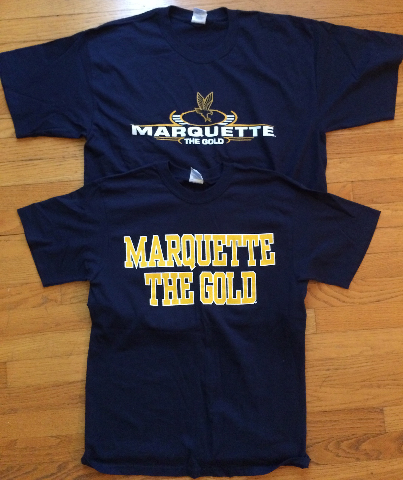
Back in 2005, while I was still in school at Marquette University, the board decided to change the mascot from the Golden Eagles to the Gold. Backlash from alumni and students was intense, and the mascot reverted back to the Golden Eagles in about a week.
It just so happened that I was interning with a clothing retailer at the time. And since we were local to the Milwaukee market, some samples with the new name were created. I made friends with another intern in the men’s athletic apparel department and, when it was clear these shirts would never get into stores, convinced him to get me the samples. Those are the two T-shirts you see above.
The shirts had official NCAA tags on them (they finally tore off in a move) but the trademarks on the screen printing remain:
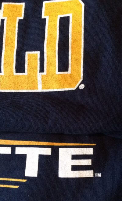
The “Gold” name didn’t last long enough for a mascot to be designed, so one of the shirts had the Golden Eagle logo that was current at the time:

I’ve never come across any other “Gold” apparel, either in stores or as samples, so as far as I know these are the only two pieces that exist. I’ve never had the desire to wear them to a game for fear of ridicule, so they remain in like-new condition.
Right, me neither: Ever wonder what it would look like if NBA teams had football helmets? A pair of graphic designers named James Politi and Luke Daly did, so they created helmet mock-ups for all 30 NBA teams.
Frankly, this kind of exercise generally leaves me cold (maybe if it had been done with colored markers or something like that, then I’d be more into it), but a lot of readers seemed to like this one once it began circulating yesterday afternoon, so I thought I’d give it a little showcase. Check out the full set here.
(Footnote: Of course, one NBA player — Calvin Murphy of the Rockets — actually has worn a helmet on the court. But it wasn’t a football helmet.)

Click to enlarge
Absolutely essential: Longtime Uni Watch pal Bill Henderson has just put the finishing touches on the latest edition of his definitive Game Worn Guide to MLB Jerseys. As its title suggests, the guide was originally intended just for jersey collectors, but it has become an indispensable visual database for MLB uniform scholars. I usually consult my copy several times a week.
Like its predecessors, the new edition covers pretty much every jersey design worn in the post-flannel era (i.e., 1970 to the present), with detailed team-by-team info about NOB lettering, patches, throwbacks, BP jerseys, tagging, manufacturers, and more. Uni Watch’s highest rating!
You can see a sample chapter and get your copy of the new edition here. Even better, Bill is offering a 33% price break to Uni Watch readers who use the discount code “purple100” at checkout. You know what to do.
(And if you want a fun little blast from the past, check out this piece I wrote about a previous update to the Henderson guide.)

Accursed color update: As longtime readers are aware, May 17 — the anniversary of this site’s launch — is Purple Amnesty Day. That’s the one day of the year when I’ll accept orders for Uni Watch membership cards that include purple.
Last year May 17 fell on a Saturday, so I moved Purple Amnesty Day to Friday the 16th. This year May 17 is on a Sunday, so I’m once again moving Purple Amnesty Day, this time to Monday the 18th. That will be the day when all you Vikings, LSU, and Rockies fans can order your membership cards. Mark your calendars now!
Also: Purple Amnesty Day will have a new wrinkle this year. Not ready to tell you the details just yet, but I think you’ll enjoy it. Stay tuned.
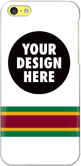
Design contest reminder: In case you missed it, I’m currently running a contest, with a cash prize, to design a Uni Watch smart phone case. Full details here.
As an aside, many of the designs that have been submitted so far feature a white background. As you can see, I used a white background for the mock-up shown at right, so maybe people were following my lead, but I want to stress that the base color does not have to be white. If you go to this page and click on “Layout,” you’ll find a link that will show all of the available background colors.

Baseball News: With all the Royals-related brawls we’ve seen this season, Indians P Trevor Bauer wore boxing gloves in the dugout for Monday night’s Cleveland/KC game. ”¦ The MLB Network ran a Tigers graphic that mistakenly showed the team’s cap logo on the jersey. ”¦ Riker Lynch did a 1920s baseball-themed dance and wore a baseball uniform on Dancing With the Stars the other night (from Kelby Phillips). ”¦ Due to the unrest in Baltimore, this afternoon’s Orioles/Chisox game will take place in an empty stadium. Poor weather and other factors have led to plenty of MLB games taking place in near-empty ballparks, but has there ever been a previous instance of a game being closed to the public? ”¦ Beginning with yesterday’s game, Maryland is wearing five different jerseys in a five-game span — plus there’s that sixth jersey at bottom-right, but it’s not clear when they plan to wear that one (from Ryan Bowles). ”¦ Whoa, check out what the Serra Padres wore back in 1982. That’s Barry Bonds on the right, incidentally. That ’82 design is the basis for the team’s current uniform (from @The_Treal_Jay). ”¦ Beau Schott got himself a full set of the Mariners’ new striped legwear. ”¦ Disappointing to see G.I. Joe uniforms down at the Little League level. That’s a team from Madison, Alabama (from James G.). ”¦ Here’s what an eBay seller purports to be a waitress uniform from one of Pete Rose’s restaurants. ”¦ Here’s a weird mix of a jersey and a tuxedo jacket (thanks, Mike).

NFL News: The Bills’ practice jerseys will now have NOBs. ”¦ Nike has unveiled a new line of NFL cleats. Key quote from the press release: “[The three new designs are called] the Nike Vapor Speed, Nike Alpha Speed and Nike Strike Speed. As the game continues to get faster, now athletes at every level can choose their style of speed, whether explosive, elusive or relentless.” Yeah, I can just picture a player thinking to himself, “Hmmm, do I want explosive speed or relentless speed?” Typical boys-with-toys nonsense from the swooshkateers. ”¦ The helmet and shoulder pad manufacturer Xenith is moving its factory operations to Detroit.

College and High School Football News: New uniforms for East Tennessee State. … The Colorado equipment staff is tweeting teaser images leading up to Friday’s uniform unveiling (from Jeff Alexander). ”¦ Key quote from this article about Ohio High School Football Coaches Association North-South All-Star Classic, which took place on Saturday: “Identifying players by their helmets was near impossible. As has become customary at all-star football games, players decorated their helmets with their opponents’ decals.” ”¦ Nebraska’s offensive coordinator is among those who’d like to see college teams start using NFL-style wireless helmet communication. ”¦ Penn State coach James Franklin was at Yankee Stadium last night. He wore a PSU baseball jersey and gave a PSU helmet to Yanks skipper Joe Girardi. ”¦ UNLV will unveil new uniforms today, and they’ll apparently include an upside-down wordmark on the pant legs. Fortunately, no wordmark for the red and black pants.

NBA News: While looking for something else, I came across this old shot of Jerry West wearing a serious wrap on his thigh. … “On Monday night’s Inside the NBA, Charles Barkley was presented with two custom-made beds for his dogs, Mango and YooHoo,” says Mike. “One dog bed had a Barkley 76ers jersey, one had a Suns jersey. It really upset me that Shaq went over and broke one for no real reason. Like, was that an attempt at humor? Man, he sucks.” ”¦ In case there were any doubters out there: Good job by Chris Creamer, who notes that the Clippers have trademarked the logos that I first broke earlier this month. ”¦ Meanwhile, a designer named Ian Bakar has come up his own Clippers-redesign proposal. ”¦ Are the Rockets teasing a new logo design? Shmaybe.

Soccer News: New home kit for Atlético Madrid. ”¦ Arsenal’s new kit has leaked (from Nate Farrer). ”¦ Bournemouth clinched promotion to the Premier League on Monday night and for some reason the club chairman celebrated with a sombrero (from Yusuke Toyoda). ”¦ Also from Yusuke: “Another day, another kit manager profile. This time it’s Barcelona’s equipment manager’s meticulous pre-match preparation.” ”¦ Brazilian team Ponte Preta used to wear neckties as part of their kits. ”¦ Looks like FC Barcelona is changing from stripes to hoops.

Grab Bag: Texas A&M’s board of regents is voting on a new school logo today. Lots of discussion among Aggies fans here, here, and here (from Greg Keith). ”¦ The Delhi Daredevils — that’s a cricket team in India — will wear lavender cancer-awareness jerseys on Friday. ”¦ Here’s your chance to vote on the best New Jersey high school lacrosse helmet. ”¦ A new logo to celebrate the Canadian sesquicentennial is causing some controversy. ”¦ A series of racist killings carried out by a German neo-Nazi group appears to have been plotted so that the murders’ locations create the group’s logo when plotted on a map. ”¦ Very cool article on paper clip design (big thanks to Mark Coale). ”¦ With same-sex marriage being argued before the U.S. Supreme Court yesterday, presidential candidate Hillary Clinton changed her Twitter and Facebook avatars to a rainbow version of her campaign logo, leading to the observation that the Clinton design is becoming the Empire State Building of campaign logos. ”¦ “The Japan Rugby Football Union has reached an agreement to have Astro Boy be a supporting character for the team for the 2015 Rugby World Cup in England,” says Jeremy Brahm. “Astro Boy is owned by Tezuka Productions, which can now say that they have agreements with baseball (Seibu Lions [current] and Yakult Swallows [throwbacks]), volleyball (Japan Volleyball Association), and now rugby.” ”¦ One of the horses running in Saturday’s Kentucky Derby is named Itsaknockout, and the Mayweather/Pacquiao fight promoters are using the horse to promote the big fight (from Jody Michael). ”¦ New cycling jerseys for the Tour d’Azerbaidjan 2015. ”¦ Canada’s uniforms for the Pan Am games will be unveiled today.
Those NBA helmets leave a lot to be desired. There’s a few decent ideas, but they’re then ruined by weird helmet striping and stupidly oversized logos.
The best one, in my opinion, was the “Los Angeles” script used for the Clippers’ fake helmet.
I agree, The Jeff.
Some were intriguing (like the flames for Miami). But, there’s a point where the look of “logo from the front going to the back” no longer works well (Minnesota).
That Football helmet designer is the very definition of a “one trick pony”. Enlarge existing logo, paste.
Mitch,
Couldn’t agree more.
Cut and pasting existing artwork is a far cry from rolling your own logo (good or bad). These are just detritus of the interlinks urge to listify things to meet a deadline.
Needs some MMLB Cream on it…
link
Actually, very few of the designs are just enlarged logos. Most of them are actually creative, although too many of them use the Rams/Eagles/Vikings style.
But overall, the project is pointless and the designs are not that good.
How many times will Arsenal’s new kit be leaked in the ticker? Has to be the 4th or 5th time now
The same for the Barcelona hoops, I think. Or maybe I’m remembering the multiple times they’ve shown up in Footy Headlines twitter feed.
Possibly, those two always seem to bubble up more and more
I’m almost surprised we haven’t seen the fake Liverpool New Balance jerseys after the official kit launch.
/Kidding, I’ve bitched about the repeat items before and I understand why they happen, but can we put a moratorium on posting “news” about leaks?
I was going to say the exact same as all you guys have. +1 here.
“Ever wonder what it would look like if NBA teams had [Arena League] football helmets?”
The Jeff and Mitch…YES!
Heehee!
(And I say that as someone who’s seen plenty of Arena and AF2 helmets in person.)
SI would seem to suggest that the empty stadium is an MLB first: link
MLB Historian John Thorn says the previous low attendance was 6:
link
“UNLV will unveil new uniforms today, and they’ll apparently include an upside-down wordmark on the pant legs. ”
It’s only upside-down when the leg is raised forward.
So it will only be upside-down *some* of the time.
(Most of the time??)
Unlike the Browns, that actually will be upside-down most of the time, like when the players are in their stance at the LOS.
Seriously football teams, stripes look fine, you don’t need text on your pants. It doesn’t look good.
…sitting on the bench…..laying on the ground after being pancaked…..
The “Las Vegas” and “Browns” pants wordmarks are bad, but still not as bad as link.
Funny how the “skidmark” (I mean, c’mon!) still has currency in basketball but is laughable on football knickers. Probably has something to do with the cut of the uniform, and the culture that permeates the sport. Idaho could have played better too; they probably warranted a shoeprint instead of a team logo.
I think the postures that are common in football make that particular mark look worse than it would in other sports.
Hillary could have had any of these logos for only $95!
link
(ok, some are already sold)
this one look familiar.
link
I remember a few years ago an article was linked about a minor league team who wanted to set a record. They kept fans out until after the 5th and then opened the gates for free.
Read the SI article linked above. That “promotion” is listed there.
The Canada 150 logo criticism is almost as offputting to me as the Hillary logo criticism. Like the Hillary logo, the Canada 150 logo has a major, basic design flaw that goes largely uncommented-upon while people complain about things where the logo stands as a symbol for completely unrelated objections that don’t actually have anything to do with the logo itself. The government held a design contest for citizens to participate, and encouraged young people to enter: Not actually a crime against democracy! If design “professionals” want to alienate the lay public, the whining quotes by industry insiders in the Canada 150 logo article are perfect.
You can’t leave us hanging – what’s the major uncommented-upon design flaw?
I don’t think the criticism reflects badly upon the design industry – you hear the same whining anytime governement work for anything (design, construction, architecture, engineering) goes to an outsider. We’ve somehow cultivated this entitled class across a number of fields who believe that the sole purpose of government contracting is to provide work for government contractors.
Back in 2008 the MiLB Nashville Sounds and the Iowa Cubs played in an empty stadium due to Des Moines being in a state of emergency. link
So, were Marquette going to be the “Marquette Gold”, like the Syracuse Orange, or were they actually going to be “Marquette The Gold” like the shirts seem to show? I certainly don’t recall ever seeing any “The Orange” shirts.
Given how incompetent they are, I wouldn’t have been surprised if they did become the Marquette The Gold.
I think “Marquette The Sad” would’ve been more appropriate (and literary!).
Since I really liked the USFL’s Denver Gold, I consider that a missed opportunity.
Mass nouns. There are three categories of quality of mass-noun team nicknames.
At the top, there are the Excellent mass noun team nicknames. This is a null set; no teams exist in the category, nor have any teams ever been in this category. It remains theoretically possible for a mass noun team nickname to be excellent, though if and only if the English language develops both new words and new grammatical structures. But English has done so before, so we keep Excellent as a potential future category.
Next are the Not Bad mass noun team nicknames. This is a small category, but it does have a few significant members. Much of MLS falls here, as do a few NHL teams. Not Bad is a very narrow band between Excellent and Terrible.
Finally, the Terrible mass noun team names. This is everyone else.
And then, right at the bottom of Terrible, almost begging for a whole new category all to itself, is Marquette The Gold.
I’ve never liked the collective noun team naming trend. I just never thought it made sense. If you’re a member of the Yankees, you’re a Yankee. If you’re a member of the Cubs, you’re a Cub. If you’re a member of the Miami Heat, you’re a ….Heat? Doesn’t square.
A few teams, like the Colorado Avalanche and Tampa Bay Lightning, have gotten around it (Avs, Bolts), but too many haven’t. I give the Minnesota Wild some slack just because that logo is so damn cool.
Although I always did want to hear someone refer to a member of the Orlando Magic as a Magi.
Magi is plural, singular is Mage /pedant
Ah, you are correct. Mea Culpa.
Wouldn’t an individual player for the Orlando Magic be Wizard?
“If you’re a member of the Miami Heat” . . . you’re a calorie.
Similarly, a member of the Orlando Magic could be a trick.
Hold on. Why isn’t Magus the singular form of Magi? Didn’t John Fowles call his book “The Magus.”? Besides, how does one pronounce Mage?
Dammit.
Similarly, a member of the Orlando Magic could be a trick.
They’re called illusions. A trick is what a whore does for money.
Mage rhymes with sage.
Personally, I think Columbus Crew is great. It’s unique, quirky, but also makes a lot of sense for a team since a crew is, by definition, a group of individuals who work together.
It was going to be like Syracuse.
I like the Clippers redesign much better than the leaked version. More traditional IMO.
We’ll have to agree to disagree. To me it was as hack as the basketball logos on the football helmets.
I did like the floor logo idea. You’re named after ships. Use it.
Logos and marks: Not bad at all. A few significant conceptual flaws. But taken together, a strong identity set. The floor design: Fan-freakin-tastic.
The uniforms: Dreadful, even by NBA standards.
So kind of the opposite of the Clippers leaks, which for me feature weak logos and marks, a confusing, almost incoherent identity, but pretty good uniforms.
Sporting Kansas City will wear a new all-white third kit for Sunday’s game against Chicago:
link
I bet the sponsors are thrilled!
Also, not digging the away-kit-for-away-kit’s-sake trend.
In and of itself, it’s a very nice, clean look. But I thought Sporting was trying to own that light blue color; why go away from it?
DJ: it’s a third kit, may go away from traditional team colors at times.
I really, really hate that aspect of soccer uniforms. Our team colors are red & white… but if we’re playing another team that wears red… rather than wearing white, we’re going to wear yellow, or green, or black… It’s just stupid.
My preference would be to use the primary color as an accent in the third kit.
link
How do you know when a sport has uniform problems?
When The Jeff becomes an advocate for white jerseys.
The Jeff: it’s really no different than baseball, basketball, or football wearing white/cream/etc. when that’s not part of their traditional colors.
That’s one of the biggest complaints I’ve heard about the NFHS rules requiring “home” soccer uniforms to be solid white. Many schools don’t have white as a “school color” — in fact, my alma mater was grey/navy.
Beginning with yesterday’s game, Maryland is wearing five different jerseys in a five-game span…
I never thought I’d be the one to be saying this, but I can’t abide that cursive wordmark. Too timid, too passive. It has the look of a sacred cow; a beloved trademark nobody has the courage to say was a mistake in the first place. The best scripts always have a hand-rendered appearance; witness the Dodgers.
I was just wondering when the Raptors supposed new look was coming. I noticed they changed a lot of their social media icons today to reflect the secondary logo, and this version appears to be made of snow. link
Not 100% sure on this, but I think they’re waiting until after the playoffs.
Thanks, Paul.
I was also a student at Marquette in the spring of 2005 when we temporarily became “The Gold.”
In fact I was in a local campus bar the evening it was announced commiserating with some friends when a group of about half a dozen older gents and ladies entered the bar (possibly already a little intoxicated) and started cheering, “Yay! Marquette Gold!” Really excited and whooping it up.
I’ll never know if they were actually part of whatever university committee that made that blunder but my group of friends went around to them and confronted them about how awful the name sounded. How even Golden Eagles was better than “the Gold.”
Hey, Nike…you forgot “Ludicrous Speed”!
Nah… Nike would never go plaid.
They prefer to give the option of which hyper-masculine aggressive trait they want for their feet.
It’s interesting to see the registered trademark symbol at the end of “The Gold” word mark on that Marquette t-shirt. A quick search of the USPTO records shows that Marquette applied for federal trademark registration for the term “Marquette Gold,” but eventually abandoned the application before the USPTO ever approved the registration. Since you’re really not supposed to use the ® symbol unless the USPTO has actually granted your registration application, I think Marquette was getting ahead of themselves a bit.
I do not recall Calvin Murphy wearing a helmet but remember that he used to wear numerous pairs of socks. I think I count five in the picture but I am not sure.
So glad to see that the Mariners are selling their new striped socks/stirrups. I wore my Pilots version to the fanfest in January (thanks Comrade Marshall!)and had team employees asking how I got them already. Will have to pick up one of the newer versions next time I am in Seattle.
Unhip/out-of-touch question of the day: What does “Shmaybe” mean (other than, of course, maybe)?
My brothers were at MU when the Gold was announced. There were a lot of Goldmember jokes going on…
link
Did no one else notice that the discount code for the Game Worn Guide to MLB Jerseys is “purple100”?
That has to be a little jab from Bill Henderson…right?
If so, that’s hilarious
Orioles-White Sox empty stadium game is “free game of the day” at MLB.com. Adam Jones is wearing classic orange/white/black stirrups. The Orioles pitcher is wearing solid-black stirrups. C’mon Adam–lend him a pair!
Those NBA helmets left a lot to be desired, but I like the initial concept. I often think about what it would look like if we had citywide sports institutions. Similar to the way say Barcelona has both a soccer club and a basketball club. What would it look like if all of the clubs from the city had the same mascot as a sort of citywide institution? I mean wouldn’t it be kind of cool to have a Dallas Cowboys baseball, basketball, football, hockey and soccer club!
Again, “Pacers” isn’t only in reference to a pace car. It was derrived also from harness racing “pacers”… which I think is much more unique.
I’m glad I’m not the only one who didn’t like 90% of the NBA helmets.
In 1989, Siena College basketball link, due to a measles outbreak. Fittingly, that same Siena team fits with your other lead topic today. The team dropped the “Indians” nickname before the 1988 season, and didn’t adopt “Saints” until after. So they played the entire season with link.
I know there was another NCAA basketball game played recently (last 5 years?) with no fans, due to a campus-wide outbreak of some type. I’m pretty sure it was also in New York, and I think it was either a conference tournament game or a late-season game with tournament implications.
GI Joe unis. I went to a little league tourney this weekend, for my nephews’ tee ball and coach pitch leagues. While I was there, 5 of 6 teams had the digi-camo, all red, white, and blue. 4 had the full Under-Armour-ish shirt, one had a solid white tee, with digi-camo sleeves, ringer neck, and solid color numbers. It’s bad when it’s one team, but at least it’s unique then. When most have the same exact color scheme AND the camo, it’s excessive and hurts the eyes. The other team had Tennessee Titans-ish unis. Baby blue shirts, Navy shoulders, Navy numbers, white pants, white helmets. Seriously, I wanted to yell.
Thank you for this great advice.
As an aside, many of the designs that have been submitted so far feature a white background.