.
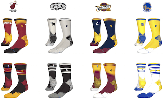
Big changes afoot in the NBA (no pun intended), as Stance will become the league’s official sock supplier starting next season. According to this story by my ESPN colleague Darren Rovell, the new socks will go way beyond the basic white and black versions that players have worn in recent years:
As part of the multiyear deal, which will begin next season, Stance will make socks for all the league’s players in team colors [like the examples shown at right; you can see larger versions by scrolling down on this page ”” PL]. Those socks, as well as other limited-edition socks made by Stance, will be sold at retail.
Because the league considers the sock an accessory and not part of the uniform, even though players are required to wear them, the NBA is allowing Stance to have its logo on the socks just like Spalding has its logo on the basketball.
A few thoughts on this:
• Socks used to be team-colored and were considered a uniform element, not an accessory. While I’m not nuts about the Stance designs, the move back toward team-colored socks, instead of just plain white or black, seems like a good thing.
• It will be interesting to see how the socks coordinate with the tights and leggings that so many NBA players now wear. It seems like a matter of time before the tights start featuring team-centric designs.
• Stance’s mock-ups are all for low-level socks. It’s not clear what options will be available for the handful of players who prefer to wear their socks over the calf.
Collector’s Corner
By Brinke Guthrie
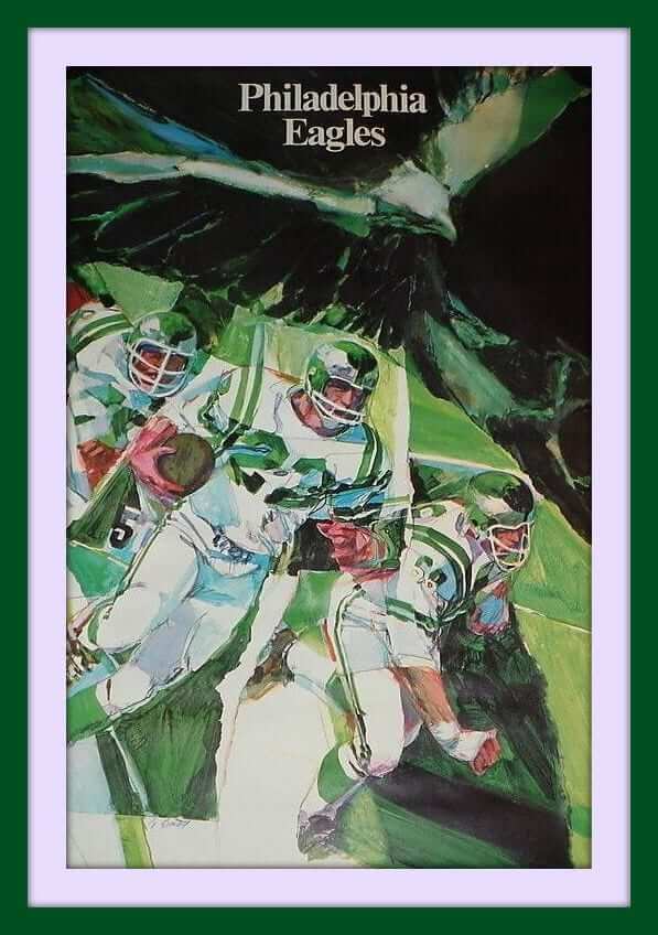
Will the Eagles ever reclaim their kelly green? Who knows. But until then, make do with this great-looking 1968 Eagles poster.
Now, on to the rest of this week’s finds:
• Ever seen an NFL “Golden Helmet” patch before? Anyone know what it was for?
• Sure do like this 1970s Clippers logo better than what we’ve seen recently. Ahem.
• The Tribe’s logo played second fiddle to a bicentennial motif for this 1976 team guide.
• Here’s a suitcase from the 50th MLB All-Star Game in 1979.
• Seattle fans, pine for your SuperSonics (or cheer for them when they eventually give you a new team with the old name) while wearing this 1970s Sonics windbreaker.
• Here’s a fan-made WHA New England Whalers knit cap — that fits on your finger! Not sure why there was a need to make this, but it’s still cool.
• This will look great at Uni Watch HQ: a vintage 1965 New York Giants Technigraph plaque.
• WJW Radio 850 sponsored this 1970s Cleveland Barons promo puck.
• Nice-looking 1965 NFL poster with just the team names, no logos.
• This 1950s NY (baseball) Giants decal is in great shape.
• They didn’t get the horseshoe quite right on this 1960s Colts helmet bank.
• This 1967 watch features the Packers win over KC in the first Super Bowl.
• And from reader Richard Paloma: If you like the A’s striped hose, you can get them in sock or stirrup versions.
Follow Brinke on Twitter: @brinkeguthrie

Isn’t he supposed to be slaving away on uni-related stuff? Uni Watch intern Garrett McGrath, who compiled today’s Ticker (as he does for pretty much every Tuesday; that’s him at right), has two new projects. The first is an article for the Wilson Quarterly about how 1965 was pivotal years in American history (Malcolm X’s murder, the Selma-to-Montgomery march, the Voting Rights Act) and the lessons it may hold for us 50 years later. It’s a strong piece, and beautifully designed and produced — check it out here.
In addition, Garrett has started an email newsletter called Historic Happenings. Each Wednesday he’ll send out links to five stories that have defined what has happened, what is happening, and what will happen in the future. These will include definitive moments pertaining to New York City, sports, culture, and more. I’m happy to be the newsletter’s first subscriber. You can subscribe here.
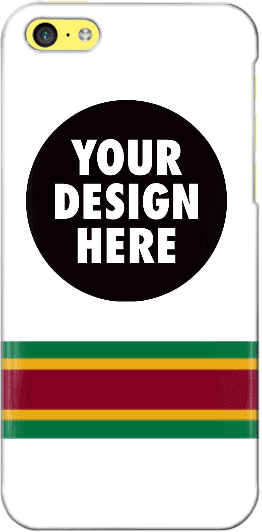
Design contest reminder: In case you missed it, I’m currently running a contest, with a cash prize, to design a Uni Watch smart phone case. Full details here.
As an aside, many of the designs that have been submitted so far feature a white background. As you can see, I used a white background for the mock-up shown at right, so maybe people were following my lead, but I want to stress that the base color does not have to be white. If you go to this page and click on “Layout,” you’ll find a link that will show all of the available background colors.
Uni Watch News Ticker

Baseball News: “My father-in-law was going through some ancient papers and came across an old Yankee Stadium Club Menu from 1962 or ’63,” says Mike Colvin. “I’ve scanned all the menu offerings with the exception of the blank inner rear cover and even included the blank fourth page since the waiter left handwritten notes there.” … The Detroit Tigers had their annual Negro League Appreciation day last Saturday. The Tigers wore their Detroit Stars jerseys, while the Indians honored the Cleveland Buckeyes. “Most (maybe all) players went high-cuffed,” says Jay Winkler. … Among these equipment photos of the Mariners you will see that Robinson Cano has numbered socks (from Michael Korczynski). … Pirates player Sean Rodriguez wore swoosh-emblazoned socks the other day (from Michael Korczynski). … The Seibu Lions will wear yellow alternates inspired by their parent company Seibu Railway’s yellow trains (from Yusuke Toyoda). … There was a uni-related question tweeted to Red Sox broadcaster Jerry Remy during the a rain delay last night. He said the ’70s had ugly uniforms and the button-ups were far superior to pullovers (from Stephen Hayes). … Check out how a catcher’s glove can deform when a pitch glances off of it (from Tris Wykes). ”¦ Gorgeous stirrups for Marmion High in Illinois (from Lincoln King). ”¦ Dan Cichalski notes that Dodgers rookie Joc Pederson appears to play without an undershirt. Not only does he not show anything around the neckline, but it looks like his belly is peeking through in this shot. Another Dodger, pitcher Brian Wilson, also went undershirtless. ”¦ Nationals starter Doug Fister knocked off his own cap during his windup last night (from David Cline).

NFL News: Here’s an article about how former Steelers defensive lineman L.C. Greenwood’s memorabilia was being sold at an estate sale. Key quote: “‘I was really hoping the gold shoes were here,’ lamented Angelo DiNardo of Robinson, referring to Mr. Greenwood’s distinctive game-day footwear. ‘I would have made a serious bid on those'” (from Art Savokinas).

Hockey News: Washington Wizards players Marcin Gortat, Rasual Butler, Paul Pierce, and John Wall attended last night’s Isles/Caps playoff game in DC and wore Caps jerseys for the occasion. “Must suck to be sitting behind those giants,” says Mike.

Soccer News: Two from Yusuke Toyoda: Here is a great slideshow of the kit man at Huddersfield Town at work. … A profile of a kit man at another lower-tier English club who was recently named “club hero.”

NBA News: “I was watching the humiliating loss of Raptors last night, and I’ve noticed that their playoff away jersey was missing the team’s 20th anniversary patch,” says Allen Kim. “They’ve been wearing it all season long on all of their jersey, including on their purple jersey.” … Here’s a collection of vintage NBA caricature T-shirts featuring some great 1990s stars (from Phil Lawson). … “The Bulls have an Eastern Conference standings chart in their locker room,” says Mike. “It has the old team name and logo for the Nets, the old logo for the Wizards, and the standings haven’t been updated in a few weeks (the Celtics and Nets are reversed in playoff seeding).”

Grab Bag: New USA kit for the Rugby World Cup (from Eric Bangeman). … Curling Watch: reader Will Scheibler found these lockets awarded to the Stovel Company Rink in the Winnipeg Printers’ Social Club bonspiel from 1913. And here is a collection of some nice championship team pictures from that era. … Reader Alex Pudlin tracks all the current franchises of a sport based on winning percentage by prominent jersey colors (or hat color in the case of baseball). “So far I’ve done one for MLB and the NBA,” he says.
Caught part of the Tigers/Indians game Saturday, and stayed there due to the uniforms.
Sparked a short discussion with my wife talking about if the Indians ever did decide to change their name, the Buckeyes would not be a bad option for a new team name, but it may cause issues with the big Ohio school.
I think half of Columbus would march to Cleveland and start burning the city if they tried to call themselves the Buckeyes. OSU fans are crazy, man.
LOL, I have heard that. They may want to stay away from it in the future too.
the other professional sports team in Ohio… with much better unis.
Just curious Brett – what do you think about the Browns (says who they are right on their pants.) uni makeover?
Eh, I am not a fan of them, but not enough to really care one way or the other. Waiting for final judgement until I see them on the field.
Having said that, I live in Mass and am a Pats fan. My wife is from the northern panhandle of WV and is a Steelers fan. Her term for the Browns is well….the body excrement that comes out brown. And when they go unitard brown, well, they do look more like that.
Ah works for me…
A Pats fan eh? Then you must be a fan of Fitzy’s Wicked Pissah’s fan-boy cast.
link
Reader Alex Pudlin tracks all the current franchises of a sport based on winning percentage by prominent jersey colors (or hat color in the case of baseball). “So far I’ve done one for MLB and the NBA,” he says.
I’m confused. Why are the Knicks shown in orange for a majority of their existence? I don’t know NBA uniform history as well as I do the NFL, but I’m pretty sure the Knicks haven’t worn orange as anything other than a recent alternate.
Same thing applies to the Pistons. Sheesh. Just because they had red numbers on their white jerseys doesn’t mean red was their primary color.
(This is a great example of why white at home is a bad thing, however.)
Accidentally posted in yesterday’s comment section today, but are designs on the hockey style catchers mask not allowed anymore? I remember in the early to mid 2000’s John Flaherty of the Yankees had a mask with pinstripes and an interlocking NY on it. Now I only see generic one or two color masks.
Only generic designs for now. John Buck was the last grandfathered catcher allowed to have a personalized design.
Stance socks are great. How long before the players start wearing the socks with pictures of themselves on them?
I love Mike Colvin’s menu scans. A few years ago, I stumbled across menus from one of the two ships that sailed to and from Hawaii before jet airliners, and they were a fascinating look into life sixty-plus years ago. The menus were clearly intended to convey a sense of luxury and opulence, yet the featured cheese for one dinner was Kraft Olde English. Jello salads and other things that today have a distinctly lowbrow connotation were the height of sophistication once upon a time.
Jello salads and other things that today have a distinctly lowbrow connotation were the height of sophistication once upon a time.
Not just sophistication but *modernity.* Processed foods were viewed as triumphs of science and engineering (which, in many ways, they were). Now, of course, we view such products as junk food.
Also, in a nation populated by immigrants, processed foods were seen as being distinctly American, because all the ethnic character had been processed out of them. At the time, this was seen as a positive; now it’s a negative.
Thus “American” cheese.
Not to go off on a tangent, but I’m going to go off on a tangent:
One of the joys of watching Mad Men is the attention of detail given to the food, and it’s clear people of the ’60s saw convenience as a virtue, consistency was king and authenticity was rarely a consideration (and one of my favorite scenes is Don taking a date to Benihana, which could only be created in America, to prep for a pitch to a Japanese client).
I have this conversation with my wife a lot, but the foodie movement of the last decade or so is basically penance for the gastronomical sins of our parents’ and grandparents’ generations.
“I have this conversation with my wife a lot, but the foodie movement of the last decade or so is basically penance for the gastronomical sins of our parents’ and grandparents’ generations.”
Reminds me of the admonition on this refrigerator magnet in my house:
link
Although it might be a bit more accurate if it said “great grandparents.” I don’t necessarily endorse the sentiment without plenty of personal qualifications. (Hypocritical? Maybe.) But it does provide a stark reminder how far the previous couple of generations drifted in terms of sacrificing food quality and nutrition in the name of convenience, and how much the pendulum has started to swing back the other direction in recent years.
And now we’re in a state of overcorrection with the the Paleo Diet and link.
Overcorrection? What?! I mean, who doesn’t have an hour or two a week to devote to making link?
‘Although it might be a bit more accurate if it said “great grandparents.”’
I guess it depends on when they lived.
As for many people alive today, their grandparents were born into a world with few processed foods, and died in a world that was rife with them.
The menu is my favorite item on the ticker; however, since I was born in 1959, I wish that Mike did not point out that the menu from 1962 or 1963 was found among some “ancient” papers.
Must be from 62 – the one photo is from the 61 World Series, since the catcher (Johnny Blanchard?) is tagging a Cincinnati Red….
I find it humorous that the Yankee Special has Virginia ham (you think a southern-style sandwich would have an ingredient from a “Yankee” state?), Swiss cheese and Russian (in the 1960s, no less!) dressing.
Even more surprised they’d have anything from Cape Cod on the menu.
And now I’m off to google what a shirred egg is.
I’m cool with the colored socks – not a fan of either white (looks chunky) or black (looks heavy).
Anyway, I was trying to figure out when NBA socks got boring and I came across link (R.I.P. ESPN.com Page 2).
Also, it looks like all the designs would scale pretty well for calf-high socks.
who are you kidding? That pun was totally intended ;)
I once entered a pun competition in my local newspaper, and sent in ten entries figuring that at least one of them would get a prize.
But no pun in ten did.
I have a few pairs of stance socks and the quality is terrible; each pair has worn a hole in them after on a few casual wears. Hopefully the quality will improve, if they expect them to stand up to the wear and tear a professional basketball player would put them through.
You say that, but let’s be real, it isn’t like they’re rushing them home to toss in the laundry between every game. They’ll use them a couple times MAYBE, then move on to another pair. They get them for free, but even then, Stance wouldn’t let a sock appear anything less than brand new. Aren’t Stance socks kind of heavy for athletic socks? They feel that way when I’m looking at them (my store sells them). Also, if the standard Stance socks are $18+, what will the NBA official socks cost, $50? Yes I know, they have the licensed ones with players on them, but those are novelty socks, not “in-game authentic”.
“Two from Yusuke Toyoda: Here is a great slideshow of the kit man at Huddersfield Town at work.”
The link to the slideshow of the Huddersfield Town kit man seems to be broken.
Fixed.
RE: the Green Bay Packers watch in Collector’s Corner. I wonder how old that watch actually is, seeing as how the Pack beat the KC Chiefs in (what was then known as) the NFL/AFL Championship Game. IIRC, wasn’t the Jets/Colts game the first one to be officially known as a Super Bowl?
PS: the fact that it’s advertised as new, still in the packaging, is another clue that it may not be as old as one would be led to believe.
Yeah, it definitely doesn’t date back to 1967. The packaging referring to “great Super Bowl victories” and the modern oval-shaped logo (the 1967 logo was still football-shaped) make that obvious. It’s part of some sort of collector series of watches. I’d guess it’s from the 90’s, but I don’t really have anything to back that up with… just a gut feeling.
Great piece by Garrett. It’s difficult to believe the upheaval in this nation, and the way we seem resigned to repeating it.
The NBA’s decision to allow Stance to put its logo on the socks is an interesting about-face from the league’s stance (no pun intended) on the issue during the time that Adidas has been its supplier. The only logo on the current socks is the NBA logo:
link
Not that I’m going to cry any tears for Adidas, but they can’t be happy about this development.
And David Stern must be spinning in his grave.
Maybe they can put uni ads on the socks while they’re at it.
Hmmm…you’re on to something…
If socks aren’t considered part of the uniform, put the ads on there and leave the uniforms alone.
Or better yet, consider them part of the uniform and #NoUniAds
Thanks for the Garrett McGrath tip. Am now an official subscriber. Look forward to reading his piece in the Wilson Quarterly about !965. Great Society! Good guys and bad guys!
Mostly I remember the joy of pop music. Motown, Beatles/Stones, Soul/R&B. And stupid fun dance steps: Skate; Shing-a-Ling; Hitch-Hike; Boogaloo. “To be young was very heaven,” as some English hipster once said.
2 Thoughts—-
Hockey News: Washington Wizards players Marcin Gortat, Rasual Butler, Paul Pierce, and John Wall attended last night’s Isles/Caps playoff game in DC and wore Caps jerseys for the occasion. “Must suck to be sitting behind those giants,” says Mike……..wasnt there a riff a few years ago during the playoffs with Rasheed Wallace than of the Celtics, wearing Flyers gear in the Celts locker room with Paul Pierce a than Bruins fan. But Wallace stuck to his gear and still wore his Flyers gear. Perhaps Paul can recall if I got the story right.
2nd Thought—-I had these in the mid -late eighty’s in grade school they were college socks with the school name and nickname, or just school name in lettering vertically on socks with school colors. I had a pair from Oklahoma and the other may have been Indiana…does anyone remember this line of NCAA socks????
I remembered this instantly. It was a Dave Schultz jersey. Yes, Rasheed Wallace is one of the biggest reppers of Philadelphia ever. Gratz High School, goes to his childhood barber…the whole nine yards and a Rocky staircase.
link
Does anyone else think these socks, combined with the myriad of shoes worn by players on each team, will look garish on the court? At least now, all the different styles of shoes are framed/separated by a solid sock.
Honestly, I think most of the players will try to coordinate their shoes with the socks.
FWIW, I think basketball shoe designs are relatively clean. There are obvious exceptions like one-off shoes and Nike’s MLK editions, but it’s usually link.
I know this might be a bit extreme, and I believe many players will try to coordinate their socks with their shoes, but I fear every game turning into this nightmare of shoe/sock combos. IMHO, not a single one of those looks good.
link
That’s from an All-Star Weekend a few years back, right? Players tend to break out the garish stuff for ASG (plus, the socks were intentionally mismatched with the jerseys).
The standard in-season shoes tend to be more understated. Or look at the link – they’re all going with simple designs in team colors (though they’re all Nike guys wearing Nike uniforms).
Most of them will look like garbage.
“Socks used to be team-colored…”
But not the way Stance is doing them. I’m no authoritative expert on NBA uniform socks, but it seems that team colors were limited to just the upper portion of the socks, while the lower part was always white.
link
Sorry, folks…Stance is doing it wrong.
Back in 2004 (I don’t remember the exact years), there were teams that wore solid colored socks like link and link. I could’ve sworn the Pacers wore yellow (or maybe it was the Nuggets) but I can’t find any photographic evidence.
Yes, but as mentioned in Paul’s old Page 2 article, that sort of strangeness was unknown prior to the Pacers breaking out all-black socks during the ’99 playoffs:
link
After that, we began to see teams with all sorts of solid-color non-white socks in the NBA, including the examples you linked above.
I should have worded my objection more carefully, but my point is that Stance isn’t resurrecting an “old-school” team colors paradigm in the realm of pro basketball socks. They’re simply adding some modern gaudiness to the same unsightly looks that have been commonplace for quite some time.
Make no mistake, I like the *idea* of team colors on NBA uniform socks. But if it’s going to look like crap, then I’d rather just go back to everyone wearing plain white all the time.
link
At least it was inoffensive.
Bad links, on the other hand, are quite offensive.
Try:
link
Gotcha – I get that NBA teams used to wear team-specific socks, but yeah, I never thought of the white tube socks with stripes as team colored socks.
Though I’d argue that white socks/black shoes combo is an offensive look.
But consider the alternative…
link
And black isn’t even part of the Cavaliers’ color scheme.
Do you only feel this with regard to basketball? Quite a few NFL teams have worn black shoes over the years…
link
Not a bad look.
You say garish like it’s a bad thing. As long as everything is in team colors, it should look fine.
Garrett: awkward bit of wording for the rugby jersey. It should say that it’s the new USA jersey for the Rugby World Cup.
Thanks. Fixed.
Because Zdeno Chara exists it’s not a shock Marcin Gortat can get a jersey.
Robin Lopez did a custom design on Damian Lillard’s shoes last night. Here he shared it on Twitter: link
And here you can see Lillard wearing them in the game:
link
Raps never wore a 20th anniversary patch on their away jerseys at all during the season. Only on their home white and throwback purple (wore only at home)
Most socks tend to coordinate with shoes. For all intent and purpose Nike makes EVERYTHING coordinate with shoe releases (socks/shorts/pants/tees/sweats/jackets/hats/backpacks)
I see teams going with the team colored stuff on more special occasions, while sticking primarily with the white or black.
In regards to Brian Wilson he usually wore an undershirt it is just normally ripped to shreds.
Shirred eggs, also known as baked eggs, are eggs that have been baked in a flat-bottomed dish; the name originates from the type of dish in which it was traditionally baked. Shirred eggs are considered a simple and reliable dish that can be easily varied and expanded upon. An alternative way of cooking is to crack the eggs into individual ramekins, and cook them in a water bath, creating the French dish eggs en cocotte.
I just saw this and thought you’d be interested. link
I forgot to mention that it’s a guy who designed football helmets for NBA teams
Very nice post. I just stumbled upon your weblog and wanted to mention that I have really loved browsing your weblog posts. In any case I will be subscribing on your feed and I am hoping you write again very soon!