[Editor’s Note: Phil and I are both indisposed, so today we have a guest entry from Joe Reimers, who has some interesting behind-the-scenes observations from a minor league ballpark. I’m traveling this weekend, so we have a very light Ticker. Thanks for understanding. ”” PL]
By Joe Reimers
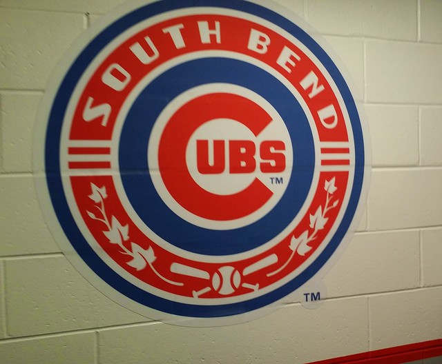
I recently had the opportunity to tour the facilities for the South Bend Cubs, the new Low-A minor league affiliate of the Chicago Cubs. Part of the agreement with Chicago was that the player facilities would be updated and modernized. With the clubhouse area now pretty much complete, some fans were given the chance to check things out.
The way things are laid out at this ballpark, the home clubhouse is on the first base side and the visitors on the third. Both clubhouse entrances are approximately behind home plate, at which point they follow long-ish corridors past coaches’ offices and the trainer’s rooms.
The players’ common area is at the far end of the corridor. The home team side looks very nice and very comfortable. The main sensation I got was one of spacious comfort [for all of these photos, click to enlarge]:
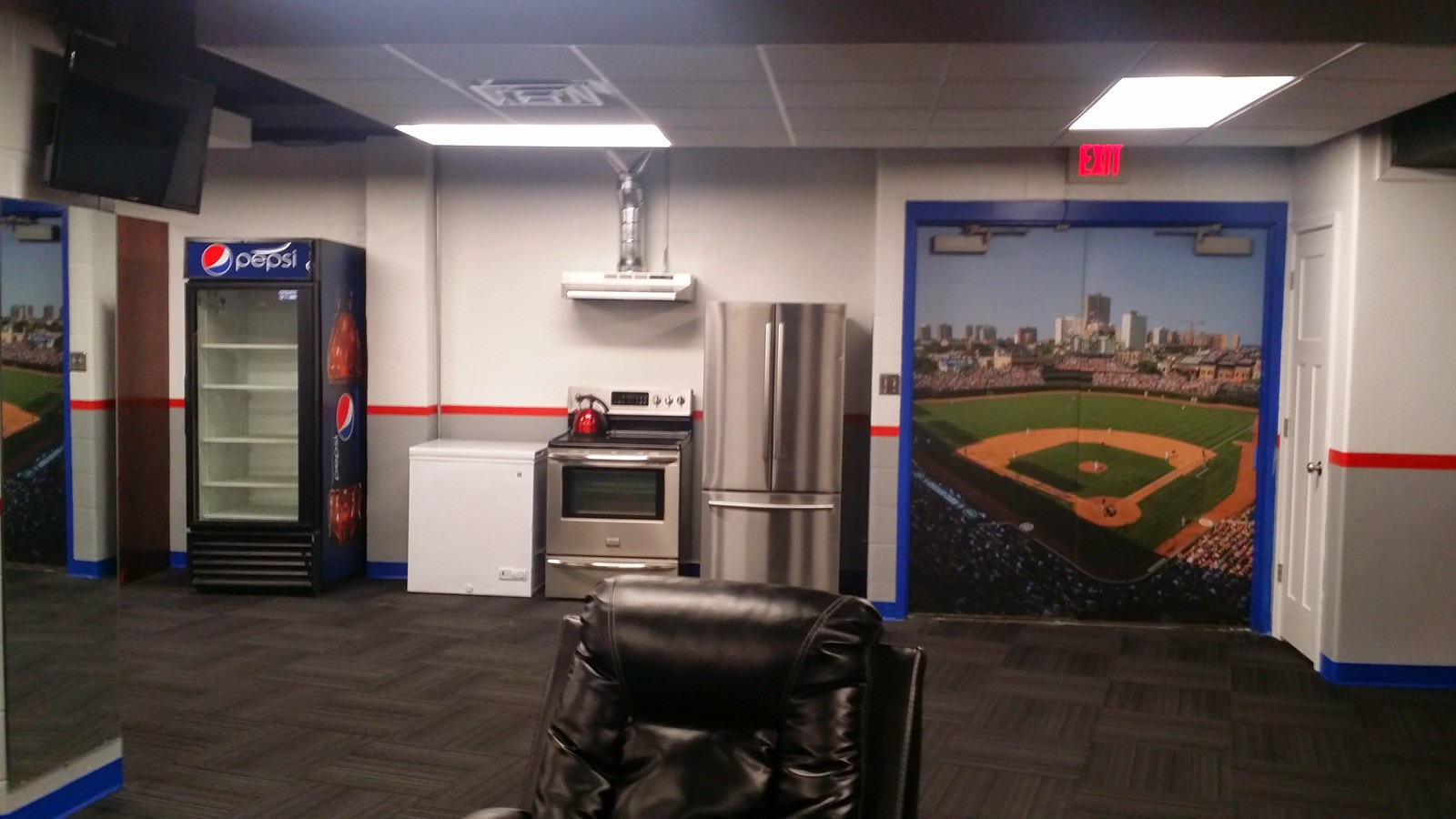
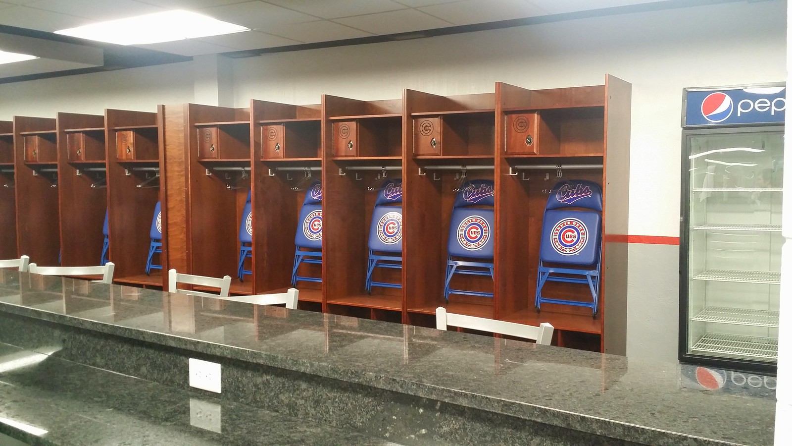
The marble island in that last photo is equipped with plenty of seats and several outlets so players can plug in their phones, laptops, etc. There is also a comfortable distance between the island and the lockers behind it.
While touring the clubhouse, I asked our tour guide (in jest) whether the visitor’s clubhouse had been repainted pink. As it turned out, the visitor’s clubhouse is pink, but the guide didn’t know if it had received a fresh coat of paint. We were then invited to take a look:
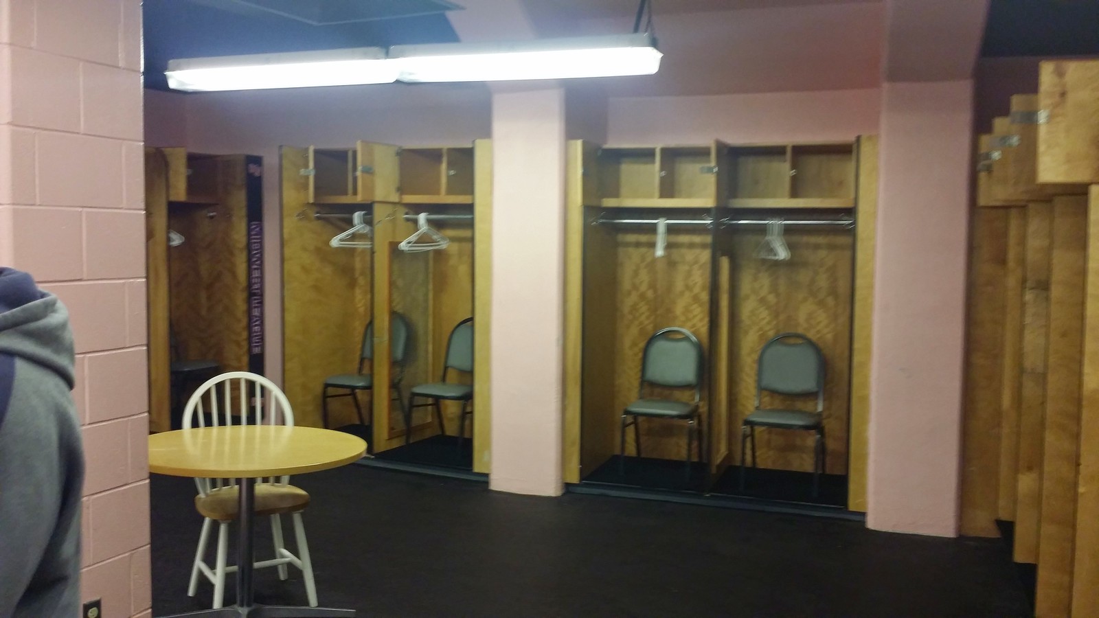
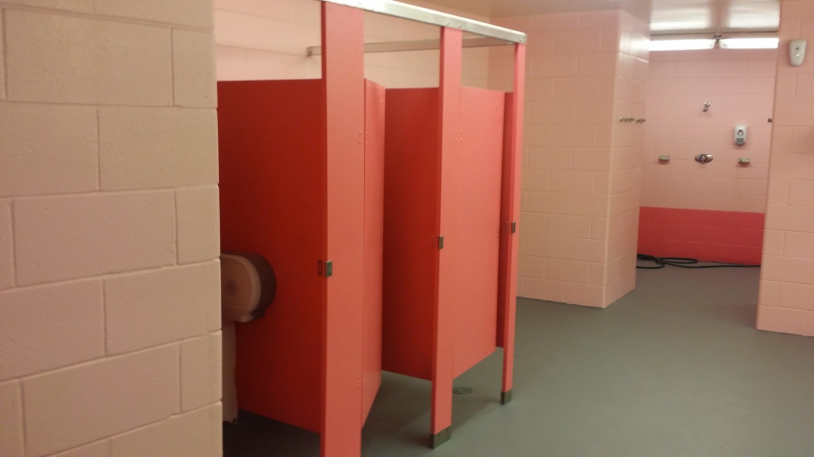
The difference between the two clubhouses was jarring. It doesn’t show up very well in the photos, but the visitor side had far crappier lighting (ironically making the pink less striking) and seemed far dingier and more cramped. I’m sure the narrative is that they spent this offseason modernizing the home facilities (not to mention building an entirely new batting cage facility), so they didn’t have the resources to dedicate to freshening up the visitor’s side.
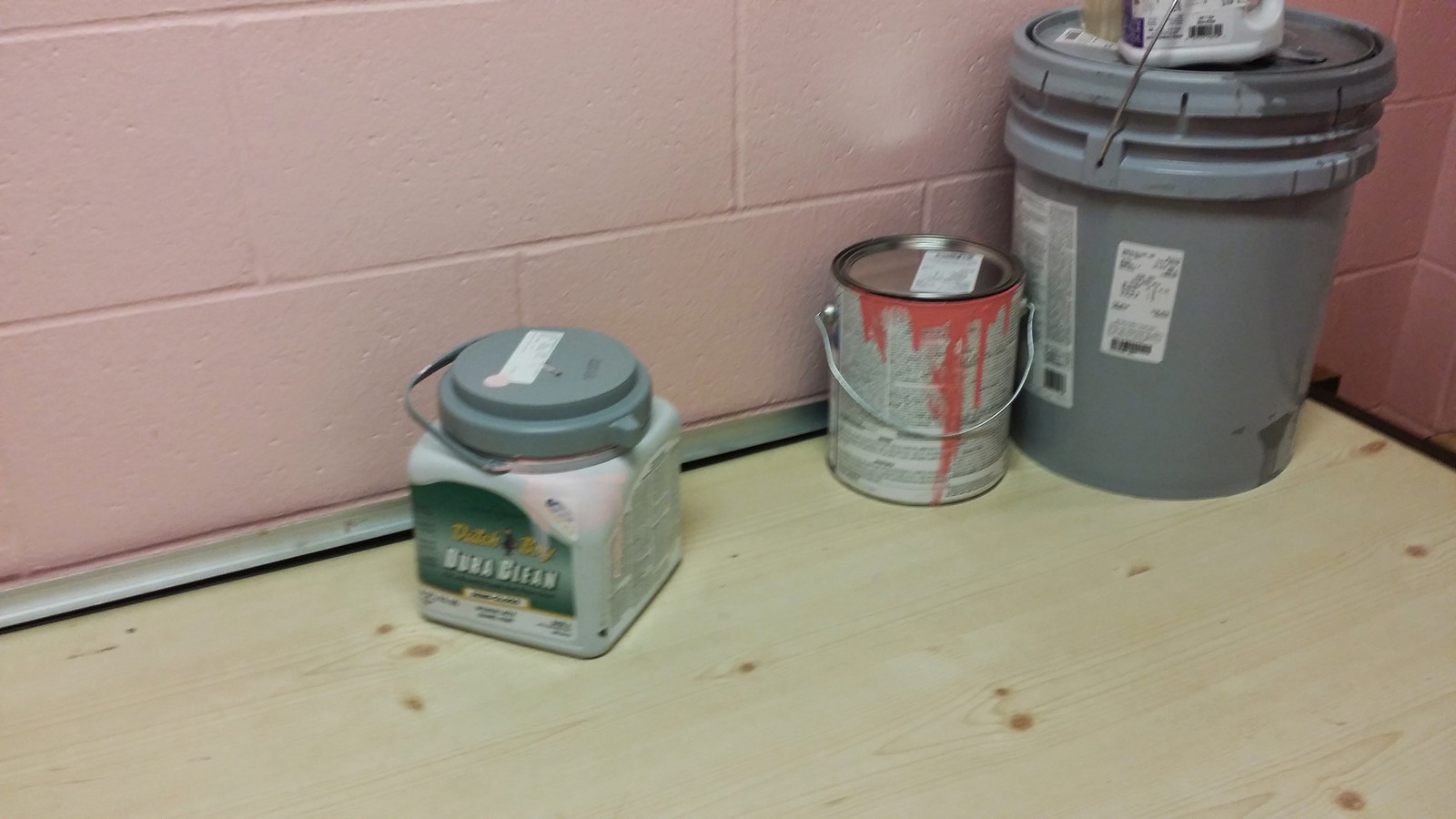
We did eventually come across the pink paint:
All in all, it was a fascinating look into the subtle (and not-so-subtle) touches that go into making a minor league baseball facility what it is. One thing I wasn’t able to photograph (because it was too dark) was a sign upon entering the facility indicating something along the lines of, “This is where the journey begins.” Also, there are constant reminders not only of the fact that this is South Bend, but also of the links to the parent organization.
One other detail I caught just a hair too late, so I didn’t get a good picture: In the visiting locker room (and presumably the home clubhouse as well) there was a small poster indicating which equipment and brands were licensed by the league for use on the field, with reminders that uniform brand compliance was mandatory. It was only a brief glimpse, but it appeared that the reminders were limited to jerseys, pants and possibly caps.
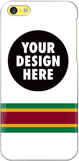
Design contest reminder: In case you missed it, I’m currently running a contest, with a cash prize, to design a Uni Watch smart phone case. Full details here.
As an aside, many of the designs that have been submitted so far feature a white background. As you can see, I used a white background for the mock-up shown at right, so maybe people were following my lead, but I want to stress that the base color does not have to be white. If you go to this page and click on “Layout,” you’ll find a link that will show all of the available background colors.

Baseball News: The Dodgers wore their “Dodgers” road jerseys on Friday, but Juan Uribe wore the “Los Angeles” jersey instead. ”¦ “Liberty and Gardner-Webb wore some spectacularly ugly camouflage caps in their game on Friday night,” says Kary Klismet. “But at least Liberty infielder Clay Keranen kind of made up for it by going high-cuffed with nearly perfect blousing and some great striped stirrups.” ”¦ I think we’ve seen this before, but once more won’t hurt: Check out the amazing checkered team overcoat worn by Senators skipper Clark Griffith (from John Muir). ”¦ Harvard’s softball team wears Boston Marathon memorial helmet decals (from Tris Wykes). ”¦ Here’s a fan wearing a Blue Jays shirt, but he has a Red Sox tattoo (from John Follett).

NFL News: Former Vikings great Alan Page wore No. 88, but the Pro Football Hall of Fame’s website lists him under No. 82. Similarly, they have Cris Carter wearing No. 88, when he actually wore No. 80. “I have contacted the Hall via their comment section to let them know, but jeez this is bush league,” says Douglas Ford.

College Football News: As had been expected, Virginia Tech’s spring game was maroon vs. orange, but bot teams wore maroon pants. ” The overabundance of color made it difficult to distinguish the teams,” says Andrew Cosentino. “I wish the orange team had worn white pants. Also, instead of calling the sides the Maroon Team and the Orange Team, they were named Pylon and Medal of Honor, which was confusing and unnecessary.” ”¦ One more VaTech item from Andrew: The Hokies will have a new Navy-style helmet for Military Appreciation Day on Sept. 12.


Hockey and Soccer News: Good story on how three AHL teams are moving from the northeast to California. … ISIS will give people 80 lashes if they’re spotted wearing a soccer jersey.

NBA News: Injured Trail Blazers player Wes Matthews, whose nickname is Iron Man, wore an Iron Man helmet to last night’s playoff game against the Bucks.

Grab Bag: Google has apologized for that illustration of an Adroid robot urinating on an Apple logo. ”¦ Marquette and Denver had a color-on-color lacrosse game yesterday (from Jared Buccola). ”¦ Unusual color choice for heavyweight contender Bryant Jennings, who wore black trunks with purple trim for last night’s title bout against Wladimir Klitschko. ”¦ Back in 1975, American modified driver Bob McCreadie drove a car with the number nine spelled out rather than appearing as a numeral (from Graham Clayton).
In regards to Douglas Ford’s ticker submission about Allen Page and Cris Carter, they did wear those other numbers. Allen Page wore 82 for his time with the Bears, and Carter wore 88 for his time with the Dolphins. Despite that, both Allen and Carter are listed for wearing their well know numbers as well.
…yeah, this. I was just going to post the same thing.
“Alan” Page. Not “Allen.”
I guess the HOF is like a stopped clock and correct once a day by listing them in multiple sections.
CLARENCE (ACE) PARKER is wearing # 7 in his picture and listed in sections 7 and 88.
Big OOPS on my part
Across the top of the HOF link it reads:
LISTING OF PRIMARY NUMBERS IN CAPS; Secondary Numbers in lower case
– See more at: link
The Hall of Fame also lists Joe Montana as #19… Leading me to believe that list consists of the last number the player wore, Montana with KC, Page with CHI, Carter with MIA.
For Franco Harris they numbers like this “32, (34)”.
At the top of the Football Hall of Fame page it says, “LISTING OF PRIMARY NUMBERS IN CAPS; Secondary Numbers in lower case”
Thanks, everyone. Sloppy work on my part. I’m traveling this weekend and threw the Ticker together very quickly this morning, based on yesterday’s emails, but didn’t provide the level of oversight and checking that I usually do. Mea culpa.
“bot teams wore colored pants” at Va Tech or BOTH teams?
Va Tech obviously using androids on their sports teams now.
”The Dodgers wore their “Dodgers” road jerseys on Friday, but Juan Uribe wore the “Los Angeles” jersey instead.” Juan got it right IMHO.
Page wore 82 when he played for the Bears.
A player whose nickname is “ironman” missed a game due to injury? I bet Cal Ripken is spinning in his grave.
More like ” ironYman”.
Cal Ripken is dead?
when is the last time you heard from him?
hell, at least Gehrig had the ice bucket challenge last year. He gets more pub than Cal.
And I don’t think the Blazers were playing the Bucks either. :) Go Grizzlies!
Didn’t the Indians and Tigers play a negro league game? I expected it to be in the ticker, but wasn’t.
Have not heard from him but last time I read about him was when he was denying that he bullied/hazed a team mate.
Meant to be a reply to mookie above.
South Bend Cubs give new meaning to the term “bush-league”, re: their crappy visiting clubhouse facilities.
Isn’t that the norm? Pink/coral/pastel/whatever paintjobs are nothing new. I think I read the visitors locker room at the Georgia Dome is painted the same way. It’s supposed to be calming, therefore making the team less aggressive.
I’d be surprised if any stadium/arena has a visiting locker room that’s as nice as the home team’s.
Didn’t Hayden Fry start this at Iowa, painting the visitors’ locker room pink?
I had no idea they were the South Bend Cubs now.
I miss the local flavor of link. And I miss the old logo, rather than the big cartoon bird.
Short comment section today.
Anyway, nice article on that South Bend clubhouse, but something at the end confused me. Why do they feel a need to remind the visiting team concerning what brands are licensed by the league? If the policy is league-wide, wouldn’t they already know?
My impression of the branding poster was that it was one of those league-mandated posters. There may have been one on the home side as well, and I just missed it. There was a lot to take in and the tour moved through pretty quickly, and to be honest, I wasn’t even thinking about writing anything up until it was over and done.