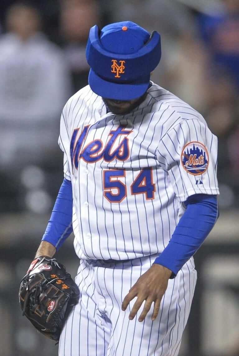
Mets reliever Alex Torres’s new protective cap, which he wore for the first time last weekend, is the latest in a long line of milestones in baseball headwear. I’ve taken a look at many of those developments — from the development of the earflap to Brooks Robinson’s stubby helmet brim — in my latest ESPN column, which went live yesterday afternoon.
Meanwhile, I’ve just learned of a team whose pitchers wear helmets. In fact, all of their players wear helmets in the field (and no, it’s not a Little League or pee-wee team). More on that tomorrow. ”” Paul
Soccer Uni Review
By Mike Chamernik
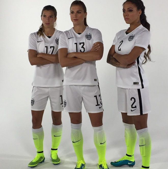
After wearing some fairly uninspiring home jerseys over the last few World Cups, the U.S. Women’s National Team unveiled its new kit yesterday. As you can see, red and blue are out, black and neon are in.
The color scheme prompted some immediate reaction on Twitter:
New Nike #USWNT kits look very Oregon 2010. @UniWatch pic.twitter.com/fpYGnnwEdC
— Greg Plefka (@gplefka) April 22, 2015
@nikesoccer @Cuse_AO @UniWatch @Footy_Headlines @sportslogosnet Updated flag to reflect our new "home" kits #Teasing pic.twitter.com/WpA3esheiV
— Ryan Wood (@ryanwood22) April 22, 2015
I can understand these reactions — and apparently so does Nike — but I love the new kit. It’s not a big deal to me that there’s no red or blue (especially since the away kit, unveiled in February, has more traditional colors). The jerseys are simple, adhering to the “less is more” mantra. Black and white probably bridge the gap between younger tastes and older tastes more than any other combo. The neon is on the trendy side, but I always liked the DayGlo accent color. In this case, it gives the look a little more pop. [That sound you just heard in the background was me taking Mike out back for a quick reprogramming. ”” PL]
But the main reason why I like them? The USWNT finished third in 2007 and second in 2011. Even though the players got a lot of fanfare and support during the last World Cup, they still didn’t win it all. And, even though this is a team on the rise with handful of mainstream players (like Alex Morgan, Hope Solo, and Abby Wambach), there’s still the sense, to me, that the women play second-fiddle to the men’s team. While the men really inspired some serious passion last summer, watching the women has seemed like more of a novelty, a feeling of “Hey, the U.S. women are playing!”
The home unis give me the sense that the USWNT means business. I take the team seriously. The sharp, no-nonsense uniform with the bravado of the socks helps to separate the women’s team from the men’s team, and makes me think of them as just a world-class soccer team (not a women’s world-class soccer team). Others may disagree, but I’m a big fan of this design.

Mike’s Question of the Week
By Mike Chamernik
As you probably know, one of the coolest traditions in sports is that each member of the team that wins the Stanley Cup gets to have the trophy for a day. Players often keep things low-key, maybe just showing it to friends and family or taking it on a parade through their hometown, but some guys like to go wild with it.
What’s your favorite Stanley Cup celebration day story? And if you could have the Cup for a day, where would you take it and what would you do with it? As always, post your responses in today’s comments.
Uni Watch News Ticker
By Mike Chamernik

Baseball News: The University of Cincinnati has some loud new helmets. I don’t know if those are official or if they will be worn on the field. … The Giants’ World Series plaque contains a grammatical error (from Brinke). … A Reds coach wore the wrong cap last night. … Pirates OF Starling Marte lost the “P” on his cap yesterday. … The Mariners will wear Negro Leagues throwbacks on May 16. … Here’s a cool breakdown of the physics of baseball, with many slo-motion replays. … Nice stirrups for Brown and Dartmouth (from Robert Kaufman). … And Elizabethtown (Kentucky) High School (from Josh Claywell). … Even better, St. Louis Catholic High School in Lake Charles, Louisiana has some awesome 1986 Mets-esque uniforms (from Christopher LaHaye).

NFL News: New 50th season logo for the Falcons. Unclear if it will be worn as a patch (from Mike Nessen). … The 2015 schedule page on the NFL website highlights past Super Bowl matchups in gold (from Donnie Gould). … Also, NFL.com hasn’t yet switched to the Browns’ new logo (from Joseph Bailey). … New 49ers RB Jarryd Hayne will wear No. 38 because it’s the number he was assigned with the Parramatta Eels, an Australian rugby team he played with for nine years (from Graham Clayton). … Mixed signals coming from the Titans. The team has been expected to switch to navy blue home jerseys this year. The promo photos the Titans have released this offseason show the navy jerseys and navy accessories, but they are still pushing the light blue jerseys in their team store (from Lee Harrell and Eric Wright, respectively). … “Saw this in the Palm Beach Post today about the Dolphins schedule for 2015,” says Daniel Merz. “Look at the logo that they used -”“ it’s one of the logos used by someone who did some mock logos before the current Dolphins logo went official.”

College Football News: New Michigan coach Jim Harbaugh explained his khaki pants obsession. It’s fair to say Brinke has an obsession with Harbaugh’s khaki pants obsession. … New helmets for Jacksonville University. … “I came across this $1 bill with a Baylor football helmet and Big 12 logo printed on it,” says reader Jared. “No idea why. I’m in Michigan. I didn’t track it though on the website that’s stamped on it.”

Hockey News: Here’s a cool poster showing the history of hockey jerseys. … The NBC networks had an Earth Day theme for their NHL telecasts last night. … Marc-Louis Paprzyca attended Tuesday’s Predators-Blackhawks game (and apparently had primo seats) and he saw a fan who converted his Corey Crawford jersey (note the No. 50 on the sleeve) into a Scott Darling one.

Soccer News: Philips will no longer sponsor the Dutch soccer club Philips Sport Vereniging. A name change is probably forthcoming. “In a similar move back in 2000, chemical company Bayer AG ended its shirt sponsorship of Bayer Leverkusen, initially founded as an employees’ team,” says Trevor Williams. “Bayer AG remained as stadium name sponsor and the club’s most important financial supporter, although the shirt is currently sponsored by LG.” Here’s a list of teams named after sponsors.

NBA News: Basketball referees struggle to find logoless all-black sneakers (from Eric Goodman). … The Mavs produced some fantastic Mark Cuban championship trophy socks. The socks are based off of this photo. I guess it’s not just hockey players that have fun with a championship trophy.

Grab Bag: Under Armour and other athletic wear companies are moving into fitness tracking (from Tommy Turner). … The woman who designed the famous “Welcome to Fabulous Las Vegas” sign has died (from Brinke). … The Australian Football League’s Greater Western Sydney Giants will wear camo next month (from Mick Henderson). … New logo and branding for BailBondsFinder.com.
In the ESPN piece, there shouldn’t be an “e” at the end of Ford Frick’s name.
Sorry, those UNWNT kits are just a disgrace.
The writer’s logic for liking them is interesting though, considering we just came off two years of the “One Nation One Team” propaganda which focused on the women wearing the same uniforms as the men for the first time.
Speaking of which, I’m just now checking out those away uniforms for the first time.
If the idea was to have the men’s and women’s teams wearing the same unis, then why do they have different socks?
link
Completely agree. Disgusting kits. This year was an absolute fail by Nike with the USNTs look.
“… New logo and branding for BailBondsFinder.com… ”
Click the link and you’re taken to a press release alluding to — but not containing — new look, and BailBondsFinder.com shows no logo, new or otherwise. This is a time-sensitive matter. I’m sitting here in DC stir (a tavern misunderstanding), and I don’t want to make bail if there’s an ugly logo involved.
Ah the Stanley Cup question. My favorite “cool” story is when Scott Niedermayer took the Cup by helicopter to the top of a mountain and had an awesome picture taken of him raising it in triumph. My favorite funny story is when the Penguins won the Cup I the 80’s and decided to see if it floated by dropping it in a pool. It sank. They had to fish it out. If I had the Cup for a day, I would get all the kids in a local street hockey program that I volunteer for to play the ultimate street hockey tournament. I would also like to ride the NYC subway with it. Me in one seat and Stanley beside me.
Manspreader! Can’t take up two seats. Just put it in your lap!!
That brings a whole new meaning to “wearing a cup”.
What? The logic of that explanation for the women’s soccer team unis doesn’t compute.
The U.S. women are dominant in soccer… always have been, always will. Them losing is a ‘thing.’
Michelle Akers
Mia Hamm
Carla Overbeck
Kristine Lilly
Brandi Chastain
Julie Foudy
Briana Scurry
Hope Solo
Abby Wambach
Alex Morgan
Not even a soccer fan, and I can name those gals off the top of my head. The men? Clint Dempsey… uh, the Howard goalkeeper guy… uh…
I’d argue that the women take no backseat to the men when it comes to national team soccer. That said, it’s a shame Nike foisted the neon green on the country. Black, whatever. That neon, for a national team? Unacceptable.
Apparently, they’re bringing back the gradient with those blues, too. Lol. We’ll surely see a new design trend emerge.
Your list actually highlights a real problem that the women’s program has. All but three of them are from the 1999 team and long retired, and Wambach has been with the team since 2003 and is arguably not worth her spot on the current team.
That leaves just two players who could be considered anywhere near their peak of their career and marketability.
It speaks to one of two things (or both): the USWNT has a relatively shallow pool of players and/or the program is over-dependent on individual personalities at the detriment of developing younger players. For example, in the current squad, Hope Solo has 10 times as many appearances as her two backups combined, because not playing Hope Solo, even for meaningless friendlies, is a marketings disaster for US Soccer. And the program is bending over backwards to accommodate Abby Wambach, who is clearly past her peak and cannot play 90 minutes at a high level, but hey, she’s famous!
And while the men’s program might not have the famous (retired) faces, it’s in a much healthier state – it can reliably fill an MLS stadium on any given night and fill an NFL stadium in a World Cup year. I’m not sure you can make the same kind of guarantee for the women (nor is there an equivalent of the American Outlaws for the women).
On the uni-side, this is the first USWNT-specific set since the 2011 World Cup. Since then, the women have worn the same design as the men in 2012-13 (the hoops and the Santorum vests) and 2014 (all-white and the bomb pops). It’s clear that the women take a backseat unless it’s a World Cup year.
terriblehuman- The problem with the USWNT is their coach Jill Ellis. Specifically, Jill Ellis is like Pittsburgh Steelers coach Mike Tomlin- unbelievably shallow in the ability to assess and manage talent. She doesn’t make any attempt to honestly look how a players and how they fit in her grand schemes. Instead, she sees a player “come through” (no matter the context) and she shoe-horns them into her plans.
There is ample amounts of talent (Allie Long, Erika Tymrak, Keelin Winters, Crystal Dunn, etc.) that have been given little to know chance because they don’t have a USWNT highlight package in Ellis’ mind.
I think it’s an institutional problem, not specific to Jill Ellis (though it is a bit alarming that she really didn’t look at new players before settling on her 23). Tom Sermanni was fired after the Algarve Cup (!) and it’s not that hard to connect the dots and put at least part of the blame on player power. When key players like Wambach actually come out and criticize bringing in new players, it’s a natural conclusion to draw.
Edit “no” not “know”
Did the women wear the same design as the men? Or, did the men wear the same design as the women? Lol, seriously. Wasn’t it a branding decision to outfit both with the same designs, rather than the women wearing the men’s design?
Which team has more credible, international respect and on-field value?
It’s not even close. The men should be grateful for any opportunity to ride the women’s coattails. I think there are numerous other women players who are marketable… they just don’t play in international leagues like Demarcus Beasley, Mike Bradley and Dempsey.
They’re a friendly lot. Kids love the women players because they’re so approachable.
A problem I find is that pro soccer executives are very insular… they’ve always been the least popular pro sport in the US, and they keep hiring “soccer buffs” as staff for their pro leagues. This, rather than hiring folks who’ve succeeded in other pro sports.
Which team has more credible, international respect and on-field value?
The men’s. Internationally, women’s soccer isn’t all that important. The quality of the men’s game (and their international reputation) have shot up in the last decade.
This, rather than hiring folks who’ve succeeded in other pro sports.
So you’re saying MLS should hire someone like Don Garber.
This illustrates perfectly the problem I discuss down below. First off, the women hands down command greater international respect. Everybody who has even the slightest bit of interest in this knows that the US women’s team have been a global powerhouse whereas the men are perennial scrappy underdogs. It takes, as you’ve done above, the irrelevant notion that it doesn’t matter about the culture of supporting women’s soccer that is inherent in America because globally the women’s game is neglected. You’re implicitly advocating that this attitude be adopted in America where it isn’t relevant.
First off, the women hands down command greater international respect.
Yes and no. The women command more respect within the women’s soccer community than the men command within the men’s. Unfortunately, men’s soccer commands far more respect within the entirety of the soccer community than women’s soccer. For example, FIFA always goes to the expense of using grass fields for the men’s Finals; IIRC, the women’s Finals will be entirely on plastic. We owe the USWNT a debt of gratitude for increasing the visibility of and respect for women’s soccer internationally. But there’s still a ways to go.
You’re conflating ambivalence towards women’s soccer with knowing nothing about it. The reputation of US soccer abroad is still heavily imbued with the idea that it is a predominantly female oriented soccer culture. I can’t tell you how many conversations I’ve had with people over here in Europe about US soccer which have included the question “but soccer is mostly a girl’s sport there, right?”. That will be based to a certain degree on their knowledge of Women’s World Cup successes. To an extent, it’s an ignorance on their part, but it also speaks to the fact that the reputation of the women’s team is better regarded than that of of the men’s.
Terrible, back away from the crack pipe.
The women are so much more respected than the men it’s not funny. Sure, the men’s game is more popular globally. But the men are barely top 25 internationally. And if the women aren’t #1… it’s a letdown.
PS, and you won’t like this statement, but it’s not really arguable… many of the top women athletes in America play soccer. The top male athletes play hoops, football, baseball, track and perhaps hockey… soccer, while very popular and growing in popularity, DOES NOT attract this country’s best male athletes. Not even close, compared to European, African, South and Central American countries.
Stanley Cup – after the Blackhawks’ 2010 win, the Cup made its way to Antigonish, Nova Scotia, where a friend of ours was able to have his picture taken with it. Needless to say, he was delighted. I like that these small towns get their day. (A quick web search indicates that the Cup also made its way to Antigonish in 2008 and 2013.)
Love ya, Mike, but your analysis of the WMNT uniforms is wrong in every respect, from the factual to the aesthetic to the ethical. Back when we were a civilized country, Attorney General Palmer would have rounded up Nike’s design team as treasonous subversives.
This. I was thinking of the 1980 U.S. speed skating team, which featured Eric Heiden winning all five men’s events. They didn’t wear red or blue, they wore gold. That at least had a sporting
“story” behind it. Even the USWNT’s use of black four years ago could be explained in that black has become a neutral color. The use of “volt,” a proprietary color, suggests that the team is not representing the United States of America, but the United States of Nike.
Looking at the photos, it’s obvious the neon yellow is meant to “bleed” onto the players’ shoes – but only if they’re wearing the latest Nike shoes.
So yeah, tail wagging the dog and whatnot.
I can live with the spilled highlighter ink. Random accent color that furthers Nike’s non-sport marketing strategy: Actually kind of a deeply American concept. But there’s a reason national teams wear national colors. Swap the black for a dark navy blue and I’d have no real complaints about these unis. Other than the way Nike is clearly treating the women’s team as a second-rank squad compared to our men, when the reality is exactly the opposite.
Is any other team in Canada wearing a trendy highlighter color this year? The only thing more outrageous than these non-USA uniforms would be if someone else showed up wearing the same non-USA colors.
In a contextless vacuum, I like the set, a lot.
But you’re right, as a national team, it fails, especially as the primary kit (I’m more forgiving with change kits). The Nike guy mentions Germany’s white and black – well, white and black were the colors of the Prussian flag (and don’t even mention Italy’s blue or Netherlands’ orange).
Yeah, Germany, Italy and Netherlands’ other colors have deep historical meaning. What Nike did here has nothing to do with history or the country…it only has to do with Nike.
You play for the team whose crest is featured over the heart, not the team whose logo is featured on the other side of the chest.
The above comments nailed it. If the kit was just black and white with red or blue accents it would make a bit more sense but highlighter yellow? That’s just ridiculous! It has no correlation to anything the team or nation stands for.
We in management can’t wait til the Olympics change all colors to shades of pink to “fight” cancer.
And as always: WE ARE WATCHING YOU, LUKAS!
The new USWNT kits? Just replace the badge with a silver fern and you’ve got some snazzy New Zealand kits.
So unnecessary.
Yep.
Black and white are taken already by at least NZ and Germany.
I also don’t get USWNT abandoning the gradient blue kit, unless I’m an incredible outlier (and that may be the case).
They’re not – white is the home kit, blue is the away kit.
Phew, then. Still like the gradient blue loads more.
(I don’t know how I missed that detail.)
I can’t believe Nike has put me in a position where I would PREFER to see the USWNT wearing those goofy blue gradient uniforms. Thanks for ruining our national team’s aesthetic, Swooshie!
Yep. The jerseys and shorts would be a nice uniform for New Zealand. No US team needs to use a color other than red, white, or blue.
Highlighter yellow does not belong on a soccer field, ever.
RE: QOTW
My favorite story is after the Pens won the cup in 1991, they were celebrating at Lemieux’s house. Phil Bourque jumps in the pool with the cup and breaks it. While the top is off, Bourque etches the inside of the cup with a screwdriver something along the lines of “Enjoy it”. Apparently those who fixed the cup left the etching in there and it’s still there today
Good one!
If the USWNT wanted to go with a minimalist uni, that’s fine. And I like it. Except the highlighter yellow socks. I think it would’ve been better with a gradient blue or red for the socks instead of the highlighter yellow.
As someone pointed it, it looks too much like U of Oregon. Maybe these were intended for U of Oregon’s women’s soccer and the team rejected them?? And now they’ve been repurposed for the USWNT.
Imagine those socks as red-and-white stripes all the way down. Now that would be cool.
Paul, I think you have mentioned this before but Matt Wieters wears a visor on the top part of his catchers mask during day games, I am not sure how many other catchers do that, but I think I have seen a few.
link
In the ESPN piece, the helmet from 1959 looks to be a pre-molded helmet with ears flaps which would make that one history’s first.
As we can see today, the problem of the creeping influence of US soccer hipsters and Euro soccer fetishists goes beyond the inappropriate application of scarves, F.C.s and other superficial elements, it’s affecting the very psyche of US soccer. The need to bring US soccer in line with the rest of the world is now leading to an adoption of the women’s soccer inferiority complex. If there’s one place in the world where this simply does not apply it is the US and hence Mike’s assessment just sounds patronizing. For example, at the time of the last Women’s World Cup, it broke all sorts of records for Twitter engagement, most of that coming from North America. The USWNT does not need, nor deserve this sort of condescending pity parade.
(Uproarious Applause)
Hear hear!
Exactly. Great comment.
I love the NFL highlighting past Super Bowl matchups in gold.
Much of the NFL’s 50th Super Bowl shenanigans have struck me as pretty stupid (gold yard line numbers, etc.), but for some reason, I kinda like this one, if only for the historical novelty.
Of course, it could have been a lot cooler had the first four weeks of the schedule not included “* Gold text denotes Super Bowl rematch.”
I would have left that out, so that all the clueless people could spend all day trying to figure out what the gold text meant.
I was coming on here to say that it seems kind of goofy – for example, the last Redskins/Dolphins Super Bowl was over 30 years ago. It’s hard to call week one’s game a “rematch” in any real sense of the word when the players, coaches, and even team owners are totally different. Most of the players that will participate weren’t even alive.
The Pats vs. Giants and Ravens vs. Niners were recent enough that those “rematches” carry some additional interest. For the rest of them, it’s just a bit of trivia.
I get that Nike wants to highlight its footwear. Fine. Glowing feet fading to sock color is one thing, but the only color on that uniform is a brand color. This is an advertisement, and I don’t think a national team is an appropriate place for an advertisement.
Dark blue trim and the full color crest would go a long way here.
Re: Marte’s missing “P”. He’s not missing it. As others have noted in the tweet attached, pretty sure he’s simply wearing a thermal headband over his hat.
As a sports official, it isn’t always easy to find logo-less footwear. I am very brand-partial to Reebok, because I know its shoes fit me better than other brands (New Balance and Adidas are close). Unfortunately, with Reebok focusing on running and cross-fit, I am going to have to switch to other brands for football, baseball and basketball.
I buy most of my on-field and on-court footwear at Honigs.com, a retailer specializing in apparel for sports officials. For the last few years, I have been wearing Reebok ZigEnergy referee shoes. They are solid black and patent leather, with the Reebok vector stitched into the side. It’s visible up close, but not from a distance. They’re still sold today, not sure if Honigs is trying to sell out the stock, or it Reebok is still making them.
For baseball, I have two brands of plate shoes (high-top shoes with a large steel tongue covering): Reebok (black with white graphics) and New Balance (solid black). I alternate between the two pairs every few games. When I work the bases, I use an older pair of Reebok turf shoes. Again, solid black.
Football is different…in the NFL, I believe every official wears shoes made by Nike. For NCAA/FCS, the brand of shoes worn by officials depends on the conference they work; some are Nike, some Adidas, some UnderArmour. I know that in D-II, the NE-10 conference wants its officials to wear UnderArmour shoes on field. I work in D-III, so we have no specific brand requirements, only that the shoes must be predominantly black.
Hey, Adidas is selling link for a low, low price of $229.99!
With MLB opting for Black/White/Silver New Balance for base shoes, our Umpire Association has allowed white to be visible on shoes. Opens up the market a whole lot. And, if your good enough (read: willing to spend the cash) those New Balance shoes are awesome to work a game in.
Not that it’s realistic to expect everyone to be able to do this, but the major shoe companies all offer some type of custom service that allows you to order blacked-out versions of some of their popular models.
Most do, but at a premium compared to off-the-shelf models. Eastbay always seemed to have a rainbow assortment of color styles, since they cater to teams, but not always in a specific shoe.
When I officiate football games, I prefer to wear cleats for better traction. If it’s muddy, regular turf shoes don’t give as good a grip as regular cleats. If I am working as a back judge, I do a lot more running, and need the cleats. If i’m working the wing (line judge or head linesman), I don’t have to do as much sprinting, but the sidelines can get sloppy with all the personnel coming on and off the field.
I umpire slow-pitch adult softball. Solid black Boombah turf shoes are great for that. Very comfortable, great ventilation, 100% black.
Bayer is not merely “(Bayer Leverkusen’s) most important financial supporter.” They are the sole owner of the club. Under German law, sports clubs are owned by their members. For commercial purposes, clubs can spin off their soccer teams into separate corporations, but the parent sports club must own over 50 percent of the spin-off. There are two exceptions in German law — for the company-owned teams of Bayer Leverkusen and Wolfsburg (owned by Volkswagen).
German fans tend to poke fun at Leverkusen and Wolfsburg as being “factory teams” (as opposed to the general model of teams being socially-responsible clubs run for the benefit of their members). They also frown upon an individual person becoming the patron of a club (as in the case of Hoffenheim, who have used the backing of software magnate Dietmar Hopp to go from a fifth-division side, to the top league).
I have a lot of respect for the “company team” history of those like Bayer Leverkusen and PSV Eindhoven, and Wolfsburg. Is it really much more a thing in England?
(And I can’t forget the Chicago “Wrigleys” and the St Louis “Buschs”.)
Quite the difference to Johnny-come-lately branding like the arena football Miami Hooters, a team I’ve actually seen play on TV.
Don’t forget the Fort Wayne Zollner Pistons and the Green Bay Acme Packers!
England has a few factory teams – Arsenal is the most famous examples (formed by workers from the Woolwich Arsenal Armament Factory), while Manchester United (Lancashire and Yorkshire Railway) and West Ham United (Thames Ironworks) are also prominent examples. Though they’re not company teams, if I’m not mistaken – they were formed independently by the workers and not by the management.
Not to mention the current controversy with Red Bull Leipzig.
Also Red Bull Salzburg. UEFA weighs in by allowing Leverkusen to keep their Bayer reference in European competition to acknowledge their history, but in reference to the Red Bull teams, they’re referred to as “RB Leipzig” and “Salzburg.”
True, but it’s totally different in the German Bundesliga.
In the Austrian Bundesliga, Salzburg is Red Bull Salzburg.
In the German Bundesliga, Leipzig is RB Leipzig – they even invented the word RasenBallSport (loosely Lawn Ball Sport) to justify the RB even though everybody knows it is Red Bull.
Favorite Stanley Cup story? The time Pantera threw the Cup into Craig Ludwig’s pool from the second floor deck. Ah, 1999.
I surprised myself by also liking the USWNT uniform. I usually don’t like gradients, and neon is hit or miss, but for some reason I really like these. They remind me of when airlines started painting just the tail of the plane, and the end of the fuselage, like the Quantas livery. Resisted the urge to paint the whole plane, just the end, and it looked really good, and many followed suit. Also an important point is they incorporated the graphics into the structure of the plane, maybe this is what is happening with this uniform. How did I wind up talking about planes?
Another Nike botch job. You would think Nike of all companies would understand branding. National team = national colors. Red. White. Blue. Get’r done! ‘Murica!
Here’s a team that the Wikipedia page forgot:
link
I’m not much of a hockey fan, but I love the tradition of the Stanley Cup’s day with the winners. I once had the opportunity of seeing the Cup at a small gathering. Hockey purists will be mortified, but I lightly ran my fingers across the Cup. So there, I’ve touched the Stanley Cup.
You and Slava Fetisov…
who held the cup in Red Square. Worth seeing is the ESPN’s 30 for 30 production “Of Miracles and Men” helluva story.
I did once, too, at the Hockey Hall of Fame. I justified it to myself on the grounds that I was not a hockey player, and never was a hockey player. Lame, I suppose.
Not lame at all. You gotta do what you gotta do.
So apparently Stephen Harper, the Prime Minister of Canada, chose the wrong jersey in the eyes of Winnipeg fans.
link
The Guardian has an infographic of the worldwide Twitter followings of EPL teams.
link
The Mariners will play Boston on May 16th, could we see the Boston Royal Giants uniforms. link
Check out this website I found. It only goes back to 2012, but it fantastic, especially for the uni-trackers in the bunch. link
I didn’t know there was a rule in soccer where your kit had to mirror your flag or the torches and pitchforks come out. It’s just one kit for one tournament, who cares? The away kit is perfect, they’ll be announcing a new home kit in a few months, the socks are just socks and the cleats aren’t even part of the whole uniform. Women that have deals with other companies are going to be in those cleats.
Speaking of other companies…isn’t it funny how when other companies buck trends the outrage is 1/100th of when Nike does it? Guess that’s the price to pay being the king of the mountain
Whoa, go easy on the strawman there!
Also,
they’ll be announcing a new home kit in a few months,
Huh? They just announced the home kit…
You obviously don’t pay attention to soccer kits much. Teams go through them quicker than Taylor Swift goes through boyfriends. There is probably going to be a new home kit full of American flag pride and color within 2 weeks of the World Cup ending.
????
They announced the home kit yesterday. They announced the away kit in February. All participating teams had to submit “colour forms” to FIFA six months before the tournament.
But sure, I’m somehow the one who’s not paying attention.
And I should add, teams can only declare one set as the “primarily light” and another set as the “primarily dark” kit. They can’t declare a third set unless FIFA specifically requires it because of a kit clash (like Spain’s all-white vs Netherlands in 2014).
I can’t believe you seriously ask “who cares?” on a site devoted to uniform appreciation and criticism. We care. All of us. And that thing is ugly.
isn’t it funny how when other companies buck trends the outrage is 1/100th of when Nike does it?
Nike apologists love to trot out this line again again, repeating it like a mantra, but it simply isn’t true. Adidas was fucking *crucified* for the cumberbun uniforms during this year’s NCAA tourney (and for the Fruit Stripe unis two years earlier, and for lots of stupid college football designs, etc.), Under Armour took a lot of media heat for their “bloody flag” football design, etc.
Sucky designs get called out, no matter who makes them. Nike apologists just have thinner skins.
It’s true, however, that only Nike has been called out for being unable to provide an NFL team with its primary home jersey color, because only Nike was lame enough to fail that most basic aspect of the client/vendor relationship.
You really don’t think Nike, being the sports apparel king, doesn’t get it more?
I didn’t say other companies don’t get criticized, just that Nike gets the brunt of it.
It’s just human nature at work. It goes on in every industry. When people criticize the conditions of electronics factories in Asia who do you hear about the vast majority of the time? Apple. When people are talking about soda, health risks, banning big drinks, etc. do they talk about Pepsi and Circle K? No, they talk about Coke and 7-11’s Big Gulp.
I’m not a ‘Nike apologist’ I just see things for what they are. There are plenty of people who pay attention to every helmet release, new uniform unveiling, rebranding, but others, brand loyalists, that just pay close attention to their brand coming out with new things. Through no fault of anyone people just gravitate towards the most popular, the biggest, most powerful, etc. More attention means more opportunity for praise or in this case criticism.
I didn’t say other companies don’t get criticized, just that Nike gets the brunt of it.
Actually, what you said was that other companies get “1/100th” the blowback that NIke gets (which implies that the other companies barely get criticized at all). I think that’s demonstrably false.
Maybe “1/100th” wasn’t what you actually meant. But don’t blame me for holding you to your own words.
When you spend a lot of money advertising this, as a result, more people are going to be aware that you do, in fact, buck trends (especially if you’re really good at advertising said trend-bucking acumen, as Nike is). Thus, when more people are aware of what you’re doing, there exists more perceived buzz simply due to the success of the advertising. The goal is awareness, intrigue and engagement, and it’s all perceived as a win, whether it’s positive or negative.
QOTW: the Cup came to Rouyn-Noranda, QC a couple of times when I was living there: in 1993, Eric Desjardins brought it to town and they held a Stanley Cup parade that consisted of two police cars, a fire truck and a marching band.
In 1999, Jacques Caron (Devils’ goalie coach) brought it to the local mall where a long line of Rouyn-Norandiens waited to get their photo taken with it. The photo of Caron, Pierre Turgeon, the Cup and I is prominently displayed in my office.
My favourite story of a day with the cup: Mark Messier took the cup to a strip bar, twice.
My favourite sort-of similar story: I was at a card show in Toronto a few years back and the cup was there. Lots of players posing for pictures, autographs, that sort of thing. Lanny McDonald (Hall of Fame, won the cup) gladly posed for photos with the cup. Daryl Sittler (Hall of Fame, no cup) wouldn’t go near it because he never earned it. The first time I’d realized how seriously players take the whole “earn it” thing.
A note on the headgear article: I know that ‘80s Mariners catcher David Valle wore a helmet without a brim – link – no “brimless” catcher is noted in the ESPN list, and I never noticed another, so he may or may not have been unique.
There have been quite a few brimless catchers over the years, many of whom can be seen here:
link…112.2310.0.2442.17.6.0.7.7.0.660.889.0j2j5-1.3.0.msedr…0…1ac.1.64.img..13.4.891.AyCMxDo6PEE
I don’t know who was first, though (but it definitely wasn’t Valle).
Is that link broken for anyone else, or am I just having browser issues again?
I keep waiting for baseball to come up with something like this:
link
… to be worn batting and fielding.
The Ravens announced a 20 year patch for the upcoming season. They’ll also feature the top 10 franchise players (voted on by PSL owners) on tickets for the season. At the bottom of this article is a slideshow of the images they’ll use. All Reebok logos are photoshopped except for one on Ed Reed. Odd that they missed that one given it’s so obvious. They removed the one on his jersey.
link
If I were in possession of the Stanley Cup, I’d start running. Talk about not earning it: I’ve never even worn ice skates.
NOT the Onion: Islamists ban Nike clothing because the sportswear firm’s name sounds like the Arabic word for sexual intercourse
link
I’d fill the Stanley Cup with Jack and Coke. Using kosher for Passover Coke. And ice cubes. And limes cut into rounds. And this would be on a beach with an epic barbecue happening.
Re: USWNT uniforms – sorry, and this sounder irrationally childish and jingoistic, but an American team not wearing red/white/blue looks somehow un-American. I know as a society we have gotten a little crazy with a bent toward militarism and over-the-top patriotism, but those colors represent America. Even in a world where countless countries have red/white/blue flags (France, UK, Russia, Thailand, Serbia, Norway…), those have become our colors.
I did have some primo seats for the triple OT Blackhawks game the other night and I did stay until the end.
QOTW
I can’t recall my favorite Stanley Cup story but I know I always like when it makes its way to far off places. Marian Hossa eating pierogi out of it in Slovakia was pretty cool.
I would definitely eat cereal out of The Cup because I love cereal and it would probably be Cinnamon Toast Crunch. Since I’m from Chicago I don’t have a cool small town to bring it to and I would probably just have a big party with my family and friends.
Kristen Bell was once quoted as wanting to eat Fruity Pebbles out of the Cup if the Red Wings won. I wonder if one of the players ever accommodated her.
$20 for a cell phone case? Really Paul? I know you could price those much lower and still make a nice profit. So greedy.
It was the price recommended to me by the supplier. I haven’t bought a phone case myself in years and frankly have no idea what the going rate is. If it’s badly out of whack, I’ll adjust it.
And yes, I’m very “greedy.” That’s why I just donated my entire share of the Jackie Day t-shirt revenue — over $4400 — to charity. Not looking for a pat on the back, but some people have v-e-r-y short memories.
For those who are wondering, Brad is referring to this:
link
Will be formally announced on the site tomorrow, but I gave out the link today on social media.
It’s a little unfair to call Paul (or anybody else) “greedy” because they offer you a product at a price that’s higher than what you’d prefer to pay. Especially for non-essential items or items like a phone case that you could get cheaper elsewhere without the UW brand.
Don’t forget how much Paul charges us for this blog every day too!
Good one Brad…no reply to the comments?
Open mouth, insert foot.
Re: $2 bill with Baylor and Big 12 stamp –
As fans follow their teams to Bowl games, this is a way to leave a true impression of economic impact. When you see this bill in your till, you know it came from a visiting Baylor fan.
This is not a recent thing- Clemson fans have been leaving “Tiger Paw” $2 bills for a long time. We saw a lot of these in Tampa in December, 1990, for their visit to the then- Hall of a Fame Bowl v. Illinois.
It’s not a player’s celebration story, but as a Ducks fan and a Disney fan, my favorite thing I’ve seen done with the Cup was the photo taken with it as part of the treasure in the Pirates of the Caribbean ride at Disneyland.
link
The GWS Giants will wear their camo on Saturday (Aus time) along with many sports teams because it is ANZAC day, which is Australia/New Zealand’s version of veteran’s day and it being the 100th ANZAC day it is being celebrated greatly by pretty much everyone.
Also for the 20th time Jarred Hayne is not a former Rugby player, he is a former Rugby League player. Rugby and Rugby League are 2 different sports
why is that pitcher wearing that thing on his head? The base coaches wear helmets why can’t the pitchers. Olerud wore one playing first and outfield.