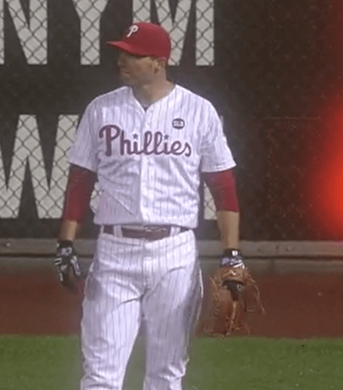
How cold was it last night in Philadelphia? So cold that Phillies outfielder Jeff Francoeur wore a batting glove on his throwing hand (and apparently laughed about it). Not sure I’ve ever seen that before.
This raises lots of interesting questions: Is it legal? Should it be legal? What if a shortstop did it? What about a pitcher? Did people ask these same questions when players started wearing batting gloves? Or when football players started wearing gloves? Or when football quarterbacks started wearing gloves? (Yes, they did. Or at least I did.) Should basketball players be allowed to do it? Discuss.
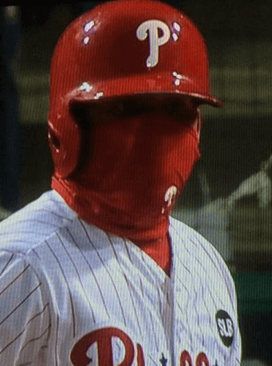
Frenchy wasn’t the only player feeling the cold, incidentally. Phillies infielder Freddy Galvis was looking like a ninja:
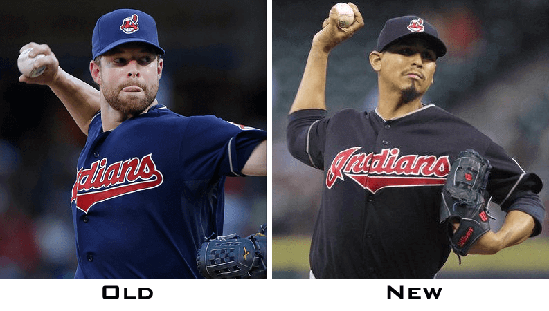
Meanwhile, a very odd development for the Indians: We already knew they had darkened their two Wahoo caps. But now, in a move that was neither publicly announced nor reflected in the MLB style guide, it turns out that they’ve also darkened their navy alternate jerseys (click to enlarge):
Social media was all over this one. By the end of the night the Indians finally felt obliged to acknowledge the situation:
To answer uni questions: We'll wear midnight navy this year when we wear dark, at home and on the road. pic.twitter.com/jbiA8hs1eq
— Cleveland Indians (@Indians) April 9, 2015
So there you go: midnight navy. And while the previous blue jersey had been designated as a road alt, this one will apparently also be worn at home. Like I said, none of this is shown in the MLB Style Guide (and neither is the change of cap colors, for that matter).
According to this story, the new darker jerseys also have “white trim, as opposed to [last year’s] gray.” But the trim on the sleeve and headspoon sure look grey to me. Hmmmmm.
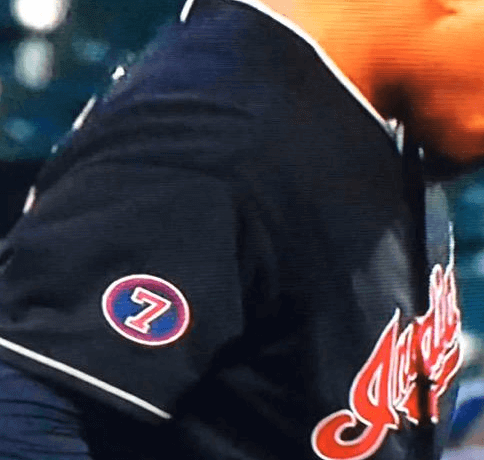
Meanwhile, the team’s new Al Rosen memorial patch was done in the old shade of blue, so now it doesn’t match the new jersey:
It’s all very strange. There’s gotta be some kind of odd backstory here. I’ll try to find out what it is, but I suspect it’s one of those embarrassing snafus that nobody’s going to be willing to talk about on the record.
(My thanks to Kevin Chmura, Matt Ciciarelli, Pat Costello, @saulzbury for their screen shots.)
ESPN reminder: In case you missed it yesterday, my latest ESPN column features the results of our design contest to create an NHL expansion franchise in Las Vegas. Check it out here. In addition, some other ESPN writers chimed in with their own name and logo suggestions.
T-Shirt Club reminder: The Uni Watch T-Shirt Club’s latest limited-edition design, jointly inspired by Cinco de Mayo and the Brewers’ “Cerveceros” jerseys, is now available. Full details here, or go directly to the ordering page.
March Madness bracket winner: Intern Mike Chamernik, who was running our NCAA bracket contest this year, reports that our winner is Alex Brown, who had 47 games correct (including Duke in the title game) and 152 points. His prize will be an item from my freebie bag. Congrats, Alex!

’Skins Watch (a day early this week): As the Colorado state legislature considers a bill that would require high schools to get tribal approval before using Native American team names, the Lamar High School Savages are defending their name (from Perry Sailor). ”¦ Good piece on why Chief Wahoo has got to go (thanks, Phil). ”¦ And if you think Wahoo is bad, check out this giant mascot the Braves used to have. Classy (from Douglas Ford).

Baseball News: We had already seen the gold-trimmed cap that the Giants will be using for their ring ceremony on Aprli 18. Here’s the jersey (thanks, Brinke). ”¦ A seven-year-old Nats fan in DC is apparently very popular with local newspaper photographers. ”¦ Interesting story on how new MLB commish Rob Manfred’s signature was put on the new baseballs this season. ”¦ Here’s the 1915 throwback cap that the Phillies will be wearing today. Pretty sure the Red Sox will be wearing a 1915 cap as well, although they haven’t previewed it. ”¦ LSU wore G.I. Joe caps on Tuesday (from David Steinle). ”¦ “Are the Sacramento River Cats changing their color scheme to match their new MLB affiliate, the Giants?” asks Joe Deanda. “Looks like a change from their normal reddish color to orange — notice the cap color vs. the jersey color.” ”¦ Looks like someone had a bit of fun with the Tigers logo on the back of the Comerica Park mound, turning the “D” into “Dios” (from Tony Natocci). ”¦ The Albuquerque Isotopes, now affiliated with the Rockies, will be wearing Rockies-style purple jerseys on Sundays. ”¦ The Giants are working on a memorial patch for broadcaster Lon Simmons and hope to have it ready in time for Monday’s home opener. ”¦ The D-backs’ base coaches now have matte helmets to match the players’ helmets. ”¦ Here’s a public service: an overview of all the A’s socks and stirrups from the past few years. Really shows how they could use some standardization. ”¦ “My girlfriend and I went to a Little League game last weekend to see one of her first grade students play,” says our own Scott M.X. Turner. “It’s a coaches-pitch league, ages 6 to 7. We were excited because we’d been told that her student’s team name is the Grays — someone in the league was paying tribute to the Negro Leagues! Or that’s what we originally thought. Turns out it’s something else entirely.” Okay, I know battleship grey is a thing (in fact, it’s why the Reds became the first time to switch from green undervisors to grey in the 1970s — they cited government studies showing that gray was easier on the eyes and kept battleship crew members more alert), but these are first graders. Putting a military battleship on their jersey, complete with three big guns, is insane. Also vulgar. What were these clowns thinking?

NFL News: The Seahawks’ newly acquired players now have uni number assignments (from Kyle Hanks). ”¦ Eagles pro shops are not selling newly acquired QB Sam Bradford’s jersey (thanks, Phil). ”¦ A Washington NFL fan will no longer be able to use his vanity license plates that took a coded potshot at the Cowboys (from Tommy Turner). ”¦ Great shot of the very unusual FNOBs worn by former Broncos players/siblings Doug and Dave Widell (great job by @itsjimmyfootbal to get them both in the same screen shot).

College Football News: Here’s a good story about former Michigan WR Anthony Carter’s use of tearaway jerseys. Lots of good details there — recommended (big thanks to Eric Skaugset). ”¦ Maryland’s poster for this Saturday’s red vs. white spring game shows a red/white split jersey (from Matt Shevin). ”¦ Here’s a Tennessee logo from 1980 that I don’t recall having seen before (from @BravesThomas). ”¦ New teal field for Coastal Carolina.

Hockey News: Hartford Whalers logo sighting on SportsCenter yesterday morning. ”¦ Check out Phil Esposito wearing a generic sorta-kinda Bruins jersey in this 1971 ad (from Douglas Ford). ”¦ Speaking of the Whalers, it’s amazing how much of their stuff is still available for sale at the Hartford airport. ”¦ Rangers G Henrik Lundqvist’s latest mask design salutes the New York fire department (from Alan Kreit). ”¦ For reasons that aren’t clear to me, the Capitals unfurled a giant jersey on the ice last night (from John Muir). … Marc-Louis Paprzyca spotted someone wearing a bedazzled Marián Hossa jersey the other night. “She must really love Reebok,” he says.

Basketball News: Oops: A rendering for the Bucks’ new arena shows fans wearing Atlanta Hawks jerseys (thanks, Phil). ”¦ An auto parts shop in Quebec City is using a modified version of the Pistons’ old logo (from Louis Droulin). ”¦ Two players on a European team will wear cameras embedded in their jerseys. ”¦ Duke is going to buy the court from Monday night’s NCAA title game and — of course — sell off pieces of it. ”¦ Interesting find by Jerry Wolper: a 1977 wire story about the the first game (or at least one of the first) in which Pete Maravich was no longer allowed to wear his “Pistol” nickNOB.

Soccer News: “Both teams in the French Cup semifinal between Paris Saint-Germain and Saint Etienne displayed the tournament sponsors instead of their usual jersey sponsors,” reports Yusuke Toyoda. “By the end of the match, at least one temporary jersey ad was peeling off.”

Grab Bag: Good story on the writer who coined the term “Amen Corner” at Augusta. ”¦ Here’s a review of a new cricket helmet. ”¦ Kudos to Jersey City mayor Steve Fulop, who wants to limit chain stores in his city’s downtown region. There’s a good radio interview with him here. Here’s hoping other municipalities follow. ”¦ Good story about the guy who designed the iconic “trollface” graphic. ”¦ I always think it’s funny when a consumer product gets a new package design and then they add a note that says, “New Look, Same Great Taste,” which is basically the same as saying, “Same Shit, Different Wrapper.” But last night I saw something even better: a note that says a new look is coming soon. Oh boy — can’t wait!

What Paul did last night: I’m a fan of Slate’s weekly political podcast. It’s usually recorded in a studio, but last night they recorded it live onstage the Bell House here in Brooklyn, which is about a five-minute bike ride from my house. Since I’ve written for Slate, I was able to weasel my way onto the guest list (plus they gave me a drink ticket, which was an unexpected bonus). Here’s how the principals — from left, that’s David Plotz, Emily Bazelon, and John Dickerson — looked from my vantage point (click to enlarge):
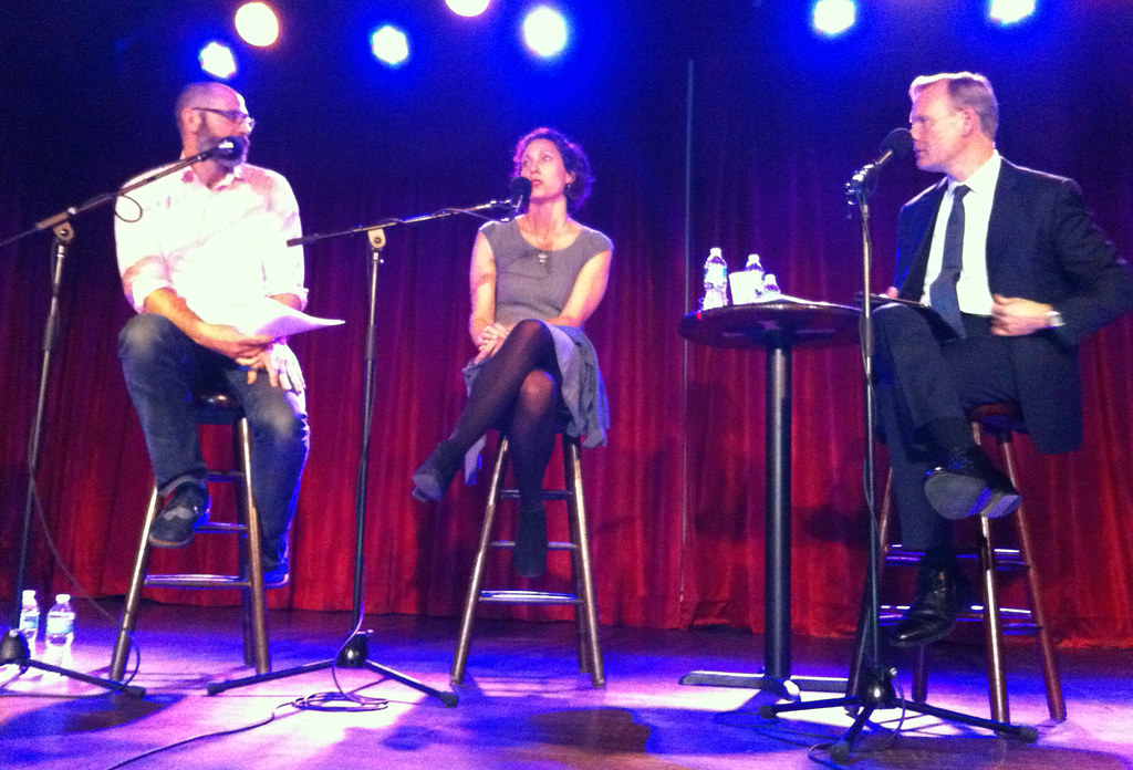
There was actually a uni-related component to the program: Next Wednesday is the 150th anniversary of Abraham Lincoln’s assassination, so they did a segment on that, at which point Dickerson removed his jacket, button up a vest that he’d apparently kept hidden under the jacket, replaced his necktie with a bow tie (which he tied without the aid of a mirror!), and — here’s the uni-related part — donned a mourning armband in honor of Lincoln’s passing:
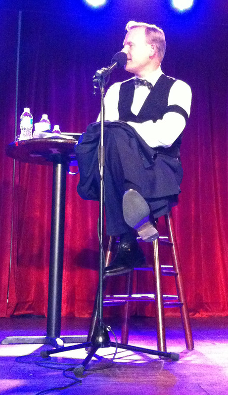
These armbands were once common after the death of someone close or important, and are the source of all the black armbands that we see in the sports world (or, rather, that we used to see, before memorial patches became more common).
Anyway: A very enjoyable time.
Busy day ahead, because it’s my Mom’s birthday — she’s turning 91 (!). So I’m picking up my brother in Queens and then we’re heading out to Long Island to take her to lunch. Or in other words, I won’t be checking email or Twitter today. Thanks for understanding.
The Indians have worn their blue alts at home in the past. I think Tuesday home games is when they’ve worn them, although I was at a game on a Thursday a couple of years back when they wore the blue alts at home.
A useful reminder when we’re discussing team colors that a team’s uniform colors are the colors of their actual uniforms, not the words or pictures in any printed style book.
Note that the Indians explicitly call the dark, Yankees-identical blue “midnight navy.” Hopefully, that puts to bed the common objections that all the teams wearing exactly the same hue of blue fabric as the Yankees are actually wearing some other name of color, not midnight navy, because team style guides use a different word or differently hued inks.
I can’t figure out the Tribe’s new choice of “blue.” Might as well wear black, eh? And if it is identical to the Yankees it’s doubly puzzling. A lot of Clevelanders consider the Yanks their biggest rival (which would be news to most New Yorkers). Why adopt the same color as them? You want to add pinstripes next?
The Indians in pinstripes and ‘Yankee’ blue?
That’s been done before:
link
I mean there’s only two shades of navy New Era has to choose from for your hat, and a ton of teams use the darker shade, not just the Yankees. I see the darker jersey as just trying to match their choice of using the darker hat option…it’ll end up being pretty much the same shade as the Braves navy jersey. And as far as the choice of unifying their shade of blue to the darker option instead of the lighter one, the fauxback road C cap wouldn’t look like as much of a fauxback if it were in the lighter navy, so they probably figured it was easier to just restore the Wahoo caps to the shade they were in the 90s and early 2000s.
link
And whether it’s all the lighter navy or all the darker navy, either way looks better than the two navys together in the same uniform
link
That shot of Lofton-Ramirez-Vizquel(?)with the Dark Navy helmet / “Light” Navy jersey almost looks as bad as the 1980s era Ram and Giant helmet-jersey shade of blue disprepancies.
Yea they haven’t had a year where they’ve NOT worn them at home, with their red brimmed caps. This year isn’t any different.
Interesting. They’re officially designated as the *road* alternates (which is presumably why they have grey piping). But I’ll adjust that part of the text — thanks for the info.
It sounds like you’ve got other things to worry about today, but I’m guessing the Hossa jersey should probably be in the hockey section.
Fixed.
There’s a “” in the Cowboys license plate link that breaks it.
And Happy Birthday to Mom.
There should be a ‘br /’ in angle brackets inside the quotes.
Fixed.
The Braves statue was named Big Victor. Victor would chop and head would spin after a home ruin. It was in the stadium for two years in the late 1960s before being removed because it was broken.
Nightmare Fuel.
Love the little league “greys” uniform. So much better than most of the plain word script uniforms kids get at that age. Looks tough and I bet the kids are proud of them. I am going to assume someone associated with the team was/is involved with the seafaring military in some way, and I don’t know how it’s done there, but around here the kids usually get to vote on what their team name will be…. so the “clowns” being referred to possibly could be the kids themselves. As far as “vulgar”, maybe it’s time to stop being offended at every little thing and hate on it, especially if one doesn’t know the complete story…. as I admittedly don’t, so I just choose to look at the uniform graphic, and like I say, for that age range, some artist put some cool detail in that logo :)
As far as “vulgar”, maybe it’s time to stop being offended at every little thing and hate on it
This is an enormously handy all-purpose means of dismissing any critique with which one disagrees. Not a very strong intellectual position, though.
calling something you disagree with vulgar is an enormously handy all-purpose means of dismissing any critique with which one disagrees. Not a very strong intellectual position, though.
Agreed, but really Paul, “military battleship”? As opposed to all those civilian battleships that clog America’s harbors? That kind of crime against the English language is what’s truly vulgar here. [Kidding! Mostly.]
I don’t find anything objectionable about the military imagery as such. But the overwhelming visual emphasis on the gun barrels crosses a line for me. An outline of a battleship, or a more cartoony ship, even with more or less realistically proportioned great guns, would be just fine. It’s not like kids are into dinosaurs for their cuddly soft skin, you know? Some degree of violent imagery is perfectly OK even at that age level. But goodness, making the whole thing about the 16-inch guns, not the ship as a whole, is nowhere near age-appropriate. Or, heck, keep the image as-is, but replace the gun barrels with knob-end baseball bats, like a proper baseball team logo.
Also, of course, this is baseball, so a Grays name that doesn’t tie to the Homestead Grays in some way is a maximal example of Missing the Point. It’d be like t-ball team called the Splinters making their logo all about Jesus pointing to someone’s eye, rather than, you know, Ted Williams. Or a team called the “White Sox” habitually wearing black socks.
I think the details are pretty irrelevant here. We’ve just gotten to a point where we’re so desensitized that an image of a device that’s designed specifically to kill on kids’ jerseys isn’t particularly jarring to non-crazy people.
arrScott is right – it’s not the military imagery per se. It’s the gun.
Actually, I may be more offended by those dirty green under-sleeves, if they’re part of the actual uniform set, than of that dumb logo.
Not sure that I’d call it “vulgar,” though. “Lame,” perhaps. But it’s the kind of lameness that many little kids tend to like, and if they’re the ones who chose it, then I’m inclined to give it a pass, because I don’t really expect first-graders to have the best taste or judgment, especially not in this age of questionable fashion.
If, on the other hand, it was the adults involved who came up with that idea, then it’s just bad.
And they should feel bad.
The Michigan wide receiver is Anthony Carter (not Davis) in the tear away jersey item.
Fixed.
I wore a black armband at my prep school the Monday after Laettner’s shot beat Uconn in 1990. I was told to take it off.
Paul, I’m only saying that I come to this site to enjoy uniform news, and I feel like I get a heaping helping of how I’m supposed to feel anymore. I’m not dismissing the critique, and not trying to shut it down. I just feel that if you don’t know the reason for sure behind something, don’t jump to the “I’m offended” card so quickly. Do a little research first, but if you don’t have the time for all that, then simply enjoy the asthetics of the uniform. That seems like the “intellectual” thing to do to me…. plus far less stress…. enjoy life…. don’t look for an argument all the time. I’m just here for the pretty uniforms :)
Gene, “I don’t come here for [whatever]” is and always has been a non-starter. Why you come here is not particularly relevant, because Uni Watch is not a service I provide to please you. It’s a creative project that I produce to please me. If other people like it, great; if not, that’s fine too.
If you think putting the image of a war ship, with a focus on the gunnery, on the chest of a six-year-old is fine, that is a legitimate intellectual position (although one with which I strongly disagree). We can debate that. But telling me what I should or shouldn’t be expressing on my own website is not open for discussion, because you don’t get to decide that. I do.
Let’s move on. Thanks.
i’m not for “gunnery” and kids obviously, but i’m guessing the reason for the “vulgar” comment is just that – don’t associate kids and guns…. but the reality is, and i will retract every word i said if this happens, a madman will NEVER bring a ship loaded with guns into a school yard and go on a shooting spree with it. it’s a ship logo…. that is all…. someone is proud of the military.
now i’ll move on…. and in the future, i’ll keep my thoughts to myself. i’m not mad, and still like the site and the fact you provide it to us and all your hard work, but i don’t care about stuff enough to get into an argument about it, unless, of course, my intellect is called into question, as it was.
You could just, you know, skip it? I’ve found that if you skip right over the part you don’t care for, then you can be happy without complaining about the free content.
I’m stumped by what makes the youth baseball logo vulgar and why they designers are clowns.
West Seattle is home to Naval Base Kitsap, a pretty large facility. People living in areas with large bases often have a lot of pride in the military and the men and women in the service. (And, of course, Boeing is based in the area as well, though that’s fighter jets and not ships.)
If you look closely at the design, you’ll see the base of the barrels are baseballs.
I don’t know if its a conscious thing or not, but it does feel like there’s an anti-military vibe running through the blog. And you’re obviously free to do that in your blog.
I think putting the image of a war ship, with a focus on the gunnery, on the chest of a six-year-old is highly inappropriate. If you disagree, that’s fine.
I am not “anti-military” but I do oppose, strongly, the sports world’s relentless celebration of the military to the near-exclusion of all other sectors of society. Not all soldiers are heroes, not all heroes are soldiers.
Now I have to get ready to pick up my brother and go out for our Mom’s birthday. Everyone have a great day.
There it is…the “Not all soldiers…” line. What crap. Talk about dismissive. Of course it’s true, but it is also true of EVERY line of work, every walk of life, wherever you go. Someone who answers the call of service may not always deserve hero status, but they DO deserve respect and admiration. Not ALL soldiers are heroes, but they are by far your best bet to be one.
Amen to you, Bob!! Unfortunately, this line of reasoning won’t resonate with Paul. Like every says, it’s his blog, but heaven forbid that someone shows some pride in the military. Especially in an area that has multiple Navy bases in the area. Love the site, but we shouldn’t be surprised, as openly liberal and easily offended as Paul is.
Of course it’s true, but it is also true of EVERY line of work, every walk of life, wherever you go.
True enough. But none of those other walks of life are relentlessly celebrated over and over and over by the sports world to the near-exclusion of all others.
— Paul, from his phone
One can respect the individual soldier without feeling it necessary to constantly shower praise upon or pay tribute to “The Military”. We aren’t Klingons who live for the Glory of Battle, nor are we in a world where Service Guarantees Citizenship.
Individual pride in the military is one thing. Systemic and institutionalized pride and sometimes worship of the military is quite another.
Little boys have been pretending to play with guns since guns were invented. And if you take away all the toy guns from them to protect their tender sensibilities, they use their fingers as pretend guns. That’s what boys do. Highly unlikely a picture of a big, scary battleship is going to scar them for life.
Predictably, this discussion has drifted quite a distance from its initial topic concerning those kids’ goofy baseball jerseys, right into that tired old argument about the appropriateness of military-themed sports uniforms, and of military-oriented occasions at sporting events in general.
Remember that this isn’t merely a website that we visit to read information about uniforms (and sports uniforms in particular), but a forum of sorts for the evaluation and criticism of those uniforms’ aesthetic value.
When uniforms are introduced that (despite how unappealing they may be to our sensibilities) we’re *not allowed* to criticize, because it somehow means that we’re anti-military — or even anti-America — that creates an pretty asinine situation.
Look at this:
link
Just because a professional sports franchise decides to dish out a feel-good message about how this is “for the troops” doesn’t mean that the polyester shirt in question now becomes some kind of sacred cow.
No reasonable American is “anti-military.” We understand that armed conflicts are not going to disappear, and we value the sacrifices of those who serve.
But war is hell…and it’s not something to be trivialized with a silly novelty jersey.
Mike Pesca made a great point link (fast forward to 16:50). He’s talking about using “for a good cause” as a cover for shameless stunts on reality TV, but I think it applies to using “The Military” as an intellectual shield on Uni Watch comments. If your instinct is to bring up “for a good cause” or “pride in the military”, chances are, it means what you’re defending is shitty, and worse, a cheap attempt at pandering.
Good clip.
Seriously…everybody take a listen to that segment, regardless of your opinion on military-themed sports uniforms.
Visited the West Seattle Little League site and some other team names are Admirals, Bombers, Trappers, Tridents, Tides, Loggers… So they onviously pick them from the local Military connection and Boeing near by as well as the local area in general. No logos unfortunately.
And those names were for the 6-7 year old teams. Just came across this site with some logos from the league, including the Grays.
Site with the logos
link
As far as I’m concerned, there’s nothing inherently wrong with any of those names.
Again, I just thought that the Grays jersey had a dumb logo. But at some point, the whole conversation went off the rails.
Lamar High School could keep their Savages nickname if they changed their logo to blogger Dan Savage.
Given the way that Dan Savage’s readers used to address him in their letters, that might give hostile crowds an uncomfortably obvious thing to chant at Lamar’s away games…
link
Not so good.
(A bit non-uni here:)
I listen to WNYC more than once in a while, but I’d like to wonder why WNYC goes straight to “preserving character”, rather than rattling consumer dollar around to make sure as much of it as possible stays in that place.
Chain stores, like new stadia complexes, are designed to vacuum up and remove every dime possible from the people spending it there, to somewhere else. Should Jersey City wants to do something about fewer chain stores, it’s up to them.
“Good story about the guy who designed the iconic “trollface” graphic.”
Here is *my* favorite troll face…
link
That’s the one I use for my My Pet Troll site:
link
I’ve never really liked the more popular trollface image and am somewhat puzzled by its virality. Still an interesting story behind it, though.
So . . . a racist drawing of a Native American on a license plate is ok, but a take off on Bumper Stumpers is illegal?
Clicked the Pete Maravich link in the ticker and scrolled to the left to page 12 in the Pittsburgh Gazette PDF and found a photo of the Cleveland Barons (the NHL version) in action against the Sabres. Not a very interesting shot, but nice to see that jersey again.
Thought I would chime in on the batting glove questions… I used to be a Little League umpire. The league I umped for used the MLB rulebook as a baseline, and used Little League and local rules as modifications to the MLB rules.
By rule, fielders can wear batting gloves on their throwing hands. Pitchers cannot wear a batting glove on their throwing hand, supposedly because it potentially gives them the ability to grip and spin the ball in unfair ways to the batter.
As an FYI, I’ve seen pitchers wear batting gloves under their fielding glove before. On occasion, I’ve told pitchers to remove the batting glove if it was white or had a reflective logo. Such things are potentially distracting to the batter and could mislead runners as to the location of the ball.
Pitchers can’t wear anything on their throwing hand or arm because it could distract the batter. It has little to do with gripping the ball. We don’t allow arm sleeves, wrist bands, or batting gloves on the throwing hand, and pitchers are not allowed to wear white under sleeves.
Just to lighten up the mood around here, my Jackie Robinson t-shirt arrived yesterday (my very first T-Shirt Club purchase). Looks great and am looking forward to wearing it proudly to the All-Star Game in Cincy.
Thanks Paul!
Thanks for posting the great article on tear away jerseys, a topic I find interesting. Never knew if the jerseys were specifically made by the manufacturer, or if they were modified by the team. I would still love more info on exactly how they were made so they would come apart so easily.
Happy Birthday to you Mom, Paul!
Hope you have a great day with her!
The Yawkey Way Store outside of Fenway still has a ton of those plain white 1915 caps from 2012. Can’t understand why they didn’t sell…..
There’s still hope for humaity, then.
Would it be appropriate to have military imagery on a childs baseball uniform if say their parents were in the military which is a distinct possibility in the Seattle area? Was it or is it ok to have Military imagery like say the Aces concept yesterday which had retro military imagery? Where is the line. Here is my line,, No Camo. Everything else is ok.
re: batting gloves
There’s no rule against it for fielders, nor should there be. It doesn’t provide any kind of advantage. If anything, a batting glove reduces throwing accuracy, which is why you most likely wouldn’t see a shortstop wearing one. The ss has to hit a stationary target in a hurry, while an outfielder can sacrifice some accuracy on a majority of plays due to a cutoff man being mobile.
It would not be legal for pitchers, the same way wearing a white sleeve or any armbands or even a batting glove under the fielding glove is not legal for pitchers. It’s a distraction thing.
I seem to remember NBC (Merlin Olsen, maybe) making a big hoopla about Jim McMahon wearing gloves for the Super Bowl (XX) after his experience wearing them in the 2 previous playoff games outside in Chicago that season. I think Olsen said something like “McMahon said he has small hands and the gloves help him to get a better grip – not just in the cold weather.”
I don’t know if he was the first QB to wear them but this was the first case of it that I remember.
“Interesting find by Jerry Wolper: a 1977 wire story about the the first game (or at least one of the first) in which Pete Maravich was no longer allowed to wear his “Pistol” nickNOB.”
Good. Nicknames don’t belong on the back (or front) of a major league uniform.
link
Nenê is his legal name, similar to:
link
His legal name is Maybyner Hilario. Though Brazilian folks tend to take a different approach to names.
His legal name is actually Nenê. He changed it in 2003.
The road alt caps look a little bit better than the home alt caps. The grey on the crest is too light; looks white. And it clashes with the crest on the jackets, as seen in shots of Collins & coaches in the dugout.
I think it just goes to show how unnecessary these caps are. The standard caps look fine with the blue jerseys.
Agreed
link
link
I actually prefer the dark navy wahoo caps–my favorite Indians caps are the road C and road alternate caps. As for the jerseys, I never liked them anyway. They should be scrapped along with the cream home-alts, which have run their course.
I used to have a number of Tennessee items with that interlocking logo – it must have at least been semi-official in the 70’s. It’s still my go-to logo when I’m decorating a Christmas cookie.
Gloves – “Should basketball players be allowed to do it?”
I had a friend in HS who had a leather allergy and played varsity hoops wearing cotton gloves. Point guard, too.
That logo lasted at least into the 2000’s:
link
Why is the Indians jersey color change a surprise? If they already announced they were changing the cap to midnight blue, they would (almost certainly) change the jersey as well. Otherwise, they’d look like link.
^ Amen!
From the article Paul linked to:
I can certainly respect someone who has a different opinion about Chief Wahoo than I do, but I’m curious about the mental gymnastics one must engage in when he or she both promotes the end of Chief Wahoo and happily raises the Jolly Roger. The Jolly Roger has for centuries been a symbol of murder, rape, and theft. Pirates are, by definition, criminals. They are murdering thieves and rapists.
On that note – what if the Pilots still existed (I guess the present day M’s would suffice) and they faced the Pirates in a World Series. Would we see some hapless Captain Obvious reject get raided by a bunch of swashbucklers under the bridge in the outfield? (On that note, are any High Schools in the Twin Cities known as the Pirates, for a more modern take).
So… It’s inconsistent and hypocritical to be OK with the use of a logo/mascot denoting bad people, but not be OK with the use of a logo/mascot denoting people who are not bad.
Or… Pirates are bad people, so we should object to using them as a logo/mascot. Indians are not bad people, so we should object to using them as a logo/mascot.
Or… If we object to using Indians as a logo/mascot because they are not bad people, we should object to using Pirates as a logo/mascot because they are bad people.
What am I missing here?
I think Kevin is saying that all pre-Colombian Americans are murderers, rapists and thieves (and he forgot human traffickers).
*pre-Columbian
As in, prior to Christopher Columbus’ 1492 expedition.
Also, I can’t make heads or tails of this thread.
What I may not have explained well enough is that I don’t understand how a person can be both of the following:
(1) insistent that one team’s logo should go because he believes it dehumanizes a race of people and is therefore harmful to that group of people, and
(2) proudly in support of another team’s identity that both glorifies a vile group of people and trivializes the heinous violent crimes they commit (I use the present tense because real pirates still exist).
We can all agree that it would be wrong to glorify those who have committed mass atrocities against Native American people over the past five and a half centuries. Why is it OK to glorify those who have committed mass atrocities against other people? To re-phrase my earlier statement as a question, what kind of mental gymnastics must a person perform inside his head to be both (1) and (2) unless he never really thought about what a pirate actually is? And, if he hasn’t, shouldn’t he?
How does Chief Wahoo (or the use of Indian names and motifs generally) “glorify those who have committed mass atrocities against Native American people over the past five and a half centuries”?
And how many people do you know who actually “happily raise[] the Jolly Roger” “proudly in support” of the Pittsburgh club’s identity whilst actively “promot[ing] the end” of Chief Wahoo, “insistent that [the] logo should go”?
Or is not caring one way or the other equivalent to “happily raising” a flag symbolizing something that one is “proudly in support” of?
Is everyone who cares about one thing but not another engaged in “mental gymnastics”?
The only “mental gymnastics” I see here is an attempt to make hypocrites out of imaginary people by equating two things that aren’t nearly the same.
“The Jolly Roger has for centuries been a symbol of murder, rape, and theft. Pirates are, by definition, criminals. They are murdering thieves and rapists.”
~~~
Pirates are also, by definition, not a race of people. If you have an issue with a team being named for and glorifying pirates, by all means, voice your concerns.
It’s not even in the same league, much less ballpark, as dehumanizing a race of people through a crude caricature.
How exactly is “dehumanizing a race of people through a crude caricature” not in the same ballpark as glorifying rapists and murderers? On one hand, while dehumanizing a race of people in any way is always a bad thing, I think intelligent people can disagree about whether or not Wahoo does that. There is certainly disagreement within Native American communities about such logos and nicknames. On the other hand, I think we can all agree that rape and murder are always heinous crimes that are far more harmful and affect a much larger group of people that these crude caricatures.
Because dehumanization and glorification are not the same thing. Nor is an entire race of people in any way analogous to an historical profession that may have included some individuals who did bad things.
My son plays for an academy team called the Grays.
Uniforms for the most part look like this link
I do have a question here. What if instead of the battleship outline, it was one of a man with a raised rifle aimed to fire with a logo underneath called “The Hunters” on a Little League team. Would that be offensive.
Come to think of it, what if the infamous New York Islanders logo was used for a junior hockey team called “The Fishermen”. Would that be offensive, also?
As for Savages, instead of Dan Savage, what about Doc Savage, the Man of Bronze? Or even Macho Man Randy Savage?
Just curious what others think?
Is the Maryland shot even a split jersey? It just looks like a photoshop combination of both jerseys to showcase the both of them.
Late to the party, but I’ve worn a batting glove on my throwing hand on a cold night. Welcome to softball in May in Wisconsin.
To paraphrase Ralph Kiner, to all the mothers out thrre, happy birthday.
What an overreaction to the ships on the kids’ jerseys. In a world of GI Joe camo jerseys and flag patches and yellow ribbons and salutes to service how is that vulgar? Get a grip on yourself and tone down the prose.
When I umpires and studied and learned and understood the rules, I always learned that a player CAN NOT wear a fielding glove and a glove on the throwing hand.
Rule 1.14 Each fielder, other than the first baseman or catcher, may use or wear a leather
glove.
When I umpires and studied and learned and understood the rules, I always learned that a player CAN NOT wear a fielding glove and a glove on the throwing hand.
Rule 1.14 Each fielder, other than the first baseman or catcher, may use or wear a leather glove.
Simply put, “a” glove is written into the rules and therefore, with a fielding and “throwing” glove, would mean a player is, in fact wearing two gloves. The letter “a” implies only one glove is permitted. The batting glove under the fielding glove is simply seen/interpreted as an extension of the fielding glove. But two different hands means two gloves, not “a” glove.