TBig Uni Watch day over on ESPN, as my annual MLB season preview is up, and so is an interview I did with the guy who’s selling that vintage Mets bullpen buggy. Enjoy.
Meanwhile: Wally Campbell, who wrote last Friday’s entry about the Cardinals’ lone white-shod player, Scipio Spinks, sent me a follow-up note with some additional news about MLB players with white footwear.
The first tidbit involves the Mets. Now, a fair number of Mets players have worn white shoes in various MLB All-Star Games, including Dave Kingman in the 1970s, a bunch of 1980s players, and, more recently, David Wright. But I’d never seen a white-shod Met in a non-All-Star setting until Wally showed me this shot of Ed Kranepool wearing white Pumas at a team workout one day prior to the start of the 1973 World Series in Oakland (click to enlarge):
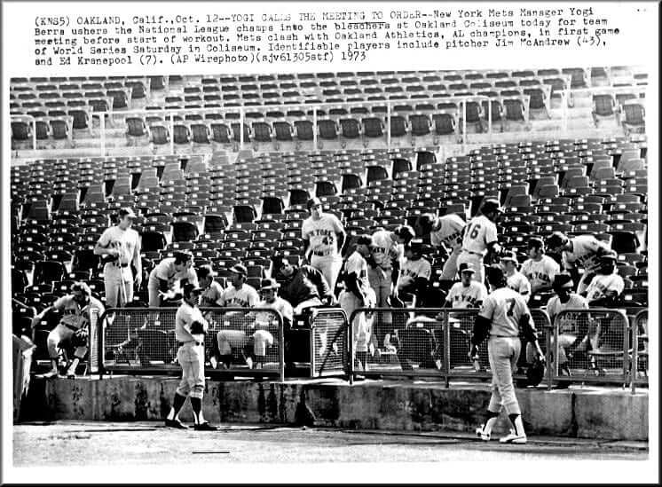
Of course, the host team — the A’s — wore white shoes, so Kranepool may have been imitating or mocking their shoe stylings. I’m pretty certain nobody on the Mets went ivory-footed in any of the actual Series games, however.
And here’s a shot of Braves players Ralph Garr and Dusty Baker wearing white shoes around the batting cage in either 1972 or ’73 (click to enlarge):
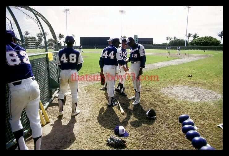
This is clearly a spring training shot. There’s no indication that anyone on the Braves went white-shod in a regular season game, or even in a spring training game. But lots of liberties appear to have been taken during workouts and such.
And as long as we’re talking about MLB shoe colors, reader Mike Williams was paging through the Phillies’ 1971 media guide and found this fascinating entry about the team’s then-new red shoes (click to enlarge):
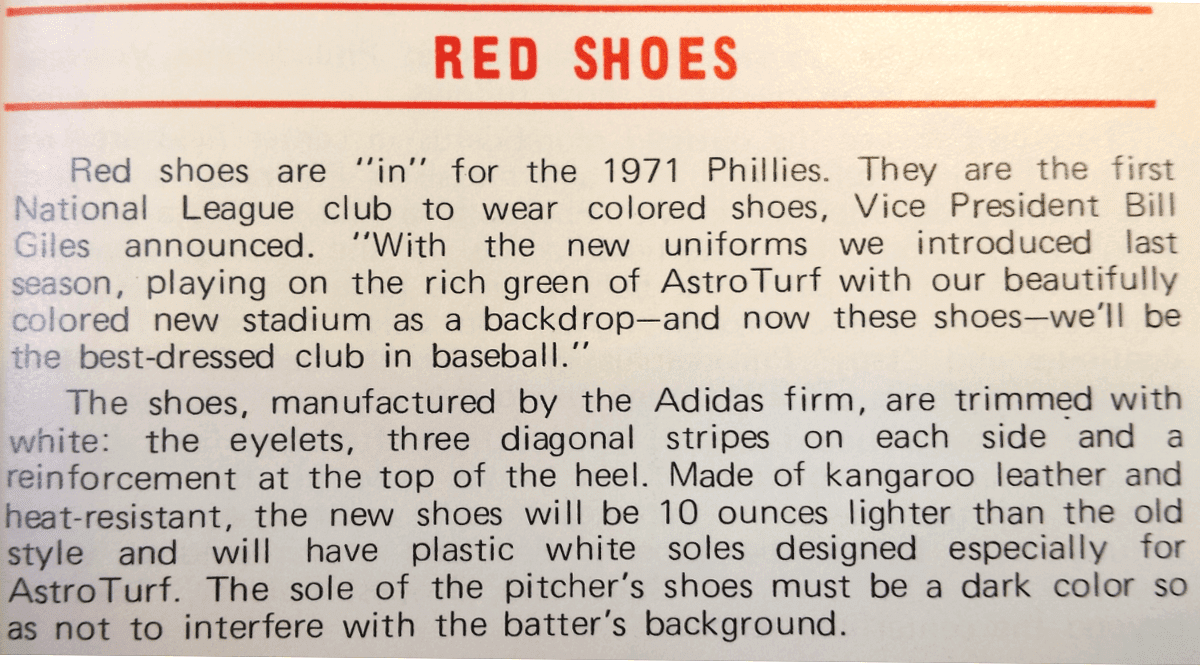
Interesting to see that they had a team-wide deal with Adidas. And I’d never heard about using white soles for Astroturf (presumably because the turf was hotter than regular grass), or about pitchers needing to wear dark soles.
As a bonus, that same media guide included a detailed description of how the Veterans Stadium scoreboard celebrated a Phillies home run. Good stuf!
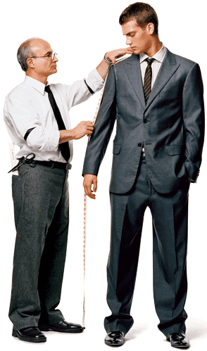
Nobody likes a tease: A really fun-sounding offer came my way on Friday. Michael Panuccio, the director of patterns and marketing for Majestic, who goes to the various spring training camps to measure the players for their uniforms (and who you may recall from this article, which ran in the Ticker last week), was coming to New York this week, and Majestic was offering to have him give me a personal fitting for an MLB uniform. A few days later they’d ship me a finished uniform, made to my measurements, for the MLB team of my choice.
That sounded great! I figured I’d get to tell Panuccio things like, “Keep the sleeves pretty short” and “Make the pants just long enough so I can blouse them at mid-calf” and “They told you I have a skin allergy to polyster, so you guys’ll make this uniform out of flannel, right?,” plus I’d ask him lots of questions. I was working to hire a videographer to record the session. Fun!
But then I got the word yesterday that Panuccio’s schedule had changed and that he wouldn’t be in NYC after all, so my personal fitting was cancelled. What a buzz-kill! We might be able to do it at a later date — hope so. Fingers crossed.
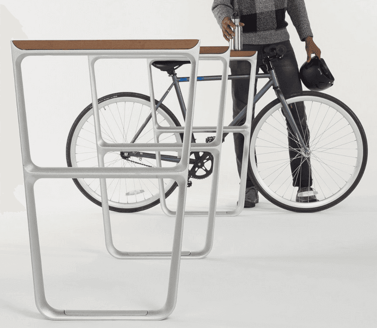
Inconspicuous update: The good news is that my latest “Inconspicuous Consumption” column for the design website re:form is now up. It’s about bike rack design, which is one of the most wide-open design areas I’m aware of — I can’t think of another product category with so many different solutions for such a simple problem. It was a really fun story to work on.
The bad news is that re:form is about to stop publishing, which means this iteration of “Inconspicuous Consumption” is finished after only two installments — disappointing. But re:form’s editor, the wonderful Sarah Rich, says she may have a new gig in the works, in which case I’d be back in business with her. Fingers crossed.
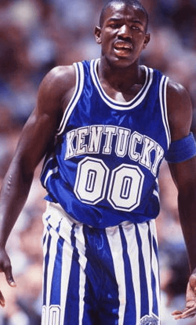
Wildcat tamer: Our own Phil Hecken’s latest piece for the Sporting News is a look back at the Kentucky basketball team’s uniform history, which you can check out here.
Phil will be doing similar rundowns for the other Final Four teams — stay tuned.
ESPN contest reminder: I’m currently accepting entries for an ESPN contest to name and design a team for a prospective NHL expansion franchise in Las Vegas. Details here.
Membership update: A few more design have been added to the membership card gallery (including R. Scott Rogers’s new card, shown at right, which is based on the Madison Mallards’ 2013 alternate jersey). We currently have one open slot in the current production batch, which means the next person to sign up will get his or her card with quickly — probably within a week.
As always, you can order your own custom-designed membership card here, you can see all the cards we’ve designed so far here, and you can see how we produce the cards here.
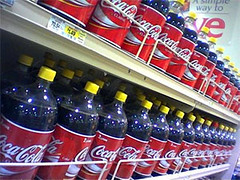
’Tis the season: Passover begins this Friday, which means supermarkets are now stocked with Judaism’s greatest gift to America: bottles of Coca-Cola with yellow caps, indicating that they’ve been made with cane sugar instead of high-fructose corn syrup (the latter of which, like all corn-based products, is off-limits to observant Jews during Passover). Further details here.
And yes, I realize Mexican Coke is also made with cane sugar, and often comes in glass bottles to boot, but it costs more, plus it doesn’t offer the bonus of letting you feel like a Jew for a Day, so snap up that yellow-cap Coke while you can.
PRICE REDUCTION on patches: There are still about two months left in Uni Watch’s 15th-anniversary “season,” so why not grab yourself one of our high-quality embroidered patches, especially now that I’ve reduced the price from $13 to $9.95. Get yours here.

Baseball News: Reader Chris LaHaye was covering a high school tourney the other day and spotted a coach wearing a vest over a camouflage undershirt and khakis. “That’s gotta be some kind of violation, right?” he says. ”¦ Steven Robinson was rummaging through his attic and found some cool stuff, including these 1969 Citco MLB collector’s coins and this totally boss MLB stamp album. Never seen that one before.

Pro and College Football News: Wrestlemania 31 took place last night at the 49ers’ new stadium. “It seemed there was a lot of red and gold throughout the show, especially from wrestlers who typically have other color options,” says Jared Patz. “I wonder if that idea was ‘suggested’ to them because of the 49ers’ colors or if a they all just had the same idea.” … A Georgia-based audio technology firm is about to release a set of speakers that look like UGA football helmets.

Hockey News: A new Virginia Tech study that ranks all the hockey helmets on the market indicates that about 25% of the ones currently in use, from the NHL on down to youth leagues, are unsafe and should not be used.

College Hoops News: Having a first-row baseline seat to one of yesterday’s games might seem pretty exciting — until you found out how far away the first row was (from David Blum). ”¦ The regional games in Houston had an outdated “UH” logo on the court.

Soccer News: Portugal’s new away kit is continuing a trend of colorful jerseys. ”¦ Details of Atlético Madrid’s new jersey have leaked. ”¦ Here’s a good photo album of MLS match balls (from Conrad Burry). ”¦ Here’s an article and infographic on the top-selling EPL jerseys.

Grab Bag: The UNC lacrosse team wore yellow socks yesterday for pediatric cancer awareness. ”¦ Pro motorcyclist Jorge Lorenzo says his performance in this past weekend’s race in Qatar because of a helmet glitch that cost him about half a second per lap. ”¦ F1 driver Lewis Hamilton was barred from switching to a new helmet with his team sponsor’s colors. … David Firestone has written a piece on NHRA uniform variations.
A vest over a camo undershirt and hakis?
Fixed.
Should the Wrestlemania thing really be in the football section?
Also, I had no idea that Sting was still a character and that he’s still using the not-quite-the-Crow makeup. It’s like the 90’s never really ended. I wonder how many WWE fans remember he used to have blonde hair and wear bright colors.
Considered putting it in the Grab Bag, but it’s really about the Niners’ stadium/colors, so….
Fair enough… I guess it works there since there’s only one other football item. I really want to say that wrestlers wearing the colors of the local sports teams is fairly common, but I haven’t really followed it since the late 90’s and the WCW/NWO thing when Hulk Hogan was trying to be a bad guy, so I could be wrong.
Sting spent the last 10 or so years in TNA Impact wrestling. He showed up in WWE in November and has only had the one match last night.
I got some of my Nationals grounds crew uniform on Friday. This year, we’re wearing black shoes. Last year, we wore blue. Plus, the Under Armour UA is a lot bigger, similar to the giant Nike swoosh on some soccer cleats.
No matter how well constructed a hockey helmet is, if players insist on wearing them with the chin strap so loose it dangles under their chin, they loose their effectiveness.
I’ve always been puzzled by that.
I guess I thought it was originally a “protest” to the mandatory helmet rule.
But now I don’t get it.
I wonder if that’s actually true. Just throwing this out there, but what if the helmet getting knocked off is actually dispersing more of the impact away from the head in the process of flying off than it does if it’s held in place? Has that been tested in any way?
Interesting question. I know with a bike helmet you want it snug under the chin because you don’t want the first blow in a crash to knock it loose, since you’re likely to bang your head more than once as you bounce along the road. But with a hockey hit that might not be true, one blow per incident might be the norm and it could be that a loose fit is more effective at absorbing that initial impact.
Red shoes:
Kangaroo leather??
Is/was that common?
10 oz lighter?? Where the old ones made of lead?
link
. . . and was that per shoe, per pair or for the whole team?
“10 oz lighter?? Where the old ones made of lead?”
~~~
Just imagine if swooshie had gotten that contract.
Kangaroo leather has always been popular with soccer shoes (though Adidas discontinued using it in 2012). It’s really light and because it stretches with moisture, you can get it a size or two smaller and break it in for a really snug fit.
I’ve never had strong feelings one way or the other about Gonzaga. Until yesterday that is. I mean, how hard can it be for your players to wear the same color socks??!!
link
ESPN update: My annual MLB season-preview column will be posted today. Thought it was gonna be later in the week — just got the word from my editor. Plus I’ll also have an interview with the guy who’s selling that Mets bullpen buggy that’s up for auction at Sotheby’s later this week.
. . . so the Rockies, Brewers, Phillies and Dodgers are chopped liver with no mentions?
Wondering what plans the Dodgers have for their script LA road jerseys as they all but quit wearing them after the all star break last season. Will they be delegated as a third jersey?
Regarding the service station coins: CITGO. For some reason correctly written in all caps – not for my attempt at emphasis!
The Houston Logo on the regional NCAA court looks like the correct “Athletics Interlocking UH” to me: link
Scroll down to “The Athletics interlocking UH is to be used specifically for communications related to Athletics with prior approval.”
Well that’s just dumb. The athletic UH is completely different from every other UH the school uses. Why would you do that?
That Houston logo actually is the current one. It’s not the horribly proportioned Kentucky ripoff they used before it.
Re: Wrestlemania color schemes
They ALL just had the same idea. Wrestlers always debut new ring gear for Wrestlemania. There is usually an abundance of the team colors that play in the stadium it is held–a lot of teal in Miami three years ago, a lot black and gold in New Orleans last year.
The problem with having performers wear the home team colors is that vast majority of those in attendance travel to the show and are from all around the world so they could care less. I think it’s a nice touch and would probably do the same thing, however.
That is interesting. I may go back and look for some of those color schemes. I guess, I wonder if they’re told “If you have red and gold, wear it.” It wouldn’t surprise given how controlling large organizations like WWE or the NFL like to be.
Enjoyed the bike rack article. And I do like that design with the ledge on top.
My issue with the standard racks are that people don’t know how to use them properly, often taking up more space or not locking both the frame and the wheel.
“… The UNC lacrosse team wore yellow socks yesterday for pediatric cancer awareness. …”
Stop.
So here’s the question: Which is larger: the number of people who knew they were wearing the yellow for that reason, or the number of people who were left wondering “wtf are they wearing yellow socks?” without ever hearing the real answer?
Loved the bike rack piece, Paul. Great job!
Thanks, Jeff — much appreciated!
Can somebody explain to me what’s so “colorful” about Portugal’s new away kit. There’s that splash of a weird red and green paint streak that’s splashed over the chest in a splash configuration that’s certainly quite splashy and seems to evoke a splash in many ways, but otherwise it’s mono-black i.e. the exact opposite of colourful.
I know it’s just the ticker, but when the claim being made in the linked article is patently a load of horseshit it would be nice to see that acknowledged rather than uncritically repeated.
When the San Francisco Giants went to pullovers and sansabelts in 1977, they played a few home games wearing the orange road jersey. When on the road, orange sannies, black stirrups and white cleats were worn; at home, they wore the white sanitaries with black cleats (unless evidence exists to the contrary). In 1978, it seems white shoes were always paired with color tops, regardless of venue.
Hope that jersey fitting is rescheduled, would love to see the results and get more info on that.
Did they say if you would have gotten your choice of jersey, or would it be random? Like having to be fit for a Yankees uniform, or maybe a purple Rockies?
Oops just re-read it, never mind.
I assume Mets?
My choice, which would be Mets home pins. Briefly flirted with the idea of going with Cardinals home whites, which is my favorite MLB uni design, but wearing a Cards uni just didn’t feel right.
Heh. Not that you would (obviously) but would you have the option to have an alternate? Or any uni that’s NOT from 2015? (Just thinking how cool it might be if they could, ya know, fit you for THIS beauty. (That would be my choice if I were ever given such a wonderful opportunity)
Pretty sure current alts would be available. Not sure about throwbacks. Wouldn’t want to get a vest (even though I like the look), because that’s not a very good tailoring test. I’d want to see how they handle shoulders, the sleeves, etc.
I would love to see the appearance of a theoretical 5-star hockey helmet in the VTU study. A hockey player would look so strange in a football or motocross helmet.
Mission used to make a one-piece carbon fibre hockey helmet. I wonder how it would have rated?
RE: Kosher Koke-
The Price Chopper supermarkets up here in the Hudson Valley (and am assuming in the home Capitol Region territory), have had KK for a couple of weeks.
Another rarity is the certified Kosher Fox’s U-Bet syrup for the REAL egg cream taste!
The only ring gear that was out of color scheme was Randy Orton (who normally wears black trunks with simple accent colors).
-Sting has worn red, black, and white since his days in the old NWO Wolf Pack.
-Rusev has worn red and gold before, and considering his whole feud against Cena is a Russia vs. USA vibe, he couldn’t wear his red white and blue gear most likely. He is also a huge heel so it’s odd to think he’d try to pander to the home fans.
-Stardust has worn red before and is also a heel so it’s difficult to see it being an appeal for a cheap pop.
-The Uso’s and Naomi are probably the best evidence for the home field approach, and considering how fan friendly they are it’s not surprising.
the Uso brothers are also big 49ers fans, so I’d guess they’d be the only ones who set out to do it to reference the team
Not only was Orton wearing red trunks, but Rollins added gold trim to his pants.
True, some of the colors are not out of the usual color scheme. But I did find it interesting the red/gold combo was as frequent as it was.
Sting had not worn that particular red coat with gold trim in WWE. He had been wearing a black coat with red trim.
Anyways, not saying none of those wrestler haven’t worn those colors before. Just saying they could’ve worn other colors, but instead kind of made it a theme.
My MLB season-preview column is now up:
link
My interview with the guy selling the Mets bullpen cart is up as well:
link
I’m pretty sure the Mets Cap Buggy debuted in 1971 or 1972. It was gone by 1978, as I watched the Mets 1978 Yearbook on TV yesterday and the carts had been replaced by standard white vehicles.
The buggy looks like it has had a lot of work and the ball part of it has likely been replaced. The cap looks like it is the original, because it was bent in a picture I found from the 1977 yearbook, like it is today…but it has certainly been re-painted. Hopefully this link shows it:
link
Brewers are retiring #1 for Bud Selig this season.
Any idea whats going on with the Bucks? link
Nevermind I just realized Wednesday is April Fools. Lame.
Three quick comments (observations) on the MLB Preview:
1. A’s: The button featuring Sal Bando looks NOTHING like him.
2. Astros: The replica Astrodome looks like an ashtray.
3. I’m all for knob stickers (…I guess) but I love the old-fashioned handwritten number made with a black Sharpie.
In 2015, you could not call them colored shoes.
Really?
Not extremely surprising about the safety testing on hockey helmets. As the manufacturers obsessed about light weight, hockey helmets started looking more like bicycle helmets than football helmets, or even batting helmets. Instead of an extremely rigid shell, with a suspension system to absorb the initial rapid deceleration of the head, they are increasingly a rigid EPP foam adhered to a somewhat flexible shell. This type of helmet is designed to absorb the energy of the blow… once. In fact, the information provided with the helmet actually says that it is supposed to be replaced after the FIRST time it is involved in an impact; not when it shows signs of impact, not when it shows cracks or even when it starts to smell bad. The first impact.