The next NFL season will culminate with Super Bowl 50 (remember they’re using Arabic numerals for that one, not Roman numerals), and the league is apparently planning to mark that occasion with a season-long initiative called “On the Fifty.”
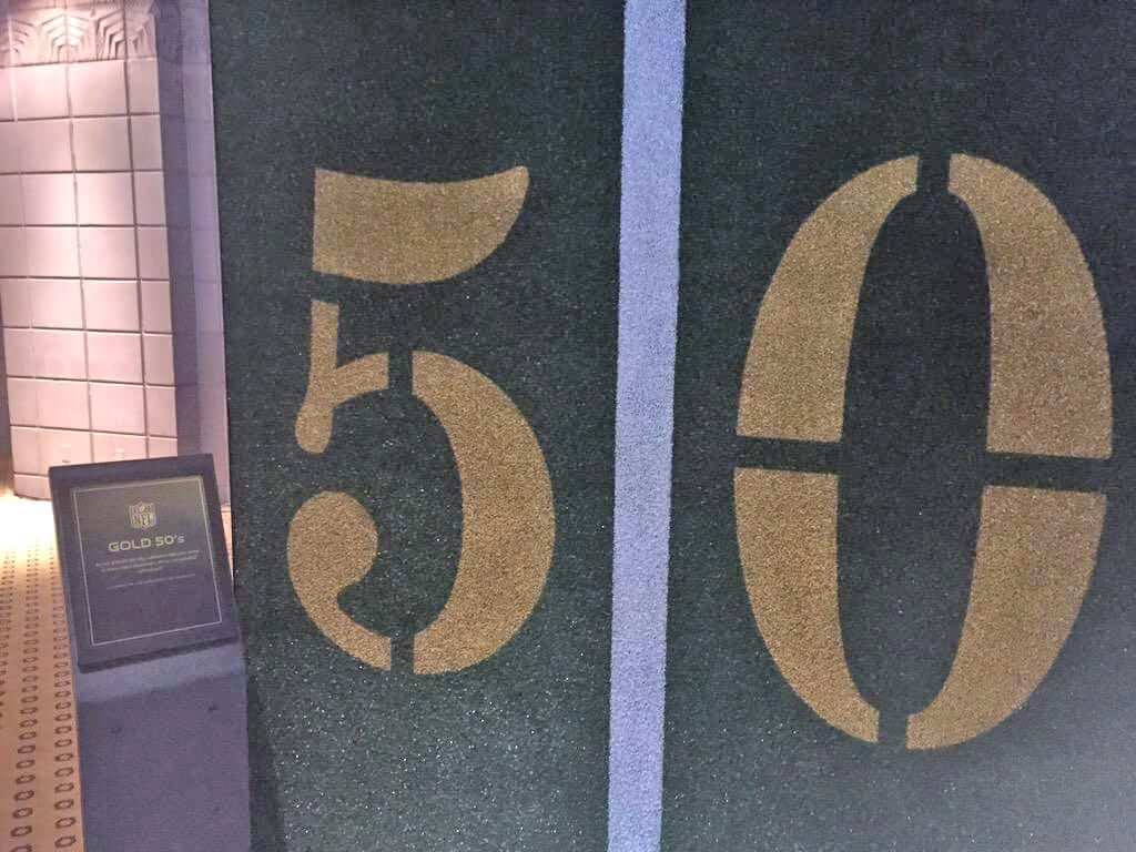
That news emerged from the NFL owners’ meetings yesterday, where NFL.com writer/podcaster Marc Sessler provided some sneak tweets of what’s in store. First, the 50-yard line markers for every game next season will be gold (click to enlarge):
Also, the uniforms for next year’s Pro Bowl will be trimmed in gold (click to enlarge):
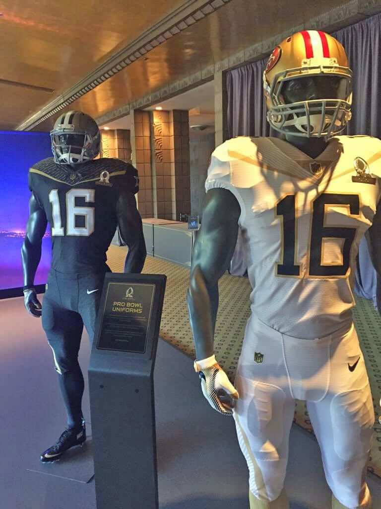
A few thoughts about those Pro Bowl unis: (1) That appears to be a new Nike tailoring template. (2) Best Least-awful Pro Bowl uniforms in recent memory. (3) Looks like the NFL logo on the pants (and maybe the jerseys?) is gold.
And hey, speaking of gold logos:
For Super Bowl’s 50th anniversary, NFL logos get the gold treatment pic.twitter.com/g1iEpIOqP1
— Darren Rovell (@darrenrovell) March 23, 2015
Why all the gold? Because the 50th anniversary is the golden anniversary, I’m assuming. But if that’s truly the reason, they’re doing it wrong: Super Bowl I was in 1967, so the 50th anniversary of that will be Super Bowl 51 (or, rather, LI), which takes place in 2017. The upcoming Supe is the 50th installment of the game but not the 50th anniversary of the game.
But whatever — the NFL’s gonna do what the NFL’s gonna do. And if there’s anything we’ve learned about the NFL over the years, it’s that they think anything worth doing is worth overdoing, so I’m assuming we’ll be seeing a lot more facets of this “On the Fifty” program. A gold version of the Lombardi Trophy seems almost like a foregone conclusion.
As for the gold yard markers, I’m agnostic. Obviously, it’ll look better in stadiums that are home to teams that already have gold in their color schemes, but overall it seems pretty harmless. What do you folks think?
So here’s a question: Would you be interested in purchasing a Uni Watch smartphone case? If so, what might such a case look like?
The reason I ask is that I was recently contacted by a company called CustomBee, which makes custom-designed phone cases. They operate just like TeeSpring (the company that’s been making the Uni Watch T-Shirt Club tees): The product is available for ordering for a limited time window — three weeks, say — and then arrives 10 to 14 days later. The price would be about $20, plus $5 for shipping.
I have no idea how many people would be interested in this, and I don’t want to put merch out there just for the sake of doing it. But if people are into it, I’d even consider holding a design contest, with a cash prize (and a free phone case, of course) for the winner.
But first things first — let’s see how many people like this idea. Please use this poll to let me know. Thanks!
Click to enlarge
Collector’s Corner
By Brinke Guthrie
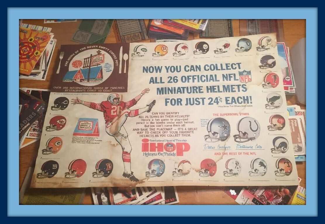
Love love love this fall 1971 IHOP NFL helmet placemat, featuring your “Super Bowl Stars” and ”¦ the “the rest of the NFL.” This is the kinda stuff that got me into the NFL. I had just moved to Dallas and discovered the allure of America’s Team. They were opening Texas Stadium, I was chowing down at IHOP at a furious rate, and getting to meet players at department store appearances and youth football league banquets — magic. Like the song says, “Old days, good times I remember.”
Here are the rest of this week’s eBay picks:
• Never seen these before: a 1969 Chiffon Margarine rub-off decal, featuring the St. Louis (football) Cardinals. That same seller also offers several other teams.
• Nice-looking set of 1970s “Aren’t You Hungry?” Detroit Tigers/Burger King promo glasses, with the tiger gobbling up the rest of the AL competition.
• Interesting 1980s bumper sticker here. It just says “Play With The Best: The NFL.” No team — just the league.
• Nice assortment here of 1970s NHL fridge magnets.
• Here’s a 1970s Tony Esposito mini goal stick and puck set.
• Great-looking 1971 Reds poster featuring the then-new Riverfront Stadium and Fountain Square.
• Staying with the Reds, here’s a 1970-2002 commemorative Riverfront Stadium ball.
• Collect (and wear!) Official NHL Crests, like this late-1960s one for the Montreal Canadiens. Heck, it could be from any era — that’s a timeless logo.
• These Vikings sports socks are an Official Licensed Product. Boy, any product with that logo on it had me cold. The seller also has a pair for the Cowboys, but $50 each? Pretty steep for a pair of socks.
• I remember this Eagles poster! The ad says 1974, and I recall being struck by how “in your face” this poster was.
Follow Brinke on Twitter: @brinkeguthrie
T-Shirt Club report: I’m reallyreallyreally pleased with the sales results on the Uni Watch T-Shirt Club’s April design. When the dust settled last night, we have sold 324 shirts — by far the Club’s largest total so far. (Our previous high was 207, in January.)
Teespring will let me know my share of the profits either later this week or early next. Once I find out the amount, I’ll let you folks know and then donate the whole shebang to the Jackie Robinson Foundation (and ESPN will match my contribution, so the amount will be doubled). I’m really happy to be doing this — thanks to all you shirt buyers for making it possible.
Meanwhile: I had previously mentioned that the May shirt would be one of our “core” designs (road, alternate, BFBS), but I’m having second thoughts about that. More details next week.

Help wanted ”” ’Skins trademark case: Phil is looking to speak to any readers who are lawyers (or knowledgeable on the subject of trademark law) regarding the pending Redskins trademark case. It makes no difference how you feel about the name or issue in general — this is simply about the status of the case and possible future actions. Should only take a few minutes of your time — if you’re interested, please shoot Phil an email. Thanks.

Baseball News: Here’s the second part of our own Phil Hecken’s interview on the Sully Baseball Daily Podcast. ”¦ Game of Thrones unis for the Durham Bulls. ”¦ End of an era, as Wilson Sporting Goods has acquired Louisville Slugger. ”¦ Someone down at spring training has a Yankees-themed car, complete with all the retired numbers along the rear bumper. Might have to get a wider car (from Andrew Cosentino). ”¦ Wanna buy a piece of the Mariners’ old dugout from the Kingdome? You can! (From Kev McCarthy.) ”¦ Several specialty jerseys on tap this season for the Salt Lake Bees. ”¦ Gorgeous striped stirrups for Syracuse softball. ”¦ New bat knob decals for the Padres. ”¦ Throwbacks on tap today for Indiana. ”¦ Back in 1961 and ’62, the Cubs didn’t have a manager. Instead, they had an eight-man committee called the College of Coaches. If you look at this photo of them, it appears that two guys in the front row were wearing golf shoes, and one guy in the back row may have had dress shoes (nice one from Michael Clary). ”¦ The rest of these items, all concerning Japanese baseball, are from Jeremy Brahm: All the current managers of the Japanese Central League teams are shown in uniform here. ”¦ Here are the uniforms for the beer/concession staff at QVC Marine Stadium, home of the Chiba Lottes Marines. ”¦ The Orix Buffaloes will wear Tuffy Rhodes-era Kintetsu Buffaloes throwbacks in May. And Yusuke Toyoda adds that the Buffaloes’ opponents, the Softbank Hawks, will wear early-’80s throwbacks.

NFL News: Interesting helmet logo on this Patriots championship T-shirt (from Michael Enriquez). ”¦ We’ve heard about helmets with impact-monitoring technology, but here’s something new: an impact-monitoring chinstrap. ”¦ Next year’s Pro Bowl will be in Hawaii, as usual, but after that the NFL is considering some foreign locales for the game (thanks, Phil). ”¦ The NFL is selling these dresses that look sorta like striped socks or stirrups (from Jon Solomonson).

College Football News: Looks like Syracuse will be going orange over blue this fall. ”¦ It was initially reported yesterday that Jim Harbaugh is bringing back Michigan’s merit decals and scrapping the “Legends” jerseys, but then the school clarified that those decisions are not yet official.

Hockey News: Drew Miller of the Red Wings literally punched the Blues logo off of Petteri Lindbohm’s helmet the other night. ”¦ Hoo-eee, look at this gorgeous old Hershey Bears program cover. A beauty! ”¦ The Islanders will wear throwbacks for their final regular season game at Nassau Coliseum. As Brian Erni points out on that page, they really should have gone NNOB, but whaddaya gonna do. ”¦ This apparently went viral late last week, but I didn’t see it until now: an amazing photo of a Canadian Mountie playing hockey, in his Mountie uniform, with a jaw-dropping mountain vista in the background (big thanks to Alan Kreit). ”¦ And in a vaguely related item, check out this shot of an FBI Agents hockey team.

NBA News: You’ll probably never see so many stars on so many uniforms, not even in an all-star game, as you can see here (from @flyersfansindc). ”¦ The Warriors used to wear “The City,” and the Blazers currently wear “Rip City.” Put those two together when the two teams face each other tonight in Portland and you get this very amusing T-shirt (from Manzell Blakeley). ”¦ The Bulls wore black at home last night, setting up a brutal-looking black vs. teal game against the Hornets. ”¦ Check out this 1974-75 shot showing Golden State players Butch Beard and Clifford Ray wearing mismatched jerseys. “The only other example I could find of someone wearing the versio with ‘Warriors’ along the bottom of the circle was Rick Barry, from the same game,” says Daniel B. Listoe.

College Hoops News: White lettering on a white jersey isn’t a new thing, as you can see in this photo of the 1933-34 Kentucky team (nice find by Chris LaHaye). ”¦ Wichita State is apparently celebrating their win over in-state rival Kansas with this T-shirt (from Andrew Costentino). ”¦ Speaking of Wichita State, here’s a good story from last year on their weird mascot (thanks, Phil). ”¦ Also from Phil: Here’s a breakdown of Kansas’s record by uniform. ”¦ This is so fucking great: The Dalton State Roadrunners have “Beep! Beep!” instead of NOBs. And in script, too!

Soccer News: Here are all the uniforms for the Nadeshiko League, a Japanese women’s league (from Jeremy Brahm). ”¦ Barcelona supporters displayed a gigantic 12th man jersey before Sunday’s match against Real Madrid (from Yusuke Toyoda). ”¦ Also from Yusuke: “Here’s an infographic showing the 15 soccer-specific stadiums in MLS. The league started in 1996 with 10 teams and zero soccer-specific stadiums.” ”¦ And one more from Yusuke: “Sheffield United played in next season’s unis last weekend to mixed reviews.” … Mismatched sponsors on the French national team’s training tops.

Grab Bag: Interesting piece about how sneakers age. ”¦ Nike is currently engaged in copyright and intellectual property legal battles on three different fronts. ”¦ There’s a new “postmodern” skateboard design that has no board! ”¦ Adidas is looking to recapture its cool factor via the sneaker market. ”¦ Here’s how Superman, Wonder Woman, and Batman have changed their looks over the years (thanks, Brinke). ”¦ Rugby news from Eric Bangeman, who reports that the wrap on the goalpost padding came off during a recent match in Durban between the Sharks and the Chiefs. “The Chiefs’ players helped to replace it — and they were the road team,” says Eric. ”¦ A Russian-affairs website has provided a good critique of the country’s WWII military uniforms. ”¦ New athletics logo for Rose-Hulman Institute of Technology. ”¦ Newly announced presidential candidate Ted Cruz is already taking some heat for his campaign logo. ”¦ I’m still calling it the Tennessee State Fairgrounds. ”¦ A teen-ager who stole a New Zealand All Blacks player’s jerseys says he’s sick of prison, although I suspect he may not be unique in that regard. ”¦ Here’s an article outlining four ways that Adidas blew it (thanks, Brinke).
I think gold field numbers during the Super Bowl would be fine, maybe even kinda cool. Gold numbers for the entire regular season is just stupid. All of the other gold stuff is also really lame. This isn’t the NFL’s 50th season, that was all the way back in 1969. Heck, we’re 4 years away from 100 and they’re doing gold 50s? Obviously the Super Bowl is a big deal, but come on.
Agreed. Having something nifty for the Super Bowl itself is fine, but they need to save the big fancy all-season decorations for 2019.
And I still call it Super Bowl L.
Doesn’t make any sense to do gold numbers during the regular season. If this were a celebration of a league anniversary, sure, but celebrating the 50th Super Bowl throughout the season? Dumb.
Whether it’s the fiftieth season or anniversary, the whole “Golden Anniversary” is pretty arbitrary – so I’m okay with that aspect of it. As far as the over the top celebration on fields and unis and the SB logo – the field seems a bit much, but only a bit. A gold Lombardi trophy would be over the top, since the winners are not more worthy than their 49 predecessors.
Unrelated, but while I’m not going to get a UW phone cover it obviously needs green and mustard stripes
it looks like your durham bulls and Wilson sporting goods link are ran together
Thanks. Fixed.
Yes, 50th super bowl seems pretty straight forward. 50th anniversary of a single game, instead of a whole season like the 75th, seems too complicated.
As for the uniforms, they look like the puma soccer unis from a few years back that look like shawls or capes.
You know, the weird shoulders were the last thing I noticed here.
Because those costumes are complete garbage. And in a way, I despise them even more than what’s been worn for the past two Pro Bowls, because people may be less likely to properly criticize them.
Black-on-black with no belt, and SOLID BLACK SOCKS WITHOUT EVEN A HINT OF LOW WHITES. And black shoes!
The other set isn’t much better. White-on-white with no belt, and gold socks. Can’t tell whether they’re gold all the way down…but I wouldn’t be surprised if they are.
And both sets have some sort of small, strange excuse for a side stripe that (naturally) wraps around to the front of the knee. Yay.
Apparently, shame no longer exists.
I was thinking “capes” too!
Not to invent a word, but do we need to call that something? “Capron strings”?
They’re about as thick them, and usually look as bad as them. But “apron strings” describes wonderfully where they are, and these stripes are in a distinctly different place.
Um, that Patriots t-shirt is obviously a knock-off.
It doesn’t even say “Patriots” or “Super Bowl”
The gold numbers are gonna look bad on fields that die late in the season. (I’m looking at you Green Bay and Chicago)
I assumed there would be a gold Lombardi trophy, similar to how Ryan Newman won a gold Harley J, Earl trophy when he won the 50th Daytona 500.
Harley J. Earl trophy:
normal link
gold link
But the logo for Super Bowl 50 shows gold numerals, but a silver trophy.
link
So maybe the NFL will stick to tradition here?
The Pro Bowl units look pretty cool. They even bear some resemblance to the Steelers “Batman” uniforms.
A gold Lombardi, eh? We can just pencil in whose trophy case that’s going in. #Steelers
#Saints
Steelers are yellow.
Yusuke’s MLS link appears to be disable by a stray quotation mark.
Was just fixing that as you were posting your comment.
When Avaya Stadium opened in San Jose last weekend MLS.com ran a story that declared it the 15th soccer specific stadium in the league. I couldn’t figure out if they were counting RFK or the Citrus Bowl as soccer specific. I figured it could be either since both stadiums don’t have a primary tenant aside from their respective MLS teams. Now I know they were counting BC Place, I guess some when better tell the Lions to find a new stadium.
Yeah, some of the choices are curious.
Providence Park is Portland State football team’s home stadium, and was home to several minor league baseball teams before the Timbers. CenturyLink isn’t any less of a soccer-specific stadium than BC Place.
I think the issue with Multnomah Stadium/Civic Stadium/Providence/I still call it the Rose Garden/Soccer Pitch is that they redesigned it after they kicked out the Beavers Baseball, and made it soccer specific. They hold multiple levels, but got it ready for the new MLS team. I cannot find any info on how long Portland State has used it, but there isn’t space for a football specific stadium, and they are not big time enough to warrant their own.
Sheffield Utd: I plead compleat ignorance as to the red stripes (before I run off to historicalkits to do some research).
What strikes me as “not working” is the three-stripes across the shoulder combined with the extended red collar going a few inches down the sternum. Choose one element.
It doesn’t help that the shirt’s busy in other areas. There are two club patches on the chest, the sponsor logo has three different type sizes going in two directions, and they have some commemorative writing under the collar.
FWIW, Historical Kits sasy they started in 1889 with solid white shirts, moved to pinstripes before settling on thicker stripes: link
There’s only one club patch on the Shef Utd shirt. The logo above the crest is that of the British Heart Foundation – a charity that provides support for research into heart disease. It looks like that the British Heart Foundation logo will only be worn for this match and they were auctioned off afterwards. The BHF logo won’t normally appear on the shirt nor will the commemorative embroidery. More details can be found here: link
Love the fact that the Yankees fan spent that much time/$ on that car, and gets the name of the stadium wrong …
EEeesh!!
Oof.
Everyone knows it’s Etihad Stadium America.
Huge pet peeve of mine. I live in Florida. (That’s not the pet peeve.) But when I see someone who lives in Florida (determined by the FL plates) who’s got a 2 foot tall Yankee decal on their back window. They are such great Yankee fans that they live 1000 miles away from where they play? Someone paints pinstripes on their vehicle is a huge fan?
Put a Yankee license plate frame on it or something, a small interlocking NY is fine, but skip the huge decals, you’re not that big of a fan.
NY’ers are well accepted here, because most folks don’t know where other folks come from to begin with, but if you want to perpetuate the apparent NY attitude a huge decal is a good start.
You have to live in proximity to your favorite team to be a “huge fan”??? Moronic statement. Ever heard of someone getting relocated for work? I assume you are not suggesting folks need to change their rooting interests every time they move. Of you are, that’s just stupid.
Some people live in places that don’t have teams at all.
Perhaps they shouldn’t watch sports.
Clearly, based on its shape, a Uni Watch phone case would be suited to the waffleboard blocker treatment. Brown, with white circles in the correct arrangement, beautiful! And a perfect match for a waffleboard laptop sleeve, but where the hell are you gonna get one of those?
The helmet logo for Miami is facing the wrong way on that IHOP placemat.
There’s also the Steelers logo on the wrong side… but that seems to be an incredibly common error.
What are they supposed to do? Show a blank black helmet? Reorient the entire set because the Steelers have this quirk? Have the Steelers’ helmet face the opposite way?
I understand it’s not strictly realistic, but in a lot of cases I think showing the Steelers logo on the wrong side is the right way to do it.
“Reorient the entire set because the Steelers have this quirk? ”
Yes.
….and the Steelers logo is on the wrong side of the helmet.
Is there some kind of regulation haircut going on in the Nadeshiko League?
Seriously, seven of the ten players shown in that photograph have the same hairstyle, and two others aren’t far off.
Soccer isn’t considered a feminine/co-ed sport in Japan the way it is in the States. It tends to attract female players who are less concerned with conventionally feminine aesthetics, and I suspect that explains the bowl cuts that are presumably easier to manage than shoulder-length (or longer) hair.
The uniforms look great. In particular I like the yellow and green, blue and orange stripes, and the teal. That’s a sharp-looking league.
what does being agnostic have to do with gold yard markers? Do you mean apathetic?
“Agnostic” is often used to indicate a state of neither enthusiasm nor disapproval.
Another definition for “agnostic” is “having a doubtful or noncommittal attitude toward something,” according to Google’s dictionary.
the attempt at Uni-Watch logo-creep is pretty ironic.
I think you’re misunderstanding the distinction between logo creep (which is when a manufacturer’s logo competes with or even supersedes the supposed “primary” brand) and merchandising.
That’s not what logo creep is at all.
I know bat-knobbery is a young medium, but are those Padres decals the first instance of a bat-knob decal with a bat on them?
Some players from St. Louis and Baltimore had bat knob decals with bats on them?
O’s:
link
Cards:
link
Thanks!
It’s weird to see all these things about that “postmodern skateboard” now when I saw them in SkyMall at least 3 years ago, and I imagine anyone else who was ever bored on a plane did too :P
I have no problem with the idea of merch for merch’s sake. It helps you get your brand out, and people want it… good for everybody.
You’re fortunate to clear the biggest hurdle by miles… You have no shortage of designers that help you put out quality designs.
Stick with quality products (material) and quality design, and no one should have issue if you want to put up a storefront.
What made the Chicago/Charlotte game unwatchable was the black tights. “The goggles! They do nothing!!”
Yeah I don’t see a problem with the color matchup.
I think it looked awesome.
Me too. The contrast worked…the Bulls’ numbers were light, while the Hornets’ numbers were dark, then vice versa when it came to the uniforms. And there was no BFBS, since black is a Bulls color. That’s a great matchup.
The Hornets’ black tights don’t bother me, as they contrast well with the cyan uniforms. The Bulls, on the other hand, should have known better.
My big problem with the Bulls’ unis (all sets) is that, as the shorts got longer in the 1990s, the empty space on the sides (between the waistband and the diamond design) went from fairly small to *very large*. They need put a stripe pattern or something in there.
“NFL uniforms adorned in gold next season…”
More like, Nike “khaki.” The same fate that has plagued Purdue and Missouri, among others.
Looking at the Hershey program, I saw this listing.
First, the French don’t use apostrophes when they write the “A’s” and it looks awkward.
Second, the player seems to have external padding on his thighs/knees. Was this common?
link
“As”, as in “Les As” is French for “Aces”, so no need for an apostrophe.
I’m not sure those are external leg pads, just socks(Quebec’s were quite unique):
link
Sort of Skins Watch related:
The new game Out of the Park Baseball 16 uses the Indians’ “C” logo for historical seasons, despite using the appropriate historical logo for all other teams.
Those Tigers glasses are pretty interesting. I’m not sure when WDIV first used that “First 4 Sports” slogan, but the 4 logo was introduced in 1979, so that’s the earliest those glasses could date to (meaning they’re possibly from the early 80s).
The seller also appears to have mistaken the Yankees’ star-spangled top hat for a Senators logo. The feathers (opposite Wahoo, apparently) would seem to represent the Orioles. So, unless there’s a seventh glass that the seller hasn’t accounted for, it seems the A’s and Mariners are lacking in representation, or are supposed to be represented by the bat.
Definitely 80’s. I remember those as the opening ‘theme’ for Tigers games when I was growing up.
Pre-game: link
After a loss: link
They don’t seem to have one where he chews up the bat after a win, nor any of the ‘opposing team’s logo’ variants (which was brief).
Are you sure that Pro Bowl uniform is white and gold? It looks more like blue and black to me.
May’s shirt should be “El Uni Watch”
Uni Viendo?
el estudio obsesivo de atletismo estética
Yes, but only if the patch is changed to read “Camisetas” for “Mayo 2015!”
Los Uni Observoderemos
décimo quinto aniversario de uni watch
To be perfectly clear, when it comes to the NFL, even if it’s NOT WORTH doing they still think it’s worth overdoing.
Lee
Those Pro Bowl jerseys don’t have the cordura seams…
At this point, I want photographic evidence showing these designers being caught dead in public wearing their designs.
They stubbornly cling to “innovation”, but every NFL jersey has disappeared from the pop culture landscape. Whether the design is intended for the field or for retail is irrelevant to me; either way the designs are unnecessary and ugly.
Are they getting paid to be weird or are they getting paid to sell jerseys?
If the itch to be weird is so strong, why not focus on women’s pro/college teams? It is safe to say women are generally more open to fashion innovation than men, so why not put your energy into that and just be a friggin supplier to men’s sports?
If anybody can find out if Mitchell & Ness is outselling current jersey designs let us know, because I wouldn’t be surprised at all…
That 1980’s NFL bumper-sticker might be a shot at the USFL.
I remember a TV ad for an NFL preseason broadcast on one of the networks, c. 1984. It went something like: “Real football… NFL football is back, on NBC…” [or CBS].
Could it possibly have been 1983, after the ’82 Strike when NBC got desperate and broadcasted CFL games?
Back then, I would’ve taken the CFL or the USFL over the NFL. No contest.
Problem with the CFL on NBC…the games they aired were serious blowouts. Had they showcased some close matchups, ratings might have been decent enough to continue.
The first CFL on NBC game in ’82 featured the defending champion Edmonton Eskimos versus their Alberta rival, the Calgary Stampeders. Warren Moon & Co. ran roughshod over the Stamps 36-17. The next week, the Stampeders were blown out by the Saskatchewan Roughriders 53-8. SCTV lampooned this by having a strike of their own, and then called in the CBC to fill SCTV’s airtime.
On the left edge of the Sixers-Nets photo you can see another Sixers player wearing a jersey design that’s different from the one Dr. J is wearing. It appears to be this design:
link
Also note Nick Weatherspoon with the “Spoon” nickname on back in that photo!
The Yankees car doesn’t have all of the retired numbers. 6 and 42 are not on there, for example.
42 is retired league-wide; are (did?) the Yankees going to retire it separately for Mo?
Lord of the Rings take on Golden State’s “The City” logo:
link
I don’t particularly hate the Hornets/Bulls color on color. They contrast well enough and all the numbers are pretty readable. I will say though, with purple/teal and the black alternates, you can’t get much more 90’s-tastic.
Pinstripes.
Back in 1961 and ’62, the Cubs didn’t have a manager. Instead, they had an eight-man committee called the College of Coaches.
That would be a great name for a fantasy baseball league or something.
Given their lack of success, they could have called it the Congress of Coaches…
The Tigers glasses from BK have the Blue Jays but not the Seattle Mariners who joined the AL at the same time (It can be argued the lawsuit that created the M’s, allowed the Blue Jays). Just a foot note, that’s all.
Wow — I would love to see your surname as an NOB!
Per Donte Whitner, the Browns’ new set will have NINE different color combos.
link
And the NFL’s Nike-pocalypse begins in earnest…
Let’s see… we’ll assume brown (b), white (w) and orange (o) for pants and jersey, helmet is always orange of course. Thus: bb, ww, oo, bw, bo, wb, wo, ob, ow. Nine combos. 3 colors. That’s the same as the Titans, and the most any NFL team can have under current rules. Nevermind that they can’t actually wear all nine as the NFL limits the 3rd jersey to just 2 uses.
In other words, not a big deal.
“All I can say is that I saw the New Jersey and cleveland you will be proud!”
New Jersey?
HAHAHAHAHAHAHAHAAAA
“Oregon Ducks of the NFL {That’s what I said!}”
To him, this is a good thing. And that’s pretty much all you need to know.
Calling them the Oregon Ducks of the NFL is pretty big stretch as long as the One Helmet Rule is in effect (unless they’re going to be wearing black & gray instead of team colors). Cleveland is going to have the same number of possible combinations as the Titans, Texans, & Seahawks. Don’t believe the hype.
I like the jerseys and they look fantastic.
the NFL shield will be gold and graphite for all season, this applies to all on field kit providers.