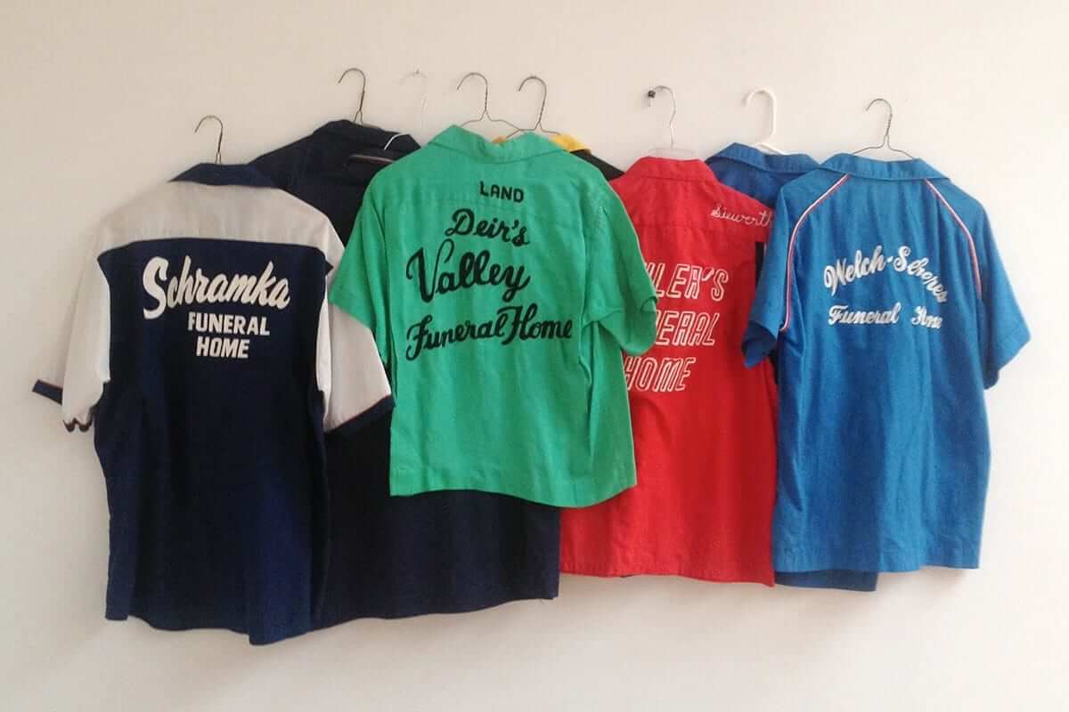
Click to enlarge
I love bowling. I also love collecting things. Occasionally these two passions overlap — I have a small collection of bowling instructional LPs, for example. I also have lots and lots of old beer ads that show people bowling, and I have a little display of old bowling books and pamphlets (I particularly like the title More Pins, More Fun).
And yes, I also have several vintage bowling shirts, but I don’t really think of them as a collection, and it’s never occurred to me to acquire bowling shirts with a particular theme.
It did occur, however to Johan Kugelberg (whose name may be familiar to some of you from his work as a music writer and record label manager). As you can see above, he’s amassed a nice collection of vintage bowling shirts from funeral home teams, an admirably narrow-focused theme that I wish I’d thought of myself. The collection was displayed as part of a gallery show here in Brooklyn last August, but I wasn’t aware of it and missed out. Only found out about it two days ago, when I was poking around on the web for something else and stumbled across the gallery listing. Dang.
If you think bowling shirts are an exercise in bohemian irony, and funeral home bowling shirts doubly so, Kugelberg doesn’t disagree. From the text of his gallery show listing:
Ironic consumption has become increasingly ironic, and the search for the ironic has become increasingly iconic. The old millennium ended, and the commodification of cultural consumption as an online experience has led directly to a dictatorship of obscurity.
Yes, that’s all rather twee, but I’m pretty sure it’s intentionally so (which just makes it more twee, right?). Anyway: Bowling shirts! Collecting! Funeral homes! They’re all worthwile.
If you can’t see the slideshow above, click here
Teed up: Golf, unlike bowling, holds zero interest to me. In fact, I have this theory that we’re all intrinsically either bowlers or golfers at our core, but I digress. The story here is that on Saturday night I went to a gallery show that featured, among other things, a display of 35 unusual golf tees made by the artist Tony Stanzione. Most of them were glass, but a few were wood. All were really interesting. If I could use these tees, I might actually become interested in golfing.
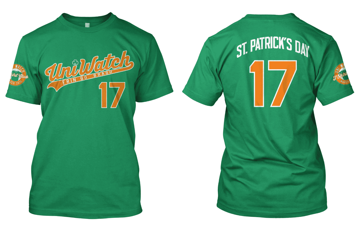
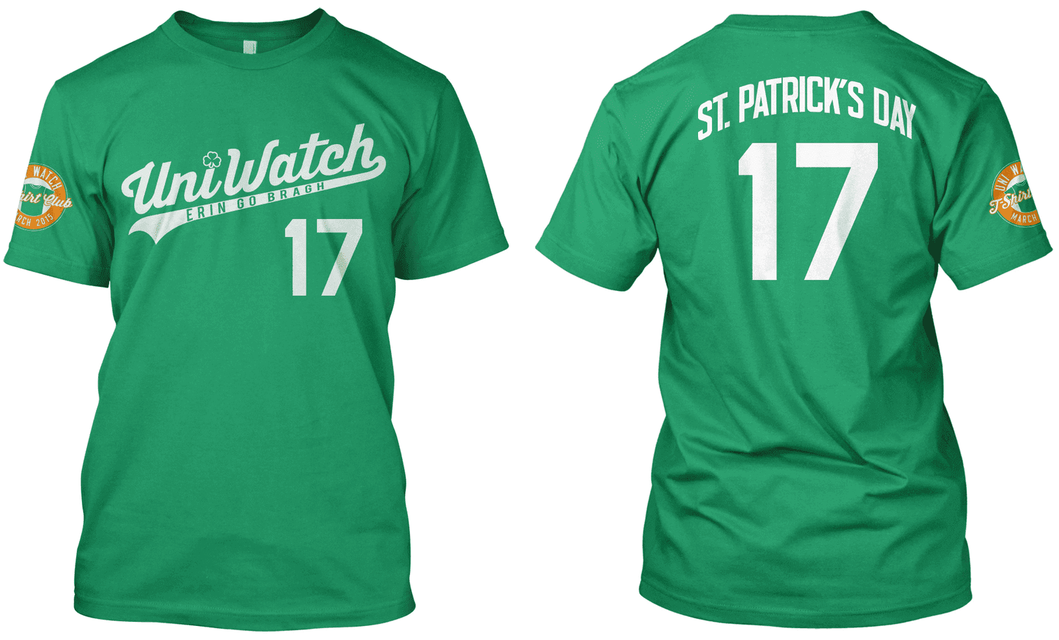
T-Shirt Club Update: The March design for the Uni Watch T-Shirt Club will go on sale next Tuesday, and today I’d like to show you what’s in store and get your feedback on a few points.
March, of course, is when teams break out their St. Patrick’s Day uniforms, so that’s the inspiration for our March shirt. We’re currently considering two designs — one with an orange script and one with a white script (click to enlarge):
A few notes about these designs:
• Green is already a Uni Watch color, of course, but the green being used on these shirts is lighter than the forest green that we’ll be using later in the program for the “Alternate” shirt.
• We’re using orange as the secondary color because green, orange, and white are the colors of the Irish flag.
• As you can see, we changed the uni number from 15 to 17 (because St. Paddy’s Day is on March 17), changed the slogan under the script to “Erin Go Bragh,” and dotted the “i” in the script with a shamrock. (We also considered putting a little icon of the Irish flag above the NOB, where the MLB logo would go on a baseball jersey, but it looked too busy, so we scrapped that.)
We like both of these designs. Which one do you like best? Vote here:

What Brian Williams and Jim Bouton may have in common: I don’t care a whole lot about the current Brian Williams brouhaha, mainly because I don’t care a whole lot about Brian Williams, period. But the episode has reminded me of something related to Uni Watch: Back in 2006 I was working on an ESPN column about baseball pants pockets, and I remembered that Jim Bouton’s book Ball Four included a mention of Braves slugger Rico Carty carrying his wallet in his uniform pants during games, so I got in touch with Bouton to learn more about that.
Bouton elaborated slightly on what was already in the book, but then he told me something really interesting (I’m paraphrasing here): “I can’t tell you much more, because I don’t remember most of what took place in Ball Four anymore. I’ve told the stories so many times that all I remember are the stories, not the actual events.”
I can totally relate. There are definitely stories and accounts that I’ve told so many times that the stories have superseded the memories of the events. I’d like to think that the stories are accurate representations of what really happened, and I believe they are. But frankly, I’m no longer sure. I don’t doubt the veracity of these stories, but I feel like I’ve lost touch with the actual events and only have the narratives that I’ve told so many times. (In fact, I’ve told the story of what Bouton told me many times, so that one could fall into this category as well, except for one thing: I still have my notes from that interview.)
I suspect this is what happened to Williams. Or as media critic David Carr put it in this article, “Stories tend to grow over time and, if they are told often enough, they harden into a kind of new truth for the teller.” This doesn’t excuse Williams’s behavior, of course, but it probably explains it, at least to a degree.
Click to enlarge
Collector’s Corner
By Brinke Guthrie
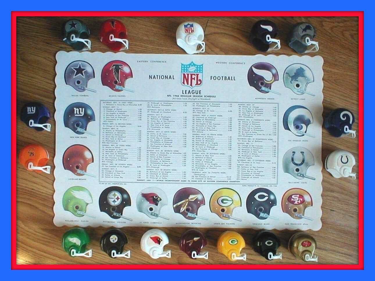
We’ve all seen the complete gumball helmet sets, but take a peek if you will at this placemat. Love the helmet art, and the schedule for the 1966 season! You get the complete set of 15 teams and the placemat in one auction.
Here’s the rest of this week’s eBay haul:
• How about this 1970 NFL Bicycle Helmet Hubcap for your ol’ Schwinn Spyder, eh? This one features the Patriots.
• Take a look at this vintage set of 1960s NFL glasses, willya? Brownie, the Colts, Pack, Eagles and Vikings. New. In. Box.
• Wow, great graphics on this 1970s Padres poster. This 1970 Portland Trailblazers poster has the same vibe, too.
• Funny how after all these years, you can still immediately place a particular image. See this pack of 1974 Fleer NFL stickers? That’s absolutely Washington running back Larry Brown.
• They didn’t do a lot of work on the graphics for this 1970s NFL board game, did they? (There’s a hoops version, too.)
• I could never figure out why the 1970s White Sox had that modern “Sox” logo but also the old-fashioned font. See them both on this dugout jacket
• Cool! A 1970s Atlanta Flames puck pencil sharpener!
• Featured these once before on CC, but it’s worth showing again: Check out this 1970s Montreal Canadiens poster. Those are some sharp graphics.
• Great look for the Chargers helmet on this 1970s pennant. Air Coryell, baby.
• Charles O. Finley (look it up, kids) probably hoarded his pennies in one of these 1973 Oakland A’s helmet banks. (Still in the bag!)
• And this one is out of left field and just for PL: a 1970 Coca-Cola delivery guy shirt. It’s the real thing.
• These Packers/Cowboys helmets don’t appear to be NFL-approved, do they?
Follow Brinke on Twitter: @brinkeguthrie
Read this: Gawker/Valleywag writer Sam Biddle — a very smart guy (and also very nice, at least the one time I met him) — has written a brilliant, devastating piece called “Brands Are Not Your Friends.” It’s very simple and direct, it’s not too long (1200ish words, or about the same as one of my ESPN pieces), and it’s totally worth your time. Highly recommended.
Uni Watch News Ticker
By Garrett McGrath

Baseball News: A tech start-up is currently in a trademark war with the Nationals and the Cubs (from Bob Gassel). … So many choices: Uni Watch friend Chris Creamer broke down all of the Mets uniform options for 2015. … It’s that time of year again: The Nationals’ equipment is on its way to Viera, Florida (from Tommy Turner). … The Dartmouth baseball team in 1880 was pretty stylish in stripes (from Jay Sullivan). … Pure gold here: a 1965 photo of the Astros riding a rocket in the just-opened Astrodome. Check out the real grass, which soon died due to lack of sunlight, leading to the development of AstroTurf. … Tequila sunrise uniforms for the Bucs from Hoover, Alabama (thanks, Phil). …

NFL News: A Patriots fans who jumped on the bandwagon this season was in the Bahamas wearing a Vince Wilfork jersey and then ran into Wilfork himself and seemed to have no idea who he was (thanks, Paul).

Hockey News: With the 35th anniversary of the 1980 “Miracle on Ice” Olympic squad now at hand, the Hartford Wolf Pack — that’s a Rangers farm team — will be wearing Miracle on Ice-themed jerseys on Feb. 28. Here’s hoping the back-jersey design includes the requisite contrasting nameplate (from Josh Tremblay).

Soccer News: From an article about the expansion New York City F.C., an amusing episode from the dark ages of American soccer: “The Phoenix Fire’s first game in 1979 and the sudden panic, 10 minutes before kick-off, when the kit turned up and the president, Len Lesser, bounded into the dressing room to announce why there was no goalkeeper’s jersey. ‘We’re going to be the smartest team in the league. None of this bullshit with players wearing different uniforms. I want us all to have the same uniform'” (great stuff from Yusuke Toyoda).

NBA News: It looks like a Atlanta Hawks rebranding is in the works for the 2015-16 season, according to a quote from their owner (from Conrad Burry).

College Hoops News: Boston College will be wearing throwback uniforms for their game against Syracuse on Wednesday (thanks, Phil). … A look at the new Duke throwback uniform (thanks, Phil). ”¦ Really good story about Muslim women basketball players who want to wear hijabs, which are allowed in the NCAA but are banned by FIBA for international play.

Grab Bag: “A family trip this weekend to the Reagan Presidential Library had some uni-notable items, including his Notre Dame sweater from Knute Rockne: All-American,” says John English. … Here’s an article about an airbag developed for skiers (thanks, Paul). … A cool piece on the popularity of dark-colored cycling kits (from Sean Clancy). … Here’s a product that turns that strap of your shoulder bag, or any other strap, into a billboard for your favorite teams (from Kevin Mueller). … Here is an interesting graphic comparing baseball logos to their university’s version (thanks, Phil). ”¦ Vote for your favorite Wisconsin high school mascot (from Joel Mathwig).
I’m surprised UConn’s baseball logo isn’t on that graphic. It’s possibly one of the better university baseball logos around.
Ah yes, the famous Phil Regan Presidential Library. One of the finest! :)
My favorite impersonation of President Reagan, by a Phil:
link
RIP Ed Sabol. I wish I could take the day off and just watch old NFL Films movies.
Quibble: usually the phrase is spelled “Erin Go Bragh”.
. . . and it is on the orange, but not the white. Huh.
Yikes — major typo. Was right on one of the earlier versions but somehow the “G” disappeared. Will fix!!
Looks like United Soccer Leagues saw the MLS re-brand last year and thought, link, too.
Geez, Louise. If you have to explain your three-letter logo, you’re trying too hard.
The White Script version of the March T-Shirt is missing the “g” in Bragh. How does that happen on Uni Watch?!!!
Fair question!
We’ve gone thru many, many iterations of the designs. At some point the “G” fell off of that one.
[Hangs head in shame]
Ha. When you have a chance to call out a legend, you have to do it. It’s like scoring a basket on Jordan in a pick up game!
Leave that poor Patriots fan alone. He was just a Seahawks fan two weeks ago.
Re: Paul’s theory about a person either being a bowler or a golfer at their core, I’m not sure I agree. I enjoy doing both. Maybe bowling more than golf now that the latter is so darn expensive, but I used to enjoy golf more in my younger days. Now, actually doing either one of them well? I can’t make that claim. But hey, they both are vehicles for easy beer consumption, which makes the physical act of sucking at the sport a little easier to accept.
Re WalletHub trademark matter: If a trademark is not used for a certain period of time (3 years IIRC; UW IP attorneys please feel free to correct me) it is considered abandoned. Sounds like it’s about time for the Nats to make those 1924 TBTC unis regular alternaties, as I suggested in the comments over the weekend.
Not an IP lawyer myself, but as I understand it non-use of a registered mark for three years does not, by itself, constitute abandonment under U.S. law; the holder having no intention of future use needs to be shown as well. Non-use for three years does constitute prima facie evidence of abandonment, however, meaning that the burden of showing intent to use in the future shifts to the mark holder. As long as the Nationals are making noise about throwback jerseys, alternates, etc., that may be sufficient to show intent.
What seems totally illogical to me, on the other hand, is MLB’s infringement claim in the first instance. How can the tech company’s logo infringe on BOTH the Nationals’ and Cubs’ logos without the Nationals’ and Cubs’ logos previously infringing on one another’s? By definition the likelihood of confusion by consumers would be far, far greater between two companies competing in the same freakin’ business! Indeed, perhaps the USPTO shouldn’t even have granted the later-registered mark for that reason. Or, for that matter, the Cubs’ mark at all – I mean, who looks at a generic “W” and thinks “Aaah, a W – the symbol of my beloved Chicago Cubs!” (And that’s without even intending to make a joke about the team’s epic ineptitude.)
Agreed. Under the “similarity of the goods and services at issue” factor that courts consider when analyzing trademark infringement claims, the goods and services offered by the Cubs and the Nationals are pretty much identical to one another (resisting the urge to make an all-too-easy Cubs joke here) and pretty much not at all similar to the goods and services offered by a personal finance website (as far as I can tell, at least).
Something about even being able to trademark a single letter in such a basic font like that seems a bit wrong to me. It’s a standard W that you’d use while teaching the alphabet to 4 year olds. It’s literally as generic as you can possibly get. Getting a trademark for it should at least involve a specific color scheme or something.
“The Nationals hold a trademark for a block-type W that was primarily used when the team was known as the Senators.”
Talk about “likely to cause confusion, to cause mistake, and to deceive the trade and public”!
Wouldn’t the trademark combine the mark (color, font) with specific uses (baseball cap, baseball jersey, etc.)?
These Packers/Cowboys helmets don’t appear to be NFL-approved, do they?
What the f… Well, I’ve never seen gumball helmets with a chinstrap before, so they’ve got that going for them.
I’ve never seen “Dallas” spelled “Dalls” before, either. Perhaps designed by the same people who brought us these fine products:
link
Love the orange and will certainly be buying one.
One quibble – Would prefer if it still said “For people who get it”. Of course I’m being selfish – but this may be the only one i buy, as i don’t make a habit of paying $20 for t- shirts.
My favorite is the white, but I’ll happily buy the orange since that seems to be duh peebles cherch. I also like Adam’s suggestion of “For People Who Get It,” and would buy that shirt as readily as one with “Erin Go Bragh.” How about the Irish Google Translate version: “Do Dhaoine Ce Faigh Se”?
Shuddup, Connie.
Oh, man, the one thing I like even better than St. Patrick’s Day jerseys is jerseys that render existing team marks in another language. I’d love Do Dhaoine Ce Faigh Se in the tail. Playing with Google Translate, I refine down to a slightly different “Do Dhaoine a Fháil,” but surely someone here actually speaks Irish Gaelic. Maybe Erin Go Bragh on the back in place of St. Patrick’s Day, which is a bit long, and anyway with Irish Gaelic text and the colors, the St. Paddy’s connection should be plain.
BTW, orange for this son of Erin, please!
I think there some kind of hiccup in the Astrodome item in the ticker.
Thanks. Fixed.
sure hope next month’s shirt has “42” on it
~~~
I prefer the orange lettering, but that’s just me.
~~~
As one who has both bowled and golfed (and now curled), I don’t think they’re mutually exclusive nowadays, although I’m sure years ago the differences were probably magnified not so much due to the different nature of the sports, but because golf was primarily a sport “limited” to the privileged few, whereas bowling was more the sport of everyman and therefore the twain probably rarely met. While those class distinctions probably still do exist, I’d say they’re much less so than in the past.
I’m not so sure the difference between a bowler or a golfer is an “at the core” thing as it is a vestigial class distinction that nevertheless still persists to this day.
^^^
Every word of this. Every word. Including the little ones at the start.
I vote that next month’s shirt reverts back to the number 15.
The combination of April and 15 can be quite depressing.
“… Bowling shirts! Collecting! Funeral homes! They’re all worthwhile…”
Indeed. Great feature.
For St Pattys shirt why not make script in front white but number in front Orange? Ala Dodgers jersey and other shirt. Then back have alternate as well (Like it is shown above). Thoughts??
link
I try to go with Pat’s Day. That’s what everybody in Galway said when I was there last year visiting a friend. Sidestepping the issue always works out for the best, right?
Paddy/Patty issues aside, I agree on the white script & orange number combo on the front, along with the white NOB and orange number on the back. Unfortunately, mix-and-match isn’t a voting option, so consider this a write-in.
Like.
RE: Misremembering
Read an article on this phenomena a while back, pretty interesting stuff. Link is below, but the short version is that remembering things is essentially like a game of “telephone”. You don’t actually remember the event, you remember the last time you remembered the event. So the more times this recall takes place, the greater chance there is for distortion.
link
The one time I met Walter Cronkite, at the very end of his on-air career as “the most trusted man in America,” he told an obviously much-embellished story and brought the crowd down with laughter. The “crowd” being a gathering of darn near every journalist and on-air talent in the entire CBS network, yet Cronkite’s reputation didn’t suffer from the exaggerations. Perhaps the key is to make sure your stories end on a self-depreciating note, so that when the inevitable gaps open between your story and the original facts, your audience doesn’t perceive it as an act of self-aggrandizement.
Note that in fact the details of Cronkite’s story very much did magnify his importance, like the expanding details of Williams’ stories. It’s just that Cronkite’s tale ended with a comeuppance for him.
Comparing Cronkite to Williams is pretty much apples and oranges.
Cronkite was a newspaper reporter and radio reporter before television even existed. His journalistic bona fides were beyond reproach, and were well-established long before he became an anchor.
Williams is the product of a media machine that turns out television celebrities. I happen to think he’s pretty good at what he does, but what he does should not be confused with what Cronkite did.
Largely agreed, though Walter link.
I usually believe we should be cognizant that all people have some facets of their lives that would not stand up to close scrutiny and that good people can still not be near-perfect. I’m just not into hagiography.
The difference between Conkrite and Williams is more than just journalistic bona fides, Cronkrite (along with Eric Sevareid)actually put himself in harm’s way, during World War II by flying on combat missions with B 17 bomber crews; link
Williams didn’t “misremember”, he knows his plane wasn’t fired on by small arms/rpg fire.
Preaching to the choir, Paul, but the public perception and expectations of a news anchor are, I posit, not all that much changed from the days when Murrow’s Boys were creating TV news and today. At least, within the context of the nightly news broadcast. Precious little actual journalism goes on anywhere on TV, but the public expectation remains that a network news anchor is a, well, anchoring figure of credibility and factuality. We demand a certain verisimilitude from our anchors, and are disappointed when they let that veneer drop.
Well, one thing has changed: In Cronkite’s day, up to 75% of televisions in the nation were tuned to one of the three national news broadcasts each night. Today, viewership is way down. Part of the thing that mystifies me about the Williams brouhaha is that we’re all talking about this Very Important Guy with a Very Important Broadcast that none of us actually watches. How big a deal is a bit of storytelling from a guy whom only 8% of American households, and more like 3% of actual individual American people, watch?
Re WWII, Cronkite et al adopted the informal unit nickname “The Writing 69th,” a reference to the famous “Fighting 69th” infantry regiment.
They even made a unit patch:
link
In Cronkite’s day, up to 75% of televisions in the nation were tuned to one of the three national news broadcasts each night.
And all three in LBJ’s White House!:
link
For all the talk about how they misrepresented LBJ in Selma, they got this detail right.
I’ve worked with a group of soccer coaches since 2001. There was one time about six years ago or so I took the bus with them & the team up to a spring event they having that involved us staying overnight.
When I came down for the bus the morning of the games, I thought I was on time, but they didn’t and were gone. The games were at a field about a mile or so from where we were staying, it was about 30 degrees and my jacket was on the bus. I walked. Needless to say, I wasn’t happy.
The story gets retold at least once every six months by the coaches, not so much by me, and when it does, it seems to get colder, earlier in the morning and longer in distance every time. So I totally know the feeling.
Anyone who followed Serial understands the fallibility of memory. And one of the failures of the justice system is the reliance on eyewitness testimony.
The uncomfortable truth is that news is more about storytelling than truthtelling. And Brian Williams is really, really good at storytelling (and I mean that as a sincere compliment). Most of the time, he has reporters on the field and fact checkers to make sure the stories he tells is also factually correct. That gets lost when he’s actually the one in the field.
There’s both a natural simplification of the story over the decade or so in which Williams has told of the helicopter incident as well as a picayune public attention to meaningless details. A lot of the criticism of Williams sounds a bit like Yossarian being told not to worry about the German anti-aircraft fire in Catch-22, because the gunners aren’t shooting at him personally. They’re just shooting at the airplane he happens to be flying in. Totally different things, so don’t worry about it.
Problem being, Brian Williams’ has had negligible field reporting experience overall, and no combat field reporting experience whatsoever prior to the Iraq stint at issue here. Though I don’t speak from personal experience, there’s no way that facing enemy fire is anything but one of the most vivid and searing sensory experiences someone might ever have in life. Which makes it impossible to “misremember” experiencing it when in fact you didn’t (barring some sort of actual cognitive issue). A Rather or a Jennings or some other journalist with war reporting experience conflating one set of circumstances with another? Sure. But someone with no such prior experience, nor any subsequent experience AFAIK? Pffft.
tl;dr: There’s no possible “fallibility of memory” at play here – Williams can only have engaged in outright falsehood. Why he did so is anyone’s guess, mine being simple self-aggrandizement.
Regarding the ticker link questioning why collegiate baseball logos differ from the schools other sports branding, I’d posit that it may be the baseball logos predate the football logos (which have come into use as a university’s primary logo) and have remained in use due to tradition. We know baseball squads employed lettermarks and iconography back to the 1800s, where football logo sets didn’t come into popular usage, really, until the NFL-AFL merger. We had the technology to apply logos to fabric jerseys and caps (needle and thread) long before we had the technology to do the same with football helmets (plastics and specialized adhesives).
My thought:
Baseball logos are fabric/needle and thread based logos that have limitations on their designs, where as football logos are something printed in ink which can have much more detail. In each of those examples the football logo is much more complicated than the baseball logo. I have two FSU caps, one with the baseball logo (which I didn’t realize was solely the baseball logo til now) and one with a stitched football logo. From my recollection the football logo has something to be desired in terms of precision.
It could also be that these colleges’ baseball logos endure because, aethetically speaking, they look much better on the front of baseball caps than more detailed logos would.
Not only do baseball caps tend to traditionally feature letter logos, the cap logo tends to be very closely associated with the team/program and, in some cases, is iconic. It’s the same reason football teams (like Clemson and South Carolina, to name two on this list) have stuck with their traditionally striped helmets while switching to nontraditional spacesuit jerseys and pants.
Also, two of these logos (Florida and Oregon State) are part of same department-wide branding scheme. They were actually changed to complement the primary logo.
Ah yes, St. Pádraig who drove the purple unis from Ireland. (Someone better remind Wexford GAA.)
Wow, that article about the missing goalkeeper uniforms turned out to include a piece of Phoenix sports history I’d never heard of!
link
Unfortunately there seem to be no images of their actual unis. The team played several games but not a single regular season ASL contest; the owner apparently had made multiple financial misrepresentations to investors and wound up spending a year in the Maricopa County jail!
link
Where has this website been all my (internet browsing) life? Thanks for the introduction. My curiousity about minor league sports and soccer in particular makes that site very interesting.
I will binge on “FWIL” during the next interminable snowstorm here in New England.
Is it reasonable to expect the St. Patty’s shirts by the 17th? I’d love to wear it to the local parade/boozefest.
link
And yes, they should deliver by March 10, and in many cases earlier than that.
Thanks for the grammar lesson. Never heard that before!
Sweet!
Not sure why the Cubs are pissed about that “W” issue. It’s not like they fly that flag very often over Wrigley.
(had to be said)
“It’s not a lie if YOU believe it.” George Costanza
Paul : Did you look at doing white script and NOB with orange numbers?
Properly spelled white-script shirt now swapped in. Thanks to those who caught the mistake.
Re: The Mets uniform combos
Has anyone mentioned that the alt road cap for the Mets that they introduced a few months ago is the Diamond Era material?
link
They don’t seem to be marketing it as a BP cap though, so this might lend some credence to the theory that MLB is switching over to the Diamond Era material for all of their hats in the near future.
Was watching Antiques Roadshow last night and they showed this beauty:
link
I think those fake gumball helmets were from cake decoration kits in the 1960’s.
Reading the story on pockets on baseball pants made me think of Tim Raines, but not for his crack pipe. After being diagnosed with Lupis, I believe he was permitted to carry a small flask or bottle of water with him in the outfield.
Was it a crack pipe or coke vial?
Believe Raines carried crack vials in his uniform pants, not a crack pipe.
The number 17 on the T-shirt does not look right to me. It looks like it wants to be a standard block font, but the top part of the one is too wide and the right side of the 7 is too narrow.
Here is a set of block numbers for comparison
link
Respectfully disagree. Prefer our “7” to the one you linked to.
I am afraid those Boston College throwbacks will tempt the players to shave points.
Bowling Uniforms.
Detroit is a hotbed for bowling. My mom’s uncle was on the Stroh’s Brewery Bowling team which was like the Detroit All-Star team. They wore all white and I always thought it was super classy and intimidating.
link
link
link
That entire article about cycling jerseys was horrible. As a watcher of cycling (especially the TDF), I fear its going to be just about unwatchable this year.
Cycling used to have great jerseys not too long ago
link
And while we’re at it, I thought this photo in the cycling article was interesting:
link
Look at that photo for a minute or two, decide if it makes you uncomfortable, then read this:
link
Post of the day so far.
Holy crap, that Sam Biddle article is amazing…
Ain’t it, though? Smart fella. And like so many of the Gawker writers, his main agenda is to cut thru the bullshit and get at the truth.
I find it amusing that people sincerely think Coca Cola was doing something good.
And yet, I still drink it.
I don’t think there’s anything wrong with consuming a mass-market brand. I think the problem is thinking they stand for anything beyond building shareholder value.
This isn’t to say companies *can’t* do good – I think Nike’s marketing has done a lot to empower female athletes and Apple has been ahead of the curve on LGBT issues, to name two examples. It’s just important to consider to recognize that (1) there is no altruism in the corporate world, and (2) any feelings you have about a brand is engineered by people for whom your best interest is not their priority.
I pretty much dismissed the ad when it aired during the Super Bowl with a response that amounted to “Nice try, but no”. While I do appreciate having an anti-bullying message, I found that the commercial’s approach, that there could be some kind of “magic wand” that could whisk away the online nastiness, is really reaching. Moreover, I think one commercial reviewer (I forget who exactly at this point) put it best by saying that the only thing you’d get from spilling Coke on a server is one pissed-off IT professional.
I suppose I shouldn’t be surprised that there were apparently a lot of people who did lap up the campaign’s pablum, but I guess I am a little bit surprised. Coca-Cola hasn’t registered a single blip on my Facebook timeline since at least as far back as January 31st, before the Super Bowl and thus before this campaign. Also, I don’t recall seeing anything about it on my Twitter feed, either (though I don’t really pay attention to the trending list). And I certainly haven’t heard anything about it on the news.
In short: meh.
Much of the article makes good sense, and I agree with what he wrote. However, it almost comes across as sour grapes, or hurt feelings.
The point about brands serving one purpose, and it’s not to be your friend, is true. He lost me when he started talking about the evils of liking a brand. The same could be said for liking anything non-human. Regardless, I thought the article was pretty damn good.
Paul, did you consider making the name on the back of the Shirt “March” instead of “St. Patrick’s Day?”
But, it’s not a “March” jersey…It’s a “St. Patrick’s Day” jersey. Just like the two previous shirts have had their NOB.
Sigh.
The name of the month is already included on each sleeve patch. The NOB is for the kind of jersey it is (Home, Road, Batting Practice, St. Patrick’s Day, etc.).
I have a Guinness hockey jersey where the NOB is March and the number is 17. Even though I only wear it on March 17th every year, I still get asked who March is.
If you falsely claim you were in helicopter that was shot down, either you are knowingly telling a lie or you have a degenerative mental condition and should be supervised by a caregiver. Let’s not make excuses for powerful people who advance our political agendas.
The Brian Williams / Jim Bouton comparison reminds me of a commercial I remember from some 20 years ago. I don’t remember if it was a Super Bowl commercial, and I certainly can’t recall the product it was advertising, but it basically involved a group of buddies retelling the story of a fairly ho-hum pick-up football game–first shortly after it happened, then a couple other times throughout the years, and finally (as I recall) to their grandchildren many years later. Naturally, it evolved into the most legendary football game ever with a nail-biting finish, or something along those lines.
Anyone else remember this?
I do remember that commercial. However, I can’t remember what it was advertising. Now I’m going to spend the next hour searching for it online.
Really enjoyed the link to the black cycling uniforms article. I guess it’s only slugs (like me) who would get too warm wearing black on the torso during the summer.
But what really pulled me was the quote, I wonder if the design departments for teams often just create their race clothing concept in isolation without taking into account how they will appear mingled in among the other squads in the peloton?
In isolation a lot of fine details stand out, and en masse some of these things don’t come across. The more athletes, closer together, the more the effect, viz. cycling or American football v. baseball or basketball. Words to live by.
Where’s the option for “I don’t plan to buy this months shirt because I loathe St. Patrick’s Day”?
But the white looks better…
Bowling shirts: Paul Schramka, the third-generation proprieter of Schramka Funeral Home, had about a three-day look from the Cubbies in 1953:
link
He wore number 14, which was shortly after that acquired by Ernie Banks. I heard from Paul’s son today. He writes that at one point, they were sponsoring 20 bowling teams.