I’ve been wearing Chucks since college and see no reason to stop now. I recently got a new pair and noticed two changes to the sneaker’s classic design. I suspect both changes were introduced a while ago and therefore may be old news to some of you, but I hadn’t bought a new pair of Chucks in about eight months, so these changes were new to me.
First, the tag on the back has been altered. Here’s a comparison — old tag on the left, new one on the right (click to enlarge; and yes, the photos in today’s entry show how everything in my house ends up with a light coating of cat hair):
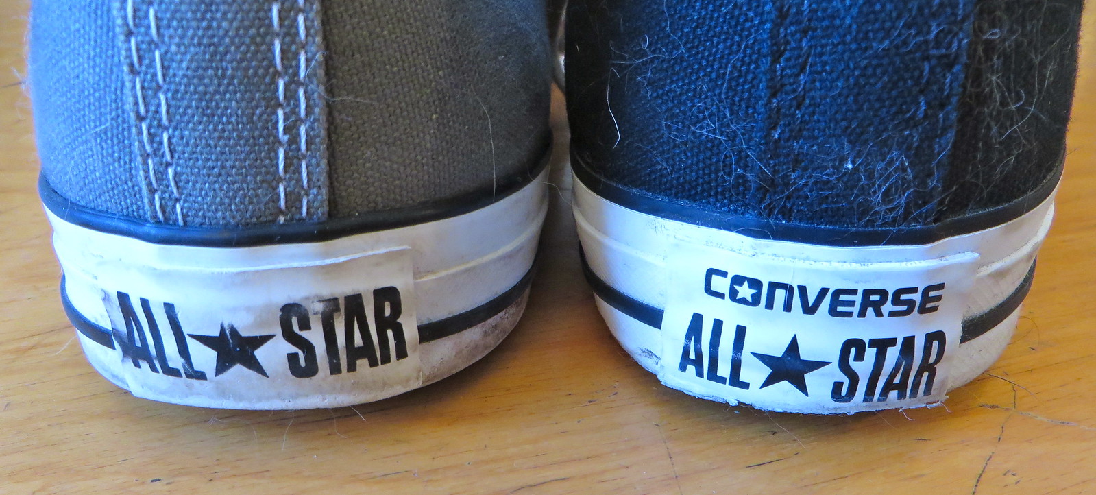
Can’t say I’m in love with this change. Why bother to add “Converse”? Like, duh, of course it’s Converse — everyone knows “All★Star” means “Converse All★Star”! Now the tag’s proportions feel all wrong. Boooooo!
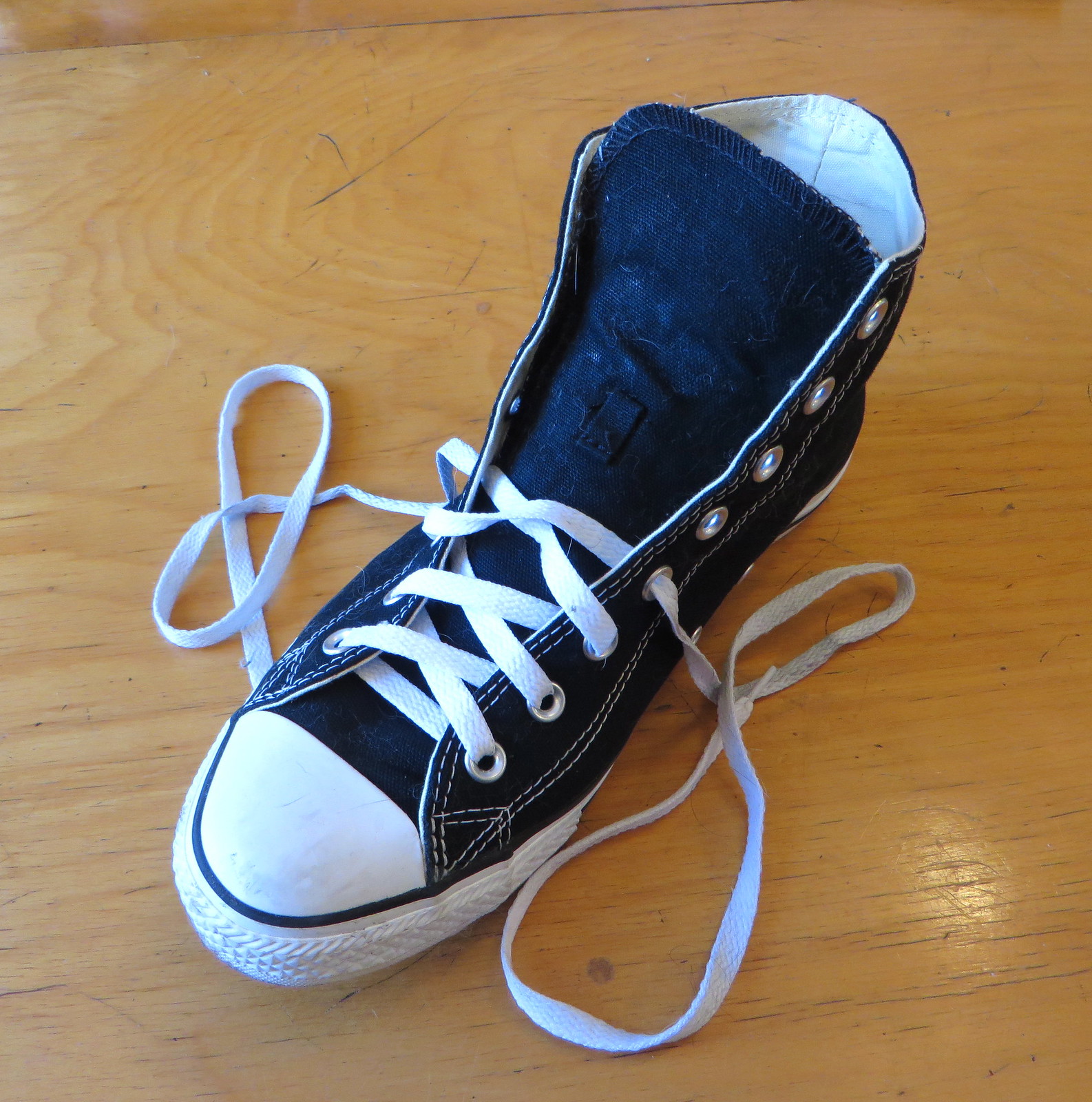
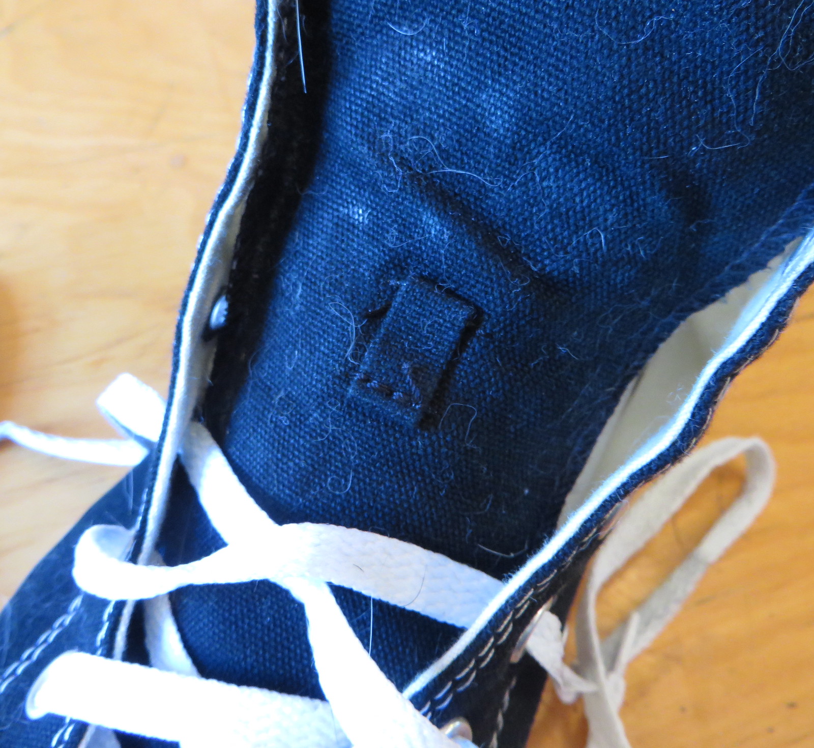
The second change is on the tongue, which now has one of those little “keeper” loops that you’re supposed to thread the laces through (click to enlarge):
I remember when I was a kid, I had a pair of cleats with this same type of keeper loop on the tongue. At the time, I thought it was super-cool — threading the laces through the loop felt very official and professional, like I was really gearing up right proper. I even made a point of looking at other kids’ cleats and felt all superior to them if they didn’t have the keeper loop. Amateurs.
I know lots of sneakers include the loop. But for a pair of Chucks, the loop feels unnecessary, and maybe even pretentious. What exactly is its function — to keep the tongue anchored in place so it won’t slide off to the side? Can’t say I’ve ever had that problem. To keep the laces in in place? Never had a problem with that either. Meanwhile, the loop disrupts the orderly visual flow of laces’ zigzag pattern (click to enlarge):

Fortunately, it’s easy to ignore the keeper and just lace up the sneakers the normal way, without bothering with the loop. That’s what I’ve been doing.
Phil has something like 30 pairs of Chucks, so I asked him about the back tag redesign (to my surprise, he hadn’t noticed, although he agrees that it’s a downgrade) and the loop (he usually doesn’t bother with it). Then he asked me a key question: “Do you lace your shoes with the bottom loop over or under the eyelets?”
My response: “They come out of the box over, and I’m fine with that. So they stay over until I break a lace, and then I do the replacement laces under, which I do not for aesthetics but because I find it easier to lace them that way. What about you?”
Phil: “Oh man, I always relace every pair. I usually buy (or dye) a pair of laces when I buy the shoes. Sometimes I’ll keep the white lace, but a lot of times I’ll go with a new color. I must have 30 new pair of white laces, all of which came from shoes whose laces I replaced with other colors. Anyway, the bottom lace ALWAYS goes over the eyelets (which, as you point out, is usually that way from the factory). But no matter what, I will relace them (even if it’s the same lace), ensuring the two sides are of identical length. I’ll even start all over if the laces are even a centimeter off at the end. Yeah, I have some OCD issues.”
I can relate. I always want my laces to be exactly even on each side, too. I also want them to sit perfectly flat, with no twisted bits.
And as long as we’re talking laces, here’s another thing: Chuck Taylor laces tend to develop black spots at the points where they pass through the eyelets. This isn’t too much of a problem if they stay perfectly in place, but if the laces shift a bit, or if you tighten them, your clean white laces are suddenly riddled with black marks. Grrrrr.
Someone out there is probably saying, “They’re not ‘eyelets’; they’re grommets.” Yes, I know. And the plastic tips at the ends are aglets.
Okay, that’s all the Chucks- and shoelace-related minutiae I can handle for one day. But I’m sure many of you have thoughts on all of this (Jen Hayden, I know you feel strongly about the over/under thing on the bottom loop!). The floor, dear readers, is yours.


Baseball News: Here’s something I missed from last week: Mets catcher Travis d’Arnaud and bench coach Bob Geren are switching uni numbers, among other number changes. ”¦ Truly hideous camouflage jerseys for Central Michigan. ”¦ Tim Smith of the Perth Heat totally Gets Itâ„¢ when it comes to hosiery (from Richard Jurnack). ”¦ Remember the A’s great Oakland Oaks throwbacks from a few season’s ago? They were selling the stirrups from that uniform for just $10 a pair at their recent FanFest event (from Richard Paloma). ”¦ If the Senators hadn’t moved to Texas in 1972, they were apparently going to wear this uni design. There’s another example here. “What’s interesting is that there is no blue outline, the Wilson varsity typeface is used, and there’s a vertically arched NOB,” says Matt Malinoski. … Someone in the band Mastodon wore a Dodgers uni to the Grammys last nigt (from Wayne Koehler).

NFL News: Falcons fans reportedly want new jerseys, and who can blame them. ”¦ Former Bills LB Darryl Talley was at a Buffalo auto show on Saturday and was presented with a matte black Bills helmet by an autograph seeker (from Peter Andrzejewski). ”¦ I have no idea what’s going on with this white Steelers helmet, but it kinda makes me feel better about the NFL’s one-helmet rule (from Tris Wykes). … A “minor league” team called the Pacifica Islanders is going with black unis at home, grey on the road.

Hockey News: Pucks being sold at the Hockey City Classic over the weekend referred to the University of Michigan as “Michigan University” (from Jeffrey Sak). ”¦ Funny story about how NHL TV analysts wear their neckties (from Mark Coale). ”¦ Pink unis and pink ice for the Manchester Monarches (from Bobby Kaufman).

Basketball News: Here’s an interactive page that lets you create your own NBA Mt. Rushmore (thanks, Mike). … Interesting court design for Cal State Bakersfield: blue court, yellow apron, no paint in the key (from Jonathan Karberg). ”¦ Here’s a bizarre one: The men’s and women’s teams for St. Joseph’s College, a D3 school on Long Island, showed up for a doubleheader against Sage College on Saturday, but the men’s team somehow forgot their uniforms. So after the women’s team played, the men wore the women’s unis. ”¦ Here’s a closer look at Pitt’s BFBS uni from their color-vs.-color game against Syracuse on Saturday (photo from @mayorbd). ”¦ Lots of women’s teams wearing pink yesterday, including Vanderbilt, Arizona State, and Hofstra. ”¦ New uniforms apparently in the works tonight for Duke. ”¦ UMass and LaSalle went color-vs.color yesterday (thanks, Phil). ”¦ Here’s one of those soda case displays for Kentucky basketball. “I especially like the attention to detail to the black seams on the ball,” says Chris Edwards.

Soccer News: Looks like that New England Revolution leaked design that was circulating might be legit. ”¦ Meanwhile, here’s another MLS leak, this time for the Columbus Crew. ”¦ And yet another, for the Chicago Fire. ”¦ New red-striped secondary jersey for DC United (thanks, Phil).

Grab Bag: Big gripe from Delta Airlines’ non-employee contractors: The airline doesn’t give them weather-appropriate uniforms. ”¦ New uniform coveralls in the works for the U.S. Navy. ”¦ The New Jersey Turnpike Authority is considering a line of licensed products emblazoned with NJ Turnpike and Garden State Parkway logos. ”¦ Traffic cops in Pakistan are getting new grey uniforms because the old white ones were associated with corruption. ”¦ Shame on the school district in Sayreville, New Jersey, which is considering selling ads on the town’s school buses — a completely unacceptable proposal (from Don Silsby). ”¦ Interesting cross-sport promotion for PGA golfer Spencer Levin, who’s sponsored by Major League Baseball (Douglas Ford again). ”¦ Graham Clayton says the last Aussie rules footballer to wear glasses was this chap — Tony Southcombe, who played for Carlton in 1977. The glasses are interesting, but what I really like is that chest logo!
Great site all about shoelacing!
link
PS: I always lace my bowling shoes (yes, I own my own!) with X’s on top. Get it?
“… Chuck Taylor laces tend to develop black spots at the points where they pass through the eyelets. This isn’t too much of a problem if they stay perfectly in place, but if the laces shift a bit, or if you tighten them, your clean white laces are suddenly riddled with black marks. Grrrrr….”
“… But no matter what, I will relace them (even if it’s the same lace), ensuring the two sides are of identical length. I’ll even start all over if the laces are even a centimeter off at the end…”
Um, sure.
I like to thread my laces down through the grommets to make them consistent with the bottom loop. Black hi-tops are my favorite; I agree they give no arch support, so I have to wear Dr. Scholl’s inserts. My recent jag is to take white Chucks and draw patterns on the fabric with a black Sharpie.
I used to do that – I did a lot of Batman scenes and mushroom clouds and whatnot, using colored Sharpies. But I always preferred the off-white to the bright-white shoes for drawing on.
I always re-lace my chucks to under. Can’t stand the other way. And always measure to make sure they’re even, and flat.
I can’t wear Chucks any more – darn you, plantar fasciitis! – but this was exactly my approach to laces. Under, and perfectly even. I don’t like the pattern-breaking compromise necessary to start over and then have the laces pass through the top grommet from underneath for proper tying.
I do something sort of odd, and for whatever reason, I’ve always done this. And it started with my first pair of Chucks. I lace the left shoe over, and the right shoe under. Maybe it’s because the L and R difference isn’t as blindingly obvious with Chucks when you’ve got ’em on the floor and you’re trying to get out the door.
It would drive me nuts to see your shoes. Chucks as negotiating strategy: I’d compromise much closer to the terms you were offering in any dispute just to get it over with and your asymmetrical laces out of sight!
Which obviously says nothing about your lacing preference and everything about my weird neurosis around symmetry. To the extent that whenever I lace my shoes, however I do the first one (right lace over left or vice-versa), I do the other the opposite so they’re perfect mirror images.
I don’t understand it, because I’m also a stickler for symmetry. I just do it that way.
Former Bills LB Darryl Talley was at a Buffalo auto show on Saturday and was presented with a matte black Bills helmet by an autograph seeker
+1 for the blue facemask, -100 for the black.
Also, you’ve got the Mastodon/Dodgers link in the NFL section.
The “keeper” loop would be a welcome feature on my (low-top) Chucks. I wonder if there’s possibly a correlation between tongue movement and pronation.
The Grab Bag item on Peter Kostis should read “donning a Chargers cap,” not “doffing a Chargers cap.” To doff one’s cap is to remove it.
And while I’m nitpicking, “kostis” should be “Kostis,” unless he chooses not to capitalize his surname.
Good point. Will fix.
The entire entry should be removed. That is not Kostis donning a Chargers cap, it’s Chargers President/CEO Dean Spanos: link
Sorry, bad link. Here it is: link
The Chucks of today are a pale imitation of their past…but thankfully Converse have recognised that and now offer a premium version via their First String line – Converse 70’s All Star – made to the specifications of the 1970’s.
These feature a higher rubber foxing along the sole, added cushioning, a more substantial toe box, stitching on the sidewall, heavier grade canvas uppers and a vintage name plate on the heel. The shoes also feature a printed image inside of a repro player graphicname
Once you’ve worn these you won’t want to go back to your old Chucks.
link
link
See, for me, the shoddiness of the construction is a feature, not a bug. I basically wear my Chucks until they’re worn out, then I move on to a different colorway.
Ugh — not “colorway.” Just COLOR!
That’s the sneakerhead lingo sneaking in there.
This isn’t really an issue with All Stars, but not nearly all sneakers are one solid color. “Black” is a color, and “white” is a color, but a black shoe with white trim is very different from a white shoe with black trim. Thus, two distinct “colorways.”
I’m fairly certain that the term pre-dated “sneaker culture,” and was used in textile descriptions much earlier.
I agree about the slapdash construction. Chucks, like all good things, aren’t meant to last. Use them up, throw them out, get new ones to enjoy.
Premium Chucks?
Wow. What will Nike think up next for this shoe design.
RE: The grab bag item on the glasses wearing Aussie Rules player – Carlton still wear that chest logo on their shirts or guernsey as the Aussies call it!
link
never got the love for Chucks.. they aren’t very attractive looking shoes.. and offer no real support for your arch…
I have flat feet, so the lack of arch support is actually more comfortable for me.
As for the design’s attractiveness, we’ll have to agree to disagree.
I have flat feet too (extremely so) and I feel the exact opposite way. If I walk around in a pair of shoes without support, my dogs are barkin’ at the end of the day. I have stayed away from Chucks for that reason, I would be walking with my feet turned in all day.
I never got the love for them either. I had a pair in junior high, and on top of the lack of arch support, I slid all over our gym floor while playing basketball.
What I miss are JC Penney’s USA Olympics shoes:
link
Comfy, with a great tread. I had the plain white low tops. Been trying to find something comparable ever since.
Yeah, I’m not much of a fan either. They just look “too old” for my taste (and I understand that’s part of the attraction for folks that really like them). My kids love them, so I’m still doing my part financially to keep them around.
I have wide feet, so the little loop on the tongue is important to me when lacing up a new pair of shoes. If I don’t incorporate the loop with the laces, the tongue will slide to one side within minutes. Not only does it look bad, it’s uncomfortable.
I once tried to wear a pair of Chucks, but they just didn’t look right on me. I even went so far as to buy a pair of Chucks when they “updated” the design (about 10 years ago). Those just looked awful, so I donated them. Some people just aren’t meant to wear them.
baseball article in the NFL section
Someone in the band Mastodon wore a Dodgers uni to the Grammys last nigt (from Wayne Koehler). …
Fixed.
The no-lace, slipon Chucks are life changers.
Will probably never happen, but I’d like to see the Falcons go back to the Bartkowski era look consisting of the red helmet, red jersey with gray numerals & gray pants.
That was a good look, but I’m enamored of the uniform that came immediately before, with the white pants, and black numerals on the road jersey.
Totally agree. I loved the clean, sharp look of the 1970s Falcons with the White pants and numerals. I always saw the Silver/Grey pants and numerals as dingy. PLUS, they were adopted a year AFTER University of Georgia did so. My thinking was – What’s the Point? And please, NO White facemasks. Rarely does it ever look good.
The Chiefs’ white facemasks are *awesome*.
The Browns’ were pretty nice, as well.
White or black facemask?
A gray/grey one would look ok too(?).
link
I suspect that many people would prefer not to have more black jerseys, but I’d like to see them go to the late-1960s style, only with the current shade of red, and a white facemask.
Also, it’d be nice to see the falcon logo superimposed over the sleeve stripe pattern, like they had in the late ’80s. Maybe a similarly-styled red jersey could be the alternate.
And perhaps I should work on my art skills…
You guys do your laces the same way I do mine. OCD PROUD!
The golfer mentioned with the MLB logo on his cap is Spencer Levin, not Irwin.
I can’t remember any other cross-promotion like this before.
Fixed.
Ben Curtis had a cross-promotion sponsorship with the NFL for a while.
link
link
link
link
Umm, Payne Stewart anyone?
link
Not a huge name, but Brad Fritsch is sponsored by the Ottawa Senators.
link
link
That screengrab isn’t of Kostis – it’s of Chargers exec Dean Spanos. Spanos was the subject of the swing tip, and was filmed at the Chargers practice facility. His golf bag also had a Charger logo on it.
Ah, thanks. Will adjust (or maybe just remove).
was really hoping what the other dude from Mastodon was wearing was Loudmouth Golf gear, but I can’t find anything with balloons on their site.
The Chicago Fire’s new shirt is fine, but I’m not really a fan of the emphasis of blue in recent. The Fire should be a Red & White with Navy accents and the occasional touch of light blue. Although, we should get rid that last vestiges of silver on our badge.
I have a bit less of a problem with navy, especially as a change kit. A Chicago fireman’s on-duty uniform is all navy, after all. But I wholeheartedly agree with the primary uniform being red with a white chest stripe (if you insist on having navy, limit it to the Adidas striping).
And a city flag captain’s armband.
I think the light blue on the away kit is fine – it’s a nod to the city flag. The navy feels more like a play to the sponsor, and not a fan of.
Yet, the Fire’s nod to the flag is nowhere near as beautiful as the Red Stars’.
link
I started with chucks probably when I learned to walk and have pretty much worn them ever since. Even in high school and college when they weren’t in style, I still rocked them.
I have some of the last made in America ones. My wife just bought our baby his first pair. I suppose theres nothing overtly special about chucks, but I like them. I like that the basic design hasn’t changed in 100 years (granted, the details have). I like the simplicity.
The bar lace at the toe end must go under, not on top (on top is known as “display lacing”). It’s explained on Ian’s shoelace site (linked earlier in the comments), but basically under keeps the visual consistency of the lace entering the aglet from the bottom. I’m SHOCKED the inconsistency of display lacing wouldn’t drive Phil mad, as it does to me. Love the site; keep up the great work!
I always have one pair of Chucks for casual wear. They’re really not suitable for any sustained athletic activity. I re-lace bottom loop(s) over, all other loops under with the laces crossing left over right and then right over left as you move up the shoe. No, I’m not OCD at all.
I’m guessing the back tag redesign came due to the lawsuit against everybody else.
link
The article is from Oct 2014, so that’s only 4 months old and within Paul’s timeframe.
I was about to post the same thing – my guess is this is another way for Converse to try to show that the various design elements of the All-Star are theirs and theirs alone.
Carlton’s bringing back that chest insignia this season… not as a throwback or an alternate, but as their main design.
Somewhat interesting, it seems like those Converse lovers out there are at the forefront of lacing trends.
link
Could the addition of the word “Converse” on the heel be because there are so many imitation brands that look like Chuck’s these days? Kmart, Wal-Mart, H&M, Sketchers, all have shoes that look exactly like them and I believe Converse has sought legal action because of it.
Maybe this is in reaction to that.
I, for one, am very grateful for the keeper loop on my new red Chucks. My two pairs of slim-sole Chucks don’t have it and I consistently have the tongue slip off to the side.
Converse will always be a part of of my shoe repertoire. They are perfect for lifting weights. They are great summer shoes. (It helps that I’m a Doctor Who fan as well. Gotta have the red ones for my 10th Doctor Cosplay. Yeah…I’m a geek of many flavors. :P)
My feet are as flat as they come and I wear Chucks basically everywhere except work and formal occasions. Buy good orthotics (not the Dr Scholl’s disposable nonsense; find a good podiatrist and spend a little for the fiberglass jawnts) and you’ll be fine. They fit in my low-tops and high-tops.
I might have to try that (the Chucks, I have the orthotics). I have always shied away from them.
also, Superfeet or SOLE make some good insoles that I put in my shoes from time to time.
When I was a kid, Chuck Taylors were aspirational athletic shoes, the ones you graduated to from the generic “fish head” sneakers your Mom would bring home from Zayre or Korvettes (or the local grocery store, even). Always laced over, just like they came out of the box.
link
Now if I wear a pair of Chucks for more than 2 hours straight my feet are in agony.
Jack Purcells were similarly aspirational, though to a lesser degree. Laced train-track style, without fail.
Why in the world would anyone buy shoes that they know they are going to have to also buy orthotics for? I believe I could do without any shoe if I had to spend extra cash just to be able to wear them.
Some of us have lousy feet and need to wear orthotics in all of our footwear, so we need to buy shoes that not only fit but fit with the orthotics in them. Usually, that means that the insoles have to be removed, which is not possible with some shoes, boots, and sneakers. For other folks, buying shoes with adequate arch support many be enough. Not for me. While I could get custom-made shoes with the supports built in, they are very expensive–hundreds of dollars–for just one pair. I can buy any shoe that fits my orthotics
Sorry. Just saw MJ’s comment below. I second his comments about going without orthotics. They have allowed me to put off foot surgery for the past 12 years.
I totally understand that…but it sounds like some are wearing orthotics just so they can wear Chucks. I don’t get that at all.
I wear gel insoles in all my shoes, except a pair of Nike white dunks, surprisingly enough.
Paul, what type of knot are you tying your shoelaces in the third photo?
I think you mean the fourth photo…. Anyway: I do a standard shoelace knot, and then I double-knot it.
Yes, fourth I meant. Looks like a solid double knot. For some reason I expected it to be something different…
I have to wear orthotics for every pair of shoes. It’s my feet, not the shoe itself. If I go barefoot or without my orthotics for more than a day, my legs and lower back hurt tremendously. So, it’s not that the shoes necessitate the support; no shoe support is enough to keep me functional.
I totally understand that.
I’m a long-time Chucks wearer, but I’ve noticed a significant change in quality since they shifted production from the United States to (IIRC) the Philippines. The soles wear out quicker, the fabric seems substantially thinner, they’re quite uncomfortable, and (shocker) they’re more expensive.
I’m still clinging to my last three US-made pairs, which were purchased in 1999-2000, and which are still relatively going strong. The Asian-made pairs, not so much. It’s a bummer.
Two things about Chucks:
1. I love that the logo is on the inside of the ankle. Its just delightfully weird to me that they’re designed in such a way that the outside is logo-free. You’d never design a shoe that way today, and in a Nike world it surprises me a bit that they changed the tag on the heel and added a loop but didn’t move the logo to the outside. That seems like something Nike would have done.
2. Chucks are the perfect curling shoe. Perfect flat bottoms, just a little grip on the gripping foot. I have a brown pair just for curling – which means I don’t wear them anywhere else (keep them clean!) and I’ve got a teflon slider glued to the left shoe. Much better than Asham or any of the actual curling shoes.
‘2. Chucks are the perfect curling shoe. Perfect flat bottoms, just a little grip on the gripping foot. I have a brown pair just for curling — which means I don’t wear them anywhere else (keep them clean!) and I’ve got a teflon slider glued to the left shoe. Much better than Asham or any of the actual curling shoes.’
~~~
Never thought of that — prior to purchasing a pair of curling shoes (pauses, goes to find the maker — OK — they are Olson Ole, just as shown — and yes I have black laces and they are laced up with the bottom of the lace over the bottom eyelets).
The ice at the Brooklyn Lakeside Curling Club probably isn’t as “good” as the ice on your fancy Canadian curling sheets, so I figured the Chucks wouldn’t provide enough grip (when I was wearing sneakers before purchasing the curling shoes); never thought to even give them a try.
I play tennis, so I had been using a pair of solid black sneakers that had just a bit of grip and good rubber, and those seemed to work just fine (so much so I only needed to wear one gripper); but now that I have the curling shoes, I’m happy with those. Wish I’d known about the Chucks trick though…coulda saved a buck fitty.
Purdue was also in on the pink teams yesterday. Not that it (or anything else) has helped this season. link
Has anyone experimented with removing the branding on the back of a pair of chucks? I was annoyed with the change on the pair I bought in October 2013 and have been fantasizing about removing it ever since.
I’ve had them come off, and there’s some weird glue lines and IIRC a seam for the rubber back there. It’s probably best to leave it on. You could scuff off the writing, I guess?
That’s a lot of Sprite Zero in that UK display that’ll take forever to sell.
A shoe tongue that slips out of place is only a problem if you run hard enough. ;)
It was annoying for me while lazing on a Sunday afternoon yesterday.
For the Cal State Bakersfield court design, it’s not the “key” that’s unpainted it’s the three-second area or “lane.” The key is the top of the free throw circle.
link
Not historically (or currently):
link
The “key” got its name when the lane was narrower than the ft circle and resembled an old fashioned keyhole.
Nice! Thanks for the shout-out, Paul.
Yes, I do have a strong opinion, but to each his/her own!
I remember when you called me out on that back in August, when my sneaker appeared in a photo that ran with one of my re:form stories.
Yes, my nerves were in overdrive that day. But, even now, just thinking about lacing them that way gives me the heebie-jeebies.
Regarding Chucks, I’ve sworn them off since the last US plant closed and Nike aquired the brand. I have been loyal to Pro Keds. Well made and still very iconic looking.
link
I wear canvas in the summer and switch to the warmer, suede Royal Master model in winter months. Kind of my own little change of seasons ritual.
Regarding the Ticker item about the ’72 Senators jerseys: While reading the Ted Williams listing, I caught the seller noting that, besides Teddy Ballgame, Nixon, & Agnew, the only other ’72 jersey was made for “Frank Thomas”. Neat trick; per baseball-reference.com, Big Hurt wasn’t yet four years old when the jersey was made.
/Frank Howard was The Even Bigger, Though Retroactive, Hurt
That jersey was mighty plain, but I like the detailing. Script is sharp-looking, the player name is well-rendered. Had they fielded a team, that year, it could have looked like the Reds.
For Paul, and any other Chuck-wearers, what made you choose them initially for your footwear? To each their own, but I’ve never found them very comfy, and I have a big, thin foot. Thus, Chucks seem to accentuate this and make my feet look like planks. I have always liked the “logo on the inside” thing and have heard them referred to as the non-conformists’ favorite shoe. Do you Chuckers really find them more comfortable than other athletic shoes or is it also a matter of style for you?
Always liked the way they looked and found them comfy enough. Simple as that. After 30 years of wearing them as my primary footwear, they feel like an old friend.
I have a foot issue or two, nothing major. For me Chucks are comfortable enough that I can meet them halfway. I have to cop to a little image-consciousness; the timeless quality is appealing, just like pinstriped oxford shirts and Levis.
I hadn’t worn them between the late 70s and 2009, when my super-messed-up feet were badly swollen. I got a pair of surprisingly soft corduroy Chuck lowtops. I liked that the lacing could be changed up to accommodate the swelling. I use a foam insole with the Chucks, podiatrist-custom orthotics with everyday shoes and Birkenstock blauefussbet on occasion.
I got my first two pairs in high school (a black and a white hi-top). I’ve always owned them (though I’ve gotten more into them of late), and had all colors of the rainbow, including, in less rational times, a camo pair (I think they were on super discount for like $10 and I might have worn them once — got rid of them shortly afterwards because I hated them). That was a long time ago.
I’ve always liked the way they look and they never go “out of style” (though I couldn’t care less about that aspect) but I’ll be the first to admit they are not the most comfortable sneakers I’ve ever worn. There’s just *something* about wearing Chucks. They transcend the decades. And unless the weather is brutally cold, one can wear them in all seasons. Just a really solid shoe.
As a drummer I have been on the hunt for the perfect drumming shoe for many years. Gotta look cool and gotta function for me. Bought some black-out Chucks that seemed perfect, but I soon hated them!! No foot support for me.
I think I have my answer now though. Whew!!
I always found regular running shoes were good for drum set work between the pedals. What shoes did you find?
I have a drummer buddy who swears by rockport dress shoes. So strange.
RCMP helping refund fake jersey victims link
Also, link
Links are there to watch the videos too (probably only works from Canada)…
Twisted shoe laces bother me, but link drive me bananas.
That’s why the kid is my intern.
If possible I will wrap a rubber band around something 3 times. This allows it to be wrapped flat without any twisting.
Holy shit I hate that too!!! I practically dismantled my car once to remedy that.
Glad we’re all in agreement on that one. Twisted sb drives me batshit.
People who twist up seat belts aren’t welcome in my car.
Or life, possibly…
I don’t really know how my sneakers are laced. Probably under the eyelets. What I do know is they get tied the right way, with two bunny ears.
“…two bunny ears.”
~~~
WTF is that. Is that like where you make two loops and then knot them? What planet are you from?
My wife ties her shoes that way too. Make two loops and then tie them one under the other like an overhand knot. She taught our boys to do the same, which makes me crazy. I was taught to make one loop, then wrap around, under and through to make the other loop. Then tie the loops if you want to go double-knotted.
What Tim said. People tried to get me to do that other way, but I saw no reason to switch and I still don’t.
This is always how I tied my shoes. I’m not sure why, but we referred to it as “the teacher way” growing. My father was a teacher and he and like two or three other teachers used this method and taught it to kids that had trouble with the more traditional way.
Low cut Chucks have a tag sewn on the tounge that was changed recently as well like the back bumper. Bothers me all the time.
Chucks are great! at school, on the street and dress down Fridays.
What annoys me about them is the people who wear them as formal wear (like a wedding) The line is drawn there. To each his own though..
Regarding the Carlton monogram on the front of their guernesy, there are several other teams who also use a monogram made up of intertwined letters:
South Adelaide Panthers (SANFL):
link
Sturt Double Blues (SANFL):
link
Claremont Tigers (WAFL):
link
East Fremantle Sharks (WAFL):
link
Subiaco Lions (WAFL):
link
Launceston Blues (TFL):
link
would love to wear Chuck’s…but the Plantar F. got me bad years ago. Never wanna have that again.
Not a huge fan of Chucks, but I have three pairs (maybe four?) and I have to say, I’m not crazy with these changes. I don’t know if it would keep me from buying another pair, I think I’m set with what I have… but they just seem not needed.
Speaking of shoes, did anyone get that Adidas catalog Eastbay put out? I received mine in the mail, some neat layouts in there. I will post a few pics to twitter.
Agree with Rydell on that. I won’t wear Chucks with my suits. Trying too hard, I feel.
I got into Chucks because I always liked the way they looked. Got my first pair in 5th grade (late ’80s), maybe it was a thing where I grew up. Loved them ever since.
Twisted laces are bad, twisted seat belts are worse, but twisted phone cords set off my OCD every time. Must fix…
Always had athletic sneakers until now like new balance, but a few months ago got myself a pair of vans, digging them alot.
And I dig the look of vans over chuck taylors.
Coupla things: For me, first lace is always under. Over just looks to bold compared to the rest of the laces. Big honkin flat lace. On the left shoe the laces must be consistantly right side over left as they cross. The right shoe mirrors the left.
Bowling shirts: In the late 60’s the brother of one of my friends came home for the holidays from a year studying in France. He gave us a wad of cash and sent us out across Central Illinois to buy every thrift store bowling shirt we could find. We found dozens at about 50 cents each. He paid us 2 bucks and sold them in Paris for about $15. 10 years later I was working for Brittania Jeans in Seattle. The designers would go to Europe to shop for trends and inspiration. In a street market they bought a few American bowling shirts. Yep. From Springfield, IL to Paris to Seattle to America. That’s how fashion works.