[Editor’s Note: Today we have a DIY project from Thomas Fiers, who’s come up with something unusual: uni-themed pillows. Enjoy. ”” PL]
By Thomas Fiers
I’ve been a big supporter of the Japanese soccer team Shimizu S-Pulse for 10 years now, and I decided to celebrate that anniversary by creating a series of decorative pillows representing the uniforms used during the club’s first 10 years — from 1992 to 2002.
S-Pulse is famous for its uniforms, which use creative representations of the Earth mixed with bright orange or white colors. To create the pillows, I redrew the different “world map” designs used in each season for home (orange) and away (white) games, and I added uniform numbers based on the team’s best players from the appropriate seasons (for all of today’s photos, you can click to enlarge):

Here are the players represented by each pillow:
Vol. 0: Takumi Horiike (1993-1994)
Vol. 1: Katsumi Oenoki (1993-1996)
Vol. 2: Yasutoshi Miura (1993-1996)
Vol. 3: Masaaki Sawanobori (1992-1996)
Vol. 4: Kenta Hasegawa (1992-1996)
Vol. 5: Teruyoshi Ito (1997-1998)
Vol. 6: Toshihide Saito (1997-1998)
Vol. 7: Ryuzo Morioka (1999-2001)
Vol. 8: Alessandro Dos Santos (1999-2001)
Vol. 9: Daisuke Ichikawa (2002)
Vol. 10: Kazuyuki Toda (2002)
Vol. 11: Masanori Sanada (2002)
Granted, there’s a bit of a cheat here: While I design the pillows on my computer, I don’t make the pillows themselves. They’re made by an American company called Society6, which does a great job. The process is like so: First I take pictures of the jerseys in high definition. Then I use them as supports for redrawing the designs on my computer:


Since the quality of the product is high, I had to draw everything as very precise vectors. With these files, I can use the designs on any media — I could cover a whole building without losing quality if I wante! But eh, I just wanted to make some pillows. Here’s how they turned out:


And here’s a nice bonus: When I position one of the pillows across the jersey that inspired it, it creates a neat optical illusion:

———
Thanks, Thomas — very cool stuff.
Now that I think of it, pillows offer a really good format for uni-based DIY projects. Now that Thomas has shown us the way, I suspect we may see more DIYers going this route. Hope so!
Click to enlarge
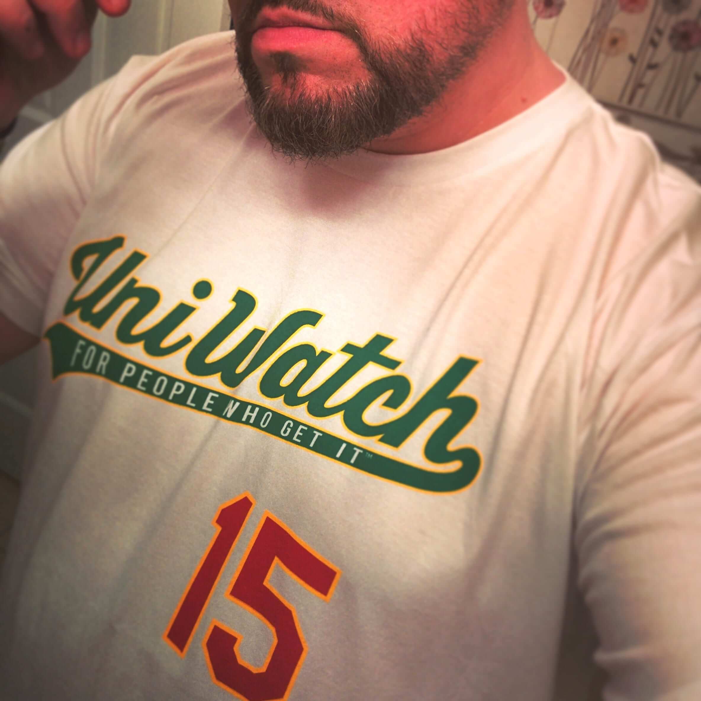
T-Shirt Club update: Even with the face partially obscured, I’d know that guy shown above anywhere. It’s longtime Uni Watch reader/pal Terence M. Kearns modeling his January tee from the Uni Watch T-Shirt Club. Should look good with his Mets road jersey lettering tattoo.
Meanwhile, in case you missed it earlier this week, the February design is now available. Full details here, or just go straight to the ordering page. And for those of you who’ve received your January shirts in the mail, feel free to send “action photos” this-a-way. Thanks.
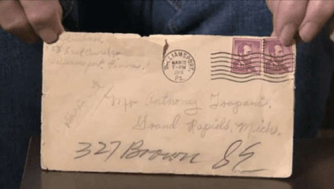
PermaRec update: A letter mailed over 50 years ago (shown at right) was intercepted and hidden away in a file cabinet. Its intended recipient recently discovered it, read it, and learned that he has a son he’d never known about. Get the full story on Permanent Record.

’Skins Watch: A prominent civil rights group that works closely with the NFL and is headed by former NFL players is calling for the ’Skins name to be changed. ”¦ Two Native American groups have launched a phone campaign to get the ’Skins name changed (thanks, Phil). ”¦ “The teams at Jackson High School in Jackson, Missouri, are called the Fighting Indians,” says Brian Rosener. “The town welcome sign has a picture of Andrew Jackson and is located not far from Trail of Tears State Park. Always found it odd that
a city named for a president who did so much harm to Native Americans would have a school mascot named Indians.”

Baseball News: The Mariners will unveil their new Sunday home alternate uni today at 1:30pm Eastern. … “The Fox show Backstrom is set in Portland, Oregon,” says Joel Hatield. “But some of the media pictures show the main character wearing a Portland Sea Dogs hat, and that team is from Portland, Maine.” … We already knew Randy Johnson would be wearing a D-backs cap on his Hall of Fame plaque, and now the rest of the caps for this year’s class have been announced. … I think it would be fair to say that Wayne State’s new unis are none too subtle (from Nick Benes). … New uniforms for TCU. … Wait, how could the Sox in shorts be playing the Astros?! Answer: That’s not the Chicago White Sox — it’s the double-A Knoxville White Sox. Of course, lots of MLB teams used to recycle their uniforms in their minor league systems, but I had no idea that the Chisox had done that with their shorts. And hey, it’s great to see shorts vs. tequila sunrise, even if it was in the minors. ”¦ Here’s another look at those new Nashville Sounds unis (from Patrick O’Neill). ”¦ Longtime Uni Watch reader/contributor Richard Paloma has written a good piece about collecting A’s jerseys (thanks to Phil for letting me know about it). ”¦ The Kenosha Kingfish want local middle and high schoolers to help design the team’s road uniform.

NFL News: To the surprise of nobody, the Seahawks will wear blue jerseys in the Supe. No word yet on the pants, although I still think it’ll be blue. ”¦ Speaking of the Seahawks, they’re attempting to trademark a bunch of stuff, including the number 12. … A Super Bowl ad encouraging people to spay or neuter their pets will feature lots of furry critters wearing football uniforms. ”¦ Here’s a good story about the Wilson football factory in Ada, Ohio. Longtime readers may recall that I did my own story about the factory several years ago. ”¦ Victoria’s Secret’s Super Bowl commercial features models wearing conventional (not babed-out) football uniforms. ”¦ Dolphins CEO Tom Garfinkel has confirmed that the team will be getting a new alternate jersey next season, but of course we already knew that (from Steve Skor). ”¦ The Supe will be taking place in Phoenix, so the downtown statue called Full Life Reach has been decked out in a generic Super Bowl uni. “At first, back in November, he had on a black T-shirt with the AZ Super Bowl logo and long black shorts,” says Kenn Tomasch. “The shorts disappeared after about two days, so he just had a T-shirt on and looked like — well, it wasn’t a good look. Then they put this uni on him.”

College Football News: Check out this screen shot of a 1970s Colorado State player with an NOB that appears to be “Bell, Mark R.” So it’s an FNOB, an FIOB, and a comma, all in one! It’s from this CSU recruiting video (great find by Bill Kellick). … More new helmets for Troy. ”¦ Oregon does better when it wears school colors (thanks, Phil).

Hockey News: The Utah Grizzlies’ uniforms tomorrow will be saluting local police and firefighters. ”¦ Here are some great outdoor hockey photos from Flint, Michigan (from Eric Romain). ”¦ Forty-nine years ago yesterday, the Red Wings’ jerseys were stolen (thanks, Phil). ”¦ Also from Phil: Canada’s contestant in the Miss Universe pageant wore a bizarre hockey-themed outfit.

NBA News: The Trail Blazers’ logo looks pretty cool when rendered in Lego (from Matt Harris). … Here’s a video on how the Heat’s “black tie” uni was developed (from Scott Moody). ”¦ Danny Green of the Spurs was granted permission to wear custom sneakers tributing fellow UNC alum Stuart Scott for last night’s game against the Bulls. ”¦ Speaking of the Spurs, they wore “NBA Fit” shooting shirts prior to last night’s game. I think every team is doing this. ”¦ We knew that the NBA all-star jersey were going to be FNOB with first name above the number, surname below. Now we’re getting our first look at how that will look on a few of the players’ actual jerseys (big thanks, Phil). ”¦ Notice anything odd about these retail photos of the Bulls’ black alts? Inconsistent color sequence on the armhole stripes! (From Connor O’Hea.)

College and High School Hoops News: A diehard Syracuse fan has named his daughter Cuse. ”¦ In a related item, Syracuse will be retiring two players’ numbers next month. … Too bad this very nice green Durene warm-up top is too big for me, or else I’d be all over it. … New GFGS alts upcoming next month for Northwestern (thanks, Phil). … I think it’s safe to say that this Western Carolina helmets is just to impress the recruits (Phil again). ”¦ Here’s more info on all those new Under Armour unis that have been showing up lately. ”¦ UCLA and Oregon State went color-vs.-color last night (thanks, Phil). ”¦ Here’s another high school team that wore throwbacks from a now-defunct school (from Jack Marshall). ”¦ 1972 throwbacks on tap next Saturday for SMU (from Brad Sutton).

Soccer News: Interesting typography on the first letter of the NOB for Martin Ødegaard of Real Madrid. Anyone know if that typographic treatment, with the partial diagonal line instead of a complete one, is common? (From Kevin Brewer.)

Grab Bag: Good historical look at UK policemen’s helmets. … New logo for UNC Pembroke. … Several prominent designers were asked to give their definitions of branding. … Inmates at a Georgia jail are being shamed with hot-pink uniforms. … Some new cycling helmets on display at the Tour Down Under (from Sean Clancy). … The Chicago Transit Authority rolled out some 1970s throwbacks trains, complete with vintage conductors’ uniforms, the other day (from Brent DiCrescenzo). ”¦ Adidas has wasted no time putting out its new catalog of Miami merch (thanks, Phil). ”¦ Pro golfer Brooke Pancake has inked an endorsement deal with Waffle House. Wouldn’t IHOP have been more appropriate?
Those SMU basketball throwbacks look awesome!
They would probably look even nicer in color.
I think that Durene warm up is from my grade school alma mater, St. Albert the Great in Kettering Ohio. Go Stags!
Let me guess. Kettering has (or had) a large German immigrant population? He’s usually styled as Albertus Magnus in Dominican schools and parishes that didn’t want to call attention to the German thing or wanted to be seen honoring scholarship or figured that there were too may places already named for Thomas Aquinas.
Obsessive athletic aesthetics correspond easily with obsessive Roman Catholic aesthetics.
Conn – Kettering is a post WW II, near-south suburb of Dayton. St. Albert’s, both the parish and the school were built after the war so the make-up was more multi-ethnic. Mostly 2nd and 3rd generation Irish, Italian, Polish and yes, German. Even though a parish school, the curriculum at St. Albert’s was more Marianist than Dominican in nature. Both the University of Dayton and Chaminade High School(the only Catholic high school in Dayton at the time)were both operated by the Society of Mary and where many, many St. Albert grads matriculated.
Obsessive Roman Catholic aesthetics.
Conn – I absolutely agree that obsessive athletic aesthetics do correspond easily with obsessive Roman Catholic aesthetics, to wit;
Kettering is a near-south suburb of Dayton, incorporated after WW II. St. Albert’s was built after the war so both the parish and school were multi-ethnic with many second and third generation Irish, Italian, Polish and yes, Germans. Although an Archdiocesan parish and school, St. Albert’s liturgy and curriculum was/is Marainist in nature. The University of Dayton and, at the time, the only Catholic secondary institution in the area, Chaminade High School are run by the Society of Mary and many, many St. Albert’s grads matriculate on to Chaminade and then UD.
Cool. Thank you.
A blurb about the three players on the 1978 CSU Rams who could go by M.Bell is: link.
Something I didn’t notice when I took the photos of Full Life Reach is that there appears to be a lock on the statue’s right hip. I will have to check that out next time I walk by there, but it appears they’ve put a lock on his uni to keep someone from swiping it!
From Patsy Elmer of Big Time Jerseys:
The Phoenix Mercury were in the 2013 Western Conference Finals and to add to the excitement of the series, I made the same statue a Mercury uniform. It had only been on him for less than a week when someone came in the middle of the night and stole his shorts. Usually this statue, ‘Bruce,’ is totally naked, so it’s almost normal to see him without any clothing and he looks just fine. But now to see him with only his jersey and no shorts, that’s when he really looked naked. I had to make him a new pair of shorts and this time we added chains and locks to the inside to deter any more thieves.
Buncha savages in this town.
Probably ASU fans. Bear Down!
They probably wouldn’t even appreciate alternate sweaters that said “YOTES”.
Great picture of the Knox Sox player wearing shorts. Anyone know how often the team broke out shorts in the 1970s?
I wonder about the jersey — it uses block numbers on the back rather than the funky type font. I’d like to see what the front of the shirt says.
Found it:
link
I find it weird that Sebastian the Ibis is still wearing a very Nike designed sweater on the cover of the Adidas apparel catalogue.
If you look at the comment thread on that tweet, you’ll find your answer.
That answers a question I had about the Nike designed fonts and logos that Miami and ASU are using currently and apparently will be using in the future, but I was referring to the actual style of the sweater. It’s based on a Nike designed football uniform set from the early 2000s. If they’re keeping that element as well as the font I would find it odd.
Those Wayne State unis look backwards. Maybe it’s because Wayne could be a NOB, but they’re just bad.
I find it interesting that UA is getting into the Tequila Sunrise act, given the fact that Adidas sold none of its “retro” jerseys to the general public for Virginia, Louisville, or any of the other colleges for which it made baseball uniforms for the last couple of seasons.
The new Nashville unis’ word mark seems to lack contrast on the screen. Perhaps they will look better in real life.
In the Victoria’s Secret video highlighted above, there’s a close-up of a shoe at the 4-second mark.
Can you guess what’s missing?
Yep, they literally ripped the swoosh off the shoe!
So much wrong in that video.
Don’t get wrong, there is so much RIGHT also!!
“… Should look good with his Mets road jersey lettering tattoo…”
“… I’ve been a big supporter of the Japanese soccer team Shimizu S-Pulse for 10 years now, and I decided to celebrate that anniversary by creating a series of decorative pillows representing the uniforms used during the club’s first 10 years…”
Without getting all hoity-toity, I have to say that, you know, Terence and Thomas are real artists. Wonderful stuff.
Seconding Con’s praise! The labor and attention to detail that went into those pillows is almost beyond comprehension. Has Thomas shared the project with the team? I’d hope they’d be both honored and just plain-out blown away by the gesture.
I guess they’ll see it on my Twitter, but I’m not sure how they would react, since I used their logo and the Puma logo, they could think of it as fake merchandise…
Forgot to mention. The Permanent Record item on the long-lost letter is fabulous.
Oops: “Stuard Scott” should be “Stuart Scott”
Thanks — fixed.
Is it me or the black tie Miami Heat jersey has Adidas shoulder stripes? Is that new for this season and any other teams are using them??
It actually has four stripes.
Thanks. Thought it might turn soccer style.
So aside from what looks like a giant sweat stain on the back of the TCU jerseys, what’s new about them again?
PL: Can you checking the “I did my own story about the factory several years ago” link? It isn’t working for me.
Working fine for me.
Try it from here:
link
The Miss Canada costume is really fun – better than some Mountie uniform or something.
A correction on the article – the proper configuration of the Canadian tuxedo is jeans, plaid flannel shirt (preferably red and black), and denim jacket.
Cool DIY today. I’d like to make a sports mesh pillow so when I wake up I would have a mesh imprint on my face that would hopefully last all day.
Isn’t every NBA team, not just the Bulls, wearing the “NBA Fit” shooting shirts this week? The picture linked is of Tony Parker of the Spurs anyway.
Right. Fixed.
J.League on Uni Watch? Who woulda thunk it?
I know, right?
BTW, those are a really cool idea and well-executed.
Between pillows and the ties that everybody loves, there seems to be no shortage of off-the-wall-but-great-ideas for things from the Uni Watch populace.
Quick question:
From the Times article “Wilson has been the exclusive manufacturer of footballs for the league since 1941”
and from Paul’s “which has turned out every single NFL ball since 1955”
Is it a typo in either article or is there a difference in what Wilson believes is the “birth” of the NFL and what Paul found. Kinda interested to know the story on that.
On the CTA and the 2400 series subway cars. I think that NYTA breaks out a few of the older cars they have and runs them on a Sunday through the current NY subway system once a year. If your interested Paul might be worth checking out.
They do. It’s wonderful, especially the one weekend when the vintage jazz and swing bands come out to play:
link
It’s interesting how they dealt with Ødegaard’s name with Real Madrid’s unique typeface. I was checking to see how they dealt with other names, and it looks like they link, but not link.
And I’m curious to see how they’d deal with the “Ã…” in “Ã…lborg” or the Icelandic “ð”.
The Northwestern GFGS are beautiful. Love the waistband!
I wonder if GFGS is really the right terminology for Northwestern’s new uniform. They’ve been using grey as an accent color for their athletics program link, so it’s not like it’s outside their usual color palette.
So… that photo of Biggio’s hat for the Hall of Fame. Does it imply he will be wearing that exact hat (from the sand and brick era)?
link
I remember seeing the pin? additions to Biggio’s hat in the gold and blue Astros era but what were they and what were they for?
The yellow pins are for Sunshine Kids. Each pin is ceramic and made by the kids.
Thank you! Some of the article titles I searched were somewhat misleading (“Biggio selects cap”)… well, obviously he will be wearing Astros – hasn’t really selected yet then.
There is a poll out there:
40% for 80s blue/orange star,
31% 2000s brick red open star,
29% blue/gold open star.
link
I’d argue for the cap insignia the Astros wore from 1994-1999. It coincides precisely with the most decorated stretch of Biggio’s career.
link
I believe it’s up to the HOF to decide what cap he wears, but hard to imagine it’ll be anything other than the late 90s design.
What? You mean it’s not up to me?! Rats!
(I do think, however, that the Uni Watch community’s collective wisdom would yield some pretty sound and well-reasoned results if the HOF ever decided to farm out that responsibility.)
Hello !
Paul, thank you so much for posting the pillow project, and many thanks for the nice comments. I’m glad to see that the Uni Watch readers know about the J.League, which had some great and original uniforms during its 22 years of existence. I could talk about J.League uniforms all day ! Actually, I write a lot about them, so if you like uniforms, Japanese soccer and if you understand French, you can follow the link in my name to read some more stuff about them.
Oh, by the way, did you know the Japanese people that created the J.League were inspired by the NFL for the merchandizing and the players’ image rights ? They went to the Super Bowl XXVII in 1993 and were totally impressed by the event. I think that’s why one manufacturer (Mizuno) supplied all the J.League in 1993, and why every team has a cartoonish mascot, among other things.
Thanks for sharing your work with us, Thomas! It’s very impressive work! Your website is great, too – and it gives me a chance to practice my French, which I haven’t used much since my college days. I’m curious to know how you became interested in the J.League.
Thank you, I’m really happy to see that you like the website. I followed Japan when they hosted the World Cup in 2002, and I really liked the team (plus they had a French coach, Philippe Troussier) As I played defender myself with my city, I became a fan of Ryuzo Morioka (often the captain of the team). Some time later, I helped to create the Nippon Ganbare website to follow both the Japan team and the local championship from France. Then I wondered where was Morioka playing, and I became a supporter of Shimizu. Since then, the J.League is my favorite league, by far.
Yep, all the teams were subsidiaries of corporations, but when the league launched, they all took the [City name] [Nickname] format.
But thanks for sharing, Thomas. Such a great project.
You’re right, this name format is from American sports as well ! Thanks for your nice comment.
Thanks for sharing your work Thomas.
I was through Shimizu in December (on the shinkasen so I didn’t see too much). I’ve also spent a bunch of time in Kashima and have accumulated a nice collection of Antlers gear.
Japan is a great place for sports. What strikes me most is the baseball crowds and how much fun they have (compared to the much more sedate MLB crowds).
Yes, as you say, Baseball is still the number one sport in Japan !
Kashima is the greatest Japanese soccer team, they have so many stars on their jersey they don’t even know where to put them. But Nike is a bit uninspired with them lately…
The World Series trophy will be on display to the public this Sunday from 11-1 at the Yogi Berra Museum in Montclair, NJ.
link
Well those new Mariners alternates turned out a lot better than I was expecting – The cream isn’t nearly that bad when coupled with the blue & gold. And those socks are awesome.
Mariners released the cream alts. They’re trying too hard, Bud Selig killed the pilots. Nice enough in a vacuum, and I’d say “really really nice in a vacuum” if they moved the stripes down (insert Ricko’s “soccer socks don’t look good in baseball rant here), but I think it’s kind of a stupid addition.
Yeah, it’s overkill. They should’ve just gone with a straight throwback to the late 80s look or the early 80s trident.
I meant to add, a cardinal rule for identity design should be, don’t try to be what you’re not.
Mariners are not the Cardinals or Red Sox or Yankees. They barely existed until Junior Griffey showed up. Seattle is not an old baseball town. Seahawks got it right – they embraced the civic personality by going with a modern look that paid homage to the aboriginal culture and the city namesake.
Embracing the classic is fine if it’s part of your identity. That’s why Alabama’s look works for a program whose identity was built by Bear Bryant. And it’s also why the Nike catalog look of Oregon works for them, because they basically owe their success to Phil Knight’s patronage.
“Embracing the classic is fine if it’s part of your identity. ”
I see this argument made a lot. Doesn’t it mean that a team can never change its identity?
I suggested a few years back that the Rays would look great with striped socks and the hivemind answer was that “the Rays can’t wear striped socks because the Rays have never worn striped socks”.
I don’t get it. I get the sense that most posters here lock in their view of what a team is supposed to look like at the age of 17 and further changes to their “identity” are forbidden.
Not at all. The St Louis Cardinals have a modern uniform that still references the past. The Red Sox have made subtle changes to their uniform over the years without ever compromising their identity.
What a disappointing viewpoint to state that teams shouldn’t be what they’re not. I like to think that the expansion teams of the past 40 years have the same hopes, the same dreams and the same aspirations as the original teams, and thus every much as right to look as good on the ballfield as their counterparts. And if that means wearing traditional looking uniforms, I’m all for it.
It strikes me as more of a best-of-all-possible-worlds thing. The Mariners have terrific marks – cap logo, jersey scripts – in their current identity. Much stronger than anything they’ve had in the past. But their old color scheme is superior to their current color scheme (as the team uses it; if they flipped the relative prominence of navy and teal, the current colors would be much stronger). So rendering the current logos in the old color scheme is just a stronger identity to me. The cap in particular may already be my favorite Mariners cap of all time.
Selig didn’t kill the Pilots, the Soriano’s did. Selig just happened to be there to pick up the pieces.
The Pilots were so under financed from the start – actually needing bailout money to finish the season – its amazing that they ever got a franchise.
The Mariners new alts give me the impression of maybe being a little unoriginal. Its looks real nice in isolation but its basically just a re-color job which is maybe a little unoriginal.
What other team(s) have done a “re-color job” with their current uniforms, using a prior color scheme?
M’s did a bang-up job on the new alternates–basically using royal blue and gold as a call-back to their early days (1977-1992), as well as the Pilots (1969). And stripes on the socks.
The M’s also rearranged the color scheme on the lettering on the regular home and away jerseys. They also added stripes to their regular socks.
Really like the Mariners’ new alts. Excellent fauxback, IMHO.
Question for Paul –
Is purple OK if it is in the form of striped baseball socks?
The baseball league my son plays in has a sponsorship deal with the Diamondbacks, and our team was assigned teal jerseys with the old wordmark and the purple caps the team wore originally.
I have ordered a set of custom socks for the players – purple with white & teal stripes in the same style of striping that the Cardinals use on their socks.
I wanted to do stirrups, but the kids didn’t want to wear them, so I compromised with socks.
Is purple OK if it is in the form of striped baseball socks?
You’re basically asking if the ends (striped hose) justify the means (accursed color). Hmmmmmmm….
Well, I didn’t get to pick the uniforms. The league assigned each team a uniform by the luck of the draw. The entire league is sponsored by the Diamondbacks, so each team wears some different version of the Diamondbacks uniforms. Some teams have the current “Sedona” red & black look, and some teams have the original (yes, purple) gear.
The team I coach happened to be assigned the purple & teal, so I did the best with what I had to work with.
I’ll put up a picture when my order arrives.
link
It’s a black uniform… there are how many back jerseys in the NBA? It’s pretty similar to this? link
Long time listener; first time caller here. I graduated from Jackson (MO) High (2001) and could never reconcile the Indians and Jackson either. Jackson started life as Byrdtown and the mascot as the Trojans (purple and gold is still in the drapery in the original theater) but I haven’t found a resource documenting the changes to Jackson and Indians.
Wouldn’t that Colorado State football player have MIOB, not FIOB?