[Editor’s Note: Our great anonymous DIYer ”” the same guy who did the team-themed neckties, the Penguins scarf, the NHL puck bags, and more ”” is back with his greatest project yet. Enjoy. ”” PL]
By Anonymous
I’m a hockey fan but I think baseball has the best jerseys — especially the vintage wool ones. Plus I can’t make a vintage-style knitted sweater myself. So I decided to make a hockey jersey from materials more similar to what would be used for a wool flannel baseball jersey.
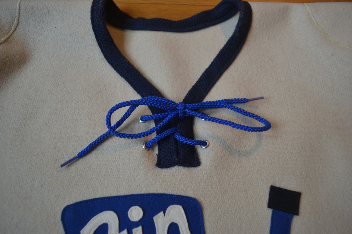
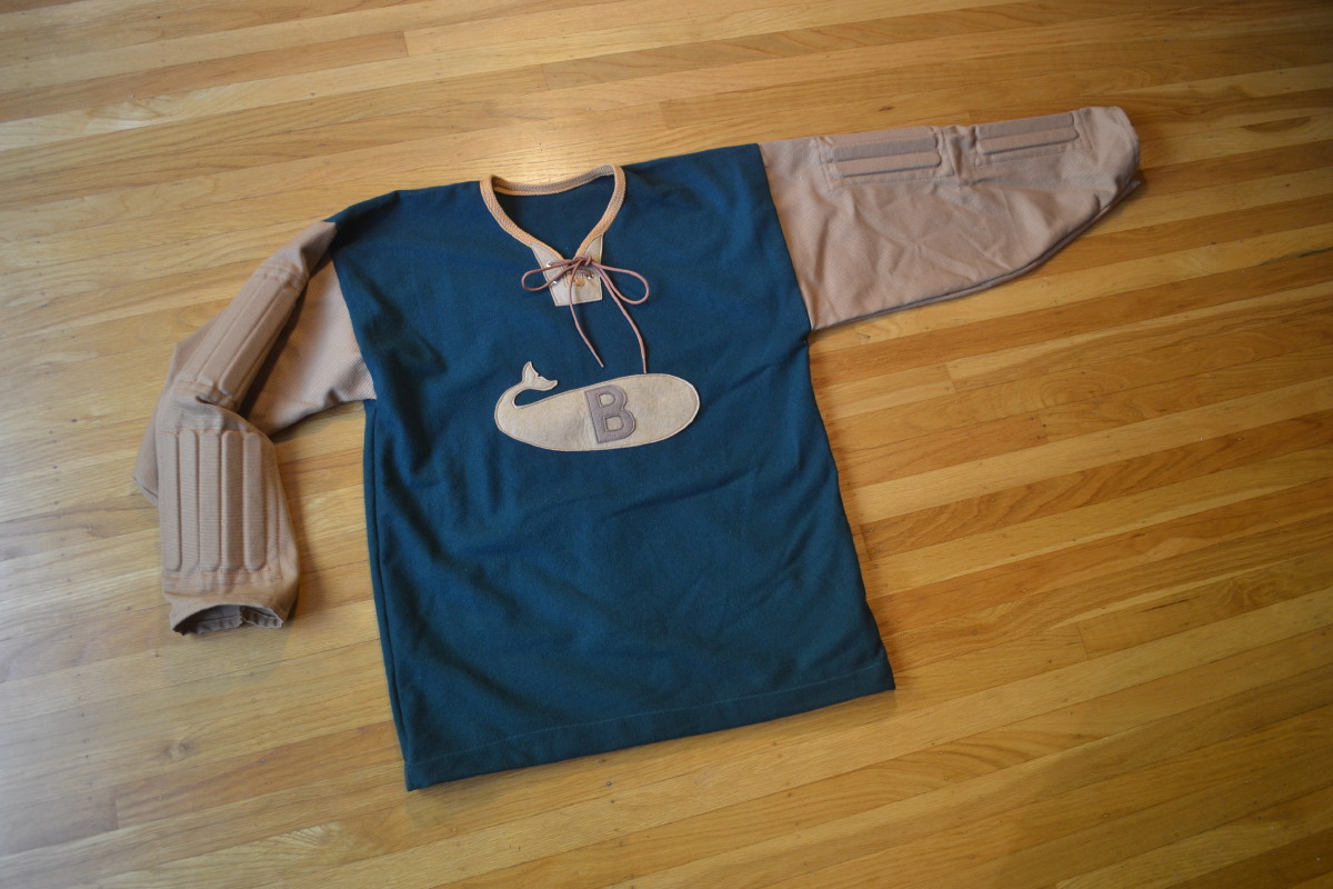
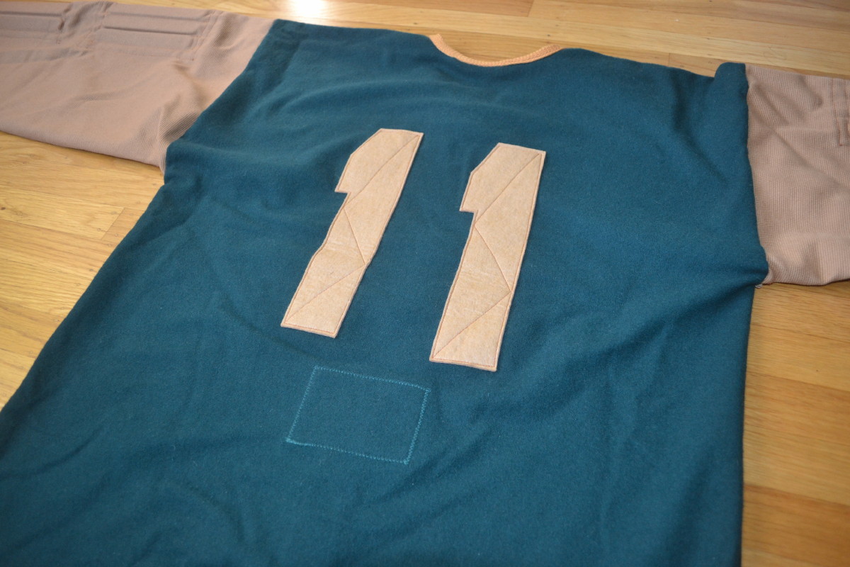
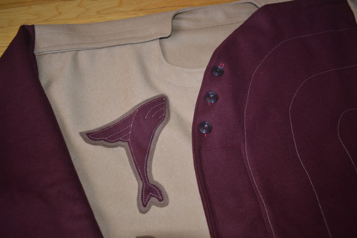
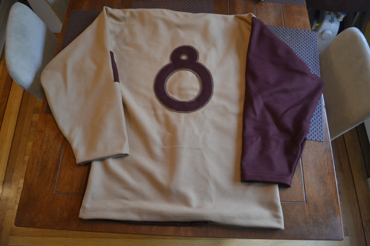
Then I then came up with a fictional framework to explain the existence of the jersey: In the 1940s or ’50s, an obscure minor league team called the Fin Whales needed jerseys that were more durable than the standard sweaters. So they approached a local baseball uniform manufacturer, who complied with their request for a durable jersey with custom features to give the team every advantage [for all of today’s photos, you can click to enlarge]:
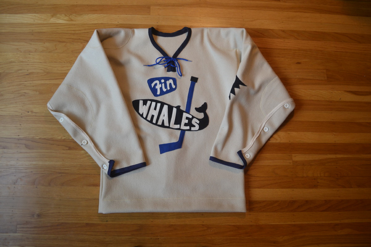

The material is a thick wool coating material that looks similar to a baseball flannel but is much heavier. As opposed to a single-piece crest, the logo on the front was created from multiple pieces, more similar to an old-school baseball jersey The single logo on the left sleeve looks like something a baseball jersey manufacturer would do, and the “flying puck” emblem looks more like a flying baseball design adapted to hockey (when do pucks ever fly at that trajectory?). And the lack of stripes feels more suited to the diamond, not the ice.
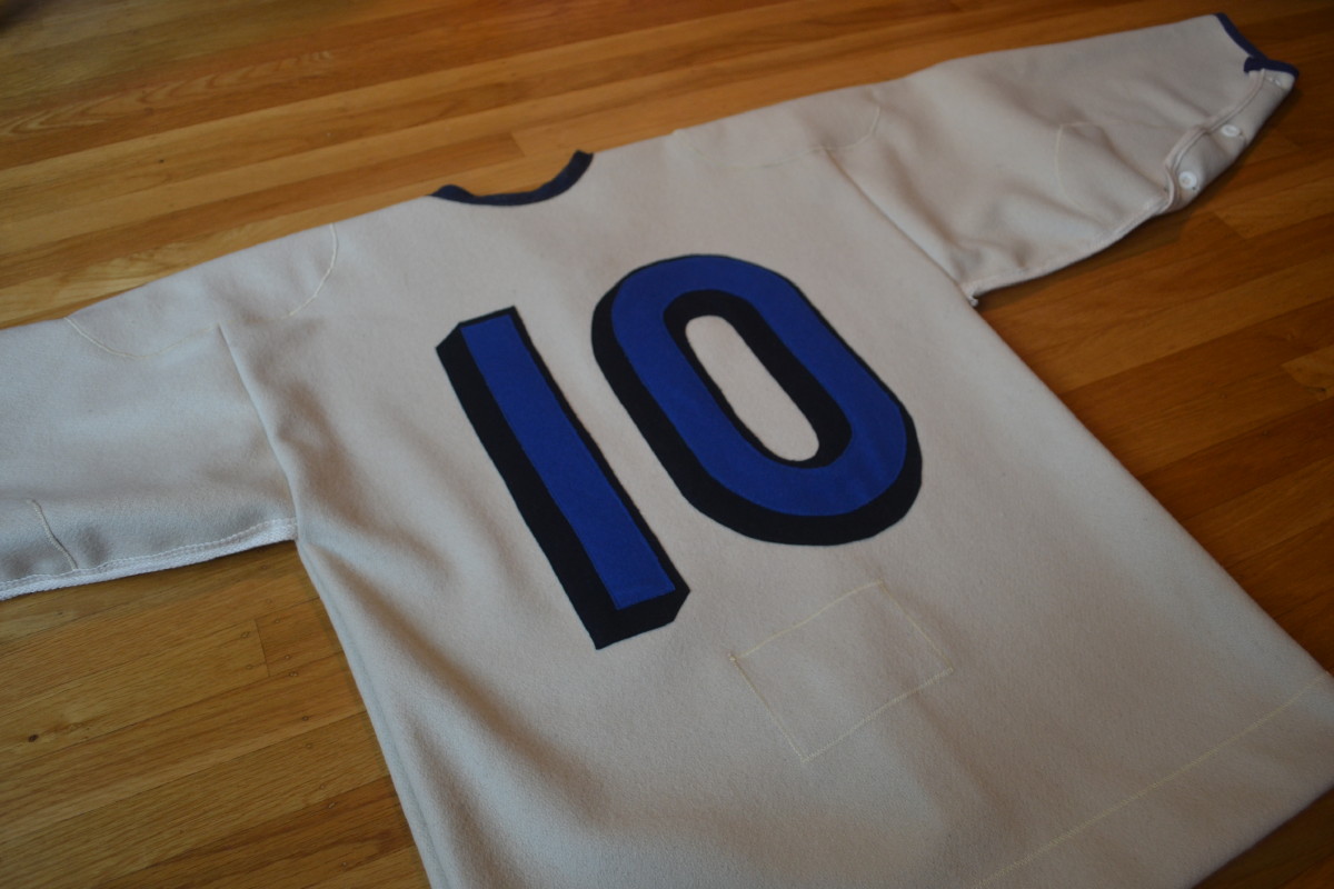
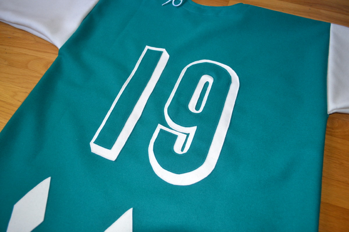
The numbers, admittedly, they don’t look very baseball-ish, but I couldn’t resist using my favorite rounded seven o’clock drop-shadow style.
One noteworthy detail is that the sleeves are a tearaway design — they’re held together by buttons but can come apart during an altercation to give the player more freedom of movement, anticipating the tearaway Velcro sleeves from the late ’80s (so this jersey combines eras as well as sports):
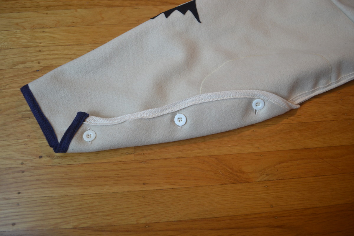
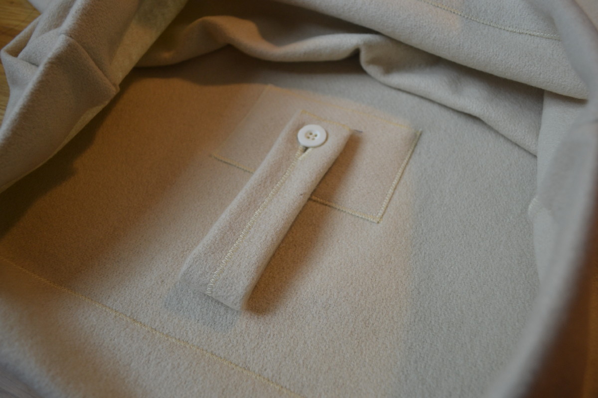
The jersey includes a tie-down/fight strap fashioned from existing materials, including a button. This resembles the belt loops from a pair of wool baseball pants — another example of the fictitious manufacturer sticking with what they know:
The project was satisfying and seemed pretty successful, so I decided to come up with additional teams and create hybrid jerseys for them:
The Bowheads. I always liked those early-1900s canvas football (and hockey) pants with with the slatted inserts, so I came up with this design:
The sleeves are canvas with rounded-end slats similar to the ones I’ve seen in old photos. To create the slats, I used two popsicle sticks glued together with felt added for padding. The design was intended to be more durable than the wool sleeves, but it also turned out to be very comfortable to wear, as the canvas really conforms to the arms and feels flexible and protective.
The Breachers. As I looked at old photos for ideas and inspiration, one thing I noticed was that baseball jersey designs didn’t seem to change much from roughly the ’20s through the ’50s, even though there were lots of design styles to draw upon. For example, the Art Deco style influenced the design of so many things from the ’20s to the early ’40s, yet I have never seen a jersey with significant Art Deco influence. At first I thought of just doing some Art Deco cresting, but then I decided to rework the tailoring of the jersey:
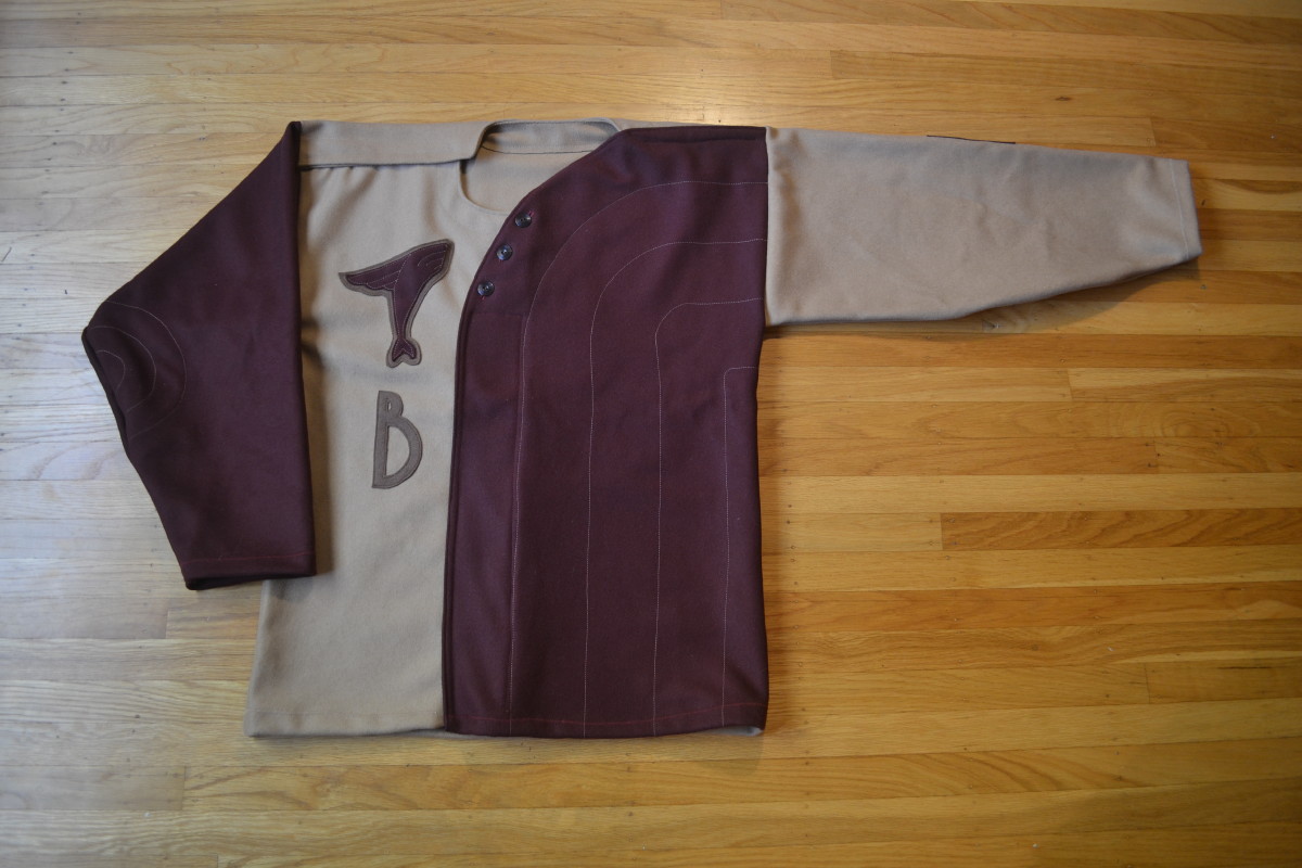
I found the perfect vintage-looking buttons to replace the lace-up college that I’d normally use. Art Deco often concerned itself with themes of speed and technological advancement — a good fit for sports — so I gave the breaching humpback whale wings instead of pectoral fins.
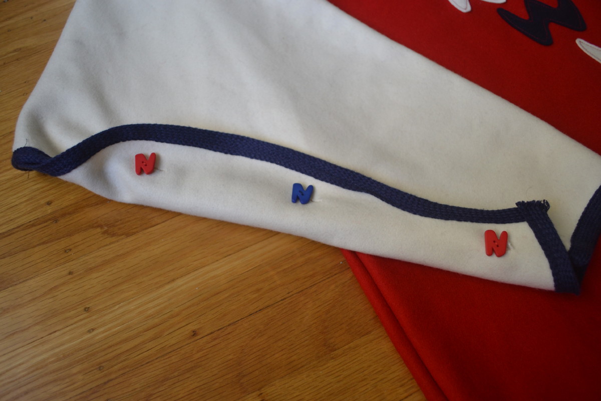
The Narwhals. After I did the Art Deco jersey, I thought about other design styles from the flannel era. I really like 1950s design, so I made this jersey for a team called the Narwhals:
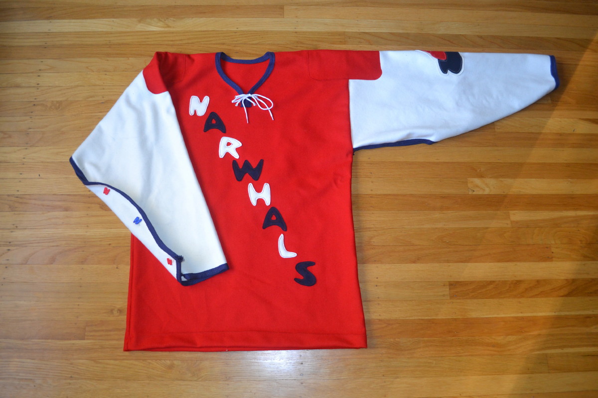
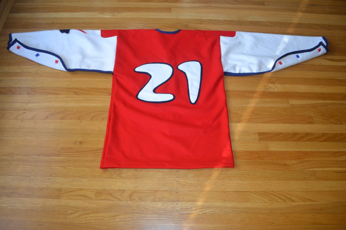
The basic tailoring template and silhouette are the same as the Fin Whales, but with a few ’50s-looking design details. I found some cool “N” buttons for the tearaway sleeves (finally an excuse to shop in the novelty button section!), and the left sleeve features a fun logo with a narwhal poking his head out of a hole in the ice that’s shaped like one of those ’50s blob shapes:

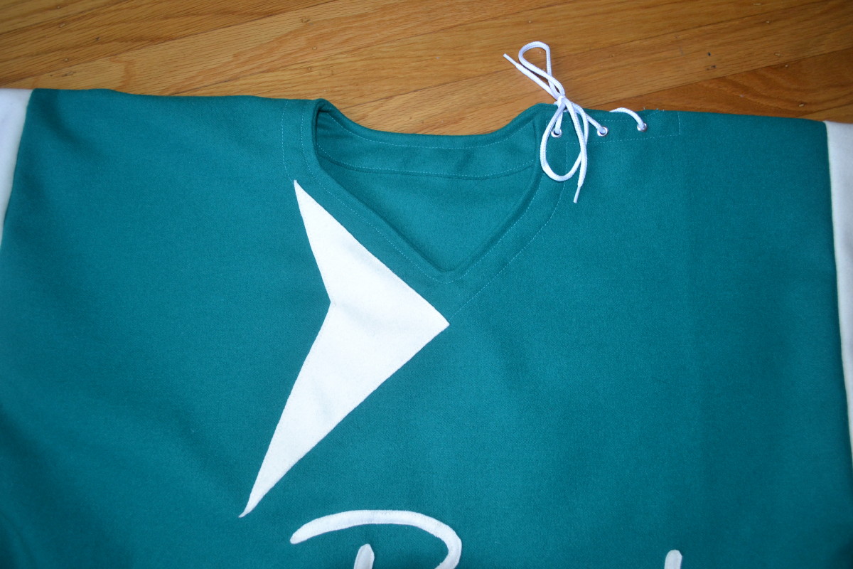
The Rorquals. I liked the Narwhals jersey but wanted to do a 1950s design that included more structural changes instead of just graphic changes. So for this one I designed the collar to have the lacing at the top of left shoulder (which, incidentally, is surprisingly easy to tie and untie while wearing the jersey):
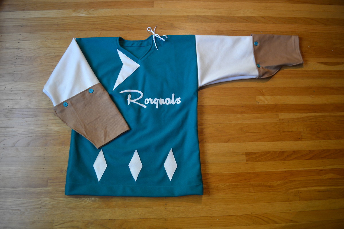
I also came up with a new sleeve design for this one. Hockey jerseys often show extreme wear in the forearms due to sticks coming up, so I added canvas half-sleeves for durability. The canvas parts button on (similar to early baseball jerseys that had button-on sleeve extensions), so they could be replaced as needed if they wear out.
———
Paul here. Holy moly — Anonymous, you have outdone yourself!! Tremendous stuff, and I’m very proud to showcase it here on the site. Thank you!
But what’s with all the whale-based team names? I asked Anonymous about that. Here’s his response:
Sea creatures are my favorite team name category. I also like the idea of using names that have not been used before in sports but still have some plausibility. And at the same time, I hope a little bit of humor comes through, as I think it’s kind of an absurd thing for them to all have whale names.
After it was clear that all the names were going to be whale-related, I thought about why such a league could have existed, and why every team would have a whale name. I imagined a rough storyline that goes something like this: The teams all played in a league that was actually a syndicate, formed on the east coast after the demise of the whaling industry, by former whaling industry moguls who needed a new revenue stream and who had a large supply of unemployed men to keep busy and/or sell tickets to. A league by scoundrels, for scoundrels. Extremely rough-and-tumble, which explains the need for the thick wool, tearaway sleeves and fight straps. After I researched it a bit, it seems my time frame would be off because the whaling industry was pretty much gone well before the supposed period for the jerseys. Still, that’s the origin story for my fictitious league.
Man, even when he’s just dreaming up stories, Anonymous is more creative than most of us. Well done, sir!

Baseball News: Lots of uni combos this season for Nebraska (from David McGee). ”¦ Holy moly, look at this amazing 1912 Washington Senators jacket (big thanks to Small Papi). ”¦ Someone showcased some old Mets memorabilia — including a very cool Lady Met figurine — on Antiques Roadshow (from Ronnie Poore). ”¦ New bat decals for Vanderbilt (from Jerry Lawless).

NFL News: Don’t look now, but the Pro Bowl is in 11 days — a week from this Sunday. Seems odd that we haven’t yet seen the uniforms, especially since Nike made such a fuss over the ones from last year. Maybe they’re just sticking with those.

College Football News: Surprising to see LSU toy figurines wearing the rarely seen purple jerseys (from Christopher LaHaye). … Ohio State coach’s Urban Meyer’s strategy to beat Oregon in the title game was to force the Ducks’ offense to take longer than 16 seconds per play. He called this strategy “Eliminate 16.” According to a note buried within this article, “Ohio State took Eliminate 16 so seriously while preparing that [team strength coach Mickey] Marotti elaborately ripped the jersey off poor Cam Burrows, the reserve defensive back who wears the dreaded number. He wore No. 8 for the title game” (nice one from Jonathan Daniel). … Here’s a pretty cool interactive guide to the history of college football bowl games. ”¦ Porn star Mia Khalifa says she’ll wear Ohio State QB Braxton Miller’s jersey in an upcoming shoot if he transfers to Florida State. ”¦ The Buckeye baby blanket thing was cute at first, but now it’s way overplayed (from Tony Crespo).

Hockey News: The Sabres retired Dominik Hasek’s number last night and wore this patch for the occasion. They had a Hasek-themed puck, too”¦ “Pink in the Rink” promotion upcoming for the Charlotte Checkers. ”¦ Some great caricatures of old-school NHL luminaries here (from Chris Mizzoni). ”¦ Several interesting things about this shot from the Russia-based KHL. First, the player got his jersey stuck in the glass. Second, the KHL officials have an interesting zebra stripe pattern. Third, what’s with the “No Logo” patches — anyone..? That screen shot came from this video clip (from Taylor Nicolaisen).

NBA News: Did you know the Bullets — the Wizards’ precursors — used to have live dog mascots? It’s true! (From Tommy Turner.) … New Air Jordan designs for Black History Month.

College and High School Hoops News: Here’s one observer’s choices for the five most iconic unis in college basketball. ”¦ The Kansas women’s team will wear pink-accented uniforms on Feb. 7. ”¦ New black unis for Davidson next Tuesday (from Ethan Faust). ”¦ Pantego High School in Dallas has uniforms that are red in the front and G.I. Joe in the back (from Cameron Macaulay). … Lots of photos of Indiana high school basketball through the years here (from Gary Moore).

Soccer News: All of these are from Yusuke Toyoda: West Ham will wear a purple third kit for their FA Cup matches. … The Asian Cup kicked off this past weekend. Japan debuted its champions kit and Australia’s Tomi Juric celebrated his goal by exposing “Mama, Tata, Braco” (that’s “Mom, Dad, Brother” in Croatian) on his undershirt. … Here’s how soccer balls are depicted in team crests from around the world. … The Star Wars uni trope has hit the soccer world.
Outstanding DIY project! Maybe the best ever featured on Uni Watch.
Yeah, wow. Honestly, the first paragraph and couple of images I was a little dubious, but then came details like the tie-down and then the sheer volume, variety, and creativity of the project, and my mind was thoroughly blown. Someone needs to connect Anonymous with an art gallery of some kind – today’s entry would make a fan-freakin-tastic exhibit.
Indeed. Outstanding work.
Indeed! The art deco observation was spot on. Too bad teams didn’t adopt some of those aerodynamic influences. The rationale Anonymous offered raises all sorts of questions as to why uniforms overall were so consistent. Even when teams tried something wild, i.e. the Dodgers satin unis, they still colored within the lines.
Those number fonts… awesome.
I would wear the hell out of those last few. Excellent work.
Absolutely gorgeous work and beautiful creativity…even the backstory is outstanding!
Anonymous need to check out the Kevin Smith, Tusk!
link..69i57j0l5.2233j0j4&sourceid=chrome&es_sm=122&ie=UTF-8&gws_rd=ssl
I see the OYO LSU figurines are shown as “Player #10”, etc.–not using actual names. I looked at the LSU roster and there is no #37 or #66 listed. #10 is a Safety. Just be random numbers??
I looked up other teams to see if the numbers were the same. Couldn’t find the same set, however…
Actual names are shown for FORMER players as in this FSU example:
link
They seem to go a bit heavy on the alternate uniforms too, which could explain LSU in purple. I was looking at the NFL, and they’ve got the Chargers in powder blue, Texans in red, and Cardinals & Eagles in black as the only options, at least for individual players.
I guess they might have just picked out former players for LSU. I know 37 was All American Tommy Casonova and 66 was All Pro Guard Alan Fanaca. Can’t think of a great former #10, However the current #10 is a QB that isn’t very popular among LSU fans (poor kid does take some crap)
So…does he/she have a PayPal account and does he/she take requests?
We asked when the ties were featured, because we’d TOTALLY get hockey ties. But the person is not interested in becoming a factory, and we have to respect that.
That is one insane amount of dedication to come up with those jerseys. Bravo!
On the Sabres’ retirement of Hasek’s jersey, I was slightly disappointed that the team didn’t wear throwbacks during the pre-game, like the Ducks and Jets did for Selanne, and what other teams have done in the past. Still, we did get to seem the classic Sabres white jersey when Danny Gare and René Robert skated out Hasek’s banner.
Pantego High School [Damning with faint praise]: they’re not as bad as they could have been. The fact that the camo is subdued helps. More interesting in that picture: is that a woman officiating boys’ basketball?
Women officiate all the time across numerous male sports. Why is that “more interesting?”
The KHL jersey belongs to Jokerit, and the No Logo patch belongs to Nordic Bet. Translating this article (link) will give you poor broken English that reads that they aren’t allowed to wear the logo outside of Finland.
So, they can’t wear the sponsor’s logo on their home unis because of Finnish gambling regulations, and the can’t wear the logo for road games in Russia because of Russian gambling regulations.
They’re really getting their money’s worth, aren’t they? ;)
If only more teams had alcohol and/or gambling sponsors and more countries had really really stupid rules about sponsorship logos… then we’d have more teams without sponsor logos. If only.
Two things:
– STG I’m not making this up, the last Bullets daschsund mascot (Tiny Too) was my next-door neighbor growing up. He had a nasty temperament, that one.
– Davidson’s school colors are red & black, so BFBS seems a bit of a misnomer.
Ah, good point re: Davidson. Will adjust text.
Those LEGO-ish LSU figures looked cool, so I went to the company’s website only to find my Volunteers only come in white jerseys. Lame!
link
Great DIY indeed. Do these get worn or are they for display only?
Anonymous DIY’er here. I don’t wear them as, ironically, I am allergic/sensitive to most wool items. When I’m making them I have to wear a dust mask to avoid breathing all of the fibres in as the sewing machine really kicks up a lot of dust. I’m sure this looks funny but seems to suit the project.
Hats off to you, Anonymous. Those DIYs are seriously sharp.
“…Man, even when he’s just dreaming up stories, Anonymous is more creative than most of us…”
Anonymous is more creative than most of us when he’s picking his nose and we’re writing a sequel to The Waste-Land. I love his fictive backstories and his command of design history and his blend of goofy and erudite. Amazing.
“…his blend of goofy and erudite.”
Beautifully put, Conn. You perfectly captured it!
Anonymous’s portfolio is growing into a formidable collection of fashion, craft and art. But like me, he’s loath to part with his creations!
Excuse me if this is a case of just not getting it, but how does selling overpriced shoes honor Black History Month? Smells like cashing in to me.
it smells like that because thats exactly what it is.
What frightens me is how many people might get assaulted (or worse) by thugs trying to obtain a pair of these shoes.
Appreciate the irony of praising Anonymous’s stunning homemade hockey sweaters, and then slamming Nike’s commemorative kicks? What I’m getting at is that the sneakers are beautiful, too, but they’re part of a craven effort to squeeze more $$$ out of gullible fans.
Small correction: That is Pantego Christian Academy in Pantego, TX. Pantego is a 1 square mile city completely surrounded by Arlington that has 2400 residents. The K-8 building is in Arlington, but the high school (located right next door on the same block) is in Arlington.
*Correction to my correction: The K-8 building is in Arlington, but the high school (located right next door on the same block) is in Pantego.
Here’s how soccer balls are depicted link from around the world
Wow. I have a new favorite project. Love to compile versions for other sports; the NFL will be easy enough but basketball will take more time than I have.
Top Ten, in Order of Appearance on the Graphic:
Chelsea
Redding
Aberdeen
Barcelona
Gamba Osaka
NY Red Bulls
Qatar
Comoros
El Salvador
Colombia
The USA is cool, but where does it ever appear?
The ball is in the US crest:
link
I have to admit, more than a few of those soccer balls look like volleyballs to me.
Baseball and basketball would be interesting to compile, especially if you include the minor leagues. Football is really not worth doing. The NFL only has 2 teams (Bucs & Jets) that use a football in their current logo sets, and even if you include historic and throwback logos, there’s still not very many.
It’s more accurate to say that volleyballs look like soccer balls, The.
link
In other soccer news, FIFA discovered the base of the original Jules Rimet Trophy, literally by stumbling across it in its basement.
link
The trophy base discovery is pretty amazing. It’s a shame the trophy itself will never be found, because it’s way better looking than the current ball-in-hand thing.
Also, the World Cup has never had an actual cup.
“… All of these are from Yusuke Toyoda: West Ham will wear a purple third kit for their FA Cup matches. … The Asian Cup kicked off this past weekend. Japan debuted its champions kit and Australia’s Tomi Juric celebrated his goal by exposing “Mama, Tata, Braco” (that’s “Mom, Dad, Brother” in Croatian) on his undershirt. … Here’s how soccer balls are depicted in team crests from around the world. … The Star Wars uni trope has hit the soccer world…”
I hope Yusuke got a big raise for the new year.
So, is the Pantego jersey a “mullet jersey?” Business in the front, party in the back…
Is that Hasek patch some kind of heat transfer? You would think they could at least do a nice embroidered patch. Maybe they need to contact the manufacturer of the Uni Watch 15th patches which are of spectacular quality.
Hadn’t noticed that, but I see what you mean — it does appear to be a printed patch, not an embroidered one. Interesting.
NHL uniforms are going downhill fast. Did you see the Stadium Series jerseys? The Rangers’ crest letting, for example, was sublimated/printed colors on one-ply material. The neck stripes were not different pieces of colored cloth but were sublimated as well, as the normally are (used to be?). Same was for true for crested logos. Details here:
link
i love Tiny. bullets ought to bring him back.
I had no idea that a pro team sport would have a live mascot, though I get that it was the pre-Jordan/Magic/Bird era and a family-owned team.
Hell, in the ABA the live mascot could OWN the team!
link
Not a hockey guy anymore, but I’d totally wear that Rorquals jersey.
Great work on all of those, Anonymous!
Also, never been a Hoosiers fan, but I’d totally put Indiana in the Top Five iconic uniforms list…especially if you’re including the warmup pants.
Here’s my idea: If you don’t like it, quit reading these “overplayed” articles about two of the times Wexner has done this for newborns and their parents and we’ll continue to do as we have been doing here before any of you knew customized baby blankets was a “thing” in Columbus.
Cheers!
If the Ohio State babies were “Born Winners” on 1/12/2015, are the Oregon babies born the same date, “Born Losers”?
Looks like they will probably go with some version of last years Pro Bowl uni’s, or at least color schemes, judging from the NFL Shop items when searching “Pro Bowl” (although no jerseys seem available)… link
Where can I get the material like anonymous used for the DIY project? Looking to do something similar, don’t know where to start
For this project I used melton wool coating material, which is used for winter coats and other garments. It’s very thick and produces a nice quality product, but can be too thick for some applications. I’m now using wool suiting, which is similar in weight to vintage baseball jerseys.
All of these were bought at local fabric stores. If you live in a warm climate you might have trouble finding it.
As Kevin Durant would say, “Anonymous you are the real MVP”
“A league by scoundrels, for scoundrels.” What a great line, Anonymous.
Single line, arched, as illustrated, is best.