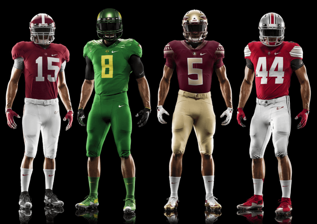
Click to enlarge
As you know, Nike has already won the college football playoff because all four of the semifinalists are Nike-outfitted schools. So now the swooshkateers are all “In your face, Under Armour!” (But they’re not even mentioning Adidas — you know, just to rub it in.) The actual playoff is therefore a meaningless formality — an exhibition, basically — but yesterday Nike took a victory lap by releasing the uniforms that those four schools will be wearing, just because.
I’ve prepared a slideshow for each one, plus an additional slideshow for the footwear (if you can’t see the slideshows below because you’re on a mobile device, you can click to go directly to the Alabama, Oregon, Florida State, Ohio State, and footwear photos):
A few thoughts:
• Nike inexplicably chose to show home unis for Florida State and Ohio State, even though those teams are the No. 3 and 4 seeds and will presumably be the designated road team. Several hours after Nike’s uniform announcement, a Florida State blog confirmed that the Seminoles will be wearing their road uni, not the home uni that Nike showed. No similar announcement yet from Ohio State, but it’s a safe bet that they’ll be wearing white (even if the NCAA wanted to grant a color-on-color waiver for the playoff games, that wouldn’t work for the Alabama/OSU game, because you’d end up with red vs. red). So why did Nike release these uniforms instead of the ones that will actually be worn? Go back and re-read the bit about how these games are just exhibitions from Nike’s perspective.
• The Nike logo on all the jerseys and pants is diamond-patterned. Not the team logos on the collars (or on the nose bumpers or anywhere else) — the Nike logos. Because this college football playoff system is, you know, all about Nike.
• The Oregon uniform is interesting, at least to the extent that they’re dispensing with the helmet feather and going with the “O” helmet logo (and the Donald Duck nose bumper — nice).
• The Ohio State jersey has some interesting elements (the sleeve stripes, the black TV numbers), but there’s no point in discussing them because there’s no way the Buckeyes will be wearing this design.
• I think the shoes are pretty nice.
And there you have it. Remember, when betting on these games, just bet on Nike. Can’t lose!
Click to enlarge
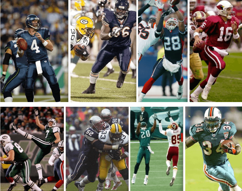
A contagious case of mono: At the beginning of the 2001 season, only one NFL team in the Super Bowl era had ever worn a solid-colored uniform (obviously not counting mono-white, which I’m not including for the purposes of this exercise). By the end of the 2002 season, all of teams shown above had done so, along with the Saints and Jaguars. My latest ESPN column examines the rise of going mono-colored and also provides a team-by-team breakdown of which teams have done it, which teams can and can’t do it, and which teams should and shouldn’t do it — check it out here.
Couldn’t happen to two nicer folks: Word came last night that Nike is suing three of its former designers who left the company in September. The suit alleges that the designers stole trade secrets and will be using those to conduct business with Adidas. Here’s the crux of it:
The lawsuit, which asks for more than $10 million in damages, alleges that before the three [designers] left Nike, they were already consulting with Adidas. To further sell themselves and capitalize on their position, Nike says Dekovic [one of the designers] had the contents of his laptop duplicated, which gave him access to “thousands of proprietary documents relating to Nike’s global football (soccer) product lines” where Adidas and Nike most fiercely battle. ”¦
Nike says the three [designers] had signed a noncompete contract that spanned to September 2015. Yet less than two weeks after the three resigned, Adidas announced that it would back a Brooklyn-based design studio managed by [the three designers].
Even though Adidas said at the time that the three wouldn’t work for them until 2015, Nike remained concerned about the trade secrets it claims were stolen from them.
Will this suit leave both companies with huge legal bills that they’ll pass along to gullible consumers in the form of inflated prices for their already overpriced wares? One can only hope.

Uni Watch earns prestigious accolade: Forbes, a highly respected business magazine that people often mistakenly think I used to write for (I was actually a columnist for Fortune; people at both magazines are used to this mix-up, which happens all the time), has published a list of 100 “must follow” Twitter accounts pertaining to sports business. It’s annoyingly spread out over seven screens, with no single-page option, so I’ll save you the trouble and tell you that @uniwatch is listed on the fifth page.
This is, of course, a tremendous honor — especially considering that probably half of my tweets are just retweets of stuff that Phil posts (and the only reason I even bother to do that is because Phil emails me the links to his tweets). Even funnier, Rovell didn’t make the list, which tells you everything you need to know about internet lists and general and this one in particular. And people wonder why I don’t like doing ranking- and list-based columns.
And now, if you’ll excuse me, I have to go add “Named a ‘must follow’ Twitter-er” to my résumé.
Membership update: Another batch of designs has been added to the membership card gallery (including Gareth Hammond’s card, shown at right, which is based on Liverpool’s 1990-91 jersey — great job by Scott on this one). The printed/laminated versions of these cards should mail out by the end of the week.
We’re now fully caught up with the flood of orders we received when I posted that “Now or maybe never” notice last month. Thanks for the outpouring of enrollments — we’ve really enjoyed working on them.
The membership program will definitely stay open for another month or so, and hopefully longer. If enrollment slows back down to the glacial pace we were at before last month’s announcement, I may pull the plug, but we’ll see. For now, I’m very happy with all the recent activity — thanks again.
As always, you can sign up for your own custom-designed card here, you can buy a membership gift voucher here, you can see all the cards we’ve designed so far here, and you can see how we make the cards here.

Baseball News: There’s a new bat manufacturer here in NYC. ”¦ Love these reindeer baseball cards (from Ed Paul). ”¦ Cardinals P Carlos Martinez is changing his uniform number to 18 to honor former teammate Oscar Taveras, who died back in October (thanks, Mike). ”¦ Dig this: Junior Griffey in a Braves uni! (Great find by Anthony Juliano.) ”¦ Check out Bucky Dent and Dick Howser wearing personalized “Yankees” gear for an Old Spice commercial. After I tweeted that photo yesterday, it prompted an amusing response from Dent’s daughter (nice one from Curtis Peddle). ”¦ New team-branded gloves for Auburn. ”¦ Love-love-LOVE the chest logo on the South Bend Cubs’ new BP jersey. What a beaut! New caps, too (thanks, Phil).

Pro Football News: Love this wrapper from a 1966 pack of Topps football cards (big thanks to BSmile). … Check out these bars of Cleveland Browns soap (from John Sheehan). … Ah, Lambeau Field, a classy haven of legendary refinement. ”¦ Lots of readers noted that Cam Newton’s car crash yesterday was sponsored by Under Armour. ”¦ Here’s more on that Harry Potter figurine that was on the Eagles sideline on Sunday (from Jonathan Daniel). … Yesterday was Dick Butkus’s birthday so the Bears posted a Butkus photo gallery. Interestingly, a few of the photos show the Bears wearing jerseys without sleeve stripes, which I’m pretty sure means it was a preseason game. There’s also a shot of the Bears wearing the block-numbered road jerseys that were briefly used in 1971, and this shot of Butkus in a Pro Bowl uni (from Jim Howicz). … Jim Cramer, a professional entertainer who plays a financial advisor on TV, is a big Eagles fan, but he must have lost a bet regarding last Sunday’s Eagles/Seahawks game because he wore a Seattle jersey on the air yesterday (screen shot by Chris Howell). … Green Bay’s indoor football team, the Blizzard, has a new logo (from Jeff Ash). ”¦ Steve Santillo was watching the 1985 AFC championship game between the Dolphins and Pats and was surprised to see that one end zone featured the Pats’ team name, even though the game was in Miami. Also: The “S” looks upside-down and the “I” kinda looks like it was added as an afterthought. Sloppy work. ”¦ Good catch by Lee David Wilds, who noticed that Patriots RB LeGarrette Blount’s visor tabs were silver (or maybe clear, with the silver of the helmet showing through) early in last Sunday’s Pats/Chargers game and were then dark later in the game. Did he switch visors? Switch helmets?

College and High School Football News: Due to an acknowledged officiating error, the outcome of an Oklahoma high school football game is going to be decided today in court. ”¦ You can vote on the best high school helmet in Louisiana (from Wesley Eustis). … In 1986, the bleachers from UNC’s Kenan Memorial Stadium were sold to a guy who built a beach house out of them. “The house is still there and can be rented on a weekly basis,” says James Gilbert. … Here’s a schedule of all the bowl games showing helmet-to-helmet matchups, although I’m assuming lots of those helmets will be replaced by “special” designs that haven’t yet been unveiled. ”¦ A high school recruit shaved the Penn State logo into his head but now he’s decided to go to Maryland. ”¦ I like this: Pillows made from Clemson marching band uniforms (from James Gilbert).

Hockey News: Great job by Brian Rowland, who is tracking all the equipment — helmets, visors, gloves, sticks, skates, etc. — worn by L.A. Kings players. ”¦ The Canadiens appear to be going for some sort of record with their memorial “4” for Jean Bevileau. First it was on the helmets, then it was on the jerseys, and now it’s on the ice behind the nets (from Matt Larsen). ”¦ Isles LW Matt Martin tore his jersey in a fight (from Dan Schneeman). ”¦ We’ve seen the NHL All-Star Game logo, but there’s also an All-Star Winter Park logo (from Leo Strawn Jr.).

NBA News: NBA commish Adam Silver has commented on the “I Can’t Breathe” T-shirts: “I respect Derrick Rose and all of our players for voicing their personal views on important issues, but my preference would be for players to abide by our on-court attire rules.” No indication that the players will be fined, though. ”¦ Silver and others who don’t like to see athletes wearing these social commentary T-shirts can take heart in the fact that yesterday’s release of the Senate report on CIA torture didn’t prompt a single NBA player to wear a shirt that said, “I Can’t Breathe (Because I’m Being Waterboarded).”

College Hoops News: New gold uni for Elon (from Alex Simon). ”¦ Here’s a fun little Cincinnati uniform mystery. Can you help solve it? (From Cary O’Reilly.) … Illinois debuted these gray uniforms last night.

Soccer News: The Bank of Nova Scotia has struck a new sponsorship deal for the Gold Cup, which is the championship for national teams from the United States, Canada, Mexico, the Caribbean, and Central America. ”¦ Manchester City’s new training facility features 16 training pitches, one of which is sky blue Field Turf (from Cort McMurray). ”¦ The 2nd round of the English FA Cup featured a pink and black ball (from Graham Clayton).

Grab Bag: Here’s a really interesting take on how lots of sports logos feature skylines and other commercial real estate (from Jason Silfies). ”¦ Here’s a company that will design your logo for 50 bucks. ”¦ Boxer Amir Khan will be wearing what are probably history’s most expensive trunks for this Saturday’s bout against Devon Alexander (from David Wilson).

The Bears wore stripeless navy jerseys for several regular season games each season from 1971-1973.
Ah, so I see in the GUD — my bad for not checking on that. Thanks, Tim!
The stripeless blue and block numeral white Bears jerseys from that era were also different materials.
The non-traditional jerseys were mesh whereas the traditional style remained durene.
Non-Traditional:
link
link
Traditional:
link
link
Its possible that the Bears were experimenting with the new fabric perhaps wearing it for warmer days while keeping the thicker durene for colder days.
In 1971 and 1972 the Bears wore the mesh fabric jerseys almost exclusively during the early and warmer weeks of the season.
This explains things. I looked at the wrong year last night. I still find it interesting that a very traditional team would go with a jersey that excludes an important detail. Like the other commentators, I find it surprising that the stripes could not be sewn on.
I have no insider knowledge on this, but note by 1974 that any and all differences regarding striping and number fonts within individual teams were gone.
I’m think that Pete Rozelle and perhaps some uniform police within the NFL were not please by the Bears, Vikings (notable with their striped and stripeless purple jersey variances) having in season variances.
So, it is probable that a league edict was handed down that, whatever the differences in materials, you must have a consistently striped and trimmed jersey for the duration of the season.
I think it was an advance in technology. By 1975 at the latest screen printing had advanced to the point where double layered features were more available on mesh jerseys. If you look at the early 70s as team switched to mesh fabric they went with single colored stripes with gaps in between. For example the Bengals, Broncos, and Browns. By 74 it seems whatever issues existed with mesh fabric were solved at that point you start to see more stripes side by side.
Totally not the same thing of course, and they’ve had the specs for a while…but I do find it interesting that Swooshie can create *new* unis in crimson, garnet and scarlet for the playoff teams, but yet it takes them six months to get the Iggles shade of midnight green correct. It’s a bad analogy — but the point remains: it never should have taken Nike until week 10(?) to produce a proper shade of green for the Eagles in the Elite 51 template, especially given that they had to have been preparing for that for months.
Also, congrats on the Twitter honor.
I don’t know, maybe just a difference of opinion and I could totally be the only one in this camp, but I think the whole midnight green thing has been way overblown. I’ve seen the word “embarrassment” used on the blog in the past. Maybe it’s just not THAT big of a deal to me and maybe I don’t like to rip Nike as much as some.
I’d think it would have been MORE of an embarrassment had they gotten the color wrong and tried to get the Eagles to wear it on the field.
Of course, NONE of this would have been an issue if the team would just come to their senses and bring this shade back: link
I’d think it would have been MORE of an embarrassment had they gotten the color wrong and tried to get the Eagles to wear it on the field.
Distinction without a difference, because it reduces to the same root problem: Nike couldn’t get the color right. How is that possible or acceptable? Yes, it is embarrassing (or should be).
I’ll defend the word “embarrassment” here. Nike has, in the NFL, the most high-profile and lucrative domestic contract in its corporate history. Literally the biggest deal the company has ever, and likely will ever, have in the U.S. market. And Nike failed to deliver on that contract. Failures of similar scope have led to C-suite firings and even corporate collapse in other settings. Nike is sufficiently entrenched in the marketplace that it will face no meaningful loss of sales or reputation. And Nike gives sufficiently small of a shit about serving its actual clients that no executive in the company is likely to be punished for this failure. But it is a failure, and an embarrassing one.
Nike won a contract to supply shirts to the NFL, and it couldn’t deliver the shirts. “Embarrassing” is almost too gentle a word for that failure.
But, wasn’t it the Eagles choice to move to Elite 51? I mean, that’s not a league mandate is it? Not blaming them by any stretch, but I went back and researched this and the Eagles themselves were just like “The Midnight Green jerseys require extra time to produce since it is a custom color and will not debut until later in the 2014 season.”
I mean it doesn’t sound like they were embarrassed?
Not saying anyone is in the right or wrong, just trying to see it from both sides. I’m not finding anything where say, an official from the Eagles was outraged that they weren’t ready.
But, wasn’t it the Eagles choice to move to Elite 51?
Yeah, but how is it possible that the world’s foremost sportswear outfitter can’t produce a given color — a color that a team has been wearing for over a decade — in one of its standard templates? Yes, that is embarrassing.
just trying to see it from both sides.
Nike’s side is that they couldn’t do the single most basic aspect of what they’re contracted to do. If you did your job that way, I think you’d be embarrassed. (And probably fired.)
Do you think its a coincidence that Oregon’s new uniform (including the helmet) is Kelly green precisely when the Eagles are looking to shift to Kelly in the near future? Oregon’s latest uniforms have all used Kelly green rather than forest and they’ve worn that color twice as often as forest this season.
It just seems like a shift in taste for Nike. Away from the darker shades of green towards the brighter. Making the fabric dye correctly may be part of it maybe not.
who says “the Eagles are looking to shift to kelly green in the near future” besides the fans? There are rumors that they would like to have kelly as their third jersey, but nothing about a full time change.
when the Eagles are looking to shift to Kelly in the near future
Where did you hear that? I know that there are many fans who want them to ditch the midnight in favor of kelly green, but I’m not aware of any real sense that the team is among them.
Agreed with Chance & Toddro — any “shift” to kelly green appears to be nothing more than fan wishing and rumor, although I have seen it reported (but unsubstantiated) on a few sites.
Here’s why it may (or may not) happen: Despite Jeffrey Lurie getting divorced from his wife, Christina, in 2012, she apparently still maintains a presence in the organization, and according to those who follow the team, she both despises kelly green and loves the “midnight” shade. There’s actually a write up on that here (including the supposed logo slick, the authenticity of which has been called into question.
It seems that as long as Lurie’s ex still has some power in the Eagles organization, we won’t be seeking a return to kelly green.
Thanks, Phil.
And even that is presuming that Jeffrey Lurie himself is inclined towards kelly. Do we know that to be the case?
“Despite Jeffrey Lurie getting divorced from his wife, Christina, in 2012, she apparently still maintains a presence in the organization, and according to those who follow the team, she both despises kelly green and loves the “midnight” shade.”
It’s curious, then, that one of the more prominent photos of Christina Weiss Lurie available online shows her link. It doesn’t appear to be photo-shopped or anything, either. The photo is used in link, and none of them mention the whole midnight green/kelly green controversy.
and the one-helmet rule is keeping them from doing any kind of throwback jerseys.
BvK1126,
1) Maybe she despises that color on men?
2) If you read the article I linked to, they mention it — but I have heard it elsewhere. I’m simply reporting that according to those who follow the team, she despises it…perhaps she does (or does not) despise it, but for a football team color, not as a personal choice.
3) I always was under the impression that it was Jeffrey who loved the “midnight” (which is why he introduced it in what, 1996?)…maybe he’s got folks who are now conveniently blaming it on Christina?
4) Really, I have no idea — but I do know that any talk of a return to kelly green is at best a rumor.
No worries, Phil! I don’t mean to discount anything you mentioned. I was just quoting you to give some context to my post. Take it as me giving voice to a mental note I’d made about the apparent inconsistencies between internet chatter and demonstrable photographic evidence.
Even though it doesn’t matter for the moment, FSU’s maroon jerseys are now in Nike’s new mache speed template.
In addition to the teams you noted above, the Broncos, Chiefs and Cardinals have all gone mono. IIRC the Dolphins did a time or two also. While you didn’t explicitly exclude any of those, it seems implicit.
If you go back and read what I wrote, you’ll see that I was speaking specifically about the 2000-2002 time frame.
Actually… according to the GUD, both the Dolphins and Cardinals wore mono in 2002. Oddly, the Saints, the only team who did it in 2001 *didn’t* wear it in 2002, instead having a gold alt jersey for a game.
Right you are. Good work, Jeff. I’ll make the necessary adjustments.
That LFC membership card is a beauty! Would love to see one done of the 1991 kit.
YNWA
link
It is very nice to see Nike actually brought back the sleeve stripes of old for the Buckeyes.
I was never a big fan of this design (especially as lots of teams used it at the time-very cookie cutter) and I thought it would look very plain on a card. Apart from winning the FA Cup in 92 it always reminded me of the bad old years since which we have not won a league title. G
A contagious case of mono: At the beginning of the 2001 season, no NFL team in the Super Bowl era had ever worn a solid-colored uniform (obviously not counting mono-white, which I’m not including for the purposes of this exercise). By the end of the 2002 season, all of teams shown above had done so, along with the Saints and Jaguars. My latest ESPN column examines the rise of going mono-colored and also provides a team-by-team breakdown of which teams have done it, which teams can and can’t do it, and which teams should and shouldn’t do it. Link coming soon.
The Eagles wore mono-green in 1997. (Denver also did in ’97, but only pre-season)
Intentionally left out the Broncos because it was preseason. But you’re right about the Iggles — totally forgot/neglected that one. Thanks for the corrective!
It kind of kills me that a guy that admittedly doesn’t respond to notifications is on a must follow list. I’d be lying if I didn’t say I was a little jealous.
Looks in the mirror and tries to make some better life goals!
Dougie, trust me, there’s nothing to be jealous of. The list, like most lists of its type, is ridiculous and bogus.
I still think it’s pretty cool. And while I agree with what you say about lists, I read that link and there are actually some pretty good follows on it.
I know it’s not worth discussing, but I like the hypothetical OSU jersey, if only because it reminds me of a Jack Tatum throwback I’ve never been able to get my hands on: link
link for the Griffey pic is coming up as the Martinez/Taveras link
The good folks of Green Bay are like other NFL fans. Reason I cut back on going to Redskin games.
I’m a big fan and a long time loyal reader and this is the first time i have ever left a comment but I can’t help but wonder why you guys seem to hate on and bash schools and or teams when they come out with new or alternate unis. I agree that some (most) teams trot out wearing some trash but it seems like you guys hate it when a team gets new unis or goes away from tradition and god forbid if its NIKE gear. My point being that thin is a UNI related site. I seems like you would like the diversity in the “UNI” world. Thats kinda what drives people to check out the site…aint it?
1) I do not “hate on” or “bash” anything. I critique things when I think they’re worthy of critique.
2) Quantity does not equal quality, and I for one have never cited uniform “diversity” as a self-validating virtue. (It’s not a self-invalidating problem, either — each design, and the thinking behind it, can and should be assessed on a case-by-case basis.)
3) People check out the site for a wide variety of reasons. I couldn’t please them all even if I wanted to, so I do what makes sense to me and let everyone else get on board or not, as they see fit.
Since you asked: While, as Paul says, each design should be considered on its own merits, the result where you can look at a clip or flip over to a game and have no idea who’s playing is a bad thing. There is, or at least should be, enough diversity in sports even if teams don’t have multiple uniforms.
the result where you can look at a clip or flip over to a game and have no idea who’s playing until you take a couple seconds and read the score bug.
Sorry, had to go there. I mean… I get your point, but I only agree when it comes to teams wearing non-team colors. Green & yellow Oregon wearing black & silver? I thought it looked sweet, but, yeah, it’s kinda stupid. Oregon wearing various combinations of green & yellow? That should be perfectly fine.
Does Nike have rights to the Duck’s winged helmet? It’s like watching the Mothership’s shows, with the helmets on the shelf in the background, that are the old style. I miss the interlocking UO myself, but would be surprised if they hit the bowl games without the wings and chrome.
“…would be surprised if they hit the bowl games without the wings and chrome.”
~~~
Why would you think they’d wear the “wings and chrome”? They’re *sort of* throwing back to the original mallard helmet (or at least to the style with the “O” on the sides which they wore from 1997 till 2012 (pretty certain on those dates).
I’ve never liked the wings/chrome helmet, (especially because they never jettisoned the “O”, instead sticking it on the ‘butthOle’ (as Comrade Marshall calls it).
Looks like they haven’t worn the “O” on the side since Homecoming 2013, and before that the end of the 2011 regular season. The only other throwback helmet they used was the one against Washington from the mid-90’s. The interlocking UO lost the outline, and got fatter, and then they changed to the single “O” in 1999.
Since the introduction in the 2012 Rose Bowl, the wings have been what they used.
The interlocking UO is the helmet I prefer, but also being a student and in the band back then I am a bit nostalgic for my time there.
But does the prestigious accolade come with a major award? You know, like a statue?
Why yes, yes it does:
link
The Green Bay Blizzard have been around since 2003, playing in af2 for 7 years before it folded. It is not a new team.
True, but damn, that is one heinous insignia. Dull colors, way too much detail, frivolously aggressive; it already looks 25 years old.
So, kinda perfect for the Arena League.
Bowl helmet schedule is already out-of-date, shows Pitt in the block helmet, but they changed to script back on 10/25
Virginia Tech has also announced a Flag type decal background that was previously mentioned on this site.
And – Oregon has worn lots of different helmets, but I don’t think they have ever worn link…
Am I blind, or is there no gallery for the Florida State Uniform? Only seeing ALabama, Oregon, Ohio State, and Footwear.
OK, that’s weird, because I *know* it was there before. But it somehow disappeared.
It’s back now.
Amazing job on the card Paul/Scott.
It’s come out really nice and exactly as I’d have imagined.
Thanks so much,
Gareth
Self-aggrandizement aside, Nike seems to be moving on from the flywire collar. Good thing.
True, but they’ve traded it in for another look-at-Nike element: the diamond swoosh.
Their business model rather requires they constantly innovate with new proprietary design elements, lest we become inured to them.
Also, while I’m thinking about it… more on the Mono uniform thing: which teams can and can’t do it
I’m pretty sure that the only team which truly can’t right now is the Washington Redskins. NFL rules allow for 3 sets of pants, correct? In their case, those 3 are yellow, white, and throwback tan. There are other teams who don’t currently have the option, like the Raiders, Packers or Giants, but for them it’s simply a matter of mimicking the Eagles and saying “Hey Nike, give us X-colored pants”, isn’t it?
Actually, I don’t think there’s any limit on the number of pants a team can have.
What I mean by a team that “can’t” go mono is a team whose current uni set doesn’t allow for it. The 49ers, e.g., wear gold pants for every game but don’t have a gold jersey; the Raiders wear silver pants for every game but don’t have a silver jersey; and so on.
Paul, looking forward to the mono-uni article! I, for one, hate-hate-hate the look on any team, particularly in the NFL. Looks to much like HS football. I find it especially awful when Seattle does it (blue man group) or any team with all red (blood clot unis). I had totally forgotten about the Dolphins doing it (Oh, my eyes!). Yikes.
In regards to the Canadiens tributes to Jean Beliveau…last night was their first HOME game since his passing so that could explain the added memorials.
Would a shiny swoosh even show up on a white jersey, should Nike choose to go that route for the “road” teams in these semi-finals? And while Alabama/Ohio State would be a bad idea, Oregon’s liberal use of green on all uniform aspects would make them vs FSU, and then them vs whoever in the championship game great color v color matchups.
I get that Ohio State changed their stripes in 2006 or whenever it was so their stripes would match the design on the helmet and pants…but it’s always looked weird to me without any silver, like it’s a knockoff jersey. I far prefer these 90’s-00’s stripes that they ostensibly “brought back”, though it would be nice if they brought them back on the white jerseys they’ll eventually wear against Alabama too, since their current white jerseys don’t match their helmet and pants stripes anyway.
Is there anything actually different with the Florida State design other than the template and the shiny swoosh? If not, I would imagine they’d keep it for next season and just replace the shiny swoosh with a white one after the playoffs so the collar actually matches the collar of their road jersey. They haven’t matched since they switched to red numbers on the white jersey, and it REALLY bugs me.
The Buckeyes uniform is a recreation of the 1968 National Championship home uniform. I suspect the road whites will be too.
As for “the Cats” jersey of University of Cincinnati’s Mr. Batts, that was the jersey they wore in the 1976 season IIRC. I remember the jersey very well having seen them in person at the old Armory Fieldhouse. I may have a program or two laying around with plenty more pics. I remember Terry Cummings wearing that uni and the coach as Ed Badger.
Yup, 1968 was a big year in OSU football uni history. They switched from scarlet to gray helmets, added names to the jerseys, wore black TV numbers on the sleeves, began awarding the buckeye leaf stickers for performance — and won the national championship. The next year they moved the TV numbers to the top of the shoulders and made them white, so that Nike look is definitely 1968 only.
I deeply dislike the mono-color NFL unis myself, but here’s a question for Paul, and for anyone else to boot: if you HAD to make your peace with 1-2 teams going mono, which would look best (or least objectionable) doing so?
For my money, the Saints aren’t as bad-looking as some of the competition. And ghastly though the Broncos and Seahawks look, at least it’s in keeping with their vaguely anti-traditional aesthetics.
I hate the look also, but my thoughts on those least-objectionable: Rams (all blue), Vikings (all, gulp, purple), Eagles (all green) and/or Texas (all blue – no red!). In think the common element with these is that the helmets are mostly the same color as the shirt/pants combo with matching trim/accents. I know you could argue Seattle as well under this philosophy, but I can’t stand almost everything about their uniforms, so I won’t bring myself to include them.
I really prefer that teams wear contrasting socks/stripes/etc. So my top mono uniforms would be the Panthers, Jets (ignoring the green color matching issues), and powder blue Titans.
I’d have no issue with the Ravens going mono (all black).
They should lose those helmet stripes as well.
Oregon’s new uniforms for the College Football Playoff have no belt on the pants. Is Nike ushering in the Sansabelt era in football?
Pretty sure there is already at least one NFL team that doesn’t use belts.
I’m pretty sure all the NFL teams wear belts. The Nike Elite 51 uniform template that most NFL teams use link. All of Nike’s most recent uniform redesigns – including the Vikings, Jaguars, Dolphins, and Buccaneers – include belts. Every NFL team whose uniforms I goggled wears belts. Am I missing something?
No, you’re probably right. I have a memory of seeing one without, but can’t think of which one it might be.
Let’s hope not! I find the link jarring due to the lack of a belt on the Adidas clad Mississippi State player. Just looks terrible.
Nice find, Susan! Adidas can boast that Nike is copying them for a change. Not that beltless football pants are something to boast about…
As an Alabama fan, I like the “elephant skin” base layer. Obviously we are one of the strict traditionalists that Nike doesn’t usually get to change much for, but in the past we had experimented a little with some houndstooth elements on the jersey. I would much rather see this (if it has to be anything), since we at least use the elephant as our mascot. With gray becoming such a predominant alternate color for teams, I was wondering when they would try to use it for us.
I really like that shade of green for Oregon. It would be interesting to see a Bama/Oregon championship game go color-on-color.
Given Oregon and FSU were next to each other as well, another color on color game at the Rose Bowl would be nice.
Using the Comic Sans font for a serious statement, such as the “I Can’t Breathe” t-shirts, is a tad amusing.
*sigh*…
link
Lee
Interesting (well, to me, anyway) side note on the Butkus ad for Miranda cameras. My father was the regional sales manager for AIC Photo (parent co. for Miranda in this country) based in Chicago and that photo shoot was done in their offices. I wish I still had the photo from after the shoot of my dad and Butkus shaking hands (my dad at 5’7″ was only slightly smaller than Dick Butkus). He kept the lifesize cardboard cutouts of Butkus and the other two athletes who were endorsing Miranda cameras, Wilt Chamberlain and Boog Powell (alluded to in the ad) in his office. God only knows what happened to those . . . certainly wish I had them. Thanks for posting that. Brought back a flood of memories.
Could or could have, but haven’t gone mono: Chargers, Browns, Washington?
Actually, all three of those teams have gone mono.
Today’s ESPN column is up:
link
Interesting take, didn’t know the Falcons dropped the black pants altogether (though I did know they dropped the black jerseys when they had their now-illegal throwbacks as their alts). I’d like to see the black pants back with the white jerseys, but the black jerseys can stay mothballed.
I do, however, think that mono looks good on the following teams: Bears, Browns, Cardinals, Chiefs, Dolphins, Eagles, Jets, Panthers, Rams, Seahawks, and Texans. As a Steelers fan I would like to see the Steelers in mono-black (it’s link among Yinzer sports fans if the AFL is to count), while the Bengals need to mothball the mono-black look but keep the black pants for the white jerseys. The Ratbirds can drop black period (Do they really need to rip off of us any more than they already have?), and the Jaguars need to go back to teal and gold. The Broncos? Just drop the blue jerseys AND pants and adopt link as their alt, helmet rule be damned!
One combination I’m waiting to see is the Chargers wear the powder blue uniform with the navy blue road pants. I think that would be a pretty sweet look. Drop the white pants, bring back the gold pants from the Air Coryell era, and introduce powder blue pants.
I just realized the Eagles ’97 and 2002 mono-green isn’t quite the same uniform as today. They had single black stripe on those pants. The green pants today have black/silver/charcoal stripes.
Also, it looks like the GUD might need to update their Eagles graphics… the single black stripe on the green pants looks to be about as wide as the Steelers… their image has it closer in size to that of the Raiders.
Check out the last team named in Paul’s column.
AWESOME!
Mono name!
Regarding the visiting Patriots name in an Orange Bowl endzone in that ’85 AFC Championship, the same thing occurred a year later for the Broncos at Cleveland. Broncos was spelled out in the Browns typeface of that era. It was that endzone where Elway hit Mark Jackson with the TD that forced OT.
Once upon a time, I think this was a fairly common thing for conference championship games. Googling the occurrence even brings back an example from this site: Brinke in front of a very 49er’ed end zone at Cowboys Stadium in the 70’s: link
Meanwhile, you can also very faintly see the word “COWBOYS” beneath the frozen turf of one end zone of Ice Bowl footage, which obviously was in Green Bay.
Once upon a time, I think the conference championship games were seen as an extension of the old NFL & AFL Championship Games rather than just part of the run-up to the Super Bowl, so I think they were treated with a little more pomp and circumstance. This is only a theory, though, and not stated fact in any way.
End zone nomenclature, to me, is something that I think could use more study. I think, too, about how the Cowboys used opposing teams names for one goalpost pad. Wonder if that was something other teams did as well, too.
Oh, and sorry, the Ice Bowl was still the NFL Championship Game.
Dan, I think you could be right about the conference championships being considered an extension of the old league championship. I remember the very first NFC title game between the Cowboys and 49ers at old Kezar; they had the NFC logo at midfield where the NFL shield would normally have been for an NFL championship.
You said you’re not a fan of purple but my alma mater high school is purple/gold. Does this look better than Vikings? The top picture is from 2013-2014 (home), the middle picture is from 2009-2012 (home) and the bottom is from 2002-2008 (home) link
link
link
Not a fan. But that’s just me.
That LA kings equip tracker is really nice. If there was a league-wide data base, it would be a great asset for EA Sports NHL to quickly update all the player’s equipment.
Thanks, man!
The new Nike swoosh is awesome, if it facilitates a return to normal looking jerseys due to the inability of counterfeiters to “quickly” replicate the new swoosh.
If they do little things like this to screw the counterfeiter each time they catch up, then maybe we won’t have to look at glowing alarm clock numbers on jerseys and all the other ridiculous shit they’ve tried.
Do you really think that Nike is going to stop Nikefying everything now just because they figured out how to make sparkly swooshes?
I must say, the “Nike were only making crap because they had to in order to throw off counterfeiters” apologia is a new one to me. It’s also probably one of the more patently ridiculous.
How is it ridiculous? If you’re going to say it is, explain why.
This website is living proof that classic uniforms are desired by MANY consumers.
What you’re saying is they make (in your words) “crap” because they’re stupid? They take 2-5 years of research/design, to come up with “crap”? Come on…
Sorry it’s late but I would argue that Nike’s tactics over the last few years have probably actually made it easier for counterfeiters. Basically, if Nike are making it so that there’s no standard look – changing on a near weekly basis, using so many diverse elements in a given year – that would mean that a counterfeiter could throw anything together (within reason obviously) and it could reasonably be assumed to be some one of the infinite alternates they wore at some stage. Moreover, what probably throws off buyers of counterfeit jerseys more than anything is that it lacks the “authentic, on-field look”, but if the genuine article you’re buying will no longer be the on-field look in a mere couple of weeks then why not go for the generic, cheaper alternative?
I disagree. Everything Nike has done has made the counterfeit jerseys look worse.
1. The stretch cordura fabric is a benefit to the players, and to the retail side. The fakes can’t put all those seams together anywhere near as neatly as the real thing.
2. The heat applied graphics aren’t cheap to copy accurately, and make it a task to join at seams (like the Seahawks collarbone striping).
3. The new plastic NFL shield is a better giveaway that the jersey is fake than the previous embroidered patch, which was easier to copy.
4. The new stretch twill (sometimes with printed graphics) is another dead giveaway, along with kiss-cutting instead of layering.
5. The flywire collar on the fakes is laughable from a distance.
These design elements are not only better for the players gear (according to Nike and the players) but also in identifying a fake. What’s the point of buying a fake if it looks like one from near and far away?
My point is if Nike can focus on tiny details like shield/swoosh innovation to distinguish from fakes, it allows for the rest of the uniform to remain simple. That’s what I’d like their focus to be, from a consumer’s point of view.
They will stop “Nikefying” everything when the Buccaneers, Jaguars, and whoever is next sell less merchandise than classic looking teams (some with winning records, and some with losing records).
If the Bucs keep their current design past the 5 year mark then I will admit I’m wrong and have no style…
It has nothing to do with whether you have “style.” I think my taste in uniforms and yours are pretty similar. I tend to prefer classic uniforms and generally roll my eyes at most of Nike’s “innovations.”
Rather, it has everything to do with Nike promoting itself. This is only minimally about how many replica jerseys Nike sells. It’s really about selling its target audience on Nike as an institution, a lifestyle, a go-to source for whatever product you need. Alarm clock numbers, two-tone fade helmets, and super hero costumes generate the headlines and maintain Nike’s brand ubiquity. Outfitting teams in the same uniforms they wore last year (and the year before that) does not.
Tampa Bay may well have new uniforms five years ago. (I personally hope they will.) Does that mean those uniforms were a failure? For the Bucs, maybe, maybe not. But for Nike, as long as they’re the ones designing the new uniforms, they’ll count that as a success.
How do I make a transaction with Nike based on them selling themselves as an institution? I can’t. Each product or product segment has its own marketing campaign. To suggest NFL owners are being used and abused in such a manner is quite a stretch…
I’m sure they have sales quotas to live up to within the 5 year contract. Do the NFL’s aggregate jersey sales figures prove the Bucs/Jags aren’t a mistake? I don’t think revenue sharing would justify an owner accepting his team looking like clowns for the sake of Nike’s personal objectives, or even the NFL’s. What you’re saying sounds like the Bucs/Jags are taking one for the team. I doubt any owner would be that naive.
Not that we’re privy to sales information, but until I see at least a generic article that proves the clown suits are selling major units, I won’t believe they are a sales success.
A uniform changeover is very expensive. Getting it right the first time makes a heck of a lot more money than 5 year changes.
Paul, nice SI column re mono unis! I’m glad we both agree the Jets with pickle pants is a no-no!
SI? ESPN!
Oops, sorry, my bad. Didn’t mean to say you turned to the dark side.
He was referring to Papi. Si si, he was very intrigued.
Forgot to comment: the Packers in all green? Holy Oregon Ducks Batman!
Just getting around to this week’s Hang Up and Listen episode and Uni Watch (on ESPN) got a namedrop from Robert Lipsyte, the former ESPN ombudsman. A really passing mention, but Paul, YOU’RE FAMOUS ENOUGH TO BE MENTIONED ON A PODCAST!
I heard that as well. Lipsyte was referring to his final column at espn.com, which Paul discussed here the other day.
Sometimes its nice to be noticed, but not when the person who’s doing the noticing is using you as a punchline to make an unrelated point. “Come on, they even have a column about uniforms”. I thought it was a dick move to raise Uni-Watch in that context.
How ironic that the Hang Up and Listen hosts, in the very same episode where they give Lipsyte space to take his passing shot at the Uni Watch column (ESPN’s “weekly look at fashion in uniforms”), spend a significant amount of time discussing a topic that is a staple of the uni-verse: NOBs on NFL jerseys. (They start the discussion about an hour and five minutes into the podcast, for anyone who cares.)
I know all three of the Hang Up podcasters (none as close friends, but as longstanding professional acquaintances). They all like Uni Watch.
I didn’t take that as a shot at Uni Watch (or uni-watching), but more a reference to the tension at ESPN between the entertainment and the news. It’s not a knock against Uni Watch that it’s not a hard journalism blog with Pulitzer-calibre reporting.
A couple of teams look better with mono than contrasting sets. The Rams look better with all-navy than navy/white. The contrast between the blue jersey and white pants is too jarring. It doesn’t help that the jersey was obviously designed with gold pants in mind, so the stripes and numbers are primarily gold.
Seattle’s all-blue works too – I really don’t get the dislike for the current set, but it’s such an appropriate, modern look for the city, and it was clearly designed for mono-uni.
No idea why the Rams got rid of the gold pants. The blue over gold combo was by far their best look.
See, I think the *white* over gold was by far their best — and one of the best in the entire league.
If I remember correctly, the 1986 AFC Championship game had both Broncos and Browns in the end zones (game was played in Cleveland)
link
and
link
Redskins went all maroon for 2 games in 2004.
vs. Steelers – link
vs. Cowboys – link
Paul, great article.
Here’s a photo of the Packers in link from October 26, 1952. There’s also link on YouTube from that game or a similar one.
I’ve written an FAQ-style explainer/backgrounder on the “I Can’t Breathe” t-shirts for ESPN:
link
I can’t wait for the first player to test Adam Silver and the NBA by wearing his own “shirt for a cause”. He set a precedent that will surely be tested by not fining the “I can’t breathe” players even though the rules clearly state they should.
The precedent had already been set back when the Clippers wore their shooting shirts inside-out last April.
In both cases, I think Silver perceived (rightly or wrongly; I happen to think the former, but others may disagree) that something organic but largely harmless was happening — something that many of the players felt strongly about — and that he’d be better off getting out of the way of it.
I agree.
If Silver won’t fine these players for breaking league rules, how can he (and Goodell for that matter) fine anyone for taking similar action from this point on?
You’re assuming (a) that such fines have been handed out with ironclad consistency in the past, and (b) that there’s an easy way to define “similar actions.”
Both assumptions are false.
If there’s one thing Adam Silver has made clear during his short tenure as commish, it’s that he cares about what’s good for business, period. Not the integrity of the game, not social justice, not ANYTHING except what’s good for business. I assure you that’s what he’s bringing to bear on this situation — his assessment (rightly or wrongly) of what’s good for business. And that’s what he’ll continue to do if “similar actions” take place in the future.
Seems like we’re advocating broken window policing for the NBA.
A follow up to the Bears entry. By 1975 the Bears had switched their usual jersey to mesh and ceased using durene.
link
Still doesn’t explain why they had their first mesh jerseys in a different style. Both were made by Wilson and the presence of stripes on the white jersey indicates that they had the ability to screen print stripes. It appears that on the early blue mesh jerseys the numbers were older fabric ones that were sewed on rather than screen printed. Is it possible that Wilson had yet to perfect two color pattern screen printing? That would make it impossible to replicate the Bears normal striping pattern on their home jerseys or their normal numerals. Thus the road jersey was altered to use solid color numbers and the home had the stripes removed while continuing to use the old stitched numbers.
Stripeless Bears home jerseys did indeed use sewn numbers not printed.
link
The Griffey Jr. pic in a Braves uniform is pretty well known.
Wasn’t to me. So there you go.
Damian Lillard of Portland is the latest NBA athlete to wear a black I Can’t Breathe t-shirt, but his is not in Comic Sand font. I’m on my phone, so I’ll share the link on Facebook. (Don’t know why copying and pasting URL’d won’t work.)
The reason the Broncos only went mono just recently: Elway hated the mono look, so they didn’t wear them while he was quarterbacking the team (outside of that preseason game). The rest of the team liked them, but Elway put the kibosh on them.
Did anyone else notice that Donald is on the sleeves of oregon’s uni’s as well?
Celtics and Hornets going green on teal. Not a good look. Almost as bad as red on orange.
Do they sleeve stripes on OSUs uniform bother anyone else? The point they come to in the middle of the stripe is really off putting. It seems to come from the Mach Speed uniform template. Upon further examination I realized the Oregon uniform template doesn’t seem to contour the same way as OSUs, seems like they stripes wouldn’t look so weird on the Oregon ones.
Love the underoos for the Rams but it would be even better if it was done in Millenium Blue.