Good morning! My annual Uni Watch Holiday Gift Guide is up now on ESPN.com, and one of the featured items in this year’s edition is artwork from a British painter named Paine Proffitt, who recently got in touch and pointed me toward his website. I was immediately blown away by his sports illustrations, which focus primarily on English soccer but also touch upon MLB and the NHL. “My work is mostly focused on the history, identity and nostalgic/emotional aspects of sports and supporting a team, and the personal stories that come with that,” he said.
I asked Paine to choose a bunch of his illustrations for me to feature here on Uni Watch. Here they are (for all of these, you can click to slightly enlarge):

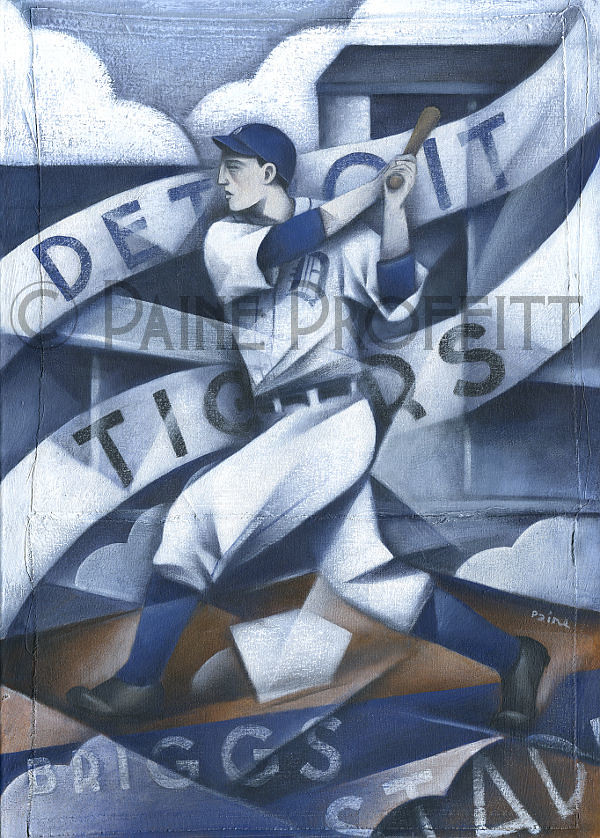
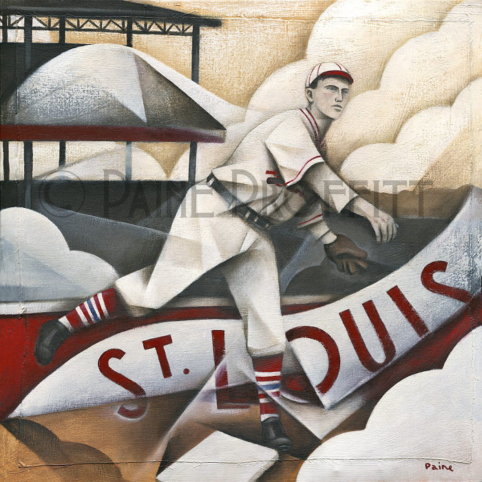
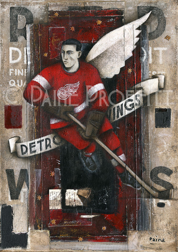
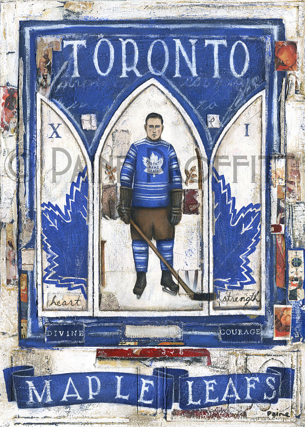
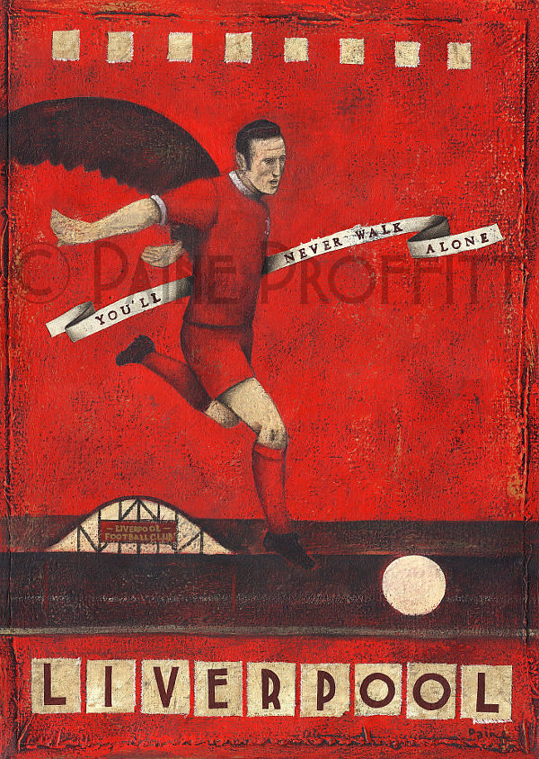
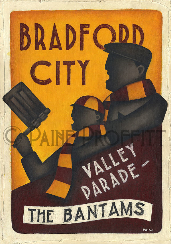
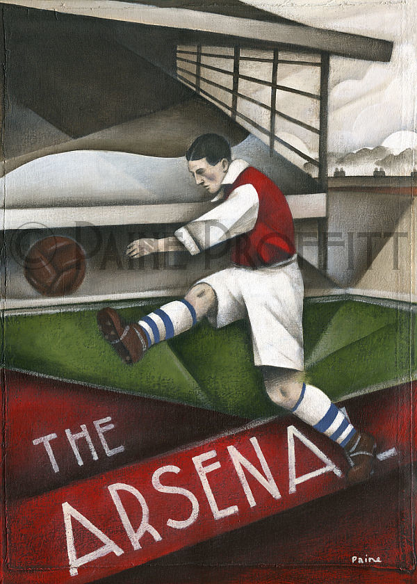
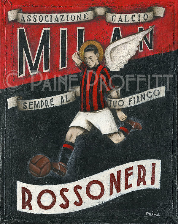
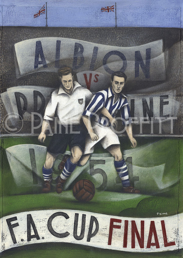
Pretty good, right? I love how Paine’s illos look like woodcuts. You can see more of his work on his website, where he sells original artwork at limited-edition prints. Thanks for letting me know about your work, Paine — I love it!
Today’s Uni Watch Birthday
By Douglas Ford
[Each day this month, Douglas Ford is selecting an athlete who’s celebrating his or her birthday and presenting some uni-notable photos of that athlete. Here’s today’s installment.]
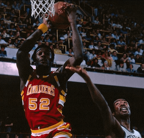
Today’s birthday boy played basketball at the University of Minnesota and then played in the 1972 Summer Olympics, including the United States’ controversial loss to the Soviet Union. He was drafted by the Cleveland Cavaliers with the second overall pick of the 1973 NBA Draft. When he scored a basket at a Cavs home game, the public address announcer would declare, “Two for the Brew!”
He turns 63 today — happy birthday, Jim Brewer!

Baseball News: The Triple-A Oklahoma City RedHawks will now be called the Dodgers (from Justin Cliburn). ”¦ The Daytona team in the Florida State League, which has switched its affiliation from the Cubs to the Reds, is due to unveil its new name tomorrow at 10:30am (from Wayne Koehler). ”¦ Here’s a new addition to our roster of catchers who’ve worn brimless helmets: former Twins backstop Dave Engle (from Andy Chalifour).

NFL News: Several wardrobe items from the TV show The Wonder Years, including the Jets jacket worn by child actor Fred Savage, have been added to the Smithsonian’s collection (from Jonathan Daniel). ”¦ Always fun to see how 1980s Giants defensive lineman Jim Burt’s NOB had super-wide kerning (from Dustin Semore).

College Football News: Fresno State will be going with a new uni combo — white-white-blue — for the Mountain West Conference championship game (from Jared Buccola).

Hockey News: Martin Brodeur, newly signed with the Blues, will use this mask design (from Rob Siergiej). ”¦ The Blues also released a video that shows Brodeur’s nameplate being stitched onto his jersey (from Vernona Elms). ”¦ Do you remember the 1999 Burt Reynolds filmMystery, Alaska? Me neither, but a hockey jersey from that film is up for bids (from Douglas Ford). ”¦ The Hurricanes wore white at home last night.

Pro Basketball News: Someone has developed a complex but amusing formula to determine which NBA teams’ uniforms are too “sacred” to be watered down with alternates (from Robert Silverman). … The latest edition of the always-awesome NBA Census, which breaks down the league’s players by position, salary, height, race, birthplace, and more, is now available. … Knott Central High School in Kentucky is using the old Kentucky Colonels logo (from Thomas Clouse). ”¦ The two primary Japanese professional basketball leagues have both unveiled the logos for their all-star games. Here they are — NBL and BJ League (from Jeremy Brahm).

College Hoops News: Whoa, check out the sashes worn by the 1911 UNC team! I’m assuming those were just for the team portrait and not worn on the court, but still pretty cool (great find by Leo Strawn Jr.).

Soccer News: Barcelona’s new home kit has leaked, and the big surprise is that the jerseys have horizontal stripes (from Sinuhé Guevara). … Also from Sinuhé: “The Mexican football club Cruz Azul (yeah, the team name is Blue Cross and represent a concrete company) has revealed its new jersey.” … Now that DC Comics has sued Valencia because of the team logo’s similarity to the Batman logo, which other soccer team logos might be infringing on the world of comic books? Maybe these (from Coachie Ballgames). ”¦ Frankfurt forward Haris Seferovic displayed a message written on his undershirt after scoring a goal on Sunday. “That is a tribute to a young female student named Tugce Albayrak, who intervened when two teenage girls were being harassed by three men in a McDonalds near Frankfurt, only to be attacked later outside the restaurant by one of the men,” explains Mira Katriina. “She died last Friday in hospital from a brain trauma.”

Grab Bag: Just what the world’s been waiting for: ugly sweater-patterned suits (from Jonathan Daniel). … Reebok has struck a deal to provide uniforms for UFC fighters. … A bunch of female NYC cops have posted side-by-side photos of themselves in and out of uniform. … I’m still calling it Fairgrounds Coliseum. … New logo for the luxe travel mag Condé Nast Traveler. ”¦ The Parramatta Eels of the National Rugby League have unveiled the jersey that they will be wearing for the nine-a-side tournament in Auckland, New Zealand in early 2015 and it’s, uh, really something (from Graham Clayton). ”¦ Pittsburgh sports columnist Dejan Kovacevic addressed the issue G.I. Joe-isms, and other aspects of politics crossing over into sports, in a recent Q&A piece. To see, go here and search on the word “politics” (from John Dankosky).

Since being nit-picky is what we do here. Burt Reynolds didn’t wear a jersey in Mystery, Alaska. He was the town’s judge and not one of the players. That’s just a jersey made in the style of the jerseys worn by the team.
Ah, I see — thanks. Will adjust text accordingly.
I remember seeing the movie when it came out. I guess it never resonated with me, since I haven’t seen it since. I only remembered that it was a small-town team that got some press that eventually led somehow to an exhibition game with the New York Rangers, and that Russell Crowe was the lead; I’d forgotten that Reynolds was even in it.
My memories of the film are also as vague, if pleasant.
Looks like Burt liked link, sometimes link with his link, sometimes link.
My big memory of the movie was that they had a Rangers player who clearly wasn’t named Messier wearing number 11. I gasped to the point where people around me noticed.
It was a pretty good movie, though.
Remember a few years back seeing some of the movie worn Rangers jerseys from the film on Ebay.
I can clearly see a white outline on the helmet of Simms.
I just went back and looked at it and thought, “No outline.” Then, just to be sure, I enlarged the photo — and you’re right! The outline is there, but it’s hard to see because of the way the light is hitting his helmet.
I’ll remove that item from the Ticker.
Still, it’s nice to see the Lions unis from that era.
“Its SIMS with one M!” bellowed Billy Sims when he saw this blog entry while using a laptop at that awful Heisman House.
First link to Paine’s site is wonky.
Fixed.
So…if they are the Oklahoma City Dodgers, will they have a hat that says “OCD”? And if so, will all the letters be perfectly aligned? Maybe have Zoloft as the team sponsor.
Awesome.
Jeezus!!
Can you imagine the batter’s box rituals??!!
(or pitchers, etc.!)
link
They should hire Mike Hargrove as their manager.
link
That joke almost – almost – makes up for the suckiness of the news! A minor-league team adopting a big-league nickname is by definition a downgrade. Especially when the big-league nickname is specific to the parent club’s city and has no connection to the farm team’s locality. Doubly so for the Dodgers, whose nickname is specific to a city the team doesn’t even play in anymore.
(If I had a time machine and three chances to change anything about history, going back to 1956 and making it so the Giants moved to LA and the Dodgers to San Francisco, which actually has streetcars to dodge, would come in ahead of preventing WWII on my to-do list.)
I’m still calling them link.
Downtown OKC did have ‘retro’-styled trackless trolleys up until a year or so ago.
I don’t know if they serviced the ballpark area or not.
Seems there is a mini-trend for minor league baseball teams to go from unique nicknames to their parent club nicknames. RedHawks to Dodgers follows South Bend SilverHawks to South Bend Cubs and Salem Avalanche to Salem Red Sox.
At least the independent Amarillo Sox just changed to an unusual nickname in ThunderHeads.
LA also had a long running street car system.
link
LOVE Paine’s work!!!
It’s certainly some beautiful work. Though, I find the single wings on the players in the Red Wings and AC Milan examples a bit… odd.
Agreed. The thing I can’t quite grok is the three matching socks on the last example above. Perhaps I’m just ignorant of a famous event in UK footy though.
Both teams in the 1954 F.A. Cup final wore striped socks, is all. It’s like Preston N.E.’s “finest hour.”
link
. . . but then why is the fourth sock plain?
Methinks you must have X-Ray Spex if you can see the West Brom player’s right leg sock through the leg of his Preston N.E. opponent.
link
I have a friend named Paine. The name suits him very well. He is a huge pain.
That’s “Tracking” on the Jim Burt’s NOB not “Kerning”. Kerning is between a pair of letters, while Tracking is the spacing between all of the letters.
Didn’t realize that — thanks for the lesson!
thomy keming VS. e x c e s s i v e t r a c k i n g
possible NHL all star jersey leak
link
link
Taking the opposite approach of the NBA All-Star uniforms, I see.
And then we NHL fans wonder why fans of the other major leagues don’t take us seriously…absolutely brutal. :-/
You put both the NBA and NHL (leaked) all star jerseys in front of a 12 year old boy and I bet 90%+ pick the NHL one.
First, I don’t think any other fan group doesn’t take NHL fans serious. Second, if they did, I doubt it is because of their All Star Game sweaters…
Good lord.
But the NHL typically bests all other pro sports event unis with the Winter Classic, so it’s sort of OK if the All Star Game jerseys are hideous. Or whatever new word is invented to capture the full aesthetic horror of those images, since “hideous” almost praises by understatement.
I like that essentially all of the players in Paine’s art have the same face. It’s like it’s one guy time and space-traveling around.
Sad to see UAB get shutdown. I thought they had one of the better, more underrated uniforms. Green and Vegas Gold pop and look good, plus there was some creativity to the uni and the helmet. #RIP
Yes the Celtics Unis are too sacred. WTF was that ridiculous alternate doing on the Parquet? Best alternate for the Cs was the Russell-era throwback they did with the arched “Boston” on the front link
That grey thing they wore the other night was embarrassing
What a coincidence, I discovered Paine Proffitt just yesterday. I have to ask whether that is this guy’s real name – it seems too punny. Unfortunately, I couldn’t find any of his artwork without the copyright watermark.
I really enjoy Paine’s work. Thanks to both Paine and Paul for sharing it with us. I’m curious to hear the story of how a Brit came to be a fan of a couple of staples of the North American sporting scene like ice hockey and baseball. I’m sure there’s an interesting story behind it.
According to Wikipedia, Paine was born in AZ & lived in PA.
Well, there you have it. It didn’t occur to me to look him up on Wikipedia. Thanks, Ethan.
Wow, Paine. Amazing artwork. I think we might be in touch about a commission.
“Barcelona’s new home kit has leaked, and the big surprise is that the jerseys have horizontal stripes.”
As a relative neophyte to international soccer, I’m sure others can speak to this with greater understanding than I, but isn’t this the functional equivalent of the New York Yankees turning their pinstripes sideways? Will this be cause for an uproar among Barça supporters?
That’s exactly what it’s like. I would expect that uproar as soon as the new kits are unveiled.
I’ve heard a few people vent their untempered rage but it seems baseless to me. Barcelona are defined mostly by the colours while the way they’re laid out has always been fluid – link, link, link, link, link,
link. Perhaps the switch from a predominantly vertical layout to a horizontal one is significant, but this is hardly a team with one definitive look that is their identity. In fact I’ve always liked that Barcelona has such a fluid identity with those colours anchoring it and this seems a natural course to take for such a team. In fact, the only part I find objectionable about the new look is the awful yellow side striping and, of course, the jersey ads – the real sin against Barcelona’s visual tradition.
There’s a pretty significant difference between hoops and stripes. With all the variations of stripes Barca has had (and even the link could be seen as two enormous stripes), they’ve always had stripes. Hoops may well be seen as something entirely different.
Define “significant difference”. I could argue that thin vertical stripes have more visual concordance with thin horizontal stripes than with the halved look by virtue of the fact that the thin sectioning of colour creates a certain visual quality that is lost when the colours are more distinct.
Anyway, the original question posited a situation where a team had one look that defined them, like the Yankees. Barcelona don’t.
Perhaps the Yankees aren’t the best point of comparison because of the way baseball uniforms (and the Yankees’ uniform in particular) seem to change at a glacial pace, whereas teams in the top European soccer leagues tweak their looks every season or two. But changing from stripes to hoops does seem fairly significant, considering that it’s the first time Barça will have worn hoops in its 115-year history.
And while Barça may change up their look for more often than the Yankees, I’d still suggest that vertical blue and red stripes are a defining part of their visual identity. Not only has the contrasting been blue and red color scheme link before, but it’s also incorporated into link. And the club’s basketball team link as a nod to the soccer team’s sartorial tradition.
So, perhaps the change won’t be cause for rioting at Camp Nou. But it does seem worthy of a raised eyebrow or two.
In 1903 Celtic switched from stripes to hoops. The look doesn’t seem to be all too different for me but maybe that’s because: 1) I don’t care for Celtic; and 2) green and white is a relatively distinctive combo.
link
Blown away by the paintings featured today. Great stuff.
Today’s ESPN column is up:
link
Amusingly, the Jaguars fridge does not use their original logo, but their current one. Plus, they have their badge logo where the other teams’ fridges have helmets.
I do like the the Lions’ fridge has the stripes moved to the center to align with the classic logo.
… and I just realized I was inconsistent with my apostrophes in that post. Apologies for the catastrophe, Paul!
Yeah, I noticed that about the Jags fridge as well. But I like the new logo better, so I’m OK with it.
At least it doesn’t fade from gold to black….
Not an Eagles fan but was dissapointed to see that their fridge was black with the old school eagle instead of kelly green or even silver/white.
I love that link features the “GB” logo, although I wish they weren’t using the modern double-outlined version. The link was so much better.
Double points for the single-bar facemask, though.
And you’re right, Rob. That Lions fridge with the centered stripes is surprisingly clever. A nice detail I wouldn’t have expected from a licensee.
No mention of Gameday Dockers??
link
My daughter loves the “Trolley Dodgers…” book (aka The Mascot Book). One nit in the book though – while the current Diamondbacks color scheme is shown, the text refers the purple and teal.
Little note on the OYO NHL sports figurines. The Blues are all wearing the 2014-15 design w/the exception of Steve Ott who is still clad in last years Bettman bib style.
link
link
Awaiting to see what kind of tributes the Habs and the NHL due for Jean Beliveau.
As I’ve requested in the past, could we pleasepleaseplease stop with this kind of comment? The body isn’t even cold yet.
Yes, there will no doubt be some sort of patch and/or decal. Yes, it will be interesting to see what it is. But saying, “Gee, I wonder what it will be!” adds nothing of value to the dialogue and shows disrespect for the loss of life.
Let’s comment better, comment smarter. Thanks.
Not uni-related, but apparently a certain land-grant college in PA link
The artwork is simply amazing! So cool.
If you look at the reveal from Oklahoma City Dodgers there is a discrepancy between the all-blue uniform that was put out in the official documents and what was displayed.
The uniform in the official guide shows white belt loops and white shoulder, cuff, and pants stripes.
link
However in the floor model, there are no stripes at all. Its just solid blue.
link
The OKLA (OK + LA) logo is sort of cool.
link
I just made this mark for fun a few weeks ago and that new OKLA marks is weirdly similar.
link
Here’s a better shot of the all blue set that was actually shown.
link
This is totally off any topic but a general site question for Paul I am sure he has answered before. My question is, how do I know which ads are part of your site and which are being placed there that aren’t part of your site or all of them part of it? I ask because I would want to be sure to support those who place ads on here.
Technically speaking, *all* the ads are “part of the site.” But I think what you’re asking is, “Which ads are served by some sort of ad-serving service, and which ones have independent arrangements directly with you?”
I almost always do a “New Sponsor Shout-Out” when a new direct advertiser comes on board. I did it it about two weeks ago for all our new holiday advertisers, in fact. Did you miss that?
In general, the ads that never change, even when you refresh the page, are the ones that have independent arrangements with me. At the moment, that includes the four advertisers at the top of the right-hand sidebar (American Trench Socks, Oxford Pennant, There Used to Be a Ballpark, and Left Field Cards), plus the Grey Flannel Auctions ad at the top of the left-hand sidebar.
Everything else tends to change when you refresh the page, which is a good way to know that it’s from an ad-serving company.
Mike Miller of the Cavs wore his shorts with the waistband rolled over last night against the Bucks. This is clearly visible as he comes on to the floor with 32 seconds left in the game. Is this the first instance of ‘waistband rolling’ in the NBA?
Do you have a video link of the 32-second bit you’re referring to?
I, too, enjoyed Paine’s artwork. But I do wonder how he deals with/gets around the rather blatant copyright issues? Are these paintings officially licensed?