Paul here, pinch-hitting for Phil, who’s working on other projects this weekend. Our topic today is the SPHL’s Knoxville Ice Bears, who’ve been staging their popular Wiener Dog Races for years. As you can see above (start at about the 0:42 mark), the races are really fun — who doesn’t love seeing elongated dogs scampering around on the ice? Aw, little cuties…
The Ice Bears’ most recent Wiener Dog Race Night promotion was last night, and this time around they upped the ante by wearing Wiener Dog Race jerseys. That should be a slam dunk, right? You can put a cute pooch on the chest, have his loooong body wrap around to the back of the jersey, or maybe show multiple dogs racing — lots of fun possibilities.
So what did they come up with? Let’s take a look:
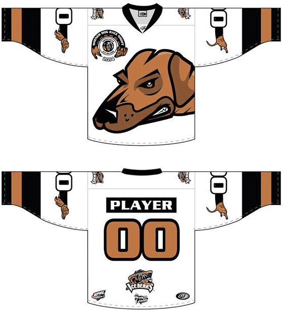
Oh, for fuck’s sake. Of course they had to go and ruin it by giving the dog a furrowed brow and gritted teeth. Memo to team management: It’s a freaking wiener dog, not a pit bull.
I can just picture the meeting that took place at some point during this jersey design’s evolution:
“Here it is! Whaddaya think?”
“I dunno — seems a little, you know, cute, don’t you think?”
“Well, yeah, it’s a wiener dog — they’re cute! That’s why people come to see them on Wiener Dog Race Night!”
“I know, I know, but team mascots have to look intimidating! What if one of our players gets in a fight? How’s he going to fight if he’s wearing a cutesy jersey design?”
“Um, with his fists, like he usually does..?”
“And besides, we’re the Ice Bears — bears are ferocious, not cute.”
“Yeah, but this is a special jersey for Wiener Do”””
“Look, I’ve made up my mind: Just make the dog tougher-looking. You know, like a cross between a dog and a bear. Simple.”
“Whatever you say.”
Nimrods.
UWFFL update/reminder: Phil’s regular stable of contributors have the weekend off, but UWFFL impresario Rob Holecko wants to remind you that the league’s weekly Saturday and Sunday games are still taking place. You can vote on them, as usual, here.

Baseball News: Reader Douglas Ford was watching footage from the 1980 World Series and spotted what appears to be some sort of sticker on the back of Pete Rose’s batting helmet. I’m stumped — anyone know what that is?

Pro Football News: Key quote in this article about the CFL: “The younger demographic is the one that appeals to advertisers and business. That’s the demographic buying the jerseys and the other stuff.” Which is exactly why, as I’ve been saying for years, the uni-verse would be better off if jerseys had never been made available for sale, because the net result is that one subsection of the fan base ends up driving the uni-related decisions. … Speaking of the CFL, commish Mark Cohon posed next to the Grey Cup while wearing a jacket with CFL team logos in the lining (from Leo Strawn Jr.). … Lovelovelove this 1970s shot of WFL founder Gary Davidson posing with mock-ups of the league’s uniforms — which still featured stirrups and long sleeves! Looks like they also had mock-ups for a red/white/blue ball (big thanks to Paul Dillon). … Eric Wright was out shopping and spotted this Michael Strahan tree ornament. Only problem is, as Eric immediately noted, the pants should be gray, not white.

College Football News: Sparky reappeared on Arizona State’s helmets yesterday. … Good article about the tension between academics and athletics (especially football) at Michigan. … Nebraska RB Ameer Abdullah lost part of the “N” on his helmet yesterday (screen shot by Jerrod Wheeler). … Baylor will be wearing solid white today. … Here’s a piece on Texas’s metallic helmet decals. … Here’s what Mississippi State will be wearing today against Mississippi in the Egg Bowl. … In yesterday’s comments, yosef777 asked about the little strip of leather that’s always tied to UCLA QB Brett Hundley’s facemask, so I posted a query on Twitter and learned that it’s a team award that symbolizes toughness.

Hockey News: There’s the “normal” Martin St. Louis — the one who plays for the Rangers — and then there this Martin St. Louis. That’s Martin Brodeur, who skated with the Blues yesterday, marking the first time he’d ever worn an NHL team logo other than the Devils’ (kudos to Vince Ruggiero for the “Martin St. Louis” line). … Rangers D Ryan McDonagh returned from an injury yestserday wearing a different helmet. “McDonagh usually wears the popular Bauer 4500, but he showed up in Philadelphia on Friday wearing a newer model,” says Luke Rosnick. … Here’s a shot of Canucks LW Daniel Sedin’s regular game pants peeking out beneath his throwback breezers. That comes from this slideshow of throwback unis across various sports (from Thomas Wood).

NBA News: The Celtics’ laughably bad gray sleeved uniforms made their on-court debut yesterday. Lots of other teams also sported alternate or unusual looks yesterday, including the Raptors (purple throwbacks), Lakers (BFBS/sleeves), Hornets (teal alternates at home), Pelicans (red alternates), Spurs (gray alternates), and Pacers/Magic (gold and black alternates, respectively, creating a color-vs.-color game). I’m sure it’s just a coincidence that this took place on Black Friday, right? … Lots of people mess up where the apostrophe should go in the word “li’l.” But it’s not often that you’ll see someone mess it up two different ways in the same ad (thanks, Phil).

College Hoops News: Lots of visual interest in yesterday’s Bucknell/Penn State game, as the Nittany Lions wore black/pink and the Bisons wore throwbacks. … Alexander Julian, the menswear designer who also designed the original Charlotte Hornets uniforms, is selling a necktie in 2008 Final Four colors (from Tommy Turner). … Georgetown’s women’s team wore gold-ish uniforms yesterday (thanks, Phil). ”¦ Very nice throwbacks today for Wichita State.

Soccer News: “Serie A side Napoli have been wearing their denim-styled away kit at home a lot recently, including for their last three Serie A home matches, against Hellas Verona, AS Roma, and Cagliari,” writes Callum Johnston. “This trend also extends to the Europa League; in fact, it was interesting to note that Napoli wore their blue home kit for their away tie against Young Boys but wore the denim kit for the reverse fixture in Naples. Also of note are differences between the denim kits used in Serie A and the Europa League: the Serie A kit has white numbers and NOBs, with blue Macron logos and trim around the crest, whereas the Europa League version has the type and trim in bright green.”

Grab Bag: Cricket players and fans around the world are displaying cricket bats in memory of Aussie cricketer Phil Hughes, who died earlier this week after having been hit by a pitch (from Dave Raglin). … Meanwhile, Hughes’s number is being retired, and the Australian Wallabies — that’s a rugby team — will be wearing black armbands in his memory. … Interesting article on how architects solve unusual stadium design problems (from Jeff Ash). … Key quote from this review of the restaurant at the Trump Hotel in Toronto: “The female bar staff here wear the shortest uniforms I’ve ever seen in a restaurant, anywhere. (The male staff wear regular clothing.) One of them stops every few minutes to yank her skirt bottom down, so it more completely covers her.” Classy. … Here’s a costume-centric analysis of the new Star Wars VII trailer. That link comes from a site I hadn’t been aware of before, called Clothes on Film, which seems worth investigating further. … New brand identity for the food distribution giant Gordon Food Service. … For decades it was unheard of for coaches, managers, or umps/refs to have beards. That has been changing in recent years, and now there’s a corresponding trend in the business world: More CEOs are wearing beards. ”¦ “Earlier this year Carlton FC asked its Australian Rules fan base to vote on which monogram they wished to see on the team’s 2015 jumper — the current version or a heritage design from earlier in their history (yes, that’s John McEnroe and Bjorn Borg!),” writes Leo Strawn Jr. “The club just officially released the winner. Oddly, both monograms are visible, with the club logo, which still contains the most recent iteration of the monogram, located on the swoosh tag at the bottom of the jumper.”
Like most people, I recognize the day after Thanksgiving as the official start of the countdown to Christmas. And in my house that means only one thing:

The giant crest is a bit dated, but those logos (especially the shoulder patch) are so nice they should immediately rename the team the Wiener Dogs.
Not like their regular logo is much better.
$85 for a tie. Woof
The links to the Celtics uni abomination photo and the “li’l” ad are both messed up.
Thanks — both now fixed.
Paul, the link to the Celtic’s gray jersey is not working.
Martin Brodeur typoed as Marin.
Fixed.
So confused. The 2008 men’s Final Four was UNC (Carolina blue/white), Kansas (royal blue/red), UCLA (various shades of blue/gold) and Memphis (royal blue/white/gray). None of the schools represented wore orange, green or purple. The name is misleading. Though I do remember Roy Williams wearing that tie – one of the few items of clothing he wears that isn’t Carolina blue (same goes for me). I would think he gets a lot of his clothes from Julian’s.
The dachshund was bred to go after badgers. (Dachs is the German word for badger.) So while they may be long and cute, their heritage is that of the crazy idiots who would go into the badgers den.
I would have gone for cute, but the growling face isn’t exactly inappropriate.
Posted this comment and then looked at the Julian website again. The wording had me realize that this is probably the same style of tie Roy Williams wore DURING the 2008 Final Four. And indeed, a quick web search yielded: link
Roy Williams has a clothing deal with Julian and/or the Julian clothing store in Chapel Hill which was started by his late father. The website linked in the ticker is for that store.
I don’t know what that Alexander Julian tie is trying to represent, but it can’t be the 2008 Final Four.
Tie colors: Light blue, orange, green, purple
2008 FF: UNC (Carolina blue), Kansas (Harvard crimson and Yale blue), UCLA (True blue), Memphis (blue)
In fact I can’t find any FF in the past 20 yrs with that combination of colors link Maybe someone else can.
Of course Trump’s joint is “classy;” he’ll tell you so any and every chance he gets. But it’s like being cool — if you have to say you are, you’re not.
Re: Pete Rose.
I have no guesses as to why he might be wearing one, but that looks a lot like the UFW (United Farm Workers) logo.
Sometimes I wonder what Penn State would look like if they had indeed stuck with their original black-and-pink color scheme. Can you imagine a JoePa team with the basic uniforms with pink stripes on a black helmet?
Marty as a Blue looks so wrong. I still hope it works out for him in St. Louis, heck if things keep going the way they are for the Devs, it will be nice to follow a team that can actually win a few hockey games. Still visually jarring though.
Yeah. That will go in the history file with Harmon Killebrew as a Twin, Patrick Ewing as a Supersonic (or a whatever-the-singular-of-Magic-is), Johnny Unitas as a Charger, and so on….
I think you mean Harmon Killebrew as a Royal …
Do want to take issue with a minor point Paul made yesterday… The Clemson-USC game has unofficially been called the Palmetto Bowl for years (the 106th consecutive of which they are playing today for the second longest current streak in the nation) and I don’t think making it an ‘official’ name of what it’s already been is really that lame. It’s no different then the Iron Bowl or the Egg Bowl or the World’s Largest Outdoor Cocktail Party.
Now in a few years when they start calling it the “Michelin Palmetto Bowl part of ESPN’s Rivalry Week™ Presented by Vizio”, then, sure, it’s corporate douchebaggery.
I didn’t say it was corporate douchebaggery, and I didn’t say it had anything to do with sponsorship. I said there’s an incessant need to brand everything these days, whether calling it the World’s Largest Outdoor Cocktail Party or the Palmetto Bowl.
The Yankees and Red Sox have a pretty fierce rivalry. Somehow they’re able to call it the Yanks vs. the Sox.
I’m just saying I don’t think it’s lame to officially name it what’s it’s already been called… They didn’t make up the name the Palmetto Bowl, it’s colloquially been called that already, here in tha Palmetto State.
Just a note on international rugby union nomenclature: it’s really only ever either Australia OR the Wallabies, never “Australian Wallabies”. Same applies for the other southern hemisphere nations (Springboks, Pumas, All Blacks).
If you look at the story I linked to, you’ll see that the photo caption includes the term “Australian Wallabies”:
link
I took the term directly from that caption.
I’d put that down to whoever wrote the caption looking to create a symmetry with “Australian cricketers”. Still looks odd though. The way it’s used in the rest of the article where Australia and Wallabies are basically synonyms is the more standard usage. It just kind of makes it sound like a club or representative side, rather than the national team, when you put it all together.
But the other mentions in the article are “Wallabies”. I’m afraid I agree with Padday.
I’m not saying Padday is wrong; I’m explaining why I wrote what I wrote.
Love the Mistletoe, tradition is so important to keep nowadays.
Well, we’ve got a pit bull. They’re “ferocious” because part of society has cast them, trained them, and exploited them into playing the part. Our Annie has never made the face the Ice Bears’ dachshund is making. Don’t hang that look on pit bulls.
Touché.
The pete rose sticker……I believe it’s the old mizuno logo. As seen on Pete’s batting glove.
link
Link not working (at least not for me).
link
or try this
link
New brand identity for the food distribution giant Gordon Food Service.
I’d wear an “I’m Still Calling It GFS” shirt.
Toronto needs to bring back the purple throwbacks! As a Celtics fan, these are horrible. What was Adidas and the Celtics thinking!
Toronto
needs to bring backthe purple throwbacks! As a Celtics fan, theseare horrible.What was Adidas and the Celtics thinking!Have to admit, the Navy/Southern Alabama game looked purty nice!
Nice colour on colour action betwixt Mizzou and Arkansas, too!