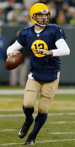
Fun game yesterday at Lambeau, as the Packers wore their Acme Packers throwbacks against the Eagles. I know some of you folks don’t like this design, and some other folks liked it better with the brown helmet instead of the yellow helmet, but I think it’s a great look. They even used old-timey graphics for the roster card at Lambeau. Looks like they didn’t have throwback sideline capes, however. And they had at least three different colors of hand-warmers out there — green, blue, and white.
Meanwhile, here’s an overlooked uni-notable development from that game: Everyone’s been worked up over the color-matching snafu regarding the Eagles green jerseys, but their green pants have also been MIA all season long — until yesterday. Hey, it only took until Week 12 — good work, Nike!
In other developments from around the league yesterday:
• The Cardinals went full-bloodclot.
• The Giants once again wore their white alternate pants.
• Very good-looking game in Kansas City, as the Chiefs wore their regular home uni and the Seahawks went white over blue. That’s Seattle’s best look by far — even the neon-green accents can’t ruin it. Pair it up with KC’s home look and you have a game that’s very easy on the eyes.
• Speaking of the Seahawks, offensive lineman Russell Okung’s nameplate was coming loose.
• The latest player to wear G.I. Joevember hosiery: Chargers wideout Keenan Allen.
• Here’s something that I think used to be more common but you don’t see it as much these days: 49ers running back Frank Gore had a loop of tape around his waist.
• I don’t know why back judge Scott Helverson keeps wearing a jersey with the old type font, but it has become a consistent thing with him. Do officials have lucky jerseys?
• I don’t know why this never occurred to me before, but Bengals quarterback Andy Dalton’s red hair meshes perfectly with the team’s color scheme. There should be a rule — not just in the NFL but across all sports — that carrot-tops can only play for orange-clad teams.
• For the second consecutive week, not a single home team wore white.
• Finally, there’s this: An Austrian TV station called Puls4 has been broadcasting NFL games in Austria. And if you think G.I. Joevember is big over here, look what the Puls4 broadcasters were wearing yesterday. “They explained that they wear the suits as a salute to Austrian armed forces as well as firefighters, the Red Cross, mountain rescue teams, and so on,” says reader Stefan Schubert.
(My thanks to call contributors, including Alex Goldman, Mark Heggen, Rob Holecko, Don Schauf, and of course Phil.)
IMPORTANT ”” membership update: Last week I announced that I might pull the plug on the Uni Watch membership program if the pace of enrollments doesn’t pick up. That spurred a bunch of you into action, as we got a big spurt of new orders (thank you!). It remains to be seen whether this was a last gasp or a renewal of momentum for the project, but for now the membership program is off of life support, although it’s still in the ICU.
One thing I hadn’t anticipated is that bunch of you responded to my announcement by saying, “I’d happily sign up right now, but the design I want includes purple and you only allow purple orders Purple Amnesty Day, which is in May. Will you bend a little on that rule, so I can sign up before you kill the whole membership program?”
I initially responded to all of these requests by saying, “No. Purple Amnesty Day is just that — one day, and that day is May 17, the end.” But after thinking a bit more about it, I’ve concluded that it was unfair to yell, “Last call!” to everyone else without including purple partisans. So I’ve decided that we’ll have a Purple Amnesty Bonus Day, which will take place exactly six months after the usual date.
Which happens to be today.
So if you want a purple-inclusive design, today is the day to order it. I’ll accept such orders until midnight Pacific Time tonight. (And of course non-purple orders are also welcome.)

What about non-Uni Watch membership cards? I’ve been thinking a bit lately about membership cards as a cultural phenomenon. Once upon a time, the term “card-carrying member of [whatever]” was a common phrase (it even became an issue in the 1988 presidential election), but what do physical membership cards mean in an increasingly digital world?
It’s no accident that I gave Uni Watch its own membership card program, because I love membership cards and have quite a few of them (including the one shown above, which you can click to enlarge). For whatever reason, it had never occurred to me until a few days ago to seek out vintage membership cards, but I see there are quite a few of them available on eBay and Etsy. (Note to self: Those vintage cards would be good Permanent Record fodder.)
I’m thinking I may want to write about this, so I’m curious about what sorts of membership cards people currently have. I’m not talking about insurance cards or Social Security cards here (and despite American Express’s “Membership has its privileges” campaign, I’d say credit cards don’t qualify either) — I’m talking about membership cards, cards that identify your status within an exclusive club. If you have any that you’re willing to share, please send scans or photos my way. Thanks.
Pinktober bleeds into November: My doctor’s office is right around the corner from the place where I donate blood every two months. So last Friday I decided to go for a daily double: blood donation followed by a flu shot. Or to put it another way, one needle to take some stuff out of me and then another needle to put some stuff into me. (And yes, it’s fine to do both of those on the same day, in either order — I checked.)
Anyway: After they take my blood, they always put a gauze pad over the needle site and secure it in place with some of that rubberized bandage wrap. The wrap comes in several colors, and I always ask for green. This time, however, I was told that only one design was available:
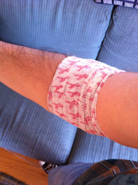
Sigh. So I had no choice but to become part of the pinkwashing phenomenon. Then I walked around the corner to my doctor’s office, where I was assigned to a nurse who was going to give me the flu shot. She told me to roll up my sleeve, and I braced myself for what I knew was about to happen. “Oh,” she said when she saw the bandage, “pink ribbons! Good for you!!” Double-sigh.
After giving me the flu shot, she put a zebra-patterned Band-Aid over the injection spot. Phew.

When I was in Wisconsin last month, I paid a visit to FAST Corp. (the acronym is short of “Fiberglass Animals, Shapes, and Trademarks”), the company that makes giant fiberglass cows, ice cream cones, ears of corn, Bob’s Big Boy statues, and so on. My article about that visit is up now on the design website re:Form — I really like how it turned out, and I think you will too. Check it out here.

Baseball News: Here’s one observer’s fairly detailed take on the new Twins home uniform (from Michael Haas).

College and High School Football News: New helmet for Lehigh. ”¦ Check this out: a fighter pilot from the Vietnam War with the Texas A&M logo on his helmet (from Matt Steinmetz). ”¦ Blackout unis tomorrow night for Ohio. Here’s a video. ”¦ A Virginia county has decided not to use impact sensors in its football team’s helmets, despite repeated requests from parents (from Tommy Turner). ”¦ It was cold in Knoxville on Saturday, so Tennessee’s Smokey mascot bundled up (from Adam Spangler).

Hockey News: Several players on the Penguins are opposed to the use of advertising patches on jerseys (from Jerry Wolper). ”¦ Blackhawks C Andrew Shaw suffered a torn jersey during a fight yesterday (from Jen Hayden and Ben Michael). . Mike Slavonic notes that Sidney Crosby and Evgeni Malkin of the Penguins have altered the scoop-hem on their third jerseys — their hems are straight. ”¦ Holy moly, check out this shot of former Canadiens great Guy LaPointe playing on the Habs softball team!

NBA News: GQ really likes the new Xmas jerseys (from Andrew Cosentino). ”¦ Cross-dressing alert! Check out this mid-1990s shot of Junior Griffey in a SuperSonics T-shirt (from Seth Shaw).

College Hoops News: For reasons that aren’t clear, at least to me, the “W” on Mercer G Jordan Strawberry’s NOB is smaller than all the other letters (from Phil and Rob Montoya).

Soccer News: This is pretty cool: a soccer-themed office, complete with Astroturf (big thanks to my longtime pal Rob Walker). … “There have been two jersey unveilings so far for the 2015 MLS kits, and it seems that the American/Canadian flags have been dropped from the designs, which I find very disappointing,” says Mike Aronson. “Do you know why this has been done?” Nope. Anyone else..? ”¦ The Jaguars logo from last weekend’s NFL game was still visible on the Wembley pitch during Saturday’s England/Slovenia Euro 2016 qualifying match (from Yusuke Toyoda). ”¦ Also from Yusuke: Wales debuted its yellow away kit and Northern Ireland did likewise with its green and white home kit.

Grab Bag: “Important new regulations regarding approved roller derby jersey numeral styles are summarized in this handy graphic,” reports the Rev. Nørb.. … Great article, with really cool graphics, on an old college sports logo designer (big thanks to Susan Freeman). … A professional video game player (yes, that’s a thing) named Matt Haag is being sponsored by Red Bull. ”¦ News flash: Nike and Adidas have a bit of a rivalry (from Brinke). ”¦ “Sports Logos” was the Final Jeopardy category on Nov. 7. This was the answer. Who knows the question? (Screen shot by Chris Flinn.) ”¦ The Canberra Captials — that’s an Australian women’s basketball team — normally dress like this, but they wore camouflage for Remembrance Day. Interesting to see that their jerseys are untucked (from Joel Berry).

Who are the Saints?
I watched Friday’s show, and didn’t come up with the answer in the alloted 30 seconds. Shortly afterward, I saw the logo somewhere, and realized that it’s not immediately recognizable as a plant, so I didn’t feel as bad about missing it.
I didn’t see the show, but I saw the question was mentioned on Twitter. I started with the NFC, and when I got to the Saints, I actually had to think for a second what the logo was – then when I remembered “Fleur de lis” I knew that translated, roughly, to “flower of lily” (hey, who knew those 7 years of French in high school would come in handy?). That had to be it.
Many years ago I remember John Madden saying he thought that logo was a banana peeled halfway down.
Wait, it’s not the Packers? I thought the G stood for “grain.”
I guessed “Who are the Steelers?” thinking that “plant” referred to a factory, not, you know, a thing that grows in dirt. He’s a sly boots, that Trebek.
Phil, why did you go to high school for seven years?
Wasn’t everyone on the seven year plan?
Good catch, tho — nah, it was actually 7th grade when I began, straight thru 12th, then one semester in college — so ~seven years total (4 of which were actually high school).
I’m an avid watcher of Jeopardy, although normally it’s on Friday after work and I get caught up on a week’s worth off the DVR. I eventually got it, but I had to pause my tv, so I would not have got it in the alotted 30 seconds.
I feel shame.
You needed someone to hum the Jeopardy theme while you were thinking. That might have helped.
Would Alex have accepted “Who dat Saints?”
Yesterday at least, “link” > “link.”
I did not get to see the show.
However, I will say I handled a lawsuit that had to do with upside-down fleurs-de-lis earlier this year.
I saw that episode, and only one person got it right–but not really. The contestant wrote “What is the fleur de lis?” and was awarded a correct answer, even though the clue clearly asks for the team name (and not a description of the logo). Had her answer not been accepted, it would have affected the outcome of the game and somebody else would have been the champion.
I thought of “Who are the Redskins.” I’ve seen too many potato meme’s.
Habs soccer team? Don’t you mean Habs softball team?
Brain cramp. Will fix!
Guy Lapointe appears to be playing baseball/softball – not soccer.
Re: Seattle/Kansas City – it was a great looking game.
A side note on the Pens’ third jerseys – although Marc-Andre Fleury had yellow gear made up to go with them (which he’s worked out in), he’s so far stuck with his regular link link in the two games so far that they’ve worn the thirds.
As far as color-coordinated QBs go, the situation was even better before this year, when the league’s other ginger QB played for the league’s other orange-helmeted team:
link
I was half-ass watching the Mercer-Seton Hall game and I thought I saw at least one other player with a small “w” in his name. Thought maybe it was some sort of “team” thing/tradition? Sorry, no screen shots, as I said, half-ass watching.
Thought I would enjoy the Junior Griffey photo…then I saw it was the late 90s Sonics logo. Pfft.
If Seattle gets a new team I REALLY hope they wear the kit that won them their one and only title. They can even tweak the design a tiny bit, but not the colors.
What is the deal (literally) the city of Seattle has on that one? If they do get a team, they get the name, logo, colors, records, etc. returned there? I think that was one of the conditions of moving to OKC, yes?
(Yeah, I know aboot Google, just hoping someone can do a quick rundown in the comments)
Pretty sure they got the whole thing just like the Browns. I know for sure they get the name.
Actually, from what I’ve read the Thunder still own the name, but will grant it to a new franchise in Seattle if so desired.
Unlike the Browns, the Thunder didn’t leave their history behind in Washington. OKC will share the history, retired numbers, etc, with that hypothetical new Seattle Sonics franchise, which means that although they did leave behind their one championship trophy, they could make a replica and put it on display in Oklahoma City to commemorate “their” win.
There’s link.
It’ll be slightly less convoluted than the New Orleans/Charlotte situation, where the Pelicans keep the Hornets’ records between 2002 and 2013 but give up the franchise’s first 14 seasons to the team that was founded as the Bobcats in 2004.
Am I the only one who thinks that none of this makes sense? If a team moves, why doesn’t the history (even if the team name changes)? The new team in the old city didn’t do anything in the past. It’s a charade.
But you could also make an argument that Oklahoma City Thunder is just a different corporate entity that absorbed the players and coaching staff from the Seattle SuperSonics, and a team’s identity belongs to the city and the fans.
I mean there’s absolutely nothing about the Thunder identity that connects to the Seattle team. When people talk about Lenny Wilkens and World B. Free and Shawn Kemp, they’re not going to be thinking Oklahoma City basketball. They’re thinking about Seattle basketball.
I can see a good justification for dragging the history and name along to a new city, and I can also see, under certain circumstances, leaving it behind as Modell did when he left Cleveland.
I don’t particularly like this sharing of history, or trading years of history between organizations.
When people talk about Lenny Wilkens, World B Free and Shawn Kemp, they’re thinnking Cleveland. Only two of them were Sonics, but all three were Cavaliers.
If the teams share things, I’d love to see the Thunder name and colors on a late 70s/early 80s Sonics-style uniform. A quick google search surprisingly found no such thing yet.
Jim – my brainfart on World B. Free. I obviously meant Dennis Johnson, who is TOTALLY the same person.
Smokey in his blanket led to some amusing Photoshops:
link
Oh Paul, I’d take pink ribbons over animal print ANY day of the week!!!
Pink animal print.
Pink camo animal print.
link
Paul,
I emailed a few weeks back about the Titans and why they haven’t worn the home jerseys. Any word on what they will be wearing tonight?
Most soccer leagues wear the league patch on both sleeves, which is what MLS will now do. The American/Canadian flag was always on the sleeve opposite of the league patch
Exactly.
I don’t know why MLS dropped the flag patches, but I’m very glad that they did. Soccer is unique among other sports in this country because all the best players play for the national team in addition to their professional club. That makes flags on their club jerseys not only ugly and in poor taste, but confusing to boot.
Michael Bradley is a midfielder who plays for Toronto FC. He also plays for the US in international competitions. He really has no business link; he’s not Canadian, and he’s not representing Canada. He should only ever be wearing link on his uniform.
This is a refreshing case of a league ramping down the nationalism and de-flagging their unis. We ought to applaud them for it.
Part of me is hoping they drop the national anthem(s) at the start of matches and go with a Champions League/FIFA-style tournament anthem.
This is a Maaaaaaaajor Leeeeeeeeague…..
They do play an MLS walkout theme, as opposed to a Champions League anthem.
Also worth mentioning, and perhaps more to the point, the new MLS logo was designed to be worn link on the sleeves. Among teams with similar color schemes, each team gets a link that’s all theirs.
Personally, I link.
That means it might not have been about lowering the level of nationalism, or addressing the ludicrous images of players wearing another country’s flag (especially since they are attracting more and more foreign talent). It might simply be that the flag patches were dropped in the service of a unified, de-cluttered jersey design. Either way, I’m pleased.
Agree totally with the Chancer on flags (boo) and MLS logo (yeah).
Several, such as Dallas, Atlanta, and Montreal, use an extra outline around the MLS logo. Looks terrible. The line extending beyond the shield on the lower left just doesn’t work with an outline like that. If the extended line was not outlined, just the shield shape, and the line “broke through” both the shield and the outline, it might work.
They all use link, it’s just that the extra outline blends into some of the backgrounds in that graphic I posted.
To use NYCFC as an example, link is navy on top, sky blue below, with a white outline and sky blue keyline. You just can’t see the keyline in that graphic against the sky blue background. On a closeup, you can see the keyline link.
I love the new MLS logo and the color specific team versions, it’s such a great branding shot in the arm for the league. A couple quick observations, the league sure has a lot of light blue/dark blue color schemes and I really hope Atlanta sticks with the red/yellow palate it will be a nice addition to the league. I know LAFC is just getting started and have opened it up to their fans to help brand the team but with Toronto FC using red/gray and DC United being the original red and black I hope they find a different color scheme.
I think LAFC could really make red and black work for them.
Atlanta seems poised to go with link, and DC United’s homes are link. I’m not terribly concerned about overlap with Toronto’s red-and-gray. That leaves the color scheme pretty much LA’s to claim.
Removing the country flag would also free up space for the Concacaf Champions League patch – the current setup ended up link.
Removing the country flag could also open up more space for more sponsors…
True, though MLS has shied away from multiple sponsors, preferring to get more from a single shirt front sponsor.
Also, FWIW, MLS jerseys used to have that link on the sleeve.
Man, I had forgotten about that thing.
I don’t think you should get a vaccination before you give blood. I would ask next time.
He said he did ask, and was told it was okay. Although in this particular instance, his vaccination came after the donation.
Someone didn’t read very carefully.
“Checking” may or may not include asking.
It is fine to give blood after a flu vaccine so long as you don’t have symptoms. Other vaccinations are different, which your readers might or might not appreciate the difference between an influenza vaccination and a hepatitis vaccination.
link
True, you might give someone autism.
link
Predictable, but great.
I agree that the Packers use of the gold helmet, while anachronistic, is superior aesthetically to the brown helmet. It’s an all together terrific look since the gold helmet unites the gold numbers and circle.
Also of note is the use of solid blue socks which begs the question as to why the NFL continues to bar them. So many players are wearing a combination of leggings or leg warmers that with a few notable exceptions, having white bottoms only clutters up the look.
I don’t know why they still mandate white socks. Really wish they would ditch those.
Not only was Smokey in a blanket, he was also link Too cute!
Great article about FAST. Man, that Red Lake government center is going to be the world’s new gold standard for so-bad-it’s-good. Transcendental kitsch! Say, did FAST have anything to do with the link?
Do you know if that ball survived the Hall’s move to Eurosport’s warehouse? Would be great if it did, but I can imagine it would be extremely difficult.
“…… Great article, with really cool graphics, on an old college sports logo designer (big thanks to Susan Freeman). … ”
Wonderful. Arthur Evans now emerges as Great American Folk Hero.
Other good things, as determined by newly-empanelled DuPont Circle focus group:
** New Lehigh helmet.
** Guy LaPointe and the Habs’ softball uni.
** Northern Ireland soccer unis. Much better than the Republic’s recent garb.
Good-looking but inappropriate:
** Wales new yellow-with-red-trim soccer uni. Would be a great look for Spain, actually, but we must relentlessly censure adoption of soccer colors that have nothing to do with the colors in national flags, escutcheons, and other historical graphics. With the exception of Italy. Not Germany, though: those green jerseys are not allowed.
The link takes exception to the thought that green is not a proper German color.
Green and white were (and still might be) the colors of the German Football Federation, representing the green of the pitch and the white lines. They still use green and white on their logo (the one with the stylized DFB monogram in the center).
Wales new yellow-with-red-trim soccer uni. Would be a great look for Spain, actually, but we must relentlessly censure adoption of soccer colors that have nothing to do with the colors in national flags, escutcheons, and other historical graphics. With the exception of Italy.
Italy does have a perfectly good historical reason to wear blue, though – the House of Savoia. It’s as befitting as the Netherlands’ orange. Plus, link and the national flower is the daffodil.
FAST article is awesome. Nice work, PL.
You can pull up the pasture on Google Maps, and there’s a great shot of the link in its “natural” state on Streetview – although I highly recommend reading the article, and letting your imagination run, before taking a look.
It’s too bad the Packers couldn’t “shrink-wrap” their helmets to resemble the old leather helmets (see Texas A&M’s throwbacks). It would have been much better than the bright yellow helmets.
Although I like the gold shells, I wonder about your suggestion. Is the process that easily reversed? Are these wraps really just labels that can be peeled off without residue? For some reason I thought they were more complicated than that.
I’m thinking the shrink wrap might be similar to the plastic safety seal on jars and bottles (mouthwash?). Of course, a good hit and it could stop or fall off. I was also concerned about sharp plastic around edges.
Over 3/4 of the cars in NASCAR are wrapped now and there aren’t any issues with the wraps flying off even after contact at speeds over 150 mph. Here’s a video of the wrapping process: link
I don’t know how difficult it may have been to remove the faux-leather graphic on the Redskins’ throwback helmet (they were single-use helmets, weren’t they?)from a few year’s back since that was some sort of hydro-adhesion product or process or something, but top-of-the-line self-adhesive vinyl wraps like those used on race cars can be removed rather easily without residuals using a heat gun and some pulling.
Plus they can be expensive to produce, labor/skill-intensive to apply and they do add weight (small but significant?) the object being covered.
Does anybody remember when exactly the Sonics debuted their new look in the mid-90s? That pic of Ken Griffey Jr. in a Sonics shirt is labeled 1995, and Griffey did play 1 game in Tacoma that season. I ask this because the Sonics were still wearing their old green and gold uniforms during the 1995-96 preseason.
They played in Tacoma ’94-’95, then returned to Seattle with the newer uniforms in ’95-’96.
Enjoyed the FAST Corp. article, as expected. Thanks!
Notice in the Guy Lapointe softball pic…jersey ads. There are Molson Export patches on the sleeves.
NHL Reebok sweaters look soooo much better with the straight hemline. It’s now been 7 years of the swoop.
Pardon my nerdy analysis:
In 2007-’08 when reebok gently pressured all the teams to redesign to meet the edge template, nine of the thirty teams maintained traditional horizontal waist striping that isn’t parallel with the the swooping hem (Bos/Car/Chi/Det/Mon/NYR/NJ/SJ/Van). The rest either incorporated accent striping into the swooping hem (Columbus), removed the waist striping completely (Toronto), or moved to side panel and vertical design elements (Colorado)
Today (thanks to the NHL’s trend of returning to tradition) that nine has increased to nineteen teams (Bos/Buf/Car/Chi/Dal/Det/Edm/LA/Min/Mon/Nsh/NJ/NYI/NYR/Phi/Stl/TB/Tor/Van) that now have primary uniform whose stripes aren’t parallel with the waist hem. 24 if you include alternates ( add Cgy/Clb/Ott/Pit/Wsh). San Jose is the only team that corrected the incongruent look but that was was by removing the striping entirely.
I have to give kudos to Winnipeg, they are the one team that has the has prominent waist striping that is properly incorporated into hem, and it doesn’t look too bad.
I dont know to me I like the packers uniform with the yellow helmet dont get me wrong I also like it with the brown helmet. Also great article with the story of the F.A.S.T corporation very fascinating
Interesting new passport design from Norway:
link
I like ’em.
I’m surprised there has been no discussion of Dr. Matt Taylor’s shirt, the consternation it caused at the Atlantic and the blowback that followed.
link
I totally missed this story.
I agree that it was a very poor choice on Taylor’s part, esp. in light of the ongoing concerns about gender issues in STEM.
It’s an interesting issue. Here’s different view of the matter as it relates to the criticism of Dr. Taylor.
link
In short it seems all parties could have done better.
The NFL needs to ditch the 5 year rule that states teams have to designate one throwback design for that term. The Packers, Bears, etc all have a few unique options that should be worn on the field at least once.
Personally I think Seattle’s best look is white over gray link Enough so that I felt I needed to post about it
I agree, nice contrast with the gray. I cannot stand teams that wear colored pants with the same colored socks. So many uniforms are ruined by that look.
I think we can all agree that the best possible helmet the Packers could wear with their throwback would be to update their brown helmet to the leather-ish helmet that the Redskins wore a few years back with their throwback.
But since that’s no longer allowed…can they at least give the yellow helmet a gray facemask like the Bears do? Or navy blue? Or tan like the pants? Or basically anything but the green of their regular uniforms?
I like the uni that Red Raider wore on Saturday. I am one of the FEW folk who reads this site that actually likes the “monochrome” look. I just wish white hats would go away.
In terms of the Seahawks best look, while I liked what they wore yesterday – and it contrasted very well with the Chiefs bright red uni, their best look of all, is the blue jersey with white pants, which we only get to see when they play an away early season game.
Two typos in the re:form piece.
Paragraph below the Big Boy statue: “…which is why the all those molds are kept out in the field.”
Paragraph next to the muskie statue: “a 30 0-foot-wide eagle”
Very cool story!
Noticed something. When you showed the faded Jags logo during England’s match, I was surprised they Jaguar head was at midfield at all. I thought they had always used the NFL logo. So I looked up previous games.
The Jags and Falcons as the home team had their logo…but it appears the Raiders had the NFL shield at midfield.
Steelers Vikings had NFL. Patriots had NFL. Bears Bucs had NFL. Anyways, the Falcons and Jaguars seem to be the only two who had their home logo on the field.
This is a story about my friend who is a lifelong Chiefs fan, and dresses like Andy Reid every time he goes to a game. link
Anyone else notice that the Eagles have a different stripe on their green pants this year? Appears to be black-white-black instead of black-white-silver.
Did anyone catch the Lafayette college football history of uniforms? They actually had “BEAT LEHIGH” as the chest name, in one of the pictures. I assume they were playing Lehigh, but it would be awesome if they had this on for the entire season.