[Editor’s Note: Today we have a guest entry from Robert Naylor, who’s going to give us a uni-centric primer on the rugby union autumn internationals, which are now underway. ”” PL]
By Robert Naylor
Back in olden times, nations used to settle conflicts by fighting bloody wars. Nowadays we have an even more violent way of solving issues of national pride: rugby union, the ultimate mix of power, pace, and intense violence that’s a hell of a lot of fun to watch, even if you don’t fully understand the game.
The annual autumn internationals are now underway. Though not a tournament, there are bragging rights at stake with intense, age-old rivalries. The matches last throughout November.
Rugby jerseys, like their counterparts in other sports, have changed over time. They used to be thick and cotton with collars, but now they’re much tighter-fitting. The only safety equipment required is a mouth guard, though some players wear a padded cap. There are no NOBs, but there are numbers, which are assigned by position: 1-8 for forwards and 9-15 for backs.
With all of that in mind, here’s a look at the uniforms of the major teams taking part in the autumn internationals over the next five weeks (in each case, click on “Team colors” to see the team’s current uniform):
New Zealand
Team name: The All Blacks
Emblem: Silver fern
Team colors: black (duh) and white
In any debate regarding the most iconic sports jersey all times, the All Blacks are usually the trump card. For a long time the jersey was unavailable to fans and the only way to get one was to be an All Black, a position set just above God in the deity ranks of New Zealand. The current jersey, unlike those of other Adidas-outfitted teams, doesn’t have the Adidas stripes on the shoulders, and the white colour is a nice touch as an offset.
Australia
Team name: The Wallabies
Emblem: Wallaby and Australian Coat of Arms
Team colors: Gold and green
There is no color combination in sport as beautiful as gold and green [I heartily agree. ”” PL], and the Wallabies have used it since 1928. I don’t like the green side panelling, but I do always like seeing the southern cross featured on the chest. Awesome socks as well.
South Africa
Team name: The Springboks
Emblem: Springbok and protea
Team colors: Green, gold, and white
More green and gold! For a long time the Springboks were view by black South Africans as a symbol of white apartheid rule. So this classic rugby look was almost abolished in favor of the Protea wreath in 1994, but Nelson Mandela stepped in and saved it. The Protea has since been added, but the basic green jersey with white shorts and green socks remain, with the two crests taking pride of place on the breast. It’s a good look, although I’m not a fan of the partial gold collar.
Argentina
Team name: Los Pumas
Emblem: Jaguar
Team colors: Sky blue and white
The name Los Pumas is a misnomer, coined from a mistake by South African journalist Carl Kohler, who mistook the jaguar on the Argentine crest for a puma. The name just sort of stuck (the second team is called the Jaguars). The sky blue and white hoops are a gorgeous look, though the current Nike design with the incomplete diagonal hoops doesn’t work for me as well as previous iterations. They also lose points for no longer using the hoop-striped socks.
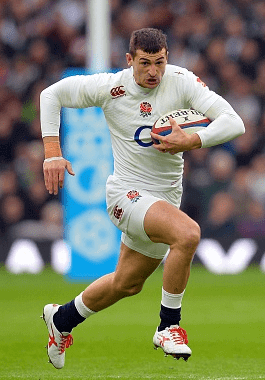
England
Emblem: Red rose
Team colors: White, red, and navy blue
My homeland keeps to the classic English look. We’ve kept it simple with the latest uniform: white, white, navy blue, with no silly accents. Extra props for the simple sleeve stripes and ditching the BFBS (yes, that’s also a thing in rugby union) away kit.
Scotland
Emblem: The thistle
Team colors: Blue and white (with red away kit)
Trust those Scots to pick a prickly, rather ugly flower as their national emblem. It’s known as the “guardian thistle,” because of legends regarding a Viking who stepped on a thistle and cried out in pain, alerting the Scottish defensemen. These days they confine the marauding to the rugby pitch and have recently returned to a classic white collar look, which I really like.
Wales
Team name: The Red Dragons
Emblem: Prince of Wales’s feathers
Team color: Red
The ultimate symbol of the Welsh nation (discounting daffodils and Tom Jones, of course), the Red Dragons have probably the best-looking of all the rugby crests and their all-red look is one level below the All Blacks in terms of classics. But they’re not looking so good at the moment, as their current Under Armour uniform set has lots of unnecessary black panels and a ridiculous GFGS away kit.
Ireland
Emblem: The shamrock
Colors: Green
The Irish’s simple look of green, white, and green never gets old, and their shamrock emblem is probably the most natural choice for a national symbol amongst these teams. The current strip, which has no unnecessary piping or striping, is probably the best of the Northern Hemisphere bunch.
France
Emblem: The Gallic rooster
Colors: Blue, white, and red
As an Englishmen, it’s easy to be cynical about the French jersey and emblem (why do you have a massive cock on your jersey?), but I will admit that the French do have a nice-looking team, with some of the best socks around. But I dislike the way the Adidas stripes on the shoulders wrap around the front of the arms and around the back of the neck — it’s too overcrowded.
Italy
Team name: Azzuri (Sky blues)
Emblem: Federation of Italian Rugby shield
Team colors: Blue and white
The most recent addition to the Six Nations, having joined in 2000, the Italians make up for their lack of wins (they’ve never finished better than fourth out of six in the tournament) by fielding a stylish look. I love their shade of blue, and mono-blue works for them. However, as with France, the wraparound stripe effect isn’t a great look and detracts a lot from an otherwise stylish jersey.
ESPN reminder: In case you missed it yesterday, my annual college hoops season preview is up now on ESPN.
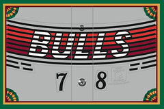
IMPORTANT! Membership update: Membership orders have slowed to a bare trickle lately. We still get the occasional new enrollee (including Brian Crago, whose card, based on the old Jacksonville Bulls’ helmet, is shown at right), but they’ve become few and far between.
And that presents a problem. For the sake of cost-efficiency, I get the cards printed in batches of eight. It used to be that we’d get eight orders every three or four weeks, so enrollees wouldn’t have to wait any longer than that for their cards. But these days it’s taking, like, two months, or even longer, to fill up an eight-card batch. So I’ve been faced with two choices: I can either ask people to wait a long time for their cards (which I don’t want to do, because it’s not fair to the enrollees), or I can print the cards in smaller batches (which I also don’t want to do, because it makes the cards too expensive to produce).
I’m wondering if maybe it’s simply time to shut down the membership program. That would make me a little bit sad, because it’s been a really fun project and I’d hate to see it end, but maybe it’s run its course and reached a saturation point with you folks.
If I’m wrong about that, now is the time to tell me. If you’ve been thinking of signing up for your own custom-made card, now is the time to order it. Because if we don’t get a bunch of new orders soon, I’m going to pull the plug.
As always, you can order your custom-made card here, you can see all the cards we’ve produced so far here, and you can see the step-by-step process by which we make the cards here.
NFL Superhero Project
By Thomas Correia
Thursdays mean the start of another week of football and another edition of my NFL Superhero Project. Tonight’s game between the Bills and the Dolphins translates into a fight between Marvel’s original villainous symbiote and DC’s king of the seven seas (click to enlarge):
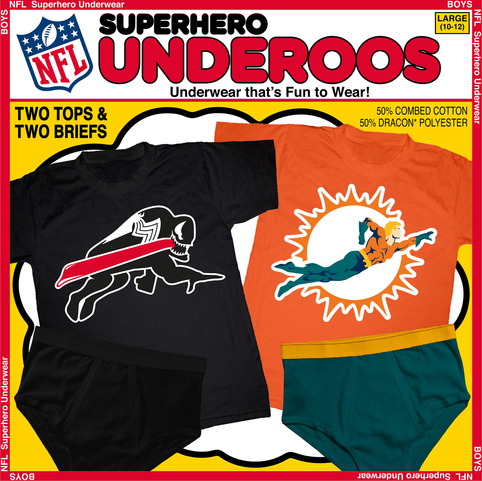
A large buffalo-sized hero to represent the Bills was hard to come by. Plus, what could I do about that red stripe in the logo? So then I thought of the possibility of opening up my project to include villains, and bam, it hit me — Venom! He’s a character with the perfect bulky build and his famously long tongue solved the red stripe issue in the best possible way. On top of all that, I’ve used the horn from the Bills’ logo as Venom’s eye.
There is no better hero to use for the Dolphins than DC’s Aquaman. Sure, you may think Marvel’s Sub-Mariner is just as good, but Aquaman is already wearing Miami’s colors (or vice versa). It took hours to piece together the perfect swim pose for him, but the longer it took, the more I got into it. This is one of my favorites from this project.
Use the comments below to toss up your best guess as to which two characters will be throwing down in next week’s game between the Chiefs and the Raiders.

Mike’s Question of the Week
By Mike Chamernik
What team, in your opinion, most needs to change back to a throwback uniform and logo design? Think of this as which team has the most to gain — the St. Louis Cardinals, for instance, looked great in the 1960s but they still look good today. Which team would benefit the most from a switch?
I would say the Sacramento Kings. They don’t look so hot now, but if the Kings went back to the Tiny Archibald era, or even the Kenny “The Jet” Smith” era, with the old logo, they’d look really nice. They’d go from outhouse to penthouse.
What do you all say? Post your responses in today’s comments.
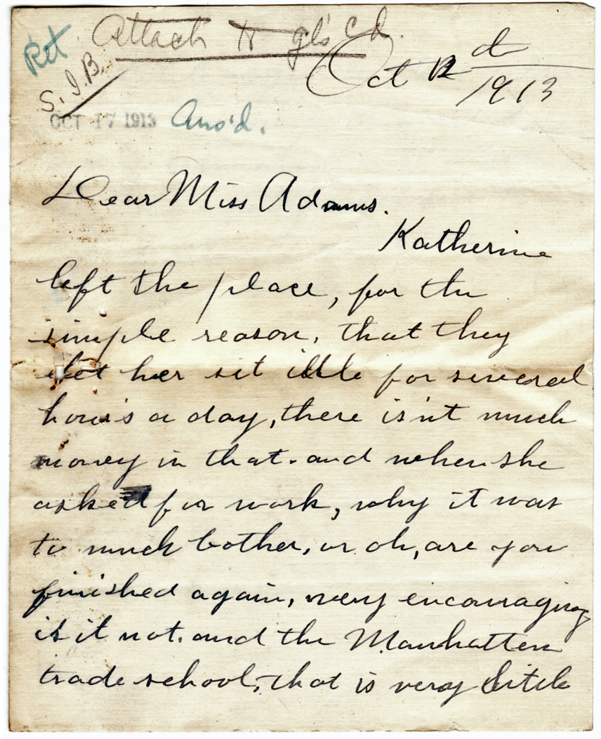
Big PermaRec news: I’m diving back into the pool of Manhattan Trade School report cards. Today’s student record packet includes a letter from the student’s mother (shown at right) in which she gets rather snippy with one of the school’s administrators. Get the full scoop over on Permanent Record.
Uni Watch News Ticker
By Mike Chamernik

Baseball News: Cubs prospect Kris Bryant has ivy-patterned sneakers. … Ted Williams was a pitchman for Sugar Crisp cereal and MLB logo patches in the 1950s (from Jonathan Daniel). … Also from Jonathan, the photo behind a Ted Williams card with an interesting backstory is up for bid. … Michael Clary found a trading card that showed a Cubs player wearing oddly-patterned stirrups — blue on top, red on the bottom with alternating stripes. ” I’ve checked other Cubs cards from the 50’s-60’s, and Dressed To The Nines, but haven’t yet found anything similar. Possibly just an error from the Topps Art Department?” … These wood coasters have ballpark layouts printed onto them! Very cool (from Jason Werth).

NFL News: The Packers’ website is in full Acme Packers mode and their Facebook page has a throwback banner. … The trend of re-imagining NFL team logos as something else has finally reached its logical conclusion. I’m Mr. Logo Mash-Up Buzzkill, so this one warmed my heart. … Here’s the story behind the Rams’ horns (from Douglas Ford). … On Sunday, Richard Sherman wore shoes printed with the feather pattern that shows up on the Seahawks helmets, numbers and pants (from Kyle Hanks). … The 1968 Western Conference Championship Game program’s cover shows all the helmets from the teams in the conference. By the way, it’s funny that Baltimore was considered west (from Douglas Ford). … Eric Bangeman found a 1972 news clip where Brent Musburger narrated highlights from a scrimmage between the Chicago Bears and St. Louis Cardinals. “Of interest was the Chicago Bears wearing block uniform numbers and the Cardinals sporting blank white helmets,” Eric says. ”¦ Cowboys WR Dez Bryant gave Air Jordan shoes to the team’s offensive linemen (thanks, Brinke). ”¦ “Ellen DeGeneres had Sophia Vergera on her show on Wednesday, and apparently Sophia is a big fan of the NY Giants,” says Alex Bending. “She has a heavy Latin accent and pronounces them as the ‘Yiants,’ so Ellen made a special ‘Yiants’ jersey for her, although it actually looks more like a Colts jersey.” ”¦ Next Monday night’s Steelers/Titans game is slated to have the longest-surnamed QB matchup in NFL history — a combined 26 letters. Can someone please sign Jarrod Saltalamacchia from the practice squad? (From Jerry Wolper.)

College and High School Football News: Maryland will wear black jerseys against Michigan State. … The New Orleans Times-Picayune is holding a best prep helmet in Louisiana contest. “The interesting thing is that they’ve divided it up into categories, the first of which is ‘classic style,'” says Joel Manuel. … Bowling Green wore gray jerseys with orange helmets and pants last night (from Phil). … Arkansas State will wear red helmets with stars and stripes lettering on Saturday (from Clay Jack). … Marshall has a display in its library in remembrance of the 1970 plane crash (from Coleman Mullins). ”¦ “I’m praying this end zone shot of Mississippi State’s Scott Field is just a Photoshop — otherwise I’m going to be sick,” says Dustin Semore. “I imagine it is ’shopped, considering Mississippi State is on the road this Saturday.” ”¦ Mono-white tonight for ECU. Here’s a close-up of the helmet (both from Phil).

Hockey News: Here’s an “It won’t be that bad,” argument for ads on NHL jerseys (from Phil). … But, add this to the (long) list of downsides to ads on uniforms: The rich teams may get richer and the poor teams will, well, get a little less richer. … The Lightning will debut their new “Bolts” alternates tonight (from Phil). … “Just passing on a couple of recent Canadian hockey military tribute uniforms, which I think are far classier than the camouflage pretend-soldier garbage foisted on us by MLB and the NHL,” says Rob Yasinsac. ”¦ Star Wars-themed jerseys this weekend for the Cincinnati Cyclones.

Soccer News: New York City FC will unveil its uniforms today and has already released its inaugural season logo (from Chance Michaels). … Huntelaar of Netherlands had some serious number and lettering issues on his jersey yesterday (from Phil).

Basketball News: Paul Millsap’s jersey was misspelled last night. That the NBA’s second NOB typo of the week so far (from Phil). … The people who’ve been cybersquatting the Nets.com domain name have revealed themselves. … New Mexico will wear unis with camo lettering on Friday.

Grab Bag: Whoa, check out all that exists in what Douglas Ford calls a Uni Watch Wonderland! None of those items are for sale, though — it just seems that some magnate is showing off his goods. What a tease. … Here’s a book about the stories behind 29 classic logos. Also, designers are creating a new font from satellite imagery (both from Jay Sullivan). … The University of Richmond’s equipment manager is retiring (from Tommy Turner). … New logo for Pizza Hut. … Here are some amusing newspaper correction items. The unofficial Uni Watch corrections section is called “Thanks. Fixed.”

What Paul did last night: So last night I’m on subway and there’s this dude with a big shopping bag full of bread sitting on the floor in front of him. He’s intently ripping the bread into small pieces — as soon as he finishes this with one piece, he rummages through to bag to find another unripped piece and begins work on that one. Is he doing this to build up strength in his hands? As a form of therapy? Out of some sort of obsessive-compulsive impulse? To get an early start on his Thanksgiving stuffing?

You’re not supposed to talk to strangers on the New York City subway, especially ones who are doing something that could be considered a bit crazy, but my curiosity gets the best of me and I approach the guy. “Excuse me,” I say. “Why are you doing that to all the bread?”
“It’s for soup,” he replies, in an accent I can’t quite place. “Oh, soup,” I say. “Do you own a restaurant?” He nods and returns his attention to the task at hand.
I’m sure there’s a cheap joke to be made here about the health department and not ordering soup anytime soon, etc. But my preferred takeaway is this: You never know what you’ll see on the New York City subway, which is one of the things I love about it.

link
Some of the links in the rugby article are out of date, France is now using this jersey
And that is one seriously ugly shirt
The All Blacks jersey is out of date as well.
They’ve removed the white and gone to s silver tone for the logos and sponsor.
link
There’s something deliciously ironic about the All Blacks being sponsored by a bank that was anything but all-black in 2008.
Also, so sad to see an iconic international uniform ruined by a sponsor.
And the England jersey has changed as well. No more Blue on the sleeves.
link
New Ireland Kit.
Ruined by an absolutely horrible sponsor logo.
link
Sweet Jesus, that is bloody awful. Much worse than the stupid O that I whined about earlier this morning.
NFL geography is always odd. For a good while Phoenix was in the NFC east, with only five teams located farther to the west. Currently AFC South Indianapolis is north of AFC North teams Cincinnati and Baltimore.
Not to mention that Miami, which is much further south of Baltimore – and west of it, to boot – is in the AFC East.
And, of course, there’s Dallas. All in the name of preserving old rivalries.
And preserving old rivalries is a bad thing? I think the NFL and MLB are both right to keep traditional rivalries intact.
indeed. The division naming scheme is the trouble, I think, since they’re never going to preserve the rivalries and such with a purely geographic scheme. I used to spend HOURS colouring in maps of the ’48 States to try and come up with different alignments. It always ended up a bit of an ugly mess, the Cowboys NEVER got to play against any of the teams they want a regular game with.
Maybe if the NFL was that bothered, they could just rename the divisions with letters, in World Cup style :p
Emulate the old time NHL and name divisions for great figures of the past, examples:
NFCE: Landry division
NFCN: Halas division
AFCW: Madden division
But then you “alienate” newcomers who don’t know what they mean and get all confused because they’re not easy geographical names and all…
… oh, wait, the NHL’s already screwed the pooch on that by introducing the “Metropolitan Division” into their current alignment.
I’ve said it before, I’ll say it again – the old NHL division and conference names actually helped encourage me to become a student of the game and its history. By going geographical or otherwise nonindicative, the leagues are taking the lazy way out by treating their fans as morons – OH, WAIT, THEY DO THAT ANYWAY.
Jeez, DenverGregg, you could have at least named all 8 divisions:
NFCE: Landry Division
NFCN: Halas Division
NFCS: Lombardi Division
NFCW: Walsh Division
AFCE: Shula Division
AFCN: Noll Division
AFCS: Brown Divison
AFCW: Madden Division
I am a Steelers fan.
How can you have the Bengals and the Browns in the Noll division and not the Brown division?
Also, to solve the AFC problem is simple.
Move Miami to the South, Indianapolis to the North, Baltimore to the East.
Done.
It’s odd that Fred Gehrke was denied enlistment into the military due to a old leg injury, but 5 years later starts playing pro football as a kick returner.
I guess our military is/was a lot more fit that our athletes.
As it should be.
The Milwaukee Brewers would look best with the old MB glove and ball logo. At Miller Park it would be safe to say more than half of the fans are wearing that logo and colors. The fans love it when the team wears the throwbacks. Their current set looks too corporate(Miller)and generic.
See, this is what I just don’t get about the Brewers critiques. Basically everyone says the same two things: The current uniforms are too “corporate,” in that they specifically remind people of Miller beer, and too “generic.” But both critiques cannot be true at the same time. The Brewers can either be too specific or too generic. Can’t be both. Either critique falsifies the other.
As for “generic,” the MB glove logo is easily in the Top Ten generic logos of all time. Not just sports, but across the entire span of American commerce, ever. An M and a B in the shape of a baseball glove? That says nothing about the team, the city, or anything at all. “We play baseball” is the only thing it communicates; it makes the average NBA logo look like the height of abstract sophistication. It’s a fun design! I like the whimsy of it. But if “generic” is a problem, then the ball-in-glove logo is obviously worse than the current logo set, which is quite distinctive from all other MLB teams and speaks directly and specifically to the beery identity of the team.
I dunno, man…I think a LOT of corporate design is generic. That’s the problem with it! Look at the new Super Bowl identity the NFL has been using…it’s boring, it lacks character or whimsy of ANY kind…it makes you think “annual report”. Maybe I’m just splitting hairs, but I think it can absolutely be both.
Note: Arguing definitions is pretty much my favorite sport. (It’s the line of conversation most likely to make me change my own opinions.) So take what follows in that spirit.
To my mind, what you’re describing – and I think you’re describing a real and important thing – is not “generic” but more like “misguided” or “inappropriate.” You read something very specific from the Brewers identity. That’s the opposite of generic. But the thing you’re reading from the identity is the wrong thing – it’s not baseball, it’s not fun and sport, it’s maybe not even Milwaukee. That critique I understand. I disagree, but it’s a totally valid complaint, and one widely shared, so I’m probably completely wrong. Still, that’s not generic. Generic is the link. “Generic” is the thing that doesn’t communicate anything but the name or purpose of the thing itself. It’s the NBA logo that mainly consists of a basketball. It’s the MLB logo that just has a glove and a ball.
A “generic” baseball uniform could belong to anybody. That’s not true of the Brewers. Dress any other team in that uniform, even if you changed the word on the chest, and people would wonder, “Why do the Padres look like a beer label?” Whereas it’s possible to make almost any combination of letters sort of work in the format of the ball-in-glove logo. So turn “tb” into a ball-in-glove logo equivalent to the classic Brewers mark, slap that on the Rays’ chest, and nobody would think twice. “Yeah, that’s a baseball team,” would be the main reaction. That’s what “generic” means to me. It’s a logo that communicates nothing specific, whereas the issue that most people seem to have with the current Brewers uniforms is that it communicates something very specific, and that specific thing is the wrong thing for the uniform to communicate.
I think the Brewers ball-and-glove logo is pretty specific. See it, and one automatically thinks “Milwaukee Brewers.” I don’t think the Yankees or Reds could appropriate it into their uniform. The current emblem, however – replace the wordmark with about half the teams in the league, and it would fit using another name. That’s generic.
I think the Brewers ball-and-glove logo is pretty specific. See it, and one automatically thinks “Milwaukee Brewers.”
That’s only because they wore it for so many years, and you’re a baseball fan. Show it to a non-sports fan, and it’s a baseball in a glove, and they might not even notice that it’s also an MB – it looks like something you’d see on a $7 kids t-shirt in Walmart, on the same rack as the shirt with a red football helmet with a blue star on it.
My misgiving about the “Ball+Glove” insignia is not a generic quality, but that it overplays cleverness. It would make a good hockey crest, where it could be writ large on the front of a sweater. Baseball iconography needs to be more spare, less open to interpretation.
Second that. Additionally, it simply takes up too much real estate on the front of the cap. The Brewers’ “MB” and the Indians’ Wahoo-head cap (when they wear it) both suffer from being simply too big for the cap panel.
Ha! Just goes to show how varied taste can be: The apparent size of the ball-in-glove logo on the cap is one of the things I like most about the design.
I’d like to see a tweak with the Brewers’ modern design, but with the older brighter colors. I think that might help.
On second thought, the current number font would still annoy me. Just go throwback!
^^^ THIS
Perhaps it’s nostalgia bias to when I first got into baseball in the mid-’80s while growing up near Milwaukee, but the Brewers’ “MB Glove” logo and associated uniform sets (particularly the one from 1978-89) is always the one that makes me think “Brewers.” That always happens to me when I see that logo, well, anywhere: THAT’S the Brewers, much more so than the current one. I kinda wish Mark Attanasio would finally pull the trigger on his earlier attempt from the last decade to once and for all make the change back to the “MB Glove.”
Mike’s Question of the Week: Philadelphia Eagles. Either the Kelly Green, Silver and White from the Reggie White/Randall Cunningham era and the Eagle with football in talons logo, or something along the likes of the Jaworski/Montgomery era. No more cartoon Eagle head. No more “Midnight Green”. No more black (although their, hopefully, one-shot all-black uniform wasn’t as bad as I thought it could be).
link
OR
link
Hank beat me to it. Agree on all parts. Hell, I’d even be okay with the bare-bones 60’s look (As long as it wasn’t paired with the white helmet)
QotW – easily the Atlanta Falcons. All of their pre-2003 looks were at least good, but 1991 would probably be the best of the bunch.
Right on. They instantly went from a very solid look to horrible with their ’03 change.
Indeed. They’d look best with either their original duds (black jersey/red helmet), or with a color-reversed (red jersey/black helmet) version of the same.
I wonder if the following statement is true.
Fact 1: The Washington NFL logo is outdated and considered offensive; the team name is a slur against a specific group. Many other similar graphics have been dropped in favor of more modern symbols.
Fact 2: The team is owned by a gigantic tool who is reviled by everyone, made his money in telemarketing, and once sold the official mattress of Six Flags and vowed the name will only change over his (figurative) dead body.
I wonder if the increasing protests against the logo are motivated as much by Fact 2 as they are by Fact 1?
Well, Six Flags is a particularly crappy company, but I don’t think people are very motivated by option #2.
I don’t know how he made his money, and I don’t care how he did. It’s irrelevant.
Paul, open up the membership (more than one day per year) to people who like purple and maybe you won’t have to shut it down.
(btw, if that’s “the old Jacksonville Bulls helmet”, what does the NEW one look like?)
‘Old’ refers to the Bulls, meaning the franchise is old. Were it an old helmet vs a new helmet, it would be the “Jacksonville Bulls old helmet”.
For the helmets alone, they ought to have kept the USFL.
The French rugby side used to wear a beautiful blue shirt, white shorts and red socks representing their tri-color flag. They have gotten away from it to be more stylish. I don’t personally care for their current unis.
QOTW:
Baseball: Easy, the Astros. They should’ve gone back to this with the latest uni change. link
Football: The Bucs. I don’t know what to call the monstrosity they’re wearing now, but either of their two previous unis would be a vast improvement
Basketball: The Bucks. I loved these. link
Hockey: The Devils. Need the green back.
Bucks link not going where I wanted. Imagine the Sidney Moncrief era Bucks.
Agree.
I’ve said this before, but I firmly believe that the Astros plan to adopt precisely that uniform, once they’re nearer the end of rebuilding. The only reason they haven’t already is because they didn’t want that uniform associated with 100-loss season after 100-loss season.
Thanks, Robert Naylor. With the significant exception of Wales, I think the national rugby unis featured today are really pretty good, especially when compared to some of their schlocky counterparts in soccer. [The Welsh situation is grievous, though: their red shirt white shorts green socks outfit was a real beauty.]
Naturally, I hate the commercial shyte on the jerseys. A large white zero on the shirts of the bold lads of Erin is particularly painful. As Padday has pointed out, only the French have resisted, making that excellent rooster all the more awesome.
And I do love those little national symbols. Rose, thistle, dragon, shamrock, fern, kangaroo, antelope, cat.
Ack-wuh-Man!!
The Superhero Project is great this week, TC. That being said, does anyone else think of this whenever they hear “Aquaman”?
link
Haha! Thanks Clarybird.
What are you, Canadian?
Eh? I’m just sitting here on the chesterfield eating some Kraft Dinner, wiping my face with a serviette, and counting my loonies to see if I have enough to pay the hydro bill.
I hate to do this on Paul’s site but Wow.
I never knew being Canadian was an insult. This must be a reality in American Education..
“We Ameerricans ain’t gonna take any shite from any non US-Amerrican not today or neeverr. Now git me my rifle so I can shoot people .
Dumb Guy’s answer must really be by a dumb guy.
I plead igornance to a lot but this is a perfect example of dumb-uneducated amerricaan people.
AKA Dumb Guy & Rob S
Simmer down Rydell….
I can speak only for myself here, but I was only noting a difference in words/pronunciations that (some) Canadians use in place of words that (some) US folks use.
*I* certainly wasn’t headed in the insult (even sarcastically) direction. I don’t think Rob S. was going there either.
reminds me of Robot Chicken
Question of the Day:
Immediatly off the top of my head has to be the Philly Eagles to kelly green. Pitts Penguins back to black and yellow (make their new third the official home). You know we all want to see the MIGHTY DUCKS make a return!
There are so much more… But I’ll leave it at that.
As a lifelong fan of all the Pittsburgh teams, I second your call for the return of the Penguins’ “Pittsburgh Gold” that they are currently using for the third jersey. Not sure what other people think of this opinion, but when the Mighty Ducks joined the NHL, I was hoping they would have had the same uniform style that was used in the original movie.
No soup for you.
Hey, lots of people use morning train-time to prep for their day’s work.
(I thought maybe he just knew a lot of ducks)
Re Mike’s Question of the Week: The link, the arguments for which are link on the interwebs…
I was going to second Mike’s suggestion of the Kings, but you’re right…the Padres need to go brown first!
As much as I LOVED the KC Kings uniforms, I don’t mind Sacramento’s current look. My only quibble is the KingS on the chest. Otherwise, the colors are nice (even the BFBS, because it has the geat Kings script), the striping doesn’t bother me…and yes, Phil, I even kinda like the unusual number font.
In fact, the Kings wouldn’t even be my first NBA choice. I’d go with Atlanta or Houston first. One of those teams really needs to go back to ketchup and mustard.
QOTW: The Penguins to the early-Lemieux uniforms, although they’re in the right direction with the new third uniforms. For teams that have a throwback that HAVEN’T been revived, I’d go with the link, which aside from the league-mandated 1994 throwback year haven’t been brought back. I’d like to see Cincy make the orange alternates their regular colored jersey (Bengal tigers are orange) and bring these beautys back as their third uniform.
Even though their striped helmet is totally creative and unique, I always liked their plain “BENGALS” helmet a little more, for some reason.
I have always envisioned that helmet in a gold (similar to LSU’s helmet color) and black. I think it would look great.
Man, I would TOTALLY buy that Aquaman/Dolphins set. Nice job.
Thanks Rob!
QOTW: Finding the best combo of a terrible current set and awesome throwback set is proving harder than it looks. Most of the throwback sets I love the most are owned by teams that don’t look like a mess right now ([Mighty] Ducks, Penguins, Angels, etc). The Falcons are a good pick to go back to the 90s set, but I don’t hate their current set as much as some people on here do, though they were much better when their black jersey was their regular jersey and their red was their alt.
My two answers are both Florida teams: the Marlins and the Jags. I hated the Marlins before they switched to their current set because of how much they were using black, which is a very non-Miami baseball color. Their current set it is a joke, they got rid of their good parts in favor of a bunch of colors that don’t go together and kept the too-much black. I’d definitely suggest a return to the major use of teal as the primary color on both the hats and jerseys.
The other one being the Jaguars. Not necessarily because they’ve had great uniforms in the past, but because their current set is just so terrible; from top to bottom. I sort of liked their previous helmet that was black in some light and teal in other light, but if they picked either that one or their original black helmet and brought back the original Brunell-era uniform to go with it, it’d be a drastic improvement.
QotW: Jacksonville Jaguars – 1995
I’m not a fan of jersey sponsors for any american pro sport, yet if it happens, I agree that there should be a percentage-revenue sharing mechanism among the league.
Loved the subway article and pic. I take taxis now unless I am headed out to Yankee stadium.
The Penguins would definitely be well-served to return to the early 90s look full time…it seems like things always circle back, especially in hockey.
But my vote would probably go to the NE Patriots…I can’t stand them AT ALL but if they slapped Pat Patriot back on those helmets I’d at least be okay with having to watch them 10 times a season!
QOTW. We’ve seen it a couple of times in the EDGE era of the NHL, but the Calgary Flames need to go back to Square One, and away from the black induced crap with the side panels.
QOTW: ask me next year.. and the answer will be the Browns
Oh man, as an old school Browns fan who loves our unis (sans the brown pants) I am “awaiting the hammer” with the changes coming! :-(
NFL: I think the St. Louis Rams Blue & Yellow jerseys are so much nicer than what they currently wear. Maybe if they move back to LA, they will go back to the old uniforms.
NBA: Orlando Magic, Shaq & Penny era jerseys are superior to the current uniform.
MLB: Agree about the Brewers.
I actually like the new Magic gray uniforms better than anything they’ve ever worn. The originals were fun, but I didn’t like that they used a star for both an a and a dot for the i. That was really annoying.
For me a bunch of teams come to mind.
Brewers
Patriots
Seahawks
Sabres
Eagles
Rams
Buccaneers
Basically any team that switched to a dark color scheme. Brighter colors look great on TV and all this black and navy blue just looks like mud.
QOTW: So far, all the suggestions above are excellent. By my estimation, half the teams in existence would be better served by reverting to one of the old uniforms hanging in the wardrobe. So let me suggest one I haven’t seen yet: I’d like to see the Phillies turn back to the Steve Carlton-era threads. No compromises: the zipper, the vertically-arched player names, the white squatchee, and the Honolulu Blue road suits must be featured. Does anybody else notice the vertical striping of the shoulders and down the sides makes the players look bigger? At least one team ought to have it.
QotW:
MLB: Padres (to 1969)
NBA: Hawks (to 1982 if not to 1971)
NFL: Eagles (to 1974-84 if the sleeve stripes can be reproduced), Falcons (to 1969), Patriots (to 1992)
NHL: Kings (to 1992; no need to be the Lakers on ice again, but lose the shoe brand-style logo), Stars (to what, I’m not sure; maybe 1993 but with Minnesota colors?)
For Chiefs vs. Raiders, how about an X-verse clash between Thunderbird (or Warpath, if you prefer) and Corsair?
Marvel bought the Star Wars franchise, so the Raiders HAVE to be the artist formerly known as Anakin Skywalker, right?
But if you don’t want to make that stretch, I suppose you could go with modern-day Nick Fury.
Kellogg,
Thunderbird vs Corsair? Whoa! NERD ALERT!! . . . Just kidding Kellogg. Being the guy making NFL/Superhero logos, I’m clearly a bigger nerd.
Jim,
I did not include any Star Wars into this project. It’s strictly Marvel & DC (plus the NFL/Star Wars thing has already been done). I see the eye patch connection for Fury but he wasn’t the choice.
Keep guessing guys.
I’d guess the Raiders are probably some version of Ghost Rider due to having a skull head and what the fans in the black hole tend to look like.
I had already used Ghost Rider for the Buccaneers (see post on Thu, Sept 18)… But you are real close with the skull head reference.
Ok, Dr. Phosphorus seem too obscure and the Red Skull’s colors won’t work, so I’ll say Crossbones. For the Chiefs, what about Daredevil? Right color, and the interlocking DD mirrors the KC.
Given that hint, I’m thinking the Punisher. He’s got the skull logo, and he’d fit with the Raider Image(tm) which… doesn’t really exist now that the team has been terrible for over a decade.
*sigh*
Arrgh. I’m trying too hard. Punisher makes much more sense.
Kellogg,
Sorry but it’s not Dr. Phosphorus or Crossbones for the Raiders. Daredevil was a good guess for the Chiefs but I saved him for an upcoming team that also has interlocking letters.
Jeff,
You nailed it! It’s THE PUNISHER for Raiders. Congrats!
Here’s a Chiefs hint: Think team colors.
The Big Red Cheese, aka DC’s Captain Marvel.
Good guess but nope. It is a DC hero that wears Chiefs colors.
The Flash would fit the bill color-wise, but seems an odd match for the Chiefs. Apache Chief just seems waaay wrong. Hawkman? The Creeper?
You’re right Rob. It is FLASH . . . and it is indeed an odd match for the Chiefs. I admit that not every team/hero match is a winner, but hopefully you’ll like the execution of it when it’s posted next week.
By the way, Hawkman will be making an appearance later this season. Creeper didn’t make the cut.
Arrowhead…red and yellow…
Speedy?
That’s an absolutely brilliant guess, Winter.
It actually makes more sense than The Flash, who I really did create for the Chiefs. I might have to revisit that logo in the future. Thanks.
Cant BELIEVE I didn’t think of Speedy!
Ah, good ol’ Roy Harper… too bad the comics haven’t been too kind to him in the past few years.
Just a shout-out to an incredible rugby feature, and a splendid Permanent Entry edition. This website is an embarrassment of riches! I sometimes feel I’m dishonoring the effort and care that went into writing these pieces, when I haul off and comment on the low-hanging fruit like “Favorite Throwback Uniforms”.
QOTW: Vancouver Canucks. Over the years they have worn throwbacks to their first year design (two stripes with the white v on the sleeves) and I think it looks as good as any of the original six uniforms.
NYCFC kit has been leaked
link
Manchester City copy, who’d have guessed?
QOTW:
This one is made local, but I, along with a lot of other people think the AAA Nashville Sounds should change back to the gorgeous suga shown here: link
That’s a Reebok Colts Peyton jersey Sophia got. No one on the show knew what a Giants jersey looked like?
Well you know… it started as a blue “Manning” jersey… that’s close enough, right?
Also… where did they get a GIANTS helmet with a gray facemask? That logo was never paired with anything but a white mask.
QOTW: Gotta go with the Brewers as well. The current uniform set has grown on me despite the proliferation of alternate jerseys (I do love the ‘Milwaukee’ script on the alt away). Going back to the more vibrant blue color would be nice. Not necessarily a straight throwback, but maybe an update of the older design.
Membership cards: Looks like the time is now to finally get one!
QotD: Penguins, Pitt (halfway there with the return of script), Bucco Bruce, Pat Patriot and early 80s LA Kings.
Also Lions in proper Honolulu Blue and Silver (70s and early 80s… silver number, NOT white number outlined in silver)
YES!! They sparkled!
Ah, yes, the Gary Danielson era. I wouldn’t mind seeing the Lions go back to that look at all. They could still keep the modern logo, so long as they changed the outline from black to silver.
link.
It basically looks like an Adidas version of the link.
Wonder why that is?
Well, yeah, parent club and all, and we knew the team colors were going to be the same.
But I thought it would look more like link. It basically looks like one of those internet projects where someone says “What would ____ look like if it was Adidas instead of Nike?”: thick white collar and white shorts.
Man City has used various combinations of sky blue and white/navy/black, so I was surprised to see something that was so close to their recent, but not their current look.
Gotta love England’s rugby look…plus that’s one sweet NOB:
link
Congratulations on your first international cap, Jim! ;-)
Great responses – the Eagles, Padres and Falcons are no-brainer choices. Good stuff!
Yeah, putting the Padres in brown obviously means they have no brain…
Since a few people already mentioned the Marlins (worst uni in MLB) I would say the Padres. They should go back to their underrated 1990’s pinstriped navy/orange set. Just please, no brown.
This wasn’t supposed to go here. Oh Firefox…
The brown pinstripe set just before those are underrated:
link
link
Reminds me of Caldor…….and the 80’s. No thank you.
I like the brown because it’s different. It’s a look that the Padres own(ed). Several teams do blue and orange already.
THAT I agree with. The only case I accept brown is if its paired with baby/Carolina blue. I guess they could steal that color from their current set and make it happen. But no orange or yellow.
A lot of teams need to Turn Back the Clock. Eschewing some of the obvious, older, more established teams in pro sports who have messed up perfectly good looks, I’ll suggest a newer candidate in the Tampa Bay Lighting. The current look is so bland, boring, and borrowed (Red Wings template, Maple Leafs colors, Grateful Dead logo). They had one of the best jerseys of the expansion era. The logo might still be worthy of improvement, but the colors and stripes were so much better: link
QOTW: I would like to see the Denver Broncos go back to the their pre-1997 set.
Yes!
As a Broncos fan, that’s a tough one for me, but I think I would have to agree. I like the Broncos’ current uniforms, but part of me still pines for the old orange and royal blue duds that I grew up watching John Elway wear. It remains one of the most distinctive uniform looks ever worn in the NFL.
There’s audio of a Verizon ad that keeps repeating on the Uni Watch page. Where is it coming from? Is there any way to make it stop? Ugh.
When did Johnny Manziel start playing rugby?
In addition to my above-mentioned advocating for the Brewers to return to their 1978-89 look (or a modernization), the following:
MLB:
Arizona (original/World Series winning purple look)
Cincinnati (Big Red Machine era)
NFL:
St. Louis (blue-gold ’70s-’90s look)
NBA:
Atlanta (’80s “Dominique” uni/logo set — though, of course, the logo’s already back as an alternate, and there’s that word of a coming uni change, so maybe this is already happening?)
They’ve been mentioned but I think the Astros are most in need of going full throwback. They’ve been through god knows how many changes and they’ve still never come close to the ‘Shooting Star’ era.
In the NFL I nominate the Broncos. The current unis are awful (IMHO) and while the Orange Crush era duds were not particularly innovative, I thought they were striking.
A caveat: The Broncos have to use the terra-cotta colored jerseys from pre-1978.
Not big on BFBS (though the Lightning wore black at birth), but I love their thirds for a couple of reasons. They look good, number one, and they piss people off who don’t matter because they say “BOLTS” on them. Which pleases me to no end.
QOTW: I’d say Celtic could do with going back to the 95-97 home effort:
the uneven hoops emphasise the green at a distance instead of washing them out, the shirt numbers were gorgeous in green block within a tight white box(link), even the sponsor wasn’t too jarring, in simple white fitting into the main design
the only downside is that they might lose the famous numbered shorts, unless competition regulations step in and save it :p
would help to include a proper team photo of the kit, wouldn’t it? link
Rugby lede is really disappointing with all of the uniform inaccuracies. The uniforms shown for Ireland, New Zealand, and France are all out of date.
Brent Musburger narrated highlights from a scrimmage between the Chicago Bears and St. Louis Cardinals. “Of interest was the Chicago Bears wearing block uniform numbers and the Cardinals sporting blank white helmets,”
Uh oh…prepare for the inevitable Stevie McQuistan comment faux-reminiscing about the ’76 Seahawks…
I thought of that too!
Call me Rosetta S. …
Wouldn’t “Giants” in Spanish be pronounced “Hiants”?
Or is Sophia doing some internal Sound translating first, THEN saying “Yiants”? (Giants=Jiants=Yiants?)
Just curious. Ole!!
The English “J” sound in “Giants” doesn’t exist in (standard) Spanish, so a native Spanish speaker will tend to reach for a consonant he CAN pronounce that bears the greatest similarity.
Now, we hear a “Y” when Latin Americans pronounce Spanish words like “pollo” and “llame,” but the sound is actually a bit tenser and “chewier” than the English Y-consonant. In fact, several lower-class Spanish dialects pronounce “ll” as a zh-sound, or even as English “J.” So if you’re a native Spanish speaker, and you’re trying to pronounce an English word with a J-sound in it, the “ll” sound will seem like the nearest equivalent.
QOTW:
Cleveland Cavaliers 2003 (i.e. LeBron Part I)
Current one isn’t terrible, but it’s bland and not distinctive. I generally like clean uniforms, but there’s just nothing memorable about it except that there’s like 4 different variations.
The previous set was modern without trying too hard, unmistakably distinctive without being tacky, and the accents brought out what are otherwise pretty muted colors. Such a great set – Cavs fan should’ve been more upset about losing those unis than arguably the best American athlete of his generation.
Also, I want to say Oklahoma City Thunder, but the franchise history isn’t treated as continuous, is it?
QOTW:
Can’t believe no one has mentioned (or either I just missed it) the Marlins. Even though they were both the “it” colors of the 90s, the black and aqua look worked for me…with any of the hat/helmet color combos, and I can’t think of any team that could gain more by reverting.
And after getting a chance to actually read the comments instead of skimming to catch up, I see it has been mentioned already
Oh, yeah, totally. Never came to mind as I was pondering this question myself, but when you say it, it seems so obvious. Their uniforms right now are pure crap, easily the worst in the big leagues (and among the worst in all of professional baseball, rookie league excepted). Their original uniforms remain among the best of the expansion era.
Otherwise, I had been leaning toward Vikings, Phillies (back to their burgundy era), and Nationals (back to link).
I agree w/ the Nationals/Expos look, but I’m ambivalent to the Phillies (I think their current uni is one of the more under-appreciated looks in the big 4) and even though I know it has the potential to become dated very soon, I don’t mind the Vikings look at all. Plus, I’m willing to bet that Nike will change the look again before it becomes too dated, I don’t imagine they’re too worried about creating something timeless. Same goes for the Bucs, Jags, Dolphins and whatever monstrosity they roll out in Cleveland next season.
I’d love to see them go back to primary teal–but lose the black entirely. So I don’t want a genuine throwback so much as I want them to go back to a very early aesthetic fork in the road, and take the other choice.
QoTW:
Texas MLB (pre-1983, the 2 button pullover preferred):
link
On second thought, make that the Tennessee NFL team.
Here’s an excellent concept from a while back (thanks, Ronnie Poore!):
link
I’m surprised no one noticed this: another interesting note about Sophia Vergara’s “Yiants” jersey is that it’s made by Reebok, not Nike. Not sure where Ellen found a Reebok NFL jersey and I’m also surprised Nike didn’t jump all over her for not giving her a Nike jersey. In the 3rd photo on that Imgur page you can clearly see the Reebok logo
QOTW – Steelers. Get rid of the Nike numerals and GO. BACK. TO. BLOCK.
This still irritates me some 16-17 seasons into the change.
Yes, yes, a thousand times yes.
Is the Steelers 1998- numeral font a new Nike thing, or is it the font that they’ve used on their helmet numbers since all the way back to the 70s?
link
QotW:
MLB: Mariners | link
NFL: Patriots | link
NHL: Capitals | link
NCAAF: Aggies | link
// Badgers | link
MLB: Phillies – Maroon look (I like the current look, but it is difficult to beat that maroon cap!)
NFL: Broncos – Orange Crush (I hate the Broncos with a white hot heat, but to me, their current set seems reserved for the late 90’s.)
NHL: Hurricanes – Drop the name and go back to the Hartford Whalers look, and fast.
NBA: Mavericks – For some reason, I really like this team in green.
In addition to the NYCFC jerseys, we got a peek at link. The old numbers with a small diagonal break and the new MLS logo.
First – almost every team in the big 4 sports would look better by throwing back to an earlier look. It’s really hard to pick, but:
NFL – Falcons edge out the Eagles, because this is gorgeous
link and their current uniform is just awful.
NBA – It’s hard to argue against Sacramento (the single worst looking team in the big 4), but I’m going with Houston. Remember the time you guys won two titles wearing these really nice, underrated uni’s?
link
MLB – Easy. link
NHL – Come on, Calgary
link
QOTW: Brewers. Obviously. link, but I’d accept pretty much anything from before the current set.
That set deserves a 2nd chance.
Yes. The late-90s Brewers set is seriously underrated.
I was about to say that the guy in the photo looks like he doesn’t have a hand due to the camera angle, but then I saw it was Jim Abbott. I don’t think enough is made about how remarkable he was — a very good pitcher that didn’t have a right hand.
“What team, in your opinion, most needs to change back to a throwback uniform and logo design?”
The Cincinnati Reds
The Reds need to go back to an button-up front jersey version of their block-lettered 1989-1992 road uniforms.
The recent (road) uniforms designed by Brandiose are simply awful. The CINCINNATI lettering on the front is too busy and small.
When the original jerseys made their debut at RedsFest in 2006, the lettering on the front was taller and so were the numbers on the back, and they looked great.
But now, not so much.
Oh, and drop the black completely.
QotW:
MLB: The San Diego Padres need to go back to brown. I don’t care which of their various brown uniforms they choose. Any of them are better than what they wear now.
NFL: I agree with most everyone’s comments on other teams that have been brought up, so I’ll nominate two teams that I think could keep their current logos and helmets, but change up to uniform styles from their past. The Arizona Cardinals should go back to link, their inaugural season in the desert. And the Miami Dolphins should go back to link below the helmet, if for no other reason than to get some more of that great coral-orange back into their color scheme.
NHL: Los Angeles Kings. I blame the Kings for launching the BFBS craze link when they co-opted the Raiders’ colors during Gretzky’s first season with the team. I think the Kings should go back to the uniforms they wore link, partially as penance, but also because it’s a great look. Regardless of what one thinks of the purple and gold color scheme, it’s an appropriate choice for the royalty-themed name.
NBA: The Denver Nuggets need to go back to their link. It has so much more character than what they wear now. (Their link is a fun homage, but the original is way better.)
MLS: The New York Red Bulls need to go back to being MetroStars. Not because I particularly like the MetroStars brand, but because anything is better than the contrived corporate-sponsor B.S. identity the franchise is currently using.
NCAAF: Every team that is currently using the “different uniform combo every week!!” paradigm should be forced to choose a pre-1995 home and road uniform set and stick with them, without variance, for a minimum of five years. Yes, that means you, Oregon, Maryland, Okie State, and Texas Tech (among others). Maybe after five years, enough balance will have been restored to the uni-verse that those teams can be allowed to rotate in a single alternate uni on a limited basis.
I agree about the Marlins. They need to return to the teal, silver and black with the old logos.
If they want it to say Miami, that is fine.
The reason the Colts were in the West is because it’s what was left of the Dallas Texans franchise of the early 50s. Sensibly, that was in the Western Division, so when they became the Colts, they just weren’t moved.
Interesting. I was sure there was a decent reason for that. But, with travel being a more cumbersome experience in those days, I’m surprised they kept the status quo and didn’t reconfigure conferences.
QOTW:
I dislike the Patriots a lot (even as a team)but I have come to really admire their “Patriot center stance” era uniforms. I hated the uniforms back in the day due to their losing quite a bit but now have come to really like them compared to their “Elvis” logo they have now. Plus I like the color scheme much more.
Since most teams I would suggest have already been represented, I’m going to say that the Colorado Avalanche should make a reversion.
There ought to be some way to make their original jagged mountain-like stripes work on an Edge jersey these days. Using that subpar 2007 template has never looked right.
That’s a good one. While the difference is only a template there are few cases in the NHL where the gap between throwback and current set is so wide.
Have to share this classic newspaper correction from, of course, The Boston Globe:
For the record
May 29, 2004
Correction: Because of a reporting error, Dr. Arleigh Dygert Richardson III, former teacher at Lawrence Academy in Groton, was described in his obituary yesterday as favoring tacky pants with tweed jackets and Oxford shirts. Dr. Richardson favored khaki pants.
link
Ha!
Question of the day: Back to throwbacks.
In MLB I really dont have a problem with any of the teams except for the Marlins or the DBacks. But am not a fan of their original uni sets either.
For the NFL, the Falcons, Chargers, Broncos, Lions, Vikings, Bengals, Rams, Jags, Dolphins and Cardinals should all throw back.
Interesting post on the MASN web site about San Diego Padres aborted move to Washington: link
I’d LOVE to order a membership card, but am forced to wait for May 17. Go Huskies!