In case you missed it yesterday afternoon, my latest ESPN column is about color-on-color matchups across many sports. It also includes a poll that allows you to vote on how you feel about color-on-color. Check it out here.
But one reader, Mark Lockwood, wasn’t content to simply vote in the poll. He quickly dashed off an assessment of how the NFL might look this week if color-on-color games were permitted. I don’t usually go in for these “What if…” fantasies, but I didn’t have a good lede for today I liked what Mark brought to the table here, so here’s his rundown.
Color vs. Color in the NFL
By Mark Lockwood
As a staunch believer in color-vs.-color (CvC) football beauty, I have taken some time to look at this week’s NFL games and see which ones would provide opportunities for contrast and good looks if white were removed from the jersey equation. We don’t want to overdo it, but my feeling is one CvC game per time slot per week would be great. So let’s look at this week’s slate of games and see how they’d look as CvC matchups, grading each pairing in terms of uniform contrast (fairly objective) and aesthetics (subjective) on a combined scale of zero through five.
Browns at Bengals (Thursday night): Since the Bengals have already used their orange alternate allotment of two games this year, that means they will be wearing their black home unis tomorrow night. That would provide hardly any contrast with the Browns’ home uniform, and even the teams’ helmets are similarly-colored (we can thank Paul Brown for this). Grade: 0
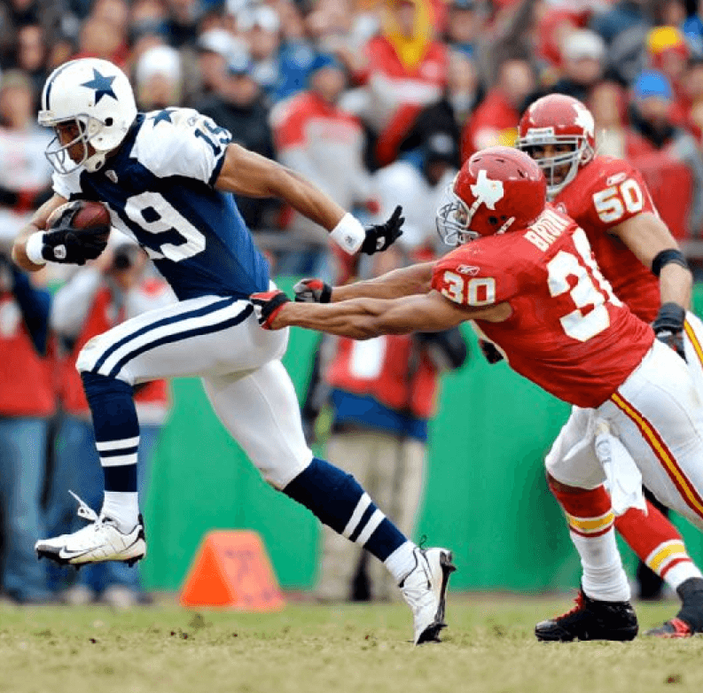
Chiefs at Bills: A potentially glorious color-on-color matchup. These two uniforms have bold colors and are classic designs to boot. Grade: 5
Titans at Ravens: If the Ravens wore black, it would be better aesthetically, but this game works fine from a contrast perspective no matter which home uni the Ravens pick. However, no game the Ravens or Titans are in will ever be considered a design delight with their current uniforms. Grade: 3
Cowboys at Jaguars: Sort of a moot point, given the Cowboys’ preference to wear white whenever possible. Even with their blue jerseys, the contrast wouldn’t be great enough, in my opinion. Grade: N/A
Dolphins at Lions: The Lions’ blue and Dolphins’ teal don’t provide enough of a contrast for a CvC game. Grade: 1
49ers at Saints: Great color combination possibility in this game, with the only caveat being that the two teams will definitely have same-colored helmets and might also have same-colored pants. Still, black vs. deep red? Let’s see some of that! Grade: 4
Steelers at Jets: I can’t help but envision how great this game would look as color-on-color on a snowy field. Plenty of contrast between uniforms and helmets. Tasty! Grade: 4
Falcons at Buccaneers: Red vs. red isn’t going to work, obviously. Grade: 0
Broncos at Raiders: Orange (with blue) against black (with silver), especially in a longstanding rivalry matchup, would be fantastic. Even though the Broncos’ uniforms bring down the grade a bit, the color contrast in the California sunshine makes this a=one a no-brainer. Grade: 5
Giants at Seahawks: Giants blue vs. Seahawks whatever-it-is would not provide much visual appeal, and certainly not enough contrast. Grade: 0
Rams at Cardinals: As with the Chiefs and Bills, there’s a lot to like about a blue-on-red game. Great jersey contrast, great helmet contrast, and a division rivalry make this a great option for CvC. Grade: 5
Bears at Packers (Sunday night): A unique color matchup that worked for decades before road whites became the norm, this game would provide a visually appealing rivalry matchup in prime time. Make it so! Grade: 5
Panthers at Eagles: The Eagles are finally going to be in their standard home green jerseys, which, unfortunately, are too dark to provide much contrast with the Panthers’ black jerseys. This would be a different story if the Eagles were back in kelly green, or if the Panthers hadn’t already worn their light blue alternates for their two allotted games this season. Grade: 1
So that’s the full slate. How did it break down by time slot? Let’s take a look:
Thursday night: No CvC.
Sunday, 1pm ET: The one no-brainer here is Chiefs vs. Bills, which I think you’ll agree is an ideal option.
Sunday, 4pm ET: We have two great options: Broncos at Raiders and Rams at Cardinals. How do we decide which one to go with? The best way is to choose the largest amount of eyeballs we can deliver the color goods to, and unfortunately the Rams/Cardinals game is only being broadcast to the St. Louis and Phoenix markets, while the Broncos/Raiders clash is being shown to the entire western half of the country. Therefore, our CvC game for the 4pm ET slot should be Denver/Oakland. [Personally, I don’t see why you can’t do both games, but this is Mark’s fantasy, not mine. ”” PL]
Sunday night: Yes please, Bears and Packers!
Monday night: Nope, not this week.
That gives us four CvC games out of the thirteen on offer this week. Not too few, not too many. Never more than one at a time. And high-contrast pairings that look great. Let’s do this, NFL!
———
Good stuff, Mark — thanks for submitting it.
Mark has offered to present a similar rundown for each remaining week of the season. What say ye, readers — interested?
NFL Superhero Project
By Thomas Correia
Tonight we have the “Battle of Ohio” between the Browns and Bengals. In my latest NFL Superhero matchup, it’s a battle between two Marvel heroes who possess the power to heal faster than normal from injury — which could lead to an extremely long fight (click to enlarge):
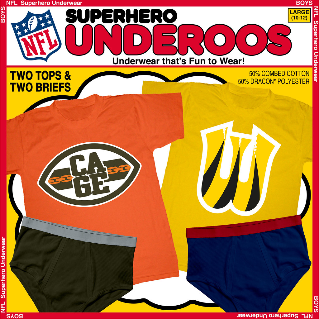
Although the Browns don’t have a helmet logo, they’ve actually had many logos in their long history, including the “Brownie Elf” logo, which reminded me of Superman villain, Mr. Mxyzptlk, and the “Bulldog” logo, which reminded me of Inhumans’ canine alien, Lockjaw. I loved the suggestion last week to use the Juggernaut, who actually wears brown and orange. But I eventually decided to use the team’s “Football B” logo and adapt it to Luke Cage (aka Power Man). Cage is known by his last name and chain link belt, so merging those elements worked well.
The three stripes of the Bengals’ B logo brought only one hero to mind for me: the X-Men’s most famous mutant, Wolverine. The three stripes can easily resemble the three claws that eject from one of Wolvie’s fists. Also, his popular yellow costume includes three similar stripes on each side of his torso. And a simple 90-degree rotation of the “B” logo allows it to be modified into a “W.”
As you prep to watch a long battle tonight, which two characters do you think will be battling next week, when the Bills face the Dolphins?

Mike’s Question of the Week
By Mike Chamernik
I’m sure this has been discussed on Uni Watch before, but I’ve never asked it: What’s the most aesthetically pleasing American sports city, from top to bottom, in your opinion? Consider everything: uniforms, colors, logos, and sports venues. You can also factor in the minor league and college scene, if you like.
To me, it’s tough to beat Pittsburgh. The Pirates, Steelers, and Penguins all have great unis, the black-and-yellow theme is awesome, PNC Park is regarded as the best in baseball, and the script “Pitt” helmet even made a comeback this year.
While we’re at it: What’s the worst-looking city? The most underrated city?

PermaRec update: The negative and resulting photo shown at right were taken many years ago at an Iowa prison. They’re part of an excellent new history project that’s described in the latest post on Permanent Record.
Uni Watch News Ticker
By Mike Chamernik

Baseball News: The Mets are changing their pinstriped unis from cream to white, plus they have a new alternate road cap and a new BP cap. Here’s what some of the team’s uni combinations will look like. Meanwhile, the “snow white” uni has been scrapped, which apparently means that the camo and blue home jerseys will now be worn with pinstriped pants instead of white pants … “Tremendous photo of Stan Musial in a St. Looey road uni (I think in Wrigley) leaning on a gun and addressing the crowd,” says Phil). … Andy Chalifour was watching Rookie of the Year the other night and noticed the catcher on the Cubs wore a flapless helmet.

NFL News: “On October 13, Paul linked to an image of three Cowboys players wearing three different sideline cap colors,” says Lou DeGeorge. “This past week against Arizona, it got a little weirder. At the start of the game, Tony Romo, who’d usually gone with the navy blue “D” cap, was wearing the lesser-seen white “D” cap. Brandon Weeden, who had all year been wearing the white cap on the sidelines, had switched to gray, while at some point early in the game, Romo switched back to navy blue. Then, by the end of the game, Weeden himself might have switched back to white (tough to tell if that’s white or gray with the sun glare).” … The Cowboys have put poppy decals on their helmets for the London game this Sunday (from Phil). … GQ has rated the best- and worst-dressed NFL commentators each week (from Eric Wright). … The Browns’ Johnny Manziel and the Bucs’ Mike Evans swapped jerseys after Sunday’s game. The two were teammates at Texas A&M.

College and High School Football News: Two West Virginia high schools, Wayne and Chapmanville, played a gloriously muddy game last weekend (from Brice Wallace). … Arizona State will wear its “Desert Fuel” uniforms on Saturday (from Phil). … Oklahoma will wear alternates with white helmets on Saturday against Baylor. … Texas’s defensive coordinator would not be happy with the Longhorns wearing a clown suit, also known as an alternate jersey (from Phil). … ESPN messed up the logos in this MAC graphic (from Phil). … Two cool items from Matt Cline: a 1931 Army/Navy game program and a copy of The Log, which was a weekly publication produced by Navy that wrapped up the previous game.

Hockey News: The Blackhawks have unveiled their Winter Classic jersey. ”¦ The Rochester Institute of Technology will wear camo jerseys this weekend (from Phil). … The Ottawa Senators have racing prime ministers, sort of like the Nationals’ racing presidents. Here’s a look at them in action (from Will Scheibler). … A wonderful 1972-73 Bobby Hull Winnipeg Jets jersey sold at auction the other night for quite a few pennies (from Jonathan Daniel). … The Rangers wore purple chinstraps for Hockey Fights Cancer (from Phil).

Soccer News: The MLS expansion team Orlando City will have an all-purple look (from Phil). … “Just wanted to share what I believe are good-looking jerseys to support Breast Cancer Awareness and Research my daughter’s U15 soccer team purchased and wore all month,” says Stuart Ciske. “Everyone bought one, and in Wisconsin the long sleeves were welcome, as October tends to be cool. Though pink, I believe the grey stripes and blue lettering and numbers make it look sharp with either their home (blue shorts, white socks) or away (silver/blue) kits. Even has stripes!”

Basketball News: The great SI Vault tweeted a photo of Bill Walton, Robert Parish, and Kevin McHale posing on a mini Celtics court. Is it just me, or do athletes not pose with silly props and take wacky photos for sports publications anymore? I miss stuff like this. … Like we saw with the Heat yesterday, the Clippers also wear undershirts that provide a phantom NBA logo showing through to the jersey (from Paul Lee). … New unis for Seton Hall.

Grab Bag: The All Blacks have a new set that is called the “blackest jersey ever.” … Chrysler is retiring its pentastar logo.

For anyone who actually wants to see what a few NFL matchups would look like as color vs color… Phil and I did some photoshopping back in 2010.
link
link
Re: Question of the Week…Have to say LA, as much as it pains me. Kings, Lakers, Clippers, Dodgers, Angels, USC, UCLA…all classic. Ducks, Galaxy, Chivas USA are just so-so, but not bad enough to write off everything else.
Chivas USA no longer exists; an expansion franchise, provisionally known as “Los Angeles FC”, will begin playing in 2017. At their introductory press conference, they used red and black as colors.
Which would be a sharp choice. Looks good link, and link with the Galaxy’s link.
If they do end up partnering with USC to build a soccer stadium on the site of the Sports Arena, red/Cardinal would be doubly appropriate.
But it’s worth pointing out that they’re taking fan input on everything, including the club’s name and colors. I happen to think they got those two things spot-on right out of the gate, and perhaps their fans will agree with me.
I, too, miss the days when athletes had a little self-deprecating sense of humor. It’s few and far between now — apparently poking fun at oneself would ruin “the brand.”
George “Iceman” Gervin posing on his ice slab throne. Darryl “Chocolate Thunder” Dawkins with a rim in his hands. That Celts photo was a treat, too.
Lighten up, knuckleheads!
My favorite Celtics photos are the ones where they get posterized by Dr. J or World B. Free. But I may have to include today’s wonderfully playful photo.
I’d love an Iceman poster on my wall, too.
re: NFL alternate jerseys: I know this has been beaten to death (and then some) around here, but the NFL is ridiculous with their uniform rules.
How so? I certainly prefer seeing some guidelines for wearing jerseys to having everything be a complete free-for-all.
While the NCAA goes a bit too far in it’s allowance of alternate uniforms… there’s really no reason why the NFL needs to require white jerseys, or limit the use of alternates so drastically. I don’t want to see everyone mimic Oregon, but that doesn’t mean that, for example, the Panthers shouldn’t be allowed to wear their blue jerseys just as often as the black ones.
this I agree with. I don’t want some shit like MD or Oregon where they are rolling out a new jersey each week, but the whole thing is overkill. Reeks of the No Fun League.
I sort of understand the whole “one helmet” thing but I think that is even overkill. I’m not really sure how that keeps players from getting concussions.
Don’t knock it. As a baseball fan, I can only DREAM of MLB having something resembling teeth in policing what the players wear, and how they wear it.
Agreed. I wish MLB would take a page from their uniform manual.
Pittsburgh wins, hands down.
Baltimore loses, hands down. The O’s have great uniforms, but too many people are too liberal with wearing shirts or even jerseys that combine the O’s orange with the Ravens’ purple.
link
I mean seriously.
“Pittsburgh wins, hands down”?!?!?
Because the teams share the same colors? That’s a drawback in my book. I nominate Beantown: for Bruins (the best black-and-yellow around, especially with that awesome B/Hub design); Celts (straight-ahead green, fewer gewgaws than most NBA outfits); and the Red Sox (who does red-and-blue better?). As a ridiculous geezer, I much prefer the pre-Elvis Patriots, with the red jerseys and Pat on the helmet, to the current blue-and-silver mess, but you can’t have everything.
I’m going to agree with just about everything Connie says. You get rid of flying Elvis and Boston is just about perfect.
Pittsburgh is a close second. Not sure I’d suggest every city adopt a uniform color scheme, but it works out well for Pittsburgh. (Maybe I like it because those were my high school colors.) Pittsburgh also gets points for venues.
Most overrated would be Dallas. Not just being bitter about the Stars.
If/when the Penguins go back to the Pittsburgh gold, it’s no contest in my book. Wearing gear of the city’s other sports to other games while still fitting in is a huge benefactor in my book. Being able to wear a Pirates hat to a Pens or Steelers game, essentially.
I don’t hold the same-colors thing against Pittsburgh, because each team generally does a good job with those colors.
Among mismatchy cities, how about New Orleans? Saints and Pelicans are terrific, and the minor-league Zephyrs are well above average.
I’m with Boston for similar reasons above, factoring in the uniforms, arenas, logos, etc. I thought about Pitt – The Pirates are my all time favorite uniform franchise, even the old mustard kits and then thepainters hats, but the Steelers/Penguins oddly haven’t done much for me aesthetically beyond the lovely colours.
I thought long and hard about New York:
Love – Islanders (including the fisherman, minus the black), Yankees roads, Rangers
Like – Nets (maybe add a third colour?), Mets (minus the black)
Ambivalent – Jets (Go a touch lighter on the green), Yankees homes (dreadfully over rated “classic”), Knicks
Dislike – Giants (Go back to the 80’s/early 90’s please)
Hate – BFBS any of the above
COLOR VS. COLOR = SUCKS
I wonder how a Packers vs. Bears colored jersey vs. colored jersey match-up would look on a rainy, muddy night.
It’d look just as ugly and brutal and awesome as it does when one team is wearing white.
Re: superhero.. i would have done Wolverine(Bangles) vs Sabertooth(browns)
Sabretooth is a good one.
Or maybe:
Lockjaw: link
vs.
Tigra: link
never a fan of the dog logo.. as a browns fan i know thats a horrible sin
I say yes to a weekly CVC rundown.
QotW: Chicago is best hands down as the Bears have by far the best uni in NFL, the White Sox are near the top of MLB, the Cubs are above average, the Blackhawks are near the top in NHL and the Fire are near the top in MLS. All the other markets (save Pittsburgh) have at least one real stinker or too few teams to really consider.
Atlanta has to be the worst simply due to the Falcons, though the Thrashers did nothing to help.
You lost me at “Fire are near the top of the MLS”
Those things are hideous: link
Agreed. The shorts and socks (red, with navy Adidas striping) are perfectly fine. The shirt is a slap in the face to Fire tradition. It’d be much better if it were red, with perhaps navy Adidas striping, and with a return to the white chest stripe.
Yikes. That wasn’t what I was thinking at all. I had forgotten the 2014 update.
Don’t leave out the Bulls. Very classy uniform, always one of my favorites.
Though not a four-team town, I think KC is a vastly underrated uni city.
The Royals’ and Chiefs’ uniforms are simple, timeless and near the top of their respective sports IMO.
Well, if you bring in the college teams from both sides of the state line, you’ve got KU and the rest, although KU is the better looking team haha
I agree. Maybe we can award KC half-credit for these beauties
link
link
link
That ’31 Army/Navy program is outstanding!
Absolutely outstanding. I also dig that cover of “The Log” with the slinky beauty and the two young swains…
Loved “The Log” cover so much I edited and link for the rest of the interwebs to enjoy.
QotW: Green Bay, Wisconsin. Only the one team, but among the best uniforms in the history of pro sports.
I’d call Toledo, Ohio a top contender if we disqualify one-team cities. The Walleye and Mud Hens are among the best-uniformed teams in minor-league hockey and baseball, respectively. A decade ago, I’d have suggested Columbus, Ohio, but the Clippers pretty much suck, aesthetically, these days. Both Oakland and San Francisco would be on my short list for major-league team unis, though Oakland gets demerits for the quality of its stadiums.
Miami and Dallas are my finalists for worst all-around city. I’d probably go with Miami just on account of being home to the Marlins.
I think Wolverine would have been better-used for the Browns. My favorite look for him has always been the brown costume from the ’80s.
link
I agree with you Adam. I had the Wolverine Secret Wars figure when I was a kid and always preferred the Brown costume.
link
But I just couldn’t resist connecting the Bengals’ stripes to the more recognizable yellow costume. That costume always seemed to bright for such a dark character.
Let me try that image again . . .
link
QOTW: It’s a tie. New York (for quantity) and Pittsburgh (quality).
I’m philosophical about Chrysler retiring the pentastar. Chrysler had a thrilling couple of decades, more or less bracketed by Imperial’s tenure as a standalone brand (1955-1972). I loved the commitment to googie architecture on wheels, but the honeymoon ended with the debut of the K-car. If Chrysler/Fiat whips up a new identity, I’m sure it’ll be cherished by the current crop of 9-to-12 year olds.
Everybody craps on the K-Car, but without the K-Car (“a nice reliant automobile”) Chrysler wouldn’t have survived the early 1980s.
On the logo, frankly I thought they’d retired it years ago. This is what my car carries:
link
Yes I’m an avowed homer, but if you can ignore the 1990s monstrosities over the last 20 years from some of the teams, NY should be pretty high up there.
The recent sets for the Mets, Nets, Knicks and Islanders are all solid. Giants, Jets, Yankees and Rangers are classics – Jets green troubles aside. Hell, Red Bulls ain’t bad and NYFC probably going to be pretty restrained.
For a city with that quantity, stinkers are hard to come by. I’m voting home.
Almost forgot the Devils… again, not bad at all.
And let me put in a word for the Beautiful Game. We won’t know link what NYCFC will wear, but our current representatives look pretty sharp both link and link.
. . . and the link with its “rich Corinthian leather” was about as groovy as could be.
I think Dodge could still make it as a niche performance brand – Challenger is selling great. However it seems like the Chrysler brand has inherited the vagueness that killed Plymouth (and Mercury, Olds and Pontiac).
QOTW: I really like the synergy between the sports teams of Miami. Say what you will about the Marlin’s redesign, but you have to appreciate that they worked in a color palate that meshes well with the Dolphins and The U (now if only they’d get rid of all the black). Even though the Heat don’t rock the green and orange, they have one of the best logos and some of the best unis in the NBA.
How many times have teams worn the same color? I remember a Mets vs Gianrs game a few years ago when both teams wore black
Jets – Steelers snow pictures:
link
Superhero Underoos Matchup:
Marvel vs. DC
Bills- Flash link
vs.
Dolphins- Namor the Sub-Mariner link
Bills/Dolphins is a Marvel vs DC matchup, but not Flash vs Namor. Keep guessing E.D.
Rhino vs. Aquaman?
Aquaman is correct!
But I did not use Rhino (it did cross my mind at one point). Instead, I used a different MUSCULAR Spider-man villain. The red stripe in the Bills logo became this character’s HYDROSTAT… There’s your hints.
The Mets new road alt cap was predictable. They never wore last year’s alt cap on the road, because it has a white outline and the blue road jersey has no white in it.
While I get the idea with the logo… why is the hat such a darker shade of blue?
Probably just the photo…I think it’s the same blue
This ^. I seriously doubt it’s actually a darker blue.
Doesn’t matter if they wear it, it’s just to sell crap to fans.
It’s like, how much more black could this be? and the answer is none. None more black.
A few things…
1. I saw it earlier on Twitter, but today’s article wasn’t up yet so I waited until it was posted, but the Steelers posted a link, apparently by link Listening to the game the other night on the radio, I know they played this video during the game in place of the regular Renegade video, as Bill Hillgrove and Tunch Ilkin made a mention of it during the broadcast.
2. QOTW Yes, Pittsburgh is the best-looking Mike (and we have the championships to back it up), but it is black and GOLD, not black and yellow. Wiz Khalifa really needs to go away now. Worst-looking goes to Tampa, only the Rays have a pleasant uniform.
3. With regards to Pittsburgh colors–really, Wolverine on the Bengals? I get that the colors are based off of Logan’s link, but as a Steelers fan it looks too Steelerish for the Bengals. Heck, we have more rivalries with Cincinnati teams than Cleveland. Red-Pirates, Bengals-Steelers, Cincinnati-Pitt (in that instance, I’ll root for the Bearcats only because I don’t like Pitt), etc… If Logan’s film appearances were used as a basis, at least it wouldn’t be Yinzer based.
4. Chrysler retiring the Pentastar isn’t news. It’s happened before, as it stated in the article. TBH, give it ten years and Chrysler & Dodge will be gone altogether, both replaced by an expanded Fiat lineup, while Ram Trucks becomes the new GMC rather than letting Jeep have a pickup truck.
I realize now that it’s borderline sinful to use Steelers colors for a Bengals logo (as is anything remotely anti-Yinzer), but my goal was to tie hero & team together the best way possible even if it meant going against team colors (see Hulk/Redskins in Week 4). Please forgive me Joe.
And Go Big Ben!…(My fantasy QB this week)
It’s OK Tom. That was just my initial thought. I understand going against team colors, but seeing the Bengals in a rival’s team colors seems odd.
And I don’t play fantasy football (tried, no goo at it), but I would recommend sitting Ben this week. We’re playing the Jets, a team that has lost eight straight. If the last few years are any indication, just like when we play the Titans (who we have the following week) and the Raiders, the Steelers do play down to their competition.
Absolutely no way the Chrysler and Dodge names go away. They’ll continue to get more Fiat platforms (and essentially be Fiats, like the Dart), but the names themselves won’t completely go away.
Well with the Chrysler brand finally giving up on its luxury car aspirations (that’ll go to Alfa Romeo in FCA’s lineup) and becoming the company’s mainstream brand in North America (e.g. Ford, Chevrolet, Toyota, Honda, etc…), it just shows how much more the Chrysler brand has no identity. Although I do like Dodge’s current lineup, it’s struggling even more (they should’ve never split Ram Trucks from Dodge, which is rolling in money right now) and a lot of experts expect them to be the next domestic car brand to go. I do think the Fiat merger was beneficial, but much like Chrysler did with AMC, Fiat bought Chrysler for its real money-maker outside of Ram: Jeep. I’m just stating a fact here.
What still amazes me is how Government Motors still has GMC has a distinct brand. Ford finally got the picture a few years ago with Mercury, and GM got rid of how many brands but kept the most redundant one around. Had they got rid of GMC, the Chevy Silverado would’ve unseated the Ford F-150’s decades-long throne by now.
As for your comments that “Absolutely no way the Chrysler and Dodge names go away”, people said the same thing about Pontiac and Oldsmobile 15 years ago. (Plymouth was already being phased out and Ford was looking to drop Mercury since the 1980s.) Dodge is next, and Chrysler isn’t too far behind.
Pontiac, Olds, and Plymouth all became redudant brands. It’s not nearly the same as the Chrysler/Dodge situation.
Fiat has terrible brand equity in the US – you seriously think they don’t know that, and would be willing to bet the farm on rebranding everything in the lineup here as Fiat? It simply won’t happen.
And “Government Motors”. Jesus, man – that joke stopped being funny five years ago. (And I don’t own any American cars.)
Scott, I’m not trying to get into an argument with you about it (and my thoughts on GM still stand–I had no issue with Chrysler being bailed out for the 50th time but GM should’ve been left to die), just stating facts. And I do think the GMC Sierra is cannibalizing sales from the Silverado–although the Ford F-Series has been the best-selling vehicle in America since 1978 and the best-selling full-size pickup for even longer, the GM full-size trucks together outsell Ford. (Disclaimer: I just bought a brand-new Ford on Monday.) Imagine if GMC went away and Chevrolet started marketing the Silverado to both farmers (its current market) and construction workers (GMC’s market). They might pull it off instead of losing market share to the Ram 1500 and the Toyota Tundra while the Ford F-150’s lead gets even bigger.
But enough about cars for today. I could go on all day about this but I don’t feel like it.
Chrysler bought AMC to get Jeep, AMC became extinct.
Fiat bought Chrysler to get Jeep, and history repeats itself?
I sometimes wonder if GM would have been made stronger sooner (they have a ways to go) had they retained Saturn’s distinctiveness and discarded Buick’s ‘legagy’ instead.
I agree it would have been good to have kept Saturn rather than Buick and to have whacked GMC’s badge-variants of Chevy.
My understanding is that Buick survived due to astounding dumb luck. Buick is the name GM uses in China because it’s their most euphonious option there. Since it’s still live in China, they kept it elsewhere.
Classic cars and sports uniforms: Y’know, this is what my website would be about if I wasn’t so busy eating potato chips.
Call me a homer, but if the Eagles were in Kelly green, serious consideration for Philly would be needed.
Phillies – generally regarded as a top-10, if not top-5 MLB uni.
Flyers – aside from that terrible RBK edge template ruining their look for a few years, they’ve rebounded nicely. Although, they would still look better in their ’83-’07 package. Either way, they’re always put up there as one of the tops in the NHL.
Sixers – eh. On the boring side, but they get credit for going back to the logo they never should have dropped.
Overall, still a strong foursome.
One thing that I think gets overlooked in these “best-looking cities” discussions: We’ve all heard that PNC Park is a great stadium (and it is), but that refers to its greatness if you’re attending a game there in person. I think it’s safe to say that the vast majority of people reading this site have never been there.
Most of us experience stadiums/arenas via how they look on television. And that, I submit, is the standard we should be applying. Fenway Park, e.g., looks AWESOME on TV. So does AT+T Park (which I would vote for as one of the best-looking ballparks even though I’ve never been there). PNC, frankly, looks pretty much like any other ballpark on TV.
That’s not a knock on PNC as a piece of architecture — I’ve attended games there and it’s tremendous, because you can see the rivers and bridges out past the outfield walls. But as a fan who experiences most of his games via TV, PNC is, for the most part, just another stadium, because on TV you don’t get many views of the river/bridges/etc. What makes the place special in person is largely lost on TV. And TV is how we experience most of this stuff.
As someone else on here who has attended PNC Park (just this past season, I was there 19 times), I do have to agree with Paul here. You have to be at a ballpark to truly experience it. Anyone who grew up with cookie-cutter stadiums including myself (I was 15 when PNC Park opened–damn, that makes me feel old now) knows that with a few exceptions like Oakland, St. Petersburg, and Toronto, the current crop of ballparks are an improvement over the cookie-cutters (of which Oakland is). The only other MLB stadium I’ve been to that wasn’t at the confluence of three rivers has been Progressive Field in Cleveland, which for being 20 years old is still a pleasantly nice stadium. I’m planning on adding the Great American Ballpark to my list next year when the Bucs open up in the best city in America to have Opening Day, and I hope to have Comerica Park, Camden Yards, and Nationals Park added to my list. (They’re all within five hours drive of my house.) Maybe in three years I’ll get a chance to finally check out Fenway Park when the Pirates play the Red Sox there. And of course, let’s not forget Wrigley Field.
Just to clarify: I’m not saying you have to have attended a venue in order to have an opinion on it. I’m saying that our opinions should be based more on how the venue looks on TV, not how it looks in person, because TV is how we experience the vast majority of our games.
Maybe it depends on the network carrying the game, but the few times a year I see PNC on TV, it still stands out. You see at least one bridge from certain camera angles the same way you see the Green Monster or the high fence in SF. And, the stone backstop and yellow accents scattered throughout are unique enough to convey to viewers that the park is a notch above most. As a whole, though, I would agree with Paul. Some parks like the Jake and Target Field are often talked about, but don’t seem particularly special on TV. Football stadiums seem to be the worst about losing their charm on camera. Unless the playing field is just absolutely shitty, they almost all look the same on screen.
I don’t know how ESPN covers the Bucs (and has Fox ever showed them nationally?), but when I get the free MLB preview twice a year, the local broadcasters are always showing the downtown view, the boats on the river, the statues, etc. Before I ever made it to a game there, I knew it was one of the best ballparks ever.
Fox has started airing some Pirates games on Fox Saturday Baseball the last couple of years, although I think ESPN still airs more Pirates games than Fox. Root Sports still beats them all, though. I enjoy hearing link commentary after the Buccos lose or RTJR.
Most of us experience stadiums/arenas via how they look on television. And that, I submit, is the standard we should be applying. Fenway Park, e.g., looks AWESOME on TV. So does AT+T Park (which I would vote for as one of the best-looking ballparks even though I’ve never been there). PNC, frankly, looks pretty much like any other ballpark on TV.
Paul, I have to disagree with you here. From the amazing link to the link, even on television the Pirates’ park doesn’t look quite like anything else in the bigs. I’ve never been there, but I can pick it out on TV.
I do like the Black Hawks (see, two words, like it’s SUPPOSED to be) WC sweaters. I’m still undecided on the Caps’ fauxbacks.
QOTW-
Best: Pittsburgh
Worst: Washington DC
Over-rated: Saint Louis
Under-rated: Buffalo
The San Fran/Oakland area is pretty solid. 49ers, Giants, Raiders, A’s, and Golden State Warriors. Not a dud in the bunch.
Are you including San Jose? If so, deduct some points for the Sharks.
But give them the points right back because of the Earthquakes. Nice black and blue color scheme with red throwback alternates, and at least for this past season, no jersey sponsor.
“The Bay” is a good call especially since the Warriors’ redesign. SJ has steadily gone downhill since their birth, but compared to some of the other “modern” hockey looks, it’s not terrible.
Also, every franchise mentioned has a distinct color scheme.
Good point on the Warriors; closest thing to a unique NBA uniform. Sharks would be okay had they resisted that tweak of their stripes last season.
Best – can’t decide between Pittsburgh or Chicago.
Most underrated – since Toronto is excluded, I’ll go with Charlotte.
Worst – Phoenix. The Suns look great, but that’s it.
Why is Toronto excluded?
The Jays, Leafs and Argos in their blue and white are a solid set of uniforms.
The Raptors are a disaster, but if they ever adopt a Huskies look they’d pull Toronto close to the lead.
link
Toronto FC, I guess they’re ok for soccer
link
Toronto FC,
He said American. I should have just said “I’m expanding it to North America,” but then George Chilvers would say “Why is England excluded?” Then I’d have to give London credit for their multiple soccer teams, but then Mark from Shiga would…well, you get the idea…
The Raptors definitely need to embrace their inner Husky, but they look a LOT better than their Barney days.
As a Torontonian I think Toronto has the most overrated unis.
With the exception of Torontosaurus, uniforms in T.O. look pretty good.
And I think I’ll take Chicago over Pittsburgh, but just barely.
Going on just pro teams, I vote Miami, where the redesigns of the Marlins and Dolphins ruined what could’ve been a front runner for best city, Nashville or Phoenix as the worst city.
As far as the best city, aside from Pitt, Kansas City, Minnesota, LA, Boston, Chicago and St. Louis come to mind. If the Rams went back to their old look, it would be a blowout.
Not a fan of any of their teams, but Detroit has a strong set of unis with the Tigers, Wings, Lions, and Pistons. Someone mentioned Chicago and I agree, not a bad one in the bunch aside from the Fire. Boston’s are all pretty great too. So are LA’s and you can throw USC and UCLA into the mix.
Cardinals and Blues are at or near the top of their respective sports but the Rams bring St. Louis down.
My own city of Denver, sadly, is not a contender. The Rockies look great as long as they don’t wear the black vests, and the Rapids are fine, but the Nugs, Avs, and Broncos bring Denver down.
Agree with those who say the color consistency of Pittsburgh is a weakness, not a strength. Although each uni is decent enough on its own merits.
I would probably have to group Michigan football in with the Detroit group
Classic Lions and Pistons and you’d have my ear. Black kills it for me with the Lions, powder/silver is where it’s at. Current Pistons looks like half the NBA.
Best would be Chicago. Only thing is the college scene (or lack there of).
All of the pro sports teams look nice, and what more can be said about Wrigley? Even Soldier Field, prior to renovation, the skyline views and historic stadium was awesome to see on TV. With the reno I still imagine what’s there and where it is and I still really like it.
Worst – probably Minnesota/Minneapolis. Only potential positive is the Twins, but only the throwback type uniforms and caps, the metrodome was so ugly to see on TV.
I notice the poppy decal on the C’boys helmet is made on the same thick stuff that most helmet decals are made of, but the NFL shied and flag are thin stuff.
Just sayin’.
Also, I wonder if they ever thought of putting the Dymo label on the BLUE stripe instead of the white. ????
I wonder if they ever thought of putting the Dymo label on the BLUE stripe instead of the white.
But then it wouldn’t be centered, which means THE ENTIRE HELMET wouldn’t be centered. And which blue stripe would you put it on — left or right?
Endless problems, I tells ya.
Well, the player’s left side stripe of course. That way back in ’76 (or maybe in 2026) they wouldn’t have to move it when they added the red stripe.
**cue Jackie Chiles voice: “And why the name? Why not just the Jumbo-sized Dymo with the number? No one else uses a name. Why doesn’t anyone else use a name? Who said they could use a name?”
These are the things that keep up all day at work!
PS: I know the Packers have names now too.
Browns used to use Dymo names too:
link
That Celtics mini-court reminds me of a shoot Greg Oden did with SI while still at Ohio State. This is the only picture I could find: link
Swing and a miss from the Blackhawks, I’m sorry to say. If they were going to do the 50’s uniform, then should have gone all the way with it and used the old logo design. With the current logo it just looks like a poorly designed knockoff you would find on the rack at Ross.
If I remember correctly, that Celtics photograph on a small court wasn’t taken for purely humorous purposes. It was the two-page bleed to begin an article in Sports Illustrated suggesting that players had gotten too physically big and the size of the court had to increase.
NY, LA, Chicago, Boston… all good examples, everyone. I even like Miami, too!
I didn’t ask this question, but Atlanta had the tools of being a good-looking city. The old Pistol Pete Hawks jerseys (then the Dominique era Pacman jerseys and logo), the old Falcons set, the Flames and the always-solid Braves. Not bad. Of course now the Hawks and Falcons are mediocre at best.
Don’t forget the red, black & gold MLS expansion. From a professional prospective, gotta love the use of red across the board in Atlanta. It’s not as pronounced as the black & gold in Pittsburgh, but still cool. The aesthetic can only improve as the Georgia Dome is phased out.
Sky Sports’ reveal of the 2015 Wembley NFL games uses the old NFL logo.
link
Best looking sports town, probably Boston (I’m a homer, what can I say). Other good looking places, NY, Chicago, SF
The Cardinals need to bring back that classic stirrup worn by Stan in that photo, current ones stripes are too small and too high up.
Chicago nails the classics. Bears navy, Blackhawks red, Cubs pinstripes, and I think the White Sox might be the most underrated complete set in all of sports. With that many teams, you still find some duds though. The Bears whites aren’t great. The Cubs haven’t been able to find a good road uni in years, and the only reason the Bulls are still holding on to their set is because the Jordan brand still sells even today. Otherwise it’s a very dated look.
The White Sox cap is the best cap.
Love the Bulls set. Only team in the NBA with diamonds on the shorts.
They’re classics for sure. The only thing better than what they wear now is if they brought back the script Chicago road jerseys.
They did bring back the pinstripes for the black alt.
I’d go with “Chicago” in block capital letters (like the alts). Plus revert them to the original white, with black trim.
For best city you also have to consider what drags the aesthetic pallet down. Pittsburgh, New York and Boston would both be very high in my mind if not for the Penguins (Vegas gold, yuck), Mets (too many bad alternates), and Patriots (side panels and horrible number font).
Oakland and Chicago are tops because in addition to having terrific classic sets for their big 4 sports, there’s no obvious problems. When the White Sox are the team with the worst uniforms in town, you’ve done something right.
For worst, I’m going to go with Miami, the city of bad reboots (Dolphins, Marlins).
For underrated, although KC sounds good I’m going with LA. The Lakers, Kings, Dodgers, Angels all have elegant designs in a wide variety of colors. Points off for the Clippers but that compensated when you account for USC and UCLA.
If KC still had the Kings, I’d vault them from underrated to best. I loved the script lettering on the front and the NOB under the numbers.
link
The Comets used to represent the city well, too.
link.jpg
In fact, former Comet Gino Schiraldi has gone with that name and look for his youth soccer teams.
link
I mentioned this above with photo links, but don’t forget about the Scouts and A’s. The Scouts in particular had a beautiful colour scheme that they later took to Denver.
1. Is it possible that the Mets keep the snow white pants?
2. Agree with Pittsburgh
3. The NFL would look great with regular color v color match ups. Road teams should be allowed to use their home jersey if they want, granted it doesn’t clash.
Is it possible that the Mets keep the snow white pants?
The word on this yesterday was no.
Hell, gray pants would look better with the camo monstrosity… I really hope they don’t expand when they’re wearing those.
I was wondering about that too. I think the home blues would look fine with pinstriped pants, to the extent they look fine at all.
Another question is, will they adopt alternate batting helmets to match the alternate caps? So far they haven’t, but during the BFBS era they did.
I still don’t think either alternate cap is necessary, but like the jerseys I like the road version better than the home.
It’s not that I’m so in love with the polar whites; what I really like is the soutache trim. I wish they’d put it on the home pinstripes, fat enough to stand out.
Finally, a real Knicks jersey:
link
Need more blue, but dig the design.
The “every Mets uni” pic didn’t include the BFBS. Could it be that it’s finally getting junked?
Yes, it’s gone. Wasn’t worn at all last season, so it’s really just the official acknowledgment of an existing state of affairs.
BFBS was quietly junked after 2012. We thought they might wear it for Piazza Day in ’13 but they didn’t. The BFBS skyline logo still appears in a few places at Citi Field, but I don’t think they even sell the BFBS hats anymore.
Mike,
Pittsburgh is a great choice, the color symmetry is nice, but I think you’ll have to consider colleges for tiebreakers and if you throw in UPitt- while the script is great, you can’t forgive that Pitt block thing from the past 15 years.
San Francisco is an obvious choice with Giants, 9ers. and Golden State all retro looks yet still modern feel to their stuff. The color combos are great too. But it’s #2 to…
Chicago! Windy City gets a nod above SF, because they do it with 2 classic look baseball teams, Wrigley field, the Bears, the Bulls, and Blackhawks all with arguably top 3 uni’s and logos in their sports. Add Northwesterns new look and its the top spot for sure.
I think for underrated, look no further than St. Louis. The Cardinals have the best uni in sports, the rams should get some credit for the horns on the helmets alone (even though they miss so badly on the not having gold pants) and the Blue Note logo is sooooo great in it’s simplicity. The +1 is the billikens logo for SLU- unique in every way.
Honorable mention: Dallas, LA (USC, UCLA), Kansas City (KU)
Worst? All of Ohio- yikes! Every team in Cleveland that didn’t need a redesign is on its 8th redesign, The only team that does need one and won’t still thinks Orange is the new Brown. In Cincy, the Bengals are too loud and have that lame “B” logo, The Reds haven’t yet determine that Red should go with white or black. In Columbus, there are the Blue Jackets or are they the “Ohio Fighting Flags”? and the “Highlighters” oh wait, that’s the Columbus Crew, who look like they literally just came from a construction site .Rough…. Not even saved by The decent College Team with the cool helmets.
Dishonorable mention: Tampa Bay, Baltimore/Washington, Buffalo
“the best uni in sports” – and the best fans, and the best franchise, and the best system…
What ever happened to the “humble midwesterner?” There are very few teams I actively root against in any sport, Cardinals and their self-aggrandizing fans have moved themselves onto that list. (No knock on you Patrick, just the situation itself.)
I’m a huge baseball fan and dig the Cardinals uni, but best in sports? Nah. Not even best in baseball.
Well it’s consistently at the top 10% of most respected lists ranking these things. You have your best in baseball? Or are we in that place on the internet where you make negative remarks without providing your own idea to be put up for debate and subsequent scrutiny.
“Respected lists” – I’ve never seen such a thing. There’s just a bunch of individual opinions. Cardinals have terrific uniforms, but I’m with Ben – they’re not even remotely in contention for “best in baseball.” Cardinals are in the next-best category of great unis.
And watch it, bub: Baltimore and Washington are two different cities. Gotta count ’em separately.
No definitely not in “that place,” always down to argue if time allows me to.
As much as it pains me, I think the Yankees are always in the running. Atlanta, Detroit, San Fran, Oakland, Baltimore, Mets. Looking over all them now, I think what I dislike about StL is the lack of contrast, they’re “too plain” for my taste – too much red, not enough contrasting navy, no headspoon or piping.
Obviously showing some sock stripes helps that, but it also does for Atl, SF, Oak, and Bal too. I think Dodgers solve the issue with the red number, which makes it a better uni than the Royals knockoff. Pittsburgh solves it with some sleeve piping.
Well, UNiwatch/ESPN power Ranking have the Cardinals pretty high. I live in Washington and here Ravens and O’s updates alongside Washington Football and Nats. O’s jerseys are worn here more than Nats. Also, I’ve combined them like I combined all of Ohio, they are equal messes all around
Ben I agree with you on the Redbirds jersey, especially the road grays… They should at least say “St. Louis” that would make a huge difference. However the birds and bats logo is good as it gets. Yankees Road bring them down as much as I love the pin stripes the “NY” is too high and too left, it sinks into the arm pit. Braves and are universally known for being unbalanced. Mets are a mess, they just nixed the best thing about their jerseys which was the cream color, and baltimore is good, but the maryland falg has no business on the jersey, I’ll give you Oak, Det, and SF as being just as good as StL
I kinda dig the Maryland flag patch, pretty unique (anyone besides Texas do it?), put it in the same category as the NL logo on the Cubs jersey. It would be even better if it was just the Lord Baltimore flag.
I mentioned this yesterday in the comments, but too late in the day.
The NHL had a lot of colour vs. colour matchups in the 1970s and 1980s when three teams (Canucks, Seals, Kings) had yellow / gold home uniforms.
Nobody is clamouring to see any of those colour on colour matchups again.
link
link
link
If we’re considering cities with only 2 teams out of the big 4, it would be tough to beat Kansas City. The Royals and Chiefs have gorgeous uniforms and great contrast. The stadiums are beautiful as well.
Of metropolitan areas with the big 4, it comes down to Boston, New York, Chicago and SF Bay:
– The Patriots severely hurt an otherwise perfect Boston.
– If we forget about weak alts from the Rangers, Isles and Mets, New York is rock solid. Weakest uni would be the Nets, which really aren’t that bad.
– Other than the so-so White Sox aways, Chicago is a town of beautiful uni’s.
– The only stinker in the Bay Area is the Sharks. But they’re a pretty big stinker.
Gotta go with Chicago.
Honorable mention to Pittsburgh, who only lose points on the Steelers italic font and Penguins Vegas gold.
What about the Mets’ alternate BP caps they introduced last year? The ones that look exactly like their alternate caps with the orange brim? Are they being scrapped after only 1 season?
They actually wore those in lieu of the alternate caps as the season progressed. The diamond-weave was noticeable everytime they had a closeup of someone. I don’t know when they actually switched over to it, but they’ve *been* wearing the alternate BP cap in-game for a while.
QOTW: I’m a Denver homer who is going to throw Denver into the mix as my favorite sports city from an aesthetic standpoint. With all due respect to Perry’s comments above, I think Denver deserves way more credit. Here’s why:
1) The Denver Broncos. Their current uniform set evokes a lot of passion, but I still argue that it is one of the best “modern era” uniforms. The return to the orange jersey as the primary home jersey only enhanced that. Sports Authority Field may not have the organic, gritty charm of the original Mile High, but it’s a great-looking stadium, inside and out. And you link.
2) Colorado Rockies. I’ll agree with Perry about the black vests, but when the Rockies wear their standard home jerseys, they look great. And Coors Field is an absolute gem. There aren’t many ballparks better.
3) Denver Nuggets. Their current uniform set isn’t as good as the classic Alex English-era rainbow, mountains, and skyline look, but at least their alternate uniforms hearken back to that look. And the Pepsi Center is an underrated place to watch a game.
4) Colorado Rapids. Best uniforms in MLS. And Dick’s Sporting Goods Park is one of the better soccer-specific stadiums.
Can’t really agree about the Broncos. They’d rank higher if they stuck to blue jerseys, IMO the orange is terrible. The old Elway orange, which was a lot closer to red, looked better, and the old sky-blue helmets were nicer than the current ones too.
Also have to disagree about Dick’s. I’m a season-ticket holder, and to me it’s perfectly functional but has no attractive features whatsoever, including the stupid tectonic-plate roof. It’s just a concrete and aluminum hole in the ground. And I understand why they put it out on the god-forsaken windy prairie ($$$), but that doesn’t make it any more appealing.
Agree with you on Coors Field, it’s just about perfect in every way.
On the Bobby Hull Jets sweater that was auctioned, is the name on back in Comic Sans? The crossbar in the H doesn’t angle but the U & the L’s look a little Comical.
Kinda resembles Mistral to me. It looks ring-spun or like chenille; not tackle twill.
Remember the Jets’ first year in the NHL? The player names were embroidery on a sweater-colored nameplate. It was rather hard to read on television.
The Dolphins color is aqua. Not teal.
Teal is dark; aqua is bright, like turquoise. Strip away the euphemistic color-names and the Philadelphia Eagles would be considered teal.
One other instance that sticks in my mind of NFL color-vs-color is from 2002, when the Saints had those “Vegas Gold” jerseys. I know they played the Vikings in them that year, and the Vikings wore purple…I suspect there wouldn’t have been enough contrast if they had worn white, as those Saints jerseys were a “lighter” shade of gold.
link
QOTW: Chicago was the first to come to mind without reading any other responses. The Bears, Blackhawks, Cubs, and Bulls all have among the best handful of unis in their respective leagues. The Sox, while not particularly exciting or classic, can at least lay claim to the fact that they were among the first handful of franchises in pro sports to embrace black as a primary color, and because of this, they’re able to pull off alternates pretty well–the red throwbacks or green halfway-to-St. Patrick’s Day.
I think where color-on-color loses its appeal is the home-and-home. I don’t want to watch the Chiefs in red play the Chargers in blue (even powder) twice. I want a Powder Blue vs White with red pants game followed by a red vs white with blue pants (I really want the old gold pants) game.
When I was in school, our rival school down the road was purple and gold. When we played basketball at our place, we wore white with orange numbers and they wore purple with white numbers. At their place, it was gold with purple numbers vs black with orange numbers. Two very different looks. Color on color would have been the same in both places.
QotW:
Best: SF/Oakland
Worst: Seattle
Overrated: New York
Underrated: New Orleans (don’t forget Tulane!)
I think the rule with color-vs-color match ups is warm versus cool colors. All the best examples are Red vs Blue.
Hockey News: The Blackhawks have unveiled their Winter Classic jersey. …
Why would Brandon Saad be wearing #15, the captain’s “C” and “PLAYER” NOB in these photos? How hard would it have been to make a Saad nameplate and put #20 on one? They obviously had Toews and Sharp jerseys made up for the occasion. Seems a little cheesy to make Saad wear a goofy jersey like that.
Great stuff today. I gotta echo Pittsburgh, ‘natch, but Chicago is strong, and the KC twin bill of Chiefs and Royals brings it too.
Did you write an article about the “monochroming” of soccer? If not, it’s needed!
SB
As a Mets fan, I’m thrilled that the snow whites are going bye-bye. Always preferred the pinstripes, and I’m glad they’re now the official uniform. I’d probably have voted to keep the pinstripes in cream rather than straight white, but both looks are very good AFAIC. And just having one fewer uni in the rotation is a good thing–this is a team that went five games last year without repeating a color (and I’m NOT counting white and cream as separate colors).
The new caps don’t work for me–the NY should always be orange! (Or maybe blue on a lighter cap, if we absolutely must have a lighter cap.) But I’ll take that as a trade-off.
The Black Hawks WC jerseys look very sharp, but now I can’t help but think of the possibilities of a color-vs-color game with the Hawks in black and the Caps in red.